
Don't wanna be here? Send us removal request.
Statistics
We looked inside some of the posts by spad601design and here's what we found interesting.
Average Info
Notes Per Post
0
Likes Per Post
0
Reblog Per Post
0
Reply Per Post
0
Time Between Posts
2 days
Number of Posts By Type
Text
17
Last Seen Tumblr Blogs


Fun Fact
Kazakhstan’s Minister of Communications and Informatics has blocked the Tumblr site because it contained 60 sites of terrorism, extremism, and pornography in 2015.
Text
Week 12 - project review & thoughts on semester
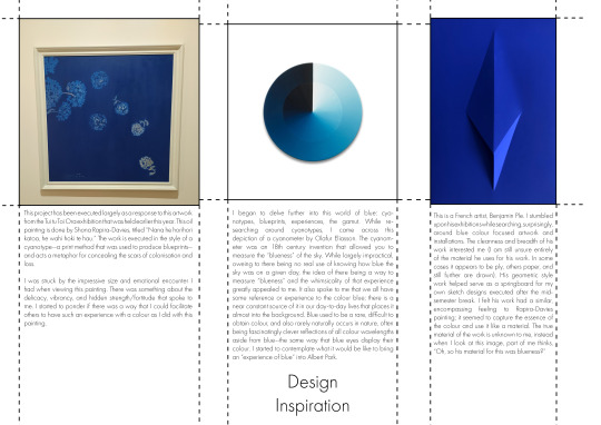
Hokusai's 36 views of Mount Fuji were all made employing a new pigment that had recently been made available in Japan. That pigment was Prussian Blue (the colour that cyanotypes are), a colour that I have spent the past semester getting to know quite intimately.

This is Yoro Waterfall in Mino Province by Hokusai. While not one of the 36 views, the vibrancy and gradient of the waterfall never fails to attract me when put against the soft creamy greys and greens. It interests me to think how each of these prints would have been different, how the colour gradient would start to fade and the image morph slightly through the printing process on the woodblock.
I began with this print for a few reasons, but most immediate I think is the element of reflection. Having had a few days since I bound my books and laid them on the table, said "thank you" and "goodbye" to many, I wanted to take some time to reflect on the first half of this year, and this project. Despite the intense period of work over these past few weeks, I have come away feeling happy, interested, excited, and also foot-achingly tired.
I think that I have started to understand the appeal, or maybe the purpose of the university much more in this one semester than in all of last year. There are many reasons for this: not being in lockdown, more certain of myself and what the process is, starting anti-depressants, seeing a psychologist, a brief that interests me, and exploring all the facilities available.
Having Spatial Design turn from something that I viewed as largely a thinking, drawing, 3D-modelling experience, into this explorative, "try-as-much-as-I-can-and-see-what-happens" has made all the world of difference. Getting involved, learning new processes and methods, reigning in the perfectionist, negative voice in my head which says "You shouldn't try doing this unless you know you can do it", and instead getting in and making things, and having them not be perfect, and being okay with them not being perfect, has been nurturing. I wish I could explain to you how good, how much fun I had in the bindery on Thursday, my deadline in an hour, but there I was perched on my seat, pulling a needle back-and-forth and loving it. At the end of our second semester last year, I didn't want to think about Spatial Design, I didn't know if I wanted to keep doing it, I didn't want to remember anything I had done. Now since finishing, I want to go back and learn more. I'm thinking, "How could I combine screenprinting, book binding, and pottery into my next semester?"
I would not describe myself as an artist. For some reason, I have a restricted definition of what an artist is, only when applied to myself. I cannot draw or paint to the level that I wish I could, and so I do not consider myself an artist. But I think that perspective is morphing, I am starting to find different mediums and skills that I can bring together and turn into an art form -- maybe I haven't felt like an artist because, honestly I don't think I like drawing that much compared to working and moulding clay, exposing cyanotypes, or marking out the spaces on a cover sheet. Having this definition of myself change is both something exciting, but also kind of scary?
There are some things about this project that I just finished which I am not happy with. I think I forgot to put my scale on my elevations, the lines turning out black in the cyanotypes, and I'm worried that my material palette wasn't really what was intended but that's okay! No project will be perfect, and I'm not expecting them to be anymore. It is a demarcation in time of where I started and where I ended, and I feel like I've grown in that time.
In fact, for once I am less concerned over the mark that I get from this project because I already feel that I have come away so much richer from this learning experience. I had fun, I've opened a lot of new doors, I've made connections with technicians, I've broadened my knowledge and my definition of myself, and that's more important to me.
I'd briefly just like to say "thank you" to Xaiver and Nooroa for all their guidance and support, all the technicians who taught me things, and my peers in studio for helping keep me sane and providing endless opinions on aesthetics.
Thank you for reading my documentation for spatial fabrication 601, I hope that it informed you of the journey this project and I went through over this time period.
Sincerely, Joel
0 notes
Text
Week 12 - Thursday
Today, I arrived at university around 8:40, to go to Gordon Harris to buy more trace paper and print out my colour document again. I encountered the same problem with the black marks, so went over and printed in WE, before collecting both my cyanotypes and my sheets and coming in to the bindery.
Before I did this, I talked with Xaiver about whether or not I needed to trim down my cyanotype pages, as while the images on the pages were A3, they themselves were somewhat longer. I didn't want to have to cut them down to an a3 exactly as I really liked the larger look with the sort of, distressed edges, and thankfully he agreed with me.
The binding process was a bit more complicated than what I did on Tuesday, primarily because of the trace paper having little to no grip, and my cyanotypes being all slightly different sizes. Aligning all of the paper together to get it as flush as possible, before attaching the cover sheet on the front and the back took me the longest amount of time. I then went with a 10mm, 5mm gap after a talk with Fleur, and also starting and ending the binding at the back. In the mock-up that I did on Tuesday, after weaving the needle and thread up and down through the holes from left to right, I went back and did the opposite. Doing that makes the thread line continuous, but I wanted the single weave to emulate the dashed lines that I had in my document.

This is the book that Fleur gave me as an example to follow for how the binding would look.
There's not much to say after this! I punched the holes, threaded my needle, doing a nice white cotton for the cyanotype and a black for the trace, and sewed the binding through for both before coming back into studio and assembling my station.


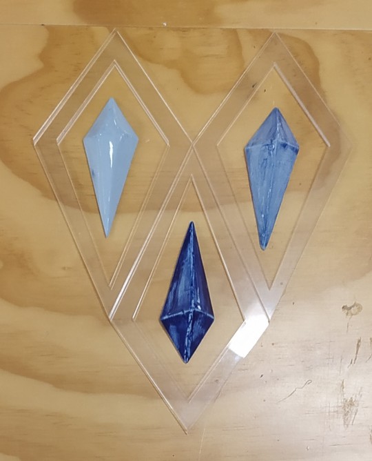
This whole process has been a mission and a lot of learning, but I'm really proud with how both of them, and my clay prisms, turned out.

Unfortunately I don't have a great photo of it laid out, due to the height of the tables I couldn't get a flat view, but here's what I did take!
0 notes
Text
Week 12 - Wednesday
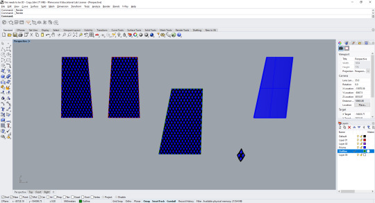
Photoshopped site map, title page, material/detail page, sections, floor plan, laid out the entire document, went and printed them on OHP, turned them into cyanotypes, re-did two, ptinting out on trace
This was a really big and stressful day. I had to photoshop my remaining elements and lay them out in my InDesign document, so that I could print them all out as the negatives to then go and turn them into cyanotypes. I thought the print lab closed at 4pm like the other workshops, but found out while doing my cyanotypes that they closed at 7pm! This meant when I thought needed to do my title page, abstract, site plan, photoshop my elevation and add in measurements, my floor plan, and my detail/material page all before around 2-2:30pm to print everything in time, I could've taken much longer.
Basically all the work that I did today made it into my design document, so I don't know if there's much point showing you.
I wanted to include the dashed lines in reference to the blueprint style, though I might a slight mistake here. The dashed lines and stroke for the boxes should have been white with a coloured background. Since cyanotypes produce a negative of the image, and I was greyscaling these pictures and then inverting them, if I wanted the lines to be white in the cyanotype, they had to be white here. i.e. white to black to white (normal form > greyscale > inversion) whereas I did the opposite. I don't really mind because they still turned out well, and this was my second time doing anything with cyanotypes.
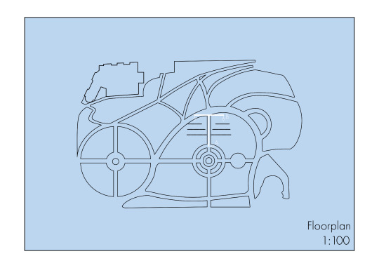
My floorplan came out the correct way because of this. The blacklines would be white in the greyscale, then black in the inversion, and vica versa for the white lines. I tried my best to lay the elements of my document out in a manner which made sense, while at the same time trying to rush to get everything finalised and printed, as I needed to print these 11 pages onto A3 OHP before I could do the cyanotypes.


Since I was doing two cyanotypes at a time, I had multiple in the waterbath developing. Both my floorplan and renders came out correctly, but the rest of my pages as stated before, were not quite as intended.
From here, I dried all the pages and placed them between stacks of newsprint following Struan's suggestion. He was really great through the whole process and both him and Greg were supportive of the final outcome!
After this I bought the tracer paper from Gordon Harris that I was going to use and embarked on a quest to get my document printed correctly onto it, but was having difficulties with the printer in studio producing strange black marks.
I took the cyanotypes home with me and set them in front of the fire, between two boards and loaded up books on the top to try and dry them as much as possible while getting them flat.
0 notes
Text
Week 12 - Tuesday
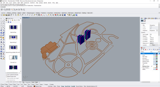
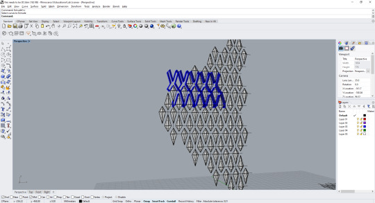
I began Tuesday morning in the 3D labs, cutting out my lattice models for my prisms to sit in. I had originally intended to get some wire and suspend these section cuts of the lattice, but ultimately ran out of time with the cyanotyping process and binding the booklets together.
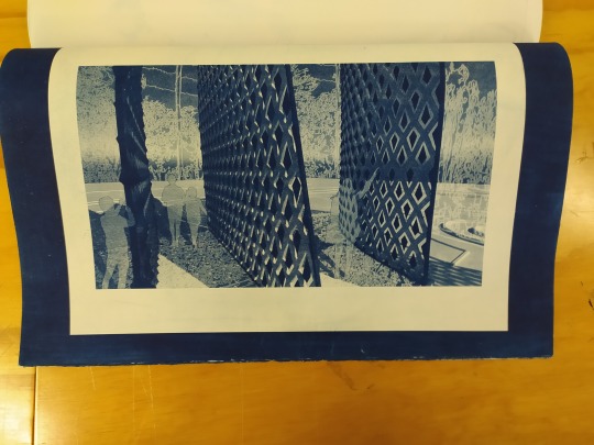
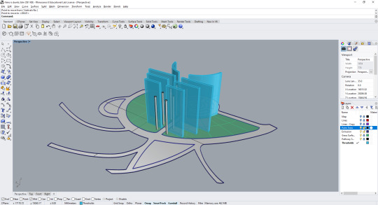
After this, I went to the bindery to talk with Fleur about binding my booklet. We had found out on Monday that a digital submission was no longer required, and we would instead be pinning our work up, or presenting it as a booklet. I wanted to actually bind my booklet together as I felt it spoke of a more considered and thoughtful approach, especially compared to just stapling it, and would speak to the "blueprint"-esque style that I was going for with the cyanotypes.


This is a mock-up of the style that Fleur taught me. The pages are assembled together and a cover sheet is place front and back and taped in place. From here, the holes are measured out via a ruler and marked on the cover sheet. This was 6mm in from the spine, and a mark every 10 mm. The marks are then drilled and sewn. I applied a spine cover with glue, which I have decided not to use on my final booklet. I think displaying the stitching speaks far more to the cyanotype/blueprint style that I am going for.
After doing my booklet mock-up, I went and cut my paper that I was going to use for the cyanotypes and took them to the print labs. Because I was concerned that I would need to photoshop and lay-out my entire document to have it done so that I could develop and wash all of my cyanotypes before 4pm on Wednesday, I thought that I would prep my paper by coating it in the cyanotype mixture and drying it today, thereby just needing to pull the sheets out one-by-one as needed tomorrow. I did not take a picture of this process, but just imagine painting fourteen white sheets with a green-y blue mixture while wearing a white t-shirt (it is no longer white.)
Having completed my cyanotype prep, I went back to studio and fought through the image trace option in Photoshop to finish creating the trees and background for my renders.

This was a test that I printed off to see what the colouration was like. I ended up reducing the glow and opacity on the white lines to help make them feel more integrated, as well as cleaning up the shadows a bit more.
I went on to finish photoshopping my last two renders, having to take a break to run and take some more photographs of Albert Park--amid the those graduating--to try and get some images which matched the perspective I needed.
After this I worked on producing my two sections and my floorplan before turning it in for the evening.
Which required the employment of mathematics so I could add in all of the dimensions!


0 notes
Text
Week 12 - Monday
I started Monday off by talking with Nooroa about a couple of things that I had thought about following the feedback that I received on Thursday. The main things that I touched upon from my rather large list of points were the idea of turning the documentation into the style of a blueprint. I had somewhat done this with my floorplan:
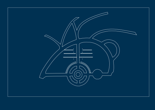
I didn't really like how this turned out (we'll also pretend that it is centred), but I quite liked the idea, and if I could carry through the "construction" line from page to page, possibly by hand-drawing them, I would. Something like this:

I had thought about the blueprint elemental as a way to connect the documentation back to my exploration around cyanotypes & cyanometers, as well as referencing the original artwork by Shona Rapira-Davies. Alongside this was the talk about turning my renders into cyanotypes, and whether or not that would lose too much information. Maybe have two booklets, one with cyanotypes and the other with the original renders? Or possibly overlay the original renders onto the cyanotypes with trace? We also talked about adding context of the site to the renders while still keeping the style/horizon line. To this the topic of Image Tracing the photographs I had taken of Albert Park came up, and taking elements of that into the background could work.
The final topic we discussed were, do I need 5 renders if I don't feel like they're communicating additional information and could instead focus on putting that kind of information in a detail/material page -- to which the answer was "yes", I could do less renders/drawings!
From here I began to finish the final elements of my rhino model. Much of the work I had done on this was on Sunday where I finished off the final threshold that curved, as well as redoing my floorplan and extrusions for the fountain/pathways.

I had attempted to do my final renders on Sunday, but was nearing 9:30 and realised that I hadn't applied a different shade to the back prisms, so surrendered the fight and came home. I had spent the last hours clicking each of the polylines that I had made for the threads and moving them onto their own layers so that I could add a thickness and then apply a material to them so that they would appear in the renders. You can't see them in the last threshold but they are there if you zoom in to the closer ones.
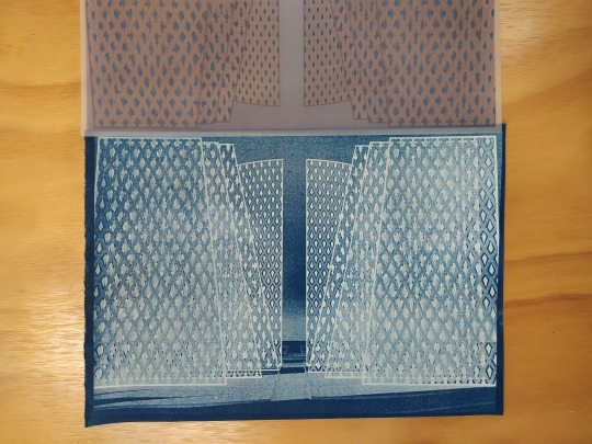
Returning to Monday, I finished my renders and saved them, then I went and tried making some cyanotypes so I could understand the process and make a decision about what I was going to do. They turned out really well:


I played with the detail of using the negative (where the render came out primarily white) laid beneath the actual render printed on trace. However, I ended up finding the atmosphere of the negative more like... an x-ray, or ghostly. I decided at this point that I was going to do two booklets one with my document entirely as cyanotypes, and one with it on trace.
I finished my 3D model and began the process of rendering in different shots, saving both the .pngs and .jpegs to choose between the background or not. I also almost finished photoshopping my first render
I wanted to add in the palm trees to root it further into the park, and maybe grass? As well as finishing adding shadows for the cutouts.
0 notes
Text
Week 11 - Review

talk about feedback received + plan going forward
These are the notes that I wrote down for myself following the presentation on Thursday. I felt the feedback around my work was positive, and most of the things I needed to work on such as adding more site context to my renders I knew I would need to do.
Include some reference to the surrounding environment in renders. Either by adding in line work of what the background would look like, or reducing the opacity to make it faint, but referential.
Keep the horizon line as the reference to the sky as a source of blue is important
Possibly rotate the lattices to show the movability of them in the final renders/maybe on the detail page?
Also show the different colour of the prisms: maybe take a picture of my clay prisms and then do it as part of a detail shot saying "and this is the layout the prisms would have?
Explore the idea of making a cyanotype of the work, or putting hte documentation pages in the same colour of the prisms, placing a hexcode/reference point at the bottom (maybe with a reference to a cut out of one of my prisms???)
Printing a physical booklet to speak to the blueprint quality/idea for the images?
What if I was to make actual cyanotypes of the work?
Still need to show key design inspirations/moments.
Consider what paper the booklet will be printed upon.
0 notes
Text
Week 11 - Presentation
It went well! The feedback was what I expected, I'll detail it more later. While working on the documentation for the project I was struck with the idea that maybe I should try and make it like a blueprint? Connect back to the artwork which inspired this all being done in the style of a cyanotype, I think that would be cool to explore!

A cheeky little pin-up in my space after the presentation to give a better demonstration of the work
0 notes
Text
Week 11 - Tuesday & Wednesday
A short time and a lot of fighting with measurements.
I had thought, for some reason, that producing these lattices and prisms, and then cutting them out of the shape that I wanted would be a simple activity. Unfortunately, this was made much more complicated by some mistaken use of the Trim tool on my part--I did not realise the surface that I was cutting with had to be thicker? If they were the same dimension it just... wouldn't. Anyway, Juliane figured it out and saved the day (thank you Juliane, my god.) and progress started chugging again.
A lot of my work the past few days has been me going, "wow this took me an hour longer than I thought."


Some planning, an image with writing on it looking dangerously like mathematics, and a commemoration of me finish my three thresholds in the cut that I wanted! (I later went back and make the frame three dimensional because of coURSE I did)
Wednesday was the real crunch of a day, but, I did it.
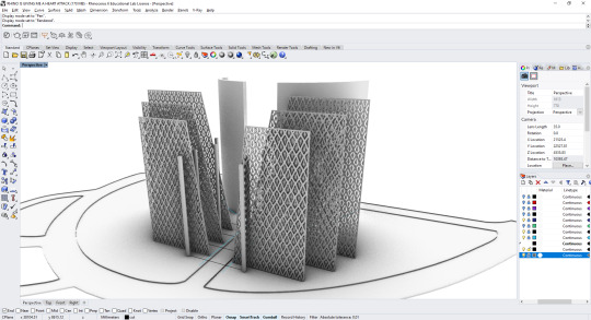
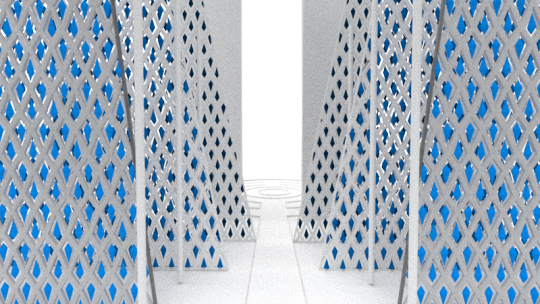
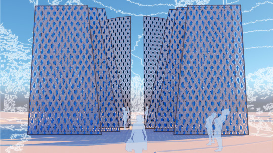
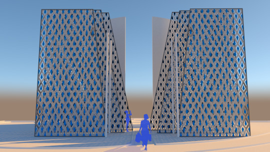
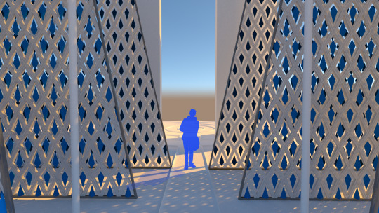
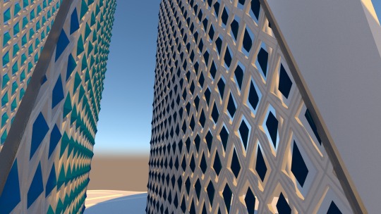
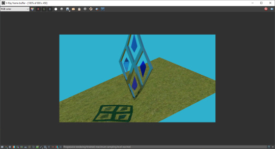
Here I properly placed in the thresholds, separated them, re-did the palm trees and realigned them, and began putting in some test renders. My idea was show the perspectives that I was planning on using so even if they weren't fully done, I could at least get some feedback on those.

A cheeky little render that happen at something like 9:30pm, playing around with the sky and lighting in Rhino to try and show the horizon line that Xavier and I talked about and also giving the image a bit more context + reference to the blue of the sky
0 notes
Text
Week 11 - Monday
I started off feeling quite worried about the position I was at with still trying to figure out how to make my structures in Rhino, materiality of my prisms (glass vs clay) and how I would depict that in my perspectives/atmospheric images.
Thankfully, I had a really good talk with Nooroa about both representation but also my material exploration. I said that I felt the three or so weeks I had spent making all my different moulds and clay shapes seemed like a waste when I could have been refining my model. Nooroa brought up the point that my material exploration had helped shape the project and was a strong facet of my design that I could highlight/focus on in my documentation and in my project, and that the time hadn't been wasted. We also discussed around ways of representing the light from the prisms if they were glass, and that instead of necessarily rendering the entire image, displaying a portion of it under that light.
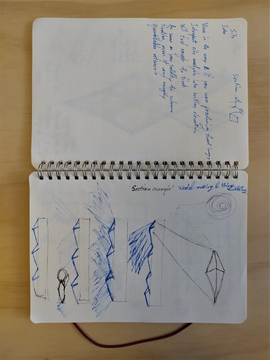

Some process work/quick sketches from and after our discussion detailing the conveyance of information
Even better however, was that afternoon at 4:15, I sprinted up to the wet labs to see if my prisms had been fired over the weekend and look:

They came out so much better than I anticipated and really sold me on working with the prisms being made of clay. (also not having to spend so much time trying to imagine blue shadows in the space, whew!) There's a lot about these that objectively need work: i.e. my poor underglazing technique, my even more hurried glazing for some of them where you can see where I was holding the shape after I dipped it, and if I had constructed my mould better the lines would probably be sharper, but... These glaring imperfections don't bother me for once? I am delighted at having spent all this time and energy working on a skill that I have never done before, I have produced something that is close to what I had in my head. The differing shades that came out, as well as the un-even underglaze also adds to the textural quality for me?
I'm feeling hopeful that I might have a bit to show!
0 notes
Text
Week 10 - Review
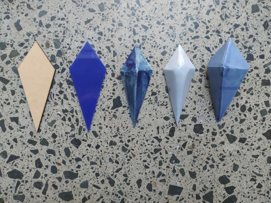
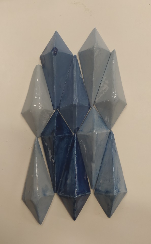
My prisms! I feel like a proud mother hen (father rooster???). There are a mixture of underglazings (cobalt + royal blue) as well as a mixture of a blue glaze and clear glaze here. I managed to very speedily get them all done on Friday in an hour and so I hope they get into kiln on Friday or ASAP on Monday.
With the introduction of our presentation happening next Thursday I am Quite Stressed as I have little other than a bunch of prisms to show for it so far. I have started my rhino model in a panicked state as I think this would be the best way to convey my design in a short amount of time, but wow, do I not remember how to use Rhino.
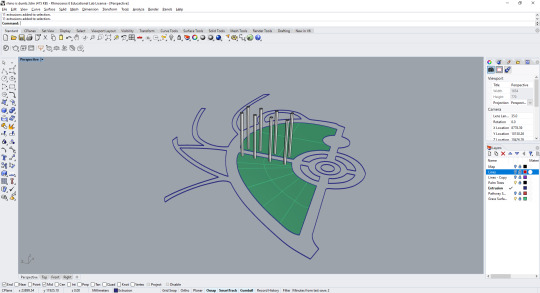
I have started by taking measurements of my site, taking a map of Albert Park, and scaling it up until it fit the measurements that I took of the site, and then started to trace my site around it. The cylinders are the palm trees, roughly.
From here I mocked-up my thresholds to get a sense of the scale in the space and how they would fit in arrangement.
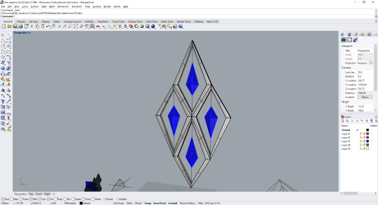
I began to make my prisms in the way that I had laser cut it, then realised what I needed to do was make the negative space, the lattice as well, which wasn't something I was ready to deal with on a Friday evening, and that I had to figure out a lot more dimensions than I wanted to, so I went home.

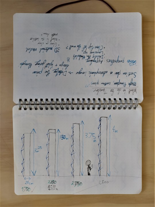
After working through something dangerously close to mathematics, ratios, and scales, I have a lighted on a prism that is 6 cm wide and 15 cm long and started to build my lattice around that.
I had a beast of a time trying to find out why, when I turned on the sun, my image would just render entirely black. After 20 minutes, I found the sun panel and realised that it took the sun position from my current location, and at 7pm on a Sunday, that meant pure pitch black night time. Here I was trying to see if the glass would show the blue light I was after and how it would interact with a surface. (later found out the reason the shadows weren't blue was because of the grass texture! Yay!) I was unable to find blue acetate that I could use to replicate this in real life. The amount of glass that I would need to render and represent how it would interact with the space is really daunting to me at the moment.
I'm worried about having enough to show at this feedback presentation in four days, long nights ahead.
0 notes
Text
Week 10
Well of course this is the week I come down sick, isn't it? I've lost a day to lying in bed being very sleepy while my sinuses fight to clear themselves but, before this happened, I did get some things done.

I sanded all of my prisms after they had dried to try and get the points as sharp as I possibly could -- an activity which took far longer than I thought it was going to take.

I even got back some of my test prisms! ...Sort of? Due to a miscommunication some clay that was only supposed to go up to 1000 was put in to the kiln which went up to 1243, creating this beautiful piece of art! I was glad it happened to my test pieces, but in some ways it was interesting to see these sharp forms piercing up through the amorphous and uneven surface that the clay melted down into.
0 notes
Text
Week 9 - Review

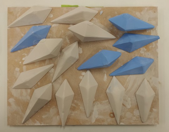
I rounded the week off by finishing making my clay prisms out of the blue clay I made (which I sadly did not document because I may have forgot, and it also took a long time and I was getting over it). I used two batches of blue clay, 500g each, with 20g of royal blue pigment rolled into the first and 40g of royal blue pigment rolled into the second batch. Additionally I sanded my dry test prisms to help sharpen the edges before they were bisque fired.
I spoke with Xavier about where my project was at on Thursday, which was useful in clarifying that the direction I was going was a good one. I've been trying to determine whether the prisms are made from glass or from clay, he suggested buying some blue acetate so I could test seeing what reflections would be cast onto Albert Park through the acetate, as a way of mimicking one of my blue glass prisms. We also talked about the site and reviewing to ascertain how my thresholds would fit within my chosen space and interact with the environment (my previous post technically happened after this discussion, but, we can pretend).
Onwards into week 10, mainly focused on editing my theory at the moment but will try to start planning out how I'm going to show/communicate this design, and finish the process of bisque firing, underglazing, and glazing my test + final prisms.
0 notes
Text
Week 9 - Albert Park
It's that time of the project where I emerge from all of my experimentation and ideation to hurriedly run back to my site and see if the ideas I have been experimenting with will actually work within the space that I am intending.


The above is the space which I was originally intending on using. It is the pathway that leads from the pagoda, straight to the fountain in the heart of Albert Park, but I am no longer sure if it is the best place. There are more surrounding trees/foliage than I remember and the pathway doesn't connect to the art gallery in any real way. The part I enjoy the most are the stairs for the difference in elevation but, I don't think they are worth trying to squish these thresholds into this space.


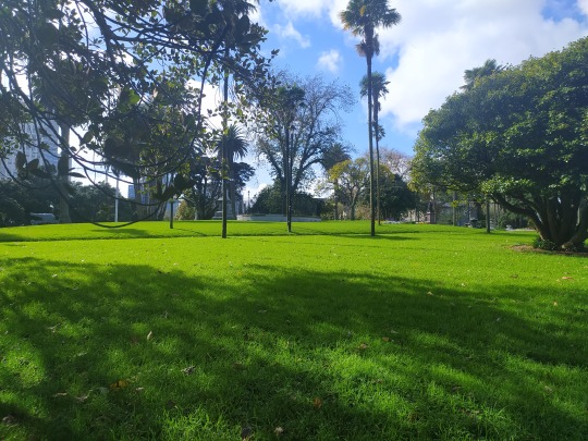
I had a walk around Albert Park again, hunting for a new site where my thresholds might "work" or be more cohesive within the space, and found this area to the north of the fountain. It's more open, there's less trees, the path diverts off to the art gallery, the space between the palm trees is greater -- I think it fits everything which I'm looking for in a site. The more elevated horizon line also fits quite beautifully with the space I think.

I toyed briefly with the idea of putting the thresholds running around the perimeter of Albert Park because the space in the outside ring has quite a beautiful (what do I mean by that? removed? solitudinous in a way? People don't tend to use these paths as much so it is less busy) manner to it, but I think that is too similar to The Gates project for my taste.
0 notes
Text
Week 9 - Experimentation
Another week, another day back in the wet labs. Production is a bit slower than I would like even with the two-piece mould but much faster than with what I was otherwise producing. I'm still struggling to get those perfect lines, though at this point I'm starting to wonder whether or not that is a bad thing? I'm thinking the handcrafted quality is lending itself to the project, but I'll see. These are my last lot of test pieces which I will try underglazing and glazing. Hopefully the order for white clay comes in this week so I am able to mix the underglazing pigment in and try the blue clay.


Another week, another day back in the wet labs. Production is a bit slower than I would like even with the two-piece mould but much faster than with what I was otherwise producing. I'm still struggling to get those perfect lines, though at this point I'm starting to wonder whether or not that is a bad thing? I'm thinking the handcrafted quality is lending itself to the project, but I'll see. These are my last lot of test pieces which I will try underglazing and glazing. Hopefully the order for white clay comes in this week so I am able to mix the underglazing pigment in and try the blue clay.
I also had a somewhat unsuccessful attempt at slumping my glass. It all sorted of pooled into the back. Apparently it turned out better than Harriet expected, but it didn't quite achieve the effect I wanted. I tried taking it to Albert Park to see how the light would shine through, but it's too dense, and light only really shines through the edges.
finishing double mould, do slump tests for making glass, site analysis of Albert Park, try to make a larger lattice, maybe a more 1:1 scale to see how one of my prisms might look within it and get that cut out!


I also realised the other day while coming into university, that the "new" parking block on Wellesley Street is done in a diamond pattern, despite going back and forth past this building many times. I thought it was cool to see another space/construction that was using a shape (albeit a different yet similar one) to what I am working with.

0 notes
Text
Week 8 - Review!
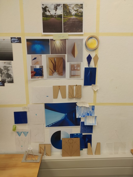
Rearranged my wall to show some of the work which I've been able to get up to this week.
A few brief thoughts about the week in shorthand:
Good start, was able to make the things I couldn't last week Felt like I've started to make good progress finalising some important things about the design (lattice, prisms) Still want to explore sound, how the prisms are suspended colours of the prism (shades of prussian blue? I want to bring in the cyanotype element back in) need to figure out position + site analysis Things to focus on next week: finishing double mould, do slump tests for making glass, site analysis of Albert Park, try to make a larger lattice, maybe a more 1:1 scale to see how one of my prisms might look within it and get that cut out!
0 notes
Text
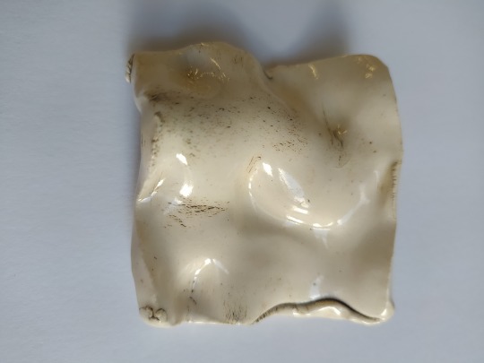
Week 8 - More tiles
Finally, on Thursday, I have some actual clay imprints of my prism! Quite a few things learned along the way: a) the way we've made the mould makes it really hard to get the shape out, surprise! I'm in the process of making a double mould that I can join together, push the clay in, and then pull apart to extract the shape which should be MUCH faster than having to put a heat gun to the back of a mould. b) I've also made a glass mould of this shape so I can try slumping glass into it that I can take into Albert Park and see how it will interact with the space there. c) there isn't currently any white clay in stock that I can buy so it's probably a good thing I have to wait for my other moulds anyway! All good learning for future projects!


First one was my attempt at pushing it in and pulling the shape out, then smoothing down the sides, the second was Harriet's of really shoving the clay in and then scraping down the back to remove excess, then we realised we couldn't easily get it out haha.
---
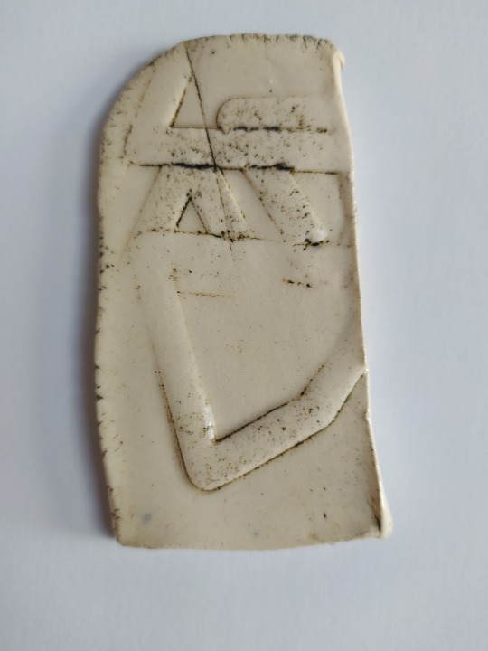
These are my clay tiles made from the first diamond shape I cut out! This was when I was thinking of the wall as a flat plane, which while interesting (is it? ...Yeah I think it would have been if instead of being uniform, some shapes had pushed out more while others receded) has been really fun to see how the design has moved to a related albeit different direction.


0 notes
Text
Week 8 - Tiles!
I finally remembered to check and yes, my underglazed + glazed tiles have finally returned on their journey from initial creation, drying, bisquing, underglazing, and glazing!
I don't think I have much to say about these from a development or work perspective, haha. These are very much experiments to understand the process, see how underglazing works and what it catches on, and get used to spending time in the wet labs and not feel out of place, and for this they served their function well.
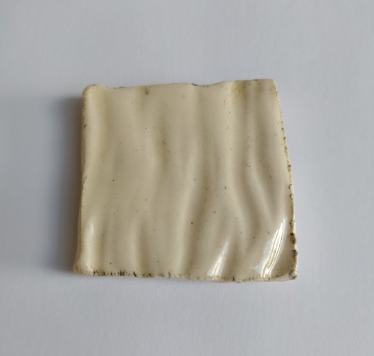
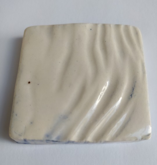


I will confess that I really liked how this piece in particular turned out with the shape and also how the underglazing pushed in and kept really nicely in the grooves on this piece. This whole process was good to see how underglazing works best with!
0 notes