
Statistics
We looked inside some of the posts by specialdivision and here's what we found interesting.
Average Info
Notes Per Post
3
Likes Per Post
3
Reblog Per Post
0
Reply Per Post
0
Time Between Posts
9 days
Number of Posts By Type
Text
15
Video
2
Last Seen Tumblr Blogs


Fun Fact
Tumblr Inc. has $15.1M in annual revenue.
Text
Module 15
Here are some of the content requirements for my remaining deliverables:
WEBSITE
Animations - I have the homepage and sticker animations complete, which are the bulk of the animations. But I still need to create a few animations for the other pages of my website, particularly the type guide page.
Copy adjustments - I will continue to refine and adjust the copy throughout the site.
Build it - Once I have the animations and copy finalized, I will need to work on building it into a functioning live URL. I have a friend who is a web developer and she said she might be able to help me out with this. I have some experience with basic web development, but I will need help implementing a lot of the functionality. I plan on talking to them a bit more about this to see if they can help me out, or at least point me in the right direction.
TYPEFACE
Refinements - I have the general look/feel of the typeface, so now I need to continue to make detailed refinements and ensure quality and consistency with each character.
Font weights - I will need to create the remaining glyphs as well as bold and italic variants.
Formatting - Once I have all the characters/glyphs created, I will format and export them into a usable file format (.otf). This includes kerning and spacing adjustments for each character.
MARKETING MATERIALS
Create marketing materials - The three marketing materials include stickers, t-shirts and tote bags. I already have the stickers designed, so I still need to create the t-shirt and tote bag designs.
Produce stickers - Lastly, I will need to physically produce the stickers. I’ve previously worked with an online company called Sticker Robot, so I will have them print and produce the stickers.
QUESTIONS
I have a clear picture of what’s required of my remaining deliverables. Over the summer, I plan on completing the website animations and creating any additional glyphs/refinements for my typeface. So, I’ll have those ready by the time I begin thesis 2.
My only question is how do we establish the order that we complete the remaining deliverables? At the beginning of thesis 2, will we create another gantt chart? I think that I should work on the marketing materials last, because I’m sure those designs will rely heavily on the final typeface. It might create extra work if I have to design that first, finish the typeface, and then redo the marketing designs afterwords.
1 note
·
View note


Video
tumblr
Digital stickers
#design #graphicdesign #stickers #stickerdesign #fonts #typography #typedesign #digital #webdesign #color #icons #glyph #glyphcity #portlandart #portland #pdxart
0 notes


Text
Module 5
This week I continued to brainstorm names for my typeface. Based on the feedback I received in module 4, I decided to revert back to “Sans Identity” because it connects better to the super hero genre. Then, I briefly worked on a few more tight sketches for Glyph City because I had a few more ideas that I wanted to explore.
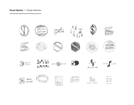
I spent a good amount of time refining my computer drafts and narrowing down to a single logo option. The option I chose is more simple than the others, it’s easier to read at smaller sizes and the refined speech bubble within logo ties directly to comic lettering. It’s also a bit more versatile when it comes to colors. I can change the color of the speech bubble depending on certain use cases.
Then I continued refining and exploring other branding elements such as typefaces and sticker graphics. I want to eventually animate some of these stickers with very simple rotations, shaking or color changes to give some motion to the website/marketing materials. Once I established the basis of some of these elements, I played around with them by updating my user journey maps, DS Chart and Materials Matrix with the new branding.
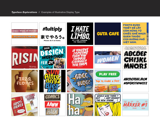
Next, I added some typeface explorations by combing through a collection of illustrative type that I have found or seen over the past few months. I began to see that there are a few different styles of illustrated type. Some are more of your typical comic sans font, and others are a little more regimented. I’m still in the process of finding different styles of existing illustrative typeface.


0 notes


Text
Module 3
This week I created an additional journey map which focuses on the basic typesetting aspect of my website. This map describes how the user might interact with this page after they purchase the font. I then made minor revisions to my contract and gantt chart based on instructor feedback. The gantt chart now includes the content that I need to gather for the basic typesetting information page.
I then continued to brainstorm additional names for my thesis. The two names that I really like are Special Division and Dialotheque. This is a combination of the words “dialogue” and “discotheque” which is a cool sounding word. After revising some of my keyword image pulls, I created more rough sketches and tight sketches which I then brought over to the computer and created some initial computer roughs. This is also where I started experimenting with some colors. Lastly, I setup my thesis project website and connected it to a domain name. This is super basic right now but will be filled in in future modules.


0 notes
Text
Module 2
I chose Amanda as my persona for the journey map because as a professional comic letterer, she represents my primary audience. With her persona in mind, I wrote down a list of all the steps that someone like her would go through when browsing and purchasing a font on my website. I started with “she buys a font” and added steps before and after that. Once I wrote down all the steps and descriptions, I brought them onto the computer using the pre-made template from Smaply.
I also want to elaborate on the direction I took for my naming and tight sketches. Since my “brand” is a type foundry for comic book creators, I thought it would be interesting to create a playful brand that tells a story. I came up with Special Division and Dr. Qwack’s Miracle Fonts as two options.
Initially, I envisioned Special Division to be a secretive government organization (as these kind of things tend to exist in super-hero comics). Then I envisioned Dr. Qwack to be a character that was a sassy, old-timey coastal grifter who was also a pink flamingo.
But as I was making sketches for Dr. Qwack, I began to realize that this flamingo persona and style wasn’t very original. I searched flamingo into Pinterest and saw a lot of similar caricatures. So, I became discouraged with that direction. But then I came up with a new idea, kind of a merge between the two.
What if Special Division had a mysterious, Miami Vice/Starsky & Hutch, Bayside PD, undercover cop kinda vibe. And their wasn’t a singular logo, but rather handful of different, generic logos that animate in-and-out. And I could have these small stickers and have super simple animations to accommodate the logo (by animations, I just mean they spin or pop-out every once in a while). These stickers can also serve as secondary graphics throughout the website and they tie in more with my colorful, bold keyword image pulls.
With this, the branding can be fun, playful and it can feel like there’s a narrative behind it. Somewhat akin to comic books. It’s also a great opportunity to experiment and not take the branding too seriously.


0 notes
Text
Thesis 1 - Concept
Module 1
In order to come up with my list of keywords, I had to think about what my overall goal was and who it pertains to. So I thought of comic books, and the entire lettering process. Most, if not all of my keywords directly relate to the comic book process in some way or another. When it came to choosing my top three keywords, I though about what a comic book letterer would want to see in a dedicated typeface. At that point, the three keywords that stood out to me were bold, letterform and emphasis. There were a few others too including, simple, super and illustration but I felt that the three I chose related more to typography.
We also went though this process in the Visual Communications class. But this time around I found that I have a slightly clearer vision of what these keywords represent and how I can use them to develop my visual system. This lead to me finding some new images to include in my image pulls in addition to keeping a few from the previous semester. I definitely want to rework the branding with less halftone patterns and more bold and colorful shapes.
0 notes