
Don't wanna be here? Send us removal request.
Statistics
We looked inside some of the posts by spookybarbariannacho and here's what we found interesting.
Average Info
Notes Per Post
157K
Likes Per Post
93K
Reblog Per Post
63K
Reply Per Post
118
Time Between Posts
6 days
Number of Posts By Type
Photo
8
Text
4
Last Seen Tumblr Blogs


Fun Fact
Premium Tumblr themes are available from anywhere between $9 to $49.
Photo

a little drawing featured in my final zine project
2 notes
·
View notes
Text
Logo Research

I find Coach’s logo really cute. The horse pulling the coach is a really smart idea. Coaches were often used by wealthier people, and coach is a more expensive brand. I think it has stood the test of time, however, if someone just showed the horse and coach I’m not sure if I would be able to recognize it immediately.

I usually haven’t seen Bic with the little character standing next to it but I find it really adorable. The head is the ballpoint of the pen, and it’s height is nice and even with the rest of the logo. I feel like it’s a really iconic logo, the colors and text just work really well together.

Nintendo! The brand that has had a serious logo identity crisis until this beauty. I really like the text and the border around it, for some reason it reminds me of a game controller, which makes sense. I feel like if I saw just the border and the color I would be able to recognize it immediately.

Pepsi, the better one of the coke vs pepsi debate. I feel like the last couple versions of this logo are also very recognizable. It has definitely stood the test of time. The color block makes this a very recognizable brand.

Batman. A beautiful logo for nerds like me. Even though this logo has changed over several times, the angles and curves make it very easy to identify. The basic yellow would make it very easy to identify right away. I would say that it’s a pretty iconic logo.

I remember when instagram updated it’s design, there was an uproar of angry people. I actually really liked it and still do. It’s an abstract Polaroid camera with the rainbow strip from the old logo over this one in a blended form. I’m not sure if I would be able to recognize this one right away, but the old one I would be able to recognize instantly. It probably needs a couple more years before it becomes the iconic symbol that everyone can recognize.

Dove is such a cute and delicate little design. I’d probably be able to recognize this brand just by the text and color. It is doing something clever, but it’s a bit more obvious than others. The simple cold logo is a dove, but it also looks like a pump of their shampoo or some other product. It’s a really nice and clean design for this brand.

The pringles can is such a quirky little iconic logo that seems to just fit perfectly with the chips. The face of the guy looks like the lid that goes on the pringles tube, and the mustache intentionally looks like he’s smiling. I actually would probably recognize the face of the brand rather than the text for pringles.

Franz the bread company has a logo that looks like it came from the 1950s and it still works to this day, so it has definitely stood the test of time. The crimped border also makes it very identifiable. The colors are also pretty iconic for it’s brand.

Crayola gives me such a warm feeling when I look at their logo. the rainbow strip underneath the text is smiling, and shows all the colors that can come in their packs or crayons, markers, etc. There’s shading around the rainbow gradient, giving it actual smile lines which I find really clever. The green border and yellow oval would be easily recognizable for this great brand.
1 note
·
View note
Photo

The cover I made for an up and coming Adventure Time comic, “Marceline the Pirate Queen”!
32K notes
·
View notes
Photo

Fake news assignment, turned away from the political side and followed my gut.. literally
0 notes
Photo
This is just so cool! I was really drawn to this because the two people look so happy and are oblivious to the doom that they are about to receive. The fin is really well placed and it ripples nicely through the water. The shadow that’s reflecting on the water is also really believable since the sun is behind them. This scene works really with the shark fin.

11 notes
·
View notes
Photo
As a batman fan, I approve. I love the monopoly board and the shadowing around it is really well done. I also feel like the pose works really well with this. I actually believe that Joker is winning the game. I also like the effect that was given to the monopoly board, because when I first looked at it, I didn’t even realize that the board was in the scene because it was placed so well. It’s a bit different from the rest of the gifs from the class, but I really like the take on this one.

8 notes
·
View notes
Photo
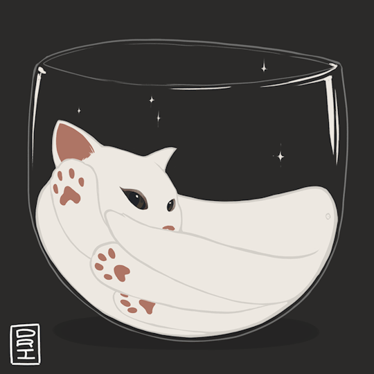
I saw a picture of a cat online and felt compelled to do this
124K notes
·
View notes


Text

hey at least I try, right? sometimes trying to be original makes you look like a fool in the end.
0 notes
Text
5 designers that use photoshop assignment.
First off we have Jeszika Le Vye with an ominous digital painting. I love how the hues of blue in the background draw your eyes to the piercing gaze of the child. She does a fantastic job with making the image ominous. The lighting and dead branches help intensify the feeling.

Next up we have Staudinger and Frank giving us a sneak peek behind what really goes on in the kitchen. I think the whole idea is so creative. As soon as a slice of bread plummets down, little workers rush to get things toasty. He does such a good job with the realism part of it that if any of my future children ask how bread becomes toast, I will show them this image.

Jr Schmidt created this little world that looks like a mix of all his passions put together. I really enjoy looking at this photo and seeing each little section pop up with something new. I do like the aesthetic of everything being divided and separate, and the art style stays the same pretty consistently throughout the world.

Mathieu Beaulieu created this interesting image. I think the character creation is really well dine. The facial expressions give her a lot of life, and the dark humor behind this image made me laugh when I saw it. I like how everything is polished and smooth.

And lastly, this image by Tiago Hoisel. This image is realistic and also so cartoony at the same time that I don’t know how to feel about it. The body language behind the characters is really appealing and I like the childish play on something obviously dangerous. It looks like the start of an action scene as they’re nearly jumping off the page. I just can’t get over those buck teeth.

0 notes