
Don't wanna be here? Send us removal request.
Statistics
We looked inside some of the posts by squidproquoco-blog and here's what we found interesting.
Average Info
Notes Per Post
20
Likes Per Post
19
Reblog Per Post
1
Reply Per Post
0
Time Between Posts
4 days
Number of Posts By Type
Text
1
Photo
16
Last Seen Tumblr Blogs


Fun Fact
If you dial 1-866-584-6757, you can leave an audio post for your followers.
Text
International Fund for Animal Welfare (IFAW) IMC Campaign
A. Company Analysis
The International Fund for Animal Welfare (IFAW) is all about rescuing and protecting animals. It was originally founded in Canada in 1969, but its presence is now international: regional leadership is present in North America, the Middle East, North and East Africa, Asia, Russia, the United Kingdom, the European Union, Latin America, and the Caribbean.
The scope of IFAW’s mission has also broadened with time. It was originally formed to stop cruel commercial seal hunting in Canada, but it now orchestrates a truly multifaceted operation to support animal welfare. Its members are a combination of (a) rescue workers and veterinarians who work hands-on to save and protect individual animals, (b) scientists and educators who cultivate an understanding of the principles behind biological and ecological conservation, and (c) policy experts and campaigners who serve as standard-bearers for large-scale conservation efforts and attempt to spur legislation that would improve animal welfare.
As I attempt to create an IMC campaign for this organization, I will need to keep in mind that their target audience includes just about everyone under the sun. Not only do they need to appeal to individuals across continents, but also across age groups and occupations; the IMC campaign should appeal to children (who will bear a great deal of responsibility for animal welfare in the years to come) just as effectively as it appeals to legislators across the globe.
My communications strategy, then, will need to be relevant across cultures and age groups. I’ll use legible typography, unassuming fonts, and images that everyone (well, everyone with a heart) will enjoy: just animals being animals.
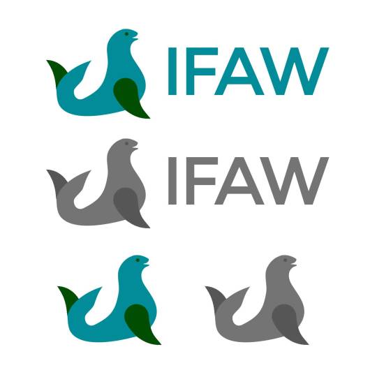
B. Logo Design
In IFAW’s current logo, the graphical element is a circle formed by two blue-green human hands; the hands are swaddling a seal’s head formed by the white space in-between. I like the logo—I appreciate its use of white space and its relevance to the organization’s mission and origin—but I do have two minor criticisms. First, the logo is not effective from a distance or at a glance; for the first few minutes I looked at it, I assumed it was a representation of Earth, which was confusing because the white space doesn’t resemble any known continent. And second, once I came to the realization that the white space was a seal’s head, I was somewhat dissatisfied with the elegance of the design; in order to create the seal’s head, the upper arm had to be somewhat misshapen and include a disconnected dot for the seal’s eye.
So, with those thoughts in mind, I went about designing the logo below. I wanted to keep a seal in the image, as I think it makes a great mascot and it’s a good nod back to the organization’s inception, but I wanted to simplify the imagery and just use clean, organic shapes. The typeface, Monteserrat, is not particularly exotic—but, as I mentioned above, I just wanted something legible that could appeal to a wide range of cultures and age groups. As for the colors, blue and green were obvious choices; across many cultures, they are collectively representative of nature, safety, and stability—all of which are relevant to this organization.
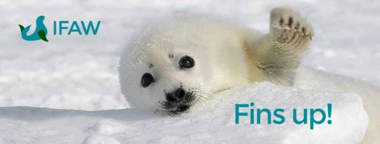
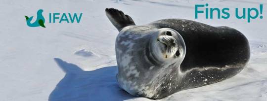
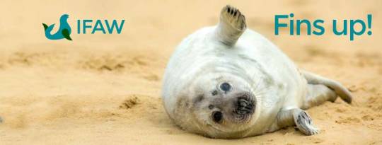
The accompanying tagline/slogan I came up with is “Fins Up” or “Fins Up for XYZ,” mostly because (a) I thought it’d make a good call to action, analogous to raising a hand or a fist, and (b) I found a lot of great images of seals raising one fin or another. I really wanted the graphical element in my logo to feature a seal raising a front fin, but all of my design attempts were disastrous; they came out looking more like horns than fins. So I had to settle for a raised tail fin, which could be worse.
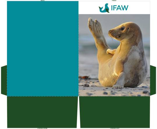
C. Print Promotions
Using the new logo as a foundation, I incorporated the same colors and personality into the following print promotions. These could be distributed at conferences, mailed to supporters, etc.
Informational Postcard

Promotional Flyer
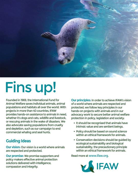
Pocket Folder
D. Social Media
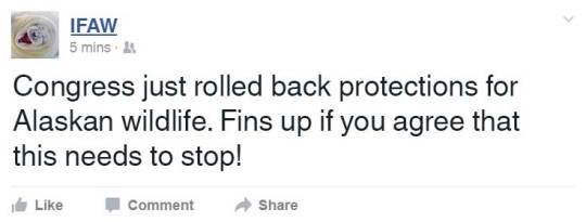
The following social media campaign is, again, designed to appeal to a wide audience. The images have a fun/cute/silly vibe that meshes with the “fins up” slogan and should draw attention from a younger crowd, whereas the posts’ subject matter gets straight down to business. Ultimately, the campaign aims to raise awareness—especially awareness of political current events and IFAW’s various initiatives around the globe—and rally support with the “fins up” call to action.
Posts should come just as often as there’s something worth sharing in politics or world news. The slogan could get old pretty quickly if it were to be used on a daily basis, so I would not recommend posting that frequently.
Beyond Facebook, I think Twitter would be an appropriate alternative venue for this social media campaign. Twitter has a comparably diverse population, and none of these posts would require more than 140 characters. (Even if IFAW did need more than 140 characters, their website is chock-full of information, so they could always redirect their audience there for further reading.)
Facebook Timeline Posts
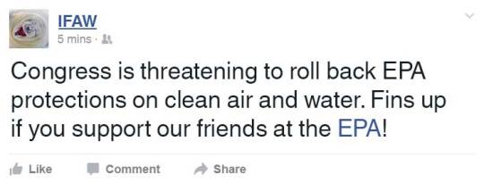
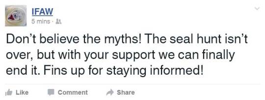
Facebook Cover Photos
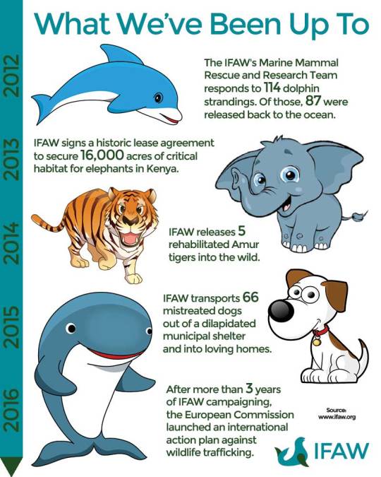
E. Infographic
2 notes
·
View notes
Photo
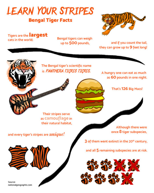
This is an infographic I created using information from National Geographic’s website. As you can tell (I hope), it’s all about Bengal tigers.
My process for creating this was pretty straightforward. I began by reading through the list of facts on the website and jotting down the ones I found most interesting. I then grouped the facts that were related to one another, and planned to give each group of facts its own real estate in the infographic.
From there, I took to the Internet and began downloading PNGs that were related to each group of facts. Some of them needed color adjustment, but that was trivial; I used the Replace Color image adjustment for a couple of them and a combination of the Paint Bucket and Pencil tools to add orange to those striped pelts.
With the text and images in tow, the rest was mostly just a matter of fiddling with fonts and placement. I used a consistently larger, bolder text treatment for the important key numbers, and I played a bit with font variations for the title and some of the key words. Finally, I added some hand-drawn tiger stripes to the layout (using the Brush tool) to help with color distribution (it was too orange without them) and divvy up the groups of facts a little more clearly. In any event, this was very fun to make!
1 note
·
View note
Photo
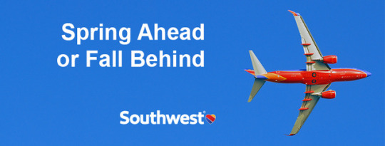
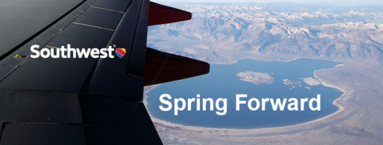
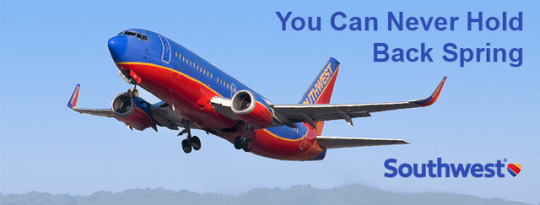
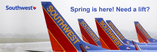
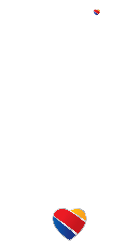
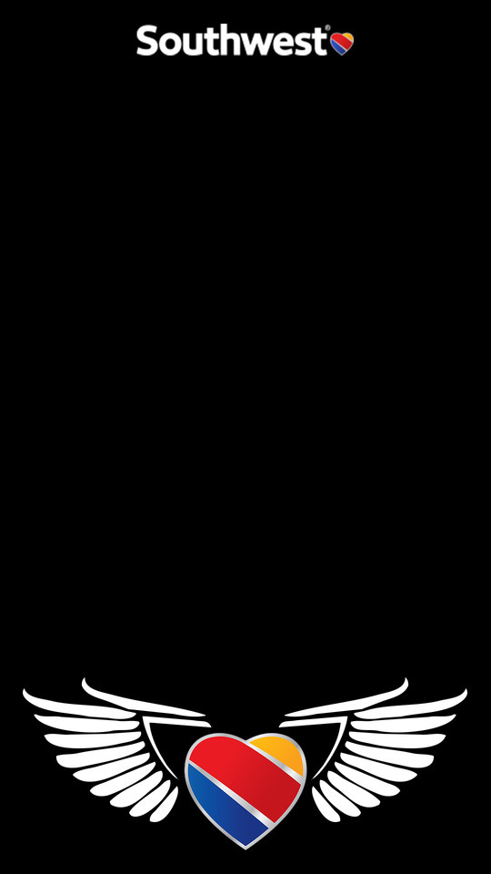
DISCLAIMER: I am not affiliated with Southwest Airlines in any way shape or form; I created these images for educational purposes only.
This is my attempt at a social media campaign for Southwest Airlines. The first three images are Facebook cover images, the fourth is a Twitter cover image, the fifth is a transparent PNG Snapchat filter, and the sixth is the same Snapchat filter with a black background.
I didn’t do anything too exotic with the cover images; I picked the font based on Southwest’s website, and I tried to leverage their logo’s two color variants to keep the text legible on all four backgrounds. For the actual copy, I used a variety of spring-related phrases (including a reference to an obscure Tom Waits song, because I couldn’t resist). Finally, I gathered up some high-resolution photography of Southwest planes, filled in the gaps and made some touch-up edits with the Patch tool and Clone Stamp, and applied some Brightness/Contrast adjustments as needed.
For the Snapchat filter, I started by putting the logo on top and isolating the heart portion to use for the bottom. These looked slightly dull by themselves, so I decided to add a pair of wings to fill out the bottom. I didn’t trust my own drawing skills, so I downloaded a custom shape of wings, resized them, and adjusted their spacing so they’d effectively hug the heart. And that was it!
1 note
·
View note
Photo
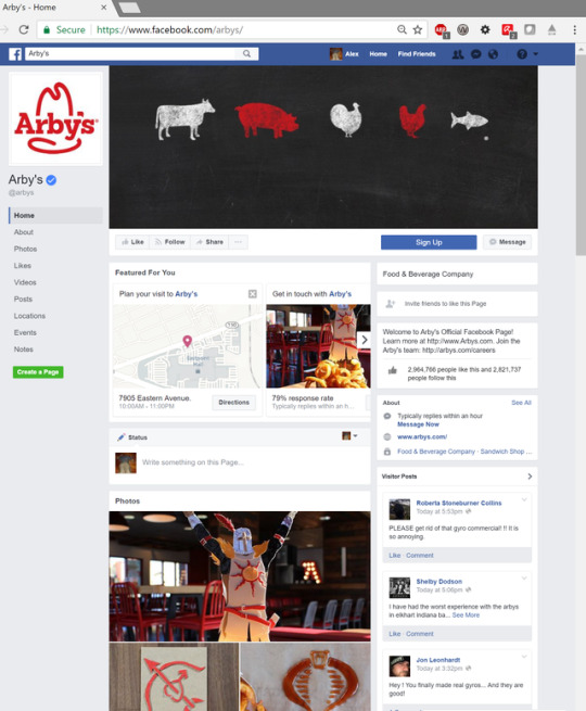
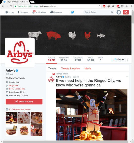
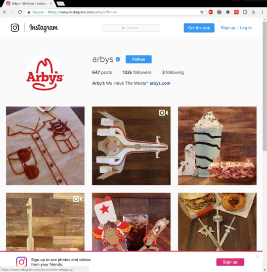
the Arby’s social media marketing campaign!
1 note
·
View note
Photo
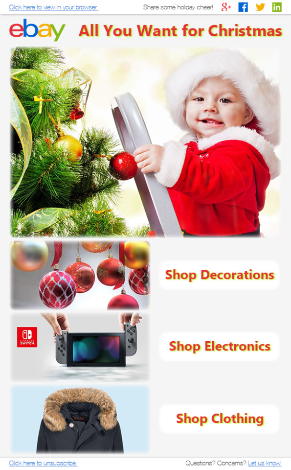
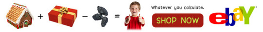
DISCLAIMER: I am not affiliated with eBay in any way shape or form; I created these images for educational purposes only.
This is what I came up with as a holiday email advertisement for eBay. Using the previous project as a learning experience, I decided to update the logo and font choices to improve legibility and give this more of a modern-day aesthetic.
The email needed several auxiliary text/links (social media, a contact option, a “view in browser” link, and a way to unsubscribe), and I didn’t want those taking up valuable real estate in the body of the email, so I decided to relegate them to a header and footer. I checked out eBay’s current website and decided I liked the style they used for the header, so I replicated that and also used their website’s greyish background color for the rest of the email.
I downloaded a suite of SVG social media icons and used Illustrator to color-swap them with the red, blue, yellow, and green from eBay’s logo. I used the same red for the header text, and I also applied a mild drop shadow using a lightened shade of the green hue from the logo. At this point, I had sort of a theme going with the light, blurry edges from the drop shadows, so I decided to apply an inner glow (with the same color as the grey background) to all of my images, just to soften the edges and go for sort of a dreamy vibe. Finally, I applied a similar effect (and used a smaller version of the header text) to the “shop” buttons.
1 note
·
View note
Photo


DISCLAIMER: I am not affiliated with eBay in any way shape or form; I created these images for educational purposes only.
I created these web ads in the fashion of a previously existing eBay ad campaign. The campaign involved addition/subtraction equations with various things you might find on eBay—my personal favorite is the Ozzy equation—and I thought it might be fun to make a holiday variant. I wish I could have come up with a more creative sequence, but I ultimately used fairly stock imagery: gingerbread houses plus presents minus coal equals happy kids! From there, I tacked on the “Whatever you calculate” tagline and a big, blatant, Christmas-colored button to serve as the call to action.
As for the layout, I basically just tried to effectively fill the limited space in each of these artboards. The horizontal variant was easy. The squarish variant was slightly awkward, but it afforded me an opportunity to add a shadow effect (in the fashion of the Ozzy equation) below the images. The vertical variant tempted me to use a traditional vertical equation (with the horizontal line before the sum), but I decided it would be too clunky with the combined addition and subtraction. (Note that the vertical variant is blown up in Tumblr’s preview, but if you click on the image it’ll appear in the intended size.) Finally, for the smallest version, I didn’t even attempt to incorporate the actual equation; I cut that out and just left the tagline, button, and logo.
All in all, this is definitely not my finest work, but I do have a newfound appreciation for the design involved in all those pesky banner ads I used to just ignore as a matter of course.
1 note
·
View note
Photo
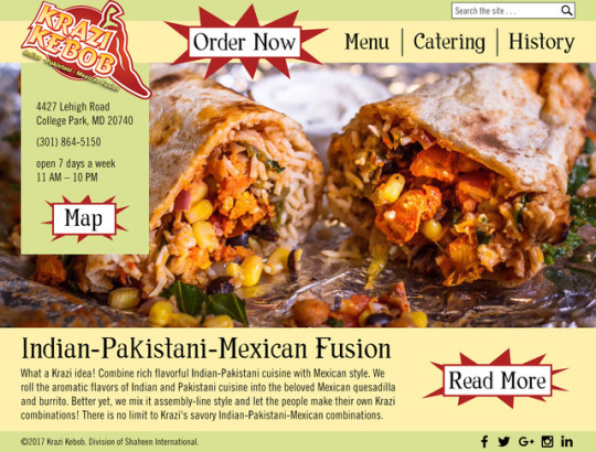
DISCLAIMER: I created this design for educational purposes only; I am in no way affiliated with the Krazi Kebob restaurant. The copyright used in the design is just a meaningless copy of the text from Krazi Kebob’s actual site.
For this project, I was tasked with redesigning the website for one of my favorite restaurants. I rarely get the chance to eat Krazi Kebob these days, but it was my absolute favorite place to eat in my undergrad years. I’ve described it as “Indian Chipotle,” but it’s honestly much better than that. Anyway, on to the design!
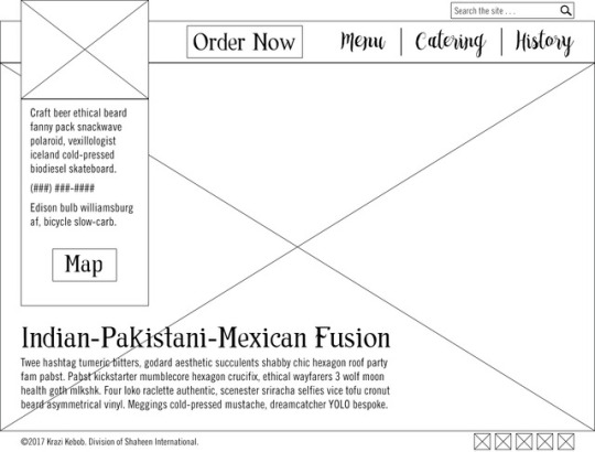
After evaluating Krazi Kebob’s current website and browsing around for inspiration, I came up with my overall approach. I wanted to keep most of the elements already there, but I felt that the core content could be consolidated and streamlined. The navigation menu in the current site has several vague and/or unnecessary links like “Krazi Home” (it’s standard practice for the logo to serve as a functional home page link, so I felt I could do away with this) and “Get Krazi” (which happens to be the link to their catering services, but you would never know that without clicking on it). The way I see it, it’s pretty rare for people to visit a restaurant’s website if they just want to idly click around and read; they’re probably hungry and they probably just want food ASAP. So I made my design with that goal in mind.
As you can see from the wireframe, I kept the search bar available in the upper right-hand corner—I think it’s nice to give people that safety net, although hopefully they won’t need to use it—but I moved the social media links down so they’re exclusively in the footer. The top of the page is premium real estate and I wanted to avoid clutter, which is also apparent from the fact that I reduced 7 links in the current navigation bar to just 4. Location and contact information are also crucial for a lot of visitors, so I gave those prominent real estate as well in a sidebar below the logo. Finally, I cut down on the amount of body copy and relegated it to the bottom half of the page; again, I think it’s safe to assume that the majority of visitors will not bother to read that text.
From there, I moved into the mockup. It’s worth mentioning that I ended up making some post-wireframe adjustments to accommodate the particular content. For the navigation bar, I decided that the script font I had chosen was too difficult to read and created a little too much chaos on the page, so I changed that font to match what I used for the buttons and headings. Also, I had originally planned on filling most of the page with one large splash image (the giant box with an X through it) and superimposing the text in the lower left-hand corner, but I couldn’t find an image with adequate dimensions. I ultimately decided to just fill about two-thirds of that space with image content and then add a separate text area below it. My final adjustment was to add a “Read More” button (mostly to fill the new white space to the right of the text content, but also so more information will be accessible in case someone actually does come to the site to just to read about food). Beyond that, I basically just fulfilled the design I laid out with the wireframe; I pulled the color palette from the logo.
1 note
·
View note
Photo
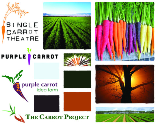
This is what I came up with as a mood board for my personal brand. My last name, Marhefka, comes from the Czech word for “carrot,” so I figured carrots would be an appropriate theme for the mood board.
I scrounged up some existing logos/brands with carrot themes—and I recently learned that purple carrots exist, so I made a point of including some of those—and laid those out on the left side of the mood board. Despite the fact that they’re all fairly different in style and tone, I rather like all four of these logos and I’d like to use them as inspiration when I attempt to design a logo for my personal brand.
Beyond that, I also included some various-colored carrots and other images with a natural/agricultural theme. The four colors chosen for the palette were (1) a deep purple to reflect my recent fascination with purple carrots, (2) a deep orange in homage to the standard orange carrot, (3) a deep green to represent leaves and crops and whatnot, and (4) a light sky blue, mostly chosen for color contrast with the three darker colors in anticipation of text/background combinations.
In and of itself, this isn’t much to look at—but I do think it will be helpful when I get around to making a logo for myself.
1 note
·
View note
Photo
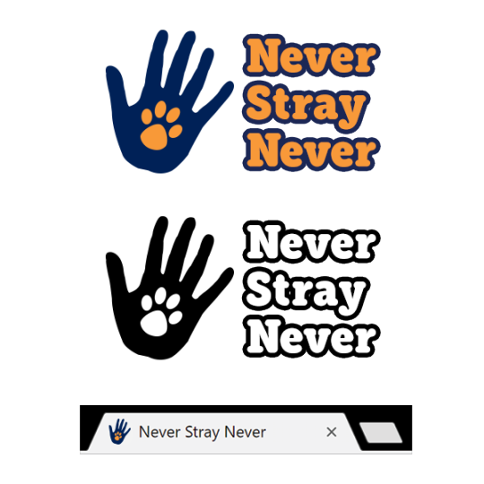
For this assignment, I needed to design a logo for either a hair salon or a pet adoption agency. I decided immediately that I was more interested in the pet adoption agency simply as a matter of principle—I’m a bald man who loves both cats and dogs—despite the fact that all of my initial ideas for names/logos were related to hair salons.
Anyhow, after I racked for my brain for an embarrassing amount of time, it produced this mediocre pun. The idea for the graphical element came shortly thereafter when I was looking through the custom shapes in Photoshop; I liked the idea of a paw superimposed on a human hand for two reasons: (1) it suggests a trans-species high-five, which is great, and (2) the fact that the animal paw is encompassed by the human hand is a sort of visual metaphor in the sense that this business is all about humans giving shelter to animals.
Once I had come up with the ideas, the execution of the logo itself was actually pretty straightforward. I actually started in black and white, browsing for a neutral, legible font—something that would look warm and inviting enough to appeal to families and elderly folks—and landing on Eacologica Round Slab. I then fiddled with the tracking and kerning, being sure to use identical kerning for both instances of “Never.” From there, I proceeded to add the graphical element. I used the Custom Shape Tool for both the hand and the paw, although I wasn’t a big fan of the default paw shape so I modified that quite a bit with the Direct Selection Tool.
At this point, I decided to add color to the logo. I went back over my notes on color psychology, and I felt that orange would be appropriately uplifting and positive and energetic, so I came up with an orange hue for the paw. I then felt that blue was the only choice for the hand, given that (a) it’s a complementary color with orange and (b) it’s generally associated with calmness and safety, which is extremely appropriate in this context—especially given the visual metaphor I mentioned above.
I didn’t want to leave the text black, but neither color really worked well with the plain text: the orange was too light to be legible on a white background, and the blue just looked kind of . . . dull by itself. So I went ahead and added a stroke. With that, I considered the primary logo complete, cloned the whole thing to make a black-and-white version, and cloned the hand to shrink into favicon size.
4 notes
·
View notes
Photo
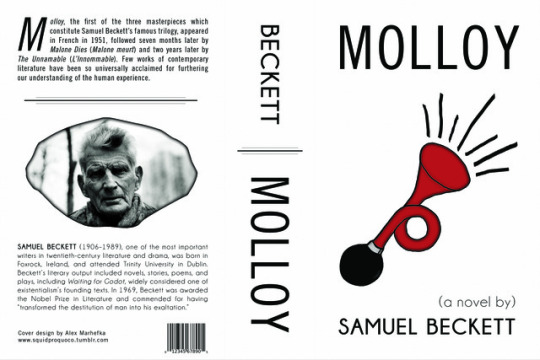
DISCLAIMER: I am not professionally affiliated with Samuel Beckett, his books, or any publisher whatsoever; I created this image for purely educational purposes.
I decided to redesign the cover of Samuel Beckett’s Molloy. If you want a plot summary, the best one I found was actually on Liquisearch: here’s a link. The gist is that there really isn’t much plot to speak of, but there is plenty of introspection as these characters wander alone across giant, bleak, indistinguishable landscapes. If that doesn’t sound appealing to you, I’m just not selling it well; I personally think that this book is hilarious and thought-provoking and that everyone should read it. Anyway, here’s one of the current book covers for comparison:

In designing my version of the cover, I knew I wanted to incorporate two elements from the story. The first is the centerpiece of the front cover: the bicycle horn. Bicycles factor into the story at several key points—what better way to traverse all that bleak, indistinguishable terrain?—and at one point the narrator actually writes to his bicycle:
"Dear bicycle, I shall not call you bike, you were green, like so many of your generation, I don't know why. It is a pleasure to meet it again. To describe it at length would be a pleasure. It had a little red horn. . . . To blow this horn was for me a real pleasure, almost a vice. I will go further and declare that if I were obliged to record, in a roll of honour, those activities which in the course of my interminable existence have given me only a mild pain in the balls, the blowing of a rubber horn—toot!—would figure among the first."
I loved the detail that the bicycle’s horn was red, so I decided to sketch and paint that in Photoshop. I’ve never been particularly good at free-hand drawing, but I figured a bit of a shaky hand could make for a fun style anyway, and I didn’t hate how it turned out. I just used the Brush Tool (a standard circular brush for the horn and then a calligraphy brush for those black lines shooting out of it), then the Paint Bucket Tool, and then I applied a mild inner glow effect to make the image look less flat.
Anyway, the second element I wanted to incorporate was a stone/pebble, which I ultimately used for the clipping mask on the back. There’s a really long passage about what the narrator calls “sucking-stones”; he carries 16 pebbles, four in each pocket, and sucks on them while he’s traveling. If you’re interested, you can read the passage here. It cracks me up and it’s one of the things about the book that has really stuck with me over the years, so I wanted to use it on the cover. I simply placed an image of a rock, added a photo of Samuel Beckett, make the clipping mask, and then applied an inner glow to make the edges more visible.
Beyond that, I didn’t want to do anything too extravagant design-wise. It’s a bleak book, after all, and I figured a plain white background would make the red horn stand out most effectively anyway. (I did put a mild texture on the white background, but I kept it subtle.) For the font choices, I just perused my collection—I’ve been downloading a lot of fonts lately—and landed on two sans-serif families that, I think, compliment each other pretty well. I used the Pencil Tool to draw a separator for the back cover and then decided to copy and shrink it for the spine as well. I also jury-rigged a drop-cap M using two separate text elements since, as far as I can tell, Photoshop doesn’t have a built-in drop-cap feature.
I guess that’s all I have to say about it! The end result feels slightly bland to me except for the horn, but I did commit to simplicity and I think it could have turned out worse.
1 note
·
View note
Photo

DISCLAIMER: I am not affiliated with Tullamore Dew and I have nothing to do with their Irish True marketing campaign; I created this image for educational purposes only.
For this project, I decided to make a tribute to Tullamore Dew’s Irish True marketing campaign. Here are some real ads for reference:
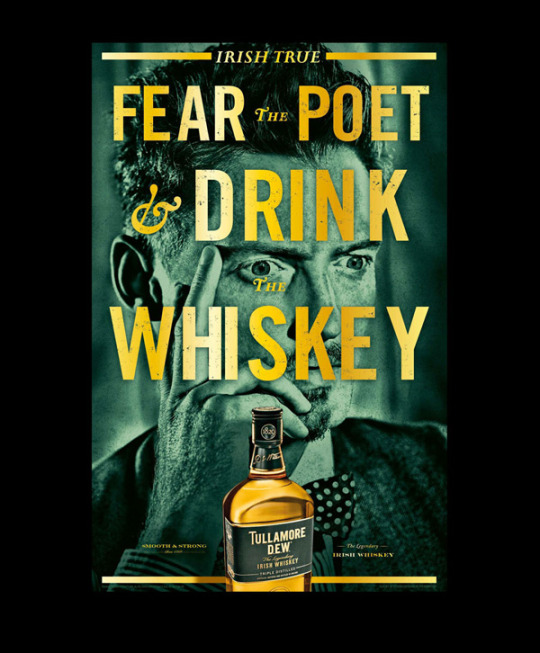
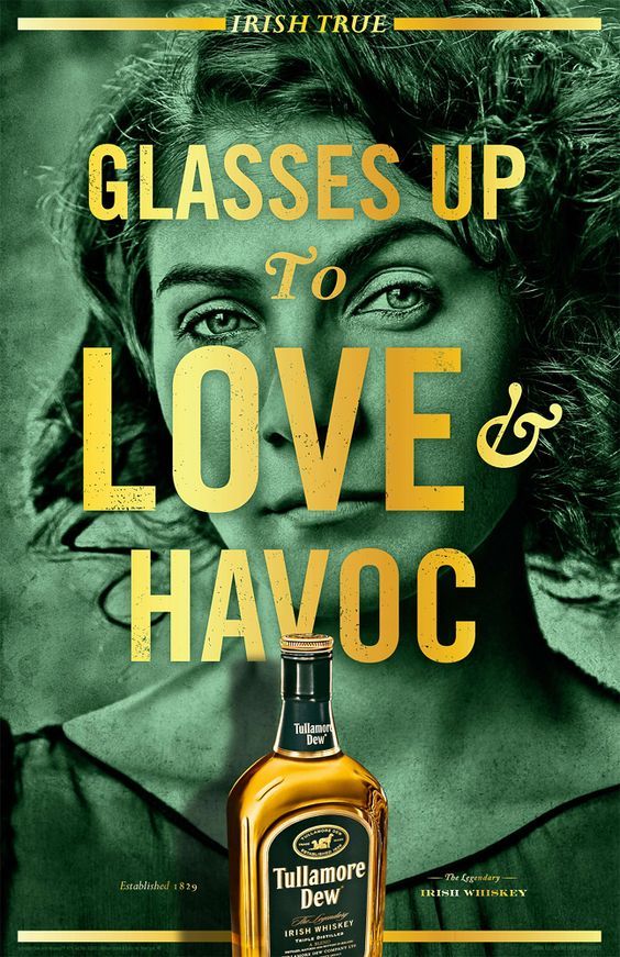
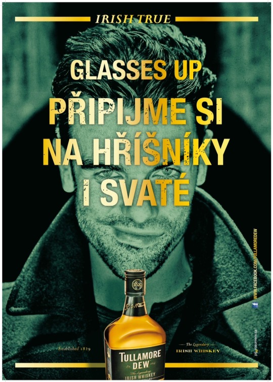
Frankly, I jumped into this without very much forethought; my initial thought process went something like this:
“I like whiskey! I should make a whiskey ad!” *type type type* “Here’s a whiskey ad for Tullamore Dew! I’ll make a whiskey ad for Tullamore Dew!”
“First I need a picture of a person. Who are my favorite people?” *think think think* “Tom Waits is one of my favorite people! I’ll put Tom Waits in my whiskey ad!”
And so on. I later confirmed that Tom Waits does indeed have a wee bit of Irish blood in him, so that worked out. From there, I rifled through my library of Tom Waits songs for some vaguely Irish song titles or lyrics to use as text in the image, and I ultimately settled on this line from “All the World Is Green.”
Anyhow, as for the Photoshop work that went into the poster, I began by placing a high-resolution photograph of the man himself on my artboard. I then applied a Photo Filter adjustment to get the green tinge, as well as a minor Brightness/Contrast tweak for good measure.
I then created the upper rectangle by drawing it with the Rectangle Tool and applying a gradient overlay. I spent a great deal of time fiddling with the gradient to make it look gradual and natural; when the dust settled, I had actually used a combination of one radial gradient and one linear gradient, with the former semitransparent. I then cloned this rectangle for the bottom of the image and used a layer mask to conceal the center portion of the top one.
Next came the text. I snooped around Tullamore Dew’s website to see what fonts they used, and I got a decent enough impression to download some similar or identical ones myself. I won’t go into any great detail, but I played with the font sizes and placements until they looked decent and then applied gradient overlays for that golden metallic sheen.
At that point, the whiskey bottle was the only thing left to add. I essentially just used the Quick Selection Tool and then the Select and Mask gallery to extract the bottle from the third screenshot above. Once that was in place on my ad, I just added drop shadows to every single element except for the background image and called it quits.
As with the last project, I’m pretty satisfied with the end result! I think I may be getting the hang of this Photoshop thing....
1 note
·
View note
Photo
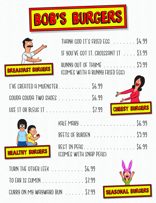
For this assignment, I decided to make a fake menu for the cartoon restaurant Bob’s Burgers. I began by replicating the show’s logo (which is also the sign on the front of the restaurant) by drawing two rectangles, applying a black stroke to both of them, and then adding a drop shadow to the outer rectangle. I then downloaded the font (which was free on DaFont), typed “Bob’s Burgers,” and fiddled with the kerning until I was satisfied with it. I actually hit a bit of a snag with the color: changing the text color in Photoshop actually only changed the black part of the font (the shadows of the letters), so I had to rasterize the text and use the Paint Bucket Tool to make the letters red.
Anyhow, from there I went ahead and added a subtle background—sort of a mildly crumpled paper texture—and proceeded to make miniature versions of the logo to use in the subsections. I just copied the same rectangles (and then toned down the drop shadow to match), and I followed the same process of adjusting kerning and rasterizing the text before adding color.
I wanted to incorporate the characters from the show somehow, so I downloaded an image of the group and extracted each character (using a combination of the Quick Selection Tool and a lot of touch-up work in the Select and Mask gallery). I then assigned each character to a subsection and placed them behind the logo; there are five characters, so I grouped Tina and Gene thinking it might be funny to have Gene sneakily stuffing his face behind Tina’s back in the “Healthy Burgers” section.
Finally, I downloaded a slew of fonts that looked reasonable to pair with what I had; then I tried them out on the menu items (which are all punny titles from the show) until I found one that clicked: NANDA! I chose a similar font with better numbers (in my opinion) for the prices, and then spent far too long neurotically aligning everything until it looked presentable.
For once I’m actually pretty happy with what I made! It’s not something that a run-of-the-mill burger joint would use, but I think it captures the style of the show and looks good for what it is.
1 note
·
View note
Photo
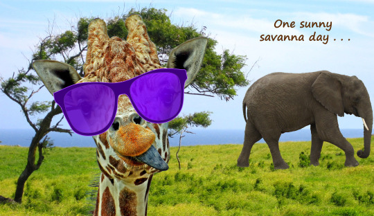
This project was themed around image corrections; it involved modifying and combining four separate image files (the elephant, giraffe, background, and sunglasses).
I began with the giraffe photo. There were some white spots on his tongue, so I removed those using mostly the Patch Tool (although, as I grew more comfortable with the image correction tools during the course of this project, I realized that I probably should have used the Clone Stamp Tool either instead of or in addition to the Patch Tool). I also removed one of his spots and some stray wisps of hair using a combination of the Spot Healing Brush Tool and the Patch Tool. Once those corrections were made, I selected and extracted the giraffe from his background using the Quick Selection Tool initially, followed by some clean-up work in the Select and Mask gallery. I found it helpful to use the Refine Edge Brush Tool for the neck hair and eyelashes, although it got a little overzealous and I ended up removing some of the selection manually by zooming in with the Lasso Tool.
Anyhow, once the giraffe was extracted, I placed him on the savanna background. There was a tree in the right-hand foreground of the picture, and I realized I would need to get rid of that (or else select and mask it) before I could fit an elephant in there. This is where I warmed up to the Clone Stamp Tool: I found it was by far the most effective image correction tool for erasing the tree and replacing it with first sky, then water, then grass. I also supplemented it with the Stamp Tool and blurred the watery horizon a bit with the Smudge Tool before I was satisfied.
With the landing zone clear for the elephant, I selected and extracted him from his photo by following more or less the same steps as I did for the giraffe. To make the perspective look reasonable, I enlarged him and placed him such that he could appear to be pretty far in the background (however, even in the finished product, I think he’s still just a baby elephant).
For the finishing touches, I first slapped some sunglasses on the giraffe by simply placing, enlarging, and rotating that image until the sunglasses looked natural on his face. Then I applied some very mild image adjustments (Brightness/Contrast and Levels), and finally added the text using a font of my choosing and a color taken from one of the giraffe’s spots (using the Eyedropper Tool). All in all, this was a very fun project and I feel like it taught me a fair bit about making clean selections and image corrections.
1 note
·
View note