Statistics
We looked inside some of the posts by srfardn716 and here's what we found interesting.
Average Info
Notes Per Post
0
Likes Per Post
0
Reblog Per Post
0
Reply Per Post
0
Time Between Posts
14 hours
Number of Posts By Type
Text
17
Last Seen Tumblr Blogs


Fun Fact
Tumblr is available in 18 languages.


Text
Feedback
Ingredients on the left is working, not sure if the blue tint on the right is working
Add captions that give the core context
Push myself in the branding - "A Scarlett Fromont campaign" - something like that
Scarlett Fromont for Swim safe
Shoot more Make more visualisations that show us how we will encounter it in the world via instagram or poster
Turn it into lots of other deliverables
“Lucky Duck’?
Add a swim safe website link
Mockup a tab on the website of my work
Repeat across deliverables
0 notes


Text


This was the inspiration for my designs, I found the same typeface on adobe fonts (Brother 1816), and then used the same blue for the overlays on my images


0 notes


Text
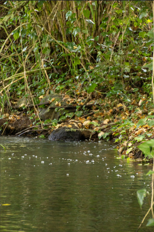
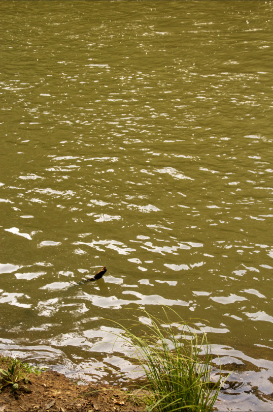
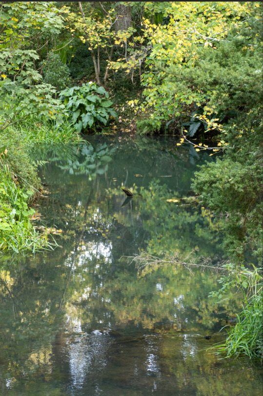
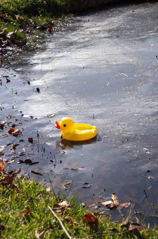
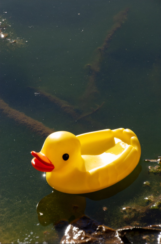
Photos taken from iPhone of exemplar bad water (After heavy rainfall)


0 notes
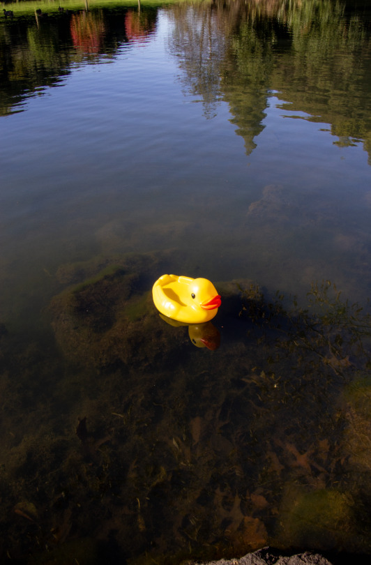
Text


Not happy with the latest one, still need to do some more editing to make it fit into the scene more, add a reflection, it just feels like its floating atm. Also need to add more emotion to the duck make it seem happier rather than neutral
0 notes
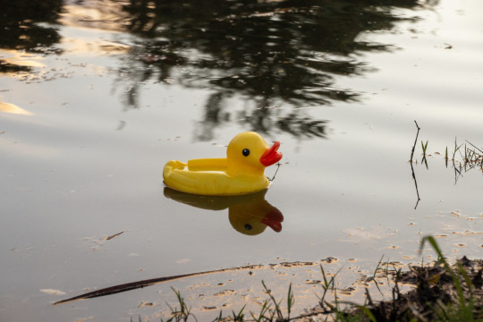
Text
Editing the photos of the ducks to add emotion e.g this one is sad / displeased

I used the content aware fill tool, so that the texture/ grain of the added sections would be similar and look real, rather than disjointed by using a colour and it not having any grain

Adding the ducks into the photograph, uses a low opacity erase tool on the bottom of the ducks to make it look like they were in the water
Experimenting with a minimal / simple look for posters

Experimented with black and white background behind the ducks
Stepped away from the Auckland Council


0 notes