
Don't wanna be here? Send us removal request.
Statistics
We looked inside some of the posts by srfmp2021 and here's what we found interesting.
Average Info
Notes Per Post
0
Likes Per Post
0
Reblog Per Post
0
Reply Per Post
0
Time Between Posts
1 day
Number of Posts By Type
Text
15
Video
2
Last Seen Tumblr Blogs


Fun Fact
Tumblr was attacked by a cross-site scripting worm deployed by the Internet troll group GNAA on Dec 3, 2012.
Text
Google Site
Because of the Covid-19 situation, there has been an adjustment in the way we are graded so we now have had to produce a Google Site. This is essentially a website we can use to display all of our FMP outcomes, as well as a portfolio of our work since the start of the first year. It is not a difficult website to use, with images being as easy to add as dragging them from the File Explorer onto the page. The pages themselves work in a grid format which is ideal for displaying images. There is also the option to make an ‘Image Carousel’, which is essentially a slideshow that can be flicked through on the page.
When I was told to start working on my Google Site, I had already received a template to work from. This had all of the necessary information at the top of the page, as well as being set up for me. All I had to do was type my name at the top, write the name of my project with a brief description, and begin to start adding in my artwork.

Here you can see some examples of my outcomes on Google Sites. The dots underneath 3 of the images are indicators that they are an ‘Image Carousel’, and the quantity of the dots is the amount of images within it. You can also see a video, which can be embedded from YouTube. The Embed button is at the top of the panel on the right side of the screen, and here you can paste in the URL of whatever video you like to add it to the page. The video dimensions can be adjusted here to go better with the layout of the website.

To separate all of the different areas of FMP, I used dividers. These put a thin line across the page on either side of a section that acts as an indicator for what was a different collection within my outcomes. You can see one of these lines in between a video of my website and my social media posts in the image below.

Once my FMP part of the website had been completed, I then moved onto my portfolio. This was quite a straightforward process of sorting through my files looking for artwork that I have done in the past, and uploading it if I liked it. The images you see in the screenshot below were done this year, hence they share the Lurcher branding.

You can also see the other two projects I did this year below. Once again, these are separated with a divider to make it easily distinguishable between each project. I wanted to include as many projects as I could that reflects the quality of my work.

I also included some projects from the first year. I did this to show how my work has developed over my time at the college, and to give comparison between the way I completed earlier projects to the way I completed the current one. I also added a video that I made from Japan project in the first year and, although it wasn’t very good, it’s a great way for me to show my progression.

Visit the website here.
0 notes
Text
Inspiration: Hardcopy 01
Hardcopy 01 is a project on Behance by Sarah Göbels and Maya Gottlob. The project itself is essentially just a hardback book that has been produced by the two designers, but I really liked the style and the way it is presented. I think it makes sense to look at styles similar to the ‘Minimal’ one within my own work, but in different medias.
Below you can see the covers of Hardcopy 01, and this is initially what caught my eye in the first place. I like how the text on the front fills the page, but transfers onto the back to stop it from being completely empty. It’s a quirky addition to the book, and it maintains the desired negative space without making the back look plain. It’s this kind of clever content management that I sometimes feel I need to develop in my work.

This is one of the sets of pages from within the book. Despite there being a coloured image on the right page, the overall colour palette is black and white and orange. Because this is completely the case on the left page, I feel that the effect bleeds onto the right just because there is white, orange and black elements. I almost didn’t notice there was other colours within the image when I first glanced at the page.

Following the same colour palette as the previous pages, these two almost only feature images. The interesting thing about the layout of these images though, is that they are seemingly randomly placed. They are scattered across both pages, but it wasn’t until I looked closer that I started to notice intentional placement in relation to other images on the page.

This is my favourite set of pages out of the ones I have looked it. The layout is very simple, featuring large text, a large image, and some tiny text at the top and bottom of the pages. These pages are a statement in themselves, and I’m a big fan of the large use of negative space. Despite there being so much white space left on the page, it does not feel empty. This is usually the end goal when working with negative space, and I feel that both graphic designers did a great job of this here.

0 notes
Text
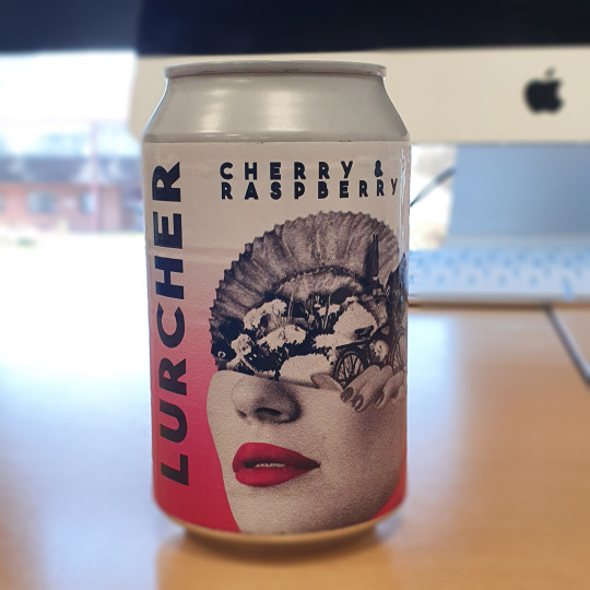
Lurcher Real Can
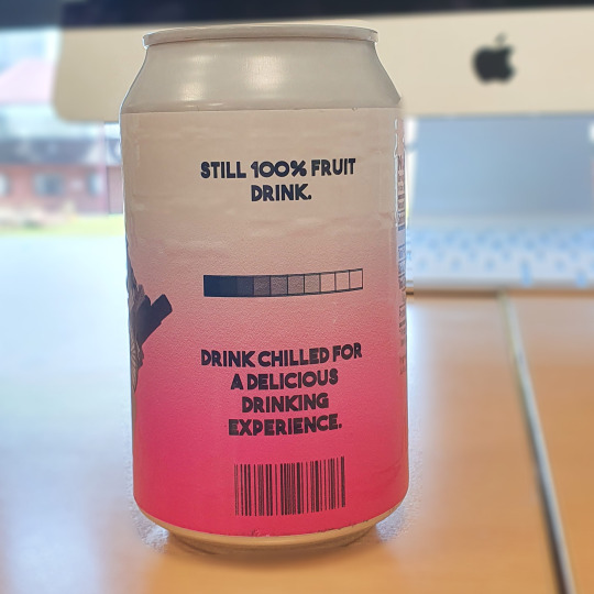
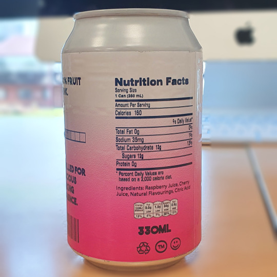
I had some free time at work so I decided to try and produce a real can using the Cherry & Raspberry can design. This design was printed onto a sticky back vinyl which was then wrapped around a white can. I was unable to find a can with a black top like I used in my mockups, but I feel that this is a small inconvenience considering how good it is to see what the project would near enough look like in person. Unfortunately, the can I used did have a slight texture on it which shows through the vinyl.
0 notes
Text
Heroink Research
Heroink is a French, freelance, Graphic Designer. I first found out about him when I saw his graphic design pack advertised on Instagram, which I went on to buy. I think his work is an amazing combination of minimalism and grunge, and sometimes even some sci-fi elements. He is definitely one of my favourite designers, and therefore has a huge influence on my work.
Below you can see an example of one of his posters. The majority of the design is well spaced out, clean, and with lots of negative space. This is why the spray paint style writing and orange tears becomes so bold. Not only does the colour stand out, but the aesthetic is such a huge contrast to the rest of the image. I love this effect, and I see it as a consistently effective way of merging styles.

This is another poster done by Heroink that I am a big fan of. The poster you see below is hugely different to the previous, and I think that goes to show how well he can adapt to different styles. This poster is obviously much more image-focused, mainly due to it being an advertisement for a clothing brand. What I find interesting about this poster is I still get the aesthetic of a post that has a lot of negative space even when there’s not. It’s possible that the space is well placed enough to give this effect, but I love the design either way.

The poster below is another favourite of mine. It’s one of his more unusual posters due to the half and half layout, but I like that the image is separate to the other elements in the page. I’ve always been a fan of colour blocks and large images, so I personally really like this type of format.

This next poster is what I consider to be a great combination of vector and photographs. The primary focus is obviously the image of the shoe, but I really like how he has integrated the vector to look like it was going around the shoe. In my opinion, not doing this would have made the shoe look like it was just slapped on top of a background. By doing this, it is more integrated into the design and runs less risk of looking out of place.
Another effect that I have noticed being used by Heroink is using blocks of texts as design elements. As you can see in every poster I have looked at other than the first, the text would be extremely hard to read unless you were looking really closely. This means that the text is purely for aesthetic, which is a technique often seen in other designers work. A notable designer for this would be David Carson.

0 notes
Text
Updated Vinyl Mockup
Below you can see the updated mockup mockup for the Lurcher Summer Mix that I intended to go with my early bird bundle. The original design that I did was done with my first set of can designs in mind, so I needed to adapt it to the designs I have decided to go for. The design you can see below was taken directly from the Available Now design I made for my Instagram page. I opened this design up in Photoshop and replaced the text with ‘Lurcher’. I felt this made a lot more sense for my branding. I then replaced the word ‘Everywhere’ with ‘Summer Mix’, which is the name of the vinyl. I think this update to the mockup was a great addition to the brand and I will be sure to include it in my final outcomes.

0 notes
Video
tumblr
This is my screen record of me using my website in the Desktop Preview mode. You can see how the website functions and how it would look if it was uploaded as an actual website. I’m happy that all the steps I took resulted successfully in creating a mock website that looked convincing and functional for my drinks brand.
0 notes
Text
Lurcher Website
A website is an important part of a brand, in terms of for awareness and for keeping a well functioning brand. I intend for my website to feature a shop and information about the brand. I want this the overall aesthetic to be minimal but to not lack function because of it. In order to create a draft website that can be actually interacted with, I decided to use Adobe XD. This allows me to lay out and design my website, and connecting different pages to elements of the page. If I click one of these elements, it would then take me to the page. Interactive elements are a great way of demonstrating the functionality of my website as Adobe XD also contains a record feature. With this record feature, I am able to properly show me using the website instead of just explaining how it would work like I’d do if I was designing in Illustrator.
Here is the title page of my website. I wanted the first page that the viewer opens to be simple with bold branding, making the navigation choices clear and accessible.

After reviewing what I needed from the page, I realised that featuring ‘Home’ in the navigation bar was not necessary. Instead I would make it so my logo would function as this button. However, because this page is purely for aesthetic and the same navigation can be accessed from every other page, I don’t see why anyone would have the need to return to it. Following this, I decided to space out the two words and place the Instagram logo in the centre.

Because my FMP is based around a drink, it made the most sense to prioritise working on the online shop. As it is the main purpose of the website to act as an online store for my products, I wanted to allow as much time for it as I could. The first products I added was the 4 still drinks that come in cans. These were given a price and a small bit of text to tell the user the size of the drink. This would be the first page for the shop. It’s a little annoying that I have to use separate pages as XD doesn’t allow for scrolling, but I quite like that everything is categorised into sections.

I then proceeded to duplicate the drinks page I made by dragging the name of the artboard to the right whilst holding ALT. By right clicking each image and selecting Replace File I could add my other products whilst keeping the exact same layout. I thought this was important as a website should always stay uniformed. As these drinks are in larger bottles, I also replaced the prices and size of the bottles. With this done, it was time to begin thinking about effective navigation. To do this, I added a next and previous button in the bottom corners of the page. This would allow the user to go to the next page and go back with ease.
You can also see an additional artboard which I added after thinking about navigation of the website. Although you can go between the shop and the about page in the header of the website, I needed something to make it easier to navigate the shop. I intended to make a page that would work as an index for the products on the site, but I decided to just write the names of all the pages and save the designing for after the rest of the website was constructed.

It was at this stage of the website that I had added all of the products for my website. These were all done in the same way as before, which involved replacing the existing images on a duplicated artboard. One of these pages was for my concentrated fruit juice product and the rest were for miscellaneous. This was items like merchandise and a resin figure.

After reviewing the design of the website, I decided that an index page would be clunky and unnecessary. It made a lot more sense to integrate the shop navigation into the shop pages themselves, which saves time in both speed of navigation and if the user has slow internet speeds. I did this by writing all the titles of the pages in the top left corner of every shop page. I will link these titles to the correlating pages later in the design process.

With the drink index page no longer needed, I decided to replace it with the About page. You can see the product of this below and I am actually very happy with it. The layout is clean and legible, and it fits in well with the rest of the website. I wrote the About page paragraph completely off the top of my head, mainly because the brand is completely hypothetical and the history of it can be too.

The reason why I picked XD over Illustrator was because of the ability to make the website somewhat functional, or at least look like it is. This is done in the Prototype panel you can see in the top left. This part of the program allows you to select one element which will cause a blue arrow to appear next to it. By dragging this arrow to another artboard, it will cause clicking that element to take you to the other page when in the Desktop Preview mode.

I realised that a key part of the shop that I was missing was an actual product page. This will be the page where key information will be about a product, as well as a description and an ‘Add to cart’ button. Creating this was extremely easy, involving adding an image of the product of my choice and adding the price and size in a different layout. With the name of the product and a brief description typed onto the page, all that was left was the ‘Add to cart’ button. This button was as simple as writing the three words and putting a rectangle with a stroke around it.
I wanted to make it so a pop-up would appear when this button was clicked, but XD does not have the ability to do that without taking a work around. This work around entailed creating an identical page with a pop up on top of it that you would be redirected to when clicking the button. I also made the cart blue to visualise there being something in there. Luckily enough, this worked seamlessly and the user would be none the wiser. However, this would obviously not be the case on a real website as the new page would visibly load, ruining the effect.

The two final pages of the website were the checkout pages. One is the cart itself, which displayed an image of the item inside, the name of it and the price. Any other information would be unnecessary as the user would have already looked at the item to add it to the basket. This cart page also has a ‘Check Out’ button and the logos of the supported payment methods. The second page was where the user would type in their personal details. Like most online shopping websites, this is just the users address, phone number and payment details. Lastly, there is a ‘Finish’ button at the bottom of the page which is what the user would use to finalise their order.

Since creating the website, I made an early bird bundle that would replace the cooler box I had initially created for the website. This bundle would feature all of the drink products on the website, a vinyl summer mix and a mystery gift. I think this addition to the website is much more tailored to the brand I have created, and I think it makes a lot more sense.

In conclusion, I am very happy with my website. I think it is well suited for my product designs, as well as to the Minimal theme I chose. My aim was to produce a website that was not only minimalist in aesthetic, but minimal in the effort needed to use it. I think the legibility of the text and uniformed but differentiable was a big aid in this. I don’t think there is anything I would have done differently when creating this website, but if I had more time to work on it I would definitely make a page for every product on the page and possibly consider expanding the quantity of items on it.
0 notes
Text
New Can Design Additional Mockups
Although I had already produced some mockups for my new set of can designs, I wanted to include another set to have a bit more variety in the amount of mockups I could use. I did this to make it easier to apply to any setting, and on the off chance it may inspire anymore ideas for my brand in the future, at least in terms of layout. This was not an essential addition to the brand, but I feel like it was always a good idea to have a reserve of brand assets to utilise within my designs.
Like the other mockups I have used, this one also just involved placing the design into a Smart Object and saving it. This will apply the design to the can and produce the images you see below. I had to do this for every can.


0 notes
Text
Social Media Posts
An important part of any internet shopping brand is a digital presence. I wanted to create a page that was not only informative of what the brand is like, but also one that is full of artwork and designs relating to the brand. In the past I’ve seen brands create one larger image by splitting an image into 3 and posting them separately. When looking at the Instagram page as a whole, it would look like one larger design. This is an effect I want to experiment with within my own brand.
Below you can see a design that I created for my drink brand. I previously created another logo for cases in which my plain text one would not work. This logo is essentially a collage, and I use it as a design asset in a lot of my designs. I wanted to feature this on my social media so I decided to make an edit. I placed the design on a square artboard with an ink in water texture in the background. My aim was to make a design where the colour within it really stood out, which would only work if the majority of the image was in black and white. This meant that the ink and water texture had to be black and white to not interfere with this. I also added a white border to the design which I filled with black text as you can see below.
There is also a clipping mask within this design. You can see in the design that the fossil on the top of the collage is going over the white border. To achieve this, I placed the collage layer above the one of the white border and the text. To apply the clipping mask to this layer, I selected the icon that looks like a camera in the layers panel. I then held CTRL and clicked the thumbnail of the white border to put a selection on it. Finally, I clicked the clipping mask of the collage in the layers panel and brushed over the right and bottom parts of that went onto the border. This would hide them view perfectly before the border starts which gives the effect of the border going over it.
In order to colour parts of the design and to make it look integrated, I first needed to draw where I would want the colour. You can see that I have already completed this for the lips, but for the purposes of this post I will show how I did the nails. The colour of the nails was drawn using the Pen Tool with a bright blue set as the fill. I zoomed in close to this accurately so all of the nails would be completely covered.

To make the colour of the nails appear to be actually on the hand, I used the Multiply Blending Mode. As you can see below, the colour of the nails has slightly changed due to the colour blending with the original colour below. But the end result is one where the colour looks like it is actually part of the image instead of just being placed over the top.

This is the final result of this social media post. I am very happy with it and I think I have succeeded in making the colour appear bold and like it was part of the original image. Although it’s fairly obvious it’s not because of the style of the design, I think that it still does when you look at the way the colour has been applied.

This is another post I did for my social media. I wanted one to let people know that the drinks are available for sale, but I wanted it to be done in an aesthetically pleasing way. I decided to use a colourful textured background to achieve this, but with the use of Blending Modes I was able to merge the design into the text. I did this by typing ‘Lurcher’ in white into the centre of the background, but it was important to make sure this was done on a black background. This is because the Blending Mode Difference, which was the one I used, will invert the texture when it is above white. Because I want it to be easy to differentiate the text and the texture, the text had to remain in white.
After reviewing the design, I decided that the colours of the original texture didn’t link enough to my brand image. After doing the previous social media post, I had the idea of using pink and blue again. But in this case, I wanted to apply it to the entire image. This was an easy process with the use of the Gradient Tool, in which I picked a linear gradient and a pink to blue colour scheme. This layer was put above the texture and the Blending Mode set to Hue. As you can see below, it blends well into the texture and I don’t think it’s at all apparent that a gradient has been applied, which is the main aim when applying colours to an existing image.
The purpose of this post was to boldly display the words “Available Now” and I feel like this has achieved that. But it has not been done in a way that is boring to look at, or in a way that your eyes would just skip past it. I think this will not only be functional for these reasons, but also fit in well to my social media page.

For this post I wanted to stay true to the concept of a post featuring lots of black and white, but with splashes of colour to emphasise key elements and add depth to the design. The post you see below is one I made from a screen grab out of my advert. The particular scene this was taken from is my favourite shot of the advert, therefore I wanted to implement it into my social media. I did this by getting a screen grab and applying the Black & White adjustment layer from the layers panel in Photoshop. This turned the entire image into black and white, but it also produces a clipping mask layer with the adjustment layer. By selecting this and beginning to paint with a black brush, you can see the original colour begin to come through. This is what I did, but I made sure to not be too precise with it. Because of the static-like nature of this image, I thought it made sense to allow for some bleed of colour and I think this was a good decision after seeing the final result.

After assessing my previous social media posts, I decided that the first one I did was going to look a little out of place. This was an easy fix however, as I used the same technique as I did in my ‘Available Now’ post. The only difference is that the Blending Mode for the gradient was Hard Light and that it was clipping masked to avoid applying colour to the square border.

Following creating the previous three posts, I wanted to make some posts that were a bit more on the side of product promotion than aesthetic branding. This was a simple process as I had already created the mockups I used in the post you can see below. I spaced them out evenly and began to make some simple shapes across the background of the image. I took some influence for these combination of shapes from a camera viewfinder.
Like I had done before, I wanted to space this post out over three. To do this, I made three square artboards in Illustrator and placed them next to each other. When my design was laid over all three, I could just export all of the artboards as separate JPEGs. They were now ready to be posted on the Instagram page.

This is a screenshot of the Instagram page that I created. Here you can see what all of the designs look like posted on the page. The final sum of posts was twelve, but this was composed from five individual designs.
0 notes
Text
Lurcher Website Inspiration
My goal for my website is to produce a user experience that is easy in terms of navigation, legible, and well connected to both my brand and my ‘Minimal’ theme. I want a consistent use of negative space throughout the website, for the sake of aesthetic and emphasis of key elements. The websites I will be researching will be done so for the sake of design only, not for their content.
The first website I looked at was a website called leta. The website is Russian so I’m not sure what the website is actually for, but you can see a huge use of negative space within the design and the result is extremely clean. Any text used is bold, well contained, and I imagine very legible if I was able to read the language.
Another key design feature I noticed was the entire website was monochrome, including images. I think there is definitely a lot to be gained from making a website entirely in monochrome, such as uniformity and the higher probability of any image suiting the page better. Unfortunately, complete black and white is not something I can bring into my own website due to the colourful packaging. That being said, making the rest of the website monochrome will help to bring emphasis the only colour and therefore the products.


The second website I have researched is a website called Minimalissimo. This is another website that makes great use of negative space, although not quite as much as the previous website. This website is for a company that is both a creative studio and the producers of a magazine. Therefore it only makes sense for there to be more information in smaller areas, or at least more images. This website seems more like what I will do within my own website, mainly because my website will need to prioritise ease of shopping over design in most cases. Otherwise it will need much more time spent on it, which means it is no longer user friendly.
I’m a huge fan of the simplicity of Minimalissimo’s website. Each element on the page has a purpose, text to explain what elements are for in a minimal amount of text, and the layout is spacious but content rich. I believe it could be a difficult task to find the right balance of content and negative space whilst maintaining the ‘Minimal’ theme I am aiming to achieve. That being said, I will definitely attempt to reach this goal, and I’m sure a huge amount of influence can be credited to the website created by Minimalissimo.


This next website is probably one of the most creative and interesting websites I have ever seen. Not only is minimalist, but it has one of the most unusual user interfaces I have ever seen on a website. Ayoto Ataraxia is a website that utilises a 4 part grid format, each section being a different aspect of what you’d expect to see on your standard style website. The top left grid is for images, the top right is for information about the project you are viewing, the bottom left is entirely for navigation of projects, and the bottom right is contact information. Although I feel that the website as a whole is much less user friendly, I can see that the website is a complete reflection of what Ayoto is like as an artist and I feel that the website is completely appropriate to its purpose.
Although I could never see myself creating a website like this for my current FMP, I really love the idea of it. I don’t think it would be fitting to do something like this for a website selling drinks, but I could definitely see myself trying to attempt something like this in future. What I find very clever about having such a unique website is the fact that it is almost a promotional tool in appearance alone. I mean this in the sense that because it is so memorable, it would struggle to not make an impression.


0 notes
Video
tumblr
Lurcher Ad Updated Final
I am happy with my finalised Lurcher advert for a number of reasons. I am still very happy with the upbeat music and pace of the advert, as well as how well I have managed to sync the clips up to the beat. In my opinion, the advert is also eye catching and I’d like to think most people would watch it if it was on TV.
Although my theme is ‘Minimal’, I do not feel like the advert itself is a direct reflection of that. There is quite a lot going on, as well as a wide range of colours, but this is for good reason. There is no point taking something that is meant to grab peoples attention and making it minimal. I think I have applied this theme enough into my packaging and my branding, so I thought it was appropriate to keep the advert the way you see it now.
If I had more time on this advert I would definitely make a much larger collection of outcomes; animated ones if possible. It was because of my lack of assets that I had to resort to animated overlays to keep the add interesting to watch. Although I am still very happy with the final result, I am not 100% positive these would still remain if I was to spend a lot longer on this part of the project. Unfortunately too many areas of my FMP still need attention, so I was unable to bring this to fruition.
0 notes
Text
Lurcher Ad Updated
Due to all of my updated designs and new products created since first creating my advert, it meant my original had to be updated to include all of my new versions. Although this isn’t a hard process, it wasn’t quite as straight forward as replacing the cans. Because my advert was composed of videos I had made separately, I had to either replace the products within those or produce completely new videos, which is what I did for the most part. The first thing I replaced was the videos of lemons and limes, which I did with an image of my fruit concentrate products next to each other. This was as easy as selecting the video in the Project Manager, right-clicking it and clicking Replace with File. I then adjusted the size of the image and transformed it so I would move from one place to another as the video was played. This can be done by opening the Transform drop down in the composition viewer and clicking the stopwatch icon next to Position. This had to be done when I had the image where I wanted it start before moving. I then dragged the image across and clicked the stopwatch again to set it as the finishing place for the image after it starts moving.

Next I did the exact same thing with an image of the gently sparkling drinks. The only difference is with this image is that I did it so it would move from right to left.

The next thing I replaced was the video of the blueberries. I did this with the image of cans I produced in my second attempt with Adobe Dimension. However, I did really like the movement from the blueberries in this part of the advert. Because this video has been replaced, I will probably add a dynamic animated overlay to make this part of the advert look less flat.

The only part of the video that would need completely redoing was the part with the rotating can. Luckily, the mockup for this was a super easier, quick rendering one from within Photoshop. I just went in, replaced the label within the Smart Object, and exported it to an MP4. I did this for every can design, and then went into After Effects and replaced the existing video files. It was actually a very quick process from start to finish.

Finally I used my new image of all of my products to replace the shot of the cans. This was the last shot of the advert that needed changing, but there was still some adjustments to be made to make the advert seem less flat to watch.

The first adjustment I made was make the scene with the rendered can more interesting with a colourful animated texture from the video FX creator Ezra Cohen. I have some of his packs which have lots of animations that can be integrated into my own work. The one you see below was applied to the layer above the image, cut down to the same duration, and I then applied a Multiply blending mode. This allowed the image to be visible through the animation.

I did the same thing again with a static texture, but applied it to the end of the advert with a Screen Blending Mode. I wanted this static to fade away to give a clear shot of the products at the end, so I used the same stopwatch method as I did for moving the images to reduce the opacity. By pressing the opacity stopwatch while the video was at 100% opacity and pressing it again at when I want it to be 0%, the transparency will gradually increase until you can’t see it.

The last thing I did was go to File > Export > Add to Adobe Media Encoder Queue. This opens up Adobe Media Encoder, where I am able to chose what format I want the video to be, where it will be saved, the quality, and then press the play button in the top right to begin rendering the video.

Adapting this video to my new products did seem very daunting to begin with. But once I got all my assets together and began to replace the originals with them, it progressed very quickly and I had an updated advert very quickly. However, due to my larger range of products, what I created was nothing like the original due to the lack of time for the majority of the original clips. That being said, I am still very happy with this and having already done the timing to the music, it was assembled very quickly. I am very happy with the outcome and the nature of the process.
0 notes
Text
Lurcher Concentrated Fruit Juice Mockup Updated
Following the issue of it being difficult to identify the different flavours of drink from their packaging in my other products, it only made sense to apply the same adjustments to the concentrated fruit juice. I am happy to say that, once again, making these adjustments resulted in a better, more eye-catching final product. As I did before, each bottle is coloured to match their drink flavour but I did run into some problems with the Passionfruit Panic. After applying the adjustments to the Mandarin and Lemon and the Passionfruit Panic, I realised that they were way too similar to each other. This would obviously defeat the whole point of the making these adjustments so I had to make a decision to overcome this issue. Luckily, purple is a colour that is widely recognised as being associated with passionfruit so I could fall back on this. This was an unavoidable decision, but it unfortunately meant that it did somewhat knock out the brands consistency. I considered adjusting the colour of every passionfruit product but this could cause some confusion from the colours of the Blueberry Blast still drink. I was still very happy with the appearance of the passionfruit concentrate, so I made the choice to keep it as it was.


Despite the problems I encountered with the Passionfruit Panic, this was another example of a successful adaptation to the products. As I have progressed through my FMP, there has been many adjustments, adaptations and complete redesigns, but I think this is what will make for the best collection of final outcomes. It is very easy to produce a design I like and stick with it, but I feel trial and error will always be what turns a design into the best end result it could possibly be. But if all goes as planned from this point onwards, the adjustments to the products I’ve just completed should be the last of it.
0 notes
Text
Adobe Dimension Experiment Part 2
After using Adobe Dimension previously, I wanted to have another go at making something that was of a higher standard and quality. When I was looking through the program, I found out that Dimension has a selection of preloaded environment lighting presets. These can be dragged onto the design, and the end result is reflected lights and an image that looks much more realistic.
I used the exact same layout as I had done for the previous attempt, but this version was done using the new can designs I recently created. I prefer these cans much more, so I think I was always going to like this image much more than than the previous. I also went for a mirror finish metal for the base the cans stand on, and I think this adds to the realism due to the reflection produced by it. With all of these steps completed, all I needed to do was to render the image in the render tab like I did previously.

This is what the image looked like after rendering, and I think the difference in quality is huge compared to my first attempt. This is an amazing development considering I hardly put in any more effort than the previous design, I just needed to get my head around the program a little more. With this done, it was time to bring the design into Photoshop so I could start adjusting it to be a little more dynamic.

The first thing I did in Photoshop was experiment with adding some more branding to the design. The way that Dimension exports means that the 3D model and the background are completely separate layers. Because of this, I can easily add anything to go behind to render and it looks completely natural. I utilised this by taking the Lurcher text logo in white, spreading the letters apart, and applying a Gaussian Blur to make it appear out of focus. The end result was a lot more effective than I expected, especially considering how subtle it is on the eye. It is definitely one of the latter things your eyes is drawn to, so I have succeeded in not making it too prominent.

The next thing I did was try and make the 3D model a bit more dynamic. This was done using the Camera Raw tool which can be located in the Filter drop down at the top of the page. This allows for making adjustments to the image, such as temperature, contrast, exposure, etc. But what I used here was the collection of premade profiles. I picked the ‘Modern 01′ profile, which saturated the image, increased the highlights and darkened the shadows. This gives the image more of a pop and highlights the key parts of the design.

After reviewing the design, I decided that I wouldn’t the background to be a lot less saturated. I didn’t think it needed to be as bright as it was, mainly because all the attention should be on the cans themselves. I didn’t have to mess with editing the background directly as I just wanted more of the white background below it to show through. To achieve this, I selected the background in the layers panel and reduced the opacity to 28%.

This is the final outcome of this attempt at using Adobe Dimension. This has been infinitely more successful than the previous, and I feel that I have grasped a much better understanding of the program. It is also ridiculously easy to use once you know the basics, so I will more than likely continue to use Dimension and develop my skills with it as much as possible. Compared to a complicated program like Cinema 4D, Adobe Dimension is much more appealing to someone starting off in 3D design.
The design itself has lot of pop, and is quite dynamic in its contrast of lights and darks. The colours themselves are well saturated, and I love all the little details such as the pink lighting on the blue liquid on the right. This has been a very successful experiment and I am very happy I did it. I may also consider using this design as one of my products, marketing it as a resin model to be sold as merchandise.

0 notes
Text
Lurcher Gently Sparkling Mockups Developed
After spending so much time on my cans and making them look easily differentiable from each other, I realised that this would still be a problem for my other products. Because the bottles were identical other than the writing on the front, they would need to stay front orientated to be easily identifiable when next to the other flavours on a shop shelf. Luckily, the mockups that I have used all allow to adjust the colours of the mockup itself. I didn’t want to mess with the design as I was very happy with it and I felt adjusting the colour of the bottle would effect this, so I decided to change the colours of the tops of the bottles. After doing this, I actually preferred the end result so I am happy that it has been beneficial in both design and practical aspects of the product. Making these changes was as easy as going into the mockup, double-clicking the top of the bottle in the layers panel, and adjusting the colour in the window that opened. I did this for all of the bottles corresponding to their flavour and the colour of the text I had already produced.


This has been an effective development for the product in several ways, and it was very straightforward to execute. Although this was catering for an issue that would not be encountered on an online website, I think it is important to cover all potential altercations now so they do not have to be dealt with later. Otherwise, there would need to be a complete adjustment of packaging design down the line which could have easily been prevented.
0 notes
Text
Can Designs Updated: Passionfruit Panic
For this design I had to break away from using the Selective Colour method to create my can designs. As you can see below, it began to create a yellow to orange gradient on the background which isn’t what I wanted. Although this happened to some extent on the blueberry, doing it on this can would run the risk of it looking too similar to the mandarin & lemon can. Therefore, I had to create a yellow to white gradient using the gradient tool and deleted the original gradient alongside the Selective Colour adjustment layer.

This is the final outcome for Passionfruit Panic and the last design I needed to do for my rebranded cans. I am very pleased with the way this can has turned out, which almost looks gold once placed onto the mockup. I love this effect and it definitely adds to the premium aesthetic I have been going for with my brand. Alongside my other can designs in this style, this would definitely stand out on a shop shelf which is always the end goal when producing a product that would be sold in a shop.

0 notes
Text
Can Designs Updated: Blueberry Blast
Once again, I relied on the Selective Colour to adjust the colours. Because I did this exact process for the Mandarin & Lemon, I could use the same document I used before but after pressing CTRL+SHIFT+S and saving so I could then work from a duplicate. All I had to do this time was mess with the Selective Colour tool until I reached my desired colour and change the top text to reflect the drink flavour. The fact that this was the entire process to produce a new drink flavour design reflects the convenience of uniformity, but this does not mean the design is lacking in its own aesthetic in comparison to the others.

Below is the outcome of applying the design to the can. I think this has been another successful updated design, and I am particularly fond of this one due to the purple that has been produced by adjusting the gradient with the Selective Colour adjustment layer. This was not something I set out to do, but I thought it as very appropriate for a blueberry flavoured drink. Even though this slightly breaks away from the other two blueberry products in terms of design, it is not a huge change and I don’t feel it will be a problem for brand image.

0 notes