
Don't wanna be here? Send us removal request.
Statistics
We looked inside some of the posts by srkingofcards and here's what we found interesting.
Average Info
Notes Per Post
0
Likes Per Post
0
Reblog Per Post
0
Reply Per Post
0
Time Between Posts
13 minutes
Number of Posts By Type
Text
17
Last Seen Tumblr Blogs


Fun Fact
Tumblr has 4 main sources of revenue.


Text
Experimental Universaul Branding
Below is an idea for a poster that I had developed. I have been very happy with the branding that I have produced for my playing cards, and I think it would be interesting to integrate that into additional merchandise. This could be anything from a t-shirt to a poster, but it could be rewarding to explore some additional options involving my designs.

0 notes
Text
Contemporary Art
Contemporary Art is loosely the term for the art of today. This would mean produced in the second half of the 20th century and the 21st century. As a general rule, Contemporary Art is distinguishable from others due to its lack of order or uniform. Despite this, it is often aimed to attack issues anywhere from cultural to political.
Takashi Marukami
Marukami is a contemporary artist born in Japan in 1962. He works in the fine arts media as well as commercial, and has become very well known in the ‘Hypebeast’ movement. This is partially because of his part in designing the cover for Kanye West’s ‘Graduation’ album released in 2007. He is well known for blurring the lines between high and low arts, as well as high and low fashion. Examples of this would be his collaborations with Louis Vuitton and Virgil Abloh, but also Uniqlo and Crocs. He has coined the name “Superflat” for his art movement, and has become a massive influential presence in the art world. However, his artwork challenges what is acceptable in his own country and is less accepted for it. But he has gained recognition worldwide and his work has sold for millions.


Damien Hirst
Hirst is a British contemporary artist born in 1965. He is a hugely well known artist who dominated the UK art scene in the 1990s. His work is unusual and striking, but he is also well known for being the richest artist in the world. Death is a main theme in his work, and he has had a famous series of artwork involving dead animals. These include a cow, a sheep, and most famously a shar, which were all preserved in formaldehyde. But he is also well known for his so called “Spot Paintings”, which either featured spots on their own or integrated into a bigger picture.


0 notes
Text
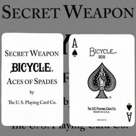
Ace of Spades Research
The Ace of Spades is considered the highest and most valued card in the pack, especially in English countries. It is also known as the Spadille or the Death Card. But what is interesting about the Ace of Spades is that it is almost always the one to feature an ornate design. This is a trend that has come from taxes being put in place on playing cards in 1588. In order to show that the text for a deck of card had been paid, a stamp was used on a singular card. This card was usually the top one; the Ace of Spades. Even though that tax was abolished in 1960, an ornate Ace of Spades is still a feature to this day.

The history of the Ace of Spades being known as the ‘Death Card’ mainly comes from the Vietnam war. The U.S. troops believed that Vietnamese feared the Spade symbol to mean death and ill-fortune, so some American lieutenants got in contact with Bicycle asking for decks consisting entirely of these cards. Furthering this, the Bicycle brand uses Lady Liberty in its Ace of Spades, who the Vietnamese apparently consider to be the “Goddess of Death”. The American army received thousands of these decks of cards and would scatter them in hostile areas that apparently would cause the Viet Cong to retreat from fear. In addition, some U.S. soldiers would frequently leave these cards on enemy bodies. These cards were known as “Bicycle Secret Weapons”, which was written on the card.
0 notes
Text
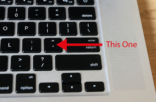
Tilde Key Workshop
For this workshop, I was told I would be using the Tilde key on my keyboard. However this turned out to not be the necessary key to perform this effect on Windows, or at the very least my computer. After some experimenting I was able to track the effect down to the key you can see the arrow pointing to.
The first step is to select the Ellipse Tool. This can be found in the Toolbar on the left or by pressing L on your keyboard. By default, my Ellipse had a black fill and no stroke. I then pressed SHIFT+X to swap the fill and stroke, and decreased the stroke size to 0.05 at the top of the screen.
Next, using the key you can see above, I held it down and began dragging out a circle. But the way that this effect works is by creating another instance of the shape on every movement, which is how it creates the effect you see below. Where the area of the shape is darker is where the circles are overlapping the most.

Similar to the previous steps, I held down the same key and went to drag the circle in the same way. The only addition was to hold the ALT key at the same time. This enabled me to have the shapes be generated around where I started, instead of just dragging from it. This effect produced what you see below.

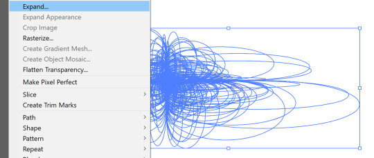
In order to apply a gradient to the design I created, the design had to be expanded. This could be found by going to Object > Expand, and make sure the Fill and Stroke boxes are ticked. This will convert each circle path into a solid shape. To make it so a gradient applied to the design as a whole, and not a separate gradient on each individual circle, I also pressed CTRL+8 which changed it to a Compound Path.
To apply the gradient you see below, it was as easy as selecting one from Swatches. However, you are able to create your own custom gradients by double clicking the Gradient Tool. This will open up a window from which you can design your own, personalise others, and experiment with properties like Opacity.

Research
After the ‘Op Art’ workshop I did not long ago, I had began looking at more art in this style and had seen several videos using hexagons. The effect that is made using hexagons in spiral artwork is something that I am particularly fond of, and felt that I could produce a similar piece of work using this tool.
Below is a piece of photography done by a YouTube channel called Adaptalux. I thought this was an incredible image to have done without any editing software, as it only used a small hexagon to produce this amazing piece of art. And the reason why this came to mind is because I was particularly impressed by how similar it was to the work I had produced digitally in Op Art.

This is my attempt at replicating that same image digitally. Obviously I did not want to do it exactly the same, and opted to use the Tilde Tool twice from the same centre point. This made the final result much more complicated, but also gave a lot more depth to the design. I think I have done a great job at showing how you can still take a lot of heavy inspiration whilst keeping it your own.

There was an additional benefit to doing the effect twice, and it’s that I was then able to use two colours layered over each other. So I selected each one (which I had previously grouped) and adjusted the colours so one was using a blue stroke and one using a pink. I think the final result is very interesting and I’m personally a fan of the two colours blending together.

Up until this workshop, this was not a tool I was particularly aware of and I think it produces an incredible effect that I will more than likely use in the future. And the fact that it takes seconds only reinforces this, as you are able to create shapes that appear so much more complex than they are.
0 notes
Text
90s Inspired Repeating Pattern
The first step of this workshop was to create an artboard. It only needed to be small as the pattern would be repeated. Therefore, I made the width and height of the document 100mm.

The next step was to create three rectangles. I did this using the Pen Tool which can be found in the Toolbar or by pressing P. However, I only made one and then duplicated it by holding ALT and dragging the triangle. I did each one with a different stroke and 1pt weight.

For this, the first thing I did was create an ellipse. This could be done using the Ellipse Tool, which can be found in the Toolbar or by pressing L. Whilst holding SHIFT to keep the proportions even, I clicked and dragged to create a circle. To apply a gradient to this circle, I double clicked the Gradient Tool in the Toolbar to open the window you can see below. I gave the gradient three colours; pink, yellow and blue.

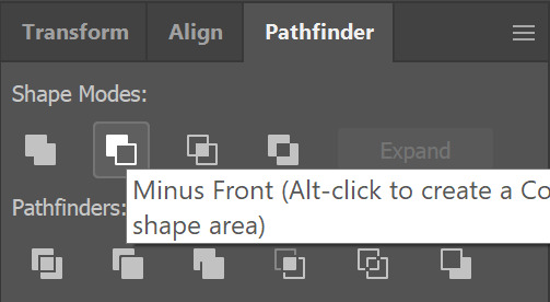
To create the broken triangle, I first made a triangle using the Star Tool from the Toolbar. With the triangle set with a fill, whilst clicking and dragging, I repeatedly pressed the Down Arrow on my keyboard until I had a triangle which was when I stopped clicking. Next I used the Rectangle Tool to draw a rectangle which I duplicated and spaced out over the triangle. These rectangles will be covering the areas I intend to remove. Then I selected the rectangles, grouped them using CTRL+G and made them a Compound Path using CTRL+8. With the rectangles as the top layer, I selected the rectangles and triangle and clicked Minus Front in the Pathfinder. This cut up the triangle, from which I coloured each part separately.

For this triangle, I duplicated one of the triangles I created earlier and applied a gradient of yellow to red using the Gradient Tool. I also double checked that the stroke from the original triangle had been removed.

By now, all of the elements for my pattern have been created so it was easy as duplicating and moving around the elements in a random manner. I also rescaled some of them for variety. It is important that no shapes touch the edges of the artboard as this would make the shapes too close together when it becomes a pattern.

With the previous step completed, I using the Rectangle Tool to create a black background behind the pattern. This makes the colours look much brighter, and the whole thing fit the 90s aesthetic much better.

To group together everything I had created, I pressed CTRL+A and CTRL+G. With this done, I went to Object > Pattern > Make.

The previous step will cause a window to open up like this. I kept everything the same pressed ‘Save a Copy’ in the top loft to name the pattern and save it to Swatches. With this completed, I had a completely usable pattern that I created.

This is what the pattern looks like on a large rectangle. I am very happy with the final result and think that it has been successful in achieving the 90s aesthetic I was aiming for. I also really like my colour choices now that it has all been put together.

0 notes
Text
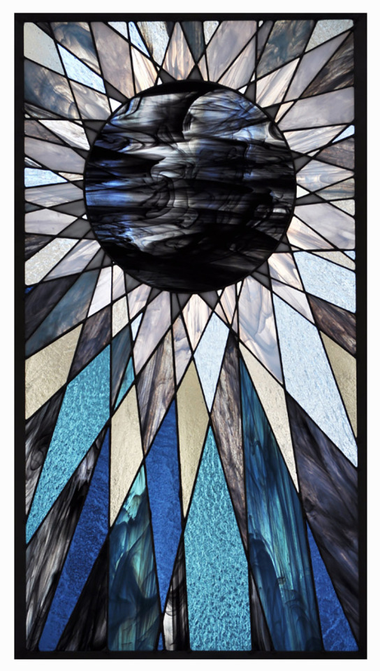
Stained Glass Research
Inspired by the Zetangle workshop, I decided to research stained glass. Stained glass is glass that has been coloured using metallic salts. Usually small pieces of this colour glass is taken and combined with other colours to create artistic designs. They are common place in Christian churches. In this context, the purpose of the glass is to prevent viewing to the outside and to control the light coming in. The designs themselves are normally a narrative taken from the bible. You can see some examples of stained glass on churches below.

Although stained glass is often associated pretty exclusively with religion, it is still a hugely recognised art form to this day. There are many modern artists whose work is primarily composed of stained glass. And not necessarily just in windows.
Below is an example of a piece of work by Annahita Hessami. Part of what makes stained glass so interesting is the way it can manipulate light. And the design below is an excellent example of that, and I am a big fan of her composition and bold use of colours.

This piece is some stained glass from Sue Humphrey who goes by ‘Rock Crest Glass’. I love this piece of art mainly from its focus on geometry. It is not as colourful as some over stained glass that you might see, but despite this it is probably one of my favourite pieces that I have seen.
Below is two examples of stained glass from Danielle Clark who goes by ‘House of Pale’. Both are amazing but the one that particularly stood out to me was the left one. What I found interesting was the tear drops. You can see that they are a completely different texture to the rest of the glass and they reminded me of diamonds. This was not a benefit of stained glass that I had considered, and I’m very impressed by it.

0 notes
Text
Zetangle Artwork

Using the image above, I drew a cat with basic details and no shading. To make this an easier process, I used some charcoal transfer paper.

The next step was to draw shapes within the cat’s face. This is what I did ended up with roughly 30 shapes within the cats face.

This step involved using a lead pencil to draw a swirling diagonal line across the image. I also drew a square around it to know where to stop when making the line. It was important to make the loops touch for a smoother image, although I did fail to do this a couple of times within the design.

Below is just after I started filling in colours and patterns in the shapes. I tried to avoid having the same colours in too many places, as I wanted a bright and colourful outcome. My end goal was to produce something that has a lot of resemblance to stained glass.

This is what the cat looked like once it had been completely coloured in. Although I had not yet gone around the shapes to separate them from each other, I did around the eyes using sharpie. These lines had to be done with a thicker pen as they would need to stand out more. You can also see that the pencil lines have been rubbed out.

The very final step was to go over the image using a black pen. Otherwise it is a bit harder to differentiate between some similar colours, and this also gives more of a toon look to the image. I though using a sharpie could result in some unwanted thick lines, so instead opted 0.8 fine liner.

I am happy with the final outcome of this workshop, and think that it has been successful in getting the stained glass aesthetic I wanted. I think I will look more into some ideas for stained glass after knowing this technique.
0 notes
Text
Joker Research
When researching why jokers can still be found in playing cards, it was hard to narrow it down to just one reason. The joker card is said to have originated from the game Euchre; a popular game in the 1860′s in which the “Best Bower” was the highest trump card. It was this card that evolved into the joker and is included in modern decks to be used in games like Euchre that still use it. There is usually two jokers in a modern deck of cards, and they are often used as replacement cards by writing a missing or damaged cards value on it.
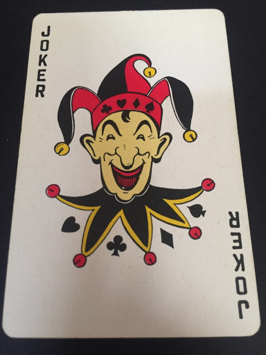
Just like the Ace of Spades, Joker cards were often custom designed to the brand producing them. This would often feature branding for that brand. However, this was not always done in the Jester or Harlequin style. This is because the card name ‘Joker’ was not always universally used for every pack. As you can see on the cards below (branded by Bicycle), there is not a Jester to be seen.

The Joker has also been compared to the Fool in Tarot cards. But they actually have no relation to each other due to the age of Tarot cards, which have been about for roughly 500 years. Therefore, being a jester of a fool was a legitimate career option at the time. With jokers being such a recent addition to playing cards, there is no correlation at all.
0 notes
Text
Universaul Inverted Experiment

After completing my Universaul playing cards, I wanted to experiment with inverting the cards I had done to see the outcome. This was a very easy process which just involved selecting every card and going to Edit > Edit Colours > Invert Colours. I thought it had a great end result and in turn created a brand new, alternative pack of playing cards


0 notes
Text
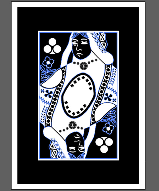
Universaul Final Outcome Mockups
Below are the mockups for my Universaul playing cards. They were done using a mockup template provided to me. It was an easy process of opening the file in Photoshop and replacing the smart objects within it with the exported images of my playing cards. It’s a great way to see a visual of what my cards would look like if they were to be made, and I’m very happy with the outcome.


0 notes
Text
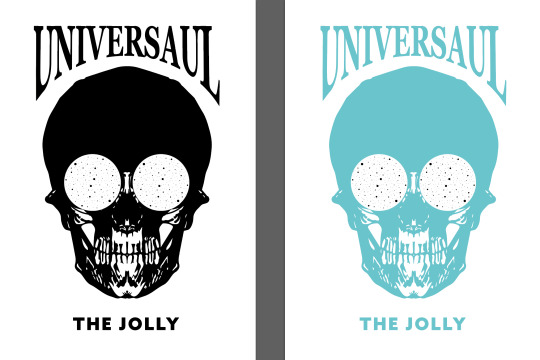
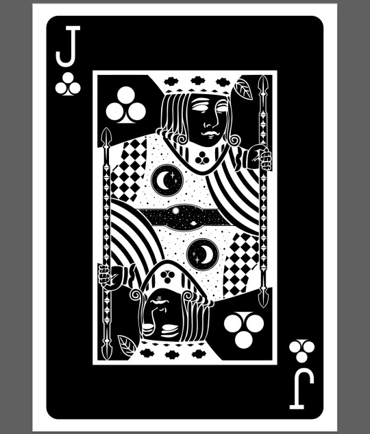
Universaul Joker
I found the card below interesting because of its choice of name. As you can see, it says “The Jolly” instead of the standard “Joker”. The design itself is an image of a Harlequin with stars in the corners, but it was the text that drew me towards it.

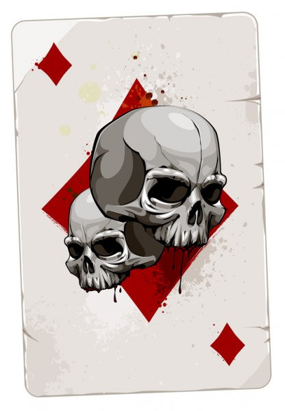
Below is an example of an Ace of Diamonds which has been decorated with two skulls. I actually first mistook the card for a Joker due to its lack of an ‘A’ as you would expect on an Ace. However, it was this card that inspired me to explore using a skull. At first, I wasn’t sure if it related much to the multiverse theme, but a Joker in itself is meant to be a wild card so I decided it could potentially be anything I liked (as long as it fit the aesthetic).
This is the Joker I decided to use for my playing cards. As you can see, it has two elements that link the aesthetic of the cards in the ‘Universaul’ at the top and the space in the eyes. So even though there is not a skull anywhere else in the pack, I still think it doesn’t like out of place. You can also see that I decided to use ‘The Jolly’ instead of ‘Joker’ as I really liked it on the card I researched and thought it would fit well into my own.

There is usually two jokers in a pack so I decided to do a version of it in red. I mad this decision because each King, Queen and Jack has a version of itself in white and in red in the pack, and I liked the idea of keeping this consistent. The only difference would be that I decided to keep the stars in his eyes that same colour, as I think the final outcome just looked better.

0 notes
Text
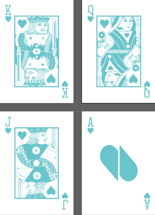
Universaul Face Cards Hearts
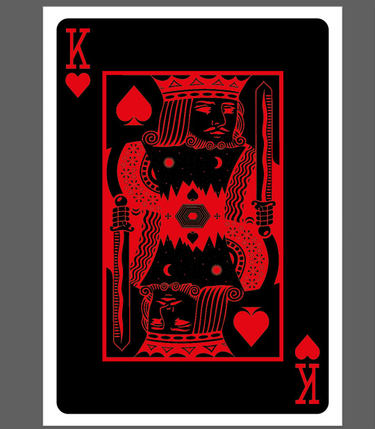
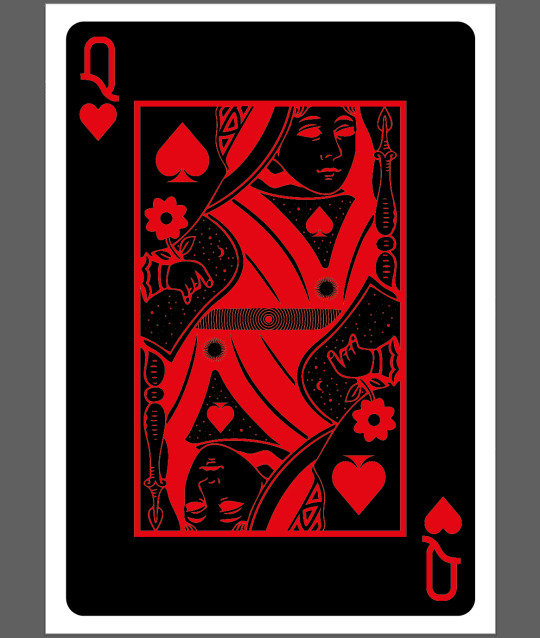
As I mentioned previously, Hearts shares the same designs as Spades for the King, Queen and Jack. The only difference is the colour. Changing this is a very easy process involving selecting the entire design and selecting red from the Swatches panel.

Like I said before, you cannot apply the same process to the Ace of a suit. This is because the design revolves around the pip of the suit, and this would obviously be different from Spades. However, I have developed a theme when doing Clubs and Diamonds. This involves splitting the pip in half, duplicating and rotating it to make it visible from two angles. Although it doesn’t necessarily look like it initially, the Heart becomes clearer the longer you look at it.

0 notes
Text
Universaul Face Cards Spades
In order to for the pack of cards to fit a theme, it was essential to follow the same process as I had done for Clubs previously. This involved in taking a premade vector of a playing card provided to me, rasterizing it, Image Tracing and inverting the colours. I also made the eyes just solid white.
For the King, one of the first things I did was delete nearly everything from the centre of the design. This left a large empty space in the design, which is beneficial to adding in my own patterns and details. The only thing I added was the Spades pips in the middle.

After looking at the design for a while, I realised that the centre of the design vaguely reminded me of two mountains . This gave me the idea to convert the centre into a mountain range underneath a star filled sky. So I cleared out the centre as much as possible and that is what I did. I am very happy with the outcome of this, and felt it was what completed the design. Therefore, I completed the card by adding the pips to the corners and the values to the outside of the design.

When I tried to Image Trace the Queen of Spades, the detail in the design made it hard to do. What I decided to do instead was to convert the original vector to grayscale by going to Edit > Edit Colours > Convert to Grayscale. After deleting some elements I didn’t want, this is what I was left with.

As I didn’t Image Trace, I had to go in and change all the colours myself. The card could only use black and white in order to fit in with the theme of the rest of the pack. So this is what I did, but I also deleted some elements and added some additional details. Such as the Spade on the neck, the space background behind it, and the ripple pattern in the centre of the design.

This is the final outcome of the card for the Queen of Spades. There is some space details to link with the multiverse theme, such as space backgrounds and sunburst shapes. The final steps was to add the Spades pips into the corners and the card value to the outside of the card.

Following the process I had done for the Queen, I decided to try the same thing for the Jack. This involved the exact same process, but I went in and removed a lot more of the original image. This is because I was not a fan of the existing patterns much.
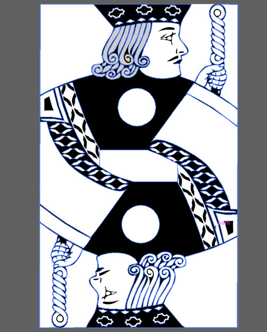
I saw this card as a good opportunity to use my Vitruvian man design again. I was very happy with it, but felt it didn’t always fit into the designs around it. I didn’t think this was the case here as I kept the chest of the Jack bare. This meant that adding the design didn’t make it look cluttered. I also added a detailed sunburst to the centre of the design, as well as the Spades pips in the corner.

The final steps of this card was to to add some final details to the card and add the card values to the corner of the card. I added a space background to the shoulder of the Jack, which was another link to the multiverse theme

An Ace of Spade is not like other Aces. It is often the most decorative, as well as the featuring the largest design. This is what I took into account when creating this card. The design you see below was cut directly from the back of the Universaul playing card, and clipping masked into the shape of the Spades pip. This is done by putting the pip over the design, making sure it’s the top layer, selecting both and pressing CTRL+7. This will execute the clipping mask and put the design into that shape.

0 notes
Text
Universaul Face Cards Diamonds
I decided to create two different sets of King, Queen and Jack designs. Each of these sets will be shared by two suits. Clubs will be shared with Diamonds, and Spades with Clubs. This is why the cards you see below are exactly the same as for Clubs, but just in red. This was an easy process of highlighting everything and changing it to red in the swatch panel.


Obviously the Ace would be the exception as it would make no sense to use a different pip for another suit. Staying true to what I had done previously, I split the Diamond in half. Even though a Diamond is the same on both rotations, I wanted to keep to the theme.

0 notes
Text
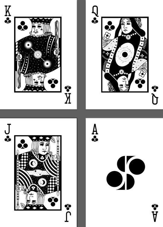
Universaul Face Cards Clubs
Using the playing card templates provided, I was able to go in and create a completely new playing card that is hard to recognise as having anything to do with the original. I was aware that this would be a challenge if I decided to keep too many design elements, which is why I opted to delete a large majority of them and replace them with my own.
To achieve this style for the playing card is easier than it looks. After bringing in the original version of it, I went to Object > Rasterize and pressed OK. This will convert the design from a vector to a pixel image. It’s then as easy as pressing Image Trace at the top of the screen and then going to Edit > Edit Colours > Invert. This process removes all colour and merges everything together. And as you can see below, I have put a sunburst shape in the centre. This was created with the shape tool. I also put the Clubs pip I created in the corners and filled in the eyes.

After removing some details from the image further, it was time to fill the space. I did this by replacing the orbs in the original with the Vitruvian man designs I had done for my Universaul back, which went unused. I also decided I wasn’t going to use the sunburst and instead opted to create a space scene. For an additional bit of detail, I also add a Clubs pip to the King’s face.

I felt the design was looking a little empty but didn’t think that the Vitruvian man was working. This is why I went back to the sunburst idea, but combined it with some geometric lines and shapes. I also made sure the whole image was symmetrical.

After the image for the design was created, I needed to add the value of the card. The standard font for this is usually a slab-serif font.

I used the same process as previously to create this, and added the Clubs pip to the corners. I also filled in the eyes and added the Vitruvian man design that I had failed to be able to add to the King. I did this so it looks like a medallion. I also started deleting all the details that I did not want to use and would be replacing with my own.
In this step, I replaced all cross shapes in the image with my own, and added part of the design back into it. This is the shape in the centre.

It was important to always try and link to the multiverse theme. I did this by replacing parts of the image and adding in stars, as I had done for the King. I did this both on the shoulder and in the centre around the shape I added in previously. There was also a band of shapes coming down from the Queens shoulder, which I made completely black and filled full of the Clubs pip.

Upon looking at the design for a while, I began to like the shape in the centre less. But since I wanted to draw as much attention as I could to the multiverse theme, I decided to design the centre as a sort of “window” to the the universe. I designed the universe by concentrating lots of stars into rings to produce the ring effect. I used the image below for inspiration.


At this point, the design was completed. All I had to do was add the Q and Clubs pip to the corners.

Using the same technique as before, I got to the inverted black and white stage of the design. I added the Clubs pips to the corners but also to on his neck. I think it’s effective to try and add some examples of the suit into the design. The checked area and the thick curved lines were also things that I added.

This part of the card is the first time that the card wasn’t completely symmetrical. In the centre of the card where I have created another “window” to space, there is any unsymmetrical star and planet. I did this because the area was too small to have two of the same things without it looking a bit strange. Even though they are two different things, I tried to make them look as symmetrical to each other as possible in terms of placement. I also added the circle with a moon and two stars in.

The final steps were to add the value of the card as usual, and to fill the white space with some more stars. I think doing this adds another layer of texture and depth to the design.
The last card I created was the Ace. I tried to think of a way to make an Ace symmetrical, and had the idea of splitting the pip in half. With this, I duplicated it and rotated it 180 degrees. The final result is a completely new shape that looks more and more like the Clubs pip the longer you look at it.

0 notes