
Statistics
We looked inside some of the posts by ssterm1project and here's what we found interesting.
Average Info
Notes Per Post
0
Likes Per Post
0
Reblog Per Post
0
Reply Per Post
0
Time Between Posts
2 days
Number of Posts By Type
Text
17
Last Seen Tumblr Blogs


Fun Fact
In 2020, 44% of users from Denmark used Tumblr daily.


Text
final evaluation
https://docs.google.com/document/d/1bQiyxS1nwaVuCEGIYf1X_HEQCZICuPTKgACiH8isejA/edit?usp=sharing
0 notes
Text
Don’t Panic Stickers


My first two stickers I used the same design, the only difference is that on the first I used more colour, the same colour of the tree with some blue line in the background to add more detail.
On the second design I went to threshold and used the paint bucket to fill in the white with the same blue as the lines on the first background.
Before getting this image on the computer I drew the image by hand and when uploaded I used the magnetic lasso tool to cut around and copied and pasted on a new layer that’s when I then turned it into a threshold.

My third piece I used the same technique as the first two but when doing the background I changed the colour to blue and made a second and third circle which I then turned it into a lighter blue and a white. One thing I would change about this is the inner circle which is a different size to the rest .

This design was supposed to be my 4th, and last piece however I didn’t like the outcome so the image below was my final design. Using sunglasses and the same method as all the other designs however I repeatedly used the design so that I could use various different shades of blue on the design.

0 notes
Text
InDesign
Keeping my design constant using mostly black and white and a little green. I also used one of my dark room picture plus two of my architectural pictures to keep my design similar. I had made a design before this one however it wasn’t the best which is why I started again and made this final piece.

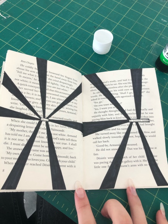
All my designs are different in a way, my first piece I created a line however its not straight as I used the pencil too. Making that shape I went to file - place and chose the image shown. Making a black rectangle for the background using the rectangle tool I then right clicked to arrange - send to back.
For my second piece my chosen shape was circles. I added the green for the first and last circle then adding the same image I used for my first design for the second and third circle.

My 3rd and 4th design, in total 4 however I decided for every 2 pages I used the same shapes or very similar designs, as shown for my first two I used hexagons and placed the same images in both as I also did for the others, and the designs below.

For the first two I made triangle, however the last two are different, rectangles on the first design still using the same image, on the right I made a shape with the pencil tool once again similar to a triangle.

This is where the designs start to change completely as I used one of my architecture photos I took for the first piece, the second I made a black background with straight lines going across with the same colour I used for the first design.
The last two I also used architectural pictures, two on the right and one on the left with a darkroom picture on top. Making one a blue and the other a green. shown below is how (right click - effect - transparency - changing the mode) to whatever one you please.


For the rest of these I only used the first image I was using to begin with which is the dark room picture and one of the architecture pictures I used above placing the dark room picture below the other picture and adjusting the mode.

0 notes
Text
postcard

My first postcard idea. I liked the idea at the time with the typed background however it was too similar to the A3 poster, the title isn’t very bold and the purple boarder isn’t even. Overall i am glad that I decided to change the design of the postcard to a more creative and funny piece.
0 notes
Text
distorted type

off site- I digitally manipulated my type using Photoshop and illustrator. I followed some steps given to me in a tutorial https://blog.spoongraphics.co.uk/tutorials/three-ways-to-create-the-photocopy-glitch-distorted-type-effect?fbclid=IwAR0zYRTNx934MjYZE7LMIVLZ_b5csUm4ySUfWGpFgkV4VFQNPJP6sTjCyCo. Created two different outcomes following method two and three.
method two - Photoshop
filter - liquify - Reduce the Pressure setting, then smear the artwork to generate the distorted appearance, the problem with creating the effect digitally is it’s too clean to look authentic, so I added noise to the background and the writing.

Method three- Illustrator
Object - Envelope Distort - Make With Mesh - configure the mesh settings to form a grid over your artwork. I chose 6 Rows but 2 Column to allow for most of the distortion to be vertical - Using the Direct Selection tool to move each point or row of points to warp the artwork. Moving rows closer or farther apart helps squash or stretch the artwork similar to the effect of moving the paper while scanning.

My on-site scanned distorted type.
0 notes
Text
postcards
My final six post cards inspired by Hattie Stewart. Most of these postcards don’t contain much to them but it is unique and funny, and that’s what I want to achieve with these postcards.
These postcards are also based off my fear just like the rest of my other pieces. They are also all similar as they are all passport specimens, however the design are somewhat different. I didn’t add as much detail as Hattie Stewart does in her art work as it can be hard to think of ideas to draw.
Most of it is doodle and drawing patterns over peoples faces or make the face features bold. I also didn’t want to add a lot otherwise it would be hard to see what they are as I’d be covering a lot of space.
It was also a last minute change as I preferred this idea, it relates to the them of flying as everyone traveling would need a passport, and it is a perfect to use the idea on the post card instead of an A3 poster or envelope as they are similar sizes.


0 notes
Text
Don’t Panic envelope

My final design, started off by adding my drawings into illustrator. Turning up the contrast and brightness so the lines are more bold and noticeable. When I had finishes adding the waves and cloud, using a drawing pad I started to create patterns inside the cloud.
On the right corner of the envelope I added the Don’t Panic logo, underneath I then added a little star with the word free inside, making it look as similar as possible to the originals.
I chose these specific illustration so not all my work pieces all have planes on them. As everybody also knows planes fly over sea in the clouds, some peoples fears while flying could be falling and crashing but more specifically crashing down into the sea and drowning. Putting that idea on the envelope was good as I was proud of how the outcome turned out.
The back of the envelop doesn’t have much detail however it has a bit of writing about the cause of the fear and the history. I thought to add that because if the image was interesting to people they might want to learn more about it, also know the name of the fear which is aerophobia.
0 notes
Text
final poster

Creating the back of my poster, the one on the left was my first try. I inverted my original poster and rearranged my type, However I didn't like how it turned out so as shown on my second outcome I removed some type and changed the colour so it wasn't as bold. Also changing the font and type to fit with the lines drawn. Going on ( effect - warp - fish )

Here is the final outcome of the front and back of the poster. Moving the original from photoshop to illustrator.
0 notes
Text
Don’t panic (stage two) poster
My 5 final design, based on my fear Aerophobia. Using my scans from the penguin book i then searched for plane designs so i could uses, as shown below. I also set it to multiply so the book still could be seen through the plane.

My first design I duplicated the plane and inverted the bottom one. I also added another layer and added some colour which covered part of the first layer. For the title I wrote the fear ‘ aerophobia ‘ using the same colour I used for the background but making it darker, I then duplicated it and flipped it to make it look like a reflection.
Overall, this isn’t my favourite design however I do like the way the title looked in the end.

My second design I added more planes than the rest, I also kept with the white and black theme didn’t add any colour to this design. My favourite thing about this design is the way the title is placed

This design I also kept it simple only moving the planes around so now they are at the bottom, and moving the title. The design shown below is exactly the same however I added colour to the background and these two are my favourite out the 5.


This piece is the same as the top however I also added colour to the background of this piece.
0 notes
Text
Don’t panic poster

SHOCK / BY DAN HILLIER
I chose this specific poster as it stood out from the rest, despite the lack of colour, the design is different and interesting to look at, as there is a lot of repetition in this poster. There is part of a figure at the bottom of the poster but no head is drawn, there are just multiple eyes 30 to be exact. Surrounding that there are also repeated shapes which are positioned to look like there is a circle behind the art work however when it gets closer to eyes the shapes over lap creating a darker area which makes it look like it has been shaded.
This poster is named shock, the feeling people may have after looking at this art work, with their eyes wide open staring at all the eyes on the poster.
0 notes
Text
Don’t panic poster

FUTURE / BY SZU-CHIA PENG
The first thing that caught my eye were the smiley faces that have been coloured with bright colours, and put over peoples faces and birds. The sun doesn’t stand out as much as it is white and grey but the artists also add the smiley face to it.
I reckon that this was originally a photograph of a street in a city or a town, with a lot of people and buildings, most likely in summer as the sun is out. This then was edited so now it is threshold, the threshold command converts grayscale or colour images to a high-contrast, black and white images. To create the faces the artist created one and to save time and to make sure they are all the same he then duplicated it many times and then changed the colour so they are not all the same. The face that the artist made for the sun is also probably a duplicate however it is in grey and white. The artist also made the lines around the sun fade into the background.
This poster doesn’t contain much detail apart from the faces and typography, The Don’t Panic type is added to the poster on the closest figure, the one which contains more positive space so the Don’t Panic type is in my opinion was purposely put in front so there wouldn’t be too much black. There is also a lot of type at the bottom which however people would be more interested to look at the art.
0 notes
Text
don’t panic posters

THE KIDS ARE NOT ALRIGHT / BY STUART SEMPLE
I decided to analyse this poster as it differed from the rest that i saw. This poster contains typography that says “THE KIDS ARE NOT ALRIGHT” which is the name of the poster, behind the typography there’s a girl with lips and feathers surrounding her, which looks like it has been drawn by hand. The colours that were chosen red and yellow wouldn’t be my first colour combination to chose from however they do look good together. The black and white illustration contrasts with the yellow tile, which is why it stands out so much.
When I first saw this poster I thought of it as a film poster or a thumbnail, as it’s different, so it stands out from the rest.
The red could symbolize blood, which could also also have something to do with the title. Kids being hurt physically or mentally. This poster makes the viewer wonder and ask themselves questions as to why they are being hurt or why are they not alright, how, what happened.
Overall this poster is one that stands out, has a lot of detail, and a simple colour palette
0 notes
Text
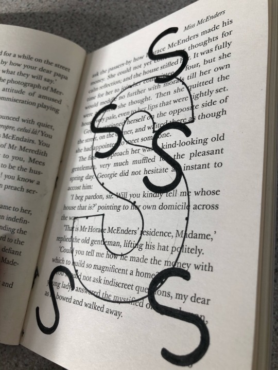
Don’t panic typographic fears (part one)
I used a penguin book to create my designs and patterns based on fears, to scan and make posters similar to the don’t panic posters.
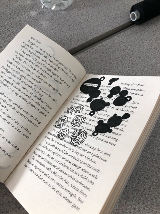
For my last page I created some doodles highlighting the word at the top, which is disappointment, This piece is my least favourite as not much of the page is filled and the doodles made aren’t very creative, I could have created a sentence to demonstrate a fear however the book didn’t have many words to choose from so I stuck with the word. To create most of my work I used fine liners, sharpies and a ruler.
Using typography on this page I drew a large S and smaller ones around it that is meant to represent the word spider, however that word is not used in the book. On this page I could have added more patterns to it, but I also like it simple like it is now.
This design is one of my favourites as it didn’t take long to do and is different from the rest, its messy, and doesn’t have a certain pattern to it. Making the thread more spaced out and coming together when surrounding the word useless, making it clear and visible that, that is the word I wanted to use for a fear.
This piece is similar to the first one as I drew around the key words and added negative space however I did not use the full two pages, I added some patterns to make the writing stand out from the rest of the other words. The words used was alone, and no longer loved. This piece was used on stage two of my work.
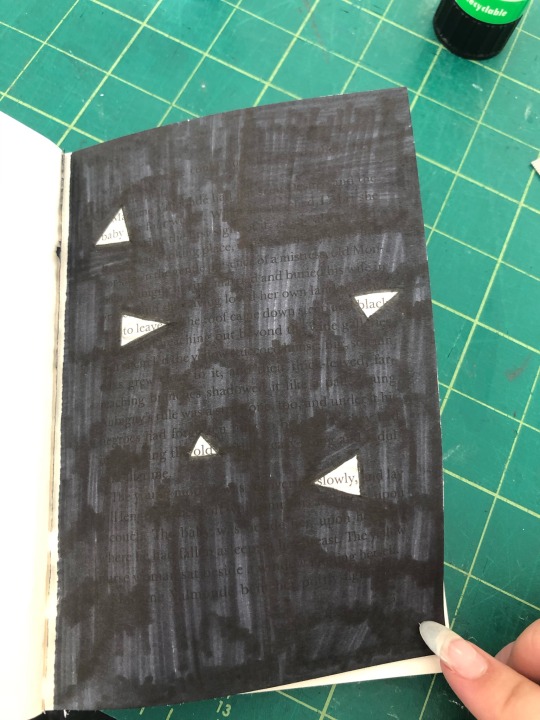
For my first page I used negative space and left triangles highlighting the key words that are based on fears, I chose the words, baby, as there might be fears of people giving birth, to leave, Many people have the fear to be left by loved ones or people in general, black, can resemble the dark and there are a lot of people who are afraid of the dark, old, people may be afraid to grow old and that can also cause a fear of death, and lastly slowly, that may relate to other fears.
0 notes
Text
Don’t panic research.
Don't Panic Pack. For over a decade, the Don’t Panic Pack has been a guiding hand for the UK’s colourful array of experience-hungry culture vultures. Bursting with informative and collectable content, the Don’t Panic Pack features a diverse selection of events information, an exclusive limited edition A2 Don’t Panic Poster and a rotation of treats

0 notes