
Don't wanna be here? Send us removal request.
Statistics
We looked inside some of the posts by staceylinsh and here's what we found interesting.
Average Info
Notes Per Post
22
Likes Per Post
13
Reblog Per Post
8
Reply Per Post
1
Time Between Posts
4 days
Number of Posts By Type
Text
17
Last Seen Tumblr Blogs


Fun Fact
12.7% of mobile users access Tumblr.
Text
final project


From starting with a single color palette to exploring a diverse range of hues—I'm surprised at how many colors I can actually create.
4 notes
·
View notes


Text
5 painting
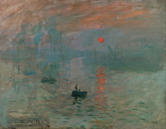
Impression, Sunrise by Claude Monet (1872)
Mood: Serene and hopeful
Color Analysis: Monet's use of soft blues and the warm orange of the rising sun conveys a sense of tranquility and renewal. The gentle blending of colors reflects the calmness of dawn and the promise of a new day.
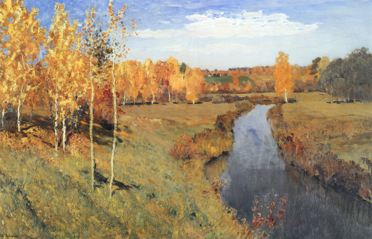
2.Golden Autumn by Isaac Levitan (1895)
Mood: Joyful and optimistic
Color Analysis: Levitan's use of vibrant yellows and reds in the autumn foliage, contrasted with a bright blue sky, creates a lively and uplifting atmosphere. The warm hues suggest a sense of happiness and contentment, celebrating the beauty of the season.
3.Composition VIII by Wassily Kandinsky (1923)
Mood: Harmonious and spiritual
Color Analysis: Kandinsky's strategic use of warm yellows and oranges alongside cool blues creates a balanced composition that radiates energy and tranquility. The warm tones invite a sense of spiritual elevation and inner harmony.

4.Sunflowers by Vincent van Gogh (1888)
Mood: Joyful and optimistic
Color Analysis: Van Gogh's use of vibrant yellows and golds in the sunflowers creates a sense of warmth and cheerfulness. The bright hues evoke feelings of happiness and positivity, drawing the viewer into a lively and uplifting atmosphere.

5. Woman with a Parasol - Madame Monet and Her Son by Claude Monet (1875)
Mood: Lighthearted and breezy
Color Analysis: Monet's use of soft greens, blues, and the pale yellow of the parasol creates a fresh, airy atmosphere. The brushwork and use of lighter colors suggest movement and a joyful, carefree moment on a breezy day, conveying a sense of joy and relaxation.

0 notes
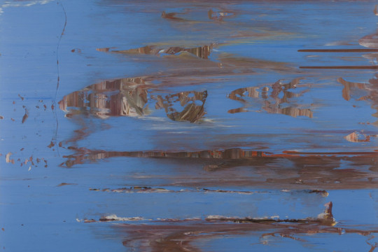
Text
broken color activity

Broken Color is a painting technique where colors are applied in a way that they are not fully blended together on the canvas, allowing individual strokes or dabs of different colors to remain visible. This method creates a vibrant surface full of movement and energy.
Why Use Broken Color:
Visual Vibrancy: The juxtaposition of colors makes the painting more luminous and lively.
Texture and Depth: It adds a tactile quality and a sense of depth.
Expressiveness: It allows artists to evoke mood and light more dynamically.
Optical Mixing: Your eyes blend the colors, creating a more natural or shimmering effect than mechanical blending.
Ways to Use Broken Color:
Short Brush Strokes: Apply quick dabs or strokes of different colors next to each other.
Layering Without Blending: Layer colors while keeping each stroke visible.
Scumbling: Lightly drag a dry brush with a small amount of paint across the surface to allow underlying colors to peek through.
Pointillism: Use dots of pure color side by side (e.g., Seurat’s technique).
Palette Knife: Apply patches of different colors using a knife to avoid blending.
2 notes
·
View notes

Text
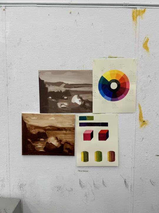
color wheel exercise
We worked on building our own color wheels . It was the first time I’ve ever done something like this, and honestly, it made me see color in a whole new way.
What surprised me the most was how emotional it felt. Watching colors slowly shift as I blended them — it was kind of meditative. I expected it to feel technical, but instead, it was calming and even kind of exciting when I finally hit the perfect orange or violet.
I noticed I was drawn to mixing the cooler tones more — something about the blues and purples just felt soothing. Can’t wait to keep exploring and see how color starts to influence the way I paint and express myself.
0 notes
Text
unconventional painting
at the Museum of Modern Art (MoMA), one artist renowned for using unconventional painting materials is Jack Whitten. His retrospective exhibition, Jack Whitten: The Messenger, showcases his innovative techniques, including pulling layers of acrylic paint across a floor-bound canvas to produce luminous, quasi-photographic blurs. In the 1990s, he cut hardened sheets of acrylic paint into thousands of mosaic tiles to assemble richly textured paintings that suggest pixels or galaxies. These methods reflect his exploration of materials and tools—from new paints to Afro-combs and electrostatic printing—highlighting his inventive approach to art-making.
0 notes
Text
introduction-1
Hi, I'm Stacey, and I'm currently a college student studying accounting major. This is actually my first time taking a painting class, and I'm really excited to dive into the world of art. I’ve always had an interest in creativity and self-expression, but I’ve never had the chance to explore painting seriously before. I’m looking forward to learning new techniques, experimenting with different styles, and connecting with others who share the same passion. Can't wait to see what we all create together!
0 notes
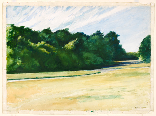
Text
observational still life exercise
The still life exercise taught me to slow down and really observe. I was surprised by how much detail I missed at first, and managing light, shadow, and space was tricky. It reminded me how important composition and perspective are for creating depth.
0 notes


Text
White on White" by Kazimir Malevich
"White on White" by Kazimir Malevich - An example of minimal contrast with a soft blending of whites that creates a calming and quiet atmosphere.
In short, "White on White" exemplifies how low tonal contrast can create a serene, meditative effect, pushing the viewer to focus on the subtle details rather than bold visual elements. It's a powerful example of simplicity in art and how minimalism can have a profound emotional impact.
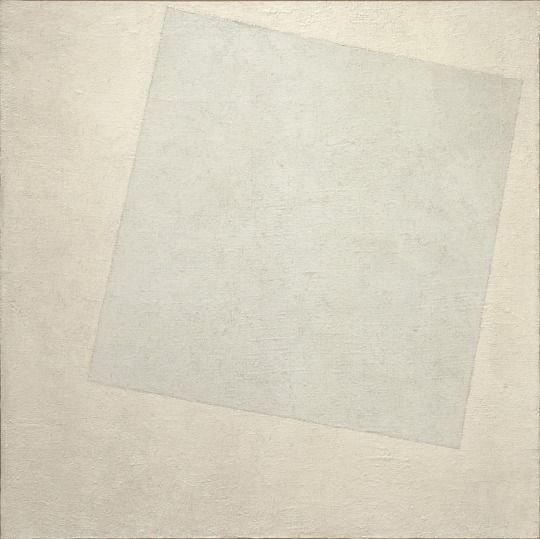
1 note
·
View note
Text
opaque tonal exercise
I tried opaque tonal exercises in oil painting for the first time, and it was very interesting! I usually use transparent paint, so opaque paint was new for me. Here’s what I learned. I had trouble with the paint being too thick. Sometimes I put too much paint on the brush, and it made it hard to blend. I had to learn how to use less paint. : Opaque paint dries slower when I use too much paint. It takes longer to finish my work, and I have to wait for the paint to dry before adding more layers. Overall, I had fun trying opaque paint, but it is tricky!
1 note
·
View note
Text

This is my first time working with oil paints, and I’m finding it really challenging to control the density of the paint. It’s hard to manage how thick or thin the layers are, and I’m struggling to get the right consistency. The paint feels either too thick, making it hard to spread smoothly, or too thin, and then it doesn’t hold the texture I want. I keep trying to find the right balance, but it's frustrating because I’m not sure how much medium to use, or when to stop adding it. I feel like I’m constantly battling with the paint, trying to get it just right, and it's making the process feel a little overwhelming.
3 notes
·
View notes
Text
Edward Hopper was an American painter, widely recognized for his realistic depictions of American life in the 20th century. Born on July 22, 1882, in Nyack, New York, Hopper is often associated with the realist movement, but his works also evoke a sense of solitude, introspection, and alienation. He’s particularly famous for his ability to capture the quiet, often eerie atmosphere of modern life.
His paintings often depict solitary figures, and the sense of isolation is a common theme. Even in urban scenes, there’s a quiet solitude, often portrayed through empty streets or empty rooms.
Hopper had a remarkable ability to play with light, which he used to create mood and depth in his paintings. His scenes often use dramatic light contrasts, with sunlight illuminating parts of a building or room, while the rest remains in shadow.
While some of his works are more rural, Hopper is often associated with modern American urban life. His paintings of diners, gas stations, and apartment buildings are iconic, offering a snapshot of American life in the mid-20th century.
2 notes
·
View notes