
Statistics
We looked inside some of the posts by startingwithe and here's what we found interesting.
Average Info
Notes Per Post
61K
Likes Per Post
32K
Reblog Per Post
30K
Reply Per Post
0
Time Between Posts
3 days
Number of Posts By Type
Photo
17
Last Seen Tumblr Blogs


Fun Fact
Tumblr’s reach among the 26-to-35-year-olds in the US is 11%.
Photo


Inspired by emojis (I know, I know) I thought about making a rebus with the coffee and donut. I drew up my own emojis and had a play around with HALO = 🍩+ ☕. In the end I decided to drop the coffee mug and rotate the donut as an O symbol instead.
2 notes
·
View notes
Photo

Yeah so the word is too short to wrap nicely around the circle. I like the icon look of the coffee & donut, though. Will try to reuse the donut somewhere else.
0 notes
Photo


Scribbled a quick logo idea and made the shapes in Illustrator, but will probably scrap as it’s less about the type and more about the image at this point.
I have been dithering about showing the donut in perspective; I want to have it as a halo like you’d see in a cartoon, but not sure how to do it without showing a literal head... Might play with the idea of having text on the donut itself. A glowing yellow heavenly donut?
0 notes
Photo

A happy bubbly HALO with the O as a donut. 🍩 This one hasn’t changed much since my last post about it, other than the addition of “Donuts & Coffee” and more messing about with colour palettes. I’m still not particularly sold on any colour, though I think I’ll stick with a blue/green.
0 notes
Photo

“Halo” written with a brush pen and vectorised in Illustrator. In the bottom 3 I’ve used simple circles to evoke the shape of the donut, though I’m worried it looks kind of like a vinyl record more than a donut. I do think the circle shape version is better and will read more easily.
The top right is inspired by the trend of having a small symbol above/beneath the wordmarks.
0 notes
Photo


Iterating from the bubble design idea in my sketch, messed about in Illustrator. The top image was drawn, a loose idea of what I wanted it to potentially look like. The bottom image uses a typeface called Jackerton, which I’ve modified slightly to make the H read more clearly. The O is not part of the typeface, but I’ve incorporated the eye of the A as the donut hole.
Undecided on colours at this point, but I am potentially looking at the baby blue to fit with the “angelic” theme. I like having pink as well because the image of the pink iced donut with sprinkles is quite recognisable (or did I just watch too much Simpsons growing up?)
0 notes
Photo

Initial sketches of random ideas for my brief, which is for a fictional donut shop called HALO. I jotted down some keywords from the brief. Most of the ideas have the word HALO in capital letters, as that’s what was consistent in the brief and I wanted to retain this.
0 notes
Photo

Cover page for the zine. I hemmed and hawed about whether to put text on it at all-- in the end I did. I overlaid the “gridless” version of this letterform that I’d made earlier and overlaid it over the white-on-red version in the background, creating a bold effect that I really like. The black overlay still lines up with the 5mm grid, just offset.
0 notes
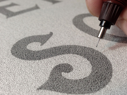
Photo


While I was looking for references and inspiration for blackletter, I stumbled upon English court hand, which I find really lovely. The ‘e’ looks like a pie chart or Pac Man. Middle image courtesy of Wikimedia Commons.
I gave it a few scribbles with the chisel tip Sharpie, but there’s something sort of missing. If I had the time I would have loved to dig out a Pilot Parallel and have a go at the whole alphabet, but a) I forgot where I put mine and b) I did not have the time.
What ended up going in the zine was the last image. This was drawn using a set of brass folded nibs and Montblanc Mystery Black fountain pen ink. Use what you have, right? I like the sketchy, clockface vibe of it a lot.
0 notes
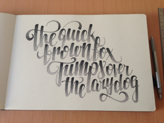
Photo


I spent maybe 3 hours just messing with the text alone once I had assembled everything else in the zine. Didn’t think through what I wanted to fit in beforehand, which was a mistake. I started writing a poem, but it just didn’t meet the 100-200 word requirements. This isn’t what ended up in the zine.
0 notes
Photo

I knew I wanted to make a larger version of yet another thing I thumbnailed during the grid workshops and for some reason I thought almost dying from Sharpie fumes was the way to do it. Problems here being I have misplaced my proper-sized ruler and only had a baby one on hand, resulting in Improvisations such as “washi-taping the baby ruler to a piece of A4 cardstock” and “trying to stick washi tape on the paper only to realise that, yes, Sharpie definitely bleeds through that too”.
Cleaned it up a little in post but I think that’s acceptable, right? Sharpie bleeds. I do really like the texture the chisel tip created.
This is a really simplistic design but I like that it evokes a strip of folded paper. If I were to try another version of it, I’d add some shading elements to where the paper would overlap and create a 3D effect. I like how it looks as is, though.
0 notes
Photo


For a previous workshop, I’d drawn an abstracted version of a cursive lowercase e that made me think of a paperclip. Though I like the idea of the separated pieces, I think ultimately it looks better joined up.
Drawn on 5mm grid graph paper, using 6x6 squares as one square.
Top L: Levels boosted to remove midtones, “gridless”. Top R: Grid intact, complete with smudges. Bottom: Prior to filling in the triangles, still trying to decide whether to fill the top or bottom triangle. We will just ignore the bad photoshop on the right. There is no shoddy spot-healing in Ba Sing Se.
0 notes
Photo


I was trying to suss out whether I like the red or the black better-- ultimately decided on the red for the poster. I like the opaque quality of the white on red a bit more, it looks less chalk on whiteboard than the straight black.
This was done with water-soluble charcoal and a water brush. I really love the effect and the slight “glow” the un-watered (that’s totally a word) charcoal leaves behind. Inverted in Photoshop.
0 notes
Photo


I like this one a lot. Top image: Water-soluble charcoal on paper. Bottom image: Same letterform, added water and moved it around with a water brush. I think both are really interesting. I’d like to use one or both in the zine... Maybe for the poster.
0 notes
Photo


Messing about with a few different styles of blackletter using pastel (charcoal in the second image). I think the centre line as its own little element is interesting, but it’s difficult to replicate with the shape of the pastel I’m using.
0 notes
Photo

Starting to mess about with setting up some pages of my zine in InDesign.
0 notes
Photo


61K notes
·
View notes