
Don't wanna be here? Send us removal request.
Statistics
We looked inside some of the posts by stellaa-r and here's what we found interesting.
Average Info
Notes Per Post
486
Likes Per Post
260
Reblog Per Post
224
Reply Per Post
2
Time Between Posts
2 days
Number of Posts By Type
Text
14
Photo
3
Last Seen Tumblr Blogs


Fun Fact
Premium Tumblr themes are available from anywhere between $9 to $49.
Text
a reflection
Somehow we are at the end of semester one, and therefore the end of this Comm Design Studies class, which I am having trouble coming to terms with given it doesn’t feel like we’ve really had much of a ‘proper’ uni experience! The shift to online learning was hard and testing at times (family and internet interruptions, sore eyes from looking at my screen all day and so. much. coffee I think I now may be immune) I’m pretty proud I was able to get through my first semester of uni, given the craziness of the world in the last few months.
I’ve really loved this class, it was such a great mix of all of the different things I’m interested in, being history, design and writing. These are all things I’d love to combine in my work or at a job one day, so this subject really excited me.
Andy and Karen’s lectures were interesting and inspiring and l learnt so much from them. The beginnings of type, The Bauhaus and post-modernism lectures were a few of my favourites. With the way things were discussed in the lectures, and this reflective Tumblr blog I feel as though now, when I see a design of any kind, I’m able to analyse, question and think about it. About it’s influences, its effect on the world and how or why the design had been created, almost like I would analyse a piece of writing. These are skills I am so glad I now have in my arsenal, as I think it’s improved my personal style and how I design.
The practical classes with Bailey were a great opportunity to discuss the theory of the lectures, collaborate (somewhat!) with people in the class and do some fun activities. Although I wish I was able to do all this in a real life class, I think I was still able to get a bit more confident with sharing my work in class, getting feedback on it, and then responding to it.
I’d never made a zine before, so the ‘Ask Me Anything’ assignment was really exciting. I’m still getting used to having freedom within projects and being able to control a lot of the work I do, so I found it a little difficult to ‘get going’ with this assignment. Once I had, I had so much fun learning about the subject of my zine and then channelling this into my design.
In reflection, I do feel a bit sad about the in-class trivialities we missed out on this semester, but really did enjoy the class nonetheless and feel as though I have come a long way in my design style and skills as a result!
1 note
·
View note
Text
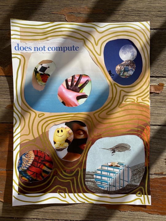
the final WIP


This week i’ve been finishing off and finalising my Anni Albers Zine, this is where I’m at before final touch ups, and am pretty happy with my progress throughout this project. I’ve really had fun playing with, collaging, and messing with Anni’s photos and textiles, trying to convey her fabulously rebellious nature.
0 notes
Text
week 12 class activity

For this weeks practical class, we did an activity where we got to rapidly create designs from a plain layout. We were given prompts to emphasise the image and text and distort which gave us all time to take a break from our ‘Ask Me Anything’ work, create and look at some fresh designs.
This activity proved to me my lack of photoshop skills (!!), as I have become so used to Illustrator in the last few years, but I still managed to create something that, while messy and not at all refined, was new, interesting and a bit weird and wobbly.
Doing this, and looking at everyones designs from this activity ended up being really useful for me in continuing with my Zine, as I felt super refreshed and energised to experiment and look at my work with a different perspective. I was beginning to get so bored and unenthused with my work, so this activity was a good lesson in playing around and having some creative fun!
2 notes
·
View notes
Text
I love Shanali’s explorations here, especially the ‘Emphasise Text’ one - the text as a fullstop is unassuming, funny and satirical! These results are all really pushing the boundaries of design in a way I find really inspiring, especially when you can get so stuck in one style, it’s great to see fresh creations!
WEEK 12
(COMMUNICATION DESIGN STUDIES RELATED):
To finish off our last class we did an activity which I feel was a great exercise to show us all mainly the importance of composition and hierarchy. We were put to the test in 3 ways. We were given sample text and images and had to rearrange and alter it to:
1. Emphasise Image (scale, colour, inset, placement, crop)
2. Emphasise Text (pull quotes, bolding, italicizing, underlining, size changes, rhythmic layout)
3. Distortion (Transform, cutting, collaging, rearranging)
ORIGINAL:

Here were my results:
Emphasise Image:

Emphasise Text:

Distortion:

Overall I found today’s class really fun, helpful and constructive. Reflecting now has made me realize that I learnt a lot from today’s session even if it wasn’t intended in one way. Being tested to alter the image and text all within 5 minutes each was in a way quite challenging as we had to think very quickly on the spot however I did try out different tools and techniques I’ve never used before. Hopefully after more experimentation I can be more familiar with all the tools to then use them to my advantage some day with my designs. I loved being able to see the other works people did (both the activity and their WIP for the ‘ask me anything assignment’). Seeing everyones work showed me how versatile design is, that design gives us the opportunity to think creatively and differently from one another however that’s what makes design such an amazing aspect - everyone’s designs were so out there (in a good way of course) but it also challenged and inspired me to get more creative with my own designs.
As we got individual feedback for our assignment, I was able to fix something in my zine which was really bothering me.

A lot of the words were getting cut off and Bailey was able to show me a tracking setting in Indesign which I found really useful. I have now gone through all my pages and used this technique to reduce the amount of divided words - my answers are now a lot more easier to read with a better flow all throughout :)
4 notes
·
View notes
Text
things that don’t exist + the week 11 lecture
This lecture both creeped me out and excited me about the future ahead in design especially when Karen and Andy referenced the ‘People that don’t exist’ which is successfully grotesque. Upon further research there are even cats and artwork that don’t exist and a shop selling this AI artwork (does this mean it does exist?!)
I don’t quite understand it but it made me question whether or not it’s ‘good’ for the world of design and art? Humanistic labour is totally upheaved here, other than the initial coding, which kind of unnerves me about the future!!
This quote from one of the Week 11 readings; Generative Practice. The State Of The Art was a point i found really interesting;
“Concepts like emergence, network theory and multi-dimensional parameter spaces defy reduction to simple principles, and artists using code quickly find themselves only partly in control of the software processes they create. So chaotic behaviour, glitch or visual complexity seem like likely outcomes.”
In regards to the glitches and pixelations which occur in these GAN processes, although they are creepy in a way, I almost feel better about them then the hype-real perfect faces, art and cats as it shows the flaws and glitches and proves its not an entirely perfect system.

https://thiscatdoesnotexist.com/


https://thisartworkdoesnotexist.com/
3 notes
·
View notes
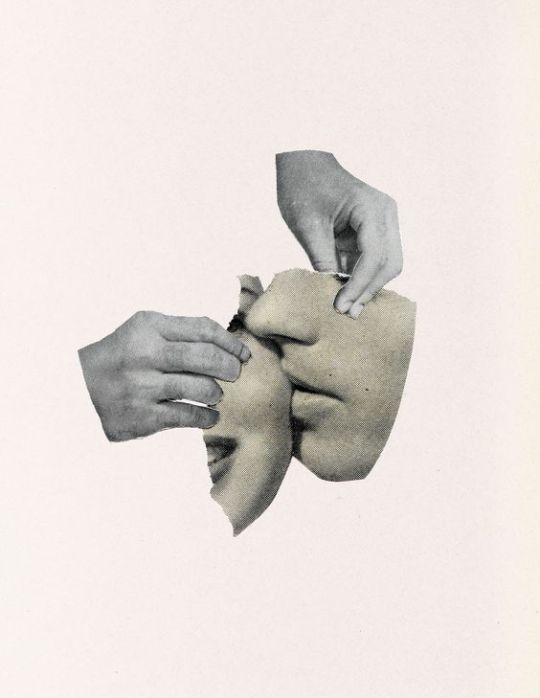
Text
collage-esque: collecting inspiration for my zine
I’m playing with tampering, altering and messing with some of the old photo’s i’m finding of Anni and the Bauhaus to achieve the digital collage style that hopefully represents some of the rebelliousness that Miss Albers brought to art and design at the time.
I’m loving playing with the contrast of the grainy photo’s with the harsh and jarring digital mediums of Illustrator and InDesign in my zine WIP, and these examples are some inspiration i’ve gained...
https://www.flickr.com/photos/richardvergez/14444457799/
https://www.polkadot.it/2014/11/04/iger-of-the-week-gumbo69/10624373_555363407901623_1248776797_n

https://www.behance.net/gallery/36965571/Torn-Around

https://www.flickr.com/photos/hollie-o/14768098011/in/contacts/
1 note
·
View note

Text
week 11 wip


This week i felt quite stuck with my ‘ask me anything’, so I went back to the drawing board on a few things. I tried to focus on finalising some of the imagery that would be used in response or in support of the answers to the questions.
I’m happy with the effect they give, and feel as though they honour Anni and her work quite well. I’m trying to create a digitally collaged effect, so will probably continue to add in elements that give it this feel, whilst also referencing Anni’s textile work.
The 3D thread on the cover page is something I want to try and incorporate throughout a bit more, but i’m still working on a way to do this.
2 notes
·
View notes
Text
conceptualism and the politicising of design
From the week 11 lecture.. I had heard of Marcel Duchamps ‘Fountain’ work before in the context of understanding postmodernism in high school; with the idea that Duchamp was being intentionally disruptive. I’d never really heart of conceptualism though, and boy, that is a whole other meaning to the idea of disruption. It makes you question what is art? What is design? what an be art or design? Apparently anything, if you follow it up with a claim that the ‘thing’ is in fact artwork.
Tate’s article on Conceptual Art describes it interestingly;
In conceptual art the idea or concept is the most important aspect of the work. When an artist uses a conceptual form of art, it means that all of the planning and decisions are made beforehand and the execution is a perfunctory affair.
https://www.tate.org.uk/art/art-terms/c/conceptual-art
Another example I found was Polish artist, Ewa Partum’s ‘Active Poetry’ from the 1970′s, where she performed poetry, taking letters from cut paper and scattering them around different locations; literally deconstructing language.

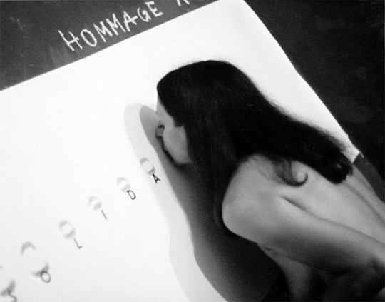
Another conceptual work by Ewa, where she imprinted her lips when pronouncing the letter, creating phrases.
https://deananeedham.wordpress.com/2016/03/21/ewa-partum/
I also found the advertisements done by Oliviero Toscani for United Colours of Benetton really eye-opening, especially for the time they were made in the 80′s and 90′s, being so radical with the constant and often jarring use of different social and political issues like AIDS, racism and environmental disasters. The diversity of the campaigns by the company were really unexpected to me, especially because this seems to be something that is more recent in it’s “trendiness”.


However the idea that some of the brands communications were becoming a political forum to showcase these issues (that certainly need/ed reform) being commodified to sell clothes is slightly disconcerting. Although, consumers often do vote with their wallets, so through these super eye catching, hard to look away from designs and advertising, maybe it’s the best way to create awareness.
1 note
·
View note
Text
ask me anything wip 2 - creating, hating and changing
This week I played with the layout of my zine, and the beginnings of exploring interesting ways to show Ms Albers’ work. I wanted to nod to a few things in the zine, that would relate to things learned and accumulated throughout the lectures.
Things such as using digital 3D elements, as an ode to Gropius’ statement that stuck with me - regarding women only being able to think in two dimensions, hence the 3D thread on the zine’s cover page. After learning more about the ideas of postmodernism and its relationship to collage, its rebelliousness, disregard for tradition, I wanted to use a collage style in the zine. Through my research, Albers seemed to constantly work to break through limitations, be that of the art form of weaving, or being a women in the Bauhaus, or running from pre-hitler Germany to start a new life in America.

This was the first iteration, I liked it, but it felt ‘flat’.

A messy illustrator page reflected my mind at this stage, playing around with ideas, getting confused and annoyed with illustrator and feeling lost about where I was heading with this project. I did like the idea of the 3D weave though, I think it is a nice ode to the literal 3D-ing of her work.

Where I’m at currently; nothings finalised here, but I feel as though i’m finding my feet with a mix of presenting her work in interesting ways through collage style techniques and Bauhaus-ian influences of refinement.
1 note
·
View note
Text
digitalising shapeshifters
I was interested to see how the activity from a few weeks ago, ‘shapeshifters’, would look digitalised. I think it looks almost clearer, and more legible than the original which i’m happy about, and I really like the futuristic, robotic and angular style of them.

3 notes
·
View notes
Text
I really loved Lily’s collage from the week 9 practical class! An awesome and interesting juxtaposition of the natural and the surreal, harsh and soft textures and shapes, while also being fun and hard to look away from.
I think it fits quite well with the ‘rule breaking’ ideals of the punk rock movement we had been discussing this week as it doesn't particularly ‘fit’ with any style but still flows nicely.
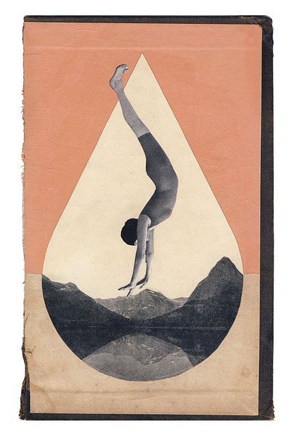
week 9 ☆ my collage attempt
after looking into collage styles, artists, movements and techniques over the previous and current centuries we were given time to have a go ourselves.
I took inspiration from these collage works from Dash Snow.

source

source
I looked to use the idea of cut outs within a page to reveal segments of other images. I chose to have a theme of the natural and the surreal, using natural scenes as my larger page images, and revealing surreal and manmade images and objects within the cutouts layered within cutouts.

the messy process.
I always seem to not be able to stop myself from taking things too far, so I couldn’t help but crack out the metallic sharpie and follow the contours of the cutouts with lines. I feel it creates more of an emphasis on the plant/animal cell type shapes, again referencing the natural elements of my ‘theme’.
4 notes
·
View notes
Text
collage making

week 9 practical! quick collage making in class with magazines we had at home.
1 note
·
View note


Photo

Emil Pirchan (Austrian, 1884-1957)
Poster design, 1912
Collage
289 notes
·
View notes
Text
week 9 lecture - postmodernism & the punk rock movement
Acting in response to the rigidity of modernism, the postmodernism movement of the mid 20th century rejected the idea of a grand narrative, rejected idealism and reason, instead favouring scepticism and a suspicion of reason.
A really interesting part of this movement is the refusal to recognise a single authority of anything or clear definition of what art should look like. This is really well represented in the punk subculture, which signified the ‘end of the future’, it gave more representability to those who were underrepresented at the time, recognising workers and students rights and also shunning the impenetrable hierarchy of the media (being newspapers, tv and radio). The rules of the Bauhaus and modernist idealism were discarded and rebelled against leading to the Punk style of the 1970′s, where instead a DIY, collaged, messy, much more careless and deliberated ethos, seeped its way into music and design.

Jamie Reid’s work for the Sex Pistols embodies this well - the disregard for order, for a grid or any particular design ‘rules’ that had been so methodically engrained into European design were upheaved, and from my perspective today, it feels pretty refreshing.
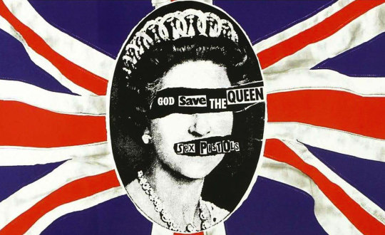
As does this work which violently attacks the establishment of the monarch, both metaphorically, and also literally with the collage method being applied feeling so frantic and powerful.
As was talked about later in the lecture, the Punk experimentation and rule-breaking occurred just before the introduction of the computer which becomes a protagonist in design in the 1980′s, allowing the ability to democratise and standardise design, allowing for the accessibility of design practices but in turn ‘deskilling’. Did this experimentation that became almost ‘allowed’ during this time, allow for the creation of computers and these new age machines?
I looked a bit further into Andy Warhol’s early use of the computer and found an article describing that The Andy Warhol Museum had uncovered Warhols art done in the 1985 in collaboration one of the first computer companies Commodore Amiga, ...


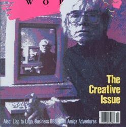
They are an interesting juxtaposition between the new and old, or the tentative embrace of these new methods by recreating old artworks like Botticelli's The Birth of Venus and Warhol’s own Campbells Soup can.
0 notes