Text
Weekly Journal: Visual Style
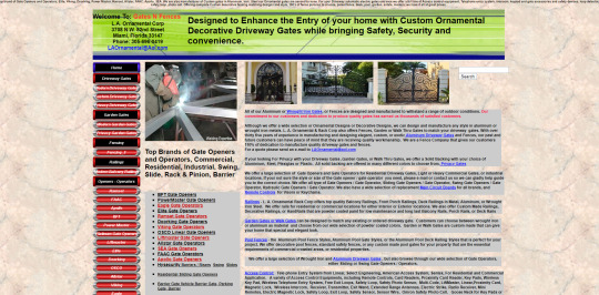
It's easy to point out the flaws in a really bad design. Creating a good design is a different animal all together. Visiting Gatesnfences feels like traveling back in time. It's covered in information and products little helpful hierarchy. It's a nightmare to navigate and I doubt people would feel too confident in buying anything from them today. So how do we make a website that feels good to use and advertises the company well? Here's my idea:

The original Gatesnfences website
What is the experience, and who is the audience?
Currently the website is difficult to navigate so a big part of the redesign is making the site significantly more functional. The audience is likely people working in construction or building management who have a job they need to get done. Making the website easier to use makes their lives easier and that user more likely to use Gatesnfences again. Using the audience as a model again, the site you be utilitarian in it's look and feel. Functionality over fluff is important.
What about this example is provocative/interesting? (Why did you pick it?)
Gatesnfences is an unending adventure in why basic design elements are important. The visual hierarchy is a nightmare that assaults the users eyes. Functionality is difficult at best with many of the links not working. My favorite thing is how you can make it impossible to check out. The view cart button does not work so the only way to see what's in your cart is to add an item. There is a button in the cart however that turns off going to cart after adding an item. If you turn that off, you can never view your cart again. It's a commerce website that makes it an uphill battle to buy things.
In what ways is this example successful?
Gatesnfences has a lot of information and a massive amount of products. While it's overwhelming, it also has enough information to allow someone to make an informed purchase. That information could certainly be better laid out but the fact that it's there is helpful.
How might you make it even better?
There's a lot to do to Gatesnfences. Like I mentioned before, improving visual hierarchy is the most important. Other improvements include having better images of their products. In its current state, the images are small and cannot be enlarged. Getting high resolution images of the products is a must.

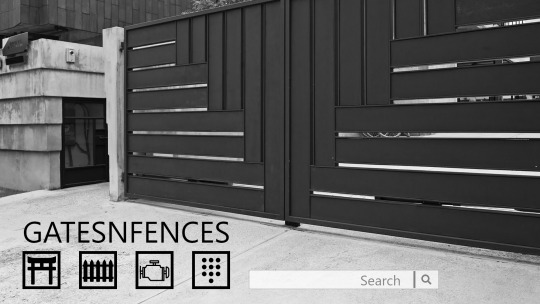
The site could even go straight to the product page to be even more utilitarian
The website also needs to have a more modern feel while not becoming too artsy. The users want a functional site first. However, the website needs to look like people today made it. Users have expectations set from competitor sites like amazon and home depot. Functions like user accounts or shopping carts that don’t disappear forever are musts for the website.

Maybe too artsy for the users but certainly more modern looking
Gatesnfences is a fascinating look at baffling design decisions. The internet is wild today but it’s nothing compared to the way things used to be. Gatesnfences is a testament to how and why much design has improved over the years.Th
0 notes
Text
Weekly Journal: Quiz Interactions

BUZZFEED! The king of quizes! When asked to write about quiz interaction, I go straight to what's popular. A lot of people dislike BuzzFeed but as Warner Herzog once said, "Why do I watch Wrestlemania? My answer is the poet must not avert his eyes from what's going on in the world. In order to understand what's going on, you have to face it.” Let's face the internet's WrestleMania, quizes on BuzzFeed.

What is the experience, and who is the audience?
I decided to choose a quiz based on something I've often wondered: "What cheese am I?" Overall I am pretty happy with the result. It seems accurate though it didn't feel particularly rigorous. The questions along the way didn't seem like they pertained to the cheese question very well but I'm far from a master of psychology. Maybe the shape I chose says something about me.

One thing that struck me was that after answering a question, it would load the next one in a a weird way. It's good UI to jump to the next question but often loaded with an ad in full view. I suppose that's the cost of learning about myself for free.

How the a question loaded after answering the previous one
The audience is likely young people looking for a distraction or a deeper understanding of their cheesy selves. The site makes it easy to jump to new content. The quizes are also quick to answer and there are a lot of them meaning that a person could spend a lot of time on BuzzFeed if that's what they were in to.
What about this example is provocative/interesting? (Why did you pick it?)
As mentioned before, BuzzFeed is practically synonymous with online personality quizes. The cheese one I picked is far from their most ridiculous. Quizes like "is your boyfriend great or just a raccoon?" show a lot of fun is put into this site. It was honestly a bit hard to which one to go with after finding the listicle "15 BuzzFeed Quizzes To Take If You Literally Have Nothing Better To Do"
In what ways is this example successful?
BuzzFeed does a wonderful job of creating lots of content. It’s the potato chip of internet. There’s a lot there and it’s easy to keep consuming but it’s also hard to argue you feel full by the end of it. Additionally, BuzzFeed does a great job of having a young and fun feel to its website. It feels like a teen magazine given life on the internet.
How might you make it even better?
The sheer amount of ads and the way they load make using the site a bit off putting. They pop in and change sizes while moving down the page, adding an awkward stutter to the experience. If they loaded better, it might make the amount of them more palatable.
0 notes
Text
Weekly Journal: Mobile/Desktop UI

One of my greatest addictions in the modern world is Twitter. If I'm bored, I open Twitter. If I'm sitting on the bus, I open Twitter. If I get frustrated with school, I open Twitter. Both it's desktop and mobile are responsive and do a good job of helping to turn my brain off.
What is the experience, and who is the audience?

Twitter’s desktop home screen

Twitter’s mobile home screen
Twitter is a social media website where posts are limited to 280 characters. It does a good job of helping to keep content short and to the point. While it has evolved to post both images and now video, it still avoids problems I have with websites like Facebook. Twitter generally targets younger people though there are many communities that break mold, especially those relating to politics.
What about this example is provocative/interesting? (Why did you pick it?)
Both the mobile and desktop site function very well. Each have a home button which can be pushed to refresh content. They also work the same way in that you scroll down to see posts. They also have similar problems, such as the video player loading poorly or images being cropped for preview in strange ways.
In what ways is this example successful? How might you make it even better?

Twitter’s desktop explore page

Twitter’s mobile explore page
What I like is that the mobile version doesn't feel like a stripped down version of the app. It feels functional but just in a different way. It's its ease of use that makes me return to it constantly. I have checked it several times while writing this post.
There are a couple of ways to improve the app. One complaint from artists and designers on the platform is that the site crops their images poorly. An option to choose how the image is cropped would be immensely helpful. I'd also like to see a return to the 140 character limit but that might be more of a personal taste. I don't see people complain about the length of posts these days but the longer posts do often get a bit less refined and a lot more ramble-y.
I know I should use Twitter less. It's user base is far from perfect. Still, I find myself returning over and over to entertain myself.
0 notes
Text
Weekly Journal: Bad/Challenging Website

I have heard every year that something like a bajallion dollars worth of scholarships go unclaimed each year. Earlier this year I found myself unemployed and decided I'd like a price of that unclaimed money. A close friend recommended a website/service called Scholly. He said it did a good job of finding unclaimed scholarships that fit your interests and helped you apply. However, it appears there had been some changes as of late and my Scholly experience was much worse.
What is the experience, and who is the audience?

Scholly finds scholarships for the user and presents them in a list. This being my first time applying for scholarships in a while seemed great. Scholly even shows a bit of information about the scholarship itself. The functionality starts to break down pretty quickly however. In order to view the scholarship, you have to left click the button. No attempts at opening a new tab can be made.

From there you get a similar view to what you had before but now with a link to the scholarship.

Once you click on that, you go through a strange Scholly loading screen then you get taken to the scholarship website. Each of these screens, the home page, the scholarship description and the redirect page all take ages too load. Additionally, when you return to Scholly’s homepage, any filter settings you’ve set are completely reset. Let’s say you told it to show you “scholarships ending soon.” You could view one scholarship then you would have to reset that filter once you returned to the homepage. It wastes a lot of time.
College students are its primary audience. It seems crazy to have a website run this slow and in such antiquated ways. Applying to scholarships is already a very tedious process and the time Scholly spends loading is all the more frustrating.
What about this example is provocative/interesting? (Why did you pick it?)
Scholly does a good job of making the potential of earning money seem alluring. At he top you can get a rough idea of how much money you could be making. It's hard to look at a site like this and as a broke college student, not get excited. I still hold out for the hopes that some of my applications get accepted.
That said scholarships feel like a gamble. Sure earning 1000 bucks for writing an essay sounds great. But some scholarships take 2 or 3 hours to apply to, if not longer. After spending all this time, what are the odds I will get it? How do I know I'm not wasting my time? The ones that take little effort and no essay feel like a scam so even if I'm not wasting much time, I never feel like they're real. The influx of junk email also makes me question it as well. None of this scholly's fault but this bubble of scholarship annoyance does hang around Scholly.
In what ways is this example successful?
I get really frustrated with Scholly, especially since it costs money to use its main features. But the worst part is Scholly is probably the best for finding scholarships. It shows a wider range and does a much better job than a lot of sites. Every scholarship website I used would take me to scholarships that were super regional in terms of who could apply but Scholly took me to the least. Applying through sac state's scholarship site was easier to use than Scholly but only showed a handful of scholarships. I have a lot of problems with Scholly and the fact that it feels like the best one makes it hurt all the more.
How might you make it even better?
Scholly could use a lot of improvement. Being able to apply for scholarships like how applications can be quickly sent on job hunting websites like glassdoor would be wonderful. Other aspects, like doing a better job of hiding scholarships I can't apply for, would also be great.

The biggest source of improvements can be found on it's mobile app. The app runs significantly faster than it's desktop brother. Many of the features that are obtuse to use on the desktop version run perfectly on the mobile app. It's frustrating seeing that this is where the effort is put. Many scholarships require essays to apply, some essays which are incredibly lengthy. To me, if I have to write essays, it would make way more sense to use my desktop with an actual keyboard and larger screen. Even if I'm wrong and young people are writing all their essays on phones, it still seems strange to have the desktop version be so bare bones and frustrating to use. Applying for scholarships sucks and Scholly is there to add to the tedium.
0 notes
Text
Weekly Journal: Cool Interface

When it comes to entertainment, I live by the rule of cool. Something doesn't have to make a ton of sense as long as it's cool. I can suspend my belief that giant monsters can't live on Earth if it means I get to watch giant monsters fight each other. I'll deal with a lot of nonsense if the final product is undeniably cool. And today, I'm talking about my favorite cool interface, Dead Space

Dead Space put players in the role of silent protagonist Issac who must fight his way through an undead army of aliens called Necromorphs. Dead Space is cool across the board by one of it's best aspects is the way it presents information to the player.

The best part about the interface is it's all meant to be in game. Health, ammo, calls to npc characters l, and more are all done in a way to immerse the player and help them lose that they are just playing a video game.
The bars on Isaac's back indicate two things: First, the long blue bar and smaller half circle bar show Isaac's health and stasis. Second, they look cool as hell. They're a good way of indicating to the player what is happening without putting a big health bar at the top.
Additionally, interactions with characters are often through a project that comes out of Isaac's chest. It's a realistic way that Issac would get fed the information so it works to immerse the player in what's happening.

Many elements in the game are projected in front of Issac. His inventory, map and shops are key examples. They all add to the world. Additionally Issac is an engineer and many of the interfaces seem practical and utilitarian. Even the ammo, which is common to be placed in one of the corners of the game's screen, is displayed on the gun when Issac aims.

These interfaces all fit a similar theme, both selling the world and immersing the player in a terrifying monster filled world. There may be more practical ways to display information to a player but that's not cool. Dead Space lives the rule of cool and scares the hell out of me while its at it.
0 notes
Text
Weekly Journal: UI vs UX

I used the terms UI and UX interchangeably since I learned them. I knew UI from GUI, or graphic user interface, which was a term I felt I should know since I was a big computer nerd. And UX to me sounded like a new fangled silicon valley way of saying user interface with the X there to show it was futuristic.
While I am far from the only person to confuse the two, there is a pretty distinct difference between UI and UX. UI, or user interface, is how a person interacts with something. Buttons, links, the little hamburger drop down menu, and more are examples of how a person can interact with something like a website. UX, or user experience, covers the broader experience that user is having. Do the buttons work intuitively? Do the links lead where the user expects them to? Does the hamburger drop down menu have enough information to warrant a drop down menu. It makes sense how someone could confuse the two but there is a distinct difference between the two.
Since we're talking UI and UX, lets get into something this user experiences at an unhealthy level: YouTube.

What is the experience and who is the audience?
YouTube is a website full of fantastic videos, loud entertainers and an unfortunate amount of neo-nazis. From an interface perspective, the website delivers what it shows you. If you see a video that sounds interesting, you can click on it and it’ll play almost immediately.

Videos themselves feature several options to change quality, playback speed and can even add closed captioning on some videos. Everything a user interacts with works well and quickly. As far as user experience goes, YouTube can send people down a rabbit hole pretty quickly. Something as innocent as putting something on in the background while you work can devolve into learning 101 different ways to cook a pizza. That is a Sunday I will never get back.

As far as an experience goes, YouTube does an incredible job of grabbing a user and never letting go. Related videos are tailored for the user and make it easy to watch more and more content. YouTube’s goal is to keep you there as long as possible and it makes that experience very easy to do. Even looking at the homepage, each thumbnail is created by a user to grab your attention. I can open up YouTube and see several videos that appeal to me and will keep me on that site for an unreasonable amount of time. YouTube features a wide range of content and several content creators who have garnered niche but dedicated audiences. According to Business of apps, 73% of US adults use YouTube and it has 2 billion monthly users. In the United States, users are generally younger people though there is still a sizable older audience. YouTube’s algorithm will do its best to find whatever a person may be interested in and it only gets better the longer a person spends with the website.
What about this example is provocative/interesting?
It is impossible for a person to watch all of the videos on YouTube in their lifetime. So much content is constantly being added, no one can keep up. Terrifying implications of computer learning aside, the algorithm for finding content for a user does a really great job a lot of the time. It makes it insanely easy to spend hours on the site. Additionally, a vast majority of the content is created by people rather than big budget productions. There is a sense of connection and authenticity that is much harder to come by with television. As movies and TV play it safe and take less risks, YouTubeis able to give people a chance to create new and interesting things and the algorithm will do a pretty good job of bringing that content to you. Algorithms on social media and Facebook also do a good job of bringing you content you want to see but the content YouTube brings can consume 10-20 minutes of your life easily and that’s assuming it hasn’t found something else that you want to watch.
In what ways is this example successful?
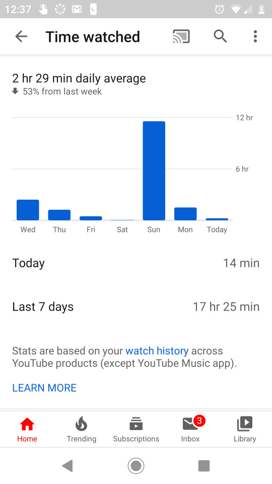
As I’ve mentioned and shown, YouTube can eat entire days away from my life. And I am far from the only person who faces this technological addiction. The UI and UX work together extremely well. Rarely am I ever frustrated as a viewer of videos. Everything works well and in a way that keeps me watching more and more videos.
How might you make it even better?

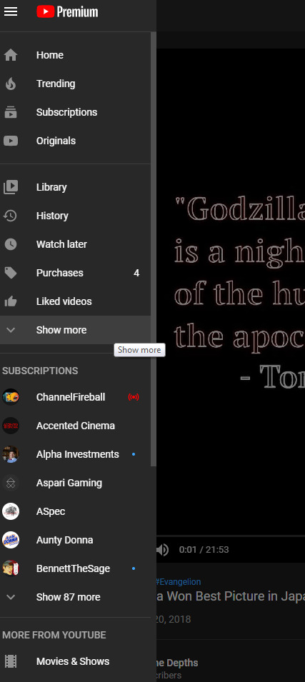
YouTube’s sidebar does leave a lot to be desired. The hamburger bar brings down a long list that needs to be scrolled down to see everything. Inside this drop down menu is the option to expand it even further. It’s a nice attempt to keep the bar a bit more manageable but it seems like things could be a bit more condensed. It shows subscriptions twice on the bar. Additionally, many of these buttons I never use. 99% of the time I open this drop down menu it is to use the history button so I can finish a video I didn’t quite finish. The drop down menu is a lot of information thrown at the user all at once. A more condensed version could feel a lot more functional. I often feel overwhelmed when I look at the bar and I want to interact with it as little as possible.
Conclusion
YouTube is a wonderful and dystopian use of UI and UX. It works extremely well and its algorithm does a masterful job of making sure you continue to use it. I’ve had it going the entire time I have been writing this post and I will likely watch it as I fall asleep tonight.
1 note
·
View note