stinginthetalehalimekaraca
Sting In The Tale HalimeKaraca
45 posts
Don't wanna be here? Send us removal request.
Last Seen Blogs
shinigamer-136649
Average Kuroshitsuji fan
popcornstudies
popcornstudies
eatspraypaint
Balanced Nerfing
squarecomix
square comix
cloud9doll
。 ・゜♡ ゜・。. ⌒♡ ☆ 。 ・゜♡ ゜・。.

Text
PROMOTION POSTER
I was inspired by the promotion posters I have seen for some children’s books. I love how each one is customised to fit in with the theme of its book.
I decided to create my own. It worked perfectly since I had the 3D book mock-up I did and when I put it in it looked as if the book was real .

0 notes
Text
Final Outcome- The Booklet


tumblr_video
Personally, I am a lot happier with how the digital mock-up turned out rather than this one. I was very pressed on time and the school printers had some issues so the desired outcome is not quite there.
While I didn't get the desired outcome, I am very happy with all the research , analysing I did and how I was able to create a new artstyle that I am quite proud of.
0 notes
Text
Printed Book Trials
I did a lot of trial and error before trying to print out my final booklet. I did a mock-up by quickly printing everything out in book format just to make sure that everything lined up. I did print them out twice to see how the size I chose would look like. Even though I printed them on A3 paper, the book itself still came out about half the size of that, which I didn’t mind since children’s books usually come in all shapes and sizes anyway.

After that, I cut all the extra paper out to the size of the pages. This was pretty difficult since some of the pages I did had a full background (like the character sheets) while others didn’t, so cutting everything to the same size took a bit of time.
As I have mentioned in another one of my slides, I decided to add the character sheets and some concept art as well. Not only did this add weight to the book, but it also made it have the Art Book effect I wanted it to.
I had to do a lot of fiddling with the size and placement of the pages since they kept coming out in different places on the page which made them very difficult to cut. I tried my best to have the pages be as close in size to each other as possible.
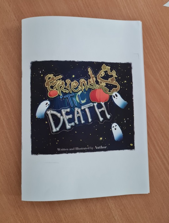
After I was pleased enough with the trials, I printed my actual book. I printed it on a thicker paper which really helped make the book look more authentic.
The placement of some of the illustrations was still a bit off but I was really pressed on time and so I tried my best to cut them all to similar enough sizes even though that meant the bottom of some of the illustrations would be a cut off by a bit.

After I stapled the book together, I tried to use an exacto knife and a ruler but the paper was too thick and there were too many pages for me to have a clean cut without going over it a few times, which could have destroyed the pages.
Instead, I decided to use a paper guillotine which made the process much faster and easier.
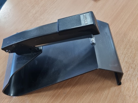
To print the book, I used this special booklet stapler. Since the pages were not as bendy as the ones I used for the first mockup, I struggled a bit to put all the pages in the right place.
0 notes
Text
Illustration Timelapse
I wasn't able to upload 2 videos in the same blog post so I am putting this one here.
0 notes
Text
InDesign
Adobe In Design is a desktop publishing and page layout designing software application produced by Adobe Inc. and first released in 1999. It can be used to create works such as posters, flyers, brochures, magazines, newspapers, presentations, books and e-books.
This is the program that I am using to put my book together. While I understands how good and widely used this program is for creating all kinds of documents, books, posters and layouts, I still found it very hard to use and at times even a bit frustrating.

I started by choosing the dimensions for my book. This was a bit tricky since some of my illustrations were different sizes than the others so I wasn't exactly sure what to do.
In the end, I decided to go with the size that I had for my covers and resize some of my illustrations to better fit in the canvas.

After that, I created the pages on which my covers, illustrations and any other bits I decided to add would be. I actually really appreciated how easy it was to create and change around the pages was. The covers had to be the first and last pages, the pages had the pattern of 1-2, 3-4 and so on . They worked a lot like layers, as in when I needed to add a page or change its position, I simply had to hold and drag or just click the page.


To add in the pictures, I had to got to FILE -> Place and then select my photo. The images would automatically go on the page I have selected but changing the size and the position of the image was a very big problematic as well.
This is where my biggest issues with this program began. I couldn't move them around as freely as I wanted and I felt like it was unnecessarily hard to have the drawing fit the size of the canvas.

I also found it a bit annoying that there wasn't any way for me to manually select a specific parts of a PNG image and change it's position. I understand that this program is not essentially made for editing images but rather for layout , but I still feel like this would make a lot of people's jobs a lot easier, since I had to make all the changes on my tablet and only after that upload the newly edited image on my memory stick than upload it onto InDesign again, which is a lot of extra work.
In the end, I manage to put all my pictures in. I wouldn't particularly want to use this program again simply because I feel like this type of layout editing isn't something I am good at but I am happy I had a chance to test the program and get a bit familiarised with the very basics of it.

0 notes
Text
Merchandise
To be honest, I was shocked to see how little merch there is for most children's books. There are the occasional t-shirts and stickers but compared to studios like Marvel and most big video games (sonic, Mario, Pokemon, etc) , there really isn't a lot.
It is interesting how children TV shows like Peppa Pig have been popular for so long. The brand has merchandise from t shirts and mugs to toys and slippers, despite having a younger audience.
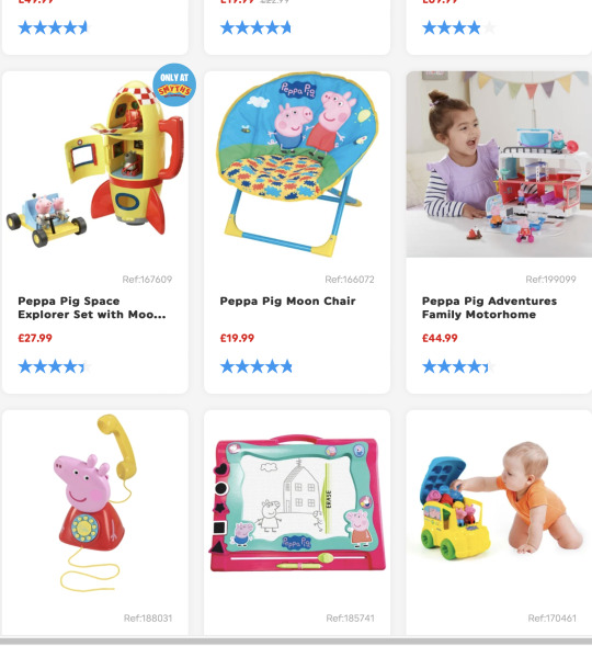

I feel like the show itself would work very well as a book series for kids but if this were the case, I am very sure it wouldnve been as popular as it is now.
I think this says a lot about how even children in today's world are more attached to electronics and would rather watch something on the TV or an iPad instead of reading a book with their parents.
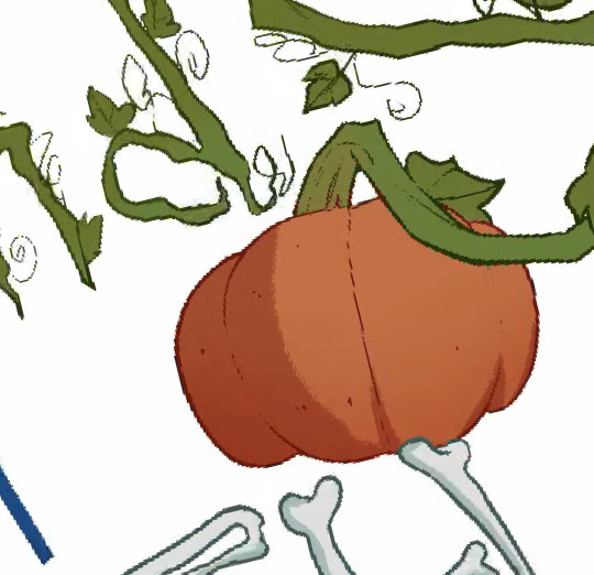
I made some quick sketches with some perch I personally think would work for my book.
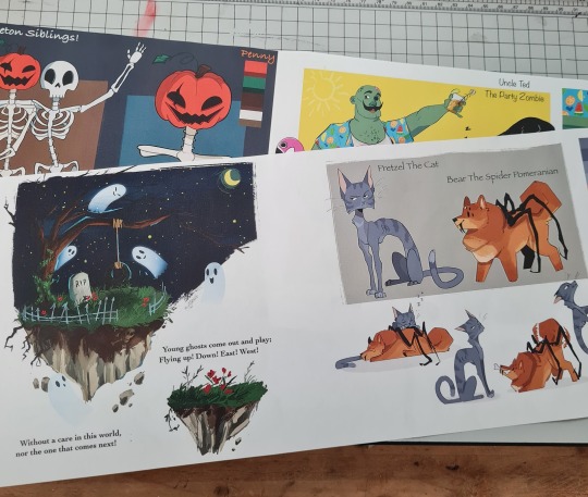
-I think the skeletons have the easiest designs so having them in plushie form wouldn't be as hard as having the zombie or the ghost.
-Stickers and pins are easy to make and children love them
-I feel like t-shirts are a bit of a stretch but at the same time I thought it would look cool to have a few prints.

0 notes
Text
Book Mockup
I have made these mockups for my book to make sure everything looks right for when I print my actual book.
To make these, I simply dowloaded some free book templates and put in my own images.
Here is when I realised that I didn't have a spine for my book, so I quickly combined the ghosts that I have already done for the front cover and the ''Written and Illustrated by AUTHOR'' bit and put them together as a spine with the blue background colour from the sky.
It is rather simple but I think it does the job.


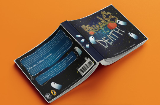
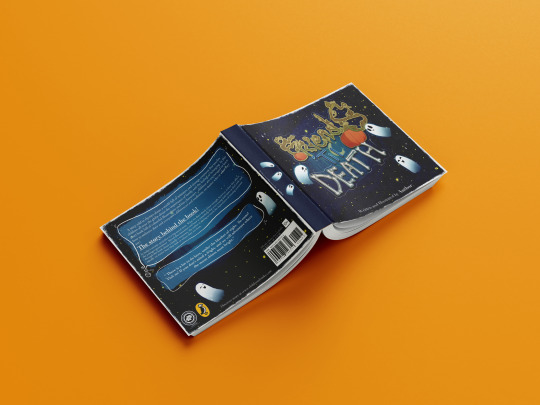
I am so happy with how this looks. I had my doubts when it came to how official the covers would look but I really think this turned out amazing, especially the back cover.
0 notes
Text
Process- The Title
I started with creating a quick, simple font just to have a better idea of which direction I wanted to go in.
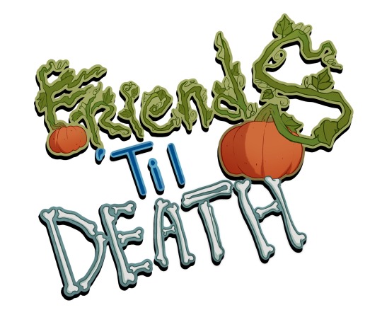
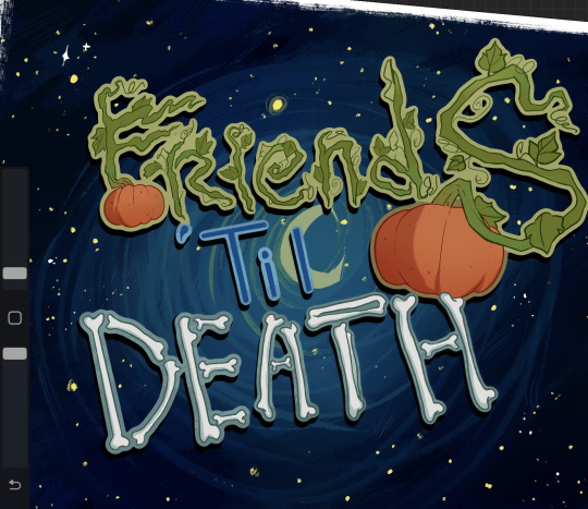
After that, I made my first sketch of the title. I decided to go with ''Friends 'til Death'' because I thought it was a nice mix between cute and just bit morbid.
I thought it would be a good idea to have the S in friends be made out of pumpkin vines and then the word Death to be spelled out of bones. Since my two main characters are two skeletons (of which one has a pumpkin head) I felt like it made sense to link the title to their designs in some way.
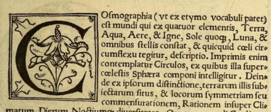
I also got this idea from old fairy-tale books where the first letter at the beginning of the first sentence would always be bigger than the other letters and have a lot of intricate details.
When printing first began in the 15th century, early typographers wanted to imitate the manuscripts of the day. They adapted this practice of using a large initial capital letter at the beginning of a chapter as a way of making their books acceptable to a public accustomed to buying illuminated manuscripts.

I decided to consult my teacher and some of my classmates regarding the readability of the title, and they thought that the S being the only letter made out of vines looked a bit out of place. They suggested that instead of having only one letter be made out of vines, I should have the whole world be made in the same style.
I decided to do that and in the end, I am glad I made that change because it did improve the title a lot, making it more balanced and coherent.

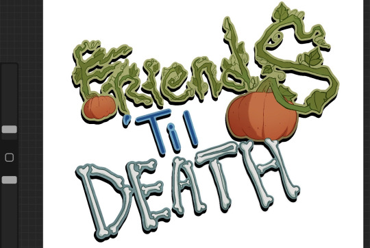
The process from here is pretty much the same as the one for the character sheets. After I decided on the design, I started the line art.
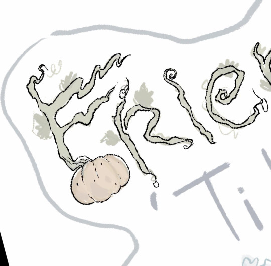
Then, I added in the colours and the shading. I really liked having the title be made out of different components of different colours, it made the whole thing look a lot more interesting.
As I was looking at the title as a whole, I decided that something isn't right. I felt like the shapes were to thin and there was too much of the linework at risk of getting lost due to the dark background I wanted for the cover.
So, I decided to make a border around the whole title with the lighter version of the colours on each bit respectively. Kind of like a sticker.
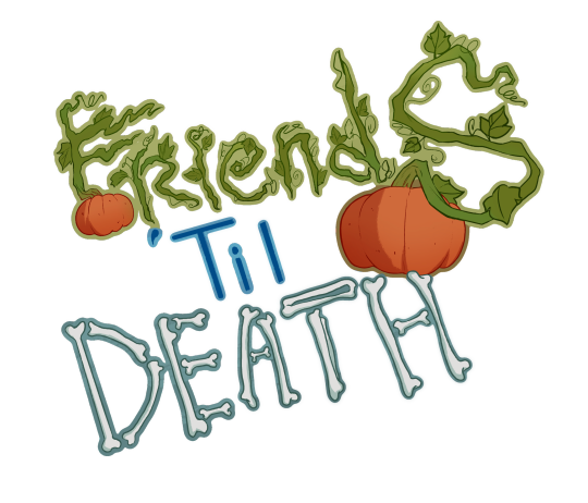
This definitely improved the situation but I thought I could accentuate the title even more by adding a shadow behind it. I duplicated the layer, painted it black and then put it behind the title, at a slightly lower angle.

This really helped made the title more dynamic and fun. While I think I could've made the title a bit more squishy and cartoony, I still think this is passable enough as a children's book title.
0 notes
Text
Titles and Fonts
FONTS
Just like the style in which an illustration's book is made, the font in which the title is made is very important and can carry a lot of emotion and set the reader for a specific atmosphere.
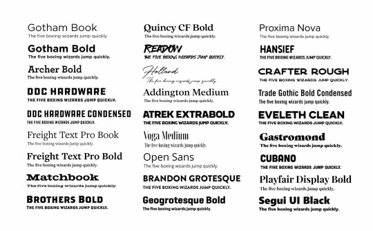
The font from The Gruffalo is very sketchy and the shape in inconsistent which makes it very fun and energetic and even works for the design of the main character as well.

Vey neat fonts that have perfect alignment and shapes could work too and I have seen them be used in children's books before, especially for the actual narration/story inside rather than the title. It is easy to read and looks professional.

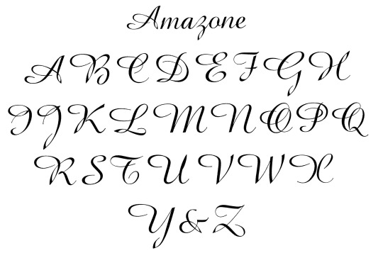
I, personally, am not a big fan of cursive fonts. I feel like they are hard to read, look overly detailed and take too much attention away from other elements. I understand the charm that these types of fonts have but at the same time I feel like they can be very easy to mess up.
I found this font while looking through some online and I really like the alien aesthetic that it has. The way it used lines and shapes to create each letter while still holding the appearance of strange symbols if looked upon from a distance is very impressive.
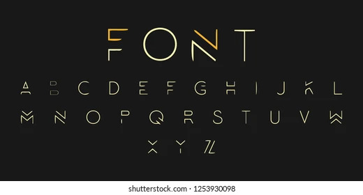
Fonts nowadays don't even need to be formed of actual letters. The can simply be symbols and characters. Egyptian hieroglyphs were mostly formed of part symbols that resemble today's alphabets and part characters such as eyes, birds, human silhouettes etc.

Abstract and eccentric fonts that have very bright colours and backgrounds usually attract people into paying a lot more attention to them .


I really want my title to be bold and dynamic and fit in with the theme of the book, so I thought about having it as the centrepiece of the cover, which allows me to have more details.
TITLES
I noticed that children's books don't usually have very abstract titles with deeper meanings or hidden messages. That is most likely because, since they are targeted to younger children, having a title that is hard for a child to understand or to remember could make the whole book less memorable.
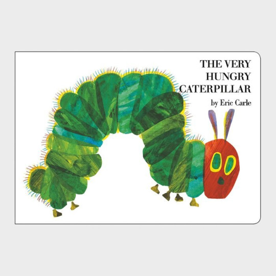
The Very Hungry Caterpillar is a great example of a literal title. The is nothing more to the title. The story is cantered around a caterpillar that is very hungry, so the title simply states that.
Titles don't have to only describe something or someone, it can also be a quote from the book or a verse that has a lot of meaning to the story.
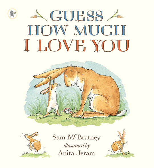
Guess How much I love you is a beautifully illustrated story about a Hare and his little leveret and how much they love each other.
0 notes
Text
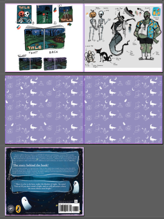
Illustrations
These are all the finished illustrations that I have added in my book.
This was by far my favourite bit of the project. Drawing in this cartoonish yet colourful and detailed style was very enjoyable and really opened my eyes to new job possibilities since I enjoyed so much.
My only regret here was how I forgot to screenshot most of my process. This is something I keep forgetting to do in most of my projects but, fortunately, I at least have the time lapses for most of the illustrations.


0 notes
Text
Book Covers (Front & Back)
The finished front and back covers.


I am very pleased with how they turned out. Compared to my last project in which I had to make a video game case, I think this ones turned out a lot better and more official looking, especially the back cover.
0 notes
Text
Process-Illustrations and Inside of Book
This is some of the process, for making my illustrations and the other bits that I decided to add in the book.
Unfortunately, I forgot to take that many pictures of the process. I know how important it is to back up your process with screenshots but the limited time for the project really made me subconsciously work on all the illustrations without thinking about anything else.
However, I decided to add the timelapse for two of my illustrations. The process for all of them is quite similar anyways so I don't really see this as too big of a problem.
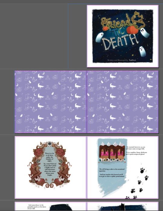
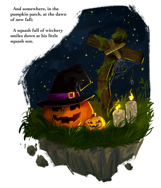
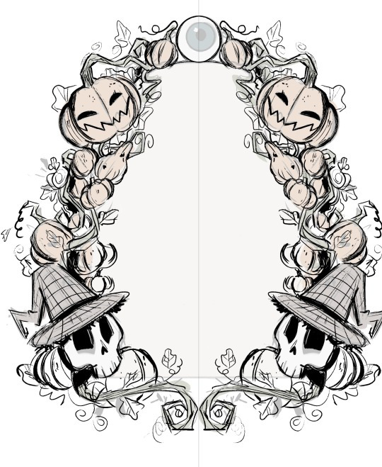
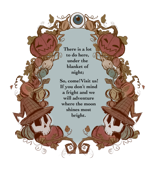
First Page
I wanted something special for the first page. In the show Over The Garden Wall, they sometimes put up images or text in these beautifully ornamented frames. They are usually made of the faces/ silhouettes of a character, a very important object for the story, or just intricate patterns and shapes.

I decided to create my own illustration in this style that would serve as the first page in my book.
Since I wanted to capture that old, folklore-inspired, fairy tale book style, I decided to refine the sketch and use it as line art. I mostly made the frame out of pumpkins, vines and leaves, with only two of my characters in it since I think they fit the best with the aesthetic I was going with. This was very easy and fun to make. I used the symmetry and mirror tools to speed up the process.
For the colours, I wanted something very soft and earthy that would suggest autumn. I mainly used browns, oranges and dark greens with just a few of blue-ish tones here and there.
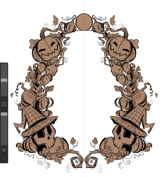
I wanted to make the illustration look like it was made with watercolours so I used a big air brush to fill in all the colours and shading. This made the whole thing look a lot softer, hand-made and as if the colours were mixing together.
I used a desaturated shade of blue for the centre and then put in the first verse of my story.
I absolutely love how it turned out. The only thing I would've added was some more watercolour texture here and there, to further emphasis the traditional aesthetic of it but in the end, I think it looks passable enough for what It is trying to look like.
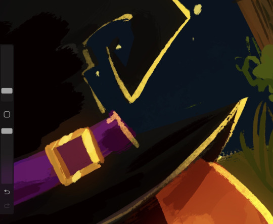
Illustrations
I decided to make 3 of my illustrations on the same canvas which means I have all the process in the same video. Working on these was an absolute pleasure and I am very grateful for the techniques and useful things I have learned while painting (digitally) in this style.
As I have mentioned before, I wanted to go with a very sketchy, paint-y look for the illustrations. This gave me a lot of freedom and actually made me more confident in my ability of creating interesting shapes and brush strokes.
Up-close, you can really see how rough and unpolished everything is, and I thing this only adds to the charm, originality and character that children's books usually have.

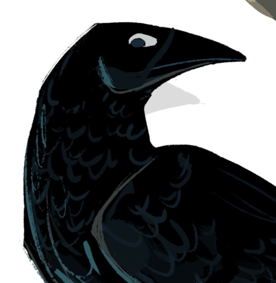
After I finished the 3 illustrations I had that were on the same canvas. I moved each one on it's on page, where I added any finishing details.
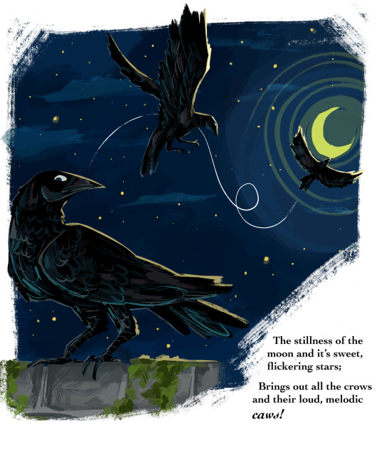
For example, I decided to add a nights sky behind the crow and a stone wall covered in ivy to sit on. I also tried to make some kind of animation/sequence by having the crow drawn three times while it took on flying . I added a white line of action to further emphasis the movement .
Since the crow and the background are both very dark, I decided to add some rim light along the edges of all the crow drawing with a muted shade of yellow, to make it look as if the moon was reflecting on its feathers.
This really separated the background from the crow and really added a lot of dimension.

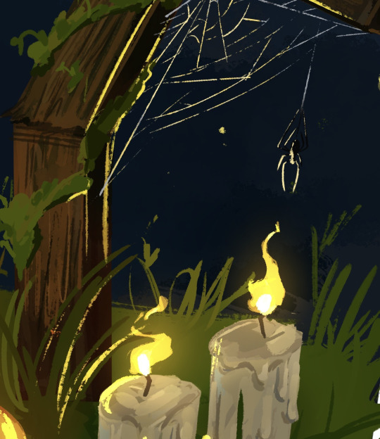
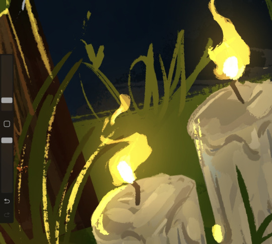
I did something similar for one of the others illustrations as well. Since I had the lit candles in , I had to make them glow and reflect on all the objects around it.
I started by creating a new layer, on which I added a very dark shade of blue-ish purple over the whole drawing. I put the layer on the blending mode ''HARD LIGHT'' which made everything darker and in harmony with the sky.

After that, I added some highlights all over the place with a bright yellow. This is also where I made the flames of the candles. For this, I used the blending mode ''ADD'' which made everything bright . I also erased the edges of the highlights with a textured brush to make them blend better with the objects they were hitting.

After that, I made another layer with the blending mode add and added a very subtle glowing effect with an air brush on all the highlights and the candle flames.
I loved working on the flames. Thinking about how the wind would hit the flames making them move was so fun and it added a nice touch of realism to the piece.
This illustration was made separately from the others. I decided to draw a cake and some dog paw prints in tune with the verse that it was representing.
I took a slightly different approach for drawing the cake. I made the ''sketch'' out of squares and rectangles using the ''rectangle tool''. I decided to go with a very generic design for the cake, I didn't want to spend too much time on the initial sketch.
After that, I started carving into the shapes, adding shading and dimension. This is where I decided to replace the pink icing with chocolate just to have more variation in colour. The wiped cream on top was a bit hard to do since the shapes was not something I have done much of before, but I think I managed to figure it out.

I added a lot of highlights on the icing to make it look shiny.

As a last, slightly gory detail, I decided to add eyes around the bottom of the cake. They were very easy and quick to do and they really accentuated the Halloween theme in the page.

This is a comparison between the ''sketch'' and the finished drawing.

As always, there is a lot of texture everywhere. This technique of adding random lines and strokes everywhere really became a signature element in my style that I have used for my other project was well. It is something I have learnt from movies like Spider-Man Into The Spider Verse and digital artists like Sam Does Art.

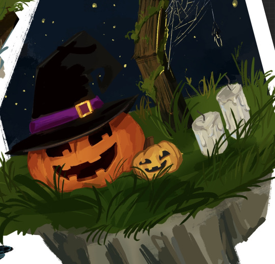
Bonus Illustration
I made also made this final illustration as a son of conclusion for my story, with the skeleton siblings having a fun time with the ghosts in the cemetery.
I was really inspired by the show Cuphead to make this illustration. In the show, all the background are made separately from the characters in a soft, hand drawn style, while the characters and the objects they interact with are made to look a lot more crisp and clean.

This is a technique that Disney used for very old animated movies like Snow White and Cinderella, where the background would be done on plastic sheets and the characters would be added on top of them.

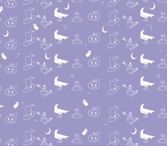
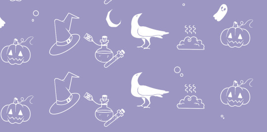
Pattern End/Start Pages
While studying the components of a children's book, I have noticed that all of them would have the first and last 2 pages be made completely out of patterns of drawings or shapes on a simple coloured background.

The functional purpose of these pages is to hold the book's interior to its cover and protect the insides of the book. However, this doesn't mean that they have to be blank, The can have little drawings, repetitive shapes, patterns and other visually interesting elements.
I decided to create my own end pages. This only took around 20 minutes to make. I decided to go with this beautiful violet for the background. I thought this colour worked nicely with the blues of the front and back covers.
Then, I started sketching the little drawing pattern. decided to stick to the Halloween-y theme and have a crow, a witches hat, zombie brains, a few potion bottles and a pumpkin.
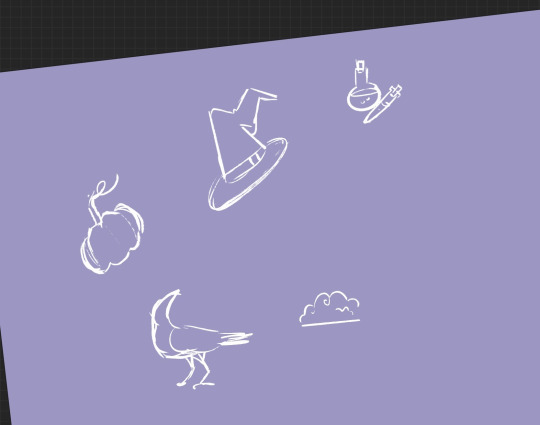
After that, I made the outline for all the objects. I decided against adding any other colours. After that, I simply duplicated the 4 objects and filled the whole page in. I duplicated the whole thing 3 more times after that.
0 notes
Text
Age Guidelines for Books and Young Readers.
Apparently, there is a huge issue in UK regarding the age limit and what specific books can a child borrow from most libraries.
It is forbidden for a child to borrow any book that is not specifically a children's book. I find it quite problematic that this issue spreads over children from 11 to 18 years old, depending on the libraries.
Since any book aside from the ones expressively made for children is considered an adult book (music books, history books, art books, etc) this really limits the range of stuff a child can read.
These kind of restrictions not only discourage children from getting out of their comfort zones and exploring different topics and finding out new things about the world, but it could also mean that a child could be denied a very important book that would help them study for a test or even their GCSEs, which can be a huge problem.
This library in particular is strange to me. No one under 11 is allowed in the Reading Rooms , and anyone under 18 needs a special pass.
There is also no law that specifically states that a child can't read an adult book nor that an adult can't read a children's book.
0 notes
Text
Book Publishing Companies
A Book publishing company is a business that creates and distributes work written by other authors by publishing them into books. This means anything from children's books to cookbooks and magazines.
Top Biggest Publishing Companies


Children's Books Publishing Companies
Puffin Books
Puffin Books is a longstanding children's imprint of the British publishers Penguin Books. Since the 1960s, it has been among the largest publishers of children's books in the UK and much of the English-speaking world
Peachtree
Peachtree Publishing Company Inc. is a trade book publisher based in Atlanta, Georgia, specializing in children’s books, including board books, picture books, and middle grade and young adult fiction and nonfiction. We create books that educate, entertain, encourage, and endure.The company, begun in 1977 by music publisher Helen Elliott, originally emphasized works exclusively by Southern writers, particularly in the areas of adult fiction and humor.

Holiday House
Holiday House, Inc., is a publishing house founded in 1935 in New York City, specializing in children's literature. It is a member of the Children's Book Council.

The Three Different Publishing Models
Traditional Publishing
When an established company such as Penguin finds or commissions a book they think they can make profit out of. The negotiate with the author and if a contract is agreed upon, then the book in question gets published. The publishing company is entirely responsible for paying the costs and managing the publication of the book.
This is a good alternative if the author agrees to give over the decision-making to the publishing company (design, advertising, etc) and to share all of the profits.
Self-publishing
This is when the author take on the role of the publisher, usually with the assistance of a payed editor or a self-publishing company. Self-publishing means the financial and decision-making responsibility falls completely onto the authors shoulders.
The advantages of choosing this route is that you have the liberty to make all decisions for your book, and with the help of a skilled self-publishing professional and an editor/designer, this can mean that you get the best of both worlds.
The biggest hurdle, however, is that all costs and expenses have to be payed by the author which can be risky at times depending on how well the book sells.
Partnership publishing
Partnership publishing is mostly a hybrid model. It is somewhere between traditional publishing and self-publishing and it can be risky at times.
The partnership is formed by the publisher signing up the author to what seems a normal traditional publishing contract , but the difference is that it is also asking the author to contribute to the costs of the book or to commit to buying a large number of books from the publisher.
With traditional publishing, the author contributes the time and and energy to write the book, the publisher contributes with money and skill to publish and distribute the book, and the profits and looses are equally shared between both.
A dodgy partnership publishing deal hands most of the risk to the author but most, if not all, gets received by the publisher. It is always good to read the contract carefully and do as much research about this particular model as possible.
Benefits of Becoming a Published Author.
Instant authority and credibility
Quality fan base
Speaking engagement opportunities
PR and Media coverage
Increased clientele
Brand enhancement
Publishing Costs
It usually costs between $500 and $5,000 to publish a book in the US. In the UK the cost is usually between £500 and 1,200. A lot of the cost comes from hiring an editor , a book designer and the marketing services.
''New York Times Best Seller''
The New York Times Best Seller list is widely considered the preeminent list of best-selling books in the United States. Since October 12, 1931, The New York Times Book Review has published the list weekly

To achieve bestseller status on the Times not only do you have to sell at least 5,000 – 10,000 copies in one week, but these sales have to be diverse sales. That is, you cannot sell 10,000 books to a pre-existing list of followers through a personal website or thousands from only one marketplace like Barnes and Noble.
0 notes
Text
Process- Front & Back Covers
My initial idea was to have a very long illustration that would run over both front and back covers. However, I decided to go with something a bit simpler and more organised due to time and the fact that I felt like another massive illustration would take the attention from the ones inside the book.
Front Cover
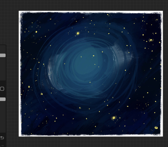
I started with my night's sky. I did not use any kind of line art for this process because I really wanted to give the covers a hand made effect, as if they were made with coloured pencils or Crayola.
The white border and the messy textures everywhere is something I have done for most of my illustrations and so I have added it to the covers as well. I think it works perfectly with the style I was trying to emulate.


I have seen this kind of textures used in most children's books and I think it looks amazing and very nostalgic.


After I was done with the background, I put in my Title. I made it big enough to make sure that it would be readable. Putting in the black shadow behind really helped the title stand out, especially near the centre where all the lighter colours are.
As I was looking at the title and the background together, I noticed how the colours of the title seemed a bit off. I thought they looked a bit washed up and since the background is already formed of very cool colours, having so much green and blue sort of created a visual ''cacophony''.
So, I decided to duplicate the title and use the gradient maps option to play around with the different gradients and tones. I managed to find something I liked which made the green on the pumpkin vines look a lot warmer . I think this balanced out the cool warm ratio of colours nicely

Working on different layers was extremely important, especially at this stage .
Making adjustments, no matter how noticeable, is a lot easier when I can work on each layer separately. This is one of the many reasons why I chose to peruse digital art as my main way of making art.

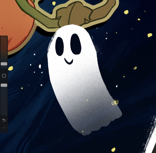
After I was done with the title, I still felt like the cover was a bit empty and lifeless, so I quickly added in two little ghosts.
I have used the same method of making these cartoonish ghosts over the course of this entire project.
I simply made the shape, added in the face, then with a textured brushed, I slightly erased the bottom bit to make them look more transparent. For some more effect, I also added some blue-ish glow with the blending mode ''ADD''

Something that should never be omitted when designing a cover, is writing in the credits. Since I didn't feel like using any names and I was the only one working on this project, I decided to simply write '' Written and Illustrated by AUTHOR''

Back Cover
Funny enough, the back cover, which is usually a lot simpler and not as complicated looking in most children books, was the one that took me the longest to make.
I managed to fin a shortcut in the process by deciding to use the night background that I have used on the front cover, which saved a lot of time since I was really unsure on weather to have something entirely different or make it link with the front cover somehow.
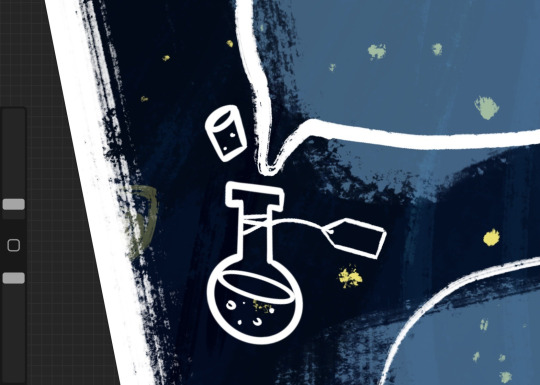
The only difference, is that I didn't add the moon in the centre. I thought this would make the cover look too crowded since I wanted to put two, slightly see-through, boxes with writing on.
After that, I added in the boxes/speech bubbles that would hold in the information and ''synopsis'' of the book. I also added a very wobbly and unperfect border around the boxes for some more detail.
Then, I got the idea of making a potion bottle on the side that was supposed to look as if the ''speech bubbles'' came out of it. I really like this little detail and I think it is very on brand with the whole aesthetic of the book.
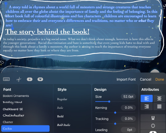
For the actual writing, I chose to go with the font ''cochin'' which I thought looked very similar with the fonts I saw being used for a lot of children's books.
I decided to have the ''synopsis'' on top, and then, some information regarding the reasoning behind the book and why it was created, as if the writer had an interview and that specific bit was added on the back of the book.
for the bottom box, I simply wrote in the first verse of my story. I have seen this on books such as The Stick Man and pretty much any books by Axel Scheffler.
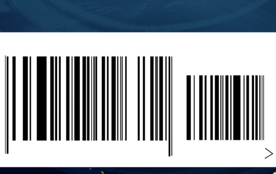
After that, I started making all the little details, such as the bar code. I have done this for projects in the past and it is always a very satisfying process, since they are very easy to do and hard to mess up.
I simply used the rectangle tool to make thin , black stripes on a bigger, white rectangle. After that, I simply added a few random numbers.

The process of making small, technical details like these ones is always so simple and straight-forward thanks to Procreate. I have all the tools I need at my disposal without overcomplicated commands or anything like that.

I thought it would add to the credibility of the covers if I added the actual price as well so I did, I tried to keep them credible so I looked at how expensive most children's books are and made a US and UK version.
I also added a fake ''E-Book'' version as well as a way of filling in space and adding variation.
I also added the age rating. At first, I wanted it to be for older audiences (12+) but then, I realised that the book itself and the way I constructed it seemed to be for children a bit more on the younger side.

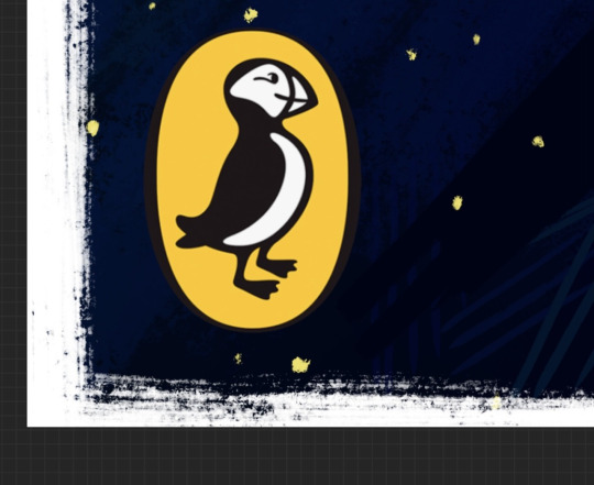
After I was done with this section, I moved onto logos and sites. Before informing myself on how the publishing house Penguin worked, I wanted to add it onto my book without realising that they don't usually publish children's books (I have seen a few graphic novels but those were targeted for older audiences).

I decided to make some research on publishing companies, and so I found out about companies such as Puffin, PeachTree, Holidayhouse etc. I decided to go with Puffin because I thought the logo would be the quickest to be recognised.
While analysing one of the covers for The diary of a Wimpy Kid, I noticed that they were associated with a ''Carbon Capture'' Company.
I thought that would be a very nice thing to have in my cover as well since this is a huge issue at the moment and spreading awareness about carbon emissions and global warming through a children's books seemed like a very good idea.


I also did the same thing as on the front cover, by adding a few ghosts here and there.

Overall, I am beyond proud with how these turned out. I think they turned out looking genuinely like something you would find on the shelf of a library.
0 notes