
Don't wanna be here? Send us removal request.
Statistics
We looked inside some of the posts by sublimegrimesworld and here's what we found interesting.
Average Info
Notes Per Post
0
Likes Per Post
0
Reblog Per Post
0
Reply Per Post
0
Time Between Posts
1 day
Number of Posts By Type
Text
17
Last Seen Tumblr Blogs


Fun Fact
The most popular pages on Tumblr are about Minecraft, GIFs, and David J. Peterson.
Text
Rationale final
My chosen place is Bastion Point/ Savage memorial. The message behind the poster stems from the car enthusiast community that congregates at Bastion point every Sunday. They engage in reckless driving, racing, etc. to show this I took inspiration from the skid marks the tires leave on the road in circular patterns. I wanted the overall vibe of the poster and motion to mimic the cars skidding. I did this by having repetitive spinning type with multiple layers. I used two typefaces in my design. The first being Arbotek light. I chose this because of the blueprint/design feel of it which relates well to the “design” left by the cars. The second font I chose was avenir next, becuase it is very clear and readable.the fonts pair well. They contrasts well with the skid illustration and colour choice. The language I chose clearly represents the community and poster.
0 notes


Text
poster with motion. need to change the poster slightly and the motion to be more consistent.
0 notes
Text


With this feedback I am going to change the weight and colour of my text to make it more clearer and eye-catching. Im going to change my motion on the "send the mayhem" sentence to match more with the spinning motion. David also showed me a couple after effects techniques to be able to do this.
0 notes
Text
Car meet words or lingo
Skids
Invasion
Burnout
Send it
Boy racers
Mayhem
Pop it
0 notes
Text
2.6
This poster features a singular blood drop falling and splatting. I chose this moving poster because of the simple yet satisfying motion that has been incorporated into it. I like how clear and connected the added movement is to the purpose of the poster. Simple steps such as changing the size, position and rotation have been used. I would use this kind of poster and motion as inspiration for my work moving forward as I like the composition and very smooth feel to it. I am definitely more interested in posters that have a small movement rather then something over whelming.
0 notes
Text
Final poster change
For the final version of my poster after the feedback I got from Caroline I have decided I’m going to change the proportions of the tire lines and make use of the empty space. I am changing the colour from black to a deep purple and looking at other typefaces I could use because of the “s” on the prior typeface. Im also going to change the words and terms I have used to relate more to the cars. I’m also going to add more text. After I’ve created this poster I am going to animate it. My animation plan is to have the words spinning around to imitate the cars.
0 notes
Text
Formative rationale
Rationale –
My chosen place is Bastion Point – Savage Memorial. The message behind the poster stems from the car enthusiast community that congregates at Bastion point every Sunday. To show this I created a road like pattern made of the letter S. The centre S is double layered to further accentuate the importance of the letter which stands for Sunday. I chose Shree Devanagari 714 as my typeface and a small size because it reminds me of text messages. This is fitting because there’s usually a lot of online communication between locals about the meetups. The words I chose are common phrases said in the community.
0 notes

Text

I needed to incorporate something that more clearly connected to cars, so I found imagery from the bastion point road where the tire marks cover over. I added text relating to the car meet us as well. just need to think about the text placement etc
0 notes


Text
this was my first real trial of after effects, I like the idea but it doesn't really give across the idea I wanted it to. im exploring different poster ideas and motion next.
0 notes
Text
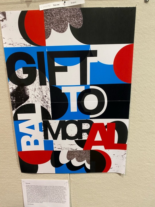
Peer posters
1. I like this poster because of the great use of shape and grid. These elements were inspired by a basketball court that is at the sight of connection. There’s a very clear message through this. The text is nicely incorporated and matches the shapes. The colours represent the vibrant busy feeling of the park which I think relates well and stands out.
2. I like this poster because of the layering used. I like how the clear focus point is the middle and how the red and white contrast the dark background. I think the texture used it also appealing
3. This poster is very modern and geometric. The meaning behind the poster being the train station is very clear thought the use of lines and direction. The colours are eye catching and the text is incorporated into the poster extremely well.


0 notes
Text

This is a poster experiment I had. I tried to take the feedback I got and use it for this idea. the idea was to make a clearer connection to car meets etc. I did this by added dark charcoal colour and by having just one 'road' that gets smaller from right to left. I like the concept but honestly this poster isn't my favourite. the colours are definitely nice and relate but I need to explore more options. I have added motion to this just to experiment with as well.
0 notes