Text
website update log #24 (April 13th, 2025)
I FINISHED RECREATING THE WEBSITE !!!

the look is more or less the same, with subtle differences and the removal of the image carousel (for now) BUT EVERYTHING IN THE HTML AND CSS FILE HAS BEEN CHANGED!!
i made a system for me to edit and add panels really easily, where i used classes for the panel design and reusable elements (ie “long-box” for really long elements like the github chart, and “three-boxes” for three panels in one row), and IDS for specific non-reusable elements like the navbar and the comment section.
now that editing the website became more flexible (compared to the previous version atleast), i FINALLY CREATED A GOOD LOOKING MOBILE VERSION OF MY WEBSITE WITH BOTTOM NAVBARS AND STUFF

i had a hard time making the previous version compatible to mobile, so it just doesnt look that great…

and besides the one before this, which looks really decent and actually mobile optimized,

it just gets worse and worse…


when i created these websites i never had “making it look great for mobile” in my mind at ALL..but when i found out how important it is for people to have a good-ish mobile experience, i gave it a try lol
ANYWAY!! NOW THAT THATS OUT OF THE WAY, LET ME SHOW YOU THE CHANGES IVE MADE TO THIS SITE YAYY!!!
- replaced the twitter feed panel to an “88x31 buttons ive made” panel

i made a whytee.xyz 88x31 button A YEAR AND A HALF AFTER I REDESIGNED MY WEBSITE

moved the under construction disclaimer from an overlay to its own panel

modified the "made by sushiwt" box by adding "built with firefox/chrome and vscode" and a "- 2025" beside the year

and i FINALLY made the artwork section for my website..
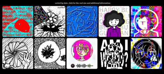
now all that's left is the section about myself, and this website is BASICALLY FINISHED!!!!
developing this website was so fun, and until i get the urge to remake it again, it will look like this for a while…
thank you for reading these logs btw :> i really really really appreciate you coming along for the ride (and by “the ride” i mean the creation of this)
- sushiwt <3
10 notes
·
View notes
Text
website update log #23 (April 9th, 2025)

spent some time recreating the entire layout, as the current html document is WAYYYY too difficult to manage...
i've eliminated as much html nests and useless css as possible..
uuuhhhTHATS ABOUT IT!! THE PICTURE ABOVE IS WHAT THE LAYOUT LOOKS LIKE SO FAR, AND OBVIOUSLY IT IS not finished as it looks a bit too ugly...
thanks for reading! - sushiwt <3
0 notes
Text
website update log #22 (April 9th, 2025)

im happy with how my website looks :)
this redesign is now a year old and i never changed a single thing about its design
- sushiwt <3
0 notes
Text
website update log #21 (May 11th, 2024)
havent posted my website updates in a while, and i changed a LOT of stuff between December 18th, 2023, the previous update log, and May 11th, 2024, today, so lets list off of the changes i have made now (in no particular order)!
set Ubuntu as the website font instead of Tahoma


added a banner for my online persona


added a visit /legacy button


turned misc (the globe button in the navbar) into a terminal, where you can access files and folders within /misc/, such as amethystlogo.html, 88x31.html, ramo.html, etc.


gave /legacy a star background


added the first version on my website (sushiwhytee.neocities.org) in /legacy!


added panels at the bottom of the welcome screen! panels include a contribution graph, my twitter page, games im working for, and the first 88x31 buttons from /misc/88x31.html


added dark mode (you can toggle it using the interactive switch on the top right corner)


added a text editor in misc


and those are all the changes! sorry i didn't get into detail for the changes since i kinda dont wannaaaaaaa
but here they are! you can visit my website at https://whytee.xyz. (now that i think about it i dont think i mentioned the fact that i bought a domain 8 months ago lol, by the name of whytee.xyz)
thank you for reading!
- sushiwt <3
2 notes
·
View notes
Text
I had to take a piss test for a job I got hired at today, and this is the name of the fuckin company that makes the tests

109K notes
·
View notes
Text
website update log #20 (December 18th, 2023)
sorry for the 6 day hiatus on this blog, I REALLY wanted to post one 5 days ago, but I decided that i wanted to wait.
5 days later, here i am! the 6 day hiatus did NOT mean i didnt do anything the past 6 days. i did a lot actually, but we will get to that in the moment.
to search for inspiration for the first thing you see when you enter the site, i was looking at more websites on neocities, but my findings either went on two things; they didnt really fit what i wanted, or i didnt like how it looked. at the same time, i was wondering how sick a the steam store page would look like if i was the web designer for valve.
but then i had an idea.
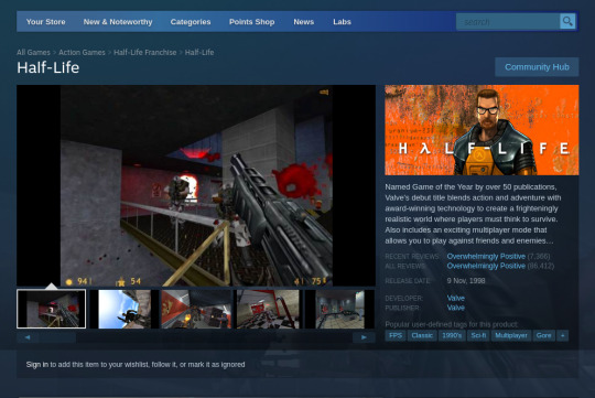
what if my home page IS the steam store page ???
(with my style of course)
before i show you the main menu, i wanna show you the changes i have made on the site (major and minor):
changing the look of the sushiwt/legacy page
i made it so that the legacy page is now contained in a lil box, while still containing the times new roman inside. (i also added the sushiwt cat here as well)
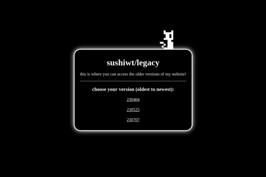
fixed all the legacy websites
i finally took the time to fix the old websites, even though i wont use them anyway lol (i also fixed the issue where the sushiwt site lagged so much, which was definitely my fault because i asked the website to render EVERY SINGLE PIXEL of the background stars, including the BLACK PIXELS, AND I THOUGHT IT WAS THE JAVASCRIPT THAT WAS DOING THR LAGGING. its fine now tho)
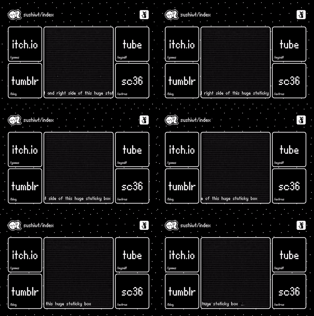
added a little disclaimer telling people that the site is still unfinished.
pretty self explanatory lol. it also gives you a link to the legacy website.

and finally...
the new main menu :3
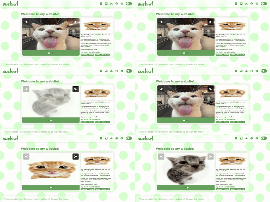
i took the title, image carousel, and the description style of the steam store pages, and used it as the first thing you see when you enter the site! (with my own style ofc)
dont worry, the cats are just placeholders, but theyre so silly
i couldnt figure out how to do this type of image carousel so i replaced it with dots, which ISNT exactly like steam, but it is close enough for me lol

i was thinking of putting the skills that i have in the user defined tags instead of the description, but i put my socials there instead...

sooo yeah! thats the main menu. keep in mind that this is held together by duct tape and a rope (figuratively), so one dent will make this whole thing fall apart, but that's a me problemmm
this was so hard for no reason because of how much the menu breaks apart everytime i make changes, so i wish i dont have to touch it again hahah, it was fun making it thoo
thank you for reading :>> - sushiwt <3
4 notes
·
View notes
Text
today, i found out that you can do css transitions for both ways,
i shouldve known that WAY BEFORE DOING TWO WEBSITE REMAKESH JBSUCHBKJS<M ill show you what i mean l8r
0 notes
Text
website update log #19 (December 12th, 2023)
while i was trying to figure out how to give this site personality, i took the time to learn javascript.
so i learned how to declare constants and variables, execute if and else statements, define functions, and some other things as well like finding and replacing classes with className, setting css variables with setProperty, and adding and replacing parameter stuffs.
with this information i have accumulated, i finally figured out how to do whatever this is:
i finally figured out how to make the dark mode switch work!!!
and to make sure that the dark mode doesn't reset itself when refreshed, I added a URL parameter that checks if dark is true or not :D

and that's basically it for the changes I made today :sob:
yknow, when i was trying to code the dark mode switch, i realized that i was struggling so hard on what the home page itself should look like so I didn't really make progress on it.
i was never really satisfied with the three index.html pages that I have made and I don't really think this one will be any different, but it doesn't really hurt to try new things
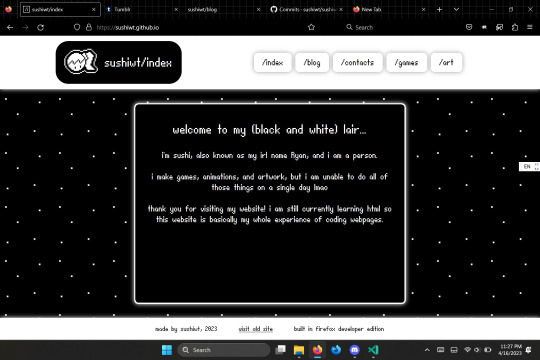
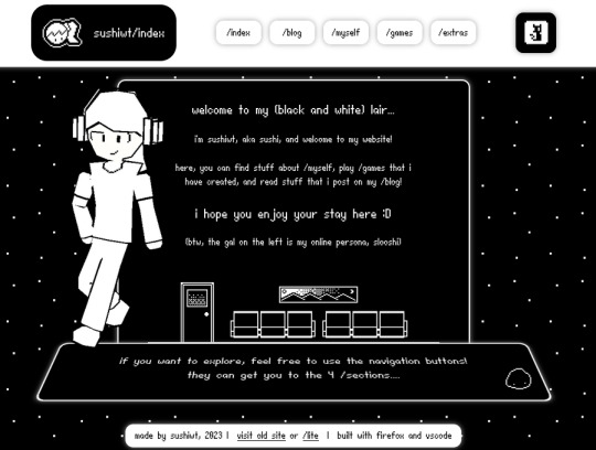

this website has gone through 3 redesigns now (including the one I'm working on rn), and that's just because I can never be satisfied with what my page is going to look, so I just end up changing the whole site every 3 months which is really hard to do but I still don't like the final result.
(the second redesign (the one with the TV and the grids) hasn't even been completed yet and yet i am still dissatisfied with the way it looks)
i just can't make up my mind lol
- sushiwt <3
2 notes
·
View notes
Text
website update log #18 (December 11th, 2023)
let's just go straightforward into the changes !!
new title

located in the navbar, i made a new and silly logo for the website!!! it wont have the pixel art look anymore, since its replaced by this cool flash brush gif (its also animated but none of the videos i recorded work smh)
------------------------------------------------------------------------------
the night mode button has been changed to a lightswitch!

the button look didnt really look good, so i decided to change it to a switch instead !!!! now the right side of the screen is just icons now (the buttons still dont work btw)
------------------------------------------------------------------------------
added og metadata for other websites such as discord

so you can see what the website is about while still being in the appl!
i think thats it.....thats all i have to say now lol, im gonna figure out ow to give this website more personality and i think that the new logo is a great start!
thank you, the two people that look at my logs :> i love youguys <3
- sushiwt <333
4 notes
·
View notes
Text
bro i am so tired that there are three website Blog #14s in a row


booo im actually gonna fix rhat now
0 notes
Text
website update blog #17 (December 10th, 2023)
(no updates about the actual website is actually here, but I'm just sharing my thoughts on how i should go handle this moving forward)

im sitting infront of my screen, the website and visual studio code open, and I'm just wondering about one thing
how can i make this website minimalistic, but also full of personality?
i look at website portfolios for inspiration, and I see things like these
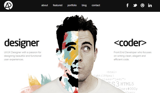


(all of these examples are just images I took from google images I don't know if these are actually real or not)
i love the look of these so much, about how simplistic they can be, but then I look at sites like these:


(this is the second time i ever mentioned sugar for brains and neo's heavenwurld but you cant blame me I love how these sites look smh)
i realized that being simple about your website can lose a lot of its personality, soo even tho these sites dont look that great on UI/UX standards, atleast it shows what the person behind the website is like!!
i wanna convey my personality as well, and i think the old theme showed off what i was like as well without even saying what i am, but with this new theme im going for, i have to be a little more creative, since i also want minimalism in it!!
thank you! more updates on the site coming soon :3 - sushiwt <3
0 notes


