
Sophie whyte - My online portfolio for my university choices this year to see more about me and my work.
Don't wanna be here? Send us removal request.
Statistics
We looked inside some of the posts by sw-portfolio and here's what we found interesting.
Average Info
Notes Per Post
1
Likes Per Post
1
Reblog Per Post
0
Reply Per Post
0
Time Between Posts
2 hours
Number of Posts By Type
Photo
13
Last Seen Tumblr Blogs


Fun Fact
Tumblr.com rank in the US is 25.
Photo


This is one of my favourite pages form Graphics sketchbook, it focuses on the work of artist Kayla Mahaffey. As an artist Kayla has inspired me through her use of realistic portraiture as well as her us of bold colours and fun cartoons. (the images below are from a flap in the middle of the double spread)


The images below are my favourite pages from my fine art sketchbook, these pages stand out to me as it is when I begin to scale up and explore the use of figures and portraiture in combination but also the layering of faces and use of collage.


0 notes
Photo

Note: I recommend this Portfolio to be viewed on a computer as the mobile app for Tumblr makes some of my images blurred and not as detailed.
I would also recommend clicking on the images as majority will pop up and be shown in a better quality.

Inspiration and interests ^


^ The images above show some of my favourite movies, Robin Hood made by Disney and the Iron Giant. I’ve loved these movies since I was a kid for the humour as I’ve grown up I have began to appreciate their use of illustration and animation. Some other Favourites are mine are The Aristocats and The avengers.

Stuart: a life backwards has become one of my favourite books as I have studied it over the course of my English a level due to its real life characters as a biography but also its emotionally compelling story revealing the heart-breaking story of Stuart. Because of it’s structure telling the story backwards, contradicting the typical biography, the reader becomes more engaged discovering more about Stuart’s life at the same time as it’s author Alexander Masters, and its why I have quickly become attached to this book and its ingenious way of captivating it’s readers with it’s story.
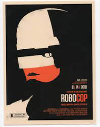
This is one example of what I think successful visual communication looks like. In his work Olly moss successfully manipulates his use of images to create the silhouette of an image out of multiple others. In this example his use of the gun to create the visor of the helmet is a clever way of showing his audience what the movie entails and engages his viewers as they look more deeply into how he created the image - only seeing the gun on a second glance. However, the use of imagery is not subtle and clearly communicates the main aspects of the film. His use of colours and text as well is bold but not too overpowering, dominating the main image while conveying the main mood of the film in a sleek and modern poster. other examples of his work:


0 notes
Photo

Click for better quality.
This is some of my more recent work in the Yr. 13 Graphic design course, for this project I focused on the theme of Stories. It started with how stories and characters become memorable and impactful then I investigated more into the attachment we develop to these stories and how it impacts us growing up. Now heading to my final piece its developed into how stories are used as an escape from reality as well as highlighting the importance of stories. My work may also be seen as reflecting on how as we grow up how we can also lose attachment to these stories as they have become “childish” or “too silly”.
Through the next few images I begin to explore my line art and how I can make it more expressive as well as my patterns. I investigate the use of figures and hands alongside the portraiture and characters as well.


0 notes
Photo


Click for better quality.
(This post shows my development to my most recent work seen in the above post)
These pieces of art work show my investigation and experimentation with digital portraiture and how to best communicate visually the attachment we develop to these characters as well as the importance of stories as an escape from reality. I used fun shapes and colours to make the artwork visually pop, creating a joyful and youthful tone, celebrating stories but also to emphasize the escapism theme slowly developing in my pieces. I also begin to develop and refine how my text could combine with the imagery, the text unravelling from the face/creating the face - reflecting on my previous typographical portraiture (shown in previous posts) but also highlighting the escapism elements show in my work, the unravelling of reality.
As for the portraiture I use the pen tool and shape to create patches of tone mimicking the contours of the face as well as the lighting and the shadows it creates. The result is a semi realistic portraiture that I use in contrast to the fun shapes, characters and bold colours to show the differences and potential parallels between reality and the narratives we create - mainly the differences to present how we escape from real life through the wonders of story telling and our favourite characters.
I also use the composition to reflect this attachment - whether it be through depicting theme side by side or surrounded by them which can also show how it is multiple stories that stay with us from life as the portraiture portrays adults and young adults too.
0 notes
Photo


Click for better quality.
This post shows how I developed my line work used in the above posts, I started with more traditional drawings and collages and then explore how I can colour these digitally using image trace and subvert the traditional techniques. I also begin to include more mark-making, this made my drawings more unique to my process and separate from the original - creating a more energetic mood to the drawings.
0 notes
Photo


These are some typographical portraits loosely inspired by the works of Sean Williams and Sarah king, they helped me develop and produce the typography I use in my project based on Stories.


This is some more typography work from my Yr. 13 stories project that also helped my use of patterns and mark-making develop.

This is some typography from Yr. 12 work exploring different uses for ink and stich as well as online work to produce typography.

Similar to my modern world project at the bottom of this blog, in the two images above I experiment with how text can be used to emphasize gesture in my figures.
0 notes
Photo


Click for better quality.
This is a mixture of work over the last two years - some school work some independent studies.
The first three were done for my college, they focus on tress and nature as that was my theme in Yr.12. I mainly focused on using a fine-liner to create small mark making and have a variety of tone and line within the piece. But I also used tea and ink on fabric to create an interesting textural element to the art work. The next three I did in my own time during Yr.13, I enjoyed the use of coffee and tea to create an intriguing background and used this and a pencil to build up tone effectively. In the other piece I focused on line - using a brush pen for line variety and a white posca pen to not only make the piece pop but to add crosshatching and marks. The painting of a Bee was also done in my spare time, inspired from watching Bees in my Grandmother’s garden, I enjoyed creating the texture through the use of dry-brushing
The last two where also in the Yr.12 project, I used masking fluid to create an interesting outline for the flower while fine-liner to look at the building as I slowly began to develop more into the them of Lockdown and the contrast between nature and man made objects.
0 notes
Photo


Click for better quality.
These are artist copies and responses from artists Elly Smallwood and Dominic Beyeler. I was inspired by the Beyeler’s use of lines and abstract shapes to accentuate the face and make the work more expressive and was excited by his use of colour through his work. I chose to investigate Elly Smallwood’s work as her use of acrylic paint and how she layered her colours to create detail intrigued me. Both Artists helped me explore how paint and line can be used to express raw emotion in my theme Dark and Light - in which I focused on both negative and positive emotions and how we as people hide our emotions as well as how we express our emotions.
0 notes
Photo


Click for better quality.
The work above are artist copies from Joshua Miles and David Theron, they were some of the main artists I looked at during my Yr.12 theme of Dark and light. Joshua Miles focuses on emotions and how he can express his subject successfully within his artwork while David Theron looks more at space and the human anatomy - its movement during the life, I chose to explore his artwork as I was curious on the technique of layering portraiture and how I can apply this to my own work to represent the many emotions we feel.


This is some my own work using ink to create more expressive and emotional lines, I chose to separate the features of the face and stitch them together in the last one to portray the multiple aspects of a person physically and emotionally as well.

This is one of the first pieces in my development process - colour scheme and composition are heavily influenced by David Theron’s work but the eyes convey different emotions. I also include more stitch that I have developed as well as the use of tissue paper, collage and dry brushing to create texture, the small its of hand written text also reflect my theme and add to the pice.


The use of stitch has developed and become more prevalent in my work, I have also explored more textural techniques to add such as the use of a glue gun and ripping my pages to show frustration and emotions that are beginning to show and rise to the surface. I chose to squish my faces to physically represent the suffocated and hidden emotions and made my colours more bold and dark as well.
0 notes

Photo

Click for better quality.
The art works above are from my current Fine Art project based on Nostalgia, I used personal memories and photographs from me and my brother’s childhood, I explored how to depict nostalgia visibly through the use of coffee staining and rough lines to create a weathered look, as if years has passed. I explore stitch work both by hand for a more personal look as well as by machine to create faster lines to outline the face. I explore the use of colour, and refine my colour scheme to a faded set of tones with pops of colour to portray the youth of childhood but also the time passed.


The two images above are from the start of the project where I looked at growing up from which I then developed to the depiction of fond memories through box frames. (The two are connected through the use of pink embroidery thread and state “do I want to grow up?” reflecting on the loss of childhood and the transition towards becoming adults.)
0 notes

Photo


Click the images throughout the post for better quality.
in my modern world project (Yr. 12) I looked at mental health and identity, focusing in on the effect Lockdown has had on not only my own mental health but the health of other people. It started with quick rushes sketches which led to me blocking the face out completely to represent the over-whelming thoughts and lack of identity, this also allowed more of my audience to relate to the emotions and struggle I attempted to present. In the image above I also explored how to digitally colour my piece but decided that digitally I wouldn’t get the successful mark-making I wanted.


In the next three images I develop and finalise my process for line work and the inclusion of text - I am still exploring the use of colour. I decided to use man made mark-making and line art as it was more expressive and had more fluidity. The addition of red X’s pop out from the black scribbles and make the piece more foreboding and emphasize the concept of the loss of identity and the rush of thoughts being over-whelming and frustrating at times - a killer mind. The text was inspired of artist (?) but I decided to lose some of the detail so the main focus is on the figure.


In the next pieces I investigate my use of colour, with the posca markers i love the bold blocks of colour used to make the figure stand out and the contrast between the sad blues and the angry reds and yellows - representing the sadness and frustration felt over lockdown/due to lockdown making us feel worse. I also explored composition and how my figures could include more energy using gesture lines. The text curved to accentuate this movement.

This was my final piece for the modern world project - originally presented going diagonally down to portray the worsening of mental health and identity issues over Lockdown. The black string presenting the order of the frames, the use of colour and shapes to highlight the figure and the main focus - the mark-making also helping the figure be more expressive while also showing the emotions.
1 note
·
View note