#ALSO WHY DO I GET FONTS FOR THE LATIN SCRIPT THAT ARE 'JAPANESE STYLE' WHEN LOOKING FOR JAPANESE FONTS. I AM KILLING SEARCH SYSTEMS WITH-
Text

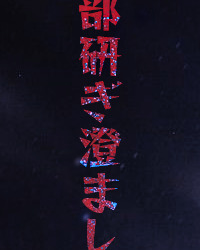

「ひたすら
セイヤソイヤ戦うんだ
拳をもっと心ももっと
全部全部研ぎ澄まして
まだまだ
セイヤソイヤ戦うんだ
悲しくなって
立ち上がれなくなっても
押忍! 押忍!」
@eorzeashan i wanted to play around with Eight, hope i did him justice
#other people's ocs#my edit#i'm not sure the song choice is good but since you post a lot about japanese things i wanted to use a japanese one for a change#however my playlist is very limited when it comes to japanese songs so i apologize if this doesn't really fit!!!!!#it's also my first time working with kanji/hiragana/katakana so i'm sorry if anything is wonky in that as well#ALSO WHY DO I GET FONTS FOR THE LATIN SCRIPT THAT ARE 'JAPANESE STYLE' WHEN LOOKING FOR JAPANESE FONTS. I AM KILLING SEARCH SYSTEMS WITH-#-HAMMERS#okay i'll stop yapping now. buhbye#Spotify
25 notes
·
View notes
Text
Cross-Cultural Design
When I first traveledto Japan as an exchange student in 2001, I lived in northern Kyoto, a blockfrom the Kitayama subway station.
My first time using the train to get to my university was almost a disaster, even though it was only two subway stops away. I thought I had everything I needed to successfully make the trip. I double- and triple-checked that I had the correct change in one pocket and a computer printout of where I was supposed to go in the other. I was able to make it down into the station, but then I just stood at a ticket machine, dumbfounded, looking at all the flashing lights, buttons, and maps above my head (Fig 5.1). Everything was so impenetrable. I was overwhelmed by the architecture, the sounds, the signs, and the language.
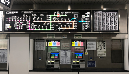
Fig 5.1: Kyoto subway ticket machines—with many line maps and bilingual station names—can seem complicated, especially to newcomers.
My eyes cravedsomething familiar—and there it was. The ticket machine had a small button thatsaid English! Ipushed it but became even more lost: the instructions were poorly translated,and anyway, they explained a system that I couldn’t use in the first place.
Guess what saved me?Two little old Japanese ladies. As they bought tickets, I casually looked overtheir shoulders to see how they were using the machines. First, they looked up atthe map to find their desired destination. Then, they noted the fare written nextto the station. Finally, they put some money into the machine, pushed thebutton that lit up with their correct fare, and out popped the tickets! Wow! Itried it myself after they left. And after a few tense moments, I got my ticketand headed through the gates to the train platform.
I pride myself onbeing a third-culture kid, meaning I was raised in a cultureother than the country named on my passport. But even with a cultural upbringing in both Nigeriaand the US, it was one of the first times I ever had to guess my way through atask with no previous reference points. And I did it!
Unfortunately, the same guesswork happens online a million times a day. People visit sites that offer them no cultural mental models or visual framework to fall back on, and they end up stumbling through links and pages. Effective visual systems can help eliminate that guesswork and uncertainty by creating layered sets of cues in the design and interface. Let’s look at a few core parts of these design systems and tease out how we can make them more culturally responsive and multifaceted.
Typography
If you work on theweb, you deal with typography all the time. This isn’t a book about typography—othershave written far more eloquently and technically on the subject. What I wouldlike to do, however, is examine some of the ways culture and identityinfluence our perception of type and what typographic choices designers canmake to help create rich cross-cultural experiences.
Stereotypography
I came across the wordstereotypography a few years ago. Being African, I’m well aware of the way my continent isportrayed in Western media—a dirt-poor, rural monoculture with little in theway of technology, education, or urbanization. In the West, one of the most recognizablegraphic markers for things African, tribal, or uncivilized (and no, they arenot the same thing) is the typeface Neuland. Rob Giampietro calls it “the NewBlack Face,” a clever play on words. In an essay, he asks an importantquestion:
How did [Neuland and Lithos] come to signify Africans and African-Americans, regardless of how a designer uses them, and regardless of the purpose for which their creators originally intended them? (http://bkaprt.com/ccd/05-01/)
From its release in 1923 and continued use through the 1940s in African-American-focused advertising, Neuland has carried heavy connotations and stereotypes of cheapness, ugliness, tribalism, and roughness. You see this even today. Neuland is used in posters for movies like Tarzan, Jurassic Park, and Jumanji—movies that are about jungles, wildness, and scary beasts lurking in the bush, all Western symbolism for the continent of Africa. Even MyFonts’ download page for Neuland (Fig 5.2) includes tags for “Africa,” “jungle fever,” and “primitive”—tags unconnected to anything else in the product besides that racist history.

Fig 5.2: On MyFonts, the Neuland typeface is tagged with “Africa”, “jungle fever”, and “primitive”, perpetuating an old and irrelevant typographic stereotype (http://bkaprt.com/ccd/05-02/).
Don’t make, use, orsell fonts this way. Here are some tips on how to avoid stereotypography whendefining your digital experiences:
Be immediately suspicious of any typeface that “looks like” a culture or country. For example, so-called “wonton” or “chop-suey” fonts, whose visual style is thought to express “Asianness” or to suggest Chinese calligraphy, have long appeared on food cartons, signs, campaign websites, and even Abercrombie & Fitch T-shirts with racist caricatures of Asians (http://bkaprt.com/ccd/05-03/). Monotype’s website, where you can buy a version called Mandarin Regular (US$35), cringingly describes the typeface’s story as “an interpretation of artistically drawn Asian brush calligraphy” (Fig 5.3). Whether or not you immediately know its history, run away from any typeface that purports to represent an entire culture.

Fig 5.3: Fonts.com sells a typeface called Mandarin Regular with the following description: “The stylized Asian atmosphere is not created only by the forms of the figures but also by the very name of the typeface. A mandarin was a high official of the ancient Chinese empire” (http://bkaprt.com/ccd/05-04/).
Support type designers who are from the culture you are designing for. This might seem like it’s a difficult task, but the internet is a big place. I have found that, for clients who are sensitive to cultural issues, the inclusion of type designers’ names and backgrounds can be a powerful differentiator, even making its way into their branding packages as a point of pride.
The world wide webfont
Another common design toolyou should consider is webfonts—fonts specifically designed for use on websitesand apps. One of the main selling points of webfonts is that instead ofputting text in images, clients can use live text on their sites, which isbetter for SEO and accessibility. Theyare simple to implement these days, a matter of adding a line of code orchecking a box on a templating engine. The easiest way to get them on your siteis by using a service like Google Fonts, Fontstand, or Adobe Fonts.
Or is it? That assumesthose services are actually available to your users.
Google Fonts (and every other service using Google’s Developer API) is blocked in mainland China, which means that any of those nice free fonts you chose would simply not load (http://bkaprt.com/ccd/05-05/). You can work around this, but it also helps to have a fallback font—that’s what they’re for.
When you’re building your design system, why not take a few extra steps to define some webfonts that are visible in places with content blocks? Justfont is one of the first services focused on offering a wide range of Chinese webfonts (http://bkaprt.com/ccd/05-06/). They have both free and paid tiers of service, similar to Western font services. After setting up an account, you can grab whatever CSS and font-family information you need.
Multiple scriptsystems
When your design workrequires more than one script—for instance, a Korean typeface and a Latintypeface—your choices get much more difficult. Designs that incorporate morethan one are called multiple script systems (multiscript systems for short). Combining them is aninteresting design challenge, one that requires extra typographic sensitivity. Luckily,your multiscript choices will rarely appear on the same page together; you willusually be choosing fonts that work across the brand, not that work well nextto one another visually.
Let’s take a look at an example of effective multiscript use. SurveyMonkey, an online survey and questionnaire tool, has their site localized into a variety of different languages (Fig 5.4). Take note of the headers, the structure of the text in the menu and buttons, and how both fonts feel like part of the same brand.
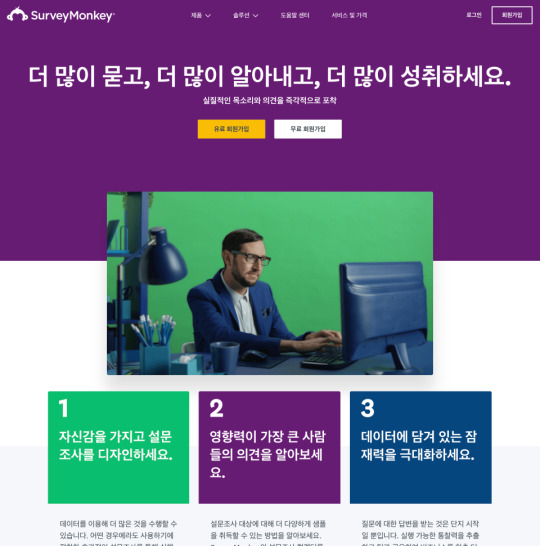

Fig 5.4: Compare the typographic choices in the Korean (http://bkaprt.com/ccd/05-07/) and US English (http://bkaprt.com/ccd/05-08/) versions of SurveyMonkey’s Take a Tour page. Do the header type and spacing retain the spirit of the brand while still accounting for typographic needs?
Some tips as you attempt to choose multiscript fonts for yourproject:
Inspect the overall weight and contrast level of the scripts. Take the time to examine how weight and contrast are used in the scripts you’re using. Find weights and sizes that give you a similar feel and give the page the right balance, regardless of the script.
Keep an eye on awkward script features. Character x-heights, descenders, ascenders, and spacing can throw off the overall brand effect. For instance, Japanese characters are always positioned within a grid with all characters designed to fit in squares of equal height and width. Standard Japanese typefaces also contain Latin characters, called romaji. Those Latin characters will, by default, be kerned according to that same grid pattern, often leaving their spacing awkward and ill-formed. Take the extra time to find a typeface that doesn’t have features that are awkward to work with.
Don’t automatically choose scripts based on superficial similarity. Initial impressions don’t always mean a typeface is the right one for your project. In an interview in the book Bi-Scriptual, Jeongmin Kwon, a typeface designer based in France, offers an example (http://bkaprt.com/ccd/05-09/). Nanum Myeongjo, a contemporary Hangul typeface, might at first glance look really similar to a seventeenth-century Latin old-style typeface—for instance, they both have angled serifs. However, Nanum Myeongjo was designed in 2008 with refined, modern strokes, whereas old-style typefaces were originally created centuries ago and echo handwritten letterforms (http://bkaprt.com/ccd/05-10/). Looking at the Google Fonts page for Nanum Myeongjo, though, none of that is clear (Fig 5.5). The page automatically generates a Latin Nn glyph in the top left of the page, instead of a more representative Hangul character sample. If I based my multiscript font choices on my initial reactions to that page, my pairings wouldn’t accurately capture the history and design of each typeface.

Fig 5.5: The Google Fonts page for Nanum Myeongjo shows a Latin character sample in the top left, rather than a more representative character sample.
Visual density
CSS can help you controlvisual density—how much text, image, and other content there is relative to thenegative space on your page. As you read on, keep cultural variables in mind: differentcultures value different levels of visual density.
Let’s compare what arecommonly called CJK(Chinese, Japanese, Korean) alphabets and Latin (English, French, Italian, etc.) alphabets. CJK alphabetshave more complex characters, with shapes that are generally squarer than Latinletterforms. The glyphs also tend to be more detailed than Latin ones, resultingin a higher visual density.
Your instinct might beto create custom type sizes and line heights for each of your localized pages.That is a perfectly acceptable option, and if you are a typophile, it may driveyou crazy not todo it. But I’m here to tell you that when adding CJK languages to a designsystem, you can update it to account for their visual density without rippingout a lot of your original CSS:
Choose a font size that is slightly larger for CJK characters, because of their density.
Choose a line height that gives you ample vertical space between each line of text (referred to as line-height in CSS).
Look at your Latin text in the same sizes and see if it still works.
Tweak them together to find a size that works well with both scripts.
The 2017 site for Typojanchi, the Korean Typography Biennale, follows this methodology (Fig 5.6). Both the English and Korean texts have a font-size of 1.25em, and a line-height of 1.5. The result? The English text takes up more space vertically, and the block of Korean text is visually denser, but both are readable and sit comfortably within the overall page design. It is useful to compare translated websites like this to see how CSS styling can be standardized across Latin and CJK pages.
Fig 5.6: The 2017 site for Typojanchi, the Korean Typography Biennale, shows differing visual density in action. It is useful to compare translated websites like this to see how CSS styling can be standardized across Latin and CJK pages (http://bkaprt.com/ccd/05-11/).
Text expansion factors
Expansion factors calculatehow long strings of text will be in different languages. They use either adecimal (1.8) or a percentage (180%) to calculate the length of a text stringin English versus a different language. Of course, letter-spacing depends onthe actual word or phrase, but think of them as a very rough way to anticipate spacefor text when it gets translated.
Using expansion factors is best when planning for microcopy, calls to action, and menus, rather than long-form content like articles or blog posts that can freely expand down the page. The Salesforce Lightning Design System offers a detailed expansion-factor table to help designers roughly calculate space requirements for other languages in a UI (Fig 5.7).
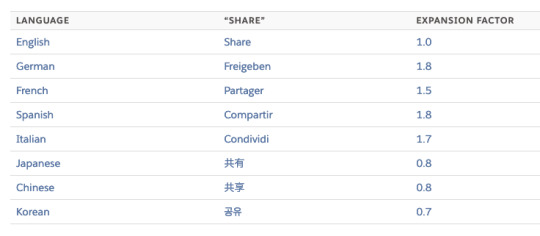
Fig 5.7: This expansion-factor table from Salesforce lets designers and developers estimate the amount of text that will exist in different languages. Though dependent on the actual words, such calculations can give you a benchmark to design with content in mind (http://bkaprt.com/ccd/05-12/).
But wait! Likeeverything in cross-cultural design, nothing is ever that simple. Japanese, forexample, has three scripts: Kanji, for characters of Chinese origin,hiragana, for words and sounds that are not represented in kanji, and katakana,for words borrowed from otherlanguages.
The follow button is a core part of the Twitter experience. It has six characters in English (“Follow”) and four in Japanese (フォロー), but the Japanese version is twenty percent longer because it is in katakana, and those characters take up more space than kanji (Fig 5.8). Expansion tables can struggle to accommodate the complex diversity of human scripts and languages, so don’t look to them as a one-stop or infallible solution.
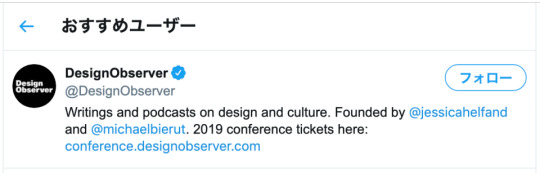
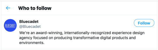
Fig 5.8: On Twitter, expansion is clearly visible: the English “Follow” button text comes in at about 47 pixels wide, while the Japanese text comes in at 60 pixels wide.
Here are a few thingsyou can do keep expansion factors in mind as you design:
Generate dummy text in different languages for your design comps. Of course, you should make sure your text doesn’t contain any unintentional swearwords or improper language, but tools like Foreign Ipsum are a good place to start getting your head around expansion factors (http://bkaprt.com/ccd/05-13/).
Leave extra space around buttons, menu items, and other microcopy. As well as being general good practice in responsive design, this allows you to account for how text in your target languages expands.
Make sure your components are expandable. Stay away from assigning a fixed width to your UI elements unless it’s unavoidable.
Let longer text strings wrap to a second line. Just ensure that text is aligned correctly and is easy to scan.
0 notes
Text
Cross-Cultural Design
When I first traveled to Japan as an exchange student in 2001, I lived in northern Kyoto, a block from the Kitayama subway station.
My first time using the train to get to my university was almost a disaster, even though it was only two subway stops away. I thought I had everything I needed to successfully make the trip. I double- and triple-checked that I had the correct change in one pocket and a computer printout of where I was supposed to go in the other. I was able to make it down into the station, but then I just stood at a ticket machine, dumbfounded, looking at all the flashing lights, buttons, and maps above my head (Fig 5.1). Everything was so impenetrable. I was overwhelmed by the architecture, the sounds, the signs, and the language.

Fig 5.1: Kyoto subway ticket machines—with many line maps and bilingual station names—can seem complicated, especially to newcomers.
My eyes craved something familiar—and there it was. The ticket machine had a small button that said English! I pushed it but became even more lost: the instructions were poorly translated, and anyway, they explained a system that I couldn’t use in the first place.
Guess what saved me? Two little old Japanese ladies. As they bought tickets, I casually looked over their shoulders to see how they were using the machines. First, they looked up at the map to find their desired destination. Then, they noted the fare written next to the station. Finally, they put some money into the machine, pushed the button that lit up with their correct fare, and out popped the tickets! Wow! I tried it myself after they left. And after a few tense moments, I got my ticket and headed through the gates to the train platform.
I pride myself on being a third-culture kid, meaning I was raised in a culture other than the country named on my passport. But even with a cultural upbringing in both Nigeria and the US, it was one of the first times I ever had to guess my way through a task with no previous reference points. And I did it!
Unfortunately, the same guesswork happens online a million times a day. People visit sites that offer them no cultural mental models or visual framework to fall back on, and they end up stumbling through links and pages. Effective visual systems can help eliminate that guesswork and uncertainty by creating layered sets of cues in the design and interface. Let’s look at a few core parts of these design systems and tease out how we can make them more culturally responsive and multifaceted.
Typography
If you work on the web, you deal with typography all the time. This isn’t a book about typography—others have written far more eloquently and technically on the subject. What I would like to do, however, is examine some of the ways culture and identity influence our perception of type and what typographic choices designers can make to help create rich cross-cultural experiences.
Stereotypography
I came across the word stereotypography a few years ago. Being African, I’m well aware of the way my continent is portrayed in Western media—a dirt-poor, rural monoculture with little in the way of technology, education, or urbanization. In the West, one of the most recognizable graphic markers for things African, tribal, or uncivilized (and no, they are not the same thing) is the typeface Neuland. Rob Giampietro calls it “the New Black Face,” a clever play on words. In an essay, he asks an important question:
How did [Neuland and Lithos] come to signify Africans and African-Americans, regardless of how a designer uses them, and regardless of the purpose for which their creators originally intended them? (http://bkaprt.com/ccd/05-01/)
From its release in 1923 and continued use through the 1940s in African-American-focused advertising, Neuland has carried heavy connotations and stereotypes of cheapness, ugliness, tribalism, and roughness. You see this even today. Neuland is used in posters for movies like Tarzan, Jurassic Park, and Jumanji—movies that are about jungles, wildness, and scary beasts lurking in the bush, all Western symbolism for the continent of Africa. Even MyFonts’ download page for Neuland (Fig 5.2) includes tags for “Africa,” “jungle fever,” and “primitive”—tags unconnected to anything else in the product besides that racist history.
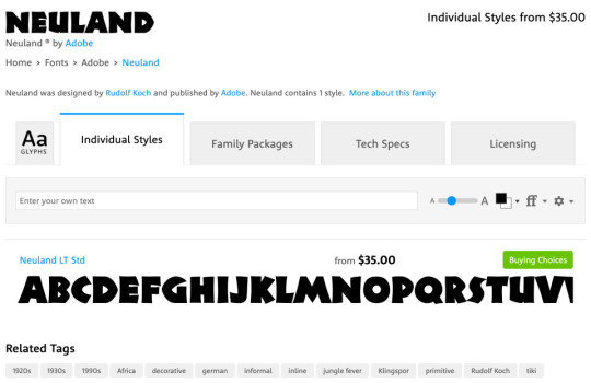
Fig 5.2: On MyFonts, the Neuland typeface is tagged with “Africa”, “jungle fever”, and “primitive”, perpetuating an old and irrelevant typographic stereotype (http://bkaprt.com/ccd/05-02/).
Don’t make, use, or sell fonts this way. Here are some tips on how to avoid stereotypography when defining your digital experiences:
Be immediately suspicious of any typeface that “looks like” a culture or country. For example, so-called “wonton” or “chop-suey” fonts, whose visual style is thought to express “Asianness” or to suggest Chinese calligraphy, have long appeared on food cartons, signs, campaign websites, and even Abercrombie & Fitch T-shirts with racist caricatures of Asians (http://bkaprt.com/ccd/05-03/). Monotype’s website, where you can buy a version called Mandarin Regular (US$35), cringingly describes the typeface’s story as “an interpretation of artistically drawn Asian brush calligraphy” (Fig 5.3). Whether or not you immediately know its history, run away from any typeface that purports to represent an entire culture.
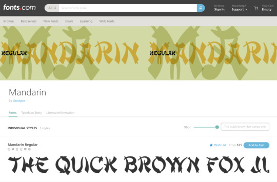
Fig 5.3: Fonts.com sells a typeface called Mandarin Regular with the following description: “The stylized Asian atmosphere is not created only by the forms of the figures but also by the very name of the typeface. A mandarin was a high official of the ancient Chinese empire” (https://ift.tt/2T4LppO).
Support type designers who are from the culture you are designing for. This might seem like it’s a difficult task, but the internet is a big place. I have found that, for clients who are sensitive to cultural issues, the inclusion of type designers’ names and backgrounds can be a powerful differentiator, even making its way into their branding packages as a point of pride.
The world wide webfont
Another common design tool you should consider is webfonts—fonts specifically designed for use on websites and apps. One of the main selling points of webfonts is that instead of putting text in images, clients can use live text on their sites, which is better for SEO and accessibility. They are simple to implement these days, a matter of adding a line of code or checking a box on a templating engine. The easiest way to get them on your site is by using a service like Google Fonts, Fontstand, or Adobe Fonts.
Or is it? That assumes those services are actually available to your users.
Google Fonts (and every other service using Google’s Developer API) is blocked in mainland China, which means that any of those nice free fonts you chose would simply not load (http://bkaprt.com/ccd/05-05/). You can work around this, but it also helps to have a fallback font—that’s what they’re for.
When you’re building your design system, why not take a few extra steps to define some webfonts that are visible in places with content blocks? Justfont is one of the first services focused on offering a wide range of Chinese webfonts (http://bkaprt.com/ccd/05-06/). They have both free and paid tiers of service, similar to Western font services. After setting up an account, you can grab whatever CSS and font-family information you need.
Multiple script systems
When your design work requires more than one script—for instance, a Korean typeface and a Latin typeface—your choices get much more difficult. Designs that incorporate more than one are called multiple script systems (multiscript systems for short). Combining them is an interesting design challenge, one that requires extra typographic sensitivity. Luckily, your multiscript choices will rarely appear on the same page together; you will usually be choosing fonts that work across the brand, not that work well next to one another visually.
Let’s take a look at an example of effective multiscript use. SurveyMonkey, an online survey and questionnaire tool, has their site localized into a variety of different languages (Fig 5.4). Take note of the headers, the structure of the text in the menu and buttons, and how both fonts feel like part of the same brand.

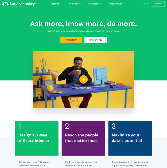
Fig 5.4: Compare the typographic choices in the Korean (http://bkaprt.com/ccd/05-07/) and US English (http://bkaprt.com/ccd/05-08/) versions of SurveyMonkey’s Take a Tour page. Do the header type and spacing retain the spirit of the brand while still accounting for typographic needs?
Some tips as you attempt to choose multiscript fonts for your project:
Inspect the overall weight and contrast level of the scripts. Take the time to examine how weight and contrast are used in the scripts you’re using. Find weights and sizes that give you a similar feel and give the page the right balance, regardless of the script.
Keep an eye on awkward script features. Character x-heights, descenders, ascenders, and spacing can throw off the overall brand effect. For instance, Japanese characters are always positioned within a grid with all characters designed to fit in squares of equal height and width. Standard Japanese typefaces also contain Latin characters, called romaji. Those Latin characters will, by default, be kerned according to that same grid pattern, often leaving their spacing awkward and ill-formed. Take the extra time to find a typeface that doesn’t have features that are awkward to work with.
Don’t automatically choose scripts based on superficial similarity. Initial impressions don’t always mean a typeface is the right one for your project. In an interview in the book Bi-Scriptual, Jeongmin Kwon, a typeface designer based in France, offers an example (http://bkaprt.com/ccd/05-09/). Nanum Myeongjo, a contemporary Hangul typeface, might at first glance look really similar to a seventeenth-century Latin old-style typeface—for instance, they both have angled serifs. However, Nanum Myeongjo was designed in 2008 with refined, modern strokes, whereas old-style typefaces were originally created centuries ago and echo handwritten letterforms (http://bkaprt.com/ccd/05-10/). Looking at the Google Fonts page for Nanum Myeongjo, though, none of that is clear (Fig 5.5). The page automatically generates a Latin Nn glyph in the top left of the page, instead of a more representative Hangul character sample. If I based my multiscript font choices on my initial reactions to that page, my pairings wouldn’t accurately capture the history and design of each typeface.
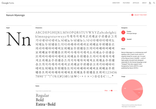
Fig 5.5: The Google Fonts page for Nanum Myeongjo shows a Latin character sample in the top left, rather than a more representative character sample.
Visual density
CSS can help you control visual density—how much text, image, and other content there is relative to the negative space on your page. As you read on, keep cultural variables in mind: different cultures value different levels of visual density.
Let’s compare what are commonly called CJK (Chinese, Japanese, Korean) alphabets and Latin (English, French, Italian, etc.) alphabets. CJK alphabets have more complex characters, with shapes that are generally squarer than Latin letterforms. The glyphs also tend to be more detailed than Latin ones, resulting in a higher visual density.
Your instinct might be to create custom type sizes and line heights for each of your localized pages. That is a perfectly acceptable option, and if you are a typophile, it may drive you crazy not to do it. But I’m here to tell you that when adding CJK languages to a design system, you can update it to account for their visual density without ripping out a lot of your original CSS:
Choose a font size that is slightly larger for CJK characters, because of their density.
Choose a line height that gives you ample vertical space between each line of text (referred to as line-height in CSS).
Look at your Latin text in the same sizes and see if it still works.
Tweak them together to find a size that works well with both scripts.
The 2017 site for Typojanchi, the Korean Typography Biennale, follows this methodology (Fig 5.6). Both the English and Korean texts have a font-size of 1.25em, and a line-height of 1.5. The result? The English text takes up more space vertically, and the block of Korean text is visually denser, but both are readable and sit comfortably within the overall page design. It is useful to compare translated websites like this to see how CSS styling can be standardized across Latin and CJK pages.


Fig 5.6: The 2017 site for Typojanchi, the Korean Typography Biennale, shows differing visual density in action. It is useful to compare translated websites like this to see how CSS styling can be standardized across Latin and CJK pages (https://ift.tt/2T2Emhi).
Text expansion factors
Expansion factors calculate how long strings of text will be in different languages. They use either a decimal (1.8) or a percentage (180%) to calculate the length of a text string in English versus a different language. Of course, letter-spacing depends on the actual word or phrase, but think of them as a very rough way to anticipate space for text when it gets translated.
Using expansion factors is best when planning for microcopy, calls to action, and menus, rather than long-form content like articles or blog posts that can freely expand down the page. The Salesforce Lightning Design System offers a detailed expansion-factor table to help designers roughly calculate space requirements for other languages in a UI (Fig 5.7).

Fig 5.7: This expansion-factor table from Salesforce lets designers and developers estimate the amount of text that will exist in different languages. Though dependent on the actual words, such calculations can give you a benchmark to design with content in mind (http://bkaprt.com/ccd/05-12/).
But wait! Like everything in cross-cultural design, nothing is ever that simple. Japanese, for example, has three scripts: Kanji, for characters of Chinese origin, hiragana, for words and sounds that are not represented in kanji, and katakana, for words borrowed from other languages.
The follow button is a core part of the Twitter experience. It has six characters in English (“Follow”) and four in Japanese (フォロー), but the Japanese version is twenty percent longer because it is in katakana, and those characters take up more space than kanji (Fig 5.8). Expansion tables can struggle to accommodate the complex diversity of human scripts and languages, so don’t look to them as a one-stop or infallible solution.

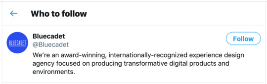
Fig 5.8: On Twitter, expansion is clearly visible: the English “Follow” button text comes in at about 47 pixels wide, while the Japanese text comes in at 60 pixels wide.
Here are a few things you can do keep expansion factors in mind as you design:
Generate dummy text in different languages for your design comps. Of course, you should make sure your text doesn’t contain any unintentional swearwords or improper language, but tools like Foreign Ipsum are a good place to start getting your head around expansion factors (http://bkaprt.com/ccd/05-13/).
Leave extra space around buttons, menu items, and other microcopy. As well as being general good practice in responsive design, this allows you to account for how text in your target languages expands.
Make sure your components are expandable. Stay away from assigning a fixed width to your UI elements unless it’s unavoidable.
Let longer text strings wrap to a second line. Just ensure that text is aligned correctly and is easy to scan.
Cross-Cultural Design published first on https://deskbysnafu.tumblr.com/
0 notes
Photo

Timothy Botts
According to his website “Timothy R. Botts is a master calligrapher who studied graphic design and calligraphy at Carnegie-Mellon University. After graduation, he and his wife Nancy spent three years in Japan teaching conversational English where he was exposed to the rich brush writing tradition of the east. Then he began a forty-year career at Tyndale House Publishers designing books and Bibles, retiring as senior art director in 2012.
Tim helped start Masterpiece Project, an outreach to high school students in the arts, and currently serves as their artistic director. He also teaches calligraphy part time at College of DuPage in Glen Ellyn, Illinois and has taught numerous workshops throughout the United States and internationally.
Tim’s work is part of the permanent collection of the Newberry Library in Chicago. Ten books of his work have been published, including Doorposts, Messiah, The Botts Illustrated Bible, and Bound for Glory”
I unfortunately did not get to meet Timothy Botts in person, but he was kind enough to answer my questions.
When did you start writing calligraphy and why?
I started learning calligraphy as a freshman at CarnegieMellon University where all freshman art majors had to take the course. My teacher/mentor was Arnold Bank who inspired me. Calligraphy combined my love for words, especially the Bible, and my love for art--so it was a perfect fit!
What or who inspired you to start writing calligraphy?
I suppose I'm known for my expression of Bible texts because I have published several books of them. But I love to write any words that are consistent with my world view. I also do calligraphic murals and programs where I do a live word picture on large poster paper with giant markers. (You can see some of them on YouTube)
Would you consider yourself primarily an artist who creates calligraphy or a calligrapher who sometimes makes art?
I always approach calligraphy as an art form because I'm always trying to express the meaning of the words by the way in which I write them. I try to strike a balance between legibility and expression.
What is the context of your writing (invitations, certificates, quotes, art)?
My training in graphic design was huge in my work to combine text and image to communicate an idea. My 40 years as a book designer for Tyndale House Publishers was a natural training ground for my calligraphic work. I often say that there are two parts to a successful piece: beautifully formed letters and knowing what to do with them. The second half is what we call design.
I love all the styles of our alphabet because they give me a range of "voices" but I am partial to Renaissance Italic because the flourishes give me the chance to dance with my pen.
Do you do any other style of writing (hand lettering, typeface design) professionally or for fun? Do you have a favorite brand of pen/paper/ink?
I work with relatively few materials which was an influence from living in Japan for three years. I use mostly the primaries of gouache, sumi black ink, Brause pens, broad-edged brushes, a large Japanese brush for backgrounds, and my favorite paper is Fabriano Artistico because it takes washes well, but still can be written on.
Do you have a favorite style of calligraphy (script, blackletter, uncial, other)? If so, why?
I enjoy starting with another writing system such as Arabic, Hebrew, or Amharic, and inspired by that style, create a new set of forms for our Latin alphabet. My son Jeremy, who is also a graphic designer helped me to create a typeface for the Botts Illustrated Bible, Tyndale House, 2000. It is based on my own handlettering.
With widely available calligraphic fonts and hand lettering being so popular, do you think calligraphy is still important? Why?
I think calligraphy will always be important because it is a personal visualization of language, a basic element of our humanity, and I think some of us will always find fulfillment in being able to communicate using our hands.
Have you learned anything from writing calligraphy that you would want to pass off to someone starting out?
Calligraphy is a lifelong pursuit, so it is necessary to be patient. Respect and learn the classic forms of our alphabet first before you start making up your own letters. This is a parallel discipline to learning to draw. And regardless of whether you can make any money doing it, you will find great joy in gifting others with something as simple as writing a person's name on a bookmark.


All images courtesy of timbottscalligraphy.com
If you would like to learn more about Timothy Botts, see more of his work, or purchase one of his prints, you can find him at timbottscalligraphy.com
0 notes
Last Seen Blogs


businessaccountingsblog
Untitled

bsbfortrade
Untitled
bsbfortrade
Untitled

stardew-snailmail
Stardew Valley Love Blog! 🌱🌿🍃