#AnnotatedRelatedWorks
Photo


Gartside, Brian & Pagan Carlos, Juan & Stephenson, Aaron. The Drinkable Book. 2014. Web. 1 Oct. 2017.
https://www.behance.net/gallery/16619527/The-Drinkable-Book
Who did it
Designers: Brian Gartside, Juan Carlos Pagan and Aaron Stephenson
Client: WATERisLIFE
Who is the audience
People in the developing world who have minimal access to clean drinking water
What
A book that acts as an educational tool to educate people in the developing world about sanitation and hygiene. The pages also double as water filters that produce clean drinking water, each filter can give up to 30 days of clean drinking water.
Where
New York, USA
When
May, 5th, 2014
Why
To educate people in the developing world about sanitation and hygiene
To provide clean drinking water to those who need it most
What did I learn
Think critically about the materials you choose to make your books with
Even something as mundane as a book can have a surprising utility
There are production processes that allow water filter paper to be created and printed on for a few cents
Critique - Positive Feedback
Beautifully designed book
Brilliant concept, so functional and educational
Very well produced
Critique - Constructive Feedback
Maybe think about how to make the cover biodegradable or another use for the cover.
Think about the lifecycle of the product, what happens to it when the filters run out??
Is the metallic silver ink safe for consumption? As the water goes through does it pull the silver pigment out?
Description of the project should come first, not after product photography
0 notes
Photo


Who did it
Director: Grant Baldwin
Main Actors: Grant Baldwin and Jenny Rustemeyer
Who is the audience
North Americans who are either concerned or ignorant about the food waste epidemic
What
A documentary that follows the food waste challenge of Grant and Jenny.
They spend 6 months living off of only food waste
They spend only $200 the whole 6 months, and save $20,000 worth of food from landfills
Where
America
When
April, 2014
Why
To educate the general public about this issue
To prove that there is so much food waste that 2 people could live healthily off of it for 6 months
What did I learn
I want to do my own food waste project to experience this first hand and collect data
We waste 40% of the food we produce
We also waste all of the energy and resources used to make that food
It is due to a culture of abundance
There are ww2 propaganda posters about food waste
Food recovery (gleaning) is when people go to fields and salvage the food that farmers don’t want
“Best before” dates only ensure quality NOT safety
There is a law stating that you cannot sue a grocery store for donating food to you even if you get sick
Therefore their main excuse (liability) for not donating food is ludicrous
Critique - Positive Feedback
Fantastic concept
Very inspirational and definitely promotes action
Helpful tips throughout to encourage people to do more
Very shocking footage that airs the dirty laundry on this very serious issue
Critique - Constructive Feedback
Production quality could have been a bit better
Editing was a bit awkward at times - cut when it shouldn’t have, dragged on for too long
0 notes
Photo


Hsin Woo, Hayley. Food Paper. 2016. Web. 1 Oct. 2017.
https://www.behance.net/gallery/37132843/Food-Paper
Who did it
Designer: Hayley Hsin Woo
Who is the audience
Anyone who is concerned with food waste and just the overall state of the environment
What
A series of papers created by using food waste
Where
Auckland, New Zealand
When
May, 13th, 2016
Why
To reduce her personal food waste by creating something useful out of unused food
To educate others that there are alternatives to throwing out food
What did I learn
There are many different things you can do with food waste other than just composting
Food waste paper is strong and can be printed on
Critique - Positive Feedback
Beautiful product photography
Brilliant concept - really good use of materials
Critique - Constructive Feedback
How can you use this food paper in an innovative way to even further educate people about food waste?
0 notes
Photo


Rittmeister, Laura. Don’t Waste Your Food App. 2015. Web. 1 Oct. 2017.
https://www.behance.net/gallery/25551273/Dont-waste-your-food-app
Who did it
Designer: Laura Rittmeister
Who is the audience
The average consumer who has problems keeping track of what is in their fridge
What
An app that allows you to register items that are in your fridge.
It helps ensure that you don’t buy something you already have at home.
It also shows when the food is going to expire so you can eat it as soon as possible
Where
British Columbia, Canada
When
April 21st, 2015
Why
To educate consumers on food waste and hopefully help them reduce or even completely eliminate their own personal food waste.
What did I learn
App design needs to be simplistic so that everyone can understand
There is room in the market for an app like this
Look for small places for change within the bigger problem and act on those
Critique - Positive Feedback
Very strong concept - will definitely help combat individual food waste
Well designed system for registering food
Critique - Constructive Feedback
Very generic name - needs a new title
App design is very overwhelming, too many graphics, not enough white space
Too many textures and graphic treatments
0 notes
Photo


Pai, Shweta. A color Harvest. 2014. Web. 1 Oct. 2017.
https://www.behance.net/gallery/19005797/A-color-Harvest
Who did it
Designer: Shweta Pai
Who is the audience
Personal project - no specific target audience
What
Hand dyed silk using food waste as the dye
Where
Bangalore, India
When
August 13th, 2014
Why
To gain a personal understanding about sustainability and slow textiles
What did I learn
That food waste can be used to create beautiful dyes
The food needs to be boiled down first
Silk and yarn both absorb the dye very well
You can create beautiful vibrant colours from food waste dye
Critique - Positive Feedback
Beautiful colours achieved with the dye
Interesting process pictures
Critique - Constructive Feedback
Could benefit from being a little bit more conceptual
How could she apply this technique to something more conceptual?
0 notes
Photo


Lin, HH. Seed to Food ‘15. 2015. Web. 27 Sept. 2017.
https://www.behance.net/gallery/30130227/Seed-to-Food-15
Who did it
Designer: HH Lin
Who is the audience
Taiwanese citizens that expressed concern over food safety and food waste
What
Tablewares (utensils, plates, etc) created from inedible pieces of food that would otherwise be wasted ie. orange peels, other citrus peels, rice bran
Where
Taipei, Taiwan
When
October, 7th, 2015
Why
To reassure the Taiwanese people of food safety
To educate the people about food waste
To reduce food waste
What did I learn
That product design doesn’t just have to be metals and plastics
You can fill an orange peel with liquids, its semi waterproof
Dried fruit peels are very beautiful and can also be functional
Critique - Positive Feedback
Beautiful product photography
Fantastic illustrations
Good amount of process work, can really see where the project started from
Critique - Constructive Feedback
Dimensions of the product at the top of the page seems unnecessary
Logo is generic and could be revised
Images are actually too high quality for web, makes the page difficult to load
0 notes
Photo


Van Der Werff, Cat. Oz Harvest Feeding the 5000. 2013. Web. 27 Sept. 2017.
https://www.behance.net/gallery/12014421/OzHarvest-Feeding-the-5000
Who did it
Designer: Cat Van Der Werff
Client: OzHarvest
Who is the audience
The audience is Australians of working age
What
A series of posters highlighting ugly produce, and promoting Oz Harvest’s Event “Free Lunch for 5000”
Promotional Banners
Promo Cards
Car sticker design
T-shirts
Aprons
Where
Sydney, Australia
When
November 9th, 2013
Why
To advocate for ugly and unused foods
To show that these foods are still very edible
To feed those in need
To promote OzHarvest and their event “Free Lunch for 5000"
What did I learn
That OzHarvest has a variety of tactics for reaching its audience, all are effective
Simplistic design with a punch of colour is very effective
Again, make multiples! Creating a series of posters creates variety and it works!
There’s more to a campaign than just designing the posters, you have to think about everything down to the cars and t-shirts
Critique - Positive Feedback
Beautifully simplistic design with just enough colour
Many posters in the series, a good variety, doesn’t get old quickly
Copy is fun and clever, in contrast with the image of the “ugly” produce
Yellow and black are an amazing colour combination
Critique - Constructive Feedback
Most of the copy is brilliant, some feel like they were worn thin “yessss” “wow”
Maybe take those out and just keep the very successful ones (there are a lot)
The “Strange but True” tags could have been placed in a better spot than on the line divider
0 notes
Photo


Citi, Stefano. Second Chance Collection -TourDeFork. 2014. Web. 27 Sept. 2017.
https://www.behance.net/gallery/13637469/Second-Chance-Collection-TourDeFork
Who did it
Designer: Stefano Citi
Client / Firm: TourDeFork
Who is the audience
Anyone who is already aware of food waste and wants to reduce their impact through beautifully designed household products
What
3 Products that reimagine inedible food waste by-products to give them new life
Orange Peel Hanger - hanging orange peels in front of a radiator to produce a natural air freshener
Coffee Scent Dissipator - hanging this in the fridge creates a natural deodorizer to absorb fridge doors
Apple Peel Grower - helps ferment sourdough naturally
Where
Milan, Italy
When
January, 10th, 2014
Why
To reduce food waste, specifically food waste from inedible items
To educate people that there are things they can do with these inedible food items rather than throw them out
To create beautiful products for the home that are also highly functional
Removes the stigma of food waste as a disgusting eyesore, re-imagines it as something beautiful to be used around the home
What did I learn
That there are things we can do even with non-edible food products and by-products to extend their life
Product design can be a really powerful tool with my topic
It is very important to show context and process when displaying my work because without it, the message can become diluted and people won’t be as invested in it
Critique - Positive Feedback
Brilliant product design, very functional, beautiful minimalist design could fit in any home
Concept is fantastic, using beautiful design to encourage consumer to reduce their waste / extend the life of items
Critique - Constructive Feedback
Maybe he should have picked something less specific for the last example, the first two could work in almost any home and the last one is only specific to people who want to make that bread
There is no process, I really want to see the original iterations and how he arrived at this solution
Unsure of whether this was FOR TourDeFork or down while he was working there, unclear - needs more description
0 notes
Photo


Atencio, Pouline & Luque, Roberto. Novelized Recipies for DIA Grocery. 2014. Web. 27 Sept. 2017.
https://www.behance.net/gallery/17889441/Novelized-Recipes-DIA-grocery
Who did it
Designers: Pouline Atencio & Roberto Luque
Client: DIA Grocery (Spanish Supermarket Chain)
Who is the audience
Impatient Cooks
People who generally do not enjoy cooking or waiting for food to cook
People who love reading
People who shop at DIA Grocery stores
What
A series of themed recipe fiction books.
Each book tells a story and the steps are embedded in as part of the narrative.
You follow the step and then the amount of waiting time aligns with the amount of reading time until the next step. This combines reading and cooking in a very innovative way, it transforms cooking into a participatory narrative and ensures that you are never bored during the cooking process.
Where
Created in: Spain and Chicago USA
Campaign was run in: Spain, Portugal, Argentina, Brazil and China
When
June 27th, 2014
Why
To encourage those who do not typically enjoy cooking to find pleasure in it. To re-think the traditional recipe book in a new and innovative way that appeals to non-chefs.
What did I learn
You can combine two completely different styles of books and narratives very successfully
Supermarkets in other countries seem more willing to accept progressive and experimental ideas
There are ways of making people do things they usually don’t want to do, like cooking you just have to figure out what they like and combine the two
Illustrations of food look very beautiful in watercolour
Creating a series of the same thing, but slightly different can be very effective
Love the video in this - really inspiring me to maybe look at creating a video
Critique - Positive Feedback
The video is SO effective because of the symbolism used that even though it is in another language I completely understand the message
Soundtrack for the video is very effective
Illustrations on the books are beautiful
Product photography of the finished book is beautiful
Critique - Constructive Feedback
There is no process section
It is difficult to identify the target audience
Although it says it is for DIA grocery stores, there is no mention of what DIA was looking for - Confusing
0 notes
Photo


Gozha, Olia. Foodly One Stop Food Store. Swinburne University, 2017. Web. 27 Sept. 2017.
https://www.behance.net/gallery/50366635/Foodly-One-Stop-Food-Store
Who did it
Designer: Olia Gozha
Client: Foodly
Who is the audience
Producers of the food: Those who had very poor e-commerce/web presence
Consumers: Who are looking for healthy, local food options online, urban dwellers who can’t access their needs within the city
What
A well-designed shopify theme for an online grocery store that focuses on produce and has a strong spotlight on product photography
Focus on user testing to ensure that the product works for both the producers who want to sell their food as well as the consumers using the site to purchase their food
Where
Designed in the Ukraine
Case studies from the UK, USA and Canada
When
March, 20th, 2017
Why
To help farmers who have poor e-commerce sites advance in the digital age by creating a customizable shopify theme. This also allows the consumers who want fresh local produce that is available online to easily access the products. In short, it creates a system that connects the producer of the good wholesome food to the consumer in a visually pleasing way.
What did I learn
You can use shopify to create custom user interfaces for your e-commerce sites
Connecting pieces of the food buying process in a meaningful way is important
Beautiful product photography can be a very successful focal point
Look for gaps in the system of buying food, and reducing food wastes and generate ideas on how to bridge those gaps
Critique - Positive Feedback
Beautiful product photography
In-depth description of project goals and outcomes
Beautiful colour scheme
Great that they included a user story - brings the viewer close to the project
Critique - Constructive Feedback
Needs more focus on the research - I’m curious as how she got to their conclusions
The user testing video is far too long - maybe cut it down to a few key realizations to keep it to under a minute
0 notes
Photo


Marcel WW. Inglorious Fruits and Vegetables. 2014. Web. 25 Sept. 2017.
http://www.marcelww.com/#work/inglorious-fruits-and-vegetables
Who did it
Firm: Marcel WW.
Client: Intermarche (French Supermarket Chain)
Who is the audience
Anyone shopping in the grocery store
Particularly lower income people who would seek out reduced prices
What
In-store signage
Pop-up juice bars with juice made from ugly fruits
Social media campaigns
Short documentary
Posters
Where
France, in Intermarche supermarkets and surrounding area
When
October 2014, after the EU declared 2014 as the european year against food waste
Why
To create a dialogue surrounding ugly produce
To promote people to buy and normalize ugly produce
To educate people that there is NOTHING wrong with this produce other than the fact that it is aesthetically unsettling
To educate about food waste
What did I learn
The people shopping in grocery stores are a good target audience
Europe has already taken initiatives over this issue
Grocery stores will be willing to accept the change as long as politics enforces it, and as long as everyone else is doing it
Pick the most progressive grocery store and start there
People (consumers) will respond positively to this, convincing the grocery stores is the hard part
Don’t just show what you did - show how it can or has made a difference
Critique - Positive Feedback
Very good animation style and graphics
Pace of the video is very good, keeps you interested, doesn’t feel like it’s dragging on
Narrative of how they did it is very effective
Graphics for the posters and labeling are very clean and minimal
Brilliant that they carried the branding throughout the whole campaign, the posters, videos, labeling in stores, creating fruit juices, soups and labeling them according to the branding too
Great that at the end of the video they show the actual impact that the campaign had
Critique - Constructive Feedback
Their website for showcasing the work is incredibly slow and it’s painful to have to wait for the project to load
The posters - maybe rethinking the rag, especially within the titles. It feels awkward and not refined.
0 notes
Photo
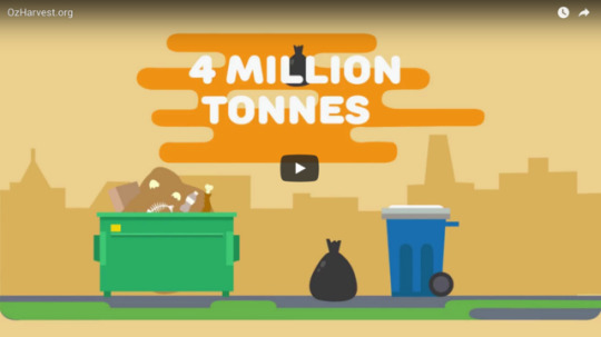
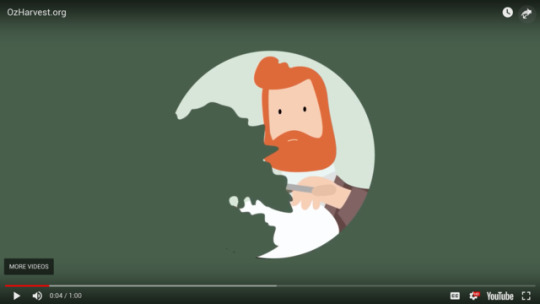
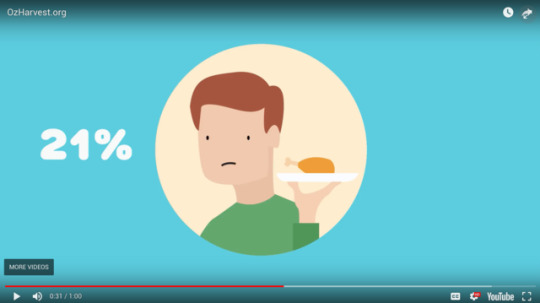

Japri, Vania. OzHarvest.org Food Waste. Swinburne University, 2017. Web. 20 Sept. 2017.
https://www.behance.net/gallery/56738487/OzHarvestorg-Food-Waste
Who did it
Designer: Japri Vania, Student at Swinburne University
Client: OzHarvest Australia
Who is the audience
The audience is Australians of working age with some sort of disposable income
What
A 1-minute infographic explaining the reasons why we waste food, the dangers of our actions and a link to a source that will help us
Where
Australia, Created at Swinburne University
When
Published on Bechance Sept 14, 2017
Why
This is a call to action to learn more about OzHarvest.
OzHarvest is a fantastic company in Australia that rescues food that would otherwise be wasted from grocery stores and sells it in their own store, food truck, and they donate the rest to local charities. They are making a huge initiative to combat food waste and the video does a very good job of provoking the viewer to go check them out.
What did I learn
Infographics are a very effective communication tool
They need to have a call to action at the end unless they are purely about education
They need to be short and concise to keep the viewers' attention
The person narrating should have some sort of a pleasing accent or voice to encourage people to listen
Most importantly: There are actually people solving this issue around the world! It can be done, even if the mainstream grocery stores don't want to be the change
Show the world the change you want to see and they will follow
Critique - Positive Feedback
Beautiful Animation Style
Choice of Narrator is very effective, his voice is pleasing
Very powerful stats
Perfect length - 1 min - keeps you interested the entire time
Critique - Constructive Feedback
The first sentence of the narration “we love eating out but how much are we throwing out" makes it seem like it's about food waste from restaurants specifically, maybe rethink the wording
Could visually represent the stats better through data visualization mixed with their animation style
The description of the project on Behance could be more in depth, a lot of my analysis was through speculation as her description is slightly vague.
0 notes
Last Seen Blogs

fllopnowel
10 ร้านเมนูไข่กระทะ อร่อ

handinhandgiveahandup-blog
#HandinHandGiveaHandUp

technologiesoftomorrow
تكنولوجيات الغد

flipyouforreal-blog
flipyouforreal

moechiii
カタクリ