#Artist did such a good job when I presented this 'dynamic' pose XD
Text
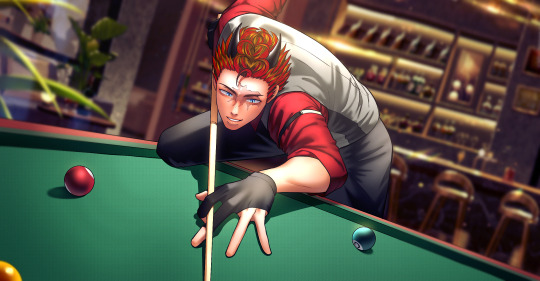
My Pool comm of Adam from @iwanttobeaseme
#adam taurus#rwby#<3#Artist did such a good job when I presented this 'dynamic' pose XD#Alas there is no further context 'x3#I simply wanted to see him play more games ^-^!~ (. . .and maybe earn some money on the side too lol)
56 notes
·
View notes
Text
Drawing Critique for the ENF-Sports Contest
Drawing Critique
The following are judge comments on the drawing submissions (for people who drew, and agreed they’d like to see the critique on their work from the judges). The critique isn’t meant to reveal what judge placed you in what spot. The comments and submissions will be in no particular order. Judges were not required to provide comments, but they were allowed to if they felt they wanted to share their thoughts with the contestants.
Even if it’s not your entry, I encourage any artists to look at this critique and consider it. Reading critique of someone else’s work could give you good insight what to do with your own art too!
If your stuff isn’t listed here, but you want it to be, let me know. I can edit your stuff in.
https://thejakebolt.tumblr.com/image/160330008821
- Your piece I felt was very bright vibrant and full of emotion, all very great things to have in your art. It really made it stand out and the attention of the drawing is really drawn to the model themselves as such. There are a few things that I would work to improve as a whole though. Your proportions, especially with the length of your arms could be improved on. The overall stiffness of your model as well, if you improve with making your models feel more real and alive then this will very much help your composition. And lastly I would advise you to put a little more work into your backgrounds. The scene is not to be forgotten in place of the model only. It helps bring everything together and give your model a purpose.
- Another successful cartoon imitation! I took a bit to look at your other art and I think this is one of your best pictures yet. I think the pose and expression can be a bit less stiff and exaggerated without losing the cartoon feeling, but otherwise I think you did a good job with your target picture!
- My favorite expression of the bunch, very expressive and she looks mortified (who wouldn't be!? XD ) about both losing her pants and giving the other team a point (or 2? I don't know how many points you get in soccer/football lol) I enjoy the cartoony look, the anatomy and the lines are done well.
- A bit crude, mixing cartooniness and misproportioned realism. Soccer net is just an uneven plane, soccer ball's movement is a scribble... bottomless exposure is nice, but no explanation as to how it happened...
http://grave17.deviantart.com/art/Bike-Ride-679160703 (link dead I believe, sorry)
- This one I feel bad to have so low on the list because it is done well, the anatomy is good (especially the placement of the arms, at that angle can be a bit tricky to make them look right.). Lines need some work, I like how the background looks faded and there is more focus on the character with her solid dark lines. Her expression is nicely embarrassed. And I really love how you took the time to make her fingers look good and like they are holding the bike handles (Really, I cannot praise them enough!). The shading does need work but I can see you tried. The reason it's low on the list is it is because she just looks like she is posing with the bike and not being very sporty, and by looking at the picture you would not think it was a dare. That all being sad this is a lovely drawing and I loved looking at it.
- I really enjoyed looking at this piece. Your display of knowledge of anatomy was splendid. The proportions are very well off and the fact that you added some foreshortening to your work really shows some depth to the art itself really making it look all the more impressive. That being said there are a few issues at hand I would like to address. For one the background, in pieces like this where there is a theme the background and the scene around the model can be just as important as the model themselves. Where it is okay and encouraged to give a depth of field by blurring a portion of the background I would not encourage you to make the entire background this way, it will generally come off as distasteful. The other thing I would work on improving would be your expressions. Where are the model is drawn very well she does not seem to be reacting very different to the situation to any other common occurrence. Its important with these pieces to remember that all that we have to go off of is the art your present to us, no descriptions, no side thoughts, so we might not know what the model is thinking or feeling unless you can show us so.
- I really liked this picture for how it pops out. The thick outlines and the fluid shading make her look almost like a 3d model. It doesn't look intentional, but seeing the rest of your art, maybe it's something you should try again! Part of the drawing looks rough, but I think you nailed some of the key aspects of the picture to make a solid picture overall.
- Very sweet looking, art brings out her beauty even if it's not perfect. shading is very nice, the blushing and the red on her breasts really sell the scene as an embarrassing thing she has to do. Plus the bike seat between her legs fits right in. background is simple but still works in 3d.
http://electrofoxart.deviantart.com/art/Rock-Climber-In-Distress-681443487
- Your composition was very well done, your proportions are fairly accurate and the way that you did the background really makes it feel like she is actually at some canyon climbing professionally. The places that I would look at improving would be within the face for one. Where as the looks are suitable for an anime style they can always be improved. Also where as your proportions are nice that does not mean that the model you have drawn looks 100% correct. I would work on improving how your breasts look. Getting the shape down and their physics correct goes a long way from making a piece go from good to great. One last thing I would like to commend you on is your shading. All of the shading seems to make sense within the piece given where your light source is, very well done.
- Unusual sport, very good choice. the ENF parts work fantastically, you can see how slipping down has torn her clothes. her sports bra appears to be pushed up, rather than destroyed, but the shorts still on the rope tell the story perfectly. Art is very cute, though it doesn't feel very dynamic physically it is excellent fanservice, and the background looks like a lot of thought was put in despite the skill not quite being there.
- Very cute! It looks like it was very ambitious for you. A few parts look rough, but I think that's a sign of you leaving your comfort zone. The background looks gorgeous but a small comment is that the coloring of the overall piece doesn't look consistent with the different components. Please make sure she gets rescued, though!
- I really liked the idea of using rock climbing rock. Not normally the first thought someone has when it comes to a sport and they did a good job making it quite a predicament. The anatomy and colouring/shading are all done well. I love her expression because she is embarrassed but looks to be giving a bit of a smile. I think the colour palette chosen also gives off a nice desert feel. I am going to be a bit nitpicky, but I wish she had something like gloves on. Who goes rock climbing without hand protection? XD
https://anewenfartist.tumblr.com/image/161186021917
- Overall the work is very impressive but I'm going to highlight some key aspects that really stood out to me. The lighting in this piece is well done but not perfect, there are some areas that seem as though they have been lit without needing to be, be extra careful to know exactly where your source light is coming from and light the models accordingly. The background is something that I feel really pulls the whole drawing together. Where as the models are well done the scene really gives the context of the shot, the depth of field as the background gets further away did not go un-noticed and it really gives it a more real feeling. On the topic of context lets talk about whats happening in the image. I can tell that the women are playing tennis and that one is stripping on her own accord but I cannot discern why from the image alone. I could take a few guesses as to what is happening in this image but the objective was to have the image known without written descriptions to tell whats happening so you lost some credit there. The last thing I would like to bring up is the faces of both the models. The one on the right who is stripping, her features seem off, perhaps it is the shading or just the shapes and sizes of the eyes and mouth but something just feels a little bit off. Now as for the model on the left, I would have liked to see a little more emotion coming from this character, even if she has seen this person naked before or is the reason she is undressing in the first place she would still have more of an emotional response that could been seen in her features. As it stands now her face looks very placid as if nothing at all is going on in front of her. I hope to see you improve more in the future.
- gorgeous shading, especially the hair. very few anatomy mistakes. Covering herself with something like a racquet that does no good really heightens the effect. Net looks good, decent cloth folds. expressions perhaps need a little work, the raven-haired one seems a little neutral and the eyebrows on the other are very misplaced, hard to see, and leave the brow region bare . Also the lower part of the face isn't drawn as if it's turned. Lots of work put into the background.
- I will be honest and admit the only reason why this one is lower on the list is because the poses are rather simple and there isn't much emotion in the piece. The black haired girl could have a bit more expression, with winning multiple times at strip tennis you would probably be more boastful or smug. The anatomy, shading and background are all done extremely well. The embarrassed lady is cute and I like how she covers herself with a tennis racket XD. All in all, a lovely piece of work!
- I follow your art too closely so it's easy to see the flaws, but it's also easy to see the ambition and detail put into your work. The strong anatomy and the attention to detail outweighs any small errors and flaws. Very strong entry.
http://saawaat.deviantart.com/art/Improper-sports-attire-684143641
- The simplistic style really worked for you! I think it's one of your better drawings in awhile. I think there is a bit more room for detail, such as with the background and even just the shading on the dress. However the minimalist style really plays to its strengths and creates a very cute picture that is fun to look at.
- First off I would like to say that your models do look very well shaped, and I especially like the drapery work that you have done with the right models dress. A few other things I would like to point out. I am not sure if you did this on purpose or not but both models seem to have very similar posing, as if you used the same frame for both of them. Where as this is not exactly a problem it was something that I noticed so others might have as well. In the future I would absolutely recommend having your models in noticeably different poses, this will help your art look and feel more alive than simply a composition. As a side note, as for what the models are doing, assuming that they are doing a sporting activity I would firstly assume Frisbee Golf. But from the lack of information on the page they could also just be playing with a Frisbee in the park. Both are fine of course but if you are going one way or the other then I would recommend making the more clear with either sports markers or perhaps more models in the background.
- Frisbee seems to be an afterthought, so it loses points on the sports front. Despite the rather naive art, the dynamics of the dress being pulled off are really good. Also proportions are alright and expressions are great.
- I love this one because it is one of the few entries where the girl becomes nude and embarrassed from another person ( And one of the realest scenarios that could happen at any family picnic :D) and a good lesson as to why you should always dress accordingly! I do like the colour palette chosen but I think the background could be spiced up a little as it feels flat, like the clouds could be more defined. The anatomy is good. The dark haired character I wish had more emotion, but maybe it just happened so fast she hasn't had time to react to the situation. Overall A cute, silly, and embarrassing circumstance.
http://arta-shrike.tumblr.com/image/161431802718
- I like what is being done here, all of the models seem to have a lot of personality and it is very easy to tell what is happening here. That being said there are a few things I would like to point out. Where as your proportions are coming along nicely they could use some more work. Some of the body parts of the models look off and something like that will throw off the entire drawing. Another thing I would work on is the background. In themed drawings the background is very important to know what is happening and where as you did provide a background it has a lot to be improved on. The plane of origin of where the pavement is seems to be set up where it looks like the models are not standing on it. I would practice working with putting down a sight line and marking your points of interest as such to help it look more natural.
- I give a lot of credit to putting so many characters into one scene, especially in a pretty action-y sports scene like basketball. The anatomy needs work, but for every character having a different pose so they aren't just standing around being embarrassed wallflowers I still think they did a good job. Again I wish there was more to the background, it is fairly flat, it may not be the focus but seeing the characters be so unique it's a shame when it comes to backgrounds people do the bare(hehehehe pun) minimum. Another thing is I think a score board should have been added (as well as something to distinguish who's on what team) to help the viewer to understand that it is strip basketball. Without the dialog I could have been confused thinking they were just playing shirts vs. skins. But still a really fun picture and I would not mind seeing this happen at my local park lmao.
- You put a lot of work into to fit all of the characters in your picture. Unfortunately, I feel the effort was more on quantity than quality. Each has very drastic anatomy issues and the posing feels somewhere between that it was for singular people but still meant to be seen as a whole. I feel it was a bit too ambitious and focusing on fewer characters would have left you with a much stronger picture overall.
- despite the art being pretty poor, especially the anatomy, this is really cute and alluring. The idea of a shirts-and-skins game works fantastically into the theme, probably the best use of the concept yet. The fact that the girls vary in body types and visible personalities, the way the front and center girl is so embarrassed and small-chested, and that expression.. the hilarious yanking down of the pants and the way the biggest girl isn't even bothered..
http://ehns-universe.deviantart.com/art/ENF-Spots-Contest-Entry-HOT-DOGS-684551041
- This comic is simply: adorable. I love the contrast between the man yelling and the girl being shy and/or softspoken, even her yelling for help is so cute. I enjoyed the dialogue and the panels were easy to follow. the line work is done well and I like the cartoon look, the simplicity makes sense for a comic. I also enjoyed the little touches like the ad-banners and wieners and buns.
- Your picture was crude, but it was cute and easy to tell what was going on. I think you had a bit more of a focus on scenery than you did on the main subjects of the picture, though. I think with a bit more focus on the girl and the hot-dog sales man, your picture could have been improved for a better standing in the contest. I hope the girl gets helped up, that looks like a huge fall.
- I can't even tell what's going on here. I assume he turned around and knocked her over, but it's not depicted at all. I can barely tell what body parts I'm looking at as she falls. The hot dog hat is drawn really well, which is oddly confusing. Now the situation is pretty good, and the ads are funny, but in the end all that's showing is her oddly protruding asscheeks in a broad thong, so it doesn't even make up for it with nudity.
- I really like the amount of work you put into the piece, I can see that you put a great deal into it. Some things I would advise you to look on would be a general increase in detail. Your proportions are setting are all good, but they could be a lot better. More on adding some of those finer points into the body and the background and your drawings will really turn heads.
http://skylindworm.deviantart.com/art/Pom-Pom-Panty-Streak-684537632
- She's drawn pretty well given the simplicity, even if simple things like the pom-poms aren't. The situation isn't really given away well by the picture, I think if you have to read the description to get it, then it's not quite as good, but at the very least it's clear she's in a kind of uniform and she's embarrassed. For some reason the flag is a nice touch.
- It's a cute picture and I think you succeeded what you went for, but the canvas you used seems small and it gives the picture a very messy look. The cartoon look otherwise seems to fit well together, so it'd be great to see what you can do with less limitations!
- Your model really has a lot of expression and in that you excelled. There are some flaws in the layout though that I would look into. The background could use a touch of refinement and the model themselves, if you add some shading into this drawing it would bring it that much further. Also take a look at developing your model proportions.
- Why isn't this sport part of the halftime show?XD You really need to read the description to appreciate this piece of work. I love the Streaking game, I find it to be very clever. The art style is cute and her expression is quite embarrassed and even I can feel her sense of RUN GO GO GO! D: !!! I am assuming this is done in crayon, so for that reason I think the lines are fine I just wish the colouring wasn't so lazy and you took your time. I think like for the audience it would have been better if you left them as circles instead of doing a light scribble over them(And I am sure the scanner doesn't help with pointing out the random lines). But still I really think this is a cute picture and her expression is perfect! buzzzzz buzzzzzz.
http://gekigamix100assartin.deviantart.com/art/The-Carry-to-Bare-Anew-s-ENF-Sport-Contest-684611715
- So to start off I would love to say that your proportions on the models are very well done. From a glance I don't see many issues with them and that's honestly very impressive. The expressions that they wear are also very well done and thought out, it helps to bring the whole picture to life. Though the things I will look at to improve would be this, work on your backgrounds. Where as this image is very good with the models your background needs a lot of work. I can only assume what is happening here by looking at the image alone and that's not something that your viewers will be wanting. When someone looks at a themed drawing they should know whats happening right from the start. Also adding a more detailed background will not only fill the viewer in but will also make your work look far more impressive overall.
- The expressions are perfect :D I actually enjoy sketchy lines but as this is a contest that judges partially on skill I think it would have been nice to have cleaned them up a bit so it would be less confusing to look at and tell what is going on without reading the description. (But at the same time the messy lines do add to the girls hectic fumbling doing the race. )It would also be nice to see how she lost her bikini, or it 'flying' away would have been a nice touch. The girl that is upside down is my favourite xD Her little butt is really cute lmao. Also I love how of all the sports you could have chosen that were more mainstream you went with wife carrying! XD
- I'm not sure I understand the background of the picture. It does however give a good sense of motion to the rest of the composition. The girls have really cute expressions, and the pose you succeeded in tackling looked really difficult. My only question is why the 'husband' of the girls got to wear clothes when the wife didn't.
- I'm going to take his word for it that this is a real sport, but the nudity isn't worked in very well at all since you can't see it. Skinny limbs are still hot, but.. well this art isn't too bad, but I can't tell what's going on in the background, and the collisions so to speak are definitely bad. the carrier's neck is sinking right into the groin to the spine, the hand is melting into the body, it's a mess. Very cute faces though.
http://rrrrrricossssssuave.deviantart.com/art/In-the-Long-Run-For-ANew-s-ENF-Sports-contest-682803540
- Overall I think this piece looks very good. The proportions on the model are all fairly well done. I do enjoy the fact that the motion blurred background adds to the camera effect you seemed to be going for and it all frames nicely. Some things I would look to improve on in the future would be the breasts, instead of having them being stationary object giving them a weight and physics could bring your drawing a long way and adding some shading into your drawings could really give them some depth.
- great premise, very nice framing device, and a simple background done right. The blur gives the impression she's REALLY trying to hurry up and finish. The body is very stiff, as if a flash poser doll was used, but the anatomy itself is quite sexy, and the running pose is on point
- The presentation of this picture makes it look like it was ripped straight out of a cartoon! I think it looks fantastic. Some details can be improved and the overall ambition could have been larger, but otherwise it looks like you captured exactly what you set to do.
-Some womens are such an inspiration *wipes away tear*. Her posture is actually my favourite, because she is running but still looks quite hunched over with embarrassment trying to not look up XD The anatomy is well, just the arm going forward seems a bit too long. Her legs/feet look wonderful though. I was uncertain what this had to do with a sports theme for a while but running is indeed a sport, my initial thought was she was streaking in town. I think it would have been portrayed better if you seen something like a clothed leg of someone at the edge of a canvas to showcase she is running with multiple people, or silhouettes. I think the girl is very pretty, and a do really like the style :D
http://x-guy5467.deviantart.com/art/Just-an-Accident-684494633
- I see and can admire the style of work that you are going for in this piece and in that it is done very well, but that being said things could definitely be improved upon in ways of detail and liveliness of the models themselves. Something I do admire about this work in particular is their expressions. They do convey a great amount of emotion in this, but their bodies however could display more. The model on the right is fine with their pose but the model on the left seems very stiff for the seemingly sudden loss of her clothing. Giving them a more bodily reaction would help this piece come more to life. And as I final note I would like to say how I do enjoy the work you have done with the background and scene but more work can always be done to it to bring things along.
- Extra points for the irony of the title and some real overt clothes removal by another person. Embarrassment factor is high here. Art looks pretty rushed, you can tell by some of the anatomy that he can do better if he tries.
- This picture is really consistent within itself. The expressions and poses look adorable and I think you used space really well in your picture. I wish there was more contrast. In previous pictures you've used contrast really well in darker situations, and with light, there should be larger contrast!
- This will probably be the last time the brown haired girl plays doubles with the blonde on her side lmao. The lines are done well, anatomy is also good, I think the background works fine, I like how it looks like the inside of a tennis court with the fencing. At first I actually thought the blonde was just taking a peek, I didn't know she accidently tripped and pulled down her shorts until reading the description. But to be fair, I do not know how you could have drawn an accidental tripping. (maybe her saying. '"...wooops.")
https://poprox101.tumblr.com/post/161394775908/official-contest-entry-pro-tip-be-cautious-when
- A few things to start out with. I think your model looks decently proportional, and the posing that you set them in is very interesting to look at and thats a very good thing. Even so I would still work on a few areas of the body in particular. One being the breasts, as they stand in this piece they look like a stationary object where the rest of the body is in motion. The other part I would give another look into is the head proportions, I think raising the hair on the model and there by extending the head would help a lot. Also I would watch your line weight. I noticed that they dont have to much of a rhyme or rhythm. Placing the line weight darkest at the part of the body that has the most weight pressing into an object or the ground will give the drawing a more refined look. And I would also implore you to color the whole drawing if you are going to add color. Leaving it as only partially colored makes the drawing look unfinished.
- Pretty hard to tell what was going on without the description, the action doesn't make sense for the garments.. almost thought she had a dildo up her ass. She also seems to be grabbing her cheeks, rather than her suit. Not sure why there are additional dots in her eyes, but the overall art is alright. The fact that the volleyball dropped like a stone in front of her does add to the humor of the situation.
- I think this was all-in-all my favourite of the contest. It's a really nice minimalist picture that captures summer and enf. The anatomy looks strong in most places, and you use space well. I can't think of much to be critical on otherwise that don't sound like nitpicks.
- This one is adorable! :D I love the style, lines are decent, background is lacking but I do like the minimal use of colour. I like the movement this piece has with the bikini, ball and the girl. One of the reasons why it's kind of low on the list is because she does not look too embarrassed. But a wonderful piece nonetheless! :D
4 notes
·
View notes
Last Seen Blogs

military-leave-rate
Untitled

jualexcavator
Adi Jual Excavator

loluisbrand
LOLUIS

tictacteen-blog-blog
Ellie 5
jinxdsimmer
Jinxd Simmer