#C-Puff also rambles about Mickey Mouse for a loooooong time
Explore tagged Tumblr posts
Visit Tumblr Blog
Explore Tumblr blogs with no restrictions, modern design and the best experience.
Last Seen Tumblr Blogs


Fun Fact
69% of Tumblr users are millennials.
Text
teirrart replied to your photoset: Starting in 1941, Mickey Mouse was given a...
anything involving mickey’s design always hooks me in. like his name was gonna be Mortimer Mouse but Disney’s wife told him it was a dumb name lmao
This is actually true.
Also fun fact, “Mickey” is short of Michel, pronounced “Mee-schale” not Micheal as one would think.
Also also, this isn’t the only time Mickey went through a redesign that’s been largely forgotten.
in the 1950s when UPA was the new hotness on the animation block, changing animation forever by introducing a flat, minimalist animation style inspired more by graphic design than looking realistic, Disney made quite a few changes to ride the coat-tales of this new aesthetic (ironic seeing as a lot of UPA animators were Ex-Disney employees who felt Disney’s animation style of trying to be as realistic as possible was stifling their creativity)
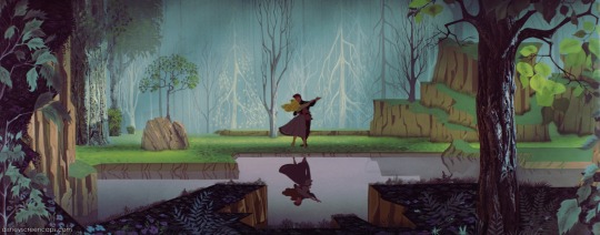
One such application went into the movie “Sleeping Beauty”. Despite characters moving and looking quite realistically, a lot more abstract shapes were used in their designs (like Aurora’s hair) and the backgrounds, inspired by medieval tapestries, having a much more geometric look to them, while still trying to appear realistic (the backgrounds were a major reason for the movie’s inability to make profit but that’s a story for another time)
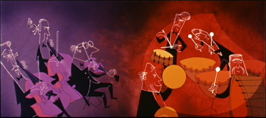
Another much more obvious UPA influence could be seen on Disney shorts, especially the likes of “Toot, Whistle, Plunk and Boom” which I don’t even need to elaborate on if you see what the short looks like
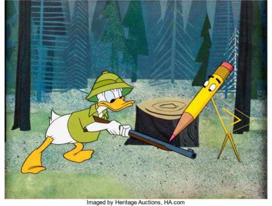
As well as “Donald in Mathmagic Land”
Anyway. My point is, in the 1950s, with television exploding onto the scene and with a demand of animation but a restriction on production costs, the UPA art style became EXTREMELY popular for television, but it did not go to cartoon shows first (as there was no such thing just yet) but instead, the first real applications of television animation went to shows that were basically just filmed story-boards, or TV commercials for products.
Disney actually had their own commercial production division in the 50s, and, with all the information I’ve just given you, you can probably guess that I am leading up to the point that Mickey Mouse was given a redesign during this period, SPECIFICALLY for use in TV commercials. Designed by Tom Oreb, considered to be the founding father of the UPA graphic style in the first place
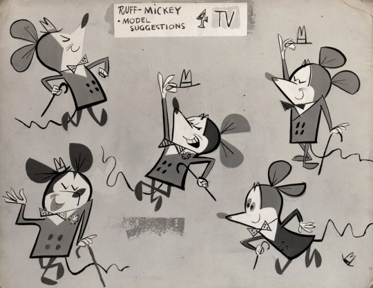
You can see this designed used in the 1955 commercials for American Motors.
youtube
However, this redesign was EXTREMELY short lived.
According to the book “Cartoon Modern” by Amid Amidi, and I QUOTE:
“There was a little kid that used to write to Walt telling him to stay away from modern art because it's Communistic. So when the commercial came on, he got a letter from this kid, a little malcontent sitting somewhere, and he wrote, "I'm disappointed Walt. I never thought you'd succumb. What happened to you?" and Walt went crazy. He stormed down there and outlawed using any of the Disney characters in the commercials...spelling the end of the unit.”
Basically some Far Right teenaged asshole who in modern times would probably be making posts on twitter about chemicals in the water turning the frogs gay tweeted at Walt "lol u commie” and Walt lost his shit and set his own house on fire and Modern Art Design Mickey was killed.
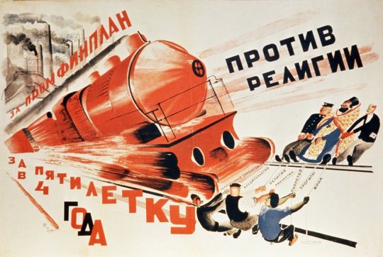
Incidentally, although this little fuckhead was being the kind of little fuckhead we’re all too familiar with, I believe his stupidity came from the fact that communist propaganda in the 1920s looked like this;
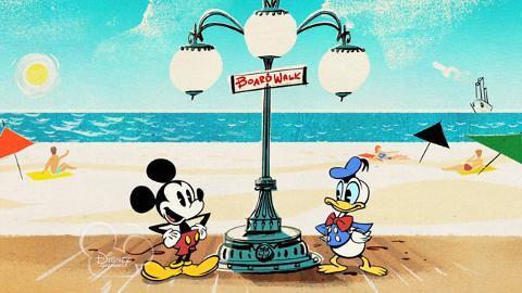
However, as we have seen, this level of jingoism did not stop Disney from doing it again anyway, althoughthis time in 2013
Anyway I just wanted to ramble about Mickey Mouse’s character design for a little.
Personally I’ve always preferred the 1980s design for him, but that may just be nostlagia as I grew up with it, but also because during this time (much like now) Mickey had multiple designs, one being the more “Disney” fleshed out version, and one being the “vintage” version which had come back into popularity. Or more accurately, Disney’s new CEO Michael Eisner (who was behind literally ALL of the 2D Disney Renaissance movies) was pushing to save the then failing Disney Company and more than likely a massive marketing and merchandising campaign felt using both designs would be the best course of action.
#teirrart#C-Puff replies#C-Puff also rambles about Mickey Mouse for a loooooong time#Disney#Animation
55 notes
·
View notes