#CTAFTASK
Explore tagged Tumblr posts
Visit Tumblr Blog
Explore Tumblr blogs with no restrictions, modern design and the best experience.
Last Seen Tumblr Blogs


Fun Fact
Tumblr has 16.74 million mobile monthly users in the US.
Text
Cape Town Art Fair 2019 Questionnaire
Cape Town Art Fair 2019
1. Blank projects – The curation of the work was very similar to the exhibition in the gallery, it was very minimalistic. However, there was a wider range of variety of different mediums and much more colour.
Stevenson Gallery – They included a lot of paintings and it was curated very similarly to the show room in the gallery. There was lots of colour and included artists Penny Siopis and Zander Blom whose work is present in the show room.
Goodman Gallery – The curation of the work was completely different to that in the gallery. There were a lot more works and they were packed together which is a contrast to the usual curation of shows at the gallery.
2. Works I liked:
Asukra Nirasawa, Cell Division, 952 Cells, 2018
Mixed media on canvas, 150x200 cm
I really enjoy the use of colour, texture and shape in this work. I’m very interested in the subject matter and think the piece is executed really well.
Kim Wolhuter, First Drink
80 x 120 cm, edition 10
I love the emotion this work triggers as it is such a special and vital moment at the start of life. The photograph includes a lot of detail. The use of light and shadow creates a very emotive contrast which I really enjoy.
Stacey Gillian Abe, Seat of Honor #6, #7, #8, 2017
UV digital print on Art Board
Edition 3/5
50 x 50cm
The images are very atmospheric and very powerful. I love the sense of movement within each image and the narrative that continues throughout the series.

Works I disliked:
Chris Soal, The search for meaningfulness in the search for meaning, 2018
Concrete, and birch wood toothpicks held with polyurethane adhesive on ribstop fabric. 130 x 70 x 7cm
The texture of this piece makes me feel very uncomfortable. I am intrigued by the shape and materials, and want to get close but when I do my heart races and I felt extremely unnerved.
Armand Bous, Les Fre Sang (Les Inseparable), 2017
124cm x 90cm
Acrylic and collage on card
I am not excited about this piece and don't enjoy the use of colour.
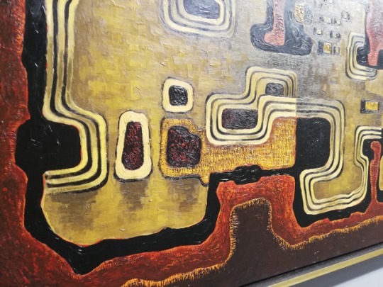
Kenneth Bakker, Abstract, 1960
68x 129 cm
Oil on board
This piece does not intrigue or inspire me. I could walk past this with out noticing it, nothing grabs my attention. It reminds me of an art work that could be found in a waiting room or hotel reception.
3. I found that painting and photography were predominant mediums present.
4. Most booths had white walls however, a few decided to have colourful walls. Another difference which was present between the booths was the inclusion of furniture, only a couple of booths had small plants whereas most booths had table and chairs.
5. Labels have been written in a variety of ways. There was a selection of; hand written labels on the wall, written labels on the floor and labels written on to masking tape. However, most labels are neatly typed out on to paper and placed on the wall directly next to or underneath the art work. I found the signs for each booth were often too small or located in a place which sometimes made it unclear to which booth I was currently in.
6. The layout of the booths was very simple and linear, making it easy for viewers and employees to move around.
7. The lighting in the convention centre was very bright and natural light. Some works had lights directly above them or pointing on to them which often added to the work. these lights were extremely bright and often much cooler than the other lights used.
8. I noticed that people working at the fair, especially in the booths wore very simple outfits. Most people were wearing black, white or a neutral coloured clothing. They didn’t wear patterned clothing, and nothing blended in with the artworks or distracted from them.
9. Products that were being sold at the fair included, books, tote bags, t-shirts, as well as books, posters and other merchandise of the artist’s and their works. I think the Art Fair is largely aimed people who are interested in art, such as students, lectures’/teachers, practising artists and other people working in the art industry. In addition to this, I feel that the art fair also attracts tourists, who travel from different places in the world to experience and discover the art and artists in Case Town.
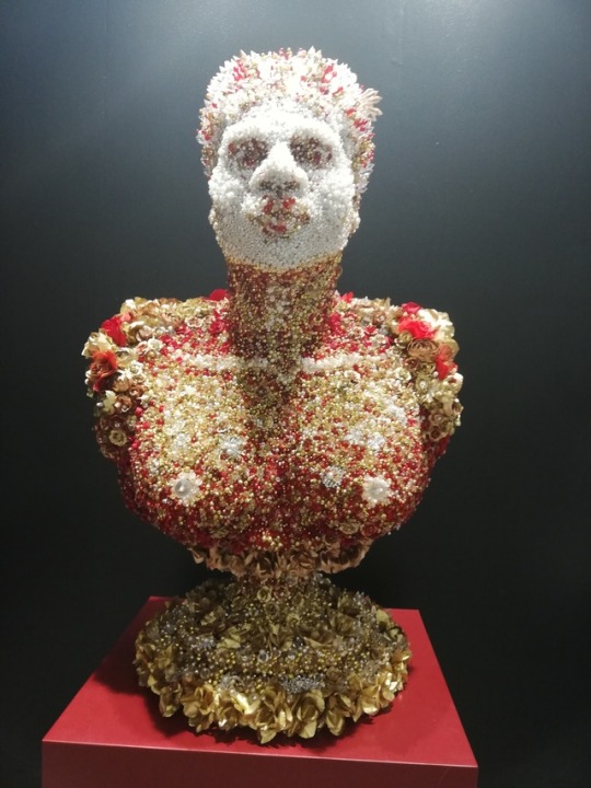
10. Athi -Patra Ruga The Ever Promised Erection I, 2019
High-density foam, artificial flowers and jewels
I feel the overall aesthetic and the materials used for this piece really exemplify the spectacle of wealth. Furthermore the style of sculpture exemplifies wealth and power.
11. John Newdigate (In collaboration with Ian Garrett), Flying Ants In Summer Rain, 2018
Hand painted and Glazed Porcelain.
83cm x 52cm
I feel this piece didn’t fit in with the work as the functionality of the pieces is very different from the rest of the work present.
12. It was easy to speak to some staff about the work, in some booths I was approached by members of staff and was asked if I needed help with anything or wanted any information. Other booths were hesitant about sharing prices whereas others had price lists available.
13.The main sponsor of the art fair is Investec.
Investec focus on specialist banking, assest management and wealth and investment divisions. I think the possible clientele of this sponsor are people involved in the art industry such as gallery owners, curators, collectors and people who interested in investment and banking opportunities. I think they chose the art fair as a place to push their product as a place to attract a large audience and to show their interest into an industry that has the ability to create and include a lot of wealth.
14. I think the Cape Town International Convention Centre is a great place for the art fair due to it’s location and accessability. Other commercial events that take place here include; Cape Town International Jazz Festival, FanCon Cape Town Comic Con and Cape Town Homemakers Expo.
15. The oldest work I could find at the fair was Albert Newall’s Untiled. This was a watercolour and ink painting on paper which was made in 1952.
16. The youngest artist at the fair was Talia Ramikillawn who is 23 and recently graduated from Michaelis. Her work was exhibited at Smith.
17.The furniture and painting of the walls of the solo booths relate and compliment the artist work much more than that in the other booths. In a lot of the solo booths the artist’s work was much more spaced out whereas in some of the other booths the work could be quite cramped.
18. Georgina Gratix – Her work has become extremely sought after. Her style of oil painting and using bright colours is intriguing and aesthetically very pleasing.
Igshaan Adams - His use of material and the style of his work holds so much emotion.
19. The trends in subject matter this year included identity and art in the digital age. I believe art in the digital age was a trend and an important subject as the world is constantly looking towards the digital and how we relate to the digital age is constantly changing as technology becomes more advance. Identity is a popular subject matter as many people go through time in their life where they question their identity and it can often be constantly changing. I believe identity is something we are always questioning and discovering.
Materials that were on trend this year included thread, string, beads and pins. I believe this is because many artists were pushing the limit of a canvas and how they can move beyond that.
20. I would love to be represented by Smith as they seem to take a lot of young artist and support them and push them as they grow as artists.
21. I would love to work for Stephenson as I love the wide range of artist they work with and the work that is produced. The subject matter they work with is extremely important and I would love to work with these artists to exhibit their work in the most powerful and meaningful way.
22. How do galleries chose which artists they would like to show at the fair? How many international buyers are usually at the fair? How many people does it take to set up and take down the fair?
23. I would love to show my gallery or institute at the fair, as I think it would be a great way for artist to be seen and a wonderful way to create connections with other galleries. I would like my stall to be quite open to give the viewer a lot of space to walk around and see each art work clearly. I would possibly paint certain walls to relate to the work being shown. I would like to include works that can be hung from the walls as well as sculptures that could be placed on the floor.
2 notes
·
View notes
Text
CAPE TOWN ART FAIR QUESTIONNAIRE
1)
Blank Projects retained much of its aesthetic from it’s gallery, which was a stark, minimalist white space with no wall colour variation or furniture. However the work differed slightly from that of the gallery, being more decorational and less conceptual on the whole when compared with Bronwyn Katz’s current exhibition at the gallery space.
The Stevenson gave off the same feel as the gallery, highly professional and serious, however the individual works did not command the space like at the gallery, space remained largely unimpeded on by art works, unlike at the at gallery where, in his current exhibition Simphiwe Ndzube uses the space to create installation in the form of sculpture as well as soil. He also painted the walls in a mural-like way.
The Goodman appeared less professional at the fair, when compared with their gallery space, the booth almost appeared cluttered and unordered, where as the exhibition at the gallery was thoughtful and well spaced.
2)
Three artworks I enjoyed:

The Ever Promised Erection
2018
Athi-Patra Ruga
WHATIFTHEWORLD
I enjoyed the opulence of this piece, and its stand alone value as something pleasing to look at.

No Title Given
Georgina Gratrix
SMAC Gallery
I am a fan of really any of Georgina Gratrix’s work, but the purity of the colours in this portrait really appeals to me.

Given To Fly
2019
Ryan Hewett
Barnard Gallery
R320 000
I enjoyed the scale of this piece and the layering of paint used very skilfully.
The Three works I disliked the most were:
Inner Fire, BBHMM, 2016 - Tabita Rezaire
This work came across as kitsch and unattractive.
Cover 01, 2012 - Jorge Macchi
The paint technique in this work appeared unskilled.
While Walking, 2017 - Mr.
The visual codes in this work are foreign to me and therefore it comes accross as unappealing.
3)
i found that most of the work to be oil painting, but I also encountered a lot of weaving and tapestry work throughout the fair.
4)
Some of the booths were laid out in such a way that invited the viewer into an experience or an installation, and the viewer was often drawn in by bright colours or multimedia installations, while some of the booths were commercially focused and therefore just displayed their artists’ work without necessarily a concept which is executed in its entirety.
5)
The various booths differed in level of professionalism, some of the booths had perceived specifically planned layouts for all the artworks and there was a sense that the work displayed was curated in a sense, whereas some of the booths were a complete miss-mash of unrelated work. I noticed specifically that the Stevenson’s signage was particularly poor, they labelled the art work with stickers from a home use handheld labeller, while most of the galleries had professionally printed labels for each of the works, which would be expected from a group showing at an internationally recognised art fair.
6)
The Fair was laid out like a maze and was incredibly hard to navigate, you could not exit where you came in and the exit was extremely hard to find. I think this was done with the intention that all the visitors spend as much time in space as possible and hopefully interact with the gallerists and galleries as much as possible.
7)
The lighting at the fair was a harsh white and was very bright. It made for an comfortable environment to view art in and I would’ve expected it to be much more professional considering the size of the fair.
8)
All the gallerists and assistants were dressed formally, in suits and formal dresses, while i found the majority of the visitors to be casually dressed, as I would imagine a large portion of them would be tourists.
9)
The different markets at the fair would be
- low income visitors, students and art enthusiasts who would be buying the magazines, books and some of the clothing merchandise.
- middle income visitors, people coming to the fair to find lesser known artists to buy whose prices aren't very high as well as prints.
- high income visitors, individuals, looking to purchase for their own collections; collectors looking to purchase for clients and galleries scouting for emerging talent to sign.
10)
The Ever Promised Erection, Athi-Patra Ruga, 2018.
The materials used for this sculpture appear expensive, and the colours used are incredible deep and rich, adding to a feeling of prestige.
11)
Inner Fire, BBHMM, Tabita Rezare, 2018.
The work just seemed to stand out as a kitsch work without any real roots in what the ICPAF supposedly exhibits.
12)
It was relatively easy for the first one. I asked about the price of Ryan Hewett’s work at the Barnard Gallery, and although the man was surprised and reluctant to give it to me, as I don't think he saw me as a prospective client, he did eventually give me the price.
The second one was not as easy, I asked how much a piece by Penny Siopis at the Stevenson was and the gallerist replied condescendingly, “ A lot”.
13)
The main brand I noticed at the fair was Investec, which would make sense. Investec caters to the wealthiest people in the country as well as a number of wealthy clients abroad, so it would make sense that they would sponsor these types of events given that many of their clients would be buying work from represented galleries.
14)
It is a large enough space to host 40+ gallery booths from all over the world, which gives the fair more international appeal. Other examples of functions hosted at the CTICC are Sex-po, Captivating Cuisine and Seamless South Africa.
15)
Untitled, 1952 - Albert Newall
16)
Ruby Swinney was one of the youngest artists I saw represented at the art fair, another young artist that i recognised was Alexia Vogel.
17)
Because the solo booths focused only on one artist, there was room for a running theme and curation, as opposed to most of the gallery booths where curation would be near impossible with such a wide variety of works from different artists.
18)
Athi-Patra Ruga was mentioned a lot at the art fair, i think because his work is selling for a lot of money and is also incredibly visually appealing as he casts a wide net when it comes to his audience. Brett Murray was also a name I heard mentioned a lot by passersby but I did not ask why.
19)
Gender and sexuality seemed to take a prominent place in the fair, as well as space and displacement, especially amongst African artists. I think because of current affairs these are very contentious as well as important issues to be discussing and addressing and thus are the subject matter of many artists.
20)
SMAC gallery, they seem a lot younger and more approachable than any of the other major galleries.
21)
Stevenson, as a talent scout (if that is a thing).
22)
What do highly conceptual artists think of the art fair, and why do they allow their work to be shown there?
23) I don't think i would show at the art fair, I would try and keep my gallery as financially unfocused as possible to ensure the integrity of the artists’ and the galleries work.
0 notes
Text
Art Fair Questionnaire
1) Blank- The minimalistic approach to the curation of the booth was similar to the gallery however only to a certain extent. The booth had a wider range of mediums and vibrant colours.
Stevenson- The booth differed in style and curation to the exhibition show however it was very similar to the curation of the showroom. Artists such as Penny Siopis and Zander Blom were featured both in the booth and the showroom.
Goodman - The crowed curation of the booth directly juxtaposed the gallery which had a space layout. There was also a variety of work and vibrancy to the colours used in the booth.
2) Artworks that I enjoyed:
Justin Dingwell, A Seat At The Table, 2018
Inkjet Print on Paper
I am very drawn to this work because of its technical skill and its aesthetic. I enjoy how the artists has played with a corresponding colour palette that accentuates the subject.The lighting is fantastic and brings focus to the subjects contrasts of their body. Studio photography can often lose the true depth of the concept however I think this could not have been created another way.
Arim Andrew, What They Want, 2019
Oil on canvas
I love the playfulness that the image portrays while overlaying a much harsher narrative. The lighting used is reminiscent of front lit studio lighting which adds interesting highlights all while juxtaposing the origin of the characters. The simple background brings forth the subject matter for me which brings focus to the details intended to convey meaning.
Ima Mfon, Nigerian Identity, 2015
Inkjet Print on Paper
Black and white portrait photography holds a special place in my heart. It holds so many emotions and stories within a single image. It can transport you to a different place or time all from looking into a strangers eyes. This piece conveys exactly that. A narrative through a strangers eyes.
Artworks I didn’t enjoy:

Chris Soal, The search for meaningfulness in the search for meaning, 2018
Concrete, and birch wood toothpicks held with polyurethane adhesive on ribstop fabric
This piece gives my a crazy amount of anxiety followed by chills up my spine. I understand that this work was intended to cause discomfort but for me it has passed the boundary of tolerable angst. I am very sensitive to textures, even looking at an unpleasant texture causes a flurry of uncomfortable emotions.
DD Trans, Unknown
Oil Painting and Balloon Ends
Honestly I absolutely hate this. The balloons look like little cat bums. Enough said.
Armand Boua, Les vièx môgô (Les grand frère), 2017.
Acrylic & collage on canvas
This piece hurts my eyes. It hurts to look at the lime green in the background which leaves me unable to fully focus of the foreground. I also feel it is bland and lacks depth.
3) There were a lot of paint mediums used in works as well as an increased amount of photography compared to last year.
4) The most obvious differences included labeling and curation of their pieces. Some works were close together on walls while others were spaced evenly apart. Some booths had no furniture where as others had an info desk or a seat for the viewers.
5) Some booths paid great attention to the labeling of the work and pasted labels neatly next to the work. Others printed labels but stuck they skew and some just had pencil marks on the walls i.e Siopis from Stevenson .
6) I feel that the fair is designed in a way to direct people straight to the big gallery names such as Stevenson and Goodman and then make their way outwards towards the smaller galleries and solo shows. I feel like a lot of good work is either missed or discarded through this layout.
7) The lighting differs slightly in each booth that has specific lighting for their work but overall the main lighting is bright and artificial. It reminds me of a grocery store.
8) The clothing is mostly neutral and monotone. Gallery black clothing is continued at art fair. However their were some individuals who enjoyed standing out by wearing vibrant colours and heavily patterned garments. What I mostly enjoyed was seeing some of the school kids bored out of their minds and resorting to mischief amongst their friends.
9) Although the art fair is advertised to the public it is mostly targeted to wealthy individuals who are interested in buying and investing in art. The art fair definitely encourages this by having extended VIP dates and extravagant events.
10) Marina Abramovic, Victory, 1997
Even though the works subject matter actually juxtaposes the ideology of wealth, the works worth is a spectacle in itself. It sold for 80 000 euros.
11) Kirsten Sims, In a Flash, 2019, Ceramic
Due to the functionality of the object Sims has created it feels misplaced amongst an array of “display” items. This piece unlike the rest is not just to be understood for its aesthetic worth.
12) I normally am very comfortable talking to strangers however at art fair I felt heavily scrutinized for my age and dress (I had a hole in my shirt which many women felt the need to make direct eye contact with) which made it harder for me to discuss work with people. I was almost laughed away by the people exhibiting Abramovic’s work when I asked for the price. It was 80 000 euros and apparently just as expensive to ask a question without utter judgement.
13) Investec is a prominent sponsor in the event. It is a private banking firm that only caters to those of a certain earning potential. I am certain that almost all of the VIP guests have accounts with Investec and would feel a sense of patriotism when they saw their bank was sponsoring the event. This helps build their relationship further and will encourage more people to lean towards Investec for cultural investments.
14) The CTICC is a very large space designed specifically for events like this. It has the capacity to cater to big sums of people and can plan events efficiently. It is also centrally located and easy to access. Events such as The International Tattoo convention and Design Indaba are also hosted at this site.
15) Albert Newall’s Untitled was made in 1952 through watercolour and ink on paper.
16) The youngest artist is a recent Michaelis graduate. Her name is Talia Ramkilawan and she is 23 years old.
17) The solo booths’ décor or paint on the walls correlate with the artwork. The space is integrated and has a stronger relationship with the works in comparison to other booths.
18) Georgina Gratrix- Gratrix’s process and the manner in which she paints is very intriguing and intense. The thick application of oil paint reminiscent to layers of make up entices people continue viewing her “pretty-ugly” work.
Igshaan Adams- The delicate nature of his work is very intricate and complicated. Through this intricacy he is able to communicate a wave of movement and narrative to the viewer.
19) I noticed a lot of work focusing on the subject of origin and identity. These are beautiful concepts that hold such a deeper meaning than when explored fully. Every human has an identity and every human can empathize with another’s identity (I HOPE) therefore creating a common understanding and concept to explore. Materials that frequented were Ink Jet Prints of photographs, weaving and sewing supplies and alternative materials for sculpture building.
20) I would love to be represented by Smith Gallery as I think they have a good understanding of how to work with young and up and coming artists. Their galleries tend to keep up with art trends and don't appear to fit into a particular mold.
21) I would love to work for WHATIFTHEWORLD as I have always found their exhibitions exciting and emotive. Their ability to transforms an artists vision into a physical space is quite remarkable. It would be an honor to be part of that team.
22) “I wonder if the maintenance team is going to be pissed about all the Ed Young balloons on the ceiling?”. “Do any of these works actually sell or is this just a giant publicity stunt?”.
23) For my booth I would build a ceiling so I could block off those horrid grocery store lights in the centre. I would black out the box inside and as my display I would have my fellow artists paint, write text, spatter on the walls of the few space using UV paint. Viewers would then be handed UV light torches to go and view the work inside the space. This way we are providing an experience rather than a commodity.
0 notes
Text
CAPE TOWN ART FAIR QUESTIONNAIRE
Vanessa Beecroftt
Vb. Paulina. 005.fs.pol, 2014
Digital print on canvas
127 x 101 cm

Gitte Mölle
Pushy passion, 2018
Oil and collage on panel
120 x 120 cm
Moffat Takadiwe
Camouflaged Robots, 2019
Found spray tops
246 × 90 × 14 cm
Rosie Mudge
Door, a the back of my mind, 2019
Automative paint and glitter glue on canvas
180 x 140 cm
Anna van der Ploeg
Great imaginary walls, 2018
Monotype on Hahnemulhe
110 x 80 cm
Jorge Maccchi
Cover 01, 2012
Oil on canvas
198 x 334 cm

Athi-Patra Ruga
The ever promised erection, 2017
High-density foam, artificial flowers and jewels.
60 × 40 × 35 cm

Tabita Rezaire
INNER FIRE: BBHMM, 2016
Disc print
170 x 100 cm
1.
Goodman: Entering the Goodman gallery space feels somewhat like entering an old museum. Its main booth, too, was serious and dry. It contrasted starkly to their solo booth, showing Tabita Rezaire’s (2019) work. Rezaire’s bright, millennial digital collages – one of the most exciting exhibits for me at the fair – had a very disconnected feeling from the somber main booth.
Blank: Blank’s booth was bright, clean and organized, similar to the main gallery space. Compared to Bronwyn Katz’ solo show at the Blank gallery space which was smoothly curated, I found the curatorship at the Blank Art Fair booth somewhat disjointed. I felt a strong disconnect between the works being shown. A number of the works in the booth were unlabeled, making some different artist’s work run into each other in a way I found quite confusing! This differed from the main gallery space, where Katz’ exhibition had a smooth and holistic feel.
Stevenson: The Stevenson booth was quite welcoming, with a very friendly “cool” person running it. Dressed quite casually compared to people in the surrounding booths, I found them helpful and easy to talk to. They were very diplomatic and friendly when Rowan declared a Penny Siopis painting “basic”. The main gallery is a little loftier, but still a very welcoming space. While the Simphiwe Ndzube’s show at the main gallery bold me over as I entered the space, the works at the Art Fair booth were not as evocative or memorable. Though this is also due to differences between the two spaces. The main gallery’s big white rooms flooded with natural light are a more effective space than a booth at the CTICC.
2.
Works I like:
Vanessa Beecroftt
Vb. Paulina. 005.fs.pol, 2014
Digital print on canvas
127 x 101 cm
Though quite simple, this portrait intrigued me. There was something timeless about it, as though it could be from any time or any world.
Gitte Mölle
Pushy passion, 2018
Oil and collage on panel
120 x 120 cm
Though I’ve seen this work before at Mölle’s solo show, it still caught my attention at the Art Fair. Mölle creates strange landscapes that take you into a world that feels both mystically dreamlike and digitally synthetic.
Moffat Takadiwe
Camouflaged Robots, 2019
Found spray tops
246 × 90 × 14 cm
The texture and colour in this work invited me to look at it longer.
Works I dislike:
Rosie Mudge
Door, a the back of my mind, 2019
Automative paint and glitter glue on canvas
180 x 140 cm
Though people are often excited by Mudge’s glittery paintings, I am never grabbed by her work. I find them conceptually basic, or at least ineffective on me.
Anna van der Ploeg
Great imaginary walls, 2018
Monotype on Hahnemulhe
110 x 80 cm
Though i am a fan and follower of van der Ploeg, Great imaginary walls (2018) did not captivate me. The colours felt muddied.
Jorge Maccchi
Cover 01, 2012
Oil on canvas
198 x 334 cm
This painting struck me as uninteresting and lazily laid out, especially for a Guggenheim fellow.
3.
There was a lot of art working with tactile and unconventional mediums at the fair, and I noticed many artists incorporating textures like material, rope, fur, hair and even toothpicks. I saw recurring iterations of tactile, rounded shapes and forms.
4.
Many of the booths bled into each other, and there was a lot of similarity with the predominantly white walls and bright overhead lighting. Some booths played with colour on the walls, such as Smac. Using furniture and colour Blank and Smith created booths that felt interesting and inviting.
5.
Most of the booths had clear labeling with uniform size and format. I saw a number of floating works with no labeling. The signage was sometimes confusing, and I could not always distinguish between booths. I liked that no prices were included in the labels; it felt like i was not influenced by their market value.
6.
I am impressed with whoever does the layout for the fair, as it must be a monumental task. However, I found the layout overwhelming and sometimes confusing. Solo booths were removed far from galleries. Though the number of artists and work shown is impressive and exciting, I found myself quickly saturated with all the stimulus in the space.
7.
The lighting is cold and clinical – not unlike some gallery spaces – and the space is devoid of natural light. However, it was also bright and clear and conducive to viewing the art.
8.
The fair workers all wore black, but the people working in the booths were a mixed bag, ranging from very casual to very formal. Much of the clientele had the laid-back golf-style attire of European tourists in Cape Town. There were also a lot of students in uniforms.
9.
My first impression was that the fair was first and foremost an exhibition and secondly a market, though this was probably naïve. Because there were no prices on artworks, I wasn’t influenced when looking at them. This differed to the Strauss and Co. show room where all the works are priced. Here the prices become part of the work’s title.
10.
Athi-Patra Ruga
The ever promised erection, 2017
High-density foam, artificial flowers and jewels.
60 × 40 × 35 cm
This work seems to play with ideas of wealth. Blending opulence and kitsch it both exemplifies and examines notions of wealth.
11.
Tabita Rezaire
INNER FIRE: BBHMM, 2016
Disc print
170 x 100 cm
Razor’s digital collage, playing with pop culture and a myriad of internet references, felt different to the rest of the Art Fair in both medium and subject matter.
12.
Asking about prices was easier than I expected. People were friendly, though they evidently did not take me very seriously.
13.
Boschendal Wine Estate and Investec, as well as the CTICC itself, were the most obvious brands in the space. These brands elevated the Art Fair, appealing to its wealthier clientele. Boschendal would naturally choose an Art Fair to push their product; almost everyone drinks wine at art exhibitions.
14.
There are a broad range of events at CTICC, ranging from corporate events to Indabas to flower shows. I imagine they chose it because it is the only large function venue in central Cape Town. Near the Waterfront, it is well situated for foreign visitors to the Art Fair.
15.
There was a collection of Jesse Fernandez photographs exhibited, ranging in dates from as far back as 1950.
16.
Talia Ramkilawan, 22.
Exhibiting with Smith.
17.
The solo booths have a more synthesized and unified feel. The artist’s names are displayed more prominently than in the group exhibits.
18.
With new ears to the art world, no big names popped up to me. Personally I am very excited to see Tabita Rezaire’s and Talia Ramkilawan’s further work.
19.
I observed trends in texture and medium as subject matter. In many works the texture of the work felt like the subject matter. I didn’t see any trends in content.
20.
Blank
21.
Smith.
I’d be happy for any position.
22.
How do galleries choose whom to represent, and who should be given a solo booth?
23.
I would only choose to show at Art Fair when my gallery or institute was well established. Similar to Bad Paper, I would create a dynamic space with comfortable seating. I would exhibit lots of videos, and create a booth that people could escape into. Insulated by headphones, people could be totally immersed in the video works.
0 notes
Photo

Investec Cape Town Art Fair: Answers for the Questionnaire
1.) When I found the three booths I was taken by surprise as for me they were similar to that of the galleries that I visited on the fourteenth of February. I could see distinct characteristics in their style of work and I think perfectly encapsulated the artist gallery.
2.)The works that I absolutely loved were-Alexis Peskine, Filhos de Oxala, Moon gold, nails, earth, water, coffee and archival varnish on wood. The reason why I love this artwork was the fact the artist used nails to construct an image on a figure in such a way to cause it to look realistic.
Williams Chechet, Adamu’s weekend, print. The reason why I love this artwork was the fact that it resembles the artwork of Michelangelo, ”the creation of Adam”, which is one of my favourite artworks that I’ve ever seen.
Ryan Hewett, Given to fly, 2019, Oil on canvas. The reason why I loved this artwork is due to the geometric shapes and the use of colour, the image has a Picasso characteristics which makes me so interested in it.
The works which I disliked were-Francois du Plessis, Africa, My Africa, 2018, cutted books, fabrics, screws. The reason why I disliked this artwork is due to it being a representation of Africa with colours that appear to be dull and not how I would reflect Africa in any way, I see it being an insult.
Simone Pellegrini, Alcoba, 2015, the reason why I dislike this artwork is due to the fact that it gives me a very sinister feeling when I look at it, as though it is filled with this dark ore
Cyrus Kabir, Mziki(music),2018,steel and found options. The reason why I dislike this artwork is because it reminds me of a death trap from a horror movie.
3.) The predominant mediums used was oil on canvas, the predominant process is mixed media.
4.) Most booths had no furniture aside from the information desks. The artworks where spaced far apart unless they were part of the same piece.
5.) Most booths didn’t have labels for there artwork.
6.) The layout displayed was that each exhibition had their own space to display their own artwork. The layout was in an organised fashion, which was very professional.
7.) The lighting in the fair was perfect as it wasn’t too bright nor was it to dim could see the details of each artwork perfectly and when I took pictures I never got any overexposure in my shots.
8.) Basically a mix of people, there for different purposes and reasons e.g. critics, journalists, students, collectors and those that just show a love for art the spectators. People at the booths are very direct and informative.
9.) There were food stalls, Alcoholic stalls, book stalls which gave out catalogs and magazines, There were also clothing stalls which sold clothing with artsy sayings and expressions. The target market was for the wealthy due to the quality in which all the markets displayed.
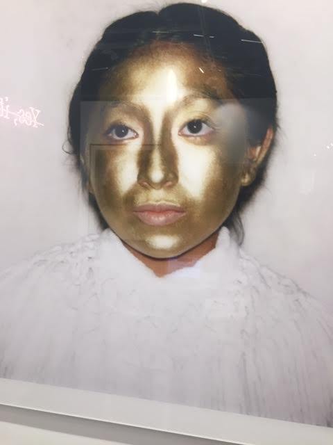
10.) There was an artwork done by Ayanda Mabulu, who made this massive artwork of Winnie Mandela which is dressed in this brightly gold cloak-which symbolizes power and wealth, she is seated on a large white horse which appears to be on the verge of galloping off in to the horizon, at the back of Winnie Mandela, In the background is a type of renaissance textile. The frame of the artwork is made of gold, and to me this suggest wealth and power due to all the characteristics mentioned about this artwork.
11.) The whole exhibition which was called timeless between matter and spirit by Esther Mahlungu which was a Ndebele mural/abstract. This seemed to be very religious and traditional and to me gave this exhibition this sense of being lost in this different world that we call contemporary art.
12.)I found that all booths that I asked gave me the prices of the artworks and information about the artwork enthusiastically. Although I did hear from other CA students who experienced lack of information about artworks saying thst they were biased based on who asked.
13.) Mostly indie brands as their target market was towards the white community.
14.) As it is generally seen as place where many powerful and successful business have meetings or functions, therefore it is seen as being amongst the prestigious places. That’s why I think the art fair holds its functions at the Cape Town International Convention Centre.
15.) The oldest artwork which I found was by Albert Newall, named Untitled in the year 1952.
16.) The youngest artist I think that can be represented was by a work which allowed the viewers to draw on the artwork, and on that day I saw a child who was five years old drawing on this artwork, so therefore I thought that he would definitely take the honors of being the youngest artist to be in the art fair. His name was Calum.
17.) They had more thematic to their booth.
18.) The big names which I see popping up was by William Kent ridge and Penny Siopis.
19.)The trend in subject matter was abstraction-the reason for this being such a trend is due to the influx in the market who showed an interest for such artworks, the trend in materials was oil on canvas ,it was the predominant medium used as it being cheap and south Africa’s trademark medium.
20.) I would love to be represented by Stevenson as I feel that my style of work will suite and complement his gallery or exhibition
21.) I would love to work for Stevenson as I really love the style of the artist and the message that he is trying to promote in his artwork.
22.)There was one question that kept coming up when I was looking at the artworks in the art fair and that was ,”Are you interested in this piece of artwork”. And most of the time I would say yes, as when I did they would take me on the story of the artist and his works, and I could better understand his collection which I found was very interesting.
23.) I would definitely show at the art fair as I think it would be a good opportunity to promote my institute or gallery on a large scale, and with the help of the publicity and stature of the art fair it will be good for business and finding raw talent. I think my booth would look different,and the way i would do this is by adding a bench in the middle of my booth which would give the viewer a much more comfortable experience.
0 notes
Text
Cape Town Art Fair Questionnaire :
1. Blank- I recognised some of the artists I had seen before at their gallery like Bronwyn Katz and Igshaan Adams. I also recognised the gallerist Tyra Naidoo. The booth kept to their minimalist style and I felt there were quite a few hanging pieces. I also found it interesting that they had paintings as I’ve never seen that medium in their gallery.
Stevenson- At the booth, I recognised Zander Blom’s and Kemang Wa Lehulere’s work. A similarity to the gallery, I noted, was the use of lots of colour. They also had quite a few paintings.
Goodman- I could not really get a grasp of what was similar and what was not similar to the gallery as I felt there was a lot going on. The booth displayed quite a few different mediums, from sculptural works to photography. The booth felt quite cramped compared to their spacious gallery space.
2. Works I liked:
Cinga Samson
Uboya benye (i)
2019
I always love Cinga’s portraits as I feel they draw the viewer in. The dark, monochromatic palette makes the work feel quite mysterious and spiritual which creates a curiosity around the figure. There is always a delicacy that contrasts the darkness like the use of flowers and the attention to detail of the clothes. The painting makes me think of youth, masculinity and beauty.
Tabita Rezaire
INNER FIRE: Shadelicious, 2017
Diasec print
170 x 100 cm
Edition of 2/5
I really really liked Tabita’s series of prints and I found them quite refreshing compared to a lot of the works at the art fair. I was first drawn to them because of the kitschiness of the bright colour and iconography but I also love how their works explores the format of memes as a way to address gender, racial and political issues.
Gitte Möller
Pushy passion, 2018
Oil and collage on panel
120 x 120 cm
I think Gitte has a very unique painting style and I admire her attention to detail. I think she explores the use of symbolism in an interesting way to create these alternative video game-like worlds. This specific work is very satisfying to me as the composition and use of colour is completely balanced. The linear perspective and symmetry draws all the attention to the bleeding out heart in the centre of the painting which makes the work feel quite vulnerable and even a bit sad.
Works I disliked:
Afshin Pirhashemi
Power , 2013
Oil on canvas
78 7/10 × 118 1/10 in
200 × 300 cm
I struggled with this work because I really did not like the use of colour and painting style. The artist’s work always depicts what I assume to be women from Dubai and this gallery did not have any labels so I assumed the artist was a woman. I thought it was interesting that the fair was showing a woman artist from Dubai who was addressing women’s roles in the country. However, I then later researched the gallery to find out more information about the work only to find out that the work was actually done by a man. With this new knowledge I disliked the work even more.
Kilmany-Jo Liversage
MACHINIKA119
198cm x 198cm
R170 000
Instagram: kilmany_jo
www.worldart.co.za
When I see brightly coloured work painted in a graffiti-like, gestural style my mind just automatically puts into a category of work that I do not like. I just find this kind of work so overrated and commercially driven to the point that I do not even want to engage with it.
Rory Emmett
Future Remnant II
Oil and acrylic on canvas
120 x 90 cm
I did not like how the artist tried to bring colour into this black and white painting. I found this piece quite boring and it kind of remind of something an art student would do in high school. The style is something that at one point was maybe fresh and innovative but now it is overdone and quite out of fashion. To be honest the work felt quite cheap and not in a good way.
3. I found that there were a lot of hanging sculptural pieces similar to Igshaan’s work and quite a few works made with found objects. I also always think there will be a large amount of paintings.
4. Some booths choose to create smaller enclosed spaces will others have one big space. The majority of the booths have white spaces but some choose to have colorful walls. I observed that Smac’s booth furniture resembled wooden school furniture but the rest of booths mostly had slick black or white furniture.
5. Some labels where placed on the floor, some where written in pencil and some where classic placard labels. Quite a few of the labels where placed in perspex with screws and the rest were either stickers or stuck down with double-sided tape or prestick. I found it strange when the labels only gave the name of the artist and not the title of the work. Some label information went into quite detail with dimensions and price.
6. The fair felt bigger than last year but I think that is a result of the layout being more open. The layout of the fair and the signs want the viewer to turn right when coming through the entrance but I felt overwhelmed with which way to go. The main commercial galleries are in the centre of the fair which I think is because the fair knows buyers are coming to see the big names. This allows for people to see the whole fair without heading straight for one areas. The layout also insured there was hardly any congestion. However I also think the layout is designed to guide people to the food and drink areas.
7. The lighting of the fair was neutral but each booth had direct lighting on the hanging works.
8. People visiting the fair were dresses fashionably but formally. Bright colours seemed to be the trend. As for the gallerists and assistants, black, white and neutral colours seemed to be the required dress ware. I think this for them to blend into the booths and to not distract from the work.
9. I would say that the fair is aimed at upperclass art lovers who can afford the expensive food and drink, and maybe even an artwork or two. The types of products being sold were food, drink, art books, art magazines, apparel and accessories relating to the art, and of course the art itself. The fair is targeting wealthy tourists and locals who have the means to indulge in art paraphernalia.
10. Athi-Patra Ruga
The Ever Promised Erection I, 2019
High-density foam, artificial flowers and jewels
Multiple 3 of 3
Approx 126 x 74 x 64 cm
For one, I know Athi’s work sells for large sums of money and the work itself exudes an air of wealth and luxury. The fact that this piece had its own booth tells us that this work is valuable and important. Even though the sculpture is made of artificial flowers and jewels, it feels expensive and the way the light catches on the beads and glitter holds the viewer’s attention. I also witnessed quite a few tour guides stopping at this piece and I found it hard to get a picture of it with the amount of people that surrounded it.
11. Tabita Rezaire
INNER FIRE: Shadelicious, 2017
Diasec print
170 x 100 cm
Edition of 2/5
Tabita’s work in general felt very different from the general work that was showing at the art fair. People I spoke to it about either loved it or thought it was absolutely terrible and that it did not deserve its place at the fair. I feel their work does not fit in because they are using newish form of art that not many people understand or appreciate. The kitschiness of the meme-like text and format is not something you see often in the art world.
12. With a group of peers I found it very easy to ask for prices. I was speaking to Tyra Naidoo, who works at Blank, and she was saying that is not unusual for people to ask for prices and that it is her job to provide that sort of information. However, I found some of the foreign galleries were a bit taken back by us asking prices, as if it was slightly taboo. The prices we gathered were:
Marina Abramovic
Victory
1997
R80 000
Pierre Fouche
Net Ons
2019
R250 000
13. The main sponsor of the art fair is Investec which is an international company which deals with specialist banking and asset management. The sponsorship for food and drink was from Boschendal which is a wine estate.
The target market for Investec could be almost anyone attending the fair, even the tourists as it is an international company. Boschendal’s clientele is most likely wealthy locals and tourists and therefore the art fair is a perfect place for them to promote their brand. Investec can benefit from promoting an art fair because it expresses their support for African culture. It shows that they are invested in the future of South Africa which benefits them as it promotes the idea that Investic is invested in their clienteles future. It also implies that investec is interested in what their clientele is interested in which creates a personal connection.
14. The Cape Town International Convention Centre is a convenient place to hold an event such as the art fair because it has the means to host such a huge event. It is also placed in a accessible location close by to many hotels that could host potential guests from around South Africa and the rest of the world. The centre also hosts events like Comic Con, Cape Town Jazz Festival and various conferences.
15. I actually struggled to find old artworks this year. I think the oldest work I could find, which was somewhere in the 1930s, was in the Norval Foundation booth but I forgot to right down the label information. So I will go with a work from 1952 which was by Albert Newall, ’Untitled’,
watercolour and ink on paper.
16. The youngest artist I knew of was Talia Ramkilawan, 23, who was showing at Smith. I found Smith often takes artists who are straight out of Michaelis.
17. I felt the solo booths were obviously more cohesive as it was one artist’s work. I sometimes felt like the gallery booths were a bit overwhelming or chaotic, where as the solo booths were more effective in the engagement of the artists’ concepts.
18. I think the big names that kept popping up this year were very similar to last year. Georgina Gratrix seemed to be one of the most sought after artists right now. Her work is very on trend, as her use of brightly coloured oil paints makes for an aesthetically pleasing centre piece. I think her thick application of oil paint and her abstraction of the figure intrigues viewers. Her work sits on the line of bad art which makes it so good.
Ed Young is someone who seems to be getting quite a lot of attention this year. The fact that his balloon intervention/performance was the first thing that guests experience when entering the fair shows that he is a trusted enough artist to set the tone for the fair.
19. I think identity as a subject matter is always something you will see a lot of in art fairs because artists often look to themselves to draw inspiration from. I found there was a lot of abstract pieces which focused more on the use of material than on subject. The use of found objects such as toothpicks, dice, and bindis seems to be a common trend this year. I think this is due to the fact that in a postmodern world people are fascinated by using objects and materials for a different purpose than their intended function.
20. I think I would like to be represented by Smith gallery because I like the fact that they are not afraid to take on young artists who are coming straight out of art school. I actually think by doing this their range of work is much more varied and unique because their artists have not yet been manipulated and influenced by the commercial art world.
21. I think I would want to work for Smith based on the fact that they represent a lot of young, emerging artists. I think it would be easier to engage with artists who are of similar ages to me as there will be more of a relatable understanding of what it is like to be an emerging artist in 2019. I think I would want work directly with the artist and the work, so maybe as a curator.
22. A question that came up for me was, why do some galleries choose to not label the work?
23. I think I would want my gallery to show at the fair because it is a great way to get recognition and to network. I like the idea of having one or two solo booths, alongside the main booth, to push artists who have more potential. I think I would play around with different hanging techniques and paint one or two walls a colour that compliments the work. Like Smac, I found it more interesting when the booths felt like multiple spaces and not one empty room. At first I found it quite annoying with some of the galleries created nooks in their booths but I actually think it is a good way to get the viewers to engage with their surroundings and get closer to the art.
0 notes
Text
"CAPE TOWN ART FAIR QUESTIONNAIRE "
1. Find each gallery booths for the three galleries that we visited on Thursday 14 Feb. What do you notice about each of these booths that are similar and different to the actual gallery (do you recognize the gallerists, the style of work/ artists and ways the work is hanging, a “vibe” etc.).
d
2. Over the course of the day, decide on THREE works you absolutely love and THREE you most dislike or find frustrating. Make note of these with full details, and why you like/dislike them.��
3. What are the predominant mediums and processes that dominate the majority of works at the fair this year?
4. What are the most obvious differences between the way different booths are curated? Look at spacing/ size/ hanging/ booth furniture and so on.
5. How do the various booths differ in terms of signage, text, labeling/ titles: note the different ways.
6. What is the general layout of the fair? Why do you think it is laid out this way?
7. What is the lighting like at the fair? Describe.
8. What do you notice about the way people dress at an art fair? Look carefully at how the people working in the booths present themselves ,as well as other people at the fair and make observational notes.
9. Who or what are the various “markets” at this fair? What are the different types of “products” being sold and promoted here? Who is the fair aimed at?
10. Find a work that you think exemplifies the spectacle of wealth. Note why you think so
11. Find a work that feels like it doesn't “fit” in this art fair context. Note why you think so.
12. How easy is it to ask about prices? Take turns with your fellow CA students to enquire about the cost of works at various galleries and take note of prices across the fair, as well as the way gallerists may treat you or react to you asking for these details. Do it at least TWICE yourself in two different places.
13. What do you notice about sponsorship and branding at the fair? What brands are visible and who is the clientele / target market of these brands? Why would they choose a fair to push their product?


14. Why do you think this fair takes place at the Cape Town International Convention Centre? What other commercial events take place here? (look up examples)
15. What are the oldest artworks you can find at the fair? (made the furthest back in time)
16. Who are the youngest artists you can see represented at the fair?
17. How do the SOLO booths differ from the other booths?
18. Who are the big names that keep popping up this year? Note why you think this is so.
19. What kind of trends in subject matter do you notice this year? What kind of trends in materials do you notice this year? Note why you think this is so.
20. If you could be represented by any of these galleries, whom would you LOVE to show or be represented by?
21. If you could work FOR any of these galleries, whom would you LOVE to work for? And in what capacity?
22. What other questions came up for you while wandering around the fair?
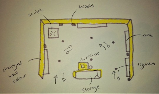
23. If you were to start a gallery or art institute, would you (hypothetically) want to show at the fair? And if so, how would your stall look and differ or be similar to what you have seen today? (you can make a sketch below)
0 notes
Text
Cape Town Art Fair Questionnaire
1.
The Goodman Booth was very different to the Gallery space. In the gallery space the work is all spaced out and all work similar in visual aesthetic with some walls painted black. While in the booth all the work differs in medium and are placed very close together. In the booth I recognized work by Yinka Shonibare and Kendell Geers.
Blank Projects gallery space is very spatious with work of a minimal aesthetic and focus on metals. In the Blank Booth there is a range of materials which are all crowded into the space. The only correlation between the two spaces would be the white walls and each space having a metal work/s. I recognized work by Igshaan Adams and Gallerist Tyra Naidoo.
The two Stevenson Gallery/booth spaces were very similar in visual aesthetic. Both spaces focused on large wall work. Both spaces have sculptural elements to them. However the wall colour of Stevenson Gallery differs to that of the white booth at the art fair. I recognized work by Kemang Wa Lehulere.
2. I ENJOYED:
Stephen Allwright
‘Fluid’
Ink, graphite, crayon, pencil and water colour on paper
2018
Initially I was drawn to this work purely for the sunflowers. However when further admiring the piece I started to love it more. I love the muted tones of the yellow paired with the dull pink of the man’s underwear. I really enjoy the way in which the character is drawn, his form is almost organic, and matching the shape of the chair he is lounging on. I am also very attracted to the repetition of texture in sunflowers, facial and arm hair, creating depth and shadow.
Chris Soal
‘Kids see ghosts sometimes’
Toothpicks in polyurethane on industrial fabric
2018
This piece sparks a great amount of my interest. It pretends to be something it is not, which I am somewhat drawn to. From far this hanging piece seems to be a soft flowing fabric draped onto the wall to the floor. However when approaching the work it is evident it is actually quite the hazardous piece. Thousands of toothpicks stick out at the viewer, causing some discomfort to some. I really enjoy the texture created by the toothpicks and how it creates a movement.
Carolyn Parton
‘Notes on the wind’
Reconstituted paint strata
2018
What I enjoy most about this work by Carolyn Parton is the use of materials and colour palette. The piece has a great sense of movement due to all of the intertwining and swirling of the materials. I also enjoy the sculptural aspect of the work.
I DID NOT ENJOY:
Ndikhumbule Ngqinambi
‘The masters unexplored library’
oil on canvas
2019
I do not enjoy the amount of greyness within this painted artwork. I believe that if one is going to resort back to being traditional and working with Oil on canvas, there should be something done different. However I find this piece to be very mundane and no different to any oil painting I have seen.
David Koloane
‘Untitled (assemblage II)’
mixed media on canvas
1990s
In this artwork I di not like the materials used. I also question why it ha to be done on a canvas and not taken off the canvas and become some sort of sculptural work. The colours are also all very similar, blurring together becoming somewhat muddy.
LR Vandy
‘Crimson and Black’
Hull
2019
I enjoy work that contains some type of textural aspect, however I do not feel like this artwork is complete. I do not enjoy the shapes created and find it to be oddly shaped.
3. Many of the works are done in acrylic/oil paint. However there is a dominating presence of mixed media/ materiality based work in the fair. Many works use a minimum of two different mediums and are combined to create one piece, example; some work has fabric mixed with painting and sewing. There is also a great deal of works that use found objects. However, the one dominating medium used either primarily or secondarily is paint.
4. The booths this year did not differ too greatly when referring to different colours, only when it was solo exhibits was it any different. The works are curated different in each booth, changing wall colours and spacing of work. Many booths keep their furniture simple with just a table and chair, while one or two booths had an exotic couch and furniture for the curators to lounge on. Some booths have many small works climbing and covering th wall, while some galleries chose to put one or two small works on a wall or one larger one.
5. The labels were almost different for every booth. Here are the ways I noticed labelling:
· Standard double sided tape labels onto the wall
· Writing directly onto the wall and underlining it
· Using stickers that are transparent
· Written on paper placed into the floor
· Instagram name instead of artist name
· Labels not directly next to artworks but scattered around the booth
6. The fair is organized to be a great never ending maze. However the booths are positioned in a way that transitioning booth to booth feels natural/ organic. There two or three ‘main’ walkways that lead directly to the back of the building, however due to open gallery booths everything simply bleeds together. Around every corner is art and even more art. The booths are structured in a way that if you walk around multiple times you could see something different every time; almost as if it’s a treasure hunt for art and sanity.
7. The lighting this art fair was not done very well. Many of the works had glares and those that didn’t have glass were lucky. The light is however mainly focused in the booths, not so much the pathways. I felt the lighting felt more natural this year. There was no specific lights pointing out and at specific work. There was no one work that demanded more attention than the one next to it.
8. As predicted a good amount of the people walking around were men in suits with their high-heeled wives on their arm. However there was a lot of differently dressed people. Many people were dressed fluidly, disregarding gender. Also many of the people seemed younger and on trend. There was no person who was standing out due to their fashion choice… Besides the man who wore a blue Hawaiian shirt which matched his blue crocs... Iconic.
9. There’s a definite target market for people of many industries and tourists, but predominantly to those interested in Contemporary art. This is shown through the multiple stands found to the left and back of the convention Centre. There is fresh meals and wine available, promoting a target at so called ‘foodies’. It also attracts the market of book collectors. Many books are sold, example; Art Times, and someone who is interested in collecting these books can do so here. There is also some clothing attracting people wanting to have trendy/ limited edition printed clothing.
10.
Paola PIVI
Untitled (Leopard)
Photographic print, dibond, frame
I believe this to be a spectacle of wealth. Many wealthy Northern-Africans flaunt their purchased leopards and other wild animals while in the desert. However this also heavily links to a picture of American rapper, Tyga, who posted an Instagram image of himself posing with a pile of money and a leopard while on a jet. Rapper, Carbi B also flexes a leopard in her music video for her break out song ‘Bodak yellow’. Therefore I think the leopard has been commodified t a symbol of wealth.
11.
Ande Stead
‘Life’
Hand forged stainless steel on granite base
To me this does not fit in the art fair. I think the theme dealt with could have been approached very differently and the specific way he approached it is overdone. I also feel like if the artist wanted to do something that has been done a multitude of times, they should consider size, placement, and other possible conceptual titles for the piece.
12. Being second year I found more confidence to ask curators and gallerist’s questions. I spoke to many of the curators however the response differed with each. Some were more accommodating to my questions and curiosities, while one or two denied telling me prices.
13. I did not notice any major branding besides Investec, but that could have just been my poor eyesight. This targets anyone who does banking and targets a wide range of people. This could be a sponsor because they may want to show that the Bank is interested in many industries, including Contemporary art, showing inclusivity in their brand. The fair would be a good place to target masses of people, both foreign and local.
14. The convention center is a good place to hold this massive events as many other events occur in this space too, such as; seminars, design indabas and other large scale conventions. The space is large and can accommodate large amounts of people. It is also very close to the city center and many other tourist attractions.
15.
Albert Newall
‘Untitled’
Watercolour and ink on Paper
1952
16. Smith Gallery was showing a large amount of Michaelis Graduate student works. One of the graduates showing, who was gaining a lot of attention, is Talia Ramkilawan.
17. The Solo Booths are much stronger conceptualized booths than those of shared booths. The booth will be a coherent space. The curation of the booth will emphasize the work creating a distinct aesthetic and visual for the solo artist.
18. One of the big names of the art fair was Georgina Gratrix. Her work has a very strong aesthetic and a specific process of creating which is visible. Many work seen in the art fair has similar motifs which Gratrix uses, showing she has influence in the market.
Although she only had one work up, I heard may people mumbling over an artwork by Marina Abramovic. The level of art she creates and her status level within the industry always brings even more attention to her artworks.
19. There were many works that resembled map-like visuals. Along with this many works dealt with themes of memory and capturing time. However it’s impossible to neglect the fact that majority of the work dealt with identity and the ‘self’.
20. As a young artist right now I would love to be represented by Smith Gallery. It seems to be a good and open minded gallery space, as it exhibits many graduates at the art fair. However I would love to be represented by Smac Gallery. The Smac both had a wide range of mediums and subject matters, showing they are diverse and possibly always looking for new talent.
21. I would also love to work for Smith. I would love the opportunity to work with young artists in the industry. If I worked for them I would want to be involved in every aspect of the Gallery.
22. Curious as to why so many booths had their storage space open for the public to view.
23. Yes. The space would have minimal emphasis on the furniture, and more emphasis on curation. I would want very similar works to be shown (possibly even a solo show) and have the whole booth transformed by changing the colours and lights. The space should be organic and one simple path to follow, nothing hidden behind walls.
0 notes
Text
Cape Town Art Fair Questionnaire
1. Stevenson: The artists that were displayed at the art fair were familiar, Nicholas Hlobo; Penny Siopis.
Blank: The artists were familiar to me, Jared Ginsburg; Igshaan Adams; Browyn Katz.
Goodman: I recognized a gallerist from Goodman
2. Like:
Daniel Arsham – Selenite and Rose Quartz Eroded Bear (Large), 2017
Natasha Norman – Sorrow (Series), 2018
Anastatia Panther – Woman’s work: a vision board of offcuts, 2018
Dislike:
D.D Trans – Couleurs, 2017
Chad Cordeiro – Hadeda, 2012
Asanda Kupa – Inja ngobanja bayo, 2017
3. Mixed media, photography and use of found objects.
4. Some booths have various spaces and sections while others are more open, some also change the colour of the walls and some keep it white.
5. Some galleries write on the walls, floor, use slips of paper on the floor or d the ‘traditional’ labeling of artworks next to each piece with the relevant information about the artwork. Some galleries also chose to show pricing next to the art when some didn’t even have any remnants of signage.
6. The general layout of the fair is quite organic and free flowing, as I often found myself having to navigate my way through the galleries without confusing one for another. It was more spacious than the precious year making it more spacious.
7. The lighting was a white light, highlighting the work, creating a bright space making everything easily visible.
8. People at the art fair predominantly wore smart black attire. Most people were dressed very smart and had an artistic appearance.
9. The fair is aimed at the wealthy as the prices of the drinks and foods were expensive. The merchandise such as books, bags and shirts were also fairly pricey, giving an indication that the market is aimed at wealthy people.
10. Athi-Patra Ruga – The Ever-promised Erection, 2019
11. Paul Gees, Temporary. This piece seems last minute and unresolved, standing out from the work at the art fair.
12. I found it very easy to get prices at the fair. Galleries like Christopher Moller Gallery and Art first provided their prices next to the work. The work at CMG was around the region of R50 000 and AFG were are R35 000 and the Smith Gallery was more than happy to provide you with a catalog with prices.
13. The sponsorship at the art fair is aimed at the richer market, It is sponsored by Investec and then Boschendal had stands at the art fair serving champagne.
14. Semonars and concerts happen at the convention center as well. It takes place here as it is central in Cape Town as well as the space it offers as well as security.
15. Edoardo Villa
16. Talia Ramkilawan and Sitaara Stodel from Smac
17. The solo shows were more curated and had a coherence to the space.
18. Brett Murray
19. Found materials, mapping, memory, gender, sexuality, reminiscent of art that has been produced before.
20. Smac
21. I would love to work for Smith as they are open to younger artists having solo shows, which helps bring in new life to the gallery. They add a new and younger fresher approach to the gallery, including their curation. Also having a particular standard that they uphold which is always consistent. I would love to potentially curate and manage the art for Smith.
22. How much of the artists input is portrayed in the way their work is presented during the fair?
23. Yes, I would want to show at the fair. I would like the stand space to be relatively open, however still having a ‘room’ like section to separate the space more.

0 notes
Text
CAPE TOWN ART FAIR QUESTIONNAIRE
1. In the Woodstock, Blanc gallery space, the sculptures and objects they have on display are very rarely placed on plinths. The galleries objects and sculptures are worked into the space. Whereas at the art-fair, Blanc made use of a number of plinths for work. On top of this, there were only big works, and small portraits, there were no medium sized works and not very many obscurely shaped works, most of them were rectangular and framed. The Stevenson space in Woodstock usually paints their walls a colour that synchronizes the space with the work. At the art fair, the Stevenson space only had white walls. In addition to this, the gallery like to spread their work inside rooms and not across a stage, they divided their area at the art-fair into little cubes with the white room dividers/walls.
2. Three works I really enjoyed: Bad paper Nico Krijno, The Fluid Right Edge 2017, Kyle Weeks – Vezepame Hembinda. Zander Blom – Zebra Butt. Three works I really didn’t enjoy: Kilmany jo liversage, machinika119. Distortion 1 horizontal lines, ihosvanny. Tuirya magadlela, hlinyo ngiphumile kuwe thando.
3. This year, many of the works on the show were paintings or had a painterly quality. There wasn’t a lot of installation work at all, which is not much of a surprise considering the point of showing at the fair is to sell things and installations are not necessarily as easy to flip or sell to a tourist or a collector as a painting or an easily transportable object.
4. There were passageways created between booths and stands. A lot of the spaces were divided with columns and few were made into cubes. I noticed that a lot of the photography galleries tried to make white cube spaces whereas the more contemporary painting galleries had dividers in the cubes.
5. Some of the spaces didn’t use printed labels, one in particular, used pencil writing on the walls as labeling! This didn’t look much like a creative decision, it looked more like a last minute fix. Some works had prices next to them, others you had to request. Most of the spaces hung the work at eye level.
6. The fair was almost split into three main sections, with photography booths, painting and then sculpture/object-based work. With the restaurant section on the one side and the sponsorship sections on the other. It was difficult to zoom out and gain a feel for where the space was going or how the curators wanted us to move across the fair.
7. Lighting was artificial and bright.
8. A lot of people at the fair had a tourist type look about them, holding cameras and wearing floral button up t-shirts. Prospective buyers or visitors seemed to dress affluently and even sometimes eccentrically, gallerist’s dressed conservatively and formally.
9. Most of the galleries seemed to pull their grandest most extravagant or large- in-scale works out for the fair. It seemed like the galleries tried to push their biggest names out into the fair. Some works on plinths, notably Athi-patra Ruga’s sculpture of a figures bust, titled Approved Model of the New Azania, was almost screaming “buy me”. It had its own solo booth and was placed strategically on the outskirts of the gallery space, close to the pathway, subjecting passers-by to its glamour and extravagance.
10. Athi-patra Ruga’s sculpture, titled, Approved Model of the New Azania, had a shimmery, gold finish. The work exemplified wealth in that it was an object, that had no physical function (apart from being an artwork), made up of what looked like diamonds, expensive crystals and pendants. Although the work may not have actually been made of real diamonds, the piece felt as though it was dripping with fortune and wealth. Something that someone might have in their lounge, just for the sake of having it, and because it looks so expensive.
11. There was a gallery called Retro Africa, a lot of the work they had up at the fair didn’t seem like it was doing “African Art” any justice in that the works on display looked very unskillfully made, they did not display any technical skill. The works looked like something one might pick up on a smaller scale at a trendy curio shop in De Waterkant. As an establishment I am sure Retro Africa don’t uphold this kind of image outside of the fair, it just seemed as though they were really trying to appeal to anyone outside of Africa that wants to own something stereotypically “African looking”, something that says “I spent a holiday in Africa and came back with this generic yet exclusive piece of African art.”
12. Gallerist’s and sales persons were very open to revealing prices to me, I am not sure if it was because they just didn’t take me seriously or if it was because it is a fair, but both galleries I asked were comfortable and approachable with revealing prices.
13. Sponsors were not that pushy with putting their brand in every bodies face. There was a Boschendal wine stand, I imagine this is good marketing for them as tourists will buy their wine at restaurant’s or shops after tasting it at the fair. As for investec, I didn’t see that many logos floating around at the fair. I suppose Investec as a company sounds quite exclusive and serious, art-fairs are considered big budget, exclusive events. Investec as a company seems to uphold that sort of exclusive attitude. I think that there was a lot more sponsorship going on behind the VIP section.
14. CTICC is a great place for conventions I imagine because it is geared for events. It has a large open space, it has all the facilities to facilitate large amounts of people, it is centrally placed in Cape Town, it is next to hotels and restaurants
15. Some of the Kentridge looked older most of the works at the fair.
16. Lea Columbo (25)
17. Solo booths were tailored to suit the style of the artists work on display. For example, in Athi-patra Ruga’s solo booth, the walls around his work were painted a dark tone. As for the way the walls were arranged, they cornered off his work from the rest of What if the Worlds space, also, the lighting may have been a little different and the work was facing outwards towards the pathway/route people were taking around the fair.
18. Jody Paulsen is popping up online and in a VISI publication this year. Bad Paper are also popping up on social media.
19. This year, many of the works on the show had a tactile quality. A lot of what we saw felt like it was created with a sensitivity or a consciousness towards the tactile. In addition to this, what came as no surprise, most all of the work at the show was rectangular in format. With regards to framing, a lot of the prints were in frames that did not speak to the work in some way. However, the Ayanda Mabulu piece had a frame that spoke directly to the semiotics of the work. This was one of the few paintings that used a frame in this way. It also looked like a lot of the work at the show dealt with Afrocentricity and many of the works I took note of dealt with conversations around post vs. the idea of neo-colonialism.
20. The French Gallery, Officine Dellimmagine, because they aren’t based in SA and they deal in Euros but are interested in some South African artists. Then again What if the World would be amazing because they are local and feel progressive in the sense that they embrace new, contemporary work, and their artist all seem to say good things about the gallery.
21. I would not like to work for a gallery if I had to choose I would choose Officine Dellimmagine because it would force me to learn another language really well and I would work in their sales department and travel the world selling their photographic work.
22. If I were to show at the fair I would enjoy creating a booth for independent, student work. I would show only student work and it would only be fun art.
0 notes
Text
Cape Town Art Fair Questionnaire
1. Goodman Gallery’s booth was far more packed and intense than their gallery space. The works were placed closer to each other at the fair.
Blank’s style of the work displayed in the booth was similar to their gallery. The works were very minimalistic and appeared more colourful.
Similar to the gallery, Stevenson displayed many large paintings at the fair. Similar artists included Penny Siopis and the works were placed in a similar manner as the gallery.
2. Talia Ramkilawan
Untitled II
2019
Wool, cloth and Hessian
I loved Talia Ramkilawan’s work as it was made from wool and cloth on hessian. I found the wool very inviting. I felt a connection towards her work as they convey her relationship towards India even though she has never travelled there. Ramkilawan feels this through stories her parents have passed onto her and I loved the delicacy and strength in her work.
Marlene Steyn
i am bush myselves
2019
i am bush myselves (2019) by Marlene Steyn is a work that I was really intrigued by. I enjoyed the distorted form and the calming colour palette as well as the repetitive lines. There is a sense of unity and support between the figures that I find very comforting.
Bharti Kher
A hybrid algorithm to fill a lacuna
2018
Bindis on painted board
I found this work by Bharti Kher really amazing purely because of the material that was used. I know bindis as something one wears, but I never imagined it to create such a beautiful pattern. I enjoyed the repetition and rhythm that was created and admire the amount of patience that must have gone into sticking each one on the board.
Three works I hate:
Chris Soal
The Sharp Edge of Comfort
2019
Birch wood toothpicks held with polyurethane on ribstop fabric
I found Chris Soal’s work the Sharp Edge of Comfort exceptionally disturbing. I felt a huge sense of nausea when I looked at it and I could not focus on it for too long. I think it was the texture the toothpicks created and the illusion that it was a soft surface. I suppose the feeling of discomfort emphasises the title the Sharp Edge of Comfort.
DD Trans
DD Trans’ paintings were very unsettling. The various balloon ends that were stuck into the surface felt as though something could crawl out of it. I found it challenging to look at the paintings for a long time as the balloon ends resembled the image of a belly button and brought the painting to life in an eerie manner.
John Newgate
Flying Ants In Summer Rain
2018
Hand painted and glazed porcelain
I was really confused by this work as it seemed very ornamental and it did not visually interest me. I thought that this series could serve more as a decorative piece that might get lost or overlooked if it were placed in a home. I then wondered where one put this work.
3. I found that there were many works that consisted of materiality that created a very visceral reaction (for example toothpicks, balloons, cloth). There were also many works in oil paint. I suppose oil paint is a traditional and well-known medium.
4. The booths differ in terms of the way the works are labelled, the varied spacing between the works and the colour of the walls. Some booths are yellow or pink, but majority of them are painted white. I found a major difference towards Smith Studio’s booth as it was painted a soft pink and had furniture such as tiny plants.
5. Many of the booths labelled works in terms of printed stickers that were placed neatly on the wall. I found it amusing that some stickers were slightly skew and I wonder whether that was intentional or not. There were also many booths that had artists’ names handwritten on the walls. I felt that this was more personal and that the curator (or whoever wrote them) was more involved in the presentation.
6. Although there seemed to be more booths than last year, it remained a very linear and an easy to follow layout. The linear pathways were effective because it resulted in easy access to the various booths and potentially relieved congestion.
7. The lighting throughout the fair was quite neutral and bright. This made it easier to navigate through the booths. However, there were different lighting styles within individual booths that were either softer or harsher. This contributed to the viewing of particular works.
8. Many people who view the works are dressed quite formally. There were a lot of bright prints and colours. Many of the assistants within the booths were predominantly wearing black. I suppose this aims to make them easily recognisable and to form a sense of unity as figures assisting with the fair.
9. Although the fair is aimed at people who are generally interested in contemporary art, I think it is mainly marketed towards wealthy tourists, art collectors or people from overseas. Products that were sold included tote bags, t-shirts, books and merchandise regarding the art fair, artists and their work.
10. Marina Abramovic
Victory
1997
I think that Marina Abramovic’s work really exemplified wealth in terms of its worth. She a well-known international artist and I think people would be willing to pay large amounts of money for her work. Her work sold for 80 000 Euros.
11. Kirsten Sims
In a Flash
2019
Ceramic
I found Kirsten Sims’ ceramic plates In a Flash (2019) quite peculiar. The plates could serve a purpose and had Sims’ artworks on them. I felt that it was a new concept for me to wrap my head around; that you could use an artwork. It made me question what defines an artwork. In comparison to the other artworks that were at the fair, In a Flash really stood out for me.
12. I feel that many of the gallerists were not willing to openly display prices, especially to a student. Some booths (for example Smith and Ebony Curated) were one of the few booths that had price lists available.
13. The art fair is sponsored by Investec who are involved in asset managing and banking. It was also sponsored by the Art Times (as well as various other sponsors).
Investec may have chosen to sponsor the fair as they could promote themselves as more knowledgeable towards contemporary art. They could present themselves as having a more diverse set of interests, making them more appealing to clients. These clients could include art collectors or curators that need funding or investment opportunities. The Art Times could use the art fair as a platform to create a mass of new content and publicity towards their paper.
A fair would be a good place to push a product as one has access to a large audience filled with a local and international audience. A fair is also a good place to meet various people within a particular industry to form connections.
14. The CTICC is a good place to hold a fair as it is a central location that is close to many tourist attractions and hotels. It is close to the V&A Waterfront and the CTICC has many facilities to host such a massive event (such as boardrooms, restaurants and security).
15. Albert Newall’s Untitled was made in 1952 through watercolour and ink on paper.
16. The youngest artist I found was a recent Michaelis graduate. Her name is Talia Ramkilawan and she is 23.
17. The solo booths’ décor or paint of the walls tends to speak more towards the artwork. The space is integrated and has a stronger relationship with the works in comparison to other booths.
18. Georgina Gratrix- I think Gratrix’s process and the manner in which she paints is very intriguing and intense. The thick application of oil paint is quite fascinating in relation to the amount of time oils take to dry.
Igshaan Adams- The delicate nature of his work is really intricate. I think the amount of skill and the movement his work conveys is something that is quite incredible.
19. There has been a lot of subject matter relating towards identity. I think this is relevant as identity is something that affects everyone. It affects our experiences and they way in which we develop meaning through life.
I noticed a lot of stitching with wool, thread, beads, wire, cloth and material. I guess act of sewing could be versatile where one could sew with almost anything.
20. I would love to be represented by Smith gallery. I feel that the range of work that they display is very different from each other. I also find most of the works that they display visually interesting.
21. I think I would love to work for Smith as I find many of the works intriguing. I really enjoy looking at them and it could form a connection that might enable me to write or speak about them.
22. How much of the work gets sold? How far in advance do the galleries/ CTICC start preparing for the fair? How does one choose which works to show in a fair?
23. I think I might want to show at the fair. I feel that the stall would be more organic with many hanging pieces. There may also be an interactive part or a curtain of some sort. The lighting might also be softer and warmer.

0 notes
Text
CAPE TOWN ART FAIR QUESTIONNAIRE
1. Stevenson’s booth was split in half. They had a Penny Siopis work, similar to at the gallery. They did not have any labels of the works being exhibited. No names or titles. This was different. It felt more informal. The gallerists were unfamiliar.
Goodman Gallery had a square booth which felt like a closed room. It was quite formal and felt business-like. This was similar to their Gallery, which also had an air of formality about it. There were table and chairs in the centre. The works exhibited were different to the works at their gallery, in artist and style. The gallerist was familiar. They had their works titled on card.
Blanc had a large closed space, it felt like a spacious room. They had new works to the ones displayed at the gallery, but they still had a sort of minimal feeling, similar to the gallery show. The gallerist was familiar and she mentioned that they had planned their booth beforehand as a machete. I thought the space was the best executed. The works were titled on clear vinyl.
2. I liked:
Thierry Fontaine, The Long Crossing, 2005.
A photograph of two shoes with spikes added to them. I liked the composition of the image and the juxtaposition of formality with a sense of darkness and anger. The contrast was striking and dynamic.
Carolyn Parton, Notes on the Wind, 2018.
Reconstituted paint strata bent into flowing swirls in a fashion reminiscent to Van Gogh, yet an abstract ‘textural’ piece. I saw a lot of textural works this year and I enjoyed seeing mediums used in new ways like in this piece.
Vanessa Beecroft, vb.paulina. 005.fs.pol, 2014.
An image of a Mexican woman with her face painted gold. She was wearing white, in front of a white background. Her black hair contrasted with the white background. I liked the image firstly because the face paint and composition was eye catching and well composed. Her expression was captivating and she was not looking at the camera.
I disliked.
Ettore Spalletti, Azzuro quiete del pomeriggio, 2016.
The work was a solid pale blue square, painted onto wood. While I enjoy minimalism, the piece did not speak to me. It was too small for the colour to have a big impact like in other solid colour works such as by Mark Rothko. It also seemed like a bleak attempt at modern revival.
Donna Kukama, One day we will fall apart together again, 2018.
White cursive writing over a black background. The medium appeared to be chalk. I didn’t like the way that the text was written, it felt too frilly and didn’t balance well. I thought it lacked emotion, which didn’t align with the pieces emotional title.
Sitaara Stodel, Smith. A solo exhibition.
Collage created from images of Southern Suburbs houses. I wasn’t mad about the composition, I thought it was too reminiscent of other collage I’ve seen over the years. They looked quickly done. I’m generally not that fond of collage though, for me it needs to really stand out or try to use the medium exploratively to grasp me.
3. From what I saw, there was a lot of exploration of texture, and works that made unique use of mediums. A lot of works mimicked other textures, and many more simply used materials in new ways, drawing focus to the medium. There were also a lot of paintings and hanging pieces.
4. I preferred booths that created a closed squarish space, as I felt it contained the works. Some booths were very ‘airy’ and open, split up. This made the space confusing to me. The artworks were mostly hung in similar ways, though I tended not to enjoy it if they were hung above eye level. Most booths didn’t have furniture. When they did, I felt it made it seem commercial and corporate and detracted from the art. It made a space to either sit down, or to purchase, not to look,.
5. Works titles differed between stickers and card. They were all labeled at the top on the side, some had different colours according to their areas. Stevenson was the only booth without piece titles, and they had written with pencil on the walls. That made me feel like they didn’t take the fair seriously and it annoyed me.
6. They kept landmarks, like the VIP section, the bar and the bathroom in separate corners of the room. This made it easy to navigate as it divided the space into quadrants. The art booths were split in ways that made it easy to pass through, and there were passageways to walk. It was laid out well. The VIP section was badly placed as you could not walk around when at Bad Paper. It was a sort of bouncer barred dead end for anyone without a pass.
7. The white lighting was bright and white. It was quite clinical, but reminiscent of art gallery lighting. It was easy to see the works. I liked the lighting.
8. People at the fair tended to be dressed smart casual. There was a lot of light, thin fabrics and flowing, and loose fit clothing. And in contrast, a few wore well fitted, smart looks. There was general summer vibe. Gallerists tended to wear their own clothes and styles, but all looked very presentable. The whole fair was quite stylish fashionably
9. There was the bar that sold expensive salads, cakes, quiches and drinks. Wine and champaign was readily available. There were book markets too that stocked a nice collection of coffee-table-style creative publishes. The whole fair was expensive and definitely appealed to the upperclass to upper middle class.
10. Tabita Rezaire, Inner Fire: BBHMM, 2016.
This piece deliberately exhibits the spectacle of wealth with images of money and gold slabs. The artist is in the centre and there are words that read, ‘BITCHES BETTER HAVE MY MONEY,
FUCK YOU BUT PAY ME, ANTI CAPITALIST BAE CHASING THE MONEY, DESCENDANT OF A COMMODITY, #REPARATIONS’
The work is done in the style of millennial internet art culture. It draws attention to the embracing of exuberant displays of wealth within millennial society. A society very influenced by rap culture and conspicuous consumption.
11. Tabita Rezaire’s whole show feels like it ‘doesn’t it’. It is the only proper example of internet art and of millennial culture that I could find in the whole fair. She uses photoshop to create digital collages that ironically embrace commodification, exuberant spending and advertising through intertextual images copied and pasted in, as well as clear text. It was unique as it made no attempt to hide its role in the commodity market. The financial world and the art world have a tense relationship, and there is a lot of facade and trend. It was interesting to see that capitalist culture not hidden and concealed, but overtly praised and embraced in a ‘joking not joking’ sort of way.
12. It wasn’t hard at all. Gallerists were very friendly in getting the prices. I feel it is just something that gets asked a lot, so they don’t mind too much. It would have been interesting to ask the same gallerist a couple of times though.
“Um excuse me. Sorry to bother you again, but how much is this, this and this?”
13. The fair was sponsored by Investec, and the bar was sponsored by Boschendal wine estate.
14. The CTICC is a very large space and it is known for hosting high calibre events, such as the design indaba. It is well lit, well kept and has good parking and security. It is also situated in central Cape Town, close to the waterfront and the highway.
15. The oldest works I could find were photographs by Jesse A. Fernandez. The works were not titled, but the gallerist said they were taken in the 1950’s.
16. The youngest artist I found was Talia Ramkilawen, who was 23 years old.
17. The solo booths were mostly semi squares. They were the same size as many gallery booths. I enjoyed them because I could get more of a rounded view of the artist. I don’t just enjoy a work for the piece itself but also how it fits in contextually with the rest of the artists work, so in this way they were nice to see.
18. William Kentridge is always popping up. I have become very aware of Penny Siopis this year too, thanks to Stevenson.
As I learn more and can identify more artists without seeing their titles, I will become more alert and astute to this.
19. I couldn’t notice any trends in subject matter, as there was such a diverse variety of works. I would say there were more abstract works, and a lot more textural works than portraits. There were not a lot of landscapes at all. There was a lot of painting, as expected. But also a lot of photography and a lot of textural works that used mediums uniquely, or mimicked other textures.
20. I would be represented by Blanc as the is friendly. I like how much effort they put into their booth and they looked pleased to be at the fair. It wasn’t too formal, but it was still very well planned out. I also like the work on display, and the galleries was friendly.
21. I would also work for Blanc, for the same reasons. I am just generally fond of the gallery and I like that they made a machete of their space before hand. I would like to work with a team that is that committed.
22. I wondered how beneficial the fair was for ‘art’ itself. I feel a lot of people, myself included, (so maybe I am biased) left making more criticisms and observations about the art scene and the fair itself than the actual art. I think you could spend a day really diving into just twenty works in great deal and learn more than you could trying to take in everything at the fair. Once overwhelmed, one gravitates to the bar. I questioned the availability of free sparkling wine, as I always do. It is enticement. The same as the VIP section, satisfying status.
23. I would like to show at the fair. I enjoyed it and I thought it was a fun space. There was also a lot of interesting artworks and it was nice to see that. People there were cheerful, and I was too. So it was a mindful space, and a good environment to feel appreciative of what I saw. That is a good reason to want to show. My space would be a square room like space, because I noted that they were the most memorable. It gives you a chance to step out of the stream like flow of the fair and into a space that seems still. The artwork sits well like that. The four corners of a square space hold a stable energy to them. I would remember to title my works! I would not have furniture as it is corporate and distracting (to me). And I would make sure to have at least one sculpture in the centre of my space, as it creates a circular flow to walk in, around the piece.
0 notes
Text
Cape Town Art Fair Questionnaire
1.
Goodman:
the only similarity between the booth and the actual gallery were the dark grey walls but the booth felt extremely cramped compared to the way the actual gallery was laid out. the actual art works in the booth from what I saw were all different from what was being shown at the actual gallery.
Stevenson:
the booth included Zander Blom and Kemang Wa Lehulere who's work was also shown in the actual gallery space. the booth felt a lot less professional because the names of the artists had been written on the wall in pencil (didn't include the tittles of the work) but at the gallery the work had all been clearly labeled (it was almost like they had just forgotten to print the information onto cards..). the booth and the gallery both had a bold use of colour in their works.
Blank Projects:
I struggled to recognise that the booth was linked to the gallery as it appeared completely different to the actual booth. the artists Bronwyn Katz and Igshaan Adams work where included in the booth like the gallery but were all along side a variety of works and artists that were not in the gallery space.
2.
Works I liked:
Gitte Möller
Pushy passion, 2018
Oil and collage on panel
120 x 120 cm
the colours used in Gitte Möller’s work is extremely bright, “feminine” and eye catching but she uses these colours along side stereotypical video game imagery to create a lot of symbolism surounding her own struggle with female identity.my favourite part of the piece was the shape of the canvas (a cross/puss sign) had never seen a painting doe in this shape and I found it extremely interesting particularly because of the bleeding heart in the centre of the piece. the heart in the centre of the piece reminds me a lot of christian imagery; specifically Virgin Mary because a large amount of images of virgin marry include a bleeding sword pierced heart. without context the image gave off a sense of sadness and loss of innocence.
Vanessa beecroft
unknown
this work didn't have a title or description just the artists name. the piece was a photograph of over 20 woman (partly nude but the clothing they did have on was extremely bright) seated at a large glass dinner table. the table had an array of bland, colourless carb loaded food. all the woman seated at the table appeared to be extremely tall and slender (they had the “perfect model look” to them). at first I was drawn to the piece because of the colour and its simplicity. after looking at the piece more in depth i noticed the colours of the woman clothing resembled the colours in a typical food pyramid. I felt as though the piece was extremely well executed and thought out to create a strong and powerful message on sociable standards of the female body and the issues a lot of woman face with food.
Nigatu Tsehay
Fragile Reality
Oil On Canvas
I really enjoyed this piece mostly because I found it extremely relatable but also because I had never seen an image portrayed in this specific way. the composition of the piece reminded me a lot of what used to be a huge visual fad on Tumblr (one that I quite enjoyed) but was usually representing “perfection” and cleanliness where as this image I feel shows a slight sense of chaos/disorder in this compasition. I really enjoy the visible brush strokes and shapes that make up each element of the piece.
Works I disliked:
Kieth Henning [BP-32]
Dick Lamp, 2019
edition of 10
R8000
over all this work just felt extremely pointless and annoying. I found the appearance of the lamp itself made me extremely uncomfortable and I felt like it was a very typical portrayal of the consumerist part of contemporary art. honestly I hated this work I can't tell you exactly why perhaps its because dicks in general are not my thing. I think it is extremly “gimmicky” and over priced....
Marinella Senatore
Bodies in Alliance Politics of the Street I, 2019
Lightjet Print, Diasec and Acrylic Fabric
90 x 135 cm | Ed. of 3
I really didn't like the fabric draping over the corner of the image it seemed as though they were trying to hide something. I was there the night that image was taken and it was in an extremely crowded club and because of that I can't get the idea that they were trying to block out a random bystander without cropping the image out of my head. I also feel like a lot of people don't know a lot of the things pussy riot have done like masterbation with frozen chickens in public grocery stores... I also think I was shocked to see the photograph as an art work because of the fact I was at the event. its selfish but it just made me fee as though it shouldn't be there.
Kilmany-Jo Liversage
MACHINIKA119
198cm x 198cm
I already don't like works done in spray paint all too much but the style, colours and spray paint all in one piece really didn't appeal to me. when I see pieces like this I automatically visualise the living room of someone with way too much money and zero taste. the work directly feeds into the consumerist part of contemporary art and the fact the artist instagram handle was available made that 10000 times more clear and I dislike the work even more.
3.
there was a large amount of paintings but I felt as though the sculptures over powered and appeared to occupy and consume the most attention/space.
4.
most booths had clear labelling of works but some just had artist names and some had no labelling at all. a large amount of the booths filled the perimeter walls with art works leaving large empty spaces in the centre while others utilised the space and put free standing works in the bridle and through out there booths not just against walls.
5.
some booths didn't have any signage at all. other booths had the name of the gallery or the name of the artist’s collection on it. Most artworks had small cards underneath with information on the artist, title, medium and date but some just had the name of the artist writer in pencil on the wall or nothing at all. some art works had prices along side them swell along with different coloured round stickers to indicate weather they had been sold or not but not all of the booths chose to indicate sales of their works.
6.
The fair is set out in a way where each booth runs into the next with thin walls separating each. It seemed as if the fair was created like a maze. I think the maze-like aspect makes it difficult to leave the fair which is ideal for those selling art as it forces the buyers to spend more time with the work.
7.
the lighting at the fair was very bright throughout unlike a lot of galleries because usually the lighting is extremely dark or specifically curated to highlight the art work but in this case the entire space was brightly lit.
8.
The people working at the booths were usually dressed in head-to-toe black. While overhearing various conversations at the fair, buyers and consultants seemed to be dressed formally while members of the public who were there to spectate were dressed casually. you could Cleary separate the groups of people into groups which made me feel uncomfortable and slightly unwelcome.
9.
There were primary and secondary markets present at the fair which include the artists, galleries and collectors. The products being sold are the various artworks and the artists who wish to exhibit in the different galleries. The fair is aimed at those individuals who buy art or who work for galleries or art collectors or the incredibly wealthy.
10.
Kieth Henning [BP-32]
Dick Lamp, 2019
edition of 10
R8000
I mainly feel like this is a work that exemplifies the spectacle of wealth because only a wealthy person would have the money to waist a lamp that looks like a dick. in my mind wealth often leads to boredom and not having an appreciation for things leading to an accumulation of random things such as a lamp shaped like a dick that costs 8000 rand.
11.
Tabita Rezaire
INNER FIRE: Shadelicious, 2017
Diasec print
170 x 100 cm
Edition of 2/5
I felt this piece didn't fit into the art fair because it was extremely different and far visually compared to the rest of the work being shown. the art appeared very young and new and might not have appealed to a lot of the older peoples idea of art because it played a lot on the idea of memes and social media and the things younger generations are exposed to and connect with a lot more than the older working wealthier class.
12.
R250 000 and R39 000.
13.
The main sponsor of the art fair is Investec which is an international company which deals with specialist banking and asset management. The sponsorship for food and drink was from Boschendal which is a wine estate.
14.
The CTICC is an accessible landmark in the city and is housed in the centre of everything. It often houses international attractions and is a good size for displaying a lot of objects. The CTICC also houses Comic Con and the Homemakers Expo.
15.
Untitled
Albert Newall
Oil on Board
1953
SMAC Gallery
16.
Talia Ramkilawan (age 23)
17.
I found it hard to deferential the solo booths from the other booths the space was extremely over whelming but a lot of the other students stated that they felt the solo booths had a lot more information readily and easily available.
18.
William Kentridge, Penny Siopis. These are some of the most popular South African contemporary artists.
19.
I noticed a large mount of “African art” or the portrayal of “African life”/”the African struggle” and plants used throughout and within a large amount of works. I feel this is largely because the art industry in cape town uses the word “Africa” to acknowledge the place we are in and to draw attention to the issues and beauties of the space we are in for those that may not be aware. the most common medium was oil on canvas and I feel that was mainly because it was the easiest type of work to display in that specific environment.
20.
Smith Gallery because they appear to be fresh and open minded. they also give students and artists straight out of university a lot of opportunities in their space.
21.
I would love to work as a curator for smith gallery because I feel it would be an interesting and pleasant environment to work in. I think it would be amazing to work with the artists they have featured in their space and learn more about them and their work.
22.
should I be here?
who is actually buying the work?
why are there no in depth explanations/descriptions on the work readily available?
why are some pieces not even labeled?
does this person work here?
23.
yes I would show at the art fair mainly to give the artists that are apart of my gallery the best opportunities possible and to attempt to have more international people aware of the artists. I would like to make the space a lot more friendly and welcoming by having information clearly available along; labels and descriptions of the work and possibly the artists readily available.i would also like to have one of the larger booths so people feel comfortable entering the booth in such a crowded space.
0 notes
Text
CAPE TOWN ART FAIR QUESTIONNAIRE
Cape Town Art Fair Question
1.The Goodman gallery had painted walls, an aesthetically varied and diverse choice in mediums, such as sand, ink, paper and prints .for the majority the booth remained one colour.
Blank gallery remained similar to the physical gallery, consisting of minimal materials, a large focus on sound. While the range of materials varied, one could say the curation of the environment may have been done by the same person.
The Stevenson consisted of tow spaces, both had sculptural aspects and large scale works on display, the only defining difference is the choice of differing colours.
2. I found myself being positively drawn in by the works of artists such as Ebenezer Akinola, Thomas Ruff and Faheem Jackson, I found greta interest in these artists choice of medium and subject matter as well as the historical and cultural reality found in these pieces. Whilst also finding myself deeply unsettled by those of Alexandra Karakashian
3. A large focus on the use of impasto and contemporary abstraction seemed to dominate the walls of the fair. Mixed media and fabric could also be found hanging proudly.
4. A specific booth chose to create an entire living room scene and play with the idea of space while a few booths chose to paint or “spice up” their booths the majority remained plain, consisting of white walls and small tables with information on top.
5. Select booths held informational pamphlets and stickers, while others gave out business cards. Other booths consisted solely of gallery “representatives” who were either happy to engage and discuss a piece or starred you down in a way that screamed “Do not engage with me or ask for free things”, this was mainly found in more professional looking European galleries who were selling artworks in euros.
6. Upon arrival the Art Fair seemed somewhat chaotic and free flowing, this did allow for organic movement around the space but made finding specific galleries difficult, I spent my time walking around trying to make sense of the way in which the gallery booths had been curated and placed, the only area that was made obvious as to its content was the Historical art area, this was due to the use of a different colour scheme and typography.
7. Bright somewhat harsh white lighting illuminated the already bright white space, this aided the galleries displaying many different types of art as it allowed for focus on the art work in the space. Few galleries made use of their own lighting that helped add an ambiance to the booth.
8. I found that many fair goers appeared very “touristy” in their way of dress, this was contrasted by the more “artsy” community in their uniqueness. Staff and gallery representatives dressed in all black stout against the bright white walls.
9. Products such as wine and gifts as well as obviously rather pricey art were being marketed. The fair was held and funded by Invested, an investment company, who also promoted their enterprise through an art exhibit near the entrance. The fair revolves around the exchange and profit of money, showing that the fair is marketed towards those with an expendable income.
10. A piece (of which's name I have sadly forgotten) consisted of imitation gold leaf and the use of human sweat to oxidise the art work and create interesting colour and texture appeared to me as one that visually represented the spectacle of wealth. The symbolism of gold depicts wealth while the sweat represents hard work and effort, I found that it portrayed the both the artists and consumers in an interesting juxtaposition.
11. The work of Esther Unahlanga whose is known mainly as a commercial African artist seems out of place in what was more largely a contemporary event.
12. I found that if you honestly seemed interested and where pursuing a substantial conversation with the representatives then it was not hard to obtain details as to price or even the artists personal life. I was lucky enough to meet many art practitioners, who gave great detail as to what the art fair represents to them (sadly, most of this information has slowly been forgotten)
13. Small independent brands such as The Lake magazine held stalls offering information as well as complimentary products for fair goers. There did not appear to be many stalls promoting overly expensive or luxurious products as I suppose that would take away from the art on display.
14. The CTCCC is large enough o hold a congregation of this size. They hold weddings, ballrooms, as well as Tattoo conventions.
15. Salt Lake City, Albert Newall. 1953
16. I found a booth close to the back right corner that had put up a large white board, they then allowed anyone passing to write and scribble or draw on the board. I saw a group of primary school children doing just that on the board, I asked the smallest one how old they were, she was six. Because of that I decided that she was the youngest artist on display at the fair, I didn’t see any babies doodling.
17. The solo booth are presented on a more intimate level, allowing for people to engage in the brands whole identity rather than be shown multiple artists in the same space. They were also more friendly.
18. William Kentridge came up a lot, as well as the works of Marina Abromavich, Takashi Murakami and Penny Siopis. They all hold prominent spots in either global contemporary art and/or South African contemporary art. Also the bias of having to show South African art because we are obviously is South Africa, although this is less off a bias and more of a home turf thing.
19. Large amounts of mixed media, a focus on impasto and texture. Interesting fabrics and digital prints.
20. PERROTIN
21. I would love to produce work for Normal foundation, or intern as a curator.
23. I don’t rely fit the art fair vibe, but if someone wants to show one of my pieces I’m definitely not stopping them
0 notes
Text
CAPE TOWN ART FAIR QUESTIONNAIRE
1.
Goodman:
Much like the actual gallery, the walls of the booth were painted a dark grey. I recognised the gallerist from the previous day. The style of displaying the work at the booth was similar to the actual gallery, however, there was a clear difference in the type of work that was shown at the gallery and in the booth. The work in the gallery on the top floor was solely Nolan Oswald Dennis. The top floor ‘vibe’ matched that of the booth in the sense of clean layout and a stark sense of professionalism.
Stevenson:
The gallery had clear labels and was well curated. The booth had a poor labeling system as the work did not have its titles, it only had rough pencil markings of the artists’ names on the walls of the booth. I did not recognise the gallerists but I did recognise some of the artists such as Zander Blom’s Landscape Lofthus 1911 and Rodent, 2018. The general ‘vibe’ of the booth was not as professional as the gallery.
Blank Projects:
The gallerist at the booth matched that of the gallery visit of the previous day and just as willing to assist. The style of the work was completely different to that of the gallery as I found the work more conceptual and experimental in the gallery which would be difficult to negotiate in a highly populated art fair. The gallery showcased the work of Bronwyn Katz only while the booth showed a wide range of artists’ work.
2.
Works I love:
Votives for the Human Exclusion Zones (series)
Nigel Mullins
Oil on Supawood, frame and found objects
2018
Everard Read Gallery
This series contains various well known landmarks painted in a gestural, expressive style. I loved the concept of how millions of images exist of these landmarks but this style of representation is unique. I am also fascinated by the texture created by a usually flat medium and the way it is traditionally presented in a frame. The way the work was presented in a shrine-like style.
2. Eve Returns to Eden
Kirsten Beets
Glass, Oil on Board
2019
Salon Ninety One Gallery
This work was displayed in a series that was typically aesthetic by the use of pastel colours and fond memories associated with the beach, however, this work specifically is not as clean cut as the rest of them. It has the pastel aesthetics of the rest of Beets’ works but contains a new type of expressionism which presents a playful mobility.
3. A Seat at the Table (series)
Justin Dingwell
Photography
2018
ARTCO Gallery
This photographic series stood out among the rest of the photographs at the fair as the subject matter was contemporary and showed a model that subtly created awareness for vitiligo while showcasing a softer side of socially typical masculinity. The monochromaticism of each image creates a personal kind of aesthetic appeal when combined together in the series.
Works I dislike or find frustrating:
A02 132/118/19
Andrzej Urbanski
Spray paint and acrylic on shaped canvas
2019
Everard Read Gallery
This work to me was too flat and did not stand out to me. It seemed to be influenced by the Pop Art movement as it seems like something that could be mass-produced.
2. The Phoenix
Benon Lutaaya
Acrylics on Canvas
Date Unknown
This work seemed to tell a too familiar story. The technique used seemed unoriginal and popular in the contemporary art world as this work seemed as if i had already seen it before.
3. Inner Fire: BBHMM
Tabita Rezaire
Diasec-mounted digital print
2016
Goodman Gallery
I found this work challenging as it had a powerful meaning attached to it and one that I was supportive of, however, the format of the work is aesthetically unappealing to me. It seems incredibly ‘superficial’ and ‘materialistic’.
3.
I found the traditional mediums of oil and acrylics on canvas to dominate the majority of the works at the Investec Cape Town Art Fair.
4.
Most of the booths hang the artworks around the rectangular perimeter of the booth. Some booths display the empirical data below the artwork while others do not and the viewer is forced to ask the assistant at the booth. Different booths make use of different fonts in terms of their signage. A few booths had a sitting area with a few chairs around a coffee table laden with various art books associated with the booth.
5.
Each booth had the name of the gallery or the name of the artist's collection on it. Most artworks had small cards underneath with information on the artist, title, medium and date of creation. Various stickers were used on this card to denote whether the work had been sold or not. A few booths used large letter stickers to denote the artists’ names spanning 1.5m at the entrance of the booth with the names of titles under the works accompanying them.
6.
The fair is set out in a way where each booth runs into the next with thin walls separating each. It seemed as if the fair was created like a maze. I think the maze-like aspect makes it difficult to leave the fair which is ideal for those selling art as it forces the buyers to spend more time with the work.
7.
The lighting at the fair was excellent. Each artwork had two spotlights on it because there was hundreds of lights suspended from the centre’s ceiling which creates a general dimly lit area.
8.
The people working at the booths were usually dressed in head-to-toe black. While overhearing various conversations at the fair, buyers and consultants seemed to be dressed formally while members of the public who were there to spectate were dressed casually.
9.
There were primary and secondary markets present at the fair which include the artists, galleries and collectors. The products being sold are the various artworks and the artists who wish to exhibit in the different galleries. The fair is aimed at those individuals who buy art or who work for galleries or art collectors or the incredibly wealthy.
10.
Selenite and Rose Quartz Eroded Bear
Daniel Arsham
Selenite and rose quartz
2017
Perrotin Gallery
This work exemplifies wealth to me because of its use of traditionally expensive materials such as the minerals. The use of the toy bear is an example of wealth in its most elementary form as certain toys can be used to show wealth among children once they understand the significance of class and the role money plays in our society.
11.
Leisure Set
Cameron Platter
Carved Wood and paint
2019
WHATIFTHEWORLD Gallery
This piece of art seems more along the lines of a piece of furniture which i view as a piece of functional art. The rest of the fair’s artworks seemed intended for viewing and conveying a message while this artwork conveys a message while it may be used in everyday life for providing a seat.
12.
The two artworks I inquired about were R22 000 and R39 000.
13.
The brands I saw at the fair were Investec and Moroso. Investec is an international specialist banking and asset management group. Statistically speaking art fairs bring a lot of money into a city through tourists and the purchase of art. Moroso is a furniture brand. Furniture and art are closely related. Many art buyers often invest in furniture too.
14.
The CTICC is an accessible landmark in the city and is housed in the centre of everything. It often houses international attractions and is a good size for displaying a lot of objects. The CTICC also houses Comic Con and the Homemakers Expo.
15.
Untitled
Albert Newall
Oil on Board
1953
SMAC Gallery
16.
Talia Ramkilawan (age 23)
17.
I found the solo booths to give more of an explanation of the work and as a viewer I was able to deduce the influences in the artist’s life that led to their unique style.
18.
William Kentridge, Penny Siopis. These are some of the most celebrated South African artists who still create work presently, subsequently, they have large bodies of work so the chances are high for South African galleries to have one of their artworks.
19.
I noticed a lot of Africans portrayed as the subject matter or issues related to the ‘African-experience’. This was a strategic move on the curators’ behalf but the fair exhibits a lot of African art.
20.
Smith Gallery
21.
I would love to work as an assistant to the curator of the Smith Gallery booth. Whomever decided on the work to show at the booth at the fair shares a similar taste to me. I also loved the presence of work from a lot of young, female artists.
22.
Why are contextual passages explaining the work not available?
How do the various galleries become part of the art fair?
Which gallery is the most profitable at this art fair?
Does the Cape Town art fair make a positive economic contribution towards the city’s tourism?
23.
Yes, I would show at the fair. It is an excellent opportunity to find potential clients, create a following for the gallery or art institute and promote the artists that are exhibited in the gallery. I would paint the walls of my booth to add emphasis and show its unique ‘vibe’. I would use labels that i saw at the fair which are large stickers for each letter. These labels consist of artist, title, medium, date and price.
0 notes
Text
CAPE TOWN ART FAIR QUESTIONNAIRE
The Goodman gallery had the same gallerists as the gallery, and the layout of the booth was similar to the gallery’s layout. The walls were not too cluttered, each work was spaced out evenly. There were about 2 Goodman gallery booths. None of them had works from the current artists being shown at their gallery in Cape Town. The Stevenson Gallery booth felt interactive, much like the gallery itself. There were different gallerists and different works up. The vibe was very similar to the main gallery in Woodstock. The Blank Gallery booth was run by the same gallerists, and displayed some work of the same artist who was being shown in the gallery. There was some other work up by other artists as well. A few pieces in the booth were installation and hanging pieces, much like the gallery in Woodstock. The booth was a bit more filled than the gallery itself.
2. I absolutely loved Sheltering by Matt Philips. This painting was geometric and colourful and abstract. It is a very textured painting made up of many sharp shapes such as triangles. The artist used silica and pigment to paint this on linen fabric, which adds to the texture. I love this piece because I love abstract art. His use of colourful shapes in the order they are makes the painting seem like a ladder of some sorts. Ascending. Another piece I loved was An unexpected absence by Kirsten Beets. This piece made up of many other pieces is part of a series of paintings this artist did. Very simple, minimal painting of three chairs in a seemingly confined landscape. The lack of people in this painting makes it enticing to look at. It brings sadness to the surface, but yet so aesthetically pleasing. One of the three chairs is tipped over, making it seem left out. The role of these chairs are almost personified. Another piece I loved was by Kenneth Baker, called Abstract. This old piece resembles an almost tribal symbolic message. The dark lines and colours create a sense of a journey that has been undertaken by the artist. Either inward or an outward journey. I love this piece because of how raw and rough it is. One can see the layers of paint, and the thick lines he wished to present. This piece brings up many questions, and makes one wonder what the artist had to experience in order to make such a piece.
Three pieces I disliked were to do with large figurative, slightly realistic pieces. I really do not like realistic figures painted in a “commercial” way. Time keeper 113 by Norman O’Flynn does not interest me because of how saturated it is. The Large painting of a figure in bright vibrant colours draws me away. The slight street art aesthetic is played with in this piece by using some spray paint and thick paint. This piece comes from a series called The timekeepers. I struggle to find meaning and authenticity is this styled work. Another piece I disliked was Ornama 119 by Kilmany-Jo Liversage. Another large scale painting. This portrait was created by acrylic, spray paint and markers on canvas. This vibrant and saturated colour portrait resembles a pop art type artwork. Using conventional materials. The street art style is also seen in this piece by using spray paint, and tagging a section of the painting. The artist’s use of thick colourful lines does not resonate with me as I find it too distracting; I’m not sure where to look at. Finally, Nouvo Mondo by A. Collesano - an ink drawing of a giant eel hovering over a lighthouse. I am not a fan of tattoo styled drawings, nor fantasy creatures. This artwork does not sit well with me because it doesn’t say much to me. I feel Andrea’s olden day technique of ink drawings are too outdated to be creating them today.
3. The predominant mediums used in this year’s art fair were painting, mixed media. Predominant processes were repetition and collaging using other materials such as fabric, string etc.
4. The major differences between booths were obvious when looking at the size of some booths. Some were much larger than others, displaying more and larger works. Some booths went inside a smaller room; this was not often, but a few booths did so. A few booths were interactive, thus allowing the viewers to really take part in the work they were displaying. Some booths just had works displayed on the four sides of their walls, where as others had pieces in the middle of the booth.
5. In terms of signage, some booths have more than others. Solo booths have more signage around the pieces; more descriptions. Sometimes there were description of the exhibition on the wall next to the artist’s name. Other booth only had a small sign stating what gallery they were, and small labels on each work. Some booths didn’t have label on their, thus one would have to ask who the artist was and what was the work called. Most of the time, titles of the works were very small next to the piece.
6. The general layout of the fair was straight forward. Borders around the room, and columns going down the middle. This made it easier to navigate through the venue, and see all the work without missing anything. This layout, too, highlighted the favoured galleries and works being displayed in the middle, and the more ‘average’ galleries were on the outskirts.
7. The lighting at the fair was bright, but calmly bright. It made it easy to critically and clearly see the work. Each booth was very clearly and nicely lit.
8. The general dress code at the fair is semi formal. Mostly button up shirts and longs, or dresses. The people running the booths differ from causal formal to very formal. Mostly the international booths were dressed more formal than South African booths. I think this is so, to make an impression the viewers. A lot of people running the booths were dressed in black, alongside a few of the fair attendees. Some attendees were dressed rather quirky and unique, whilst others were dressed more casual.
9. The various ‘markets’ at the fair were around food, alcohol, books and prints. These products being sold are aimed at the general public attending the fair, either tourists looking for souvenirs and lunch for the viewers. These various markets are quite higher end markets, selling more expensive products. The fair is aimed the slightly more wealthier people.
10. An artwork that exemplifies wealth is done by Ayanda Mabula. I do not know the name of the painting, but it is very large framed painting of a black woman on a horse. This vibrant painting shows a black woman dressed in old victorian dress, riding a bucking horse. The background resembles a bright wallpaper. This pieces displays wealth because of the clothes this woman is wearing, and the animal in the painting. The golden frame also emphasises wealth because of it elaborate design. The connotation of horse riding depicts wealth, along with a victorian styled dress.
11. An artwork that I feel does not fit in with the context of the art fair is Singer, bissection by Jake Michael. This metallic and sharp sculpture, I feel does not resonate with the rest of the art fair because it does not feel welcoming, nor does it give a sense of hope, much like I feel most of the artworks in the fair does. This sculpture is part of a series of metallic sculptures of similar style. As this artwork does give this artist presence and freedom of displaying his vision, it does not form part of the collective vision I felt from the rest of the artworks; the vision being bringing awareness to certain issues, or highlighting up and coming artists.
12. It is not very easy to ask about prices at the art fair. It feels very intimidating to ask a gallerist how much a piece costs, as this is not the normal thing to do. The gallerist immediately pauses and gives a certain look of shock when asking about the prices of artworks. One gallerest, of whom I knew personally was willing to share the prices of some pieces, but others were sort of reluctant.
13. There was not too much branding around the art fair, but the brands I did notice were alcohol brands, and magazine brands. The alcohol sponsorship was targeted at attendees or the fair, and was pushing the name of the alcohol company. The company being Boshendal Wine, the brand is rather fancy and the clientele is for the wealthy. The magazine branding was for inquisitive art lovers, and young people, because the Magazine brand is curated for young people (The Lake Magazine).
14. The CTICC is a popular event venue in Cape Town, and has a large enough space to cater for such an event like the Art Fair. The CTICC is home to other international commercial events such as the Design Indaba and the Cape Town International Jazz festival. To host an event at the CTICC gives one status and recognition. I think that the Cape Town Art Fair is hosted at the CTICC because of the venue’s popularity and status.
15. The oldest artworks I found at the Art fair were works made by Kenneth Baker and William Kentridge. Both artists dating back to the 70’s. I do not know the date or the name of the artwork by William Kentridge, but Baker’s work dates back to the 1970’s.
16. I found that the local Galleries were showing some of the younger artists works. Fanie Buys, Bronwyn Katz and Chris Valentine were some of the younger artists.
17. The solo booths drew me in more. By displaying a variety of work by one artist, an impact can be made. The solo booths had more information in the booth, and similar themes were touched on in the body of work, making it easier to follow what was going on in the work. The group booths did give face to various artists, but I feel that to have a solo booth allowed a strong message to be conveyed to the viewers.
18. Pierre Vermuelen was a big name that I picked up on at the art fair. He is a young, but very strong artist. His work was also on auction at the Cape Town auction house. William Kentridge popped up a few times. His work is becoming historic, and a few different galleries were displaying his work. It was interesting to see different galleries showing the same artist - that, to me, shows how loved and valued the artist is.
19. Trends in subject matter that I noticed were over racism and psychological issues or tendencies. A lot of African galleries were displaying bodies of work showcasing issues around racism. I think this was done to invoke emotion and awareness to the typical art fair goer, being a white middle class person. Psychological subject matter was displayed in order to demonstrate the so called “norm” of having psychological issues. Trends in materials I noticed were the use of fabric and painting. Mixing the two has become evident in a lot of works. Artists are expanding their mediums and attempting to use mixed media.
20. I would love to be represented by Ebony curated or Smac gallery. Both these galleries are open to new and different art. The open mindedness behind these galleries is promising and hopeful.
21. I would love to work for 99 on Loop. This gallery, I feel, is one that is on top of the times, and showcases very new artists and gives these new artists a chance in the art world. I would love to be a gallerist for this gallery in one of their shows. Either this, or to find new artists to showcase.
22. Questions that came up for me were questions around where is art going to? I found a lot of the same ‘commercial’ work in many booths. I do not feel that this is where true art should be going. Other questions that came up was why were there so many European galleries present at the fair, and why non of the America’s? Another question was how do people want to perceive art? Do they want to see change, emotion, protest, or do they want to see colourful and big paintings that look ‘nice.’?
23. If I had a gallery or some sort of art institute, I would want to show it at the fair. I would want my booth to differ from the others by displaying many different works by many different people. Almost littering the walls with different local art, from artists who are almost nameless, to up and coming artists. Each piece would be titled and the artist’s name would be shown. This would attract people because of how much would be in the booth.
1 note
·
View note