#Digifab
Explore tagged Tumblr posts
Visit Tumblr Blog
Explore Tumblr blogs with no restrictions, modern design and the best experience.
Last Seen Tumblr Blogs


Fun Fact
The KCSC sent more than 20K requests to delete posts related to prostitution and porn to Tumblr from January to June 2017.
Text

>I found this broken windshield at my local train station and thought that the glass could be arranged to form words in the same way that Ed Ruscha used tobacco to paint the word "Spread" in his 1972 work by the same name.


>I tried to emulate a a road using ply, bitumen paint and gravel

>The first iteration did not feel particularly effective
>I felt that I needed to make experiment with positive and negative space
>also, it didn't seem clear that the bottom surface was meant to imitate a road.

>I added a solid white line to make it look more like a road and started placing the text in negative space as I felt it made the text look more natural and effective.
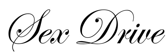

>Due to the fact that the psychoanalytic theory drives includes the opposing death and sex drive, I thought it would be interesting to include both drives as a series.
>the staff at the Digifab showed me how to install vinyl stickers using hinges

Driven Young Man, acrylonitrile butadiene styrene plastic bumper, vinyl sticker, plywood, bitumin, aggregate, primer, broken windshield, variable dimension.
>One thing that came up in the crit of this work was that it could be read as a narrative in that the work is read from left to right from life to death.
>Narrative seems to be a theme that keeps coming up in my work, maybe I could explore that in a time-based work.
0 notes
Text
Thinking
Works I've done this semester 1- The end of extinction (can't use ❌- used for A1 speech) 2- 'OPEN' works (left in 2 public spaces) ✅ - will document 3- photobook ✅ ! 4- The stones/scroll algorithm works? > could get digifab to laser-cut the paper/metal at workshop 5- the window install ✅ 6- the bricks..... not done 7- shrine, not done 8- fillette artwork ✅ look at sherrie levine I think I've spent too much time developing ideas and left not enough time to do them.
0 notes
Text


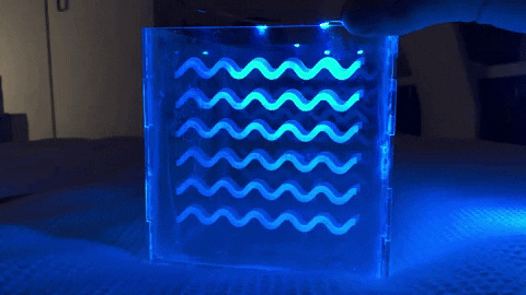
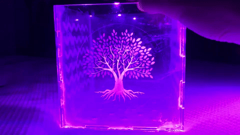
CD LASER TEST:
Etching onto a clear CD with the laser at Digifab. Used a variety of settings to find the best depth so that the words are visible.
The etching on the front was 50% power at 80% speed. Maybe a little bit too deep. It makes the words harder to read. Blurs them almost. This means that you have to shift the CD around in order to read the words clearly.
The very faint sideways IRIS was on 15% power. This was the hardest to read. So light that you have to look extremely close and be in perfect lighting for the letters to be visible.
The final IRIS was 25% power. Perfect for visibility.
My favourite out of all of them is probably the faint 15%. It hides the words so well. It feels secretive. I love that you have to handle the CD in order to read it.
0 notes
Text
Hello! My name is Ivy and i am a junior ICT student currently enrolled in IDS2141. This is my failureblog.
I spend my time as a DJ at WVFS where i host a radio show called 'staring at the sun' which runs from the hours of 12am-2am and is dedicated to experimental and ambient music. I also serve as their production director and help create cool stuff like this.
I have a couple internships with the College of Communication & Information this semester running social media accounts and trying to convince students to use digifab tools like 3D printers.
As a result I have some experience in 3D modeling, printing, and audio production to bring to this course. Here's a picture of me.

1 note
·
View note
Text
Final Installation of Images of Me

Above is the final installation and photo selection of my 'Cake Eating' series. Minor differences were made to the original images, the biggest being a change to colours and blur. I altered the images so they would seem dream-like/cloudy. In this, it creates the vibe that these were taken out of a video clip from the '90s. The final images were printed out in A2 at the digifab and I was able to hang them on the wall, which changed a lot of aspects of the work. As a whole the work is more effective printed large and hung on the wall, as compared to digitally.
youtube
On that note, I also created a short art video of all my 'angry experiments'. These were all compiled, overlaid and oversaturated to create a new work that encompasses how angry I was at the time and the emotional turmoil I was experiencing. As a new iteration of all my other little works, they all work well together as a whole. When displaying them in the studio, keeping them close together, as well as combined with other works of similar nature would work really well - works such as Christina's photo series would work well along side my own work. Like my other works, there a small subtleties that could be classed as symbolism - all relating to the people that I made the artwork about.
0 notes
Text


Manon Thomson, Blow Me, Tissue Box, Digital Print
Like said in the previous blog, this work is a further iteration of Man-Made and explores the sexual myths that surround female bodies in order for men to gain some sense of control over the “unknown” (females). I honestly am very happy with this work, I think it has many layers and I think that is down to how many iterations were made - I had a clear vision and it definitely came to life as I wanted it to. Using DigiFab labs I was able to print my digital work, Man-Made, into 8 small squares. I made sure when printing them I had them scaled to the perfect size in which would fit the tissue box well. I then used glue to stick these prints onto the pre-existing tissue box. Also highly simple, I think that the work is effective and eye-catching whilst also delving into an array of issues within the broad topic of feminism.
Unlike the digital mock-up of this work I decided to choose the blinged teeth rather than the plain black as I think it holds more pre-existing connotations that viewer’s will be able to connect with more.
0 notes
Text

TOXIC
This is another practice poster working on Hues and colour balance. I hope to practice this more going forward. These greens and colours are for the 'Hung Out To Dry' photo capture of a performance style piece. Getting the shades and the correct greens in order to make it look eerie without looking slightly off putting and gross.
I really enjoy how it looks and the way that it is balanced overall. I also hope to test out the printing in the Digifab labs as this will be my first print and it will help a lot in texting colours and styles when turning these photo/graphic pieces into physical artworks for exhibition.
0 notes
Text


not pictured: 20 hours - i dont think im exaggerating - on Canva making/resizing/rearranging this photobook and every little 1mm distance between text, pictures and hole punches on 112 pages. I had to convert the book to A3 at one point with cutting guides... I just had to make a custom-sized book. This project was meant to be a quick little project I could finish in a week while waiting for my bricks and I felt stuck in other projects. Slicing this 4 metre digifab sheet took me an hour and I was not even a third way in. It would also turn out a crappy little DIY book because I'd have to glue the pages together and cut them twice. So, $124 later at Officeworks.... but wait it absolutely turned out. I'll post soon. Also, I'm glad I could test this liminal hovering wall-to-floor idea I've had, but the weight of the paper and it not being high enough on the wall for its scale made it kind of sad and flat-looking.
0 notes
Text
Finishing the final working prototype
GLUING THE BASE TOGETHER + SANDING
I wanted my plant pot to have a nice and clean look to it, so I decided to sand down the MDF ready to be painted, and then glue the base together, and glue the faces together in twos to be easier to paint multiple pieces at once.


GLUEING THE SIDE PANELS + SANDING

SPRAY PAINTING THE MDF
I’m very new to spray painting/painting in general, it’s something I’ve pretty much not done before, and even though I knew I had to do light layers to achieve the best possible look, I got impatient and covered to much paint on in certain areas.

RUNNING OUT OF SPRAY PAINT, MOVING TO BRUSHES
Halfway through spray painting the can that I was using ran out, and although I could’ve bought more spray paint, I decided I’d be able to achieve a better look by just hand painting the pot, with the brushes adding a grainy wood like texture to all the faces.

HAND PAINTING THE BASE AND SIDES


GLUING THE ACRYLIC PANELS TOGETHER

TESTING THE 3D EFFECT OF THE PANELS WITH LEDS
PUTTING THE INSIDE ACRYLIC BOX INSIDE
Sadly when I had the acrylic box all glued together and attempted to simply slot it inside the outside box, because of the paint adding thickness to the mdf, the acrylic box didn’t slide right in, and while trying to push it in I accidentally broke two of my pieces apart.
I spent time sanding down the sides of the box, until the inside box could finally fit which took forever, but it eventually worked, then I was able to add the final top piece to the box which covers the tops of the acrylic.

GLUING THE SIDES BACK TOGETHER
Now that I had accidentally torn two of the pieces apart from each other, I had to bring back out the wood glue, and this time not take any risks or make any mistakes and use as many clamps as I could possibly find to keep the box all together as the sides were gluing.

FINISHED PLANT POT AND BASE
Sadly I didn’t get any photos of it, but I couldn’t fit the LEDs in as snug as I wanted them to be, since I didn’t solder the wires long enough, the strips were struggling to turn the corners, so I sanded down all the edges inside the base allowing them to turn easier. Then I peeled back their adhesive and stuck them into the base, and now the plant pot is finally complete.

MODEL SHOTS/MY POOR ATTEMPT AT PHOTOGRAPHY


2 notes
·
View notes
Text
DigiFab - Test Print and Resize
After printing out the initial design, I found that the size in some of the areas were off by slight millimeters so I resized and will be reprinting the holster.


1 note
·
View note
Text
A day in the life of “Shuh” the dancing robot snake: April 7, 2019
Today we began prototyping the basic mechanics of how this snake gets his groove :)
I think he needs a theme song.
1 note
·
View note
Photo


DIGI FAB: Final Reflection
Week 12: 20/10/18
The above images are of the 3D printed model of my final prototype for hand-in. I printed it 50% scale to minimise cost.
I’m happy with how the spiral formations turned out. Both Chinese patterns came out a bit finicky, however that may have been because this is a scaled down version. Unfortunately, I am unable to test out how well it tessellates because I only printed one copy. Upon reflection, this would have been a smarter idea as I would have been able to test how well the modularity worked.
Reflecting on my process, I think I was a bit all over the place to begin with. This is because I kept changing my direction from self-watering planter, to trellis, to vertical planter to a modular planter. While it is important and natural for ideas to change throughout the design process, I think it would have been more beneficial for me to have selected a direction and stick with it. This would have allowed me to spend more time exploring and developing that one direction. This is something I struggle with in other papers, and is a skill I need to work on.
I found incorporating randomness and control into the design process really challenging and thought-provoking. Initially I thought it would be as simple as putting together natural forms with geometric forms. However, through researching and applying these elements into my design and process, I realised that it was so much more than that. Randomness and control appear obvious opposites on the surface. However, I found they are such abstracted and interrelated concepts. It made me question a lot of the time: what is ‘randomness’ and ‘control’? For example, natural forms can be mathematically generated and controlled. So, are they random, or controlled? Does our ability to represent natural forms with functions make it controlled? Does something random need to be created randomly?
Overall, considering randomness and control made me think about the process and the form in a different way. This led me to an outcome I wouldn’t have anticipated or reached had I taken a more ‘conventional’ approach.
Process Blogs:
Mid Semester Break Week 2: Initial Concepting
Week 8: A Change in Direction; Researching the Form; Researching the Functionality
Week 9: Working Towards First Prototype
Week 10 - 11: Iterations – Considering System for Design and Necessity
Week 12: The (not) Final Design
Fusion file can be found in A360, DIGI FAB > Assessment 2 > Prototype 7.3
Final STL can be found in A360, DIGI FAB > Assessment 2 > Final STL for Printing
5 notes
·
View notes
Text
Digital Fabrication
This blog is a summary of our process of creation for our second Digital Fabrication assessment. The parameters for this project (randomness and control) seemed quite unusual to our group members so we decided to all experiment with the capabilities of Fusion 360 and see where it lead us. Two key directions we started with were the Image 2 Surface plugin which turned an image into a 3d mesh inside Fusion 360 and Dynamo which allowed for more controlled experimentation. I started out with Image 2 Surface while Kevin focused on Dynamo. After some individual experimentation we decided to try and combine bot of our ideas. In Dynamo Kevin had created a pencil bin with a repetition pattern on one side and I tried to warp an image of Tim’s (fellow classmate) face onto the other surface. This brought about our first major issue as Fusion 360 has very little ability to work with meshes. To get around this we exported the mesh as an OBJ and imported it into Maya where I was able to warp its form. This process also caused some randomness to occur as the export to OBJ causes triangulation to occur, changing some of the originally random shape albeit quite minimally.

Once exported back into Fusion 360 we faced the second challenge of making the mesh into a Brep so it as a solid object and could be printed. The issue was that Fusion 360 required the mesh to have fewer triangles else it would not be able to run the calculation. The solution I came up with was to send it to Meshmixer where we reduced the triangles and re-imported it back into Fusion 360. This process introduced a ton of randomness into the project as we had no real say over which triangles were removed, just that it kept the general shape. All the while this process was going on Kevin and I attempt to print out a prototype of the box he had created. Due to some technical issues it came out half the size but gave us a few learning opportunities that we then used in our next round of printing. It was around this time that Michael suggested we didn’t need to use the bin idea and somehow, we came up with the idea to attach classmates faces to chess pieces instead. This process of creation was natural and allowed us to come up with some random ideas. Michael was about to fine some chess piece meshes that contributed to our controlled element as we did not change their form other than adding on the face mesh. This lead to us creating a rook combined with Tim’s face and create our first print. We had a few issues with the supports being difficult to remove but found that they added another mild randomness element to the project. Our plan to continue making pieces, each with their own student’s face added to them.

2 notes
·
View notes
Text
A Few Draft Images of me destroying a cake.


(Final Edits must be made to them, and I will print them at DigiFab)
0 notes