
Statistics
We looked inside some of the posts by taliabct and here's what we found interesting.
Average Info
Notes Per Post
36
Likes Per Post
31
Reblog Per Post
5
Reply Per Post
0
Time Between Posts
5 days
Number of Posts By Type
Text
4
Video
2
Photo
11
Last Seen Tumblr Blogs


Fun Fact
In 2020, 44% of users from Denmark used Tumblr daily.
Text
Blog Contents
Project Inception and Initial Research
Week 1: A New Year, A New Flounder
Week 2: Progress – Team Formation and Idea Generation
Week 2: Developing our Research Question
Week 3: The Pitch and Next Steps
Week 3-4: Some Precedents
Project Development and Research
Week 4: A Contemporary Pepeha?
Week 5: A Contemporary Pepeha? Continued…
Week 5-6: Mythology
Week 7: Auckland International Cultural Festival
Studio V Formative
Playtests and Prototypes
Week 3: Interviews
Week 4: Workshopping Playtest
Week 6: Playtesting Tiles – Iteration 1
Week 6: Playtesting Tiles – Iteration 2
Week 7: How would you represent home?
Week 7: Playtesting Tiles – Iteration 3 ft. feedback from Herewini
Week 8: Programming OpenCV
Week 9: Playtesting Tiles – Iteration 4
Week 10: Collective Visual Display
Week 11: Playtesting Collective – Prototype 1 & 2
Week 12: Material Testing and Colour Schemes
Week 13: Question Refinement and Interface Design
Week 13: The Collective Visual Display
2 notes
·
View notes
Video
tumblr
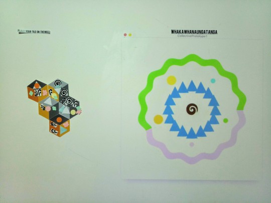
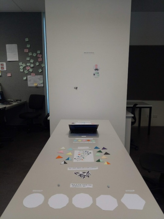
The Collective Visual Display
Week 13: 2-7/6/19
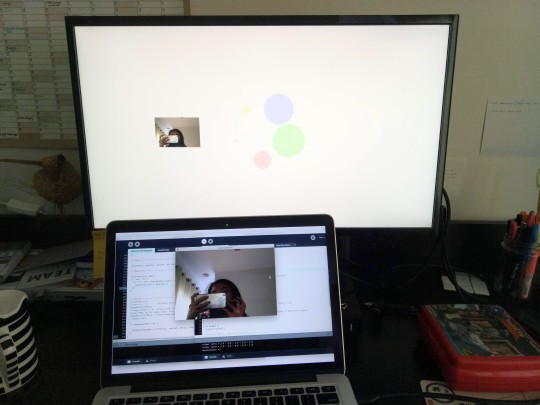
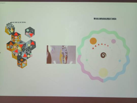
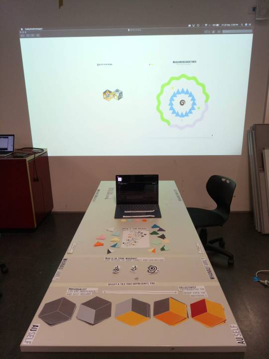
As part of our most recent iteration of the Visual Display we:
Implemented the Koru visualisation
Updated the continent visualisation (which was previously the squiggly ring) so we could layer elements behind it.
Created a hexagonal mask for the webcam display
Implemented a double window display so the webcam would show on the laptop screen, and the visualisation on the projector (see image below)
Previous Prototype:
Prototype for Open Studio
Reflection:
In previous playtests, users have said that the visual display looked bare and visually not interesting compared to the collection of physical tiles. However, as demonstrated in the video, the display gets increasingly cluttered (spatially and colour-wise) with more inputs. As a result, this reduces the clarity and readability of the display.
Thus, while the methods we have used for our data visualisation will work in a small-scale setting like Open Studio, it will not in a larger-scale setting i.e. if it were to be displayed for a long period of time as a contracted installation. For example, the ‘pie-chart’ method which we used for the continent data set, effectively works for both small and large sample sizes without compromising the visual composition. On the other hand, changing the scale of the environment circles according to number of inputs, doesn’t work as effectively for larger-scale settings because eventually the circles will get too big.
To improve, we would need to conduct more research into live data visualisations and how we can make our visualisation better suited to larger sample sizes.
To develop further, we also want to automate the collective display using computer vision technology, which we had explored earlier in the semester. Refer to this blog for more information. With this, we would love to use animated graphics to highlight the individual contributions from the physical tiles to the collective tile to create a more dynamic display.
Another avenue we would like to pursue further is to offer the participants a post-experience extension such as an email with:
a link to an image of their tile (taken as part of the experience),
the individual contribution they made to the collective tile,
and a link to a website about the work where they view a live feed of the future and past contributions to the collective tile.
We hope this would create a greater sense of individual contribution and provide a long-term memento to remember the experience by.
5 notes
·
View notes
Photo
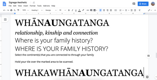
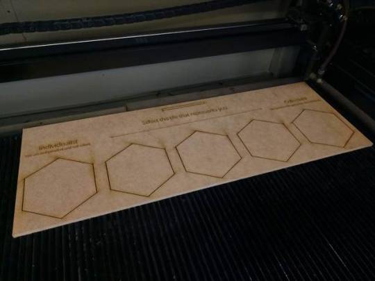
Question Refinement and Interface Design
Week 13: 2-7/6/19
As part of the development for our prototype for Open Studio, Olivia and I refined the wording of our instructions to increase clarity. We then play-tested it by using a paraphrasing technique to gage how well the users understood our instructions.
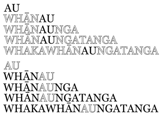
As clarity is also achieved visually, we then prototyped the interface design. Using design principles, we created a clear visual hierarchy using distinct fonts for headings and subheadings, sizes, emphasis and order. For example, for the sections headings (Au, Whanau, Whanaunga etc…) we used our title font, Georgia, and made the font size relatively larger than other text elements on the table. We also took advantage of the physical constraints of the medium, by raising this signage up onto the third axis. This has created a clear distinction and visual weight in relation to the other elements on the table.
To further achieve clarity, we applied consistency so that like elements were formatted in the same way, and we reduced clutter by only showing only what was important and leaving enough negative space.
We also visually sectioned off each section of the questions into individual panels to further highlight the Au to Whakawhanaungatanga framework.
We decided to laser-cut our signage out of MDF because it worked with the tactile and hand-crafted aesthetic that we wanted to achieve.
Overall, I believe the development of our user interface and the wording of our instructions has improved the user experience by increasing the intuitiveness and clarity. Thus, the users can focus more on what they are doing rather than on trying to understand what to do.
References:
Porter, J. (n.d.). Principles of User Interface Design [Webpage]. Retrieved on 11th June 2019, from http://bokardo.com/principles-of-user-interface-design/
2 notes
·
View notes
Photo
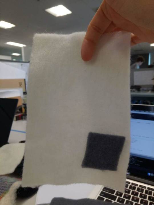
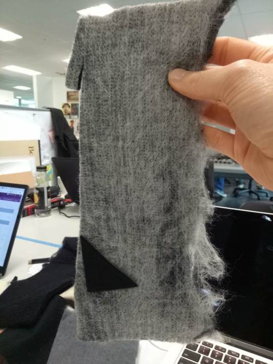
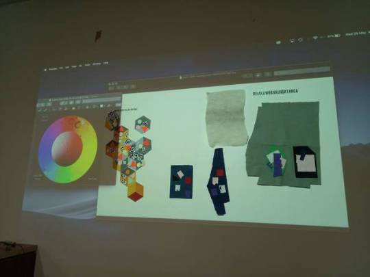
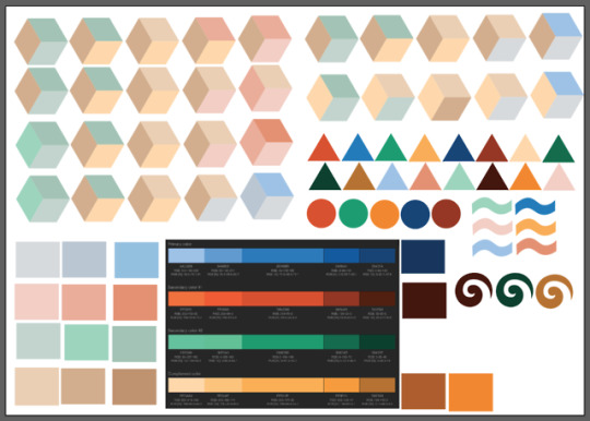
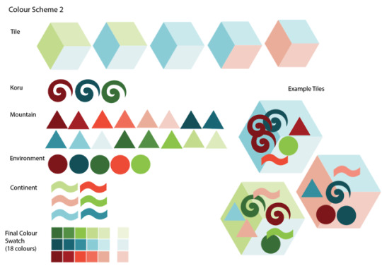
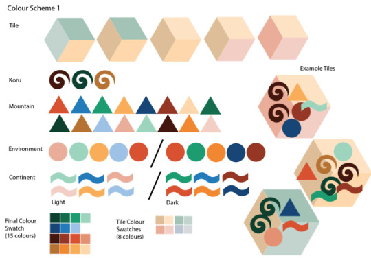
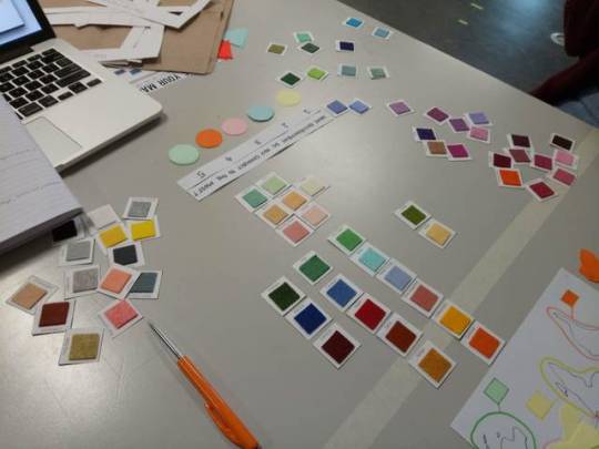
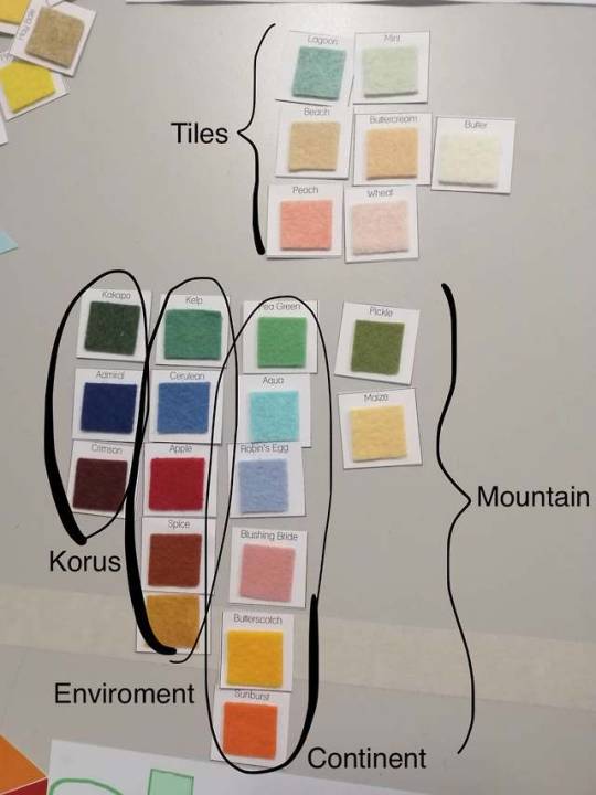
Material Testing and Colours Schemes
Week 12: 29-31/5/19
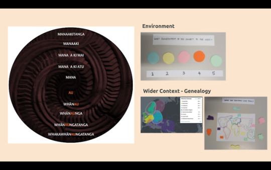
We decided to use felt as our material because of its ability to stick to each other without extra adhesive. Furthermore, it worked within our design constraints in which we needed a minimum of 16 different colours for the mountains which is our biggest data set.
Our colour scheme also had to work within the design constraints in which there had to be enough colour variation so that our data sets can be easily distinguished from each other both physically and digitally. Thus, we decided on a tetrad (4 colours) scheme as it offered enough variation.
We wanted a warm and earthy colour scheme that drew inspiration from New Zealand’s landscape. The four main colours we used were: Red, Blue, Yellow and Green.
Red ochre is one of New Zealand’s national colours and is used on the national flag
Blue symbolises New Zealand’s waterways and the importance of its sea trade, and is also present on New Zealand’s flag
Green symbolises the importance of New Zealand’s native forests, flora and fauna
Yellow represents New Zealand’s beaches as a nation surrounded by water
2 notes
·
View notes
Text
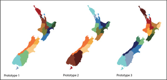
Playtesting Collective – Prototype 1 & 2
Week 11 – 12 : 20-28/5/19
Design Decisions:
Due to the difficulty of implementing the image recognition component and given our time constraint, Olivia and I have decided to discontinue developing this component for now. We felt we could get more valuable learning from refining the physical and visual display. Thus, for Open Studio, we will be manually inputting the data into the Visual Display. However, the image recognition work that Olivia did, can act as a proof of concept for future development.
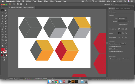
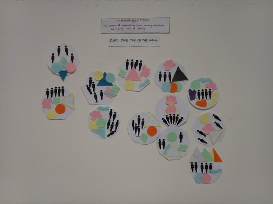
For our most recent tile iteration, we have re-considered using hexagons as they intuitively encourage tessellation, and thus connection. Individual expression is now demonstrated through selecting tile colour pattern. The 3 subdivisions create a rhombus tiling pattern which blur the lines between individual tiles and increase connection.
Playtest 1:
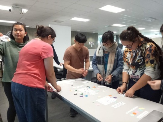
This playtest combined both the physical and virtual aspects of our system to understand how the collective visual display influences the user experience. To get user feedback we used retrospective cognitive probe questions such as think-aloud and comprehension. (Collins, 2003).
^Top: Playtest set-up, Bottom: Results from participants
Here’s what we found:
Participants found it difficult to connect the physical tiles with the virtual summary, and comprehend what each element represented. Furthermore, they did not feel represented in the collective mainly because they did not notice any significant change in the updated display.
Upon reflection, this is probably because we were playtesting only the bare skeleton of the visual display, so there wasn’t enough working for us to get the feedback we wanted.
Playtest 2:
Iterating on our last prototype, we implemented more of the interactive elements of the visual display e.g. mountain and environment sounds. Moreover, to make the individual contribution more obvious, we implemented a function that displays the most recent tile next to the visual display.


^Top: Results from 1st group of participants, Bottom: Results from 2nd group of participants
Here’s what we found:
Displaying the photo of the most recent tile helped create a stronger connection between the physical tiles and virtual display. However, users still expressed that their individual contribution wasn’t obvious and they didn’t notice the soundscape at all.
Thus, in our next iteration, we need to see on how we can create a stronger sense of individual contribution and connection to the visual display. We have discussed perhaps adding in a delay, creating an animation, or using visual signifiers to guide the user to look at the digital display.
Some of the instructions weren’t clear – especially the whanau question, and some users were unsure what the purpose of the activity was.
Thus, in our next iteration, we will implement clearer instructions and include an introduction placard at the start to inform the user of the activity’s purpose. In doing so, we need to ensure that our instructions do not create bias.
Updated Time-Plan:
References:
Collins, D. (2003). Pretesting survey instruments: An overview of cognitive methods. Quality of Life Research, 12, pp. 229-238. DOI: 10.1023/A:1023254226592
0 notes
Video
youtube
Collective Visual Display
Week 10: 13 – 17/5/19
This week, Olivia and I worked on developing the collective aspect of our project. To use our time effectively, we have broken this down into two key components: image recognition, and the collective visual display. Olivia is overseeing the former, and I, the latter.
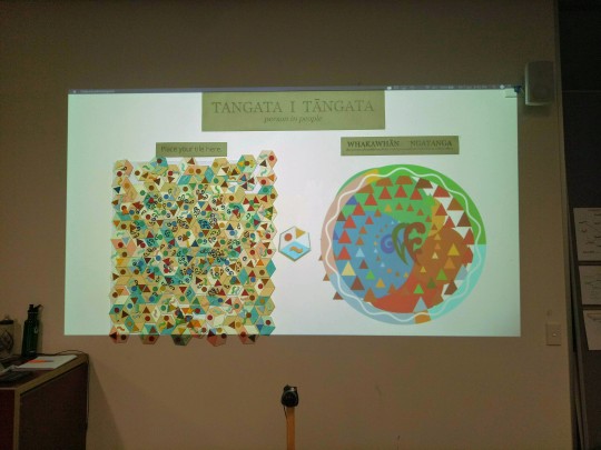
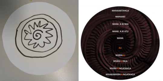
The purpose of the collective visual display (which I have previously referred to in my blogs as the Summary Tile) is to highlight the connections between the current identity tiles, and thus encourage a sense of connection. On a metaphorical level, it will represent New Zealand’s evolving pepeha/identity tile. On a practical level, it will act like an infographic in which it will display the data in a more condensed, digestible and visually engaging way.
Reflection:
When researching effective infographic design, it is recommended to have a high data-ink ratio (Tufte, 1983, as cited in Martin, 2018). This compares the ratio of valuable information to the graphics. Thus, as our data is already graphically represented, we have decided to use the same symbols for the data visualisation. This will create a clear connection between the data inputs and visualisation.
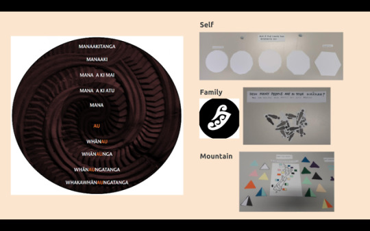
We have designed the layout of the visual display using the Au to Whakawhanaungatanga framework to reflect the structure of the questions (see image below). This will also provide a clear visual hierarchy from Au in the centre, to Whakawhanaungatanga on the outer most ring. We also want to display the data aurally to reflect the auditory questions for the environment and language.
Upon reflection, we acknowledge that the above design decisions may raise issues around the honest representation of data as we aren’t using/declaring a standard baseline or scale for our datasets. However, as the collective tile’s purpose is to create a general summary of the individual contributions and will be displayed alongside the raw data, the complete accuracy of the data display is not essential. In saying that, we will do keep on iterating on the design so that it is still intuitive to read.
Regarding next steps, we plan to playtest the physical questions with both the image recognition and collective visual display. However, as we have been having trouble with coding the image recognition, if we don’t get it working in time, we will have to playtest the display by manually inputting data.
Here is an image of our updated time-plan:

References:
Martin, L. (2018). Designing Effective Infographics [Article]. Retrieved on 19/5/19 from https://www.nngroup.com/articles/designing-effective-infographics/
4 notes
·
View notes
Photo


Playtesting Tiles – Iteration 4
Week 9: 8/5/19
Today, Olivia and I conducted another playtest of our 4th iteration of our system. For this prototype, we focussed on improving the questions, e.g. wording and types of, and the intuitiveness of the layout.
Here are some questions and feedback we received:
1) Was the setup and questions clear and easy to understand?
Generally, participants found the set-up and questions easy to understand. From observation, the main points of confusion were the first question – “how do I start?” and “what is the scale?”; and secondly the environment soundscape question – they didn’t realise the question required the laptop. To improve, participants suggested we use bigger headings and perhaps an introductory title to provide some context.
2) What are your thoughts on the tile shapes?
For this iteration, we designed the tiles with little connection nodes for people to use when place their tile on the wall. However, it was interesting to notice how many people did not realise the purpose of the nodes. Even more interesting, was that those who did realise what they were for, intentionally chose to not place their tile with everyone else’s.
Thus, we will need to continue to iterate to make the tile shapes clearer so to encourage more connection. However, perhaps it only seems like there is little connection now, because not many people have conducted the survey. Overtime, with more participants and as space on the wall runs out, there will be a greater sense of connection.
3) Did you feel you were you able to express yourself?
There was a mixed response. Some people really connected to the identity markers we used, and some didn’t. We were happy that most people said that the questions didn’t feel like a census as it was more personal and creative. Overall, while we may continue to iterate on the questions further to encourage more self-expression, we acknowledge that we cannot create a system that everyone will connect to due to the scope of the project.
Reflection:
After doing some research into applying Cognitive Methods to testing survey methods, I now realise that in all our playtests, Olivia and I have been employing the retrospective probing technique (Collins, 2003). This refers to how we ask the participants questions after the playtest to find out if the prototype is fulfilling our intention.
However, I think now that perhaps the probes we used were not the most useful in determining the effectiveness of the questions in our prototype. For example, in this playtest it may have been more effective to use more cognitive probes (see Table 2) to see how well our system’s questions helped the participants at each stage in the Question-and-Answer model:
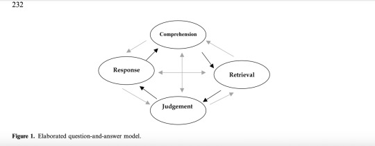
Figure 1: Collins, 2003, p. 232
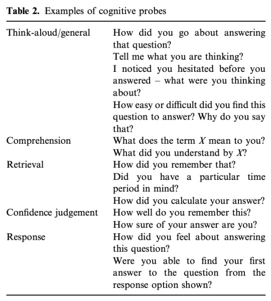
Table 2: Collins, 2003, p. 235
To gain a better understanding on the effectiveness of our system, it may also be helpful to employ other tools such as Paraphrasing, this is where participants rephrase the questions in their own words. Alternatively, we could use the Think-Aloud technique where participants voice what they are thinking during the playtest.
References:
Collins, D. (2003). Pretesting survey instruments: An overview of cognitive methods. Quality of Life Research, 12, pp. 229-238. DOI: 10.1023/A:1023254226592
1 note
·
View note
Photo
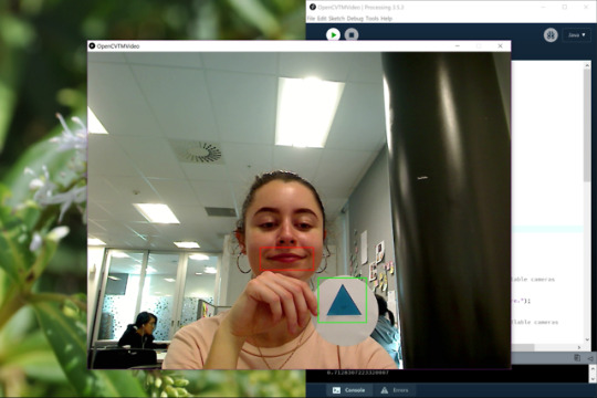
Programming OpenCV
Week 8: 29/4-3/5/19
As per our timeline, Olivia and I worked on prototyping the digital aspect of our installation. Our initial idea was to use a Kinect to detect and recognise the different symbols, or “data objects”, from the collection of tiles. We plan to use this data to create an outcome that will augment or summarise the tiles so to highlight connections. This will develop on from our previous prototypes by focussing on the collaborative and collective expression.
After researching and weighing up the different options for object tracking/detection, and consulting with Krishna, we decided to use the OpenCV library with Processing 3 as it best fit what we wanted. This was a lot more difficult to get working than we anticipated so we had to give ourselves a hard-deadline that if we couldn’t get it working by Sunday we’d have to change direction. However, the amazing Olivia (who is a whiz with code :D) managed to get a basic prototype to work.
We discussed with each-other the feasibility of using this program for our project and have decided to go continue with it. To make the digital elements easier for us to manage, we will need to make some adjustments to the physical aspect of the work.
Reflection:
Throughout this process, we discussed whether having us, as the creators determine the type of outcome, will create a passive form of collective expression for the participants. Currently, participants exhibit active individual expression through making their tile. Thus, should they also have an active role in shaping the collective expression? Thus, we will have to do more playtesting to find out whether the participants feel like they have agency in the creation of the outcome – and whether they think that is important.
2 notes
·
View notes
Text
Studio V Formative
Research Question:
How do we preserve a multicultural national identity?
Some Testing:
Olivia and I have play-tested three iterations of our system. The system guides participants along a series of questions about their identity, to create their own contemporary ‘pepeha’ tile. Each person’s tile is then placed on the wall, thus contributing to the New Zealand collective identity and pepeha.
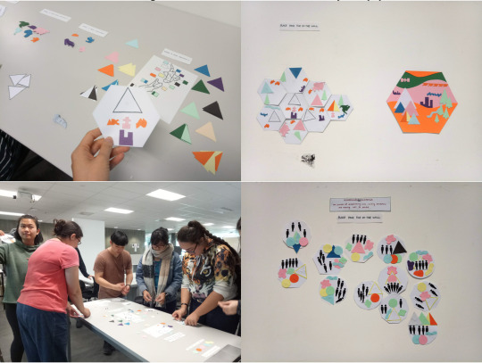
Images (clockwise from top-left): Iteration 1 – my tile; Iteration 2 – the ‘summary’ tile placed alongside the individual tiles; Iteration 3 – collection of tiles; Iteration 3 – testing multiple users.
For more information, please refer to my blogs:
Playtesting Tiles – Iteration 1
Playtesting Tiles – Iteration 2
Playtesting Tiles – Iteration 3 ft. feedback from Herewini
Some Learnings:
Individual versus Collective Expression
Most participants said they felt they could express themselves through the system. Some said that it felt like a census and thus the questions did not relate to them a person. Whilst others said it was a very individual experience.
Thus, we will continue to iterate on the questions (i.e. the wording and types of questions) to encourage personal, and just as importantly, collective expression.
Sensation
Participants said they enjoyed the tactility of the system, and the auditory question in our third iteration. Olivia and I found it difficult to represent certain aspects of identity, such as language, through visuals alone. Thus, we want to further develop ways to engage different senses so to better communicate intangible concepts about identity.
Collaboration and Community
In our third iteration, we observed that participants didn’t really discuss with each other, and when interviewed afterwards some said they did not really feel a sense of collaboration. Thus, building on collective expression, we want to develop strategies that will encourage learning through collaboration so to build a sense of community.
Problems and Strategies:
A problem that we face, is that our scope of our project, i.e. the concept of national identity and how we plan to address it, might be too large given the constraints e.g time frame, skill-sets, resources etc…
To address this, we have set out a time-plan with clear milestones that we must meet:
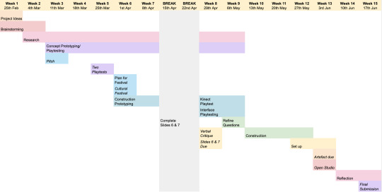
Image: Time-Plan as of 17/4/19
We have also discussed success criteria, which will help us prioritise and measure what is most important to our project. They are:
Our project will encourage participants to reflect on their own identity and how it contributes to the collective identity.
This can be found out and measured through our playtesting and during Open Studio.
Our project will respectfully and innovatively incorporate concepts from pepeha and the Au to Whakawhanaungatanga framework.
This can be measured by continuingly consulting our Maori learning advisor, Herewini Easton.
Our project will be engaging across multiple senses.
This can be found out and measured through our playtesting and during Open Studio.
2 notes
·
View notes
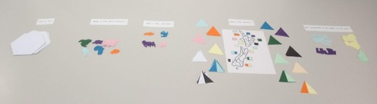
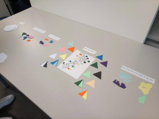
Photo
Playtesting Tiles – Iteration 3 ft. feedback from Herewini
Week 7: 9-12/4/19
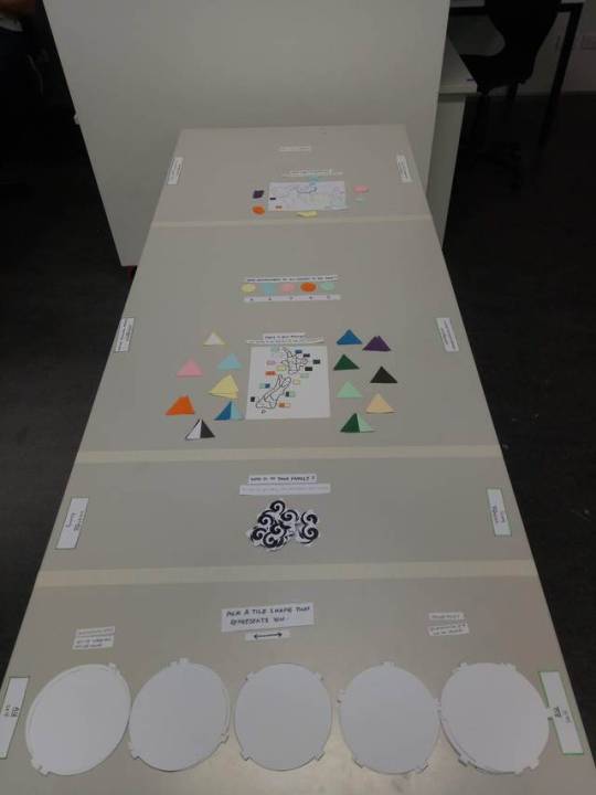
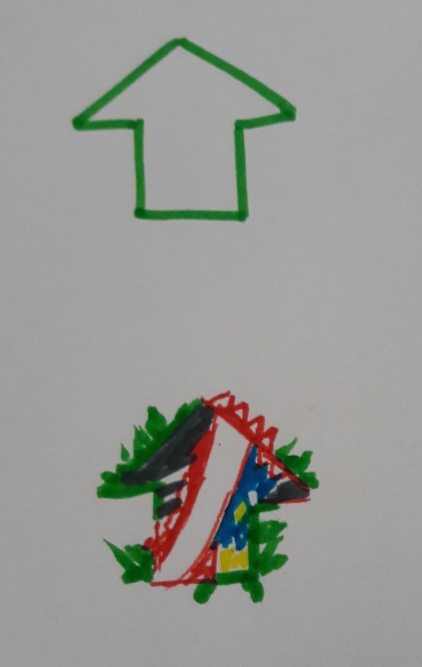
For our third iteration, we made the following changes:
To encourage discussion and collaboration, we changed the orientation of the table and questions so that multiple participants can complete the activity together whilst facing each other.
To make the order of the questions more intuitive and build a greater connectedness between each, we took inspiration from the Au to Whakawhanaungatanga framework that Herewini gave us last time.
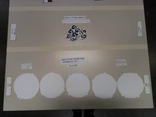
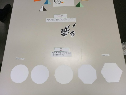
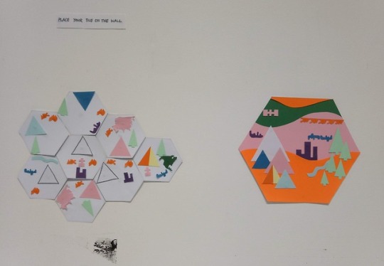
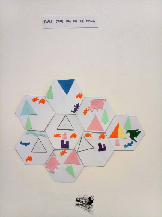
To allow a greater sense of individual expression, we offered a range of tile shapes for participants to choose from based on whether they felt more individualist or collectivist. We used the circle to represent individualist because of how it has very few connection points, and the hexagon as collectivist as that is the optimum shape for tessellation.
As we want our work to be engaging across multiple senses, we introduced an auditory question where participants would choose which environment soundscape they connect to the most. We decided to use sound because of its emotive qualities.
Feedback from Herewini:
To ensure we remain respectful of Maori culture and are using the frameworks correctly, we set up a meeting with our Maori adviser, Herewini to discuss our idea.
He was really happy with our idea and said it shows the pepeha. He said that if we want to use Maori symbols, we should use generic ones as each tribe has their own specific symbols. He also suggested we think about how we might intertwine the entities of the pepeha into the Au to Whakawhanaungatanga framework i.e. language, mountain, river etc…
Feedback from Playtest:
Did you feel like you could express yourselves?
There was a mixed response. Those who felt ‘yes’ said it because they didn’t feel restricted, the process was like a gamified pepeha and that it made them think about what they were connected to. Those who felt ‘no’ said it was because the questions felt more like a census and thus had nothing to do with them as a person i.e. factual v.s. character.
Did you feel a sense of connectedness?
Most participants felt a sense of connectedness whether it be with their tile, with the people they did the activity with, or with the other tiles placed on the wall. Those who playtested our previous iteration, said that despite having different shaped tiles that didn’t tessellate well with each other, they still felt connectedness between them.
Did you feel a sense of collaboration?
Most participants said they did not feel collaborative because it was a very individual experience. However, they did sometimes discuss or help each other understand the questions. Some participants said that if there was a summary tile, like in our previous iteration, they would have felt a greater sense of collaboration as they would have contributed to something.
Reflection
Once again, the question is raised: how do we create a system that everyone can express themselves in? From talking to Donna on Wednesday, the answer is: we can’t. However, through playtesting Olivia and I can distinguish where we make an ‘informed’ line. We can continue to iterate on the wording of the questions so they are less census-like
I was pleasantly surprised to learn that having different shaped tiles didn’t diminish the sense of connectedness whilst increasing individual expression. It was interesting, though to see how this informed where people placed them. With only hexagons, everyone automatically slotted theirs next to the existing tiles. Contrastingly, this time participants placed theirs anywhere. For future iterations, I wonder how making more obvious connection points on each shape would influence tile placement and sense of connectedness. E.g.

People were unsure about where to start the activity, so I think we need to continue to iterate the layout and UI and UX design so that it is more intuitive.
I think we still need to iterate on the collaborative aspect of our system as currently it is very self-focussed.
4 notes
·
View notes
Photo

How Would You Represent Home?
Week 7: 8/4/19
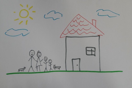
On Friday last week, Olivia and I discussed ways that we could iterate on our last prototype. When reconsidering the question about which environment do you connect to the most, we wondered: how would you represent home? Thus, we did a small series of interviews with our classmates on the topic of home and place.
The questions we asked included:
Think of a place you connect with personally.
Where/what do you call home?
What are 3 words you would use to describe home?
How would you represent home? (Answers were drawn)
Do you feel like/how is your culture represented in your what you’ve drawn?
All the questions required verbal answers, except for the second to last question where we asked them to respond using felt-pens and paper.
Debrief and Reflection:
We acknowledge the limitations of the interviews and how they might have influenced the participants’ answers e.g. the given tools and how we framed the questions.
From the interviews, there was a running theme of ‘home’ being associated with family and comfort.
Most participants said they didn’t feel like their culture was represented in their drawings of home. Two said it was because they just drew the iconic representation of home. Two participants said it was because there were no obvious cultural motifs. So, when designing our system for a multicultural audience, how can we represent culture without the use of obvious motifs?
We found the keyword question was effective and could be something we adapt to our next iteration of our system.
Overall, I learnt that ‘home’ is more complex than we realised. It can range from something as specific as “my bedroom” to something much broader such as “my home island”. It can be a feeling, or something more physical such as a place or a person. Although divergent, these are all valid definitions of ‘home’.
Thus, going back to our prototype, I think the concept of home cannot be unpacked in a single question like we initially thought. Rather, it must be unpacked alongside concepts of national identity and belonging as they are interconnected.
4 notes
·
View notes
Photo


Auckland International Cultural Festival
Week 7: 7/4/18
On Sunday, Olivia and I attended the 20th Auckland International Cultural Festival at Mt Roskill War Memorial Park. At the festival, there were TONS of food stalls with cuisines from all over the world, shops selling various cultural items, cultural community stands, and two performance stages – one dedicated to music and the other to dance.
Originally, we had planned to ask several people about their culture and how they represent their identity through their culture. Unfortunately, we didn’t manage to pluck up the courage to ask. Regardless, it was still a rewarding experience observing and experiencing different cultures through watching the performances, eating the food, looking through the shops etc…
Reflection:
This event reminded me again of the how diverse diversity is (duh!). This is a challenge because how do we design a system that everyone can use to express themselves? Is that even possible? Is it important? Perhaps, we could apply Universal Design Principles which recognise human diversity by promoting inclusion and flexibility. E.g. a ramp can be used by anyone whether they can walk, need a wheelchair or use a cart etc… (Ti Kete Ipurangi, n.d.) Or even, we embody the Treaty of Waitangi Principles into the design: Partnership, Protection, Participation (Clements, 2016). These principles transcend the treaty itself and as Herewini Easton said, can be applied to any collective.
At the official opening, councillor Cathy Casey said that we can achieve a multicultural society by learning about different cultures. We really liked this because it highlights the difference between having a society with multiple cultures versus a multicultural society that is collaborative. Thus, perhaps our system could have a didactic element where the participants can also learn about other people’s cultures.
References
Ti Kete Ipurangi (n.d.). Guide to Universal Design for Learning. Retrieved on 6/4/19 from https://www.inclusive.tki.org.nz/guides/universal-design-for-learning/
Clements, A. (2016). Te Tiriti O Waitangi - Living the Values. Retrieved on 8/4/19 from https://www.schoolnews.co.nz/2016/11/te-tiriti-o-waitangi-living-the-values/
1 note
·
View note
Photo
Playtesting Tiles – Iteration 2
Week 6: 1-3/4/19
Based off feedback and discussions from our last iteration, we wondered what it would be like if we had a ‘live’ summary of everyone’s tiles that would represent New Zealand’s ever-evolving national identity. In later prototypes, this could be done digitally using perhaps Kinect and projection.
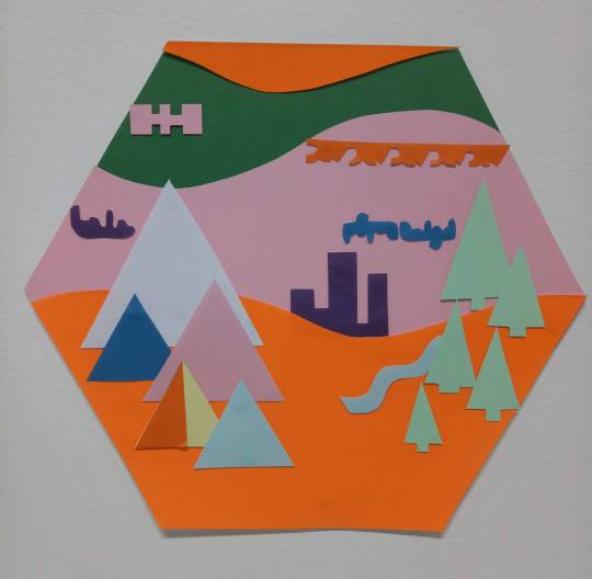
We decided to arrange the summary tile like a landscape because we wanted to avoid it looking like a pie-chart or graph. It also helped that many of the icons we had created in related to things in the environment.
As we couldn’t easily update the summary tile to reflect a live-feed, we got 4 of the participants from our first iteration to give feedback.
Feedback
Overall, all the participants could see the connection between the collection of individual tiles and the ‘summary tile’.
It was interesting to see how the way we had composed the ‘summary tile’ influenced the participant’s interpretation of the symbols. E.g. many commented how the language symbols looked like clouds or a satellite.
When asked if they felt the summary tile represented them, most participants said that they felt it kind of did, but also not really. One said it was because it was no longer a personal representation, but a group one. Another said that although they didn’t see themselves and their chosen symbols in the summary tile, they still felt they belonged there. Another said that this time they felt more connected, whilst previously they hadn’t. They also said that they would still like to be able to spot their own individual contribution.
Laurent's Feedback and Reflection
The main piece of feedback we got from Laurent was: “how do I express my identity in a system that is not mine?” He said that our current system had a lot of constraints and parameters, for example in the way we had designed the icons. Using the example of the tree icon, he said that there are countless ways to draw a tree and that having one tree shape may not connect to everyone. Moreover, he encouraged us to consider a more co-creative approach to our system in which the summary tile’s composition can be modified by the participants. His feedback echoes Donna’s feedback a couple of weeks ago where she said we need to acknowledge the sub-conscious biases we have when designing the experience (see blog post here).
Upon reflection, I did notice that most participants struggled to find a language shape they connected with but, felt they had to choose one. Thus, perhaps the icons we used did limit their ability to express themselves fully. Regarding the summary tile, I admit we did take a lot of creative licence with the design and there are countless other ways we could have done it. When we asked a couple of the participants whether they would have liked the opportunity to modify the summary tile, they said yes. Overall, while it’s impossible to create something that will relate to everyone, developing a more co-creative approach may be one way to tackle this.
2 notes
·
View notes
Photo
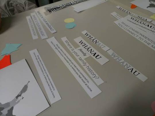
Playtesting Tiles – Iteration 1
Week 6: 1-3/4/19
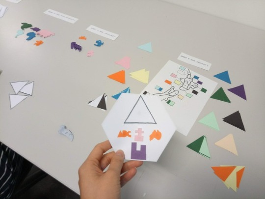
This week, Olivia and I prototyped making a ‘multi-cultural’ and visual pepeha. Inspired by pepeha.nz and Soft Identity Markers, we mocked up a system – which we have unofficially dubbed as a ‘abstracted census’ - where the participant answer a series of questions regarding different aspects of their identity. By the end, they will have a completed tile that represents them – a sort of visual pepeha – which they will add to the wall. We made tiles of our own first to provide an example.
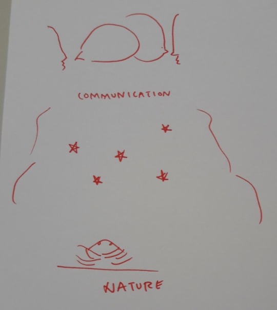
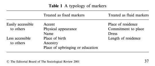
We decided to use hexagons for the tiles because of their ability to fit snugly and therefore build a greater sense of connectedness between each tile. We based our questions off the pepeha framework and a typology of identity markers, focussing more on the less accessible markers (Kiely, Bechhofer, Stewart, & McCrone, 2001).
Our Questions:
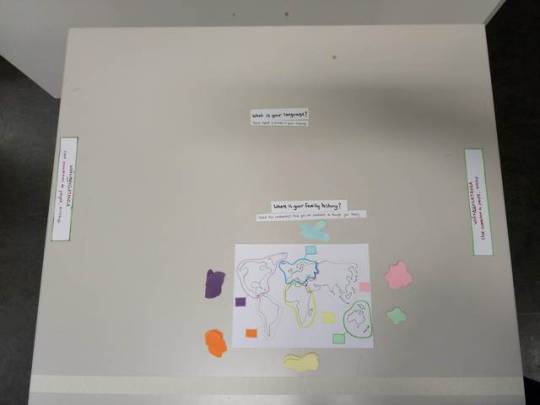
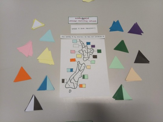
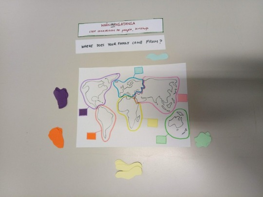
Where is your Birth Continent?
What is your language?
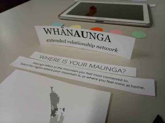
Where is your mountain?
What environment do you connect to the most?
We wanted to keep the icons quite symbolic and geometric so that they were more open for interpretation and expression.
Notes from Debrief:
Having the tiles on the wall helped make the process very self-explanatory. In future iterations, it may help the first participants to have more pre-made tiles already on the wall.
Some of the questions confused the participants – especially the language one – so like pepeha.nz it may help to have little captions that explain what each section means. However, to avoid being too prescriptive, we still want there to be room for interpretation.
One participant suggested we have a key up on the wall beside the tiles so that it makes it easier for people to interpret the tiles.
Participants said they felt connectedness with the other tiles but also a sense of individuality as they were all unique. We found that latter participants felt a greater sense of connectedness. This may be because there were more tiles as the playtest progressed.
The questions need to be iterated further and can possibly include other identity markers from different cultures. We want our questions to be more emotive than factual to reflect more of the narrative quality and connectedness of the pepeha.
Overall, this was playtest helped us get out of ‘research’ mode and into ‘doing’ mode. It has opened a range of possibilities to explore our concept further which we wouldn’t have otherwise known had we just stuck to researching.
References:
Kiely, R., Bechhofer, F., Stewart, R., & McCrone, D. (2001). The markers and rules of Scottish national identity. Sociological Review, 49(1), 33–56. https://doi-org.ezproxy.aut.ac.nz/10.1111/1467-954X.00243
0 notes
Photo
Mythology
Week 5-6: 29th March - 1st April
On Friday last week, Olivia and I took a trip to the Auckland Central Library to look at some mythologies from different cultures. This was based off Donna’s suggestion to look at different mythologies to uncover possible connections between metaphorical identity markers from different cultures. We mainly looked at Maori and Polynesian myths to begin with.
We found this process a lot more difficult than we had initially anticipated because firstly there is such a massive scope of different mythology and cultures. Also, it was challenging to find connecting themes between them and how they relate to identity construction.
A key theme that we did find was the personifying of “inanimate” things and places. For example, in Maori mythology, there is Sky Father and Earth Mother.
There were also a lot of ‘origin’ stories that would explain the names of places, food sources or the appearance of landmarks etc…
A lot of the myths involved the characters trying to manipulate their environment to make life easier for them. E.g. Stealing the full moon (Solomon Islands)
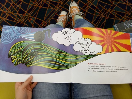
Overall, we haven’t been able to find any clear connections YET. We still need to look at mythologies from other cultures. Reflecting on this, perhaps mythology is not the best approach to find out what we need. Regarding next steps, we have considered taking a different approach and interviewing people of different cultures. We have briefly discussed about doing this at the upcoming Auckland International Cultural Festival this Sunday.
0 notes
Text
A Contemporary Pepeha? Continued…..
Week 5: 25-27/3/19
Continuing our research on the Pepeha and how it might be applied to our project, we reached out to Herewini Easton, a Teacher and Learning Advisor from AUT. He helped answered our questions and gave us some material to consider.
What is the pepeha?
The pepeha is a framework to introduce yourselves in terms of who am I, where am I, and where do I come from?
It isn’t about me, it’s about who is behind me and in me.
Uses three spatial metaphors: connectedness, inside-outside, and grounding. (Penetito, 2009)
By reciting one’s pepeha, you become kaitiaki, a guardian, of those entities. Each entity (mountain, river, land and ancestor) is a living entity and carries a narrative history.
What aspects of the pepeha could be updated into a contemporary pepeha?
Can the pepeha be applied to a group/collective context?
What would New Zealand’s pepeha be?
In the meeting, we discussed what national entities could be used in a New Zealand pepeha. For example, the whenua could be Waitangi as that is where the national marae is. The longest river in New Zealand is Waikato, so that could be considered the national body of water. However, we realised that the problem with creating a generic pepeha is that there is no entity that will personally connect to everyone. Once again raising the question: how do we go about reconciling personal and collective identity?
Can the pepeha play a role in forging a multicultural identity?
Are there any other relevant concepts related to the pepeha?
Can the Treaty of Waitangi play a role in forging a multicultural identity?
In answer to these questions, Herewini suggested we look at the Treaty of Waitangi as a related framework with a national application. He encouraged us to focus on its three principles: partnership, protection and participation, and how these could be applied to other contexts. From doing a quick research of this afterwards, it was interesting to see how it’s the values, principles and intentions of the Treaty that are considered more than what is written. Thus, the treaty can adapt to meet new circumstances. (Hayward, n.d.)
Another relevant concept he showed us was the wānanga which situates au (me/myself/I) within the different levels of connectedness:
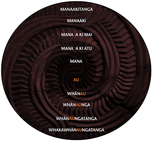
Whānau – family; whānaunga – relative; whānaungatanga - sense of family connection and belonging; whakawhānaungatanga - process of establishing relationships which connects all three preceding components. (TKI & Ministry of Education, n.d.)
We really liked this framework because of how it reconciles the individual with the collective.
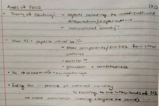
Overall, from this, we have created a list of areas we want to focus on moving forward:
We showed this to Donna and she suggested we map what the entities referred to in the pepeha signify in other cultures i.e. what those are (not necessarily literally) and why. One way to do that was to look at different mythologies to see how they portray them. This might help us adapt the pepeha to a multicultural context.
References
Hayward, J. (n.d.). Principles of the Treaty of Waitangi – ngā mātāpono o te tiriti - What are the treaty principles?', Te Ara - the Encyclopedia of New Zealand, Retrieved on March 28, 2019 from http://www.TeAra.govt.nz/en/principles-of-the-treaty-of-waitangi-nga-matapono-o-te-tiriti/page-1
Penetito, W. (2009). Place-Baed Education: Catering for Curriculum, Culture and Community. New Zealand Annual Review of Education, 18, 5-29
TKI & Ministry of Education. (n.d.). Outside-school wananga. Retrieved on March, 28, 2019, from http://hekakano.tki.org.nz/The-programme/Outside-school-wananga
1 note
·
View note
Photo

A Contemporary Pepeha?
Week 4: 20-22/3/19
One of the pieces of feedback we received from our pitch was to look at The Pepeha Project. This is a website that wants to encourage learning Te Reo Māori through building your own pepeha.
A pepeha is an oratory statement to introduce yourself by acknowledging the status of your tribal mountain, river, canoe and meeting house. This tradition is rooted in Māori tikanga (way of doing) which is based on “notions of ancestral continuum and the passing down of codes, which embed land, sea, and sky within our consciousness.” (Shea Murphy, & Gray, 2016)
We were inspired by how Māori culture frames identity within a wider context of connections and whakapapa, which includes people, landmarks and environments.
Something that stood out to us from The Pepeha Project was the statement Koinei tā Aotearoa whakaniki/This is how New Zealand introduces itself. Regarding our topic, this made us think:
How would we introduce ourselves as a nation?
What would New Zealand’s pepeha be?
Or even, what would a multicultural New Zealand pepeha be?
This raised other question such as: how has pepeha evolved overtime? And what does a contemporary pepeha look like?
The Pepeha Project (Pepeha, 2018) is a contemporary example. This work is very text-based and in ways seemed quite prescribed like a fill in the blanks exercise. Thus, it doesn’t acknowledge the different types and approaches to structuring a pepeha.
Another contemporary example is Areta Wilkinson’s exhibition Whakapaipai – Jewellery as Pepeha. The work is about treasuring taonga (wearable personal adornment) and the knowledge transfer that surrounds them. Thus, it is interesting to see how she translated pepeha as an oral tradition into physical artefacts.
“The nature of pepeha announces, distinguishes, identifies and locates. Jewellery as pepeha is located in the remnants of memory and knowledge, in whakapapa and whenua, in the legacies of belongs of sustenance and in the spirit of continuum – taoka tuku iho.”
(Te Rūnanga o Ngāi Tahu, 2014)
Overall, forming a New Zealand pepeha proves a big challenge, and one that needs to be done respectfully keeping in mind the language and cultures that surrounds it. Perhaps it would be beneficial to reach out to someone in the Māori community to talk about concepts around a national and contemporary pepeha.
References/Bibliography
Pepeha (2018). Retrieved March 19, 2019, from http://pepeha.nz/
Robb, A., (2017). What is the role of Pākehā in supporting the reo Māori? [Opinion] Retrieved on March, 22, 2019, from https://e-tangata.co.nz/reo/what-is-the-role-of-pakeha-in-supporting-te-reo-maori/
Shea Murphy, J., & Gray, J. (2016). Ko Mitimiti ahau, I Am (of) the Place, Mitimiti. Dance Research Journal, 48(1), 33–36. Retrieved from http://ezproxy.aut.ac.nz/login?url=http://search.ebscohost.com/login.aspx?direct=true&db=s3h&AN=114918080&site=eds-live
Te Rūnanga o Ngāi Tahu. (2014). WHAKAPAIPAI: Jewellery as pepeha. Retrieved on March 22, 2019, from https://ngaitahu.iwi.nz/our_stories/whakapaipai-jewellery-pepeha/
University of Otago. (n.d.) Māori ki Te Whare Wananga o Ōtākou - Maori at the University of Otago: Mihi – Introductions. Retrieved on March 22, 2019, from https://www.otago.ac.nz/maori/world/te-reo-maori/mihi-introductions/index.html
4 notes
·
View notes