#Hammerbarn vs Bunnings vs Home Depot
Text
Signage Fonts: Hammerbarn, Bunnings, Home Depot
Based on a suggestion, I started comparing Hammerbarn to its real-life counterpart, Bunnings, and a North American equivalent, Home Depot. Went down a rabbit-hole on signage. Enjoy?
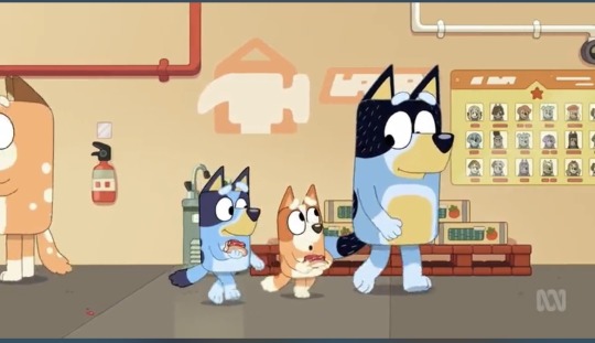
Hammerbarn uses a handwritten chalkboard font in most places, including both large and small pricing signage. They don’t seem to have signage inside for different areas of the store (so you have to look for things like plastic flamingos to know if you’ve gone too far) 😉


The aisle marker numbers do use what looks like a standard rounded-letter font (nitpick: while Bluey and Bingo are rolling through the store after visiting the paint samples, the aisles go 69,67,65… and then start increasing again!)

There do look to be some standard Bluey-universe fonts for some signage within the store.
The real-life Australian equivalent, Bunnings, uses a standard font for wayfinding/locational signage and aisle numbers, and a hand-written font for large call-out pricing using chalkboards.

In North America, Home Depot uses a standard font for the different locations throughout the store too, and for aisle numbering.

Home Depot used to use a hand-written-looking font for large call-out prices (based on the thick/thin line you get with large-tip marker pens) but appear to have shifted to a more standard font for these signs.


They still use a font that looks like hand-written writing for the on-shelf pricing. Maybe this will eventually be phased out.

17 notes
·
View notes
Last Seen Blogs

anhcoffee
Untitled

delightfullycrookedkryptoni-blog
Untitled

reality-capture-crack-di
🏅 RealityCapture Crack + Serial Key Download

regal-bones
✧・゚: *✧・゚:*

aauchefguilds
A Au Chef Guilds