#I WAS JUST EXPERIMENTING AND FOUND OUT ABOUT UNSHARP MASK?
Explore tagged Tumblr posts
Visit Tumblr Blog
Explore Tumblr blogs with no restrictions, modern design and the best experience.
Last Seen Tumblr Blogs


Fun Fact
Tumblr’s reach among the 26-to-35-year-olds in the US is 11%.
Text

We close our eyes so tightly
Just hoping we can meet again
Strobe - KAF
#just a doodle ajddiidjd#having a bad week 😞#thinking about how trigger has that eye cover and how she holds on to those cracked pieces#sorta embedding the vision her squadmates being alive and blindly believing it#idk something something deep 😂😭🙈#I WAS JUST EXPERIMENTING AND FOUND OUT ABOUT UNSHARP MASK?#i love fungzau and hanacue tutorials waaaa#my art#animedrawing#fanart#doodles#my doods#fanart of a game#zenless zone zero#zenless fanart#zzz#zzzero#zzz trigger
14 notes
·
View notes
Note
How did you make those drawing that mimic the dragon age tarot card look?
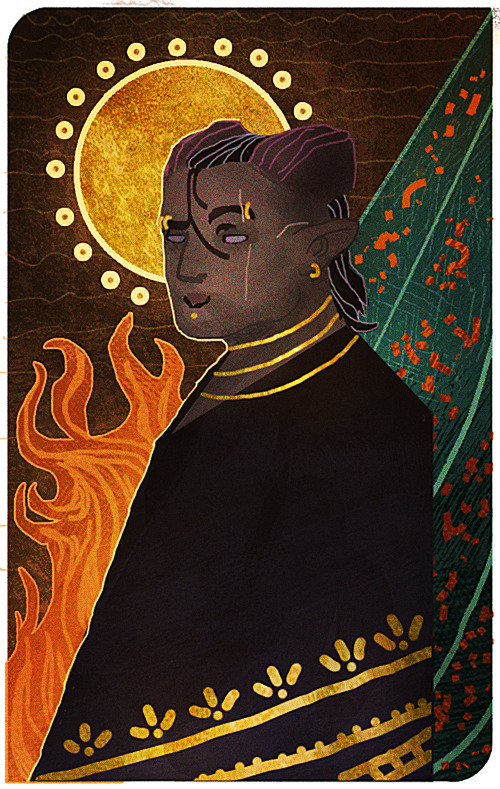
I’m sorry that it took me this long to reply, anon! There were some complications and illness that kept me away for a bit, but better late than never! I assume the drawing you’re referring to is the experimental card I made of my Inquisitor 4 years back?
It’s been a while since I worked on it, but I tried to dig up the old psd file to go through the layers and see what steps I made. The drawing itself was highly experimental, as I was completely new when it came to trying my hand at the DA:I card style. For the most part I decided to make the character and his anatomy very simplified, and rather focus on putting the details in the shading and background.
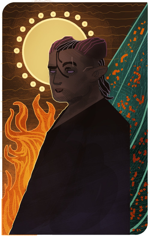
Let me show an example of what my drawing looks like without the added textures and extra overlay soft brush shading:
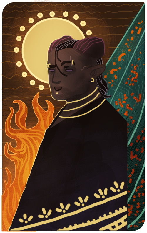
And here is the same drawing where the textures and shading are added:

But if there is one thing I’ve learned from both my own attempts and other artists, is that textures can sometimes make a very huge difference when it comes to that final touch. Whenever it’s from digital brushes or images that you’ve gathered. It’s no question that most of the work with these paintings lies in the drawing itself, but adding those final textures can really give it that ultimate DA:I card feel you’re looking for.
I’m not really experienced enough to give proper advice or tips on how to make these drawings, but for now, all I can recommend is studying the DA:I cards themselves, take inspiration from other artists, tarot cards in general, or patterns/paintings that can inspire what to use for the backgrounds. Another thing I personally like to recommend, is staying away from too much realism or overblending the image. The more the textures and those rough brush strokes are apparent, the more it adds to it. Keep it simplified, while the more detailed/realism stuff is kept to a minimum in comparison. But once again, this is my personal taste, and not the ultimate way to do this.
However, something I can add to my reply, is showing you guys a very quick, basic and simple way on how I generally go on with these paintings and how I add image textures. Please, rather look at these tips as suggestions on how to do it, as there are plenty of other and simpler ways to go about it. But since this will be a very long post filled with images, I’m gonna keep it under a cut, so that anyone interested can check it out there! Also keep in mind that I’m using Photoshop CS5 on an iMac for this.
First of all, I will apologize to everyone for the extreme low art quality, as I only have my computer mouse to draw with for this. Not to mention the extreme lack of balanced values that makes this more chaotic than it should. Make sure to always keep values in mind with these things, folks!
Anyways, I always start by making the drawing itself. Most of the work and style are put into this part of the process, as the image textures will just be extra flavoring.
Now let’s say that we want to add some fancy gold details to this drawing. We’ll be doing so by making a new layer over the drawing itself, then use a basic round brush to draw the shapes we want to be textured with gold. Wherever you choose to make something more detailed, or just make simple shapes with a single color, is all up to you.
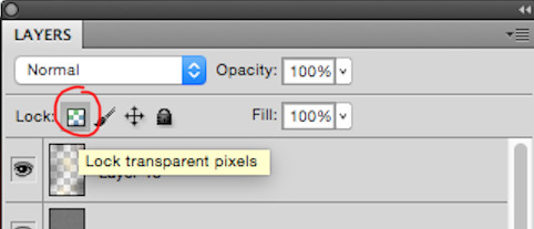
Now I’ll be locking the layer by clicking the icon shown in the image below. It’s usually found over the layers, and make sure to keep the layer with the new shapes activated when you click it.
This will now make us able to draw on the shapes without going outside of them, so let’s use this to add some simple shading based on gold in general. This will add a bit extra once we apply the texture itself in the end. (References are your best friend here!) Also be aware that the colors you choose on these shapes will affect the end results once they are merged with the texture image. Here’s how it looks like after I’ve added some simple shading with a brush.

Now it’s time to add the extra gold texture itself. We’ll be doing so by first digging up your preferred gold texture image that you can either place or copy/paste into the psd file. Make sure the image is on a layer above the shapes we just added. Once that is done, we will right click on the layer with the image, and choose the option ‘Create Clipping Mask’

Now it should only be covering the shapes drawn in the layer below it. So now we can mess around with the image layer until it gives you a look you’re satisfied with. It’s mostly common to put the layer on Multiply or overlay, but try to experiment to see what you prefer. Also play around with the opacity of the layer, too! In this case, I set the layer to multiply and the opacity to 80%. I also adjusted the colors on the shape and the texture itself until I was satisfied.
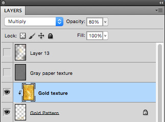

I also added a gold texture to the circle in the background by doing the exact same thing. Make a layer with the shape, add the gold texture image in a layer above it, right click it and choose ‘Create Clipping Mask’. Then adjust to your heart’s content. This layer is set to multiply with 100% opacity. Colors were adjusted until I was pleased with the results.

And this is basically how I add textures to my art in general. Sometimes the Clipping Mask isn’t even needed if you want to cover the whole drawing itself with it. However, another thing you can do to add a texture over a painting, is having the image on its own layer over the drawing, but instead of setting the texture layer to Clipping Mask, you add a Layer Mask by having the layer itself chosen, then clicking the icon shown in the image below.

The texture layer should now have a white page next to it that looks like this.

This layer will now only let you draw on it with either black or white. Basically what this means, is if you draw on the layer with black, it will “erase” the texture, so that you can draw on the spots where you don’t want the texture to show on the painting. If you want to bring the texture back, all you have to do is draw over the black again with white, and it will appear.
I added a final grunge texture to the background, using the same method as we did with the gold, but simply skipping the Clipping Mask part. Instead I added a Layer Mask and drew over it with black, so that the texture would only show on the brown colored part of the background.
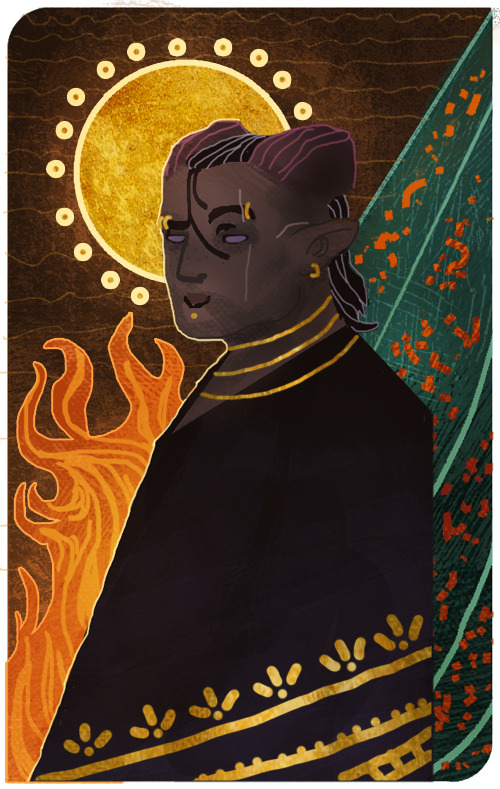
As a final touch, I added one more texture to cover up the whole image. It’s the same gray paper texture that I made and use for all my sketches or paintings in general. It can be found and downloaded here.The gray paper texture was set to overlay, and I darkened its values, as it tends to brighten up the drawing a bit too much when set to overlay.I also added a final layer on top of it all, setting it to overlay, and then draw with a soft brush to add some extra highlights and shadows to give it that final touch. Highlights were drawn with a very light/pale yellow, while the shadows were drawn with more dark brown tones. All in all, I used colors to match the ones used in the drawing.After all of that, this is how it finally looks.

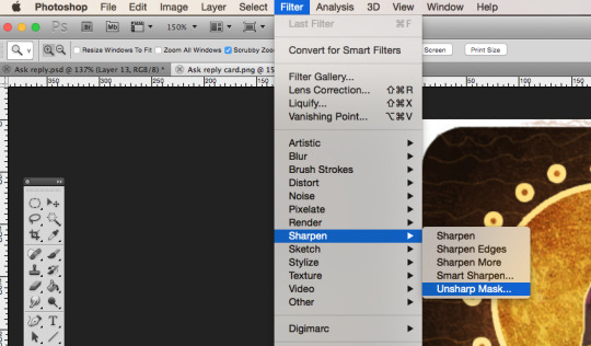
Now this last step is completely optional, but I’ll add it to this post, in case some people will find it useful. One final step you can do to give the painting that extra crisp, is to add Unsharp Mask.First you need to save the drawing as a png file, and then open that file, so that all the layers are merged into one image. From here, we will click on Filter, among the tabs found at the very top of the program. From there we will find and choose Sharpen, then Unsharp Mask. Here’s an image to make it more clearer.
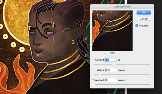
When you click Unsharp Mask, a little window will pop up, letting you adjust on three different sliders. Treshold will be on 0 levels, Radius will be on 2,0 pixels, while Amount is where we can adjust the slider to our liking. Usually it’s enough to keep it somewhere between 60-80%, but experiment and see what you prefer. Once you are done, click OK, and the changes will be added. Make sure to check the box next to Preview, to see what the changes look like before you click OK. When you resize the image to make it smaller, the unsharp mask effect can look pretty neat!
Aaaand one more optional final touch that we can add, is something called the Grain Texture. However, there is already a very great tutorial made that explains easily how to add it, so I’ll link to it here!
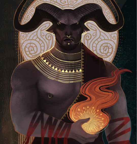
And FINALLY. After all these walls of texts and images, this is what the end results look like.
I apologize if my way of explaining these things is confusing and pretty bad. It’s always been a weakness of mine, so if any of you have any questions, don’t hesitate to ask! I’ll try to answer as good as I can.Other than that, I hope this is somewhat helpful to some of you. This is basically how I do things in most cases when I make art.I’m not sure how much this helped to answer your question, Anon, but hopefully it shed some light on some of it! If not, I can always try to make another tutorial some other time, once my health allows me the extra time.
Thank you so much for reading, and good luck with your art!
#Anonymous#Mieran replies#Tutorial#Long post#Anon#Ask#I'm sorry for the long post#And sorry if this whole thing is messy xD#I tried my best
32 notes
·
View notes