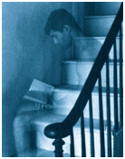
#I want to emphasise that this collection of photographic evidence is SELECTIVE
Text
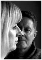
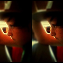
Carlos using Charles as a stressball
Or: Charles is so used to Carlos absolutely bodying him as a sign of affection that Charles has no reaction to Carlos doing it anymore
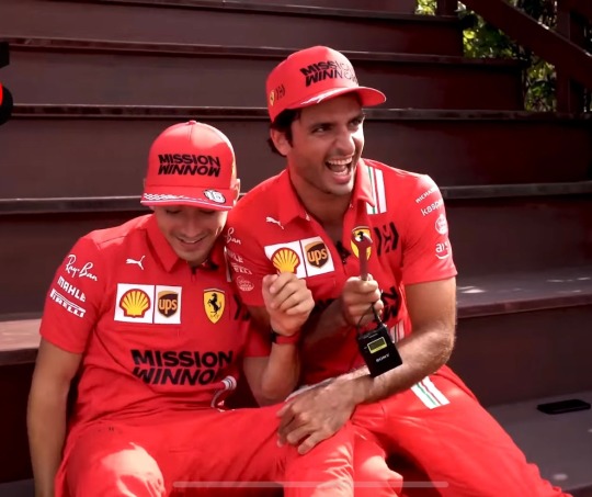


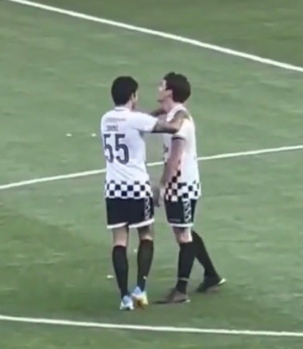
#charles leclerc#carlos sainz#charlos#these photos are in rough chronological order look at Charles just giving up hahahha#I want to emphasise that this collection of photographic evidence is SELECTIVE#there are so many more examples of their insanity#at this point charles is like yes Carlos will probably shove his head into my chest at some point in this video#he simply lets Carlos push him out of frame#they make me insane they are insane#formula 1#Ferrari#scuderia Ferrari#f1
191 notes
·
View notes
Text
Final Images Selection
This is my final selection of photographs for this project. In total, there are 16 images. They are all pastel colours, and appear bright and striking, with a significant message with each image, which will be displayed clearly in the exhibition, (this will be in my Exhibition Proposal). I think the images blend together well as a set, and I think I definitely achieved the more subtle aesthetic I was going for, rather than the vibrant colours in my first shoots, or the darker, dramatic colours I experimented with in another shoot. I think this pale colour scheme works effectively with making the subject matter stand out and highlights it’s importance. It also is very visually appealing, therefore attracting viewers to the images, which is what I want to do a significant amount in order to promote the cause. Pink is a colour that represents youthfulness, particularly female, tenderness, nurturing and vulnerability- all very apt themes for my project. There is evidence that I have taken inspiration from artists I have studied, such as Juno Calypso, especially with the colour scheme and the more abstract images from my series.

This first image depicts a pair of legs, delicately poised, as they are slightly apart from one another. I wanted to capture the tenderness of adolescence, as for many young teenagers it can be very embarrassing to have your period, as it is a new, scary sensation, and this age range is often easily embarrassed or ashamed, as they are struggling to fit in with their peers, and figure out who they want to be. The image features a very pale pink background, created by coloured gels, keeping to the youthful, fresh, pastel theme. A large drip of blood is portrayed running down the model’s leg, this signifies a lack of sanitary protection, due to Period Poverty. I thought this would be a good image to start off with, as it introduces the subject visually, however it is not too gory, and quite subtle. I like the contrast of the crimson blood with the pale skin colour and background, giving it accentuation.
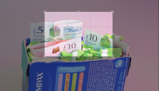
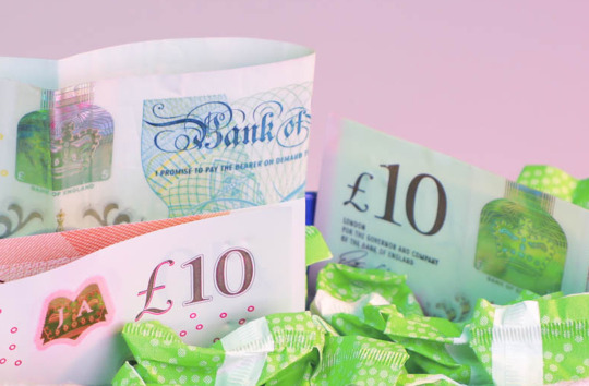
I chose to place this image secondarily in the series as it is, similarly to the previous one, an introduction to the facts about period poverty. In an exhibition I would have information placed beside my work to be able to refer to the factual evidence and statistics on the subject of Period Poverty. This photograph depicts a box of vibrant green tampons, intermittently dispersed with British pound sterling notes. This highlights that the issue of period poverty is happening in the UK. In addition to this, the notes signify the money a woman may spend on period products a month, the average amount is £40. I made an aesthetic choice to crop into this image, I decided to do this because I didn’t want to include the vibrant blue box much (this is already in another image), and I was intrigued by the use of the colour green, as this signifies money, and greed- something that is heavily at play with the issue of period poverty. Therefore, I wanted to emphasise the green tones in my images, and it features in a few. This fresh, light green in contrast with the pink background compliments nicely and makes a visually appealing image. I also like the reflective quality of the green tampons in the £10 note on the right, as this gives the image more texture, and highlights the green tones more.

I chose to place this image next in order to counterbalance the busy composition of the previous image, and to state my other purpose for this project. Not only is it to inform people about the concept of Period Poverty, but also to show periods in a different light, and to normalise the concept of them, helping people to break the stigma that periods are disgusting and shameful. The image depicts a red rose, placed simply on a pink background. I attached a tampon string to it, to signify it being used as sanitary wear. This signifies two things- firstly, to rid the stigma of shame and disgust, and secondly, a rose has spikes, therefore symbolising the pain that women go through every month simply mensturating. This image is one of the more simplistic ones in the series. I really like how it turned out as it is striking in it’s own right, the vibrancy of the rose contrasts vividly with the pastel background.

Following the simplicity of the previous image, I have chosen to place this one next. I again, think the simplicity is important here, especially with the message of this photograph. It speaks for itself, with the schoolbook simply adorned with the number ‘137,700′, which is the number of girls that have missed school due to their period, and not being able to afford sanitary protection. This emphasised by being written in vibrant pink pen, representing their vulnerability, clearly depicts my point and is shocking for the viewer, without being gory- I have approached it in a different way. I like the shape that the edges of the book creates, and that I have left some negative space by positioning it at an angle, rather than directly central like some of the other images- I didn’t want them all to appear similar.

I chose to put this image next in the series in order to in-keep with the theme of children. I think this is one of the strongest images in my series, as it depicts a hand adorned with jewellery, clutching a variety of sanitary products. On the opposing side of the image, there is a smaller hand reaching out insistently. This image can be interpreted in different ways, and has been when I have shown it to different people. It can be seen as the person with the jewellery as an authoritative adult, such as a teacher, giving the child products, or it could be seen as not allowing the child the products, as the child’s hand is so outstretched, and the jewellery could represent the wealth of adults in power who keep the items from children. I really like both the composition and the concept of this image. I like that the shade of pink differs slightly to the other images, it is more of subdued, dusty rose, therefore making it stand out as a political statement within the other images in the series.

I chose to place this image next as I thought the skin tones matched the previous one quite well- I have used both red and pink coloured gels in both images. This again, is simplistic but powerful. It shows a sense of vulnerability, as the model is removing her underwear to reveal a period pad, this image states that women should not be ashamed of periods and should not feel embarrassed by it- it is normal. I like the colour scheme, the nails, underwear and background match, whereas the skin tones create a visual contrast, drawing your eyes in. I also like the tighter composition, as I think it makes the image more dynamic and interesting, rather than more middle distance.

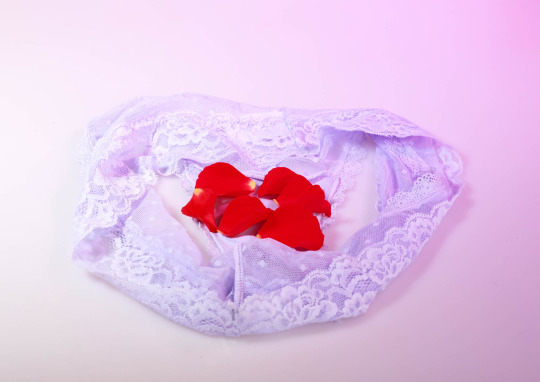
I wanted to place this image next in the series, as it has a vibrant red element to it, which I wanted to intersperse evenly throughout the collection. This photograph refers to one of the items those in Period Poverty are forced to use when they cannot afford the alternative. Depicted is a toilet roll, the end of it is unrolled and displayed on top is a delicate array of rose petals, symbolising menstural blood. The vibrancy of the red contrasts with the pure white of the toilet roll. This could symbolise the innocence of many of the women going through this, especially children, and this in combination with the red of the petals could symbolise danger. I like this image, especially the composition, as again it is not simply central.
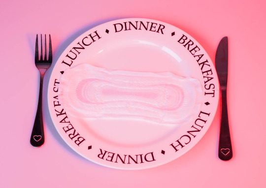
This image has been placed after the previous image, as both are creating hard-hitting statements. This image represents all those who have had to make the terrible choice between buying sanitary protection, or their next meal. The use of the plate featuring the words ‘breakfast, lunch, dinner’, emphasises the thoughts of someone in poverty who cannot afford enough food, and to have to go without something so essential as period protection to be able to eat a meal is unspeakable. For this reason, I have ensured that this image is slightly more saturated and has more of a red tone to it, signifying the dangerous position many of these women are in, and making it stand out against other images. Although it is not the strongest image in my series, I think it has possibly the strongest and definitely the most heart-wrenching message.


This image refers back to themes of school, as it depicts a pencil case with a pad inside it. I like that it is quite subtle, as the pad is not quite obvious, but at the same time it is definitely present. The vibrancy of the green refers back to another previous theme I have mentioned- greed/wealth, which represents the power of the government. I decided to create an interesting crop with this image, as I thought the original was not as interesting, it was quite ‘middle distance’ and dull. The featuring of a period pad alludes to the idea of a friend of a school child having given them one, if they cannot afford it. It also emphasises the idea of pads being as essential as pens to a girl at school.

Continuing with the school theme, this image depicts some school lockers. I used a pink coloured gel on my lighting in order to make them appear pink. This image signifies the shame that many young girls may feel at school, or their fears about what may happen. Depicted is some pink underwear, doused with blood. This represents a period leak. The way the knickers are seen to be falling out of the locker represents a child’s embarrassment at everyone seeing, and the shame they would feel for something completely normal. A lack of period protection would cause this, something so easily rectified if the government were to class sanitary protection as an essential, rather than a luxury, and to remove the unnecessary tax from these items. The pink and red contrast to create a strong visual sense and attracts the viewers eye.

Continuing with the theme of children, this image depicts a doll. I wanted to include a figure of a person, but without including a real child, as I feel this would be embarrassing for the child, because of the stigma still attached to periods (which I am trying to break). I also would not want to connote a child with underwear, for ethical reasons. I decided to apply ‘blood’ to the doll in order to demonstrate normality, much like many dolls are created for- to simulate real life through play. I thought featuring a doll would represent the mind of a child and enable people to understand the age range this problem can affect- girls can get their periods as young as 10, or even younger in some cases. I again featured the colour green to represent the greed of the government, reiterating my point.

Returning to the school environment, this image depicts a toilet. I thought a toilet should be included in my series as this is a key location to be for those changing period products. I wanted this image to be simple, and not off-putting, as photographing a toilet bowl could be. I have portrayed rose petals in the bowl to signify the amount of blood a female loses when having their period. I like the simplicity of the image, and the contrasting colours to the previous one.

Continuing with the theme of school and children, I wanted this image to represent the hands of a teacher and students. I wanted to feature the size and age difference of the hands in order to represent the differences in maturity and life experience, expressing the children’s innocence in the situation. The image is quite cool toned, with the blue of the box and the lilac of the background, this signifies the coolness that the government are expressing towards the situation. The image depicts the ‘teacher’s’ hand holding the box, and a smaller hand pulling out a tampon, portraying the difficulties that teachers have to face when looking out for the well-being of their students, as many teachers say that children who are affected by Period Poverty perform lower than average in class. I like the delicate poise of the children’s hands, a they seem almost timid when reaching for what they so desperately need, again alluding to their innocence in the situation, and their sense of shame/embarrassment.
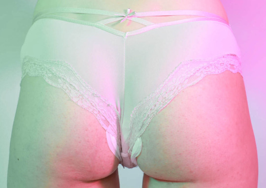
Contrasting with the themes of school, I placed this image here in order to give the series some variety. I really like the colour scheme of this image, the lilac in contrast with the vibrant red is entrancing, and your eyes are drawn straight to the centre of the underwear. The lace material is very feminine and delicate, alluding to femininity and embracing it. I think this image portrays the concept of period poverty- a lack of sanitary protection, in a way that makes it seem elegant, therefore getting rid of the stigma that periods are disgusting and shameful, which is a key aspect that I want this project to achieve.
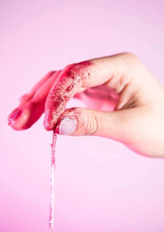
These last two images are my favourites from the project. I wanted to finish on these so that the project is memorable and these images in particular stay in your mind. They are both focusing on the idea of ‘period pride’, and not feeling shame about menstural bleeding. They both depict period products, but these are to show what should be happening, rather than the alternative of not having these resources available. I think they are both aesthetically alluring and the soft-hued colour scheme draws your eyes in. Because the images are so bright and inviting, the normally ‘gross’ concept of periods created by society is overturned and made out to be elegant and beautiful. I like that they both depict body parts as it makes the images organic and portrays realism. I also really like the inclusion of glitter as the ‘blood’, as this emphasises the overturning of society’s views of periods.
0 notes
Text
An Evaluation and Reflection on the Development of my Personal Investigation Photography for both the Graphic Design and Fine Art Approaches.
For my second year of photographic studies, the initial briefing given was to choose any genre of photography, with the final outcome aimed to be a graphic vehicle combining both typography and photography. This project would then be followed by secondary fine art outcome, allowing a more expressive piece to be made out of continuing works and develop themes and ideas further. Initial studies into style within a photograph; which can be found in my journal, drew out particular techniques and moods that I wished to emulate within my images. Setting out this initial basis of creating a sense through a composition is something that, now when reflecting on my work is a critical element that I have used in my project. When choosing my subjects and techniques for my photographs I looked and compiled many ideas which can be seen in my mood boards. These for me were an effective way to put a large amount of resources together and I have used them continuously to experiment through my edits, looking at styles, artists and photographers I collected in this body of research. For these I selected the genres Portraiture and Natural Forms, both due to the availability of subjects, influences and information to enrich my studies.
Having previously focused on Portraiture in my AS CD cover I decided to continue with this genre of photography to develop my skill set further. As this is my favourite subject also in my own photography outside of school also, I had some ideas of the images that I wished to create. I particularly set out with the aim to mimic the high contrast portraiture genre, which is common within fashion and journalistic photography. Although I knew the images I wanted to create, I didn’t however know the theme that I wanted to explore within these. As my family and friends were the only available subjects I decided to base my images around the theme of showing relationships within a photograph. This gave me two possible pathways, the relationship between two individuals or the relationships between a person and their environment. I explored both these options in my first technique workshops.
^Examples of work by Nina Shahroozi (top) and John Dugdale (bottom)
The first two techniques I experimented with were cyanotypes (photographic printing process using chemicals and sunlight that creates cyan blue hued prints) and Dylon image maker (an image transfer medium, that can place images onto varying material surfaces). These allowed me to not only learn new printing techniques but also look at previously created images in my theme and possible inspirations before my first critical studies. Looking at these processes has given me a better understanding of historical printing techniques alongside traditional analogue photography. Out of both techniques I personally found that cyanotype was harder to create a successful print from due to needing good amounts of sunlight to darken the emulsion. It took me a few attempts before create a print dark enough when put in the hydrogen peroxide. On average I found it took roughly 10 minutes of sunlight to be successful, this knowledge I then used later on when experimenting further later on in my project. Having reviewed both techniques I think that Dylon image maker will be a useful for my future fine art outcome as I wish to look at image overlay, as I enjoyed creating the tickets emulating the work of Nina Shahroozi.


^Examples of inspirational photography for Photo-shoot One (photographers top to bottom: Nicholas Nixon, Lee Jeffries and Adam Goldberg)
For my initial Critical Study I looked at 4 portrait photographers, 2 of which used high contrast editing styles and 2 that used overlay techniques to elaborate on from my workshops. By looking at the works of these photographers gave me a good basis to design my first photoshoot around. By looking at Nicholas Nixon’s images I learnt about how to position multiple subjects in order to compile an image or capture a successful group composition. Platons posing of strong individuals has shown me how to pose my subjects in order to convey their personality or how their crucial their facial expressions are in suggesting a mood. For Jeffries and Goldberg I focused more on their editing styles and techniques in their compositions such as high contrast black and white portraiture and overlaid images. As a result of these studies I took a large amount of simple headshots on blank backgrounds and some group images for my first photo-shoot.
My first photoshoot was critical in my theme development as it quickly highlighted the group compositions that I wanted to create, that I originally thought possible in Photoshop. However from these images I created a successful range of high contrast black and white images, which were especially effective against the striking black background, created by a reflector. These images mimicked the style of both Jeffries’ and Platon’s work, yet followed a similar theme to Nixon’s with experimentation of family compositions and singular portraits that looked at the textures of the face gained with age.


^Top and bottom; examples of image overlay on photographs from photoshoot one / middle; exemplar of my portraits inspired by the works of Lee Jeffries.
The images above are some of my most successful pieces that came out of photo-shoot one and the experimentation that followed. Having chosen the themes of relationships throughout the workshops I focused on illustrating these and showing the links between subjects within the image. One way I found to successfully illustrate this relationship was through image overlay both digitally and with film. This technique of compiling images together, whether it is faces or possessions highlighted subtle relationships within the image. Out of all the workshops the techniques that I did not feel were successful towards my development were painterly boarders and Bas relief because I didn’t want to distract from the texture in my subjects face by adding more. Although these were interesting to learn, personally I do not think I will use them for my graphic outcome, however they may be useful in my fine art outcome.
After my workshops I quickly realised which images I was personally drawn to and from looking at more photographers the styles I wished to emulate or copy. From this I drew all inspirations together for Photo-shoot Two, and focused primarily on my family and the relationships within it. In this photo-shoot two I focused on multiple subject compositions and the poses in which my subjects were shot. This was a feature I felt was lacking from my images from Photoshoot One and after looking at Platon’s and Jeffries’ work realised would enrich the mood portrayed through my photography. Also in this photo-shoot I looked at peoples relationships with possessions by asking my subjects to get an object of meaning to them and just watching how they interacted with it, how they held it and looked at it.

Examples of Platon’s (top) and Lee Jeffries (bottom) work that inspired my posing of subjects for Photoshoot Two.
From this photo-shoot I was particularly drawn to images taken where multiple subjects had overlapped faces or where parts were hidden behind objects. This led me to further experimentation with image overlay of faces and possessions, but I struggled to create successful compositions with this as I felt my final images both analogue and digital were too busy. This was not the style of simple but striking images I set out to create when initially looking at the works of Platon and Jeffries’. Their images revolved around the texture of the subject rather than texture that could be created. From this I decided to strip back my images and fully focus on creating strong and striking high contrast black and white portraits that looked at the details of the face that could be highlighted through this strong editing technique.
When editing my digital images into black and white I found rather than converting my entire image out of RGB colour and into greyscale, I could actually achieve a better result from selecting my black and white colours thorough adjustments. By decreasing the red hue slider, the texture of the skin of my subject was particularly emphasised showing any fine lines or freckles.
Throughout my project I have enjoyed using a range of editing techniques on Photoshop and I have also learnt a lot of new tools particularly around combining images and even image and text. This new skill set has allowed my outcomes to be a lot more creative and playful as shown in the array of experimentation. I have also enjoyed creating similar images in the traditional analogue process such as negative overlays. With this technique I have found it difficult to create full compositions as often the edges of the film have created dark areas or lines throughout the image. To resolve this issue it is best to chose two images with the same orientation (landscape or portrait) and that needs minimal movement to be successful. These can be seen in my analogue experimentation after photo shoot two.
After photo-shoot 2 I conducted a market research questionnaire to see what photos other people felt successful, this was based against what people felt illustrated family and relationships and what compositions they thought were effective. From this research the general feedback was that compositions that featured an element of overlay were the most visually appealing. This Knowledge has allowed me to tailor my graphic outcome to the most effective design. Also from the research the most suggested outcome was a campaign for a family orientated issue especially relationships and communication. This outcome was well suited to my images however alone the theme was not evident. Looking at previous campaigns centred on family issues, a common feature was a strong slogan that often was rhetorical or challenged social views. Therefore when creating my own images I knew the key components needed was a strap line, logo all layered over a striking image.
Both the work inside and outside of the camera has been critical in the outcome of my images. From the set up and location to lighting and posing, throughout my entire journey refinement of these steps has been necessary in order to create the successful compositions I needed for my design ideas. For my 3rd and final photo-shoot I refined my process down further to create minimalist portraits that could quickly be edited into high contrast portraits with little editing to the background, as I had to do previously. To do this I had a minimal set up of a single reflector if needs be , but the images were shot in my living room which has neutral walls anyway so this wasn’t critical, instead I focused more on the dynamic composition and detail within my shots. This enabled me to not have to worry about typography that was striking to carry the message, but instead have the photography be the eye-catching element. For this photo-shoot I used a manual lens on my digital camera (Pentax k-5) as I was then able to use a smaller aperture than given by my kit lens. I felt this personally gave me stronger images as details were clean and prominent yet areas outside of these had a soft blur, this allowed me to frame the expressions and poses I wished to emphasise most.


^2/4 final piece posters for the Family Matters Campaign
For my final edits I used high contrast black and white to make the subjects face the focus within the composition, as most of my image had plain backgrounds I used this negative space to my advantage, placing typography in these areas. On images with more dynamic compositions such as the image of my mother, which was a close in crop, I laid the typography across her face in order to keep in blended into the composition and take away from the imagery behind. I liked this subtle look, but chose to add one element of colour to my campaign typography, choosing to emphasise key works in a bold red. This red was the same as that of the logo I had created online to title my campaign ‘Family Matters-The importance of communication.’ For me this made all the compositions tie together and look as part of a series rather than individuals, due to the fact that all the images were different compositions.
In conclusion I think my Graphic Vehicle final piece was a successful journey of refinement from looking at my four initial influences at the beginning, through to all the technique experimentation and Photo-shoot to my final designs and outcome. To me the real turning point of my project was when I realised that I needed to focus on the subject matter first rather than the outcome at the end. by putting this initial focus on the images I was creating rather than the editing process I had focused so hard on initially, helped me up both my compositions and the final outcome. From this the use of multiple subjects lead me towards what I believe are some of my most successful compositions, that have been used in my final piece. I believe by looking at my four final posters it is clear to see the influences of Platon from posing and image composition, to Jeffries in editing style with heavy contrasts.
Going on to do the Fine Art outcome I wish to continue exploring ways to show relationships within photographs. Looking back at my first workshop of Dylon image maker, I feel as though I may experiment with this further. I particularly like the idea of printing photographs onto alternative surfaces, like the compositions create by Nina Shahroozi. This could be effective with my portraits, perhaps also experimenting on printing onto other surfaces similar to this such as newspapers, letters and books, all of which could have a subtle link to the portrait displayed on it. This would be similar to the works of multimedia photograph artist, Michelle Caplan, whose works combine photographs new and old, sketches and other materials.
Also in the Fine Art outcome I would like to look at image combination possibly through distressing techniques like cutting up images and rearranging them, similar to collage. This would allow me to also include other subject matters such as possessions, home environments and reportage shots. By combining these images together in this way would allow me to suggest things about the subject’s personality and characteristics that cannot be shown in a simple portrait. An influence for this is Vaclav Chochola who cut up images of a seated woman shows how it is possible to combine multiple images, perspectives and compositions together, to create an abstract almost distorted perception of the subject. This outcome would follow on from my Graphic Vehicle easily as the images from all photo shoots both film and digital could be used together, alongside further shoots to create mixed media compositions.
Having completed the fine art outcome now, I chose to continue with the theme of multimedia and image transfer, having been inspired by the works of Nina Shahroozi earlier on in my own work. In my initial design ideas I looked at ways to us image combination to enhance the texture within my photographs as I wanted to draw out the theme of age. This lead to me using Dylon image maker on laser prints of my photography to transfer the images onto textural surfaces. I chose to transfer my most successful images form my refinement shoot onto old vintage postcards bought online, as the old writing and stamps peeked through my high contrast prints injecting a little colour to the works.
Overall I think my fine art final piece is successful as the link to age and family is shown through the combination of images and textural surfaces. It is a good follow on to my graphic vehicle as it shows the way in which the same high contrast images can be re-purposed to a different outcome, and to show the same themes and convey a similar message about family and the connections within them.
Bibliography-
Nina Shahroozi image transfer - http://www.ninashahrooziphoto.com/
John Dugdale cyanotypes- http://johndugdalestudio.com/
Nicholas Nixon- https://fraenkelgallery.com/artists/nicholas-nixon
Lee Jeffries-
http://lee-jeffries.co.uk/
https://nikoninframe.co.uk/behind-the-lens/lee-jeffries-portrait-photographer
Adam Goldberg
-
http://www.adamgoldbergphoto.com/
Platon-https://www.milkbooks.com/blog/photo-wisdom/platon/#
Michelle Caplan- https://thepassengertimes.com/2017/12/05/michelle-caplan-collage-art/
Vaclav Chocola- https://www.mutualart.com/Artwork/Zada/1B3CF2C44ADEA2B4
For images of Fine Art Outcome see project work below.
0 notes
Text
Shoot Plan / Shoot
After analysing Joan Foncuberta’s deceptive Sputnik series, employing photography as evidence with factual informative contexts to enable the photographs to appear truthful responding and developing a visual insight into the context. Collaborating Mishka Henner’s reappropriation of Robert Frank’s classic photo series ‘The Americans’, adapting post-production techniques to isolate the original the subjects in the photographs to recontextualise the interpretations on the new platform for the viewer's depiction. I will employ the recontextualization of post-production in Mishka Henner’s ‘Less Americains’ with Joan Foncuberta’s subject-matters to formulate an informative preconception of the newly discovered Trappist-1(f) dwarf star; experimenting with the presentation of the photographs to enable the viewer's consumption to appear truthful, authentic, realistic representations. I will transfer and adapt the methods, approaches and techniques learnt from both practitioners to my response; elevating the overall significance of the outcome to adapt firmly with my photographic practice. I must consider what I want to present in the photographic series as the photographs will be accounted as evidence towards the concept - considering the audience's interpretation of the subject and to preserve the continual ambiguous theme in the presentation/aesthetics.
Foncuberta’s Sputnik series appeared highly deceptive, where if the viewer was unaware of his photographic practice or the intentions of the series the viewer would depict the photographs as a documentation of the Sputnik missile. Due to the wide range of photographic evidence Foncuberta utilised, he is able to present multiple perspectives - times, compositions, intentions, approaches, aesthetics all accounting to the same context. I understood that to enable the audience's decision on the project, I must include more than one perspective, which means more than one recontextualizations of representations. I began researching and analysing key points and characteristics associated with the Trappist-1 to understand how I could post-produce material representations to align within the context of the project. While studying the Wikipedia page, I discovered that the Trappist-1 is a host to Flare Star’s, “A flare star is a variable star that can undergo unpredictable dramatic increases in brightness for a few minutes. It is believed that the flares on flare stars are analogous to solar flares in that they are due to the magnetic energy stored in the stars’ atmospheres.” I thought about creating a conceptual visual representation of a Flare Star by exposing photographic paper near a radiation emitter: microwave, bananas, bomb-tests etc... to generate a visual that would predominantly appear over-exposed, although the conceptual approach relates to the context and the post-production recontextualization of the essay. Although, I don’t believe I would be able to participate with the idea of utilising radiation as the practicalities of the photographic paper with the exposure of light would remove the radiation applicants from the paper and simply be exposed to the light. I would, however, like to construct a conceptual approach to be presented with the series to preserve the ambiguity and remove the direct literal representations of the Trappist-1.
After analysing the aesthetics of the Trappist-1, I gathered several objects/subjects/items that I could photograph and post-produce to appear as truthful representations of the recently discovered dwarf star; revitalising the banal vernacular through post-production - the hyperreality. Below, I have listed several initial ideas of what I want to photograph and how I could post-produce the authentic appear as representations of the dwarf star. Once I had several ideas in mind for the representations, I equipped my Fuji X-pro1 with two SD cards (to prevent any loss/damage with the results) and began to explore Leeds to collect a basis of fundamental aesthetics for the dismantlement of the indexical, to utilise as fabricated evidence with the context of the Trappist-1. On the shoot, I must avoid human presence of cultural identity within the photographs for the viewer to establish and to depict the subject correctly, without further distractions, to simply present the subject and to preserve the ambiguity of the photographic series.
Chewing Gum: I wanted to photograph chewing gum on the pavement; the existence of humans to employ post-production techniques to recontextualise the representation of the chewing gum to appear equivalent to the depiction of stars. I would consider the composition and angle of the photographs to formally present the chewing gum in a geometric aerial composition, recreating the vision of the journey through the atmosphere and emphasising the hierarchy of the photographs, developing a significant contrasting in the truth and untruthful subjects presented. While photographing the chewing gum found on the streets, I employed the exposure compensation to -2 enabling me to underexpose the representation to assist with the post-production modifications; increasing the black depth of the background, signifying and highlighting the contrast of the chewing gum. Additionally, once the composition had been considered, I employed the focus lock to obtain the detail in the selected area of chewing gum or the studying the paramount subject to unveil the detail. I found the focus lock a key technique as it enabled me to consider the composition more substantially, ultimately considering each minor fragment depicted in the frame and how the viewer would interpret them in relation to the composition. In order to develop the representations, I should consider what post-production methodologies I could equip to enable the chewing gum to appear as stars, although if the photograph is composed correctly, I should simply be able to increase the blacks on the white balance to enable the background to suffocate the irrelevant information distracting the viewer from the subject, and it’s new representation. By increasing the intensity of the blacks in the white balance in Photoshop, the detail of the pavement would be removed from the photograph resulting in the chewing gum to appear as white speckles presented on a black background; implying the notion of stars from the initial interpretation. I sharpened the detail of the chewing gum by opening the ‘Filters’ menu and selecting the ‘Smart Sharpen’ applicant to manually adjust the intensity of the sharpness in each of the stars - to expose textual studies, highlighted the dense white stars against the black depth of the background. Also, I modified the representation further by decreasing the saturation of the photograph, appearing black and white, directly informing the viewer on the subject and to align with the general aesthetic of the stars and the atmospheres perceived - formulating recognisable features collaborated and superimposed above the indexical trace of the real, adapting to the features and presenting a new context.
I believe the photographs successfully communicate the context of the representation, referring to spontaneous preconceptions and visions depicted of space and the atmosphere of stars. In order to clarify the effectiveness of the representations I showcased the photographs to friends at uni, without any context or knowledge on the project, I simply asked what they thought the photographs were. In response, every person I asked associated the photograph with space or planets in which I was exceedingly pleased with, plus it emphasises radically the crucial effects of post-production modifications on the authentic indexical photograph to expose the hyperreality.
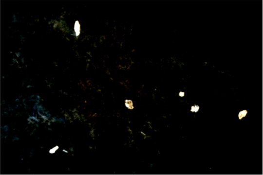
Screenshot of post-production in progress.
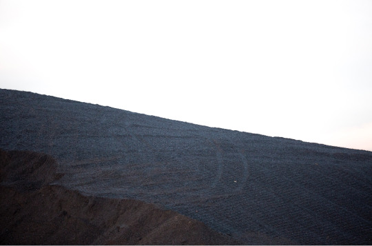
Pit-Stacks: Once I had seen the results of the chewing gum photographs, I decided to develop the idea further to photograph pit-stacks in my village of Hoyland Common, Barnsley. After 1984 miners strike, the majority of the coal mines in the UK had been removed but the pit-stacks still remain, haunting the village from the existence and history of the struggle and poverty associated with the era. I wanted to photograph the pit-stacks to apply post-production, isolating the subject from reality, distinctly portraying the pit-stack to recontextualise the photograph to appear relevant as evidence towards the context of the project. Although I must consider the weather and time of the shoot for the effectiveness of the final result. Realistically, I needed to shoot on a bright day with a strong sun to assist the exposure of the photographs and the post-production modifications to unveil detail in the textures and to help isolate the subject from reality for its recontextualisation. Whilst photographing the pit-stacks, I understood the contrast from capturing chewing gum on the street to capturing abandoned pit-stacks, as the perspective and physical material of the pile would include features of reality within the composition. The composition must invite the viewer but preserve the ambiguity to maintain a consistency with the aesthetics and the presentation, so I considered leading lines and formal textural facets to intrigue the viewer into the intentions and reasonings of the photographs, implying the conceptual approach. I had to consider the intentions for the photograph and how it could assist the post-production modifications, why have I photographed the pit-stacks and what I wish to portray and present to the viewers emphasising the emphasising the significance of the deceiving information portrayed; elevating the purpose of the purpose of the series. While on the shoot, I experimented with alternative perspectives and angels to formulating interesting depictions of the pit-stacks, transforming the mundane into intriguing compositions, studying the textural/material studies in the aesthetics of the pit-stacks. I have specifically chosen to photograph the rubble stacks due to the aesthetic of the material/textural features relatable with the textures of a planet - perceived as a location photograph. As there is minimal public information and interest about the Trappist-1f, no photographs (as of yet), I am able to hijack the representations and preconceptions of the planet to formulate an initial visual representation, informing the viewer of the planet through my photographic delineation. After photographing the pit-stacks, I imported the photograph to Photoshop to utilise the Eraser tool and the quick selection tool to detach the subject from the background, developing two separate entities only allowing the viewer to depict the pit-stack - highlighting and emphasising the audiences study of the subject presented, without distractions or interruptions in the interpretation. When the subject was isolated from its original context, the contrast of the pit-stacks with the white background appeared too unrealistic and highlighted. So, in order to smooth out the juxtaposition, I increased the exposure of the subject to reduce the density and emphasising the effect of the deposition and slightly reduced the contrast to subtly flatten the depth within the subject.
I believe the pit-stack photographs work effectively with the chewing gum photographs to provide and account evidence for the discovery of the Trappist-1f. A consistency is depicted not only through the ambiguous subjects, but also through the visual aesthetics of the photographs - the black and white features, correlating the photographs together professionally as a series and elevating their individual purposes for evidence. I am pleased with the results of the pit-stack shoot and believe the outcomes present a strong contemporary, ambiguous, abstract recontextualization of an everyday banal unused item, redirecting and communicating the context of the project. I will continue photographing objects/items/materials that will form the fundamental aesthetic for the post-productions recontextualization.

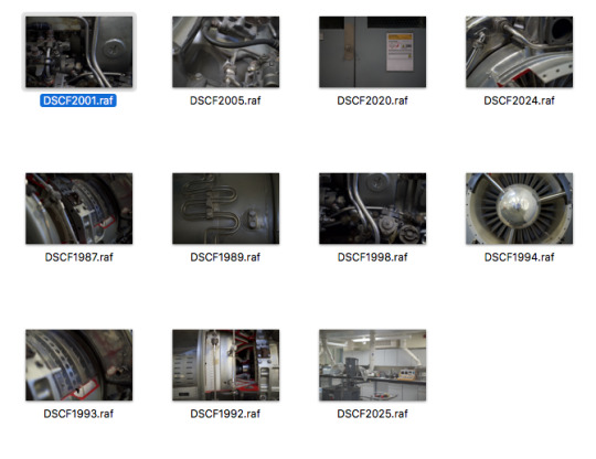
Mechanical Photographs: Referencing Sputnik and the photo-journalistic methodologies of communicating the context through supporting informative text, transforming the photographs as evidence to appear truthful to the text. I thought of another perspective to apply to the evidence after analysing the overall aesthetic of space and solar systems, questioning how I could transform the fundamental aesthetics of a representation to mutate the appearance and characteristics, in reference to photojournalism approaches, to present an informative visual depiction of the context. Although I had captured the atmosphere of the dwarf star, a location shot of the planet, I somehow needed to understand what else I could equip to represent the trappist-1 effectively without human or cultural interactions in the photographs. I decided to photograph the physical mechanisms of the discovery, the astrophysics behind the journey to develop a realism within the photographs to reference the event. Although I must consider how I compose the machinery, in reference to the concept and visual aesthetics to correlate with the series to emphasise the overall viewers depiction on the photographic evidence - the photographs must appear abstract, black and white, and ambiguous to preserve the consistency throughout the series to maintain the professionalism, and the viewers depiction of the professionalism to enable the photographs to appear as truthful sources of information. In order to capture ambiguous photographs of machinery to imply the progression to the discovery, I entered the Leeds Univerisity of Mechanical Engineering campus to find a statue positioned in the entrance that looked an engine of a rocket; the mechanical similarities in the aesthetics of the supposed rocket to have captured the location photos? Dissect small fragments of the object to construct compositions emphasising the size, density and scale of the machinery, overall signifying the importance of the discovery. I began to delve into the aesthetics of machinery through the viewfinder, considering the composition to construct a mysterious unknown textural study, almost macro, with slight implements to the recognisable features of the machinery, removing direct recognisable aspects from the photographs to distract the viewer's knowledge upon the subject - fabricating a new perspective. As an initially starting point for the photographic evidence, I believe the rocket/shuttle engine appeared relevant to the context through the physicalities of the actual discovery. While photographing the shuttle, I began to comply technical methodologies with the context to gain the photographic results relevant to communicating the context and correlating with the series. I utilised a small aperture to create a shallow depth of field in the photographs allowing me to portray ambiguity in the subject, studying the form and textural depiction within the composition; capturing natural patterns in the machinery, stamped by the composition. As the shallow depth of field highlights specific paramount information in the photograph to portray intentions and key features of the photograph, assisting the post-production after the shoot - I have used it to include the mystery and obscurity to create an unclear representation of the subject presented. After I had gathered a collection of photographs that I was pleased with, I imported the photographs into Adobe Photoshop to post-produce the fundamental facets of the subjects aesthetic, to relate with the recontextualisation of the series. Initially, I decreased the saturation presenting the photograph black & white, correlating with the rest of the evidence while implying the ambiguous from the simple informative presentation, without the distraction of colour and the implements of reality from colour. I did minor alterations to the machinery photographs as the post-production was considered on-shoot rather than after, I considered the obscurity of the object presented and how it informed the context.
I am pleased with the final results of the machinery photographs as I believe they subtly communicate the context of the Trappist-1(f) discovery, although when presented with the rest of the series, the significance of the photographs are elevated as evidence to emphasise the legitimacy of photographs and the visual representations of the discovery; informing the viewers of the event while substantially increasing the effect of the fake hoax photographic series, responding to the truth and objectivity essay question. Although, as the machinery photographs present more detail within the composition - more information to be interpreted, I should consider this in relation to the series and how the viewer will interpret the photographs.
After changing the concept of the photographic response from the disorientated limbs to the photographic insight of the Trappist-1, I believe the concept of the disorientated limbs successfully communicates the truth and objectivity of the essay title, however, there was no consideration for the visual responses, leaving them to appear irrelevant aesthetically and unsatisfying from the visuals. I specifically curated the concept without considering the practicalities of the visual aesthetics - the subjects (legs) morphed reality, morphed the actual, while positioned in a natural location to prove the realism of the subjects. Although, after I unsuccessfully didn’t achieve the results I wanted, I began to realise the presentation of the photographs were a key feature to the deceiving misinterpretations, not the subjects. The presentation and context provided, the photojournalist approach, accounted towards the truth of the photographs as the text informs the viewer on the depiction in the photographs formulating the viewers understanding of what is being perceived. I am pleased that I modified the concept of the response as I believe the visual results of the Trappist-1 outcomes appear more effective and communicative to the context, symbolising the truth and objectivity much clearer. Analysing the results gained from the initial shoot, I am happy with the outcomes: the conceptual recontextualization of the subjects, the aesthetics of the photographs and the visual relations with the atmosphere and general depictions of space. The Photography as Evidence lecture by Ross helped inform the ideologies of photographic representation and directed my understanding of how I could utilise the photographic medium to deceiving the viewers through a fictional context. Whether I will need more evidence to provide the legitimacy of the context, or whether I will need to consider another shoot to gain the results I will begin to analyse the photographs as a series to understand what how I can elevate the deceiving overall interpretation of the project.

An example of Mechanical Photograph from the contact sheet.
0 notes
Last Seen Blogs

saturngirrrl
STARGIRL
o-gajo-do-swag
Aquele Gajo Do Swag
morningfugitive
Welcome
blabberjay
Show/Movie Quotes