#I was inkjet printer on watercolor paper and I had to go over it with India ink and it did help at least
Text

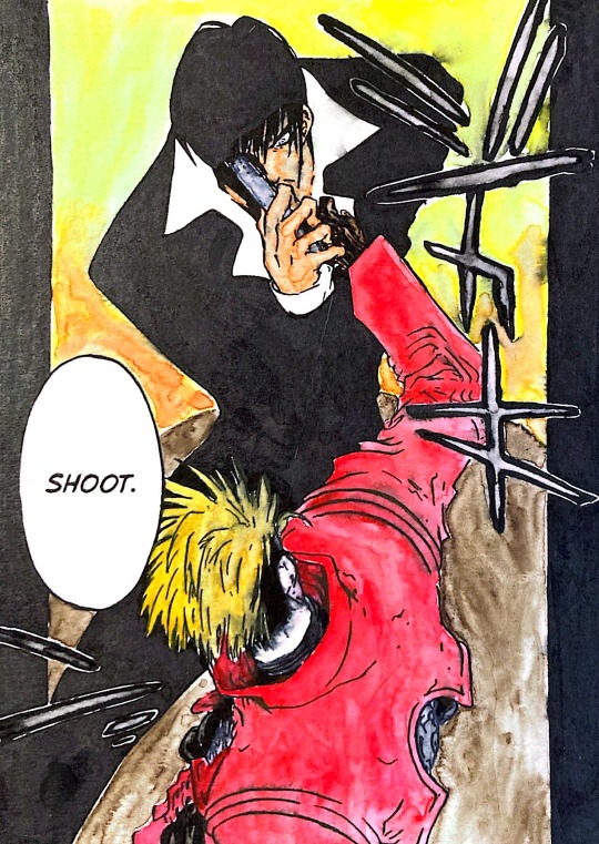
My attempt at watercolor-ing in possibly my over all favorite TriMax panel.
#random dribble#trigun#vashwood#vash the stampede#trigun maximum#wolfwood#I did what I could to stop the ink bleed from the black but there was only so much I could do#I was inkjet printer on watercolor paper and I had to go over it with India ink and it did help at least
32 notes
·
View notes
Text

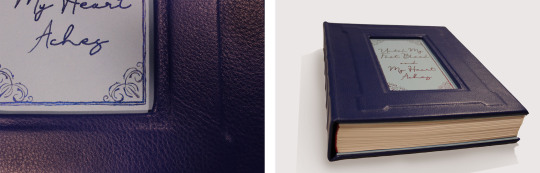


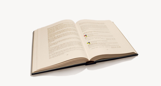

My first completed fanbinding! There were so many fun typesetting elements I had trouble narrowing the photos down but I didn't include everything. My favorites are definitely the music QR codes and the meta AO3 fics.
Until My Feet Bleed and My Heart Aches by @kazliin
‘…Of all the rivalries in the world of sports over the years, perhaps none has become so legendary as that of Russian figure skater Viktor Nikiforov and his rival, Japanese Yuuri Katsuki…’
A single event changes the course of Yuuri’s life, throwing him into a bitter rivalry with Viktor Nikiforov that spans across his entire skating career. But as the years go on, rivalry and hatred begin to develop into something very different and Yuuri doesn’t seem to be able to stay away, no matter how hard he tries.
Hatred and love are two sides of the same coin and even though everything changes, some things are still meant to be.
Technical stuff and bonus photos below the cut.
General
197,692 Words / 11 x 8.5 Paper / 500 pgs
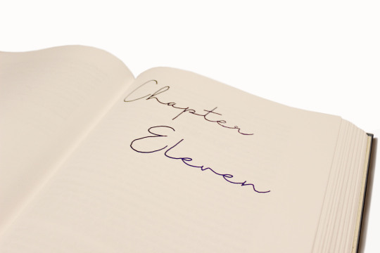
Title Font & Chapter Number Font: Just Signature
Chapter Title & Body Font: Adobe Caslon Pro
Misc Fonts: Georgia, Lucida Sans, Zilla Slab, PT Serif, Segoe UI
Designed, typeset, and bound by me.
Programs used: InDesign and BookletCreator.
Anyone who knows me knows I am a sucker for enemies to lovers and this fic executes the trope beautifully. It was one of my very first fics on AO3 and since then I have read it countless times. The fic diverges from canon in a single moment and what proceeds is one of the best Victuuri fics of all time.
Materials
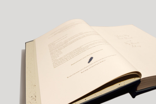
This was the first ficbinding project that made it off of my computer. The original plan was to keep the book thinner by scaling the page size up to 11 x 8.5, but obviously that didn't work. I ordered short grain 11 x 17 sheets from Nicole Nikolas Modern Paper Goods and printed with my large-format inkjet printer (which used more cyan and magenta than I would have expected).
Once my signatures were printed I realized just how massive this thing was, and in that moment I decided the casing was going to be leather. I ordered Royal Blue leathers from Peggy Sue Also Leather's Dutchess Collection. And while I waited for that to come in I hand-painted the chapter numbers using Dreamland Watercolor's Beta and a fluid writer. The color changing effect wasn't as dramatic as I hoped but it still turned out gorgeous.
I decided not to complicate things too much and left the spine flat and the edges deckled. I used the basic method of sewing tapes and spaced five of them out across the spine. The headbands are actually Vintage Petersham Grosgrain Magenta ribbons from Fini Ribbon that I folded over some string I had laying around. I also made my own endpapers from Strathmore drawing sheets and more of the Beta watercolor which I sprayed over the sheets using a cheap paintbrush.
I created an embossed frame on the cover by layering chipboard on top of the 0.098" Davey Binder's Board I ordered from Talas. Then I cut out a window so that I could do the title out of watercolor. I didn't have a pairing knife for the leather so I tried sanding down the edges to help minimize the thickness of the folds. I am actually not sure if this helped or not but the leather turned out better than I thought. The only issue was that I didn't have enough of an overlap at the top and bottom on the inside of the book board, and the endpapers couldn't cover the seam properly. I came up with the solution of adding a second layer of chipboard that I covered in light blue construction paper. I made it to the same dimensions as the Davey Board and then glued everything together with pva. I really like the effect it has and it also worked out as a base to paint the title onto.
Typesetting
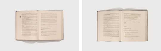
Typesetting this fic was a lot of fun because of all the social media aspects included in the fic. This included articles, Reddit threads, Twitter posts, Instagram posts, Youtube videos, Tumblr posts, and even meta AO3 fic summaries. I did my best to match the real-life counterparts as best as I could. I ended up using Segoe UI for most of the social media typesetting. The articles used Zilla Slab for the title and PT Serif for the body. The AO3 summaries were the most complicated as they used Georgia and Lucida Sans fonts and jpeg graphics.
The other really exciting element I incorporated was the music. Kaz used music throughout the fic as a very imporvictant part of the storytelling. Yuuri and Victor communicate through their skating and their routines and the music is what brings those routines to life. I placed QR codes in the margins at the start of each routine. It is so cool to hold your camera up and suddenly have the music playing from your phone as you read! I also included an appendix of the music so that when QR codes become obsolete the music is still accessible.

279 notes
·
View notes
Text
The Myth About Image Files Resolution and How to Solve It
Here are a few factors to do not forget when you need to determine on photo decision. Having been within the printing enterprise for over 10 years i have seen many humans get confused with the entire enterprise of figuring out precisely how tons decision ones desires to produce a super print from any of the virtual printers available today. you'll get into all the medical jargon and advertising hype, however there are just a few fundamental considerations you need to bear in thoughts whilst you need to prepare an photograph file for printing. all of us have heard the 300 dpi wide variety being thrown around.
it's far a fact that most commercial establishments require at least three hundred dpi as a standard guide line to produce a great output but with regards to inkjet based totally digital printers there are more than one concerns to maintain in thoughts. most digital printers today print everywhere among 600 to 1440 dpi. right here are speaking about the printer head resolution, no longer the photograph report decision. Printer head decision will decide how a lot decision your report desires to be with a view to get a great print. the overall rule of thumb is to divide the head resolution via 4, and you've the minimum resolution your photograph file have to be maximum print stores set their printers to run at 720 dpi at the head. What this means is that your photograph document have to be at the least a hundred and fifty dpi.
Giclee or satisfactory art printer modes are set at 1440 dpi, therefore through dividing 1440 dpi through four you get 360 dpi. this will be an appropriate resolution of your picture record if you had been printing onto picture or satisfactory art cotton based totally media. As you notice that is why the 300 dpi range caught round for such a long term. One more component to do not forget is the type of media floor you are going to print on, such as canvas or heavy textured watercolor paper. Canvas is a outstanding instance how you can break out with printing a totally low decision document and still get incredible effects in your output. we've got created fantastic photographs on canvases from record resolutions as little as 72 dpi. next time you are thinking in case you are going to get correct effects out of your photograph record, first decide what kind of decision is getting used at printer degree and you may have a much more first-class printing revel in because you do not always need to have three hundred dpi to get a amazing print.
0 notes
Last Seen Blogs


