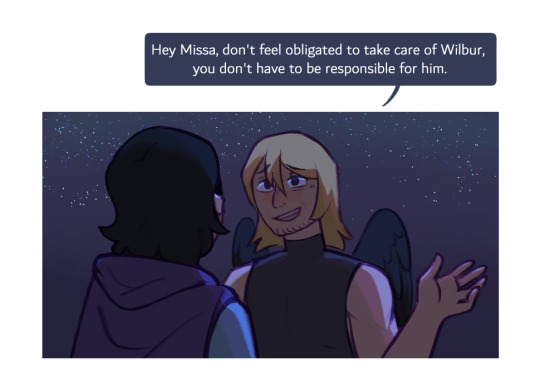
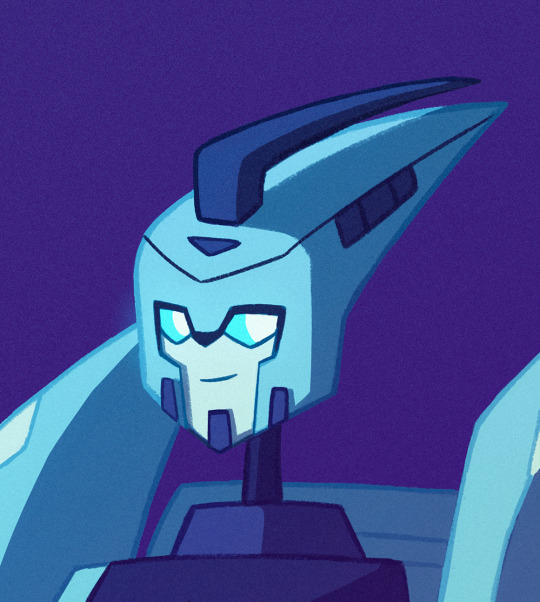
#I'd like to think the difference in style and shading relates to the contrast of scenarios! The first one is comedic-
Text
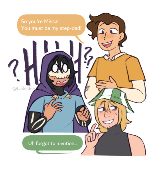

I just like the idea that once Missa hears Phil has another "kid" he'd try and do whatever he can to help and Phil feels emotions about it
#Qsmp#Qsmp fanart#Pissa#qsmp shipping#qsmp philza#qsmp missa#qsmp Wilbur#I'd like to think the difference in style and shading relates to the contrast of scenarios! The first one is comedic-#while the second one is more serious and genuine in mood#Definitely not because I tryharded for the second scene#I have rotated this family in my mind so much aaGH#I just think Phil would fall a little more in love hearing Missa care about the people that are close to him#Also it is late I just would love to see Missa and Wilbur interact so bad and Missa being like: Okay as your father I'm going to help you#Missa may just have as much if not a bit more than Wilbur does but I think it could be a really funny dynamic#Anyway maybe Pissa reunion today prayge
2K notes
·
View notes
Note
I really like how you color things! Do you think you could make a tutorial, maybe? I'm trying to get better and I'd really like to learn from you :D
Thank you! I’ve never made a tutorial before, but I’ll try. I experiment A LOT with every piece, so I don’t have a 100% set in stone process. (Always experiment! You might find something new that works for you!)
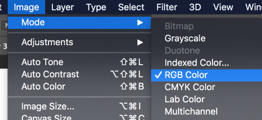
First off, make sure you’re working in RGB color mode. This is so you can abuse Camera Raw Filter later, and you really should be in RGB mode anyway unless you plan to make prints.
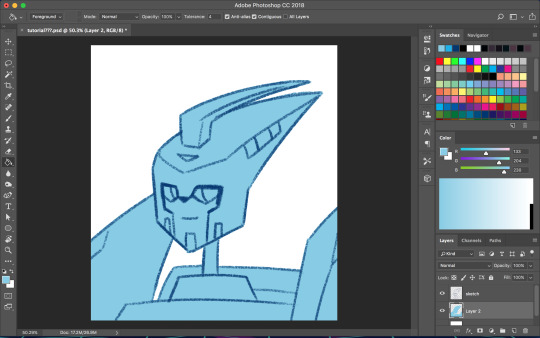
So start with your line/sketch on a multiply layer, or even just a normal layer mode if you want. My lines are usually dark blue but I often change them later on.
Use the wand tool (w) to select the negative space around your lines, invert your selection (command>shift>i), and on a new layer use the bucket tool (g) to create your base layer. On this layer, go to (filter>other>maximum) and set the radius to one or two pixels. This will clean up the base a bit so you don’t get a weird halo around your lines.
Before you start adding colors, change the background color to a mid-tone grayish color. This is to better judge tones and contrast. This doesn’t have to be the end color of your background; you can change that towards the end. If you actually are drawing a background, you might want to choose the general color of that background instead, but checking your colors against a gray background periodically can still help.
Now is when you start using clipping masks. Make a new layer directly above your base. Make this layer a clipping mask by right clicking on it and selecting “create clipping mask” from the pop up menu. Do this for every base color.
As you choose your colors, try to visualize what you want the end result to be. If you want a warmer or cooler piece choose colors accordingly. I do this mostly by eye, so I don’t have a specific process. You can play with each color by going to image>adjustments>hue/saturation.

Once you’re happy with your base colors, create another clipping layer over all the base color layers (except for glowey bits like optics/biolights), and set it to multiply (sometimes another layer mode will be better but I usually go with multiply). This will be the shading layer, so now is the time to figure out where your light source is. You can add your shading using the brush tool, but I tend to visualize lighting better by erasing where the highlights are, so I just fill in the entire layer with the bucket tool and start erasing. Change the opacity of the layer to whatever you think is best. A higher opacity creates more dramatic lighting and a lower opacity makes softer lighting. For the shading color I usually choose a darker, desaturated color, like purple or brown, but again you can just play around with the hue/saturation until it looks right. Sometimes I will make a second shading layer to add even darker shading in areas.
So now the shading is done! If you want, you can make another layer for highlights but I don’t always do this. I don’t have a specific way I do highlights except that I usually add them only in the most intense lighting or on the most reflective areas, but do whatever works best for YOU. If the subject is backlit, adding highlights around their silhouette can add a dramatic effect.
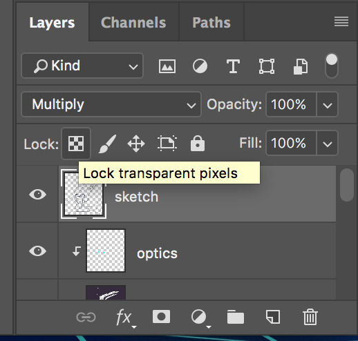
I usually leave my lines as a single color, but sometimes I will use multiple colors over each base color. I did that for my last piece of idw Blurr. To color your lines, lock the transparency of the layer using this button, or make another clipping mask over it. A lot of the time changing the layer mode to overlay will make the new colored lines look nicer. You may need to touch up some of the darker colors though.
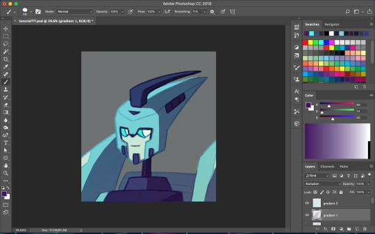
Next is when we start getting really experimental, by which I mean I have no idea what the fuck I’m doing. I make one or twenty new layers with various gradients over all the colors and play with layer styles. These layers are to soften the shading, bring colors together, etc. Something fun I do a lot is set the gradient tool mode to dissolve and then play with the layer mode and opacity on that to get a textured effect. If you still have a gray background switch to your actual desired bg color. Upon doing this you might want to make even more adjustments. If you have any glowey bits like optics, make a new layer for that. I usually use the gradient tool or a blurry brush at a low opacity around the glowing parts and set the layer mode to screen, but again experiment. You can also add reflected light from these secondary, less intense light sources onto the surrounding surfaces.
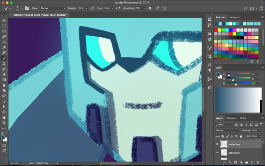

I don’t always work with clean lines and end up having to render and clean up a lot towards the end. I do this on a new layer above everything. Rendering is tedious but can make the end result look a lot softer and painterly, or sharper and more defined, depending on how you do it. Make use of the dropper tool (alt+left click) here to grab colors as you go and define shapes. This step is only necessary if you are going for a painterly look (or you were lazy with the lines and now regret it like I often do). This step must be done only when you are as certain of your color choices as you can be, because after having used the dropper tool to color grab, you will not be able to adjust the layers individually.
So hopefully, you’ve chosen colors that work well and you are happy with how they look at this step. If not (like I usually am), you’re going to cheat with Camera Raw filter. It’s like hue/saturation adjustments but better. Make sure you’re happy with how everything other than color looks here because we’re going to do the thing where we suddenly work deconstructively and probably regret it later. You might even want to do this step on an entirely new canvas so if you fuck up you still have the version with all your layers. There’s always control+z, but if you end up playing around a lot it could be annoying to go back.
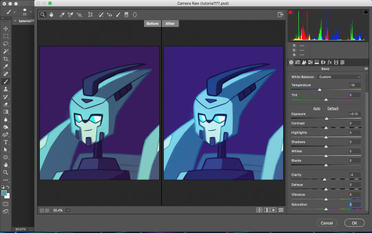
Flatten your image. You can do this by right clicking any layer and selecting the option from the pop up menu. Now that everything is merged into one layer, go to filter>camera raw filter (or command+shift+a). There is a lot you can do here. You can change the temperature of the whole piece and play with values and clarity until things look nicer. You can even go into HSL adjustments and tweak individual hues. I also use camera raw filter to add grain or a vignette sometimes (not color-related but still nice to mention). Also, when I want the piece to look really soft, I lower the clarity to give it a soft, glowing look. I did this for the idw Blurr also.
So now hopefully the colors you weren’t happy with look better, but you can still play with gradients even after this step. Sometimes this last step barely changes anything and other times the colors will be wildly different from what you originally had planned.
So to be honest, my colors are mostly all experimental. I’m constantly changing and adjusting colors as I go along. Try to put thought into your initial color choices, but also it’s fine to change things if you need. I mostly go on instinct, so I’m sorry if this is a lackluster explanation.
If you have any specific questions or don’t understand something I said here feel free to ask! I’ll try my best to clear things up!
#Anonymous#tutorial#my art#it's also like 6 am so this probably is confusing im sorry lol#my art process is mostly me doing something and being pleasantly surprised it worked lmao#the images look like shit on desktop but fine on mobile????#ok tungle thanks
20 notes
·
View notes
Last Seen Blogs

theeswizzlesnake-blog
SwizzyDaSwizzle Snake
themarvelettesgreatesthits
the marvelettes greatest hits
frogmansides
frog sides
janethonesty
J's Good Day Good Time

zephyrakevin
无标题