#JogList
Text

Plaza, Yuichi Yokoyama: Not a new translation, but the very newest book from the cacaphony king, published by 888 books, which also handled Yokoyama’s oversized hardcover art & design collection “Fashion and Closed Room” (2015) and the JP edition of his gekiga tome “Iceland” (2016). I did not know Yokoyama had a new book out in Japan until this twitter thread tipped me off - it’s a no-dialogue comic, and the publisher does international direct sales, AND they don’t mind English-language messages from dumb foreigners (or, they didn’t mind me), so dropping them a line would be the easiest way to get it.

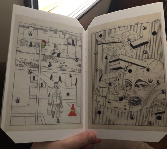
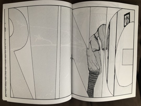
This is not “Flower Garden”, the forthcoming third installment of Yokoyama’s gekiga tetralogy; it’s a 264-page large-format softcover, slightly taller than the average “Kramers Ergot”, with the kind of cranked-to-fuck reproduction that allows you discern the texture of the spotted blacks on the page. It won’t make much difference to those I’ve heard from irregularly over the past half of a decade who feel Yokoyama is an all-tricks artist who’s been plowing the same ground to increasingly barren results, but “Plaza” is something of a back to basics piece; while “Iceland” and its predecessor, “World Map Room”, explored slightly plottier interactions between paranoid characters amidst the usual din of life (to say nothing of the intervening gag manga collection “Room”, which I don’t think has yet been published outside of Japan), this new book is like a graphic novel-length version of the most methodical stories from “New Engineering” - activity under a fixed gaze.

But Yokoyama is not the same artist he was in 2004. While his “New Engineering” comics gazed dispassionately upon activities left inscrutable on any level more complex than ascertaining the motion of bodies in combat or the construction of a room — a consequence of the artist creating his stories by drawing forward and backward from key images, avoiding ‘humanism’ so as to escape the impotency of art as personal expression, per him — “Plaza” erects an absolute terror field from the clamor of social joy. Not a single panel of this book is without gigantic sound effects slashing across space with razor edges, COROCOROCOROs and DODODODODOs superimposing themselves atop rolling and marching forms like the reader is gazing through an impossible floating lattice; a prison of noise. And it’s a party on the block!

Apparently inspired by Brazilian carnaval, the action of “Plaza” depicts a massive, unreal stage show, with cheering audience members frequently visible toward the bottom of panels. Banners are unfurled, effigies are raised, rockets ignite, and folkloric skits are enacted. At one point, money is thrown into the crowd like the Joker did “Batman” (1989), though we need not imagine any threat: the roaring crowd is constantly in danger. Enormous trees crash into the audience, they’re nearly chopped by a gigantic swinging blade - at one point a swarm of bees is loosed upon them, yet still they roil in a frenzy as rows of figures stride above them like a martial fashion show-cum-Busby Berkeley dance number roiling with smoke and fire, English titles occasionally superimposed atop the action to demarcate exhibits, but this is not like Yokoyama’s story collections. It’s not like “Travel”, his depiction of a rail journey, and the closest thing he’s had, I guess, to a popular favorite. It takes the sense of specific menace he introduced to his world in “World Map Room” (his best book, along with the majesterial “Color Engineering”), makes that menace integral to the idea of fun, and depicts it as something with no beginning or end. You can read this book starting at any point, which I suppose makes it high formalism, and imagine it never dying, and never being born. Is this Spectacle? Is this the idea Yokoyama has, of life as a fenced rampage of distraction wedding high spirits and mass violence as the unyielding character of existence? The artist stands aloof, but it’s hard to be a god.

23 notes
·
View notes
Photo


Salammbô, Philippe Druillet, Anne Delobel, Technology Artwork: In which Druillet, co-founder of Les Humanoïdes Associés, devotes the majority of the 1980s to adapting Gustave Flaubert’s 1862 novel of high exoticism in 3rd century North Africa, in a style best described as suturing the loudest comics in your collection together to heal them of lingering quiet. If you like your metal screaming, you will sympathize with Druillet’s approach, which preserves big chunky blocks of Flaubert’s none-too-restrained text and sets them atop an ecstatics of interstellar conflict starring Druillet ‘s own space warrior creation, Lone Sloane. Conceptually, this all makes perfect sense. Flaubert’s book is already an extremely visual work, driven by an artist’s imagining of a vanished era in terms of martial, social and religious spectacle, and in translating the visuals of a comic as absolute fantasy, Druillet rudely underlines the personal and visionary qualities of the book. Sloane is his self-insert, murdering his own space crew to voyage into a cosmic portal filled with the face of the titular maiden princess; but when Sloane arrives, he is transubstantiated into Mâtho, the doomed mercenary and would-be lover of Salammbô, and he does not ever realize that everything he does is therefore predetermined. In Sloane’s eyes we see Druillet, madly filling every inch of the page in prolonged devotion to this Salammbô. The reading experience, as a result, is rather aloof; a supplementary text by author and economic theorist Jacques Attali(!) suggests that the book is Druillet’s meditation upon contemporary unrest, but what he adds to Flaubert strikes me as a leveling of cultural conflict, rendering these ‘barbaric’ peoples as a miscellany of alien, monstrous, and occasionally cliche-racial types, the 18th century fantasy of post-Punic War struggle becoming a towering 20th century triple album of Human Conflict. The real conflict, however, is Druillet’s with the page, images shifting from teeming crowds to sleek phallic spires to the occasional and ill-advised retouched photo-comics bits, climaxing in the arrival of early CG art as the presence of alien power from outside this world, this story, this adaptation, lifting Solane/Druillet from death like digital angels carrying him up to Heaven from the Hell of Doing This.
-Jog
25 notes
·
View notes
Text

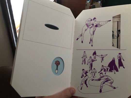
Pierrot Alterations, CF: And then, suddenly - a new book from Christopher Forgues, one of the madly-loved art comics figures of the 21st century, who had seemed to turn away from even small-press book publishing of late. This 52-page project, however — lavish with sawed-off corners and exposed spine and all-color innards — comes from Anthology Editions, an imprint of the Brooklyn record label Mexican Summer. The first batch sold quickly, but there should be more in a few weeks.

How you get there from here is the question posed to me by this stack of drawings. The first 25 or so pages are devoted to a quiet two-panel-per-page narrative in which a small crew of clowns erect a tiny city; they work, drink, fight, and occasionally ride each other like erotic horses, though pantaloons-clad sourface Regulus has manifested psychic abilities that the rest of the crew indulge as another frivolous distraction from their dialectical labors. Then, suddenly, a miraculous transformation occurs, in which a series of die-cut gaps in the book itself guide us into a series of crowded, denuded, domestic purple drawings, interspersed with and ultimatly supplanted by incomprehensible faux-photo ID images and official-looking documents and dystopian pencil images drawn atop calendar pages redolent with decomposing architecture and tiny faces in tiny circles.


What does it all mean? Nothing; it’s just a bunch of sketchbook pages dropped in at random to plump up a short comic in a faintly suggestive manner so as to tickle the arrogance of flatulent critics-cum-marketers and fool hapless culture consumers into paying twenty dollars for a tiny book and you should never, never trust naughty artists and/or Brooklyn hipsters again!
-Harlequin

Among the first of the ‘calendar’ pages is a schematic for Alterations on the Pierrot form, in the Pierrot Quality Amphitheater, where characters line up in discreet sections of a walled stage like dates stuck in boxes, peering at each other. “[P]oetry means very little if taken in its practical sense,” CF muses in a brief text coda. The Pierrot of the newer traditions, the longing Pierrot, seeks an impossible sense of art amidst the building of tradition: Regulus, the Leo, levitating and transforming, his flight from the stagebound story of one half of the book revealing a future of increasingly varied activities, collapsing into categorization and suppression. It is the ember of desire, the Idea, “poesis” encumbered, gradually, by practice and consideration and concretization and more, more, more, until the city of this art is a prison. Art as a process of life vs. the life of art as process. The back cover of the book depicts a woman in modern dress smashing a rock through a window, and clowns then scrambling to build a brick wall. What do you do when even dancers seal you in? Vanish?
-Jog
13 notes
·
View notes
Text
I Took Some Paying Work and My Posting Suffered, 4/28/19
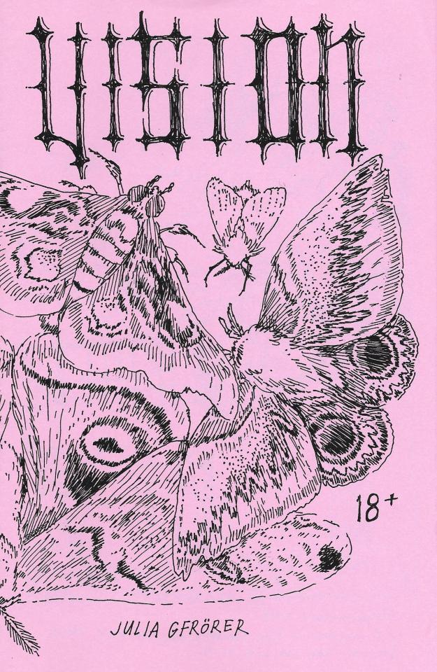
Vision, Part One, Julia Gfrörer: This 24-page comic is from the 2019 MoCCA Arts Festival, which I did not attend. Instead, I ordered it online directly from the artist, because Gfrörer makes comics that are unlike anyone else’s - bleak, elliptic fictions, often in a historical setting, lashing stolid characters with sexual fervidity and occasional bloody violence until they hemorrhage despair, fear, desire. My favorite of her works, the 2014 comic Palm Ash, is an account of Christian martyrdom in the Colosseum that inhabits an exquisite space where it reads as both a straightforward climax-to-the-lives-of-the-saints-type of narrative, and a disquisition on religion as spectacle, with all participants subject to the possessiveness of the men on top... a situation which transcends the particularity of the fable.

Vision, Part One is the first half of a two-part story, which also concerns folklore and possession. The heroine is an orphan, living in a well-appointed home with her brother, and working at the bedside of an ill and abusive woman. But up in her room is a magic mirror, which speaks in the self-deprecating-and-then-demanding voice of a punter urging on the show of a woman at the other end of a webcam. There is an unsettling air of sexual exploitation all over the house, but Eleanor can see nothing: certainly not the lover in her mirror, as all it ever shows her is herself. “You were longing for men to touch you before you even learned to walk,” says the portal, its dialogue balloon reporting from images of the heroine masturbating with a candlestick. It does not matter if this is a magical exchange, or literally a means of addressing herself. She cannot penetrate the hard glass of the screen, and meet her lover; she cannot become the woman reflected. She must sleep, and wake, and dress again.
*

Goodnight Seattle, Julia Gfrörer: I also didn’t go to MoCCA last year, and this was Gfrörer’s debut for that - an eight-page homage to the inescapable 1990s sitcom Frasier. The main feature is a three-page comic (20-24 panels per page) which sees Seattle hit with a nuclear blast and, basically, plunks the Frasier cast down into the middle of Threads. Witticisms and killings ensue -- I dare not reveal the awful fate of poor little Eddie -- but the central joke is one of wide application: that Frasier Crane, psychiatrist, even in the fact of society’s collapse, remains utterly convinced that offering patrician advice to strangers is the most important thing in the world. A one-page backup comic is even more trenchant, riffing on the forever-unseen character Maris as vanished due to an eating disorder, with graphic descriptions of physical symptoms giving way to sitcom-ready fat jokes, just like the ones you heard in that recent superhero movie blockbuster. Also includes paper dolls.
*

The Whitney Comics Biennial, Matthew Thurber: There was a really lively interview last month between the artist and educator Austin English and Thurber, author of the satirical graphic novel Art Comic, and that interview has now inspired a short comic for The New Yorker. It’s a rich 28 panels, lightly tapping the lower-hanging fruit of cartoonists as sadsacks starving for validation while whacking hard and often at elite institutions as machines for exploitation - especially those institutions that understand the language of Art. That artists long for the type of grand statements these institutions can facilitate, even knowing the facts, is the poignant chassis of all these gags.
-Jog
7 notes
·
View notes
Text
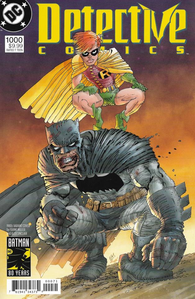
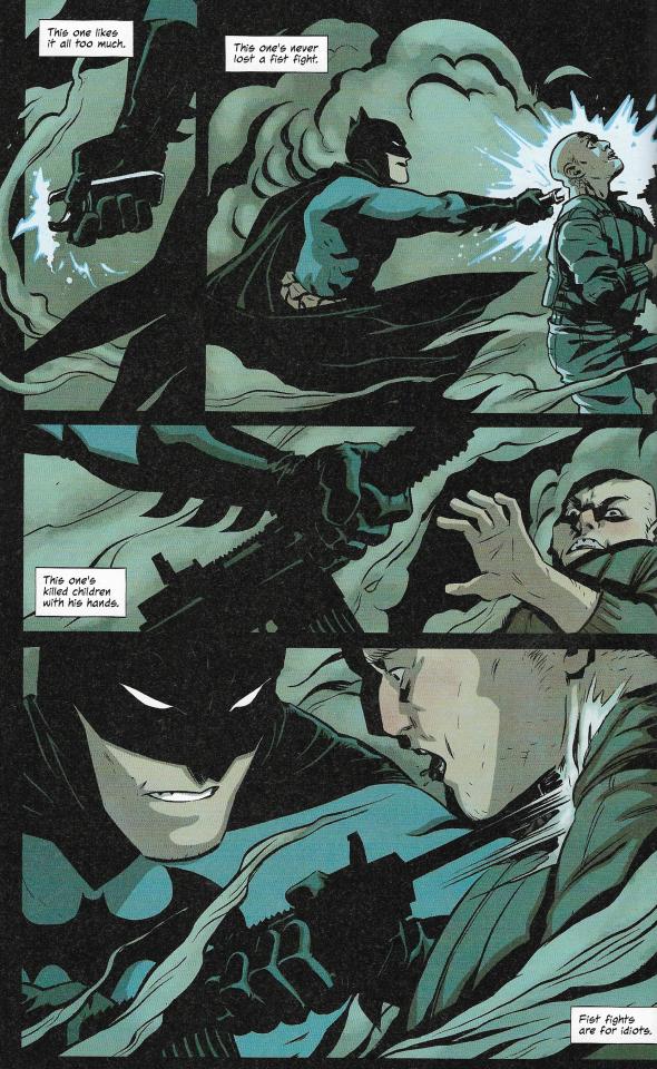
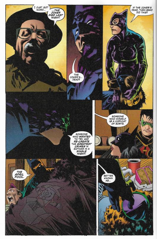
Detective Comics #1000, Chris Conroy & Dave Wielgosz, eds.: I bought this on impulse because it was on the new releases shelf and people were talking about Batman online. It’s a 100-page anthology tribute for the Batman character’s 80th year and the one thousandth issue of “Detective Comics”. I don’t think anyone is ever at their best in a tribute anthology, but that makes them kind of interesting to look at, you know? There are eleven stories, which I will now spoil in their entirety.
1. “Batman’s Longest Case”, Scott Snyder, Greg Capullo, Jonathan Glapion, FCO Plascencia, Tom Napolitano: The first of two stories in which Batman is doing something that looks grim, but is actually happy and anniversary-ish - both with similar titles, and both from major Batman writers. This is the better one, because I think Capullo is an interesting artist. He’s comparable to Jae Lee, in that he’s someone who had some work in comics under his belt prior to being ushered into the second ‘generation’ of popular Image artists, and has continued to evolve quite vividly over the years. The Capullo of today dials up the use of shadows and silhouette that used to sort of decorate the folds of Spawn’s flowing cape and such - here, they’re used more to focus attention on storytelling fundamentals: geography; gesture; etc. I also generally like the colorist, FCO Plascencia, who’s done some Varleyesque color-as-mood work on earlier comics with this team, though the story here is subdued... very classy, dressed for the gala.

Hints of ‘90s grotesquerie only pop up once Batman has solved a large number of flamboyantly abstruse riddles and discovered that the titular Longest Case is really an initiation test fronted by wrinkly old Slam Bradley, the original Siegel & Shuster-created star of “Detective Comics” back in 1937, who welcomes Batman to a Guild of Detection. This is clever of the writer, Scott Snyder, because Batman as a basic concept is hugely derivative of earlier pulp, detective and strip hero characters - and, if you’re being honest about paying homage to the character’s origins, you might as well play up lineage as your metaphor.
2. “Manufacture for Use”, Kevin Smith, Jim Lee, Scott Williams, Alex Sinclair, Todd Klein: In contrast, this story shoots for the quintessential. Smith, of course, is the filmmaker and longtime geek culture celebrity who’s written comics off and on, so maybe it’s his distance from the continuum of superhero writing that has inspired a short story that could have run as a backup in any Batman comic since the 1970s, give or take few cultural references. Matches Malone (Batman, when he is being an undercover cop) descends into the secretive world of true crime memorabilia to buy the gun that killed Bruce Wayne’s parents, which he then melts down to form the metal bat-symbol plate Batman wears on his chest, verily steeling his heart with the memory of this tragedy to fortify him in his neverending battle against crime! NANANANANANANANA BATMAAAAAN! Jim Lee and his usual crew makes everything look like it’s ‘supposed’ to, provided you see this type of statuesque posing as the best sort of superhero art, which many DC comics readers presumably do, given how a lot of these things look.
3. “The Legend of Knute Brody”, Paul Dini, Dustin Nguyen, Derek Fridolfs, John Kalisz, Steve Wands: Dini has written tons of comics, with not a few of those drawn by Nguyen, but this feels mostly like DC1k (acronym’s resemblance to “DICK” a purely innocuous reference to Nightwing, I assure you) acknowledging the extensive legacy of “Batman: The Animated Series”, on which Dini was a writer and producer. The story takes the form of a biography of an infamously clumsy hired thug for supervillains, whom even the most novice reader will have figured out is a Batman Family asset about halfway down page 4 of 8, leaving a whole lot of laborious and narration-heavy slapstick to wade through. Admittedly, this might work better as an animated cartoon, with voice acting leavening the pace of the gags, but I’m also not sure ‘this would be better in a different art form’ is the impression superhero comics should be giving right now.
4. “The Batman’s Design”, Warren Ellis, Becky Cloonan, Jordie Bellaire, Simon Bowland:

Most of the drawing in DC1k is the kind of stuff you can easily trace to a few popular and fairly narrow traditions of ‘realistic’ superhero art. Becky Cloonan is the only woman to draw an entire comic in here -- Joëlle Jones co-pencils a story with Tony Daniel later on, and Amanda Conner does a pinup, mind -- and her work is the only place in this book where you catch glimpses of a global popular comics beyond the superhero provinces in the Hewlettian wild eyes of the hapless human opponents of her Batman, lunging through velvet layers of cape and smoke, lipless mouth parted on a shōnen ai jaw. It is really very impressive.
The writer, Warren Ellis, does a pathos-of-the-hard-man story, in which Batman explains his combat strategies via narration while carrying them out, occasionally making reference to the medical bills his prey will incur and their timely motivations as terroristic white men who feel ignored by the world, and at the end Batman asks the last guy U WANT TO LIVE IN MY NIGHTMARE, LITTLE BOY and the guy is like n- no dr. batman sir, and gives up because Batman’s is too dangerous and scary a life model. It is made clear from the text that Batman has programmed himself into a system of reactionary violence that he inevitably reinforces, but this message is so heavily sugared with cool action and tough talk that the reader can easily disregard such commentary, if so inclined, which has been a trait of Ellis’ genre comics writing since at least as far back as “The Authority” in the late 1990s. It fits Batman as naturally as the goddamned cowl.
5. “Return to Crime Alley”, Dennis O’Neil, Steve Epting, Elizabeth Breitweiser, ‘Andworld Design’: I was surprised that there weren’t other writers from across the Atlantic in DC1k, given the extensive contributions of Alan Grant and Grant Morrison to the character. I was maybe not as surprised to see Dennis O’Neil as the lone credited writer to pre-date the blood and thunder revolution of Frank Miller et al. in the mid-1980s, as that commercial shadow is far too long to escape. Of course, O’Neil was one of the architects of superhero comics as a socially relevant proposition and Batman as a once-again ‘serious’ character in the 1970s, and it may be a reflection of his standing as a patriarch that this story contains no sugar whatsoever: on the anniversary of his parents’ death, Batman is confronted by a childhood caregiver who has figured out his dumb secret identity, and castigates him for doing stupid shit like dressing up as an animal and punching the underclass when he could actually do something as a wealthy man to improve the world. Then Batman starts beating the shit out of young masked teens who have stolen a gun, after which Batman, who is also a masked thug, is told that he is, at best, a figure of pity. The end!
What emerges from this story, to my eye, is that Batman is a terrible fucking idea if examined with any sort of serious realism - and Steve Epting draws the story as close to photorealism as anything in this book gets. I also think it is not insignificant that O’Neil, the writer here most unplugged from superhero comics as a commercial vocation, is the one to make these observations; to believe in superhero comics is to understand that there is play at the heart of these paper dolls, and to make your living from these things is to contemplate new avenues for play. Maybe Batman is dark, obsessive! Should he... kill? Sure, Bill Finger made him kill. The Shadow killed lots of dudes. So did Dick Tracy. Ramp up the verisimilitude too much, though, and you’ve got a guy wearing a hood going out by the cover of night to scare the shit out of superstitious cowards who’ve been taking from the good people of society, which, in terms of motivational narratives, is the same origin as the Ku Klux Klan. To play nonetheless, is the craftsman’s burden.
6. “Heretic”, Christopher Priest, Neal Adams, Dave Stewart, Willie Schubert: Meanwhile, on the other side of the coin, is veteran Batman artist and frequent Dennis O’Neil collaborator Neal Adams. And while Adams is not credited as the writer on this story, it bears all the hallmarks of his 21st century work at DC: whiplash pacing; uneasy expository dialogue; and eager callbacks to Adams’ earlier work. This is the Batman comic as a continuity-driven adventure, and I found it largely incomprehensible as a story, not unlike Adams’ recent “Deadman” miniseries. I still like his husky Batman, though.

7. “I Know”, Brian Michael Bendis, Alex Maleev, Josh Reed: Hey, did you know Brian Michael Bendis, writer of approximately ten and one half zillion Marvel comics, is writing comics at DC these days? Here he teams with longtime collaborator Maleev for a story that brings to mind the old line from Grant Morrison’s & Dave McKean’s “Arkham Asylum” about Batman being the real person and the guy under the mask being the mask. The Penguin, of all villains, figures out Batman’s secret identity, but elects not to pursue Bruce Wayne in his private life, because destroying Bruce Wayne would create a pure Batman far too dark and twiztid for anyone to handle. Or, maybe that is all just an image the perfectly sane Batman has deliberately encouraged as part of his umpteenth contingency plan. I would argue that this is a gentle spoof of people taking Batman too seriously, which clicks with what I’ve read of Bendis’ idea of the character in those 100-page comics they sell at Walmart: a globetrotting detective-adventurer, appropriate for all ages. Bear in mind, I’ve read maybe 0.2% of all Brian Bendis comics.
8. “The Last Crime in Gotham”, Geoff Johns, Kelley Jones, Michelle Madsen, Rob Leigh: Whoa, now we’re talking! Kelley Jones! Just look at this:
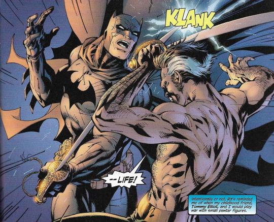
Such totally weird stuff, coming from the artist who drew all those classic ‘90s covers with the huge bat-ears and wildly distorted musculature, the cape this absurd, unreal shroud. It looks like he’s working from photo reference with some of this comic, but also just tearing out these drawings of huge jawlines and shit, this total what-the-fuck-is-going-on haze, which perfectly matches Geoff Johns’ furiously ridiculous story about an elderly Batman and his wife, Catwoman, and their daughter, and Damian, and a dog, who all investigate a mass murder that turns out to be the Joker’s son committing suicide, and then Batman unplugs the Bat-Signal because crime is over in Gotham forever, and then we find out it’s all the birthday wish of Batman, who is blowing out the candles on his birthday cake, in costume, in the Batcave. Is “Doomsday Clock” like this? Should I pirate it??
9. “The Precedent”, James Tynion IV, Alvaro Martinez-Bueno, Raul Fernandez, Brad Anderson, Sal Cipriano: Inevitably, we come to the story that argues that Batman is actually a great guy, and his pressing of children into action as vigilantes under the cover of night is an amazingly positive thing. This is what I mean by “play” - it doesn’t literally make sense, we all know that, but if you buy into the superhero idea, you can buy into this universe of metaphor where the Batman Family is a vivification of finding your company of people, and belonging, and being loved. Lots of talk in here about snatching young people out of the darkness and forging them in light, and helping them find a better path - it sounds like Batman is signing these kids up for the Marine Corps, which is one of several organizations that recognizes the power of these arch-romantic impulses.
10. “Batman’s Greatest Case.”, Tom King, Tony S. Daniel, Joëlle Jones, Tomeu Morey, Clayton Cowles: This is just unbearable. Oh god, what absolute treacle. It’s the second story in this book about Batman being serious and mysterious, but it turns out something nice is going on - he really just wants a photo of the whole Batman Family, because he lost his family when his parents got shot, but then he cracked his greatest case by finding a new family, which is the Batman Family!
All of this is communicated via clipped dialogue in which various Batman Family superheroes trade faux-awkward quips and cutesy ‘moments’ that are supposed to embody the endearing traits of the characters, but read as the blunt machinations of art that is absolutely desperate to be liked. This is art that is weeping on my shoulder and insisting I am its friend, and I want to get away from it, immediately. Tom King is the most acclaimed superhero writer of this generation, and I can only presume his better work is elsewhere.
11. “Medieval”, Peter J. Tomasi, Doug Mahnke, Jaime Mendoza, David Baron, Rob Leigh:

Finally, we have the obligatory story-that-leads-into-next-issue’s-serial, thereby demonstrating that Batman endures. It’s done as a series of 12 splash pages, depicting Batman in battle with his greatest foes, and it benefits immeasurably from the presence of artist Doug Mahnke (some inks by Jaime Mendoza), whose been a favorite of mine since those early, blood-splattered issues of “The Mask” at Dark Horse decades ago. Broadly speaking, Mahnke is working in a similarly muscular vein as many contributors to DC1k, but his sense of composition, of spectacle -- that boot-in-the-face energy the British call thrill-power -- adds an important extra crackle, and an element of humor; his Batman looks like a hulking maniac dressed in garbage bags, beating the shit out of monster after leering monster. What we are seeing is the fevered imagining of a new villain, the Arkham Knight (a variant of a character introduced in a video game), whom writer Peter J. Tomasi characterizes via the old trick of having the villain narrate to us a bunch of familiar criticisms of the hero, which the hero will presumably react to and overcome, or acknowledge in an interesting way, or something, in future installments. This probably would have worked better if other stories in this book hadn’t already made a lot of the same points in a manner that is not an advertisement for the rebuttal of those points... or if I were even capable of reading a story like this without imagining a final dialogue bubble coming in from off-panel going “SIR, THIS IS A BURGER KING DRIVE-THRU.” But something’s gotta go in issue #1001.
-Jog
12 notes
·
View notes
Text

Rodney: The Premonition, “Charlie Trumper” (Eddie Campbell & Phil Elliott): This is a really lovely edition for a comic strip serial - a little bigger than 8” x 11”, all its 36 pages scanned from the original art or filled with notes or letters or script excerpts or preparatory drawings. It was crowdfunded, and you’ll need to check Phil Elliott’s eBay page to see if he has any left. “Check the artist’s eBay page” now joins “please crouch on this record label’s homepage to see if they’ve printed more” and “Facebook message the Japanese publisher, they know English” in the pantheon of Steps to Buy Comics in 2019, as presented by me.
This is from an introduction by the strip’s writer and letterer, Eddie Campbell, who gives us a sense of the milieu in 1984, when “Rodney” ran in the weekly UK music paper “Sounds”. It reminded me quite a lot of sentiments expressed by the artist Chris Ware in his 2017 art book-cum-memoir “Monograph”, despite one ocean’s and the better part of a decade’s distance:

Campbell frames it terms of scholarship, of taste, while Ware alludes to a spirituality of the human authentic, gunked by commerce, but for both the idea of working in an alternative culture is presented as necessary for the artist, because the mainstream culture is completely worthless. I don’t think this separation is so common a thing anymore, in part because I think the ever-consolidating gigacorps of today are very adept at corralling alternative viewpoints under their banners - many ways to earn money in the absence of a monoculture.
The suite of strips that included the “Rodney” serial was Campbell’s first paid work in comics, and close to that for Elliott. As Campbell tells it, “Sounds” was interested in ‘orrible work: something to shock the squares, but not raise so great a shock as to endanger the venue’s profit. The American behemoth MTV teetered similarly atop this foundation, and to great success; there was no such trash allowed my Catholic household’s television as a child. But as an adult, I sense the whimsy — the theatre — behind this small, bloody epic, which Elliott draws in a sprightly and clean-lined style that connects “Rodney” to the continental trend for reviving the aesthetics of the Belgian comics midcentury... I do not know if “Sounds” was aware of how fashionable they’d gotten.

To an American, though, “Rodney” — full title: Rodney: The Premonition II (The Astounding Autobiography of the Man Who Will Blow Up the World in 1985!!!) — recalls the fine tradition of the alternative weekly comic strip, the best examples from which could offer a really sharp rejoinder to the complacency of popular media circa then. Modeled titularly after the film “Damian: Omen II”, “Rodney” finds its title character born with a button that can kill anyone or anything. So he kills his cousin; he kills his classmates; he kills his parents; his lover; his boss; the Parliament; the media; all of the world’s valuable licensed characters; and all of the different types of music listeners on Earth, all of whom are annoying, and must die. All is ho-hum to Rodney, who understands that to live is inevitably to die, and that perhaps if we are aimless in this life, it’s because we’re shaking through the death rattle of a species already fatally wounded - and don’t dare beg recourse to God, for Rodney shall kill Him next! A few people told me on Twitter that they encountered this strip long ago and it really opened their eyes to what comics could do; Campbell says they got no feedback at the time save for one bit of reader mail calling them shit. Elliott prints two letters from “Sounds” right next to each other: the letter accepting them for work, 1984, and a letter booting them from the venue with a sneer in 1986, in the midst of a later serial. That’s life among the living dead.
-Jog
7 notes
·
View notes
Text
More Superhero Comics, Revealing My Reactionary and Facile Engagement with Art as Little More Than the Accrual of Social Capital, Benefiting Nobody But Myself, 4/7/19
The League of Extraordinary Gentlemen Vol. 4: The Tempest #5 (of 6), Alan Moore, Kevin O’Neill, Ben Dimagmaliw, Todd Klein: This is an often very funny issue, set up like a pasted-together UK edition of old US pre-Code horror and crime comics, which, in addition to being funny, plumps up the page count as the plot moves maybe two or three tics forward in advance of the very-last-issue-of-LoEG-ever. The conservative in me wonders why we’re being this digressive in the penultimate number of the entire saga, but then -- at least since “The Black Dossier” -- this project has been more about positioning various strands of fiction and their accrued cultural baggage against one another than telling a propulsive adventure story. Anyway: the realm of Faerie, having easily survived an attempted nuclear strike on the collective imagination by a military-corporate black ops fiction squad comprised entirely of various revamps of James Bond, has brought in every character from every game, comic, cartoon, TV show, movie and book reality with everything for a HUGE apocalypse!
Scenes of bedlam involve: the life story of Victorian painter and murderer Richard Dadd; cameos by Stardust the Super Wizard and David Britton’s Lord Horror; the oeuvre of musician Warren Zevon, brought to terrifying life; a Corbenesque image of a nude muscleman’s massive dick flapping into battle in 3-D; Mick Anglo’s Captain Universe, presented by Moore in unmistakable evocation of his own Marvelman/Miracleman stories of decades ago; a ghost wearing the word CRIME on his head a la Charles Biro’s Mr. Crime, the greatest American comic book horror host; at least one figure from the annals of racist caricature firing powerful sound waves from his mouth; a monster named Demogorgon, the leviathan of Populism, which the heroes allegorically cross as a footbridge en route to a safehouse named the Character Ark; a page-long parody of Batman (via the forgotten UK superhero playboy character the Flash Avenger), describing his origin as motivated entirely by hatred of the poor; a text feature telling of UK comics artist Denis McLoughlin, who worked consistently since the end of WWII, never made enough money to retire, and spent decades as an elderly man drawing for survival on titles he hated, eventually taking his own life in his 80s; and the secret of what happened to all the British superhero characters after the midcentury, which is that they were all eaten by Capitalism, pretty much. I laughed a bunch, but if you think LoEG is tedious shit, this probably won’t turn you around.
*
Savage Dragon #242, Erik Larsen, Ferran Delgado, Nikos Koutsis, Mike Toris: The latest installment of the longest-running Image comic written and drawn by one of the Image founders, now deeply dove into problematic network tv drama stuff. The Dragon’s relationship with his partner Maxine is still strained in the wake of her sexual assault, a video of which the Dragon viewed in the police archives; meanwhile, the mother of one of the Dragon’s young children has been telling them all the truth about their parentage, further disrupting the peace of the household. Also, a formerly aggressive sex robot has joined the gang, dressed as an anime maid. And, the Dragon reluctantly teams up with the mid-’00s-vintage sexy heroine character Ant (which Larsen purchased from creator Mario Gully a few years ago) to foil a scheme by elderly elites to project themselves into the bodies of mythic gods in order to provoke the Rapture. Most interesting to me, however, is a bonus segment in which Larsen presents newly-lettered pages of his preliminary solo work on “Spawn” #266 (Oct. 2016), which would later be filled out by contributions from Todd McFarlane, colorist FCO Plascenscia, and letterer Tom Orzechowski.
As usual, I prefer the ‘unfinished’ version (top) to the official release product (bottom).
*
Superman Giant #9, Erika Rothberg, ed.
&
Batman Giant #9, Robin Wildman, ed.
These are two of those 100-page DC superhero packages they sell for five bucks exclusively at Walmart (for now; later this year they’re gonna have them in comic book stores too), which marry one new 12-page story per issue with three full-length reprint comic books from elsewhere in the 21st century. I just wanted to know what was inside them. Here is what I found:
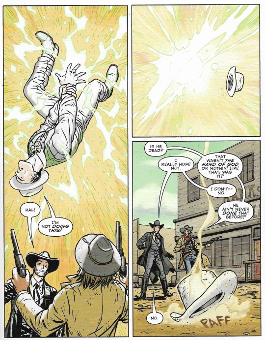
-The new Batman comic is written by Brian Michael Bendis as a very conspicuously all-ages prospect, where the story is about nothing more than what it’s about, and the title character is presented as a serious-minded but inquisitive and compassionate man of adventure. This issue -- just in time for the remix of “Old Town Road” featuring Billy Ray Cyrus -- Batman and Green Lantern travel back to the Old West, trade in their superhero outfits for cowboy clothes, and meet up with Jonah Hex. Nick Derington draws the heroes smooth and squinting with Swanian sincerity, and Dave Stewart colors it all bright and sunny. This is not my thing at all, but it’s confident to the point of acting like almost a rebuke to the rest of the book, where literally everything else is chapter whatever of a nighttime doom ballad drawn by either Jim Lee or something trying very hard to look like him.
-Like:
I can spot the differences, sure - if nothing else, reading superhero comics trains you to spot differences in otherwise similar things. But, there is absolutely an aesthetic at work. The top page is from an issue of “Nightwing” that tied into the 2012 “Night of the Owls” crossover in the Batman titles, produced by a seven-person drawing and coloring team fronted by pencillers Eddy Barrows & Andres Guinaldo. The writer, Kyle Higgins, has Dick Grayson fight his semi-immortal great-grandfather, who is an assassin for the Court of Owls: one of the more popular recent Batman organizations of villainy, presented here as a fascist group mediating society’s function through murder from the gray space between social classes. The Graysons, therefore, are the Gray Sons, but Nightwing resists the pull of destiny by winning a big fight, slinging the villain over his shoulder, and walking away toward a better future of just beating the shit out of bad people instead of killing them, I think. The Batgirl story -- from 2011, written by Gail Simone -- is comparatively orthodox, finding the character gripped with uncertainty about the superhero life and going about some downtime character-building activities, though most of it’s a big fight with a villain with a tragic past. The penciller, Ardian Syaf, kind of has trouble blocking the action so that characters’ movements are clear; I think Syaf is best known for having his contract with Marvel terminated in 2017 for slipping what were widely interpreted as anti-Christian and antisemitic references to Indonesian politics into an X-Men comic.
-There is a whole lot of Jeph Loeb among the reprints. He is not a writer who has been in critical fashion for much the past two decades, but he has undoubtedly sold a lot of comics for DC, and they probably feel he can do it again. The Batman book is serializing (deep breath) “Hush”, a 2002-03 storyline notable for its extraordinarily easy-to-solve central mystery, and generally being a taped-together excuse for Jim Lee to draw as many popular Batman characters as possible across 12 issues; it sold like hot cakes. The highlight of chapter 9 is probably a bit where a three person fight ends in one panel, and then one of the characters leaves, and then a second character wakes up from unconsciousness and also leaves, and then the first character comes back and nurses the third (also unconscious) character back to health, and then Batman arrives, all in the transition between the aforementioned panel and the next, which takes place in the same room; such is the befuddling desire to race ahead to more spectacle. Jim Lee (with Scott Williams and Alex Sinclair) is indeed Jim Lee (et al.) throughout, though at one point the team drops a howler of a swordfighting panel where Batman’s blade appears to grows to JRPG length due to what I think is the colorist filling two whoosh lines with the same hue as the swords.
Meanwhile, the Superman book is serializing a 2004 storyline from “Superman/Batman” -- the series where Loeb has Superman describe the action on the page with his own Superman-branded captions, and Batman does the same with Bat-captions, and Superman says tomayto and Batman says tomahto -- in which the late Michael Turner, one of the rock star 2nd generation Image artists, illustrates a new introduction for Supergirl. But this isn’t quite the same comic that was originally published... can YOU spot the difference?
Is this like how Walmart won’t sell CDs that have an explicit content sticker, but with teen superhero g-strings? It’s hard to explain to younger readers how the low-rise/thong panties combo forever sealed the horniness of a generation of het male superhero artists into the late 1990s, and maybe DC doesn’t want to face that. Or, they’re just leery of how Turner slipping some peekaboo glimpse of Supergirl’s underpants or bare thighs into virtually every panel in which she is depicted below the waist might affect the marketability of the comic in 2019 - although I guess it could have happened in an earlier reprint somewhere too.
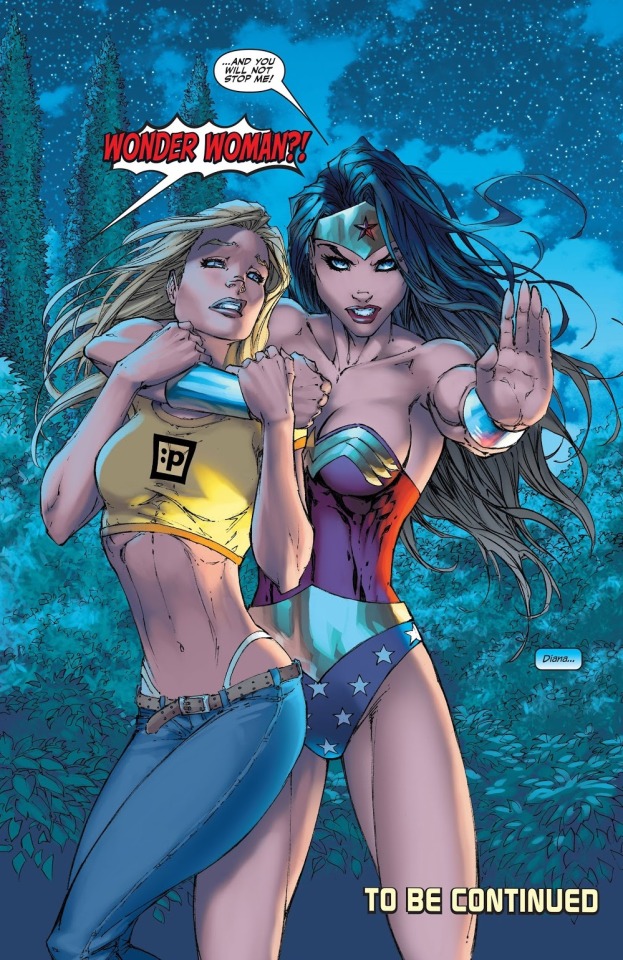
-The new Superman comic is a series of 12 splash pages depicting a race between Superman and the Flash. There is very little sense of speed, because Andy Kubert (inked by Sandra Hope, colored by Brad Anderson) draws the characters as frozen in time in a way that prioritizes muscular tension in the manner of contemporary superhero cover art; at one point the two characters part the sea with the force of their bodies, and it looks to me like they’re gesticulating in front of a theatrical backdrop. And, anyway, the story pulls back almost every other page to depict Batman standing on a ledge, or Lex Luthor in a sinister chair -- or some birds flying next to a building, or the Earth as viewed from space with streaks on it -- as the race occurs deep in the background or off to one side. The point is not excitement, but reflection, as imposed upon us by the between 13 and 21 narrative captions and/or dialogue balloons pasted atop all but the first page.
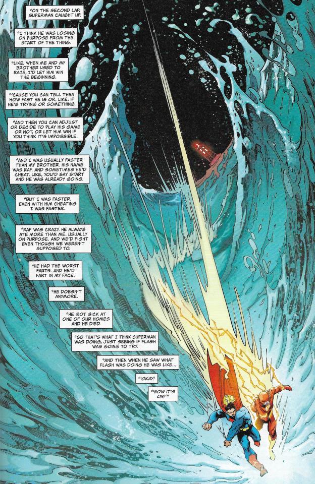
The writer is Tom King, whose “Mister Miracle” (with artist Mitch Gerads) gets a double-page advertisement later in the book, festooned with breathless blurbs from major media outlets. His narrator here is a little girl who is literally chained in captivity, clutching a Superman doll, and delivering her soliloquy in a manner of a superhero-themed TED talk with handclap repetitions on the nature of contradiction. Being faster than a speeding bullet is a CONTRADICTION. Being as strong as a locomotive is a CONTRADICTION. Leaping tall buildings in a single bound is a CONTRADICTION. Superman is about to lose the race, but then he wins, because to beat the Fastest Man Alive is... a contradiction. No wonder the GQ entertainment desk was blown away. DC comics do this kind of thing a lot, where they just have the writer tell you how great the characters are, and since you’re still reading superhero comics in the 21st century, you’re expected to pump your fists in recognition, because you and the writer and everyone at DC are just big ol’ fans... but I am not, because I am Jesus Christ, the only son of God.
-Elsewhere in the Superman book is an issue of “Green Lantern” from 2006, drawn by Ethan Van Sciver (inked with Prentis Rollins, colored by Moose Baumann), who is known today mostly as a conservative ‘personality’ online. He also netted more than half a million dollars last July in a crowdfunding campaign to make a 48-page comic book which he has not yet finished; funny to see an American right-winger on the French schedule. Funnier still to see the kind of people (mostly guys of a certain age) who mill around such personalities croaking about how diversity is ruining comics, because ALMOST EVERY FUCKING STORY IN BOTH OF THESE 100-PAGE BOOKS IS DRAWN BY EITHER SOME DUDE FROM THE 1990s OR SOMEBODY WORKING EXPLICITLY IN THAT STYLE, but - I guess when you’ve been pampered for so long, every paper cut feels like a ripped limb. Speaking of dismemberment, the writer here is Geoff Johns, who is often pegged as a superhero traditionalist, though he also has a grasp of gory pomp which occasionally pushes the comics he writes into a Venn diagram set with loud youth manga... at least in terms of how the action plays out, all broad and pained. So, needless to say, he’s currently writing “Doomsday Clock”, which is DC’s present attempt to extend the publication life of the valuable “Watchmen” property, so that they needn’t return it to the original creators, per the original writer, Alan Moore.
-To hear Alan Moore say it, the America’s Best Comics line was done on a work-for-hire basis as a means of ensuring prompt payment of the various creators from Jim Lee’s WildStorm, the original publisher. WildStorm was then acquired by DC (Jim Lee is now their co-publisher and chief creative officer), and Moore -- who has been (fairly) criticized in the past for taking ethical stances that cause financial harm to his artistic collaborators, who are in a less economically flexible position than writers in the comic book field -- allowed the line to continue under DC’s ownership, as to cancel everything would disadvantage everyone working on the titles. One of those titles, “Tom Strong”, was written by Moore and pencilled by Chris Sprouse for a while, and then there was a long line of guest creators, and then Moore and Sprouse came back when the ABC line wrapped, so that the concept could reach its logical termination point in an apocalyptic manner... Moore does love an apocalypse. The final story in the Superman book is a very recent, late 2018 issue of “The Terrifics”, in which we find an attempt to revive the DC-owned Tom Strong characters as players in broader DC stories. Jeff Lemire & José Luís are the primary creators. Jack Cole’s Plastic Man is there, as well as the John Ostrander/Tom Mandrake version of Mister Terrific. It’s a lot of offbeat characters; we even see Moore’s own parody of Hoppy the Marvel Bunny, because, I mean, Alan Moore does a lot of riffs on preexisting characters too, right? It’s a big blob of cartoon whimsy, filled with available characters running around. If they’re available, you might as well roll ‘em out, off the new releases rack and into a supermarket reprint package stacked in a box next to squeeze toys and discount Pokémon merchandise, which I bought, because it was really cheap.
-Jog
17 notes
·
View notes
Text

Goro, Sarah Horrocks: This is the newest long work (200 pages!) from Oklahoma’s own Sarah Horrocks, who posted the whole thing online the other day for digital purchase. So, naturally, I’m now going to post a bunch of double-page spreads from the print comics, which were just about magazine size and look really good all spread out.


“Goro” is a more grounded piece than Horrocks’ preceding serial, “The Leopard”, in that its various confrontations among unhappy members of an extended, massively rich family play out through dialogues set in b&w, contra the hallucinogenic color styling of the prior work. The only color here is found in one of two lengthy depictions of running, chasing: flight as means of challenging destiny. Horrocks includes a handy list of her influences for the project -- television and film melodrama figures heavily -- but I’m in the headspace now where her comics give me the same feeling as the video games of Goichi Suda, which are full of allusions to popular culture, and adopt a very declarative tone, yet primarily feel suggestive, even cryptic, like the author has reserved something of the work for themselves. Kyoko Okazaki, whom Horrocks cites, is like this too, as is some work of the filmmaker Andrzej Żuławski (to me, at least!). So, Horrocks might pause to have a character march around the room of a single splash page, detailing the hypocrisies of a transphobic society, and this will not seem out of place because that is the eluction of her text, but the greater relationship of the seething family is something she depicts in vignettes pressed together, different characters sometimes resembling one another, as if each suffers a neverending psychic hangover from the others being inside them, socially and emotionally and genetically. Best downed in one shot.
-Jog
11 notes
·
View notes
Text


Happy Hour In America Vol. 2 #1, Tim Lane: This is a 24-page stapled comic book Fantagraphics put out in 2017, dedicated to works by Tim Lane, who deals in archetypical characters and scenarios he deems informative re: the American self-image, drawn in a very heavy, Burnsian style that you can trace back to the post-E.C. roots of the undergrounds if you want. Lane’s an older guy, in the back half of his 40s, and his are a type of explicative, no-shame-in-text comics that Harvey Pekar would be quick to inform us are their own type of literary composition, even without any space left unshaded for the reader to imprint upon; it’s a talking-to-you comic, of the type that becomes overbearing to me in big collections but fits snugly in a format like this. The topics are Masculenity and Self-Determination and Cool, as embodied by Steve McQueen, depicted by Lane in his mid-1970s hiatus from acting, bearded and disgusted by the unmanly/inauthentic nature of acting, which we might understand as Art. The conflicted appeal of such rugged isolationism to an artist like Lane is explained to us flatly in caption, though I think I could have guessed on my own - it is also the animating quality of a lot of cultural and subcultural discourse right now (“learn to code”), and I don’t know if essaying Steve McQueen in such terms is too informative, though I *am* interested in how Lane stacks ultra-literal narrative strategies on the page to the point of paradoxical surrealism: Steve McQueen remembering his performances by watching multitudinous Steve McQueens on an ever-running tv. The counterargument, that this is all just very overworked, is made by a ‘funny’ backup strip in which a McQueen figure zooms into a crowd of sour beatnik poseurs and gives the ladies booming orgasms before kicking them satisfied to the curb, a theme still best expressed by the Virgin and Chad meme imo.
-Jog
17 notes
·
View notes
Text

How to Read Donald Duck, Ariel Dorfman & Armand Mattelart, translated by David Kunzle: Not a comic, but one of the all-time classics of writing-about-comics, though it’s not especially concerned with the comics form. First published in Chile in 1971, in the triumphal flush of the Allende presidency, the book instead addresses charges on the part of certain press interests that the new, socialist-minded children’s literature of the day was politicizing the arena of youth entertainment dominated by Disney comics - I’ve heard rumors there are similar arguments online in 2019! So, the authors present a puckish title: Para leer al Pato Donald, addressed both to young students and to their opponents, who cannot read the simplest things in terms of ideology. To massively simplify things myself, the authors detail how the sexless, anti-biological uncles-and-nephews setup of the Disney menagerie creates a closed circuit of children/nephews behaving as an adult’s ideal of good behavior, correcting the transgressions of adults/uncles in a world with no sense of history or progress, therefore policing the maintenance of the status quo; moreover, the true ‘children’ as portrayed by the Disney comics are foreign, native, backwards caricatures, grinning simply as the heroes chase rewards they are shown to deserve through the sufferings of adventure - ‘treasure’ that exists as divorced from the circumstances of its production, and is therefore up for grabs by the clever and daring. This is the imperial project that Disney represents... real tinfoil hat crazy stuff, right?! Haha, anyway, two years later a CIA-backed military coup crushed the Popular Unity government, and scores of copies of this book were sunk or burned; Disney itself attempted to block the book’s entry into the U.S. through copyright litigation upon its initial English translation, but this 2018 edition from OR Books — nearly half of which is comprised of various introductions, forewords, and supplementary texts, including a lengthy, annotated list of related books and articles — can easily be obtained however you want. Disney, meanwhile, has not gotten smaller.
-Jog
15 notes
·
View notes
Text
Some American Comics, 3/27/19
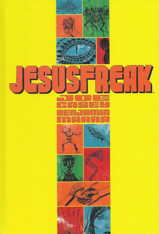
Jesusfreak, Joe Casey, Benjamin Marra, Brad Simpson, Rus Wooton, Sonia Harris: Or, ‘The First Temptation of Christ’. This was recently controversial on Fox News and among those certain greater media outlets keen on tracking culture war stuff, but it’s really just a hard PG-13 adventure story that does what Asian comics have done with epic books like “Journey to the West” for decades, i.e. slap the clay of the source material into the shape of more recent popular entertainments. In fact, and moreso than the ‘action comix version of the New Testament’ angle, what’s notable about “Jesusfreak” is that it adds an extra layer of artifice by employing an idiom reminiscent of Bronze Age U.S. comic books, like Marvel’s “Master of Kung Fu” under Doug Moench & Paul Gulacy, or dawn-of-the-direct-market indie genre fare like Gulacy’s and Don McGregor’s “Sabre” - comics marked by a keen interest in popular media outside of comics (SFF novels, genre movies, commercial illustration) and an often very earnest, purplish narrative approach. This isn’t guesswork; there’s an essay in the back of the book that pretty much spells this out, positioning the mid-’70s as the last time the classic American comic book was both genuinely a player in mass media, and artistically adventurous. I personally don’t feel much attachment to comics of this period, though I have read a bunch of them; in terms of English-language work, I prefer the British stuff of the same period, from magazines like “Action” or early “2000 AD”, which interfaced with outside media by seizing their concepts wholesale and presenting them in as screaming-loud a manner as imaginable. U.S. comics of the time feel very cautious compared to those, unless we’re including the counter-mainstream of late-period b&w horror magazines, which mostly consisted of Spanish artists drawing charcoal swirls around glamour models while the writers and/or editors vamped out 467-word text captions about the hopelessness of life. That was also good. Doug Moench wrote some of those too.

As a result, “Jesusfreak” can readily be compared to works by Michel Fiffe, or Tom Scioli, or Ed Piskor, all of whom take inspiration from ‘70s or ‘80s American comic books, and put that inspiration to different ends. The writer here is Joe Casey, who’s been around for a long time, though I most readily associate him with certain off-center mainstream comics from the ‘00s; his is a more chameleonic style, and as a result the book reads like more a straightforward pastiche than those of the artists above. A dark-skinned Jesus grimaces from the pain of visions, working construction on properties rules over by fair-skinned Romans: houses where he can never live. Abusive soldiers attack religious worshippers, and Jesus fights back with lethal karate power! Older comics would boldface their social relevance in pulpy terms like this, and so it goes as Jesus confronts an Edenic snake-with-legs Satan in a Bruce Lee/Chuck Norris “Way of the Dragon”-type colosseum martial arts duel, which the devil intends as a premonition of all the violence to be done in the Christ’s name in later history. It’s a little cleverer than it looks, but when I see the drawings of Benjamin Marra — blown out under a permanent desert haze via colorist Brad Simpson — I recall the finale of his solo book “Terror Assaulter: O.M.W.O.T.”, which takes the absurd macho combat fantasy devices of its own earlier chapters and keys them to specific alpha male behaviors in the lives of the types of men who need these fantasies: ideals that invariably leave them unhappy and maladjusted. Marra, I think, is underestimated in his ambivilance toward what he depicts, and those struggles are more vivid to me than poppy provocations such as this.
*
Go-Bots #3 (of 5), Tom Scioli: Speaking of which - I am now two full issues behind on Scioli’s new robot hallucination, but I’m getting there! This issue has what the anime fans call a timeskip - a leap forward many years, to a place where rogue transforming vehicles are now the dominant species. I love how Scioli draws the humans in this issue: tiny, scampering things, speaking in a uniform, childlike voice, all soft and squishy inside the cold steel combatants. Our toys are now a security apparatus, but we still look like we’re playing.

-Jog
7 notes
·
View notes
Text


Letter to Survivors, Gébé, translated by Edward Gauvin: Hot damn, this is a French one! I would even go so far to say that of all the French comics New York Review Comics has published, this is the most French comic of them all. Gébé (Georges Blondeaux; 1929-2004) was a longtime editor of and artist for French satirical magazines, and this 1981 album lays out its vignettes in a manner both blunt and elusive. A hazmat-suited mailman arrives at the fallout shelter of The Typical French Family from advertising history and reads them a series of letters recounting tales of the pre-apocalyptic past - and all of those tales are themselves concerned with how people discern the past. It’s not ha-ha humor, it’s humor like ‘a little girl can see the future and takes pains to sabatoge a situation that she knows will create a sentimental family memory that her relatives will use to distract themselves from the pain of their future,’ you know? At first the fallout family groans over didactic potential of the mailman’s mission, but gradually they cotton on to sentimentalization of the past as a failsafe switch for restoring the past’s iniquities in the future. Will a revolutionary society rise from the ashes?! L'humanité ne sera heureuse que quand le jour où le dernier bureaucrate aura été pendu avec les tripes du dernier capitaliste, as they say in the funnies.
-Jog
9 notes
·
View notes
Text


No Visitors Season Four, HTMLflowers: The self-published latest from Melbourne-based cartoonist and musician HTMLflowers, a 20-page stapled comic book with tape marks visible around the edges. The “Season” label tempts comparisons to television, and much of the work indeed consists of characters facing each other with statements, invitations and challenges, transmitted via the camera control of tight grids: 12-panel base, with departures therefrom. But this no ensemble dramedy; it is a concrete-hard gaze at the situation of Little, an impoverished hospital inpatient with an incurable disease, introduced in this issue deriding the progressive pieties of a support group for the chronically ill before making off with other patients’ food. Little is ambulatory, and fucks off from the hospital sometimes to snort and sell drugs, and hook up a bit, though the realities of health and lodging assure that such casual encounters end with the sickly partner jacking off in a hospital bed at the end of the night. Many television Seasons have been devoted to nasty protagonists being amoral-yet-compelling, but to Little this is nothing dramatic or exciting; it’s not the titilation by which a disadvantaged person becomes a compelling trope, it’s life.
What the artist does here is something challenging; he remains totally fixed on the perspective of the character, relying on perepherial information as a means of complicating their worldview - we see, for example, a patient in an adjoining room gurgling in critical pain in between panels of Little eating fast food and laughing at Simpsons videos online. What is implied, is implied loudly. Yet this is not an obvious or cloying work, because HTMLflowers does not use these techniques to undercut the character. He presents instead a simultaneity, in which Little’s anti-communal, anti-“progressive” point of view rolls out in uninhibited tandem with ‘sensible’ alternatives that are, frequently, sensible. At one point, Little is told that, while very ill, they are occupying a bed that could go to somebody with a worse prognosis: “If you don’t start doing as we advise... well I give you five more years at best...” But the advising is the problem. That the abled do not allow the disabled the human dignity of self-destruction is the provocation I see in this raw and bloodied work.
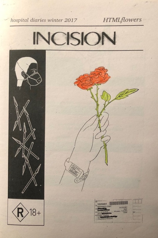
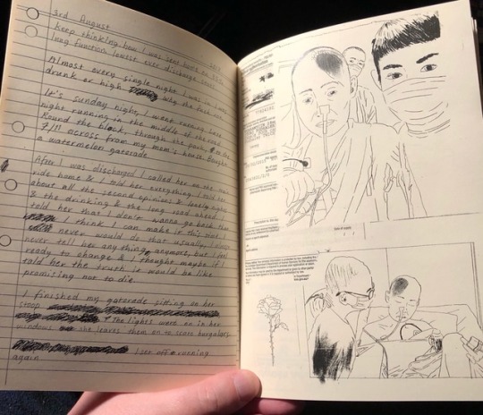
Incision, HTMLflowers: This is a 2018 zine, arranging 72 pages of diaristic material, much of it handwritten. HTMLflowers was diagnosed with cystic fibrosis as an infant, and moved to Australia with his mother to escape the U.S. health care system that swallowed their money and made basic survival impossible. There are not a few similarities here to the situations depicted in “No Visitors”, but the scope of the narration is both wider and more admittedly excerpted: the handwritten portions were composed during various hospital stays the artist underwent in a four-month period in 2017, with times lived outside the hospital only presented in the context of inpatient reflections. The tone is tenderer than that of “No Visitors”, with references to friends and family made fleshy and warm, while the newer comic hardens such things into narrative immediacy. Left to wander, “Incision” dwells on the frustration of going back and back into hospital care, with its contradictory diagnoses and the push and pull of administrative regulations struggling against underfunded staff; the animating image is of the artist running, which is both useful exercise and potentially dangerous. Regularly, sketchbook drawings are collaged atop actual medical documents and hospital ephemera, obscuring the literalism of “trying not to die” with the capture of life in art. The thorny rose on the cover is hand-colored. You can buy these and other books here.
-Jog
9 notes
·
View notes
Text
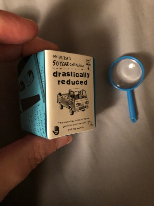


Drastically Reduced, Mike Haeg & others: This is a really cool little package of 24 zines from the 1990s, reprinted at roughly an inch and a half high - slightly larger than an average U.S. postage stamp. Comes in a teeny-tiny slipcase, with a little plastic magnifying glass, which, to be honest, doesn’t help much with the readability of some of this stuff. Doesn’t matter; it’s arrogant, perhaps, to think you can gaze clearly backward to a time when gnarly comics shared space with thrift store magazine cutouts broadly defaced with rude dialogue and snide text. Maybe you *ought* to strain your eyes trying to stare through the gauze of one quarter of a century of economic and technological changes, kiddo. Comes with an all-new 25th zine of reminisces by mastermind Mr. Mike Haeg; distributed by Zak Sally’s La Mano.
-Jog
12 notes
·
View notes
Text

N for Nadelman, John Hankiewicz: This is a new self-published comic from the fervently-admired Hankiewicz, whose superb and mysterious graphic novel “Education” you can still get from Fantagraphics. “N for Nadelman” is not a graphic novel, it’s a 16-page short story, printed roughly at magazine size, but several familiar devices link these works: word balloons always emanate from outside the frame, never connecting to any character’s mouth; a running, caption-based narration gradually decouples itself from what the panels are showing; and characters are depicted as if against flat scenery, which they traverse, as if to invoke theatrical rather than cinematic values. Or:

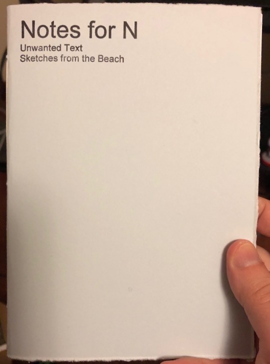
Here we see the three strands of narrative winding through the comic: (1) a caption-based narrative of a woman from an art gallery visiting the sculptor Elie Nadelman in the final years of his life, as he struggled financially, unwanted sculptures rotting in the attic of his home; (2) a bubble-based dialogue between the woman and “N” from one portion of her visit; and (3) drawn depictions of the woman wandering in and around Nadelman’s house, smashing one of his sculptures by accident and gazing at others. Sometimes the three strands line up juuuuust enough to approximate a typical integrated comic, but then they veer apart, so that the woman seems engaged in a disconnected dialogue with the sculptures themselves while recalling events that have not yet happened. It’s rather operatic, in its play between recitative dialogue and aria-like bearing of the mind, though Hankiewicz, of course, knows that comics flatten these elements into an uneasy, mutable reality. And his are uneasy comics - explicitly, the story is about people looking at art and art looking at people and art looking at art, and men looking at women; all of them shifting, like the traits of this comic, to confirm their own perspective. But the only sure connection is their proximity in space, as staged by Hankiewicz. Comes with a bonus booklet of unused text, paired with sketchbook drawings done on a beach.

-Jog
10 notes
·
View notes
Text

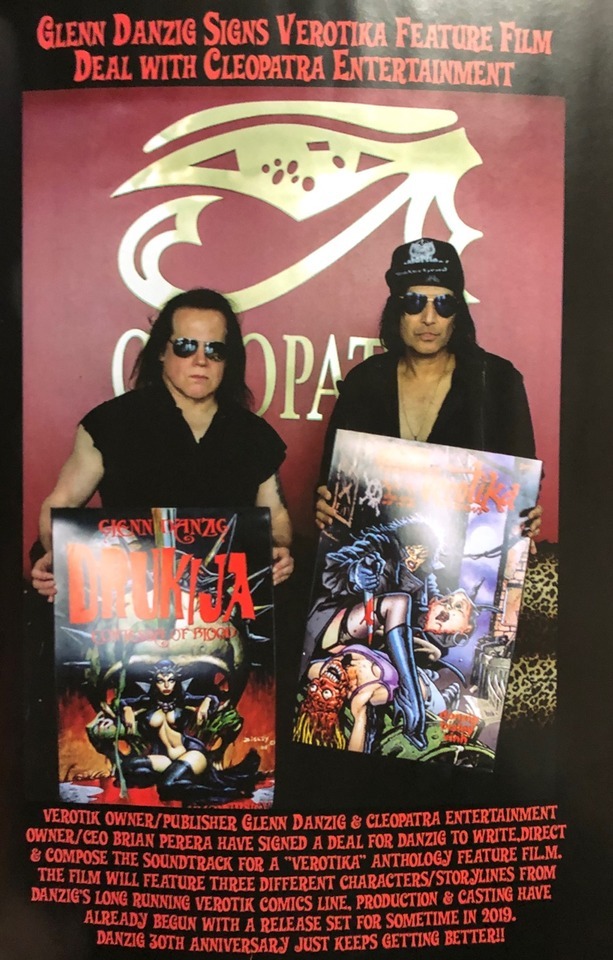
Verotika Returns #5, Glenn Danzig, Rafa Garrés, Pac Vinh, Matt Yackey: That’s right, Glenn Danzig is still publishing comics - maybe one or two per year? He’s also the sole writer (and possibly a supplemental colorist) on both stories in this, a 24-page stapled package of serial bits.

Rafa Garrés draws the first story, “Muertana Act II”, in which the titular ‘Mujer de los Muertos’ has her crew of Mexican character types (including masked wrestlers, a tough dude with a machete, and a mustached guy in a sombrero) murder a bunch of drug dealers, one of whom wears an enormous golden dollar sign chain. She’s trying to set up some kind of spell, but mostly it’s a lot of pages of Garrés — a gaming art veteran who’s drawn Lobo, Judge Dredd, etc. — showing dudes getting their wriggly bodies murdered. Lots of big, twisting hands on everyone.
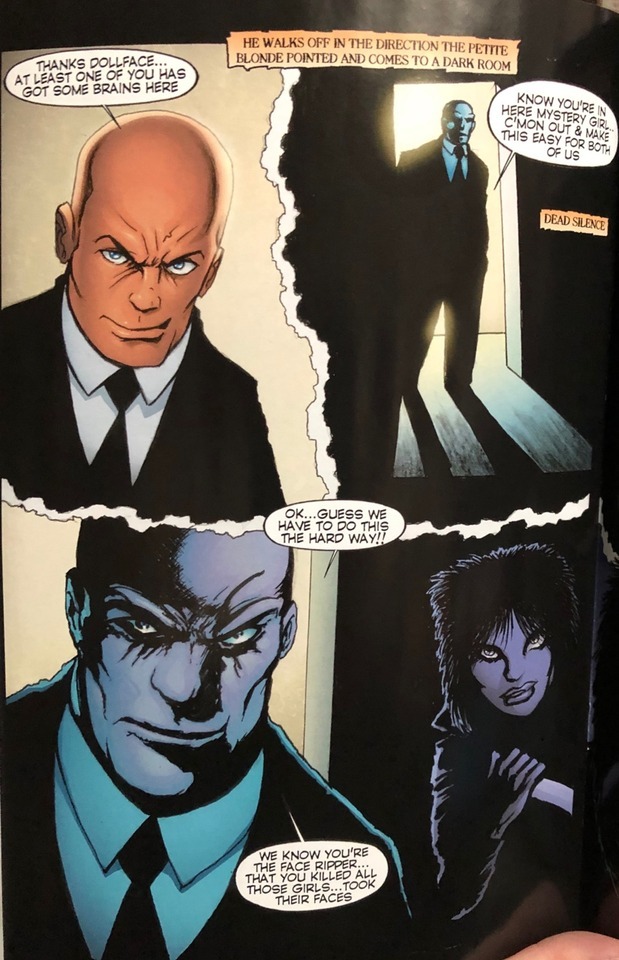
The second story is the finale to “Change of Face”, in which a mystery lady who is also a stripper cuts off faces and is pursued by a big bald cop. I have no idea what’s going on in this comic; there’s a confrontation between the two characters, and the mystery lady gets away, and then she’s dancing with her face covered because I guess she needed new faces to replace her deteriorating face? Mostly, I noticed lot of weird half-nudity, insofar as all the women are basically topless, but the coloring makes it seem like they all have clothes painted on their breasts, which I guess is how you stay out of the Adult catalog at Diamond or something. Stiffly drawn by one Pac Vinh, the whole thing feels like a Zenescope comic where they take your money on the basis of the cover art and leave you stranded in the midst of comic book market specifics that make no sense to anyone who isn’t completely buried in this shit. Great photo of Glenn in the back, though!
When I was in my 20s, a lot of people used to talk about how individual comics might be analogous to pop singles... but they all had a pretty brainy and self-referential, literary/cinematic idea of pop. They weren’t talking about comics like Danzig writes them here, where they’re mostly these ad hoc concoctions of whatever genre stuff is floating around in his headspace; that kind of writing can work as songwriting, because it’s the character of the music that emboldens and emphasizes what’s primal or unstated or otherwise subconscious about the stuff. The music of comics, though, is drawing, and that’s often very hard to mediate in a collaboration, as it’s so slow and lonely a thing, and so hewn in stone once it’s done. Ironic that those collaborative comics which could touch a less writerly musicality have a higher chance to fail...
-Jog
9 notes
·
View notes
Last Seen Blogs
midnallu
midnallu

miidiary
11:11...
the-doctor-9-10
Proud Nerd Queen

baemy624
Just Vibing Along..

monemisawa
MONE