#RAMBLEDOG
Photo


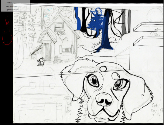
my late great black lab. I will see him and those I love after my death, so i no longer fear death. haha!
5 notes
·
View notes
Photo
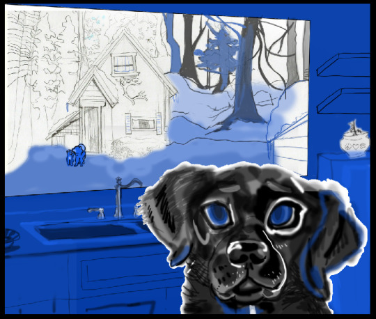

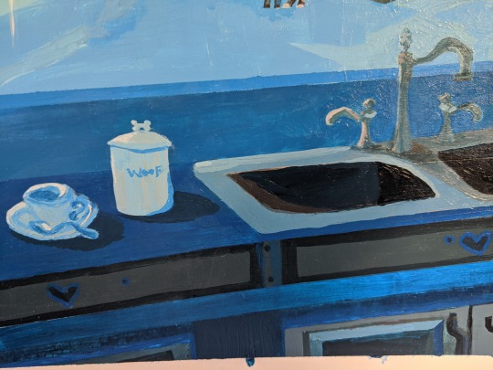
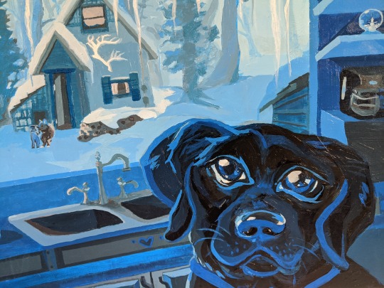
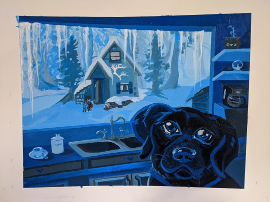
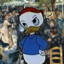
HERE IS THE 1ST PROJECT FOR COLOR THEORY CLASS!!!! AS WELL AS THE PROGRESS.
THERE WERE GRAPHITE DRAWINGS DONE FIRST FOR THIS BUT LIKE....THIS IS WHAT I GOT ON MY COMPUTER.
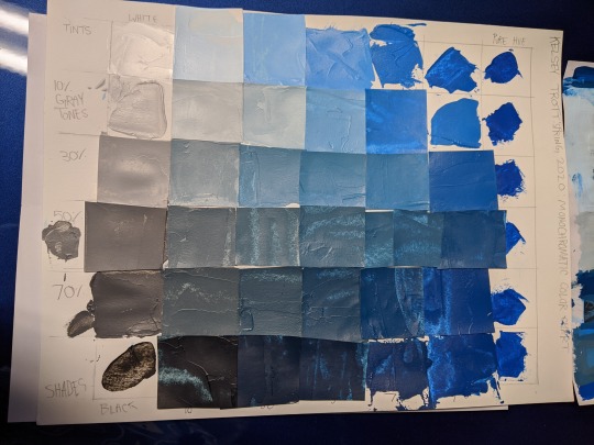
MONOCHROMATIC. JUST USED BLACK, WHITE AND BLUE HEAVY BODY ACRYLIC!
AND YES HERE IS THE GHOST OF RAMBLE, LOOKING INTO THE FUTURE, LOOKING AT YOU.
IF YOU HAVE CONSTRUCTIVE CRITIQUE ID LOVE TO READ.
HERE’S MY PROCESS JOURNAL IF YOU WOULD LIKE TO READ MORE
Kelsey Trott
15 April 2020
Professor Wasson
Spring 2020: 2D Color and Composition
PROCESS JOURNAL FOR PROJECT #1:
Briefly describe the subject and mood of the design.
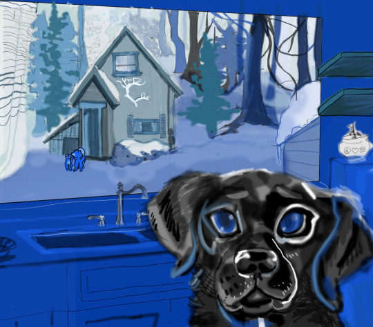
The subject and mood of the design is persuaded by the color blue. Blue is calm and content while simultaneously suggesting gloominess. The subject of “Luncheon In The Kitchen” centers around loss and what I hope to gain in the future. I miss my black labrador retriever, ‘Ramble’, dearly. Since I am an only child and come from a small family, the loss is still felt. Two days before Valentine’s Day of 2020, without warning, my closest cousin passed away, and there will never be a replacement for her. Those who we lose seem to make the biggest impact in comparison to those who are still living. The subject conceptualizes a new home for me to start again with the assets to care for a dog(s) and live on my own. My mom observed that the dog is looking into the future.
2.
Indicate the monochromatic color scheme you selected (which color you selected), and explain how it contributes to the mood or expressive nature of the piece.
With blue, the brain is naturally inclined to stay awake since the color simulates daylight. The logos for Twitter, Tumblr and Facebook are blue to match with their blue and white schemed user-interface. This is a web designer’s hack to convince their visitors to stay up late looking at their website! Marketing aside, Blue expresses purity and clarity due to water’s tendency to be within the cool green-blue range. However, depression, gloominess and simply ‘feeling blue’ can be suggested if the viewer is feeling distressed at the moment.
Through this creation, I hope the dog’s blue eyes will remind onlookers to feel calm within. Good dogs have always reminded me that I am loved and to take a breather during hard times. To contribute to the mood, blue was chosen to express a multitude of happy , sad, and content feelings.
3.
Identify and explain how color has been used to create a sense of depth in your piece. Provide examples to clarify your statements. (think about whether you used atmospheric perspective or recession into darkness; think about how you used value and intensity to create/enhance depth).
Atmospheric perspective was used by painting the sky very light tints of blue. Lowering the tree’s intensity in the background by turning them into ~10-20% toned. My house is more intense than the background’s shapes so it is popping out of the middleground. Ramble, the biggest dog possesses the darkest shades within the piece, but also has many mild tones and a tiny bit of tints to suggest light coming in from the window on the left side.
4.
Identify and explain what you feel to be the design’s 2 greatest strengths. The strengths should relate to the goals of the project.
The first strength of the design is the recession to lightness/ atmospheric perspective. I feel the snow on the ground gradually tinting towards white and the toned down trees promotes depth within the piece. A second strength is the dog’s face. I know that he is stylized and my work could be less sloppy looking, but I still love how his facial expression conveys the mood.
5.
Identify and explain what you feel to be the designs greatest weakness/es and indicate how would you correct it if you could? Weaknesses should relate to the goals of the project.
Hard edges are not easy for me to persuade. The weakness of my project is from the messiness within my painting style. I would correct my mistakes with photoshop if it was allowed. The greatest weakness is the presence of transparent wet paint strokes and jagged edges.
#BLACKLAB#RAMBLE#PROCESS#MONOCHROMATIC#RAMBLEDOG#ACRYLIC#BLUE#MONOBLUE#MONO#LIQUITEX#LIQUITEXHEAVYBODY#WINTER#LANDSCAPE#CABIN#DOGS#labrador#labradorretriever#MYART#PROUD
1 note
·
View note
Last Seen Blogs

markdsmith90
Junk Removal Tips

zdecitolre1983
Untitled

gloriouscyclesheep
Sans titre
razecah
Monsieur zero