#SOME THINGS TO NOTE! i painted over the bg of a specific shot from the video. painted over a portion of that LIGHT FIXTURE
Text
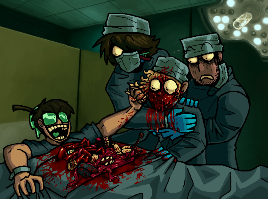
HOW DO YA LIKE THAT DARK DOG??
BEEN REAL ENAMORED BY THE 'SORRY' BOYS AND THEIR ODD ESCAPADES LATELY. I THINK THEY COULD DO A LOT OF GOOD THINGS WITH THREE GALLONS OF 'FAKE' BLOOD.
#sorry boys#sorry fanart#cw gore#cw body horror#DEAR GGODODDD I HOPE I TAGGED SORRY THE RIGHT WAY#PLEASE SORRY FANS IM HHEERE IM HERE AND IM CRAAZYYY GODDD PLEASE FIND MEEE FIND MEEEEEEEEE#GONNA BE HONEST IVE BEEN FLOPPIN BACK N FORTH ON THIS REAAAALL HARD LIKE. IM NOT SURE IF I LIKE IT#BUT EVERYONE WHO SEES IT SAYS ITS COOL! SO IMM GONNA TRUST IN THE WORD OF MY FRIENDS!!!!! THANK YOU FRIENDS!!!!#i tried to fit in as many things in the video as i could into his vile chest cavity. im rly proud of how jumbled n messy n fun it looks!#SOME THINGS TO NOTE! i painted over the bg of a specific shot from the video. painted over a portion of that LIGHT FIXTURE#BUT I Had to improvise the rest and im PRROUD LOOK AT THAT!!! WITH A MOUSE TOO BTW#DREW THIS WHOLE THING WITH A MOUSE. took some time but i think im gettin the hang of it#ANOTHER DETAIL: ranboos lil wires behind his mask. teeehehhehee i rly liked gen loss#i like this weird combo i do of cartoony and photo realistic. not sure where my balance is yet with that but im havin fun!!#ughghgh what else can i say abt this piece... other than it kicked my aASSSSSSS!!!#adding highlights in blood is always SSUCH A FIGHT for me guhhh it takes so much wrestling to make it look right....#ggbbhhbbgbh thats all thats in my brain for now. enjoy my art and enjoy my notes about my own art. enjoy ur day aswell if u can
84 notes
·
View notes
Text
Draft Research Statement
We were asked to come to the ideation workshop with 5 different ideas which could make potential GARP projects. My ideas were; Typography through time, How advertising has developed over the years, Graphic Design before computers, Advertising & Marketing and Corporate Identity. At the end of the workshop, with the help of other students ideas, I decided that I wanted to base my project on ‘Graphic Design before computers’.
The next step was to research this in more depth. Suggestions I got from the workshop were The history of graphic design/techniques used before computers, Is design better or worse now?, Better graphics for the film industry, Types of technology and what they have been used for, Can you be a graphic designer now and not use computers?, Have numbers of designers gone up and saturated the market?, Apple products, How it has affected the way people see design and Can anyone now be a graphic Designer?
I decided to make my main focus for the project the traditional techniques used in the graphic design industry. I find this topic interesting because I have never really been taught about how designers created their work before computers were introduced. I want to compare the analogue techniques with digital techniques commonly used today. I think this may be of interest to others because designers had to produce work within limitations, compared to today where possibilities are endless. When there are limits to what you can achieve, sometimes the work can come out looking a lot better compared to if you are working on a computer and you can literally create anything. This is why some people today still love using older techniques such as the risograph machine
The defined subject area of my research is ‘Graphic Design before Computers’. As a starting point for my research, I watched a documentary ‘Graphic Means’ which explores graphic design production of the 1950s through the 1990s—from linecaster to photocomposition, and from paste-up to PDF (Graphic Means, 2016). The documentary focused on graphic design processes during the 70s and 80s. It showed the major transition for the design and printing industry as centuries old procedures and machinery made way for photographic processes and eventually digital technology. I found the documentary to be very informative and interesting - I was shocked at the complexity of the procedures and the amount of steps it took to produce work compared to how fast things can be made today. I noted down the names of some designers mentioned in the film and then went and did my own research online about their work and techniques. My favourite examples are Gunter Rambow (unique designer who created engaging and political posters) and Leonard Koren (producer of 70s California New Wave Magazine). I have since done some broader research, looking into more designers who used similar techniques. I have been fascinated in the psychedelic posters produced by Wes Wilson in the 60’s who used lithograph techniques. He created posters for huge bands such as The Beatles and The Doors. “Wes Wilson single-handedly pioneered what is now known as the psychedelic poster. His style of filling all available space with lettering, of creating fluid forms made from letters, and using flowing letters to create shapes became the standard that most psychedelic artists followed.” (Erlewine, 2019). The image to the right shows the first clear example of this, the poster BG-18. This was created for a show with the Association at the Fillmore Auditorium. Set in a background of green is a swirling flame-form of red letters.
Since getting feedback about my research, I was advised to look more into the technical side of the different techniques used rather than focussing too much on comparing different visual styles. I have also done some research into skeuomorphs as I find this concept really interesting. It links an object or feature to the design of an older similar object. An example of this would be deleting files on your computer. “When computer manufacturers decided to move their machines from the clutches of techies into the jittery hands of the general public, they thought skeuomorphic graphical user interfaces would make them comfortingly familiar. That crumpling paper sound is very satisfying.” (Herman, 2014). The universal icon for erasing computer files is a trash bin, there is no real reason for this other than it giving the user a feeling of familiarity. Sounds can be skeuomorphic too. Camera phones don’t have mechanical shutters, but the electronically produced click reassures users that they’ve “snapped” a picture. Another example is they way people edit their photographs in certain ways in order to give them a vintage look. It is very popular nowadays on Instagram for people to add filters which give their photos a grainy effect, to give the illusion that it was taken on film. “We tend to associate sepia tones with nostalgia. Over exposed, light leaked photographs are reminiscent of the kaleidoscopic properties of memory – oscillating between moments and images in a blink. In our childhood we saw through the same eyes as we do now. With hindsight, the mind’s eye distorts the scale, saturates the colors, blurs some things and enhances others.” (Lembke, 2015).
Another subtopic I wanted to look into was the timeline of popular design methods techniques and look into where things became mostly digital. It is hard to pinpoint a specific date because to this day, people still combine old and new style techniques in order to create their pieces of work. You could look right back to the stone age and talk about the design techniques of cave paintings, however I am just going to stick to the modern era of design. Early Modern design styles emerged from the 1900s. Paste up was preceded by hot type and cold type technologies. “It took a steady hand, good eye, and the use of very toxic solvents and razor sharp cutting tools.” (Schneider, 2012) It starts with a layout board, a pre-printed board with non-reproductive blue lines. These were then pasted on more layout boards, to be shot again into film, that would be turned into a printing plate to print a magazine, poster, or flyer. This process took a huge amount of time longer than what we now do with simple strokes and keyboard commands on computers and are either digitally printed or go live in digital format onto the web. Starting in the 1990s, many newspapers started doing away with paste up, switching to desktop publishing software that allows pages to be designed completely on a computer.
In the 1980’s in Japan, the Risograph machine was invented as a quick, cheap, and easy way to make multiple copies, and since adopted by the art and design community for its low cost, speed, and versatility. Creating Riso images is similar to screen printing in terms of color separation and ink transfer, but with the rough-and-ready results of an office photocopier. The riso machine is a great example of how a lot of designers love working to limitations.
I think a gap in my knowledge is whether there are still many designers today who prefer to use the traditional techniques to this day rather than using computers. I want to find designers who prefer working to those limitations. I have found a couple of books which I am interested in reading over summer. I plan on reading ‘Know Your Onions: Graphic Design’ by Drew De Soto and ‘100 Ideas that Changed Graphic Design’ by Steven Heller & Veronique Vienne. Both of these books are recommended for design students as they talk about the history of graphic design methods, which is relevant to my topic.
However, I still need to find more reading materials to support my research. I also want to do a lot more in depth research about the technical side of the techniques, as well as discussing how boundaries can improve design. When using software like photoshop or illustrator, possibilities are endless. However, freedom isn’t always a good thing. When faced with a brief, you are left thinking “What should I do?” instead of having the mentality of “What can I do?” (O'Nolan, 2010). An example of how limitations can improve design is colour. When you have a limited colour palette, the piece looks more consistent. Using a huge range of different colours in your work makes it harder to portray a solid identity. Also, limiting typography is similar to colour. “Restricting our use of typography contributes to a better and a stronger overall design.” It can become confusing if you use a number of different fonts in your work. Instead, it is better to limit yourself to just one or two fonts. Apple products are a good example of how using limitations can create something extremely successful. Apple uses minimalism, which means they take normal limitations one step further to create such clean, simple products. However, limitations are not always a great thing for design. You need to know how to use them to your advantage. The more boundaries you have, the more of a challenge it can become.
I still need to find out more information about the technical side of some of the design methods. I also would find it interesting to dig in deeper looking into skeuomorphs in the design world as I find the concept of them really interesting, and questioning whether skeuomorphs will eventually go out of fashion as time moves on. Mostly my methods of research over summer will be through reading books and finding online articles. If I find a designer relevant to my essay who still uses certain traditional techniques in their work today, it may be a good idea to interview them about their work as a possible method of research. If I do this, there will be ethics issues that I will need to consider. Over summer, I aim to continue my research through reading and updating my tumblr blog so I am in a good position to continue when I return to university.
0 notes
Last Seen Blogs

swgardaddy
Swgardaddy

sun-bloom
・ 。゚☆: *.☽ .* :☆゚.

infinitemonkeytheory
infinitemonkeytheory

zardachu-blog
Zardachu
beatlefication
Mother Nature’s Son