#Serial SRRC
Text
i , once again, for no good reason at all, have redesigned cherp. not posting screenshots of the last time cuz it was ugly and i was just curious what i could get up to with the existing css. this, however, is a ground-up purely design-based rebuild that i did from scratch that required me to brute-force learn javascript because i am.... insane.
heres the link if you wanna click things though 95% of the things you can click do nothing, except the directory menu and the expand/collapse buttons on the prompts. i coded the javascript myself and its only my second attempt at doing so.
notes/fun stuff i learnt while doing this under the cut, with information starting from the top of the doc to the bottom.
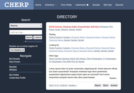
so when i started this project my first thought was about how to make the header look less like "cherubplay with the serial numbers ground off" and i decided to go for a single inline "logo"/nav setup. i like the two navbars and actually preserved it on smaller screens/mobile (as is necessary, frankly) but tossed it for the desktop version. i think this looks fun & modern and adds a unique touch that keeps it from looking too much like cherubplay.
the nav bar gave me some trouble. if you click the "directory" button, you get a dropdown of links accessible through the directory (which, since this happens to be a directory page, is the links under "navigation" in the sidebar as well.) this gave me so much trouble-- right now its just a onClick toggler that adds or removes the "show" class, which is just... a single class with the "display: block;" declaration. i did at one point have this as a clickable link that would take you straight from the directory, but if you HOVERED (or rather, onMouseOvered) over the directory button, it would actually bring a popup menu of these links. and when you stopped hovering over the popup link menu (or onMouseExited as the case may be) the menu would disappear. however this proved to be a huge bitch on mobile and i didnt love it so i replaced it with the current onClick menu.
im not sure this is done as best as it can be done. the onClick menu isnt in the nav element, its outside of it, which i think is probably bad for screenreaders. unfortunately i was using a flex div inside the header (which holds the "cherp logo" which is actually text (h1) as well as the navigation links) so when i tried to keep it inside the nav header it just caused the whole thing to expand, which i didnt love. i have no clue how i would go about fixing this right now, so its staying
i was thinking of coding some meta elements for this-- like, say, a toggler for if you wanted to preview the site as if you had a new unread-- but decided not to because i was getting angry. but maybe in the future. for the record, my idea for new unreads was to have a "glowing" (read: span of "(1 unread" with a text shadow of the lightest color) notification in the header. this would obviously be lost on mobile..... or maybe it wouldnt. i just realized ive never tried to apply text-shadow to bootstrap icons. maybe that would work. idk
anyway moving on toooo THE SIDEBAR!
the sidebar on cherp has always pissed me off. everything about it makes me angry. i am not joking. i "fixed it" (read: made it look the way I WANT!!!) in stylus and imported those styles here. here are the major changes i made
i made the search dropdown the full width of the div to match the search box which IS the full width of the div
i moved the dropdown links out of the dropdowns
i made the text size consistent across the buttons, inputs, and dropdowns
i moved the advanced search button beneath the other two (this one i did because i aligned the buttons to the right and i felt it looked silly otherwise.)
i used the hr element which. holld on what does hr stand for. like img srrc stands for image source but what does. okay w3schools was useless for that but i used the hr tag to separate the different sections rather than having two dropsdowns. i think this looks neater.
and now moving on to THE MAIN CONTENT!
the changes here are incredibly minor and are mostly quality of life. however i think they would be useful but even more importantly, fun!
first of all, i changed the nsfw extreme tag to a different color red. the other warning tags-- and every other warning that isnt nsfw extreme (so nsfws and nsfwv) show up as the slightly darker red that the regular extreme warning tags show up as. originally this had a little text-shadow too for a glow but i thought that was overkill becausseeeee
i was thinking that, if you were searching the directory by a tag, it would be fun to highlight the tag you were searching for as it appears in prompts. this would be kind of redundant given that every single prompt that would appear when you searched would obviously have the tag in it, but like..... i think it would be fun.
anyway, aside from that, i divvied up the fandom/character/gender tags with some colors to show where they end and begin. i think this looks neater. it looks nice with a few fandoms and is helpful if you have a LOT of fandoms because it would show where the characters start, so if youre, say, in a tag for a fandom and the prompt has 20 fandoms tagged with 5 characters each, you can see at a glance where the characters start to see if the character you want to play is one that theyre looking for.
this is a minor detail, but in the expand/collapse buttons, i tried to add enough padding that they didnt partially cover up the last word in the prompt. i care.
some final notes:
the code in this is so messy and contains a lot of redundant code or code that i started to use and then decided not to use and just left. it was also my second attempt at writing my own javascript (the first was creating a dark mode for a different webpage) so its probably............ inefficient. but i made it work and im very proud of myself. yes it took hours because i tried to brute force it
its mobile compatible! peek at it on your phone.
i would have liked to have added other features such as darkmode and a meta information toggler (preview a fake unread for instance) but i didnt do that
if you are scrolled any amount down the page, when you click on the directory button, it brings you to the top. i think i know why this happens but idk how to fix it sorry lol
i would have added keyboard prompt navigation which is like my #1 cherp 3.0 wish but unfortunately when i googled it it looked like it required jquery which i am not fighting with until i finish this stupid javascript course on vanilla javascript
........ yup. thats it bye
7 notes
·
View notes
Text
Smartphone application for SRRC certification
Smartphone application for SRRC certification
Introduction to SRRC and CMIIT ID, smartwatch SRRC is the State Radio Regulatory Commission of the People's Republic of China, a subsidiary institution of the Ministry of Industry and Information Technology of the People's Republic of China.
A CMIIT ID is the type of approval code for radio transmission equipment. The CMIIT ID of the product is a certificate of approval for sale approved by SRRC after passing the test according to the national standard. Only radio transmission equipment with the type approval code of my country's radio transmission equipment can be sold in my country. For the sales and use of radio transmission equipment, according to the "Regulations of the People's Republic of China on Radio Management" and relevant documents for model approval, the production and import of radio transmission equipment need to undergo model approval for its emission characteristics, and a "radio transmission equipment model approval certificate" is issued. And the model approval code, the model approval code must be marked on the label of the factory equipment.
What does a CMIIT ID mean?
NETGEAR Wireless Network Security Leader Resolves SRRC and CMIIT IDs
CMIIT ID identification
Teach everyone how to look at this number (note that C and P should be marked in red), NETGEAR wireless network security leader analyzes SRRC and CMIIT ID.

3-5 samples
The sponsor submits the original or photocopy "Application Form for Approval of Radio Transmission Equipment Model" and "Registration Form for Equipment Testing Information" that have been completed and stamped with the official seal of the applicant unit (equipment manufacturer); if there is an agent applicant, the "Approval Power of Attorney for Radio Transmission Equipment Model"
1. Submit a copy of the "Business License of Enterprise Legal Person" of the applicant unit (including the agent applicant unit).
2. Submit the technical specification (including software and hardware version numbers) and user manual of the bid equipment model;
3. Submit the circuit diagram and block diagram of the equipment under test.
4. Submit three sets of colour photos printed on A4 paper or an electronic version. The photos should include:
5. Follow SRRC as a whole to find ZHONGREN detection;

6. Front view;
7. Side view (including launch port, interface and other parts);
8. Rear photo (including launch port, interface and other parts);
Photo of the internal circuit board of the tested equipment
The nameplate (label) of the inspected equipment; the nameplate (label) should clearly show the equipment model, the applicant (equipment manufacturer), the equipment serial number and the approval code CMIIT ID:, and the lower part of the appearance of the photo should also indicate the inspection The structure size of the equipment
ZHONGREN is a comprehensive third-party organization specializing in testing, certification and technical services. It is committed to providing enterprises with One-stop domestic and foreign certification services. It has obtained the accreditation of China's CNAS National Laboratory and thus obtained the International Laboratory Accreditation Organization (ILAC) accreditation.
0 notes
Last Seen Blogs

fypbskids
Fuck Yeah PBS Kids

jeeveshsabharwaal-blog
Jeevesh Sabharwal
urbancentaur
UrbanCentaur

maruhana-bachi
Maruhana Bachi