#a2production
Text
what is Bilona desi Ghee
What is BILONA A2 GIR COW GHEE?
Our Indian food is incomplete without a dollop of Ghee be it Paratha’s, Dal, Sweets, and tempering curries you name it .It adds aroma and alluring taste to food. Ghee has a traditional and cultural importance in India. Ghee is made traditionally by boiling milk then setting it to make curd, then by using wooden churner it is churned. Butter is heated and stirred continuously on low flame to obtain ghee. Ghee is loaded with lots of nutrients. Ghee is a good source of Vitamin A, Vitamin D, Vitamin C, Vitamin K and many more; I bet your Grandma would vouch for its benefits.
Ghee can be made from Cow, Buffalo, Sheep and Goat Milk. However, the Purest and Healthiest option for Ghee is A2 Cow Ghee that is made from A2 Cow milk.
Now you must be guessing “What are A2 Cow and its Milk?
A2 Cows are commonly known as Desi Cows like Gir and Sahiwal. According to old scriptures, A2 cows have some unique identification features. They have Surya Ketu Nadi hump present on them. Desi A2 Cow has distinct veins. This vein takes energy from the Sun and the moon. This energy is then subsequently converted to milk, urine and manure produced by Cows. These benefits are carried on to the products made from this A2milk.
Gir is a special breed of cows that are found in Gujarat’s Gir Hills, Kathiawar forests and in nearby areas. Gir cows are rare breed with just 2.5million left in India. Their daily milk production capacity is 10-15 litres. The milk from Gir cow is significantly superior to that of other cows because it has A2 casein protein. Which is easily digestible and is healthy option for young Infants and Old people?
A2 Milk has lot of health benefits over A1 Milk. It is because A1 milk is prepared according to industry needs. They are harmful, adulterous and not naturally produced. While, A2 milk occurs naturally to Desi Gir Cows. People who are lactose intolerant or have hard time digesting milk and milk related products have no problem consuming A2 Milk products.
Desi Gir Cow milk is also free from chemical and preservatives. It is also lactose free. Lactose is naturally occurring sugar which makes digestion difficult for lactose intolerant people. So A2 milk becomes easier to digest option that’s why A2 ghee made by traditional Bilona method is a better healthier and safer option.
Why Bilona A2 Gir Cow Ghee is the Best?
A2 Gir Cow Ghee is the natural occurring substance its tastier and nutritious form of ghee that is prepared by using traditional Bilona method.
It is made up from the Desi cow A2 Milk which has A2 beta-Casein Protein
A2 Cow ghee is the storehouse of important nutrients and vitamins that soothes and protects your body.
A2 Cow ghee is the storehouse of important nutrients and vitamins that soothes and protects your body.
The Nature’s Way Desi Cow Ghee is Homemade, not factory-made.
It can be tested for its purity by pan test method, add a teaspoon of ghee to pan and heat it. If ghee starts melting immediately and turns dark brown then it is genuine product. If it takes time to melt and turns yellow colour then it is adulterous product. Hoping on to the next question
What is Bilona Method?
Bilona is old traditional method of making ghee which has a mention even in Ayurveda. According to Ayurveda, in the traditional Vedic process there are 5 Sanskaras or steps that need to be performed to get the purest and healthiest form of Desi A2 Ghee. The Desi ghee made using this process is called Bilona ghee.
This process involves following steps;
Boiling Raw Milk: Raw A2 Gir Cow Milk is used in Ghee making process .Milk is boiled to make it free from bacteria and other harmful things according to Ayurveda text .Milk should be obtained from Desi grass fed cows to obtain its natural benefits.
Curd Formation: Milk is then mixed with curd for setting up of curd and allowed to cool down overnight.
Vedic Wooden Churner: Milk is then churned by wooden churner bi-directionally this method may be cumbersome but is helpful in separating butter and butter milk.
Butter Separation: After separation of butter and buttermilk. Butter is heated in medium flame to evaporate water .Once water evaporates we can see a clear Butter and Ghee accumulates at the bottom.
Pro Tip: The time of boiling this liquid determines its taste and aroma. The ghee is then strained and stored in bottles. This traditional method of making Desi ghee is known as the Bilona process.
However, this method is somehow lost due to ever expanding demand ,Big industries and private limited companies that deal with dairy products rely on the commercial method for the production of ghee by using automated machines that churn out thousands of kilograms of ghee every day but in this process, they lose many vital health benefits.
Benefits of A2 Gir Cow Ghee
A2 Gir Cow Ghee has its demand because of its Purity. A Ghee that is unadulterated, healthy, nutritious, and free from chemicals. Ghee our Grandparents used to talk about. You should definitely look at its benefits mention below.
Immunity Booster: finest way to boost immune is to consume A2 Gir cow products regularly due to presence of Vital Vitamins A2, E, D, Riboflavin etc. and Omega3 fatty acids it boosts immune response and does cause harmful cholesterol and keeps heart healthy by not causing any blockages.
Increases metabolism: Due to presence of Butyric acid which is anti-cancer element and other amino acid it is easily digestible like a2 milk, also due to presence of a2 protein Casein it boost metabolism. It is a boon for lactose intolerant people.
Helps in weight loss: It helps to burn stubborn body fat. Due to presence of Omega 3 and Omega 6 fatty acid body manages to lose body fat this pulls fat cells out and burn fat for fuel.so exercise added with our nutritious Bilona A2 cow ghee is the new fat loss buzz.
Keeps Heart health: Unlike other Fatty Dairy Products its does not add bad cholesterol LDL which leads to the heart diseases. It adds good cholesterol HDL which further picks up cholesterol and takes it back to liver for further breakdown process.
Home Remedy: Pure Ghee has been used as Home remedy since the time unknown; Ghee has been there for generations in the Indian families used to make home remedies. For headaches consumption of ghee with black pepper is useful take it with Luke warm A2Milk to get relief. Sick persons health can be improved by providing him with one spoon of ghee as it possess all the healthy nutrients that Cows A2 milk have Ayurveda has a unique nasal cure for person suffering from nasal problem known as Nyasa therapy.
There are more lot more health benefits than stated above. A2 Gir cow ghee is vital for new born babies, pregnant women and old age people. And list goes on and on one must consume it to experience A2 Gir Cow Ghee benefits.
If you are searching for Best Organic Dairy Products that are 100% natural and made from Happy Herding of Desi Gir Cows then Shiv Organic Farms is the answer for you. They produce the Organic Purest, Freshest & Best Tasting Dairy Products you will ever find. Our Products Include Gir Cow A2 Milk, A2 Desi Cow Ghee, Malai A2 Paneer , Kachi Ghani Ground Nut Oil , Shiv Dhup Batti, Gir Cow Dung Cake , Desi Gir Cow Gomutra.
Why choose Shiv Organic Farm for Desi Cow A2 Milk or Desi Cow A2 Ghee?
They use traditional method to obtain milk and make ghee out of it.
They have Desi Cow Breeds and they are nurtured properly with care and love. They professionally maintain their good health and feed them self-grown grass only. They give no hormonal injections to their cow.
For packaging, They use Clean and Hygienic bottles to pack and preserve milk and ghee and supply Desi Cow Ghee all over India.
https://www.shivjaivik.com/
1 note
·
View note
Photo

This is my final digipak design. On the front cover ( bottom right photo ) I wanted to have a picture of the artist on their own. I didn’t want there to be too much going on in the front cover and I wanted the main focus to be on the artist herself, this is why I chose a plain background and simple font. I wanted the digipak to reflect back on the music video and to do this I decided to have the artist wearing one of the outfits that featured in my music video.
On the back of the the digipak (middle bottom photo) I decided this is where I was going to place the song lyrics that would be featured in the album, on the back I wanted to have the area in which we filmed our music video, which was Bristol. To take this shot I went to one of the places where we filmed part of our music video which was the top floor of Cabot Circus car park, because it was so high up you have a clear view of the whole of Bristol, I took pictures from different sides of the car park but I think one fitted best.
On one of the spare panels ( bottom right ) I wanted to include the other artist who was involved in the music video but I didn't want her to be the main focus of the digipak which is why I didn't decide to put her on the front cover however I felt like it would be necessary to include her as she had some involvement in the music video. I included her name just so if anyone was interesting in finding out about her they were aware of who she was. like the front cover I decided to take the picture in front of a plain background so the main focus of the picture would be the two girls, I took the picture slightly far to the left so I could fit writing into the top right hand corner, once again I used a plain font and font colour so the no attention wasn't diverted from the artist and co artist.
In the middle of the digipak I used the name picture but split it up so it was across the entire inside of the digipak, I did this because I wanted it to be simple and effective and also to have an on-going them on the inside of the digipak so there wasn't too much going on. the theme I decided to use across the inside of the digipak was an establishing shot of Bristol with the artist included, I had her facing away from the camera as if she was looking across Bristol. As you can see on the top middle slide there is writing which includes the debut song of the album, I have placed it there in a circle because this is where the CD would ideally be placed, so when the person who purchased the album took it out of the case they were able to read that.
2 notes
·
View notes
Photo

So from my research into album covers, looking at the different designs and themes of them. My inspiration for the front cover of my album was from Green Day's American idiot digital design. I liked the look of the hand holding an object right in front cover, as it is a very obvious and eye catching part of the album design. I changed their design slightly although as I didn’t want a cartoon hand, I instead found a picture of a regular hand on images, outlined it in black then filled the colour of the hand with white. This to me perfectly made it fit with the colour theme of the album which is black and white, and altogether looking satisfying and pleasing. The overall design of the album is black liquid like splats all over the album, reasons for this was mainly because of the title of the album 'bad blood, So it which case it gave it that blood like effect although taking the obvious red colour out of it. This is because I didn’t want it too look gory or unsettling, but instead more artistic and serious look. Sending more of a meaningful message rather than a violent sight. I also did such things as the hand prints, with the scribbles of 'HAHA' looking as if some psychopath wrote it. Giving it that idea of insanity and mental health, which goes along with the other panel of the outlines pipe with smoke coming from it. Showing the connection between drugs and mental health, which is the story of our music video. For the 'HAHA' text I used the well-known comic and film villain the jokers design, this is generally just because I enjoyed the look of it and it added the insanity effect to the album. Also having such things as the black paint twirl where the CD goes, this is simply because I liked the design of it in the background of where the CD is. A very satisfying sight personally for me to look at. Also the text showing the songs of the album, I wanted to use the same font as the title of the album so I did. Although it didn’t fit too nicely, looking a bit plain on its own, so i added a shadow effect on the text, as well as some black splats around it.
1 note
·
View note
Text
Production Day 6
Production day six took place at my house in Bishop Sutton, here we would be filming Ceara and Ellie together and Ceara on her own. For this shoot we needed a tripod and a one lens camera and another camera. The reason for needing two cameras is that one of them has only one lens and creates amazing close up shots you can also pull focus a lot easier with it. The other camera is for all of the other shot that aren’t pull focus or close ups, as this camera is better at long shots and zooming in and out.
We all drove to my house which is about 7-8 minutes away from school this is ideal so that we can spend as long as possible filming rather than traveling. The first shot we wanted to achieve we got there was Ceara tying up her shoes laces. This was so we could put it at the start of the music video to represent her as getting ready to go out and have fun this fits well as for the rest of the music video is it based outside and around being active. We filmed Ceara sat on the stairs tying up her shoe laces the camera was at a high angle and you could only see her shoes, we filmed her doing this three times as we were confident we had the right shot. We decided Ceara would wear black and white converse as they are the fashion for our target audience and therefore they can form a sense of personal identity from watching our music video, this theory comes from Blumler and Katz, Uses and Gratifications.
The next shot we wanted to achieve was Ceara doing her lipstick in my room. For this shot Ceara had all of her other makeup on and her hair tied back so that we could see her face clearly. We set the mise-en-scene at my dressing table so that it looked realistic that this was a place she would stereotypically do her makeup. We positioned the mirror on an angle so that Ceara could see herself but also so that the camera could see Ceara’s face in the mirror and Cameras face to the side. We filmed the shot several time of Ceara’s putting her lipstick on, to start we focus the camera on Ceara’s face not in the mirror and once she started putting the lipstick on we pulled focus to her in the mirror so the audience attention would be dragged there, this was to give the effect that you were seeing it from her point of view because she is seeing herself in the mirror. After filming this several times, we decided to swap the lipstick to a brighter colour so that it caught the audience’s attention more. We were confident that the pull focus had worked well and we moved onto the next shot.
The next shot we filmed was Ellie and Ceara together, this was to represent them as best friends and to shot they did everything together. In this shot we kept Ceara’s makeup and costume the same as when she was doing her makeup, the only thing we changed was that she put her hair down, this was used to demonstrate that she had been getting ready and he styled her hair down and she was now ready to go out. We changed the mise-en-scene to a different room in the house to create contrast. I filmed Ceara and Ellie from a mid-shot side angle, this shot was to show them taking a selfie together. We had to rearrange the shot and camera a few times to ensure you could see both Ellie and Ceara and the phone they were taking pictures on. We positioned them in front of a large window so that we got lots of natural light making the shot look better. Once we filmed this several time we were happy with the outcome and we were extremely pleased with the lighting. The next shot was going to be a match on action, we were going to film Ceara posting the selfie of them on Instagram. I filmed this from an over the shoulder shot so that represented a point of view.
Overall I think all of these shots worked very well and were filmed well. They represent that protagonists in the way we wanted the audience to see them. We have also achieved a lot of different shot and angle types showing a variety of shots to keep the audience interested, it also shows our experience in working with the camera. After gathering all this footage, I believe we now have enough footage for our music video and more, by filming extra we can ensure that if something’s not quite right we have something to substitute it with.
1 note
·
View note
Text
Production- Day 1
Day 1 of production took place on the 26th of November 2016. All the footage was taken in different locations in and around Bath including Victoria Park, Cafe’s, the city centre, Christmas markets, etc... We decided we wanted to film the scenes in the park during the morning (between 9&11), this would allow us to capture footage which was nice and bright. Filming in the park during the morning would also provide us with a bright sunrise reflecting the positive mood of the characters. The park at this time was fairly quiet and allowed us to film quickly with no disturbances. The park also provided us with a few ‘passers by’, making the footage look more natural. Between 1 & 3 we shot footage in the city centre, this allowed us to capture bright and colourful footage also reflecting the mood of the characters. Filming in the city centre, although provided us with a busy environment (making footage look more natural), was quite difficult to film without bumping into people. So therefore on reflection we should have picked a less busy time of the day between 10/11 or alternately filmed on a different day in the week such as a Monday which would be way less busy. We decided to film in the Christmas Markets at dusk in order to capture the lights and therefore reflect that Christmasy and romantic feel. Although we did manage to capture some footage, we unfortunately didn't plan which day to film on very well and it was the second day the Christmas markets opened. This meant that lots of the footage had to be deleted because passers by kept looking straight into the camera.

Overall filming was very successful and we managed to collect enough to complete over half of the editing for our video. Everyone was also available on the day and no one cancelled meaning everything ran smoothly. We plan to film two more sessions. One at Chew Valley Lake and another at my Grandparents house. Once these production sessions have been filmed we should have enough footage to finish the editing of the music video.
1 note
·
View note
Text
Main task music video
https://www.youtube.com/watch?v=SeaszTv_ypQ
0 notes
Photo
GFO Farming knows what role milk plays in an individual’s health that is why we make certain we provide products with essential nutrients and benefits to customers.
Visit now: https://gfofarming.in/
0 notes

Text
Digipak and Poster
0 notes
Photo

Whilst creating my magazine advert I wanted to make sure the audience would be interested in it. to make sure of this I had the same ongoing theme of wearing the same clothing and using the same locations in my music video, digipak and magazine article. I wanted to make sure throughout the artist was stylish and trendy, wearing mainstream clothing which would attract our target audience of teenage girls. By having the same ongoing theme running throughout you get an ideal of the artists lifestyles and interests and the audience members will feel like they have something in common with the artist.
the way I created my magazgine advert was by using photoshop, which is the same software I used to create the draft of my digipak. I was able to alter and change the saturation and brightness of the photo until it was they way I wanted it. I was also able to import photos such as the atlantic records logo and was able to change the font colour, size and style to what I thought the target audience would enjoy most. I chose to have most of the writing in black and white however had the artists name in a bold red font so it would stand out. I also used star ratings as a way to try and persuade the target audience to buy the album as the ratings from other media companies were positive.
0 notes
Photo

So, our 4th and very last day of production was the shortest and easiest to do out of the other 3 we had. All we were doing for this was our green screen shots of our protagonist standing in front of the sun, as our song talks about Icarus the Greek god and the story of him flying into the sun so it didn’t seem right to not have any reference at all towards that. Today was basic and easy to get done just getting the shot that we needed. So, in the end we got ourselves a basic close up of my face in front of the green screen led down. Showing me hiding my face then opening it for the cameras view. The problem I could we had with this was setting up the green screen so that there was no wrinkles or creases within the sheet, which could have made it awkward to edit on top of the green screen.
0 notes
Photo

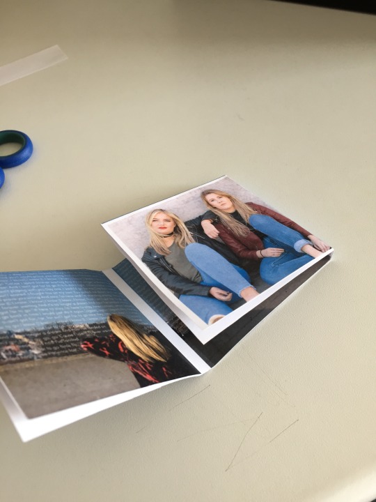
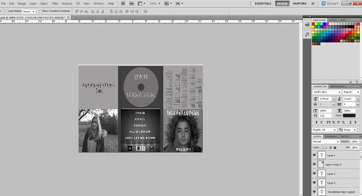
Digipak
Before creating my digipak, I researched the codes and conventions of a pop genre digipak so that mine would conform. I wanted each of my 6 panels to be artistic and represent the artist in a fun, energetic way the same way as in the music video. I wanted a continuous colour theme to run throughout the digipak panels to maintain consistency and continuity as well as being aesthetically pleasing to the audience. I wanted most of my panels to feature elements or the artist that the audience would recognise from the music video. By doing this it will help the audience see links between the two which will help promote the artist and album as well as meeting the demands of the record label.
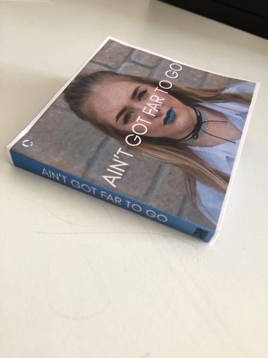
The front cover of a digipak is one of the most important pieces as it is what the audience see first and what will remain in their memory longer. It sets the scene for the rest of the album and must represent the artist in the exact way as you want the audience to view her. For my front cover, I wanted to keep it simple and straight forward making the message to the audience very clear. The front cover image was taken on the same day as my advert pictures so there would be a clear link between the two. I took them outside by the wall in bishop Sutton that is a location commonly used in the music video. The picture is well lit as it is done all by natural light. The background is also very plain and simple with a grey scale colour tone so that the artist would stand out when posing in front of it, this also ensures that the audience’s attention does not deter away from what’s important. However, the outfit featured in the front cover of the digipak and the advert has not been seen in the music video this was to show the audience another part of the artist’s personality, throughout the music video several outfits are used, because of this we wanted to change it again, this suggests to the audience that if you purchase the album you can learn a lot more about the artist. She is also seen to be on trend wearing a choker and a white shirt with blue glittery lipstick this represents her as trendy, fun and energetic. For this image, I wanted to frame the artist in the centre of the shot so that she is the only focus for the audience, I have also used a shallow depth of field to make sure the reader’s attention is only on what’s necessary. In the top left hand corner, there is the artist’s logo, this is used to identify the artist, I did not feel the need to make her name a big title as the audience can see clearly who she is using a close up. I thought that name of the album looked best going in the centre of the shot right across her face, it does not block any information out for the audience instead it draws all the attention to the centre third of the shot which is the most important. I believe the front cover of my digipak conforms the conventions of a pop genre as it features a close up of the artist meeting the demands of the record label, the artist is also dress fashionable so that the target audience can aspire to be like her and the colours that are used are bright and bold to represent her personality and the genre.
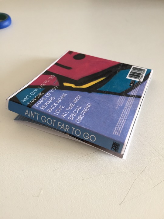
Below shows a picture of my back panel, again I wanted to use a shot that would be recognised in the music video, for this one I used a shot of the graffiti walls in the Bear Pitt tunnels, this is where the artist and her friend are seen in several shots in the video. The graffiti has lots of bright and bold colours in it that can be used to represent the pop genre, I played around with the colour adjustment slightly to make the colours brighter and more vibrant. I also wanted to use a part of the wall that had bright blue in it to tie in with the artist’s lipstick and the continuous colour theme throughout the digipak and advert. I chose a simpler and more minimalistic shot type for the back panel so that the song titles would be the main focus, as well as being easily readable. As the graffiti shot included colours such as purple, blue, pink, yellow and black I wanted to put the song titles in a colour that wasn’t involved to create a contrast and so they ‘pop-out’. Because of this I chose white, again it is in the same font as the title of the advert and digipak front cover to show consistency and brand identity. The tall, slim white font makes it easy to read and look aesthetically pleasing. I have followed the typical codes and conventions of putting the barcode in the bottom right hand corner where it doesn’t draw much attention. Next to the barcode there is also the fine print about copyright and information about the artist, this is again in white to tie all the aspects together. By including a barcode, I am making the product seem more authentic as if it was actually being sold. I have also included the ‘available on iTunes’ as an artist like this is most likely going to be seen in iTunes and big institutions, it also helps to build the brand identity by being associated with a company such as iTunes.
I wanted to keep the colour scheme and the theme of friendship running throughout my digipak as well as music video. To incorporate the theme of friendship I added a picture of the artist and her friend on the extra panel, they are both in blue jeans which keeps to the colour theme making the image more aesthetically pleasing, they both are dressed fashionable so that the target audience can aspire to be like them. To place emphasis on the target audience we have represented the artist and her friend as part of the target audience so they feel more relatable. The artist is wearing bright red lipstick so that she still differs from her friend and the audience focus on her more. We decided that the artist should have her arm on her friend’s shoulder to represent friendship in terms like she is there for her and acts as a support system. Again, the shot has a shallow depth of field and the mise-en-scene is a plain wall this is so the audience focus on the artists and not their surrounding however the minimalistic mise-en-scene gives a cool impression that ties in with the rest of the digipak. Conforming to the codes and convention I have not included any text on this panel, this is often the case in pop digipaks.
For the inside 3 panels, I decided to use one landscape picture to fit across all 3, this idea was inspired by the Rhianna, Loud digipak. I used a wide shot of the artist looking out into Bristol. The location was used in the music video for several shots and therefore using it will remind the audience of the video and show continuity. Unlike any other images in the digipak the artist is wearing an outfit that she wore in the music video, reminding the audience even more. The shot was shot on top of Cabot circus car park on a clear sunny day, this meant that we got a well-lit shot that represented the artist as fun and energetic, the feeling may have been different if it was a dull rainy day. The bright blue sky fits in well with the colour scheme and to ensure that the same blue was used throughout I used the eyedropper tool. The picture also represents the name of the album ‘Ain’t got far to go’ as she is looking out into the distance perhaps thinking about where to go from here. I then used the lyrics on the song to fill the gap in the sky but not going over the tower or artist, this gave the digipak a more creative feel and made it all come together.

I feel that my digipak conforms to the codes and conventions of a pop digipak, it does this by using the artist looking trendy and fashionable in several shots as well as this bright colours are used to represent the mood and the font choices suit the tone of the song.
I printed out my digipak to see what it looked like, doing this allowed me to visualise it in its proper form and see what it would look like if it were to be a real media product, overall I am extremely happy with the outcome and I believe it represents the artist and pop genre in the way it should.
0 notes
Text
Creating a Digipak
After creating my plan for the digipak, it meant I had a clear of what I wanted the final outcome to look like and so therefore I was able to create the digipak as quickly as possible, helping with my time management. Seeing as there was 6 different panels I created each one on separate layers and then inserted them into the same layer at the end to create the final design.
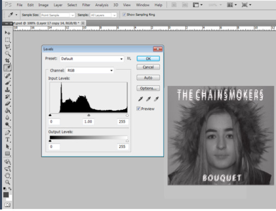
For the front cover the first this I did was inserted the image (closeup of the female protagonest) into Adobe Photoshop and adjusted the colours to greyscale using the levels tool. By using as closeup on the artist face it follows the typical conventions of a digipak front cover. The model has very minimal makeup on however her facial features such as her eyebrows and eyes are emphasized by the greyscale filter applied over the top. By doing this it brings hints of intextextuality to the album cover which is a very common feature of electronica/pop album cover. I decided to use different shades of grey throughout the digipak as it gives connetations of sadness, indecisiveness, and detachment which relates to the songs on the album giving the audience a clear idea of what sort of songs will be included. I decided to add text to the front cover in the font ‘Josefin Sans’ and stretched it out slightly to create a font similar to the actual ‘Chainsmokers’ official album, therefore keeping within the music genre and conventions. I used Josefin Sans on both the digipak and advert to promote cross promotion. On the front cover I used the copy and paste tool to overlap the fonts, which gives an halhallucinogenic vibe making it more pleasing to the eye.

For the back cover I used the colour correction tool in order to apply the grey filter, making the lights look brighter and more effective. I used a white text against it to add contrast and make the piece more eye catching. I overlapped each text like on the front cover to connect the two panels and give that halhallucinogenic vibe. I inserted a barcode, aswell as the producing companies of the album as this is a common feature on digipaks. When inserting the song titles I placed the longest lettered ones at the bottom and the smallest at the top to make a pyramid shape, I thought the final outcome looked very effective.
Overall I found that creating my digipak was quite easy to do, although it did take me slightly longer than expected due to me changing different things quite frequently and not having much experience with the use of Adobe Photoshop. I’m very pleased with the final outcome and believe it follows all of the conventions to follow my music genre. I also find it links rather well to my video and advert, therefore encouraging cross promotion to take place.
0 notes
Last Seen Blogs
msmisfit91
Jane Doe(sn't give a fuck)
frightening-rigatoni
frightening rigatoni

stagtongueclit
Untitled

thetouts
The Touts