#all the signage was clear and concise and in multiple languages
Text
it’s like they designed JFK airport’s international arrivals hall to make me ask myself, Why did I come back
#honeymoon#almost home now#like seriously#a mere ten hours ago I was in a well-labeled multilingual airport#staffed by ppl who were not necessarily happy to be there but didn’t get fucking MAD at you for not knowing where stuff is#all the signage was clear and concise and in multiple languages#here in the land of the free? English-only small-text mislabeled lines unclear instructions#and I’m a native fucking speaker#maybe it was just travel-fatigue but I was kinda ready to punch the gate agent in the face#when she started irately saying ‘I SAID NEXT CUSTOMER-you need to PAY ATTENTION PEOPLE’#in ENGLISH#at the INTERNATIONAL ARRIVALS DESK#I WONDER WHY PEOPLE ARE HAVING DIFFICULTY FOLLOWING YOUR DIRECTIONS MAAM
2 notes
·
View notes
Photo
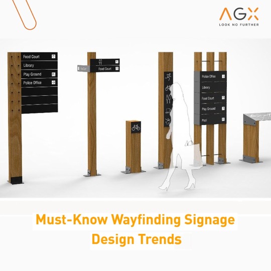
Have you ever entered a building and felt lost, unsure of which direction to go or who to contact for assistance? It's a common experience in larger structures like train stations, hospitals, shopping malls, convention centres, and other complex environments that can leave you feeling baffled and forgetful of why you even entered in the first place. That's where AGX can make a difference with their custom wayfinding signages.
We at AGX specialize in designing wayfinding signages that seamlessly blend in with the environment they're placed in, creating a user-friendly experience for your visitors. With our expertise in creating visually appealing and functional signages, we help individuals easily navigate through complex spaces and find their destinations with confidence.
In the retail sector, effective wayfinding signages are particularly important. Shopping malls and retail stores can be overwhelming with multiple floors, sections, and stores. We understand the unique challenges of the retail environment and design custom signages that not only complement the aesthetic of the space but also provide clear and concise directions to help visitors find their desired stores or facilities effortlessly.
AGX's wayfinding signages are designed with careful consideration of factors such as visibility, consistency, clear information, accessibility, and user feedback, addressing the common problems associated with wayfinding. Our signages are strategically placed to provide optimal visibility and are designed with easy-to-read fonts, high contrast, and universal symbols for clear comprehension. We ensure consistency in design elements, symbols, and terminology to eliminate confusion and provide a seamless experience. Accessibility features such as braille, tactile elements, and language translations are incorporated to ensure inclusivity for all users, including those with disabilities or limited language proficiency.
As a leading expert in signage design, AGX has extensive industry knowledge in creating effective wayfinding solutions. Discover how AGX is at the forefront of innovative and user-friendly signage solutions that can transform the way people navigate through built environments. In our latest blog post, we share valuable insights on how technology, aesthetics, accessibility, user feedback, and branding are shaping the future of wayfinding signages.
According to the experts at AGX, here are the top 5 latest trends in wayfinding signage design. Don't miss out on this informative blog post!
Read more: https://lnkd.in/d2v4_gzw
0 notes
Text
3 Ways to Make a business Website for Your Target Market
As entrepreneurs and small business owners, we’re proud of our self-made success—and we should be! It takes a lot of determination and grit to get to where we are. NextgenItTech help in this process or we can say 3 Ways to Make a Website for Your Target Market , NextgenItTech.com is the best web development company in Calgary Canada But entrepreneurs and small business owners often think too objectively when it comes to their website. Here are three ways they miss the mark: 3 Ways to Make a business Website for Your Target Market 1. They feel they only need to share what it is they do or provide or facts about why they are qualified. 2. They focus on the product or service specs, not on how it can make their customers’ lives better. 3. They get lost in the humble—or not so humble—brags about their accomplishments, state-of-the-art facility, high tech or highly educated team. When that happens, the story of how they connect with customers, or why they’re passionate about what they do gets lost. This is not at all what your customers want in a website, nor is it how people make decisions to purchase or revisit your business. 3 Ways to Make a Website for Your Target Market 3 Ways to Make a Website for Your Target Market to make your eCommerce site about your customers, not about you: 1. Use empathy-based marketing. Empathy-based marketing has become a much-talked-about topic since COVID-19 hit. It was around before then, but it’s really gained momentum in the past six months. Basically, empathy-based marketing means thinking like your customers, and putting yourself in their shoes. (It sounds similar to compassion, which is related to sympathy). NextgenItTech web development & web design company at Calgary canada Here’s an example: you have a retail store that serves a wide range of age groups, and you notice that elderly people aren’t coming in as often. You think like one of your customers. Maybe you’re tired, or frail or extremely anxious about COVID-19 because you’re immunocompromised. So, as an empathetic small business owner, you update your site content and create store signage for this segment of your audience. Between 8 and 9am, your store is going to open just for people over the age of 65. Everything will be sanitized, there will be free coffee and staff will be available to help people shop. Now here’s a real-world example: when hundreds of Delta Airlines passengers had to sit for hours on runways due to extreme weather, the airline ordered hundreds of pizzas. ??The passengers were in a much better mood, and I’m sure were way more likely to use Delta again or give positive feedback thanks to the extra-cheesy empathy. 3 Ways to Make a business Website for Your Target Market 2. Don’t build an eCommerce site for yourself. Often when small business owners are building their eCommerce site, they concentrate on the design aspects they prefer. Really liking the colour green or having a collection of already-purchased images from a stock photo site are not good reasons to make them part of your eCommerce site. It’s all about doing the research before you make a website for your target market. It’s important to do an in-depth analysis of things like: Your target audience. Are they middle-aged, high income empty nesters? Or tech-savvy, time-strapped moms? You need to speak their language; show them you care and get to know them. Your target market’s values. For example, if a questionnaire you send to your clients shows the majority of them are very concerned about sustainability and the environment, images of happy people drinking out of disposable coffee cups could be a deterrent. Your competitors. You don’t want to copy a site design from a competitor in your space—you always want to be unique! ??This is why I frown upon purchasing a pre-made theme. It’s been used by hundreds if not thousands of others and your unique brand will not stand out as a result. But doing proper research can give you an idea of the look and feel that your audience might gravitate towards. How to Improve Your eCommerce Website by NextgenItTech.com at calgary One of the big reasons why now is the prime time to maintain an eCommerce site is that consumers are online more than ever. Once forced to buy online because of COVID-19, many consumers will continue to do their shopping online, now accustomed to the experience and convenience. Because your target audience will be spending so much time online, I’m sharing some common problems that often come up and how to improve your eCommerce store. Keep everything simple. We can get so caught up in giving our customers lots of options, or storytelling about our brand that we don’t even realize we’ve created utter chaos! Its make easy to get web development company in Calgary , toronto canada Before you begin posting content or products, it’s crucial to map out your navigation. Adding multiple drop-down menus or tabs as you go, without a well-thought-out plan, is a recipe for disaster. When you make a website for your target market, every image, piece of content and CTA should have a purpose. Bold, concise headlines will draw attention, while long chunks of copy will look overwhelming. What customers want in a website is a clear path to a call-to-action to gently guide them, not randomly placed buttons. And don’t be afraid of white space! Clean areas of white space will do wonders for your site. White space makes your copy much more readable and creates a contrast with your other elements that visitors love. By cleaning up the clutter and guiding people towards your products or services through sensible navigation, you offer a much more enjoyable experience than hitting them with walls of copy, multiple drop-down options, hope this gives you a clearer idea of what customers want in a website. By truly listening to your audience with an empathetic ear, you can create a connection with your eCommerce site and products or services that will keep them coming back. NextgenitTech will help in all process , we are digital marketing agency toronto,digital marketing industry in canada, web development companies in Ontario, web design company, web design services, If it’s time to give your website an upgrade so it will attract the right people with the right message, hire a professional web development agency who has the understanding of how much psychology plays a role in great web design.
For more details please visit this URL:
https://nextgenittechcom.blogspot.com/
https://nextgenittech.com/
https://nextgenittech.com/3-ways-to-make-a-website-for-your-target-market/
#best web design company in dubai#list of web development companies in dubai#digital marketing agency toronto#web design companies toronto
0 notes
Text
‘The Frozen Palace’ Evaluation
For this project I was commissioned to create a brand identity for The Frozen palace, a small family run business focused on serving the handcrafted gelato flavours that they have been working on for the past two decades. In addition to this, they wanted to have a logo and overall representation that was inviting and welcoming to customers. My immediate ideas were to focus primarily on the palace aspect of the name and then add the frozen aspect of the name through texture. After having a vague idea and starting point I created a mood board and this was to understand the atmosphere I wanted to create. For this exercise, I collected architectural images such as the Sagrada Familia and the Milan Cathedral and I picked these two structures because they had interesting shape language that I immediately thought it would be interesting as the palace imagery in the logo. I then started thinking about colour and how in the brief it stated that the client wanted minimal colours so I opted for a more monochromatic colour palette. This was because it allowed me to add more variety of colour through tone and it not be as imposing as if I used multiple different colours. Additionally, I looked at the texture of ice and its reflective qualities gathering images of both murky ice that could’ve given my logo a more playful atmosphere and reflective ice that could’ve given it a cleaner more sleeker look. And finally, I Looked at potential packaging for the product and I was interested in the giant ice cream tubs to make of card and how they could give off a more environmentally friendly vibe for the company. Finally, the last of my initial research was in reference to the Aaker model and understanding how different brands present themselves creating a personality that they can use to attract a specific target audience. After my initial analysis of the brief, I decided early on that I wanted to go for a more sincere personality as the brand is family runny locally sourced giving off a more down to earthen, honest personality, but as they want to open up in an area like Soho where there is a younger target audience I also chose excitement as a personality trait opting for a cleaner and more modern approach to my logo as well.
To create a starting point for my logo design I did a twenty-second sketch workshop where I created small thumbnail sketches back to back and this helped me have a variety of starting point and allowed me to understand what would work simplified and what wouldn’t. For in a lot of my sketches I used a very sharp shape language for the roofs of my design and this ended up giving it a negative, menacing and almost evil lair atmosphere, which was the complete opposite of what I wanted to this workshop helped me soften some of my shape language up so that it alines more with the brief being more inviting and welcoming. Another workshop I did was the custom type workshop and the main objective of this workshop was to get me to understand how type can be used to create feeling making it just as important as the visual mark of the logo. Using brush and ink focusing on keeping a consistent line making sure to keep the brushwork fluid so that I get an even application achieving the cleanest result possible. During this workshop, I primarily focused on emulating sans serif fonts so that when it came time to transition to digital I could separate the letters. After the transition to digital, I played around with scale and size but it didn’t fit the aesthetic of my initial designs because the type was too choppy and rough.
Collecting research for this project was an integral part of my understanding f the largest audience and who I’m appealing to when I’m creating this logo. To collect primary research I took a trip to Soho Landon and was focusing in on how businesses present themselves and what type of target audience they’re trying to appeal to. Looking at the competitors of the frozen palace was so important for this project because it allowed me to understand what target audience is present in the area already that I could tap into my logo design. For example Snowflake, they opted for a more minimal approach to their logo design focusing on the sans serif font with wide kerning and thin line weight gave the design a cleaner look and this was reflected in every aspect of their brand identity, on napkins, cups, leaflets and signage. In contrast to Snowflake, there was also Ben and Jerry’s a way more playful brand that was present in the Soho area using a serif font that had a thicker line weight, but staying away from the more formal aspects of a serif font they used a rectangular shape language for the feet of the font and this helped give the logo a more playful and western atmosphere making me believe that they were targeting a younger or potentially family target audience. The two brands I looked at for secondary research were The North Face because it was a really good example of a real-life structure like the Yosemite mountain being translated into a simple tow dimensional, easy to read logo. Finally, I looked Disney’s logo because I wanted to emulate the way it creates space in its logo for example how the type is layered over the mark pushing it back into the distance. I also like how the highest tower of the logo os reaching pst the arch that represents the shooting star making it seems as if the castle is so big that it's reaching into the sky giving the audience a sense of scale and the simple small rotated triangles and flags above each tower helps to give information to the viewer showing how small the flags are in relation to the tower.
After my first presentation was told to pick a font that was better suited to my final logo design and experiment with different colourways to see if this would have an effect on how people viewed the logo. I went for Avenir font because its a sans serif font removing all irrelevant marks from the type making it easier to read even for a younger target audience and making the logo look overall cleaner appealing to the young adult target audience.
Other-worldly/abstract approach in regards to the architecture because I didn’t want it to just be a simple translation of a real-life structure and I linked this into the brief by saying that I wanted to visually represent their handcrafter gelato flavours that have been developed for the past two decades and are supposed to take you out of this world.
Get better at presenting my ideas and clear and concise way, making sure to make talk about the simple links of my work to the client so that they understand how I arrived at my final idea. Get better at exploring more initial options so I don’t limit myself in terms of options altering on and gather a wide range of both primary and secondary research so that I have more information to draw from and analyse. Additionally, if I had managed my time better I could've produced some mock-ups and refined my colorways thinking more about what unique flavors The Frozen Palace would present. Lastly, try to experiment more in the initial stages of the project so that I have a wider range of starting points and deliver a more relevant design to the brief.
0 notes
Last Seen Blogs
kararisa
see how it shines

benno-nuehm
Unbetitelt

jopsycho
Jo.Psycho
pasmag
PASMAG

nefstang
Untitled