#also I stopped using the pencil brush by the end of Dec
Text


some lawlus
#lawlu#lulaw#law x luffy#luffy x law#goin thru my comics n pulling out some of my favs#kinda funny u can see the different eras I went thru of figurin out how to draw these two#over time laws hairs gets longer lmao#also I stopped using the pencil brush by the end of Dec#my art
153 notes
·
View notes
Text
Little white lies
Little white lies is a magazine created with the sole aim of capturing and reviewing movies through out the year normally printing 4 times a year quarterly, though the magazine has become more well known for its independent ethos and iconic, striking illustrative covers created by a new artists each time, deadicating its front section to upcoming theatrical release.
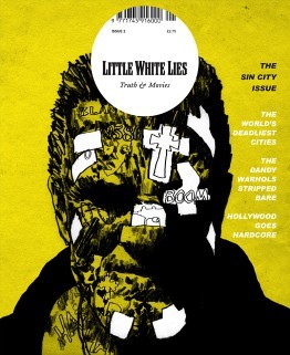
Sin City Issue 2 - Jul/Aug 2005 this one was one of the first early covers that stood out to me, reminiscent of early grunge comic styles used for the gritty Noir/Action graphic novels, fitting for the fact that the movie itself is based of the Sin city comics, the difference for this is that the artist for this cover has taken the features form the actor to then blend it with the style used for comics; heavy sett shadows sonf light shown but blacking out the ares where the shadows are completely in black and leaving the background showing through to show where the light hits, but they still show a lot of texture in the face by using what I can assume is almost like a dry brush texture, roughing up the face implanting the idea that this character is ether rough character or dangerous, the artist also hints at the story itself with smaller type and illustration shown in the form of tattoos hidden under the layers of grime and of what I would assume are plasters, I do like the white negative look off it.
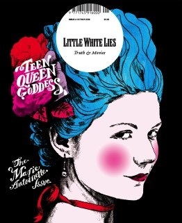
Marie Antoinette Issue 8 - Oct/Nov 2006 I personally like this one because the vibrant colours, hinting most likely to her more risky and existing life before she became romantic heroine that we know now in history, though its nice to at least learn more about the various females throughout history as there stores are normally erased or twisted, so for a historical drama I believe it works well, the one single figure of Marie Antoinette by herself standing out against the flat black background, making the character of Antoinette the main visual point of the illustration, because she is, looking at the portrait itself, id assume they took a image of the actor in their costume and thresholded it and then they most likely multiplied the layer so that they could then drawn underneath, similar to the techniques in the pen tool workshop.
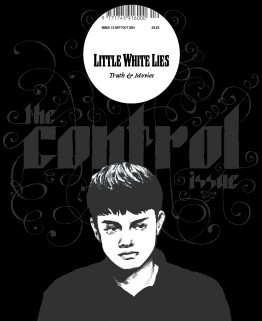
Control Issue 13 - Sep/Oct 2007 the cover for this one I like the monochrome colours and black used, it gives this feeling of hollow pared along side the mood the thresholded image of the actor, I particularly enjoy the typography the font strong and bold in its shapes has these spirals exploding, visually interpreting it as them loosing control which I thinks works very well for a sci-fi mystery thriller film, so meany lose ends left unsolved. the colour palette as I said before is monochrome which I think is a interesting handle on a typical cover the highlighting the character with lighter colours showing the characters important and stands out against the simple darker colour background and text.
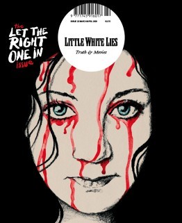
Let the Right One In Issue 22 - Mar/Apr 2009 This Swedish romantic horror film reinvented vampier in the love film, because lets be honest most vampire movie suck, the artist took one of the iconic scenes from the movie and beautify painted it with water colours and pencil/graphite, the iconic light eyes of the character shine through as the, watercolour blood drips down her face ones again reminiscent to the movie itself, I like the use of the hair being used to silhouette the face, the position/placement of the face itself it feels like its looking directly into your soul almost.
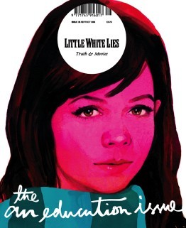
An Education Issue 25 - Sep/Oct 2009 I think this is a brilliant depiction of a coming of age movie, straight away introducing you to the main character, the bright pink hue, brilliantly used to show off the innocences of the character themselves, and that is pushed by the limited about of skin showing. the illustration itself seems to of been done with gouache paints considering the smoothness of the colours working together on the page, the hair, nose and eyes are my favourite, especially with the eyes and nose they have so much detail, you can see the youth in the eyes and the realistic look of them works so well and I love how the artist has used just shadow and light to detail the nose, and I like the hair personally because of the way they got light to reflect onto it as well as how it looks so soft and neat it looked.
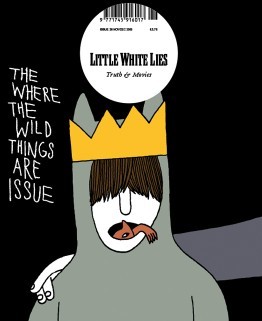
Where the Wild Things Are Issue 26 - Nov/Dec 2009 I wanted to personally wanted to look at this issue was because it relates to the movie/book that I am looking at now, I think this is a brilliant concept for the movie I personally love the childish simple drawing, reminding me of childish drawings, and I like the idea of the ‘wild things’ climbing from in Max’s mouth, I think this is brilliant due to the fact that Max has problems of acting out in such a wild way. it also relates to the original poster for the movie ‘there is one in all of us’, I like the use of the colours are quite depressing in itself, but in the realistic view of the movie where in the ‘real’ world the character maxi is struggling with the divorce of his family.
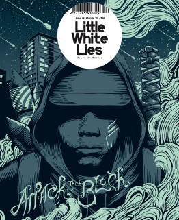
Attack the BlockIssue 34 - Mar/Apr 2011 This one stood out to me both because of the colour pallet and the style of the outline. The outline themselves reminds me primarily of the linocuts, I think it shows the mystery and the lack of empathy for there assailants and how the gang themselves blend together when the character is all one colour. I personally loved the background/the sky it has beautiful speckles of stars and meteorite shower. I don’t particularly understand the Artists use of smoke, id have to assume that it has a impact or relevance to the story itself but it beautify shapes that fit with the Lino style.
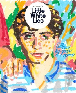
Call me by your name - issue 71- Sep/Oct 2017 I particularly like this illustration for this coming-of-age romantic drama film, though I personally don’t like cinematic worlds use of age gaps between their gay romantic relationships. but this particularly artistic interpretation, the oil pastils drawing dose defiantly scream coming of age movie and it also dose make me think of the link that combines with the main character being half Italian, the background flows but also seems to be pulled away from the page, maybe because of the fact that there is less gaps in the foreground, I also like there use of lighting its done well to be presented coming from the right side of the page. But the type that they used to show the title docent fit for the rest of the image, naturally I believe that the artists probably wanted to remove from the original type from the movie poster.
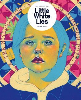
The miseducation of Cameron post Issue 76 - Aug/Sep/Oct 2018 I believe that this depiction of their movie, the colour used for the face is a direct reference to the film poster the yellows, green and pinks. the background gives away so much for the movie and the elements and its relationships with the story of being sent to a conversion camp, and the coping methods that one turns to. The expression on there face is a well done illustration of Chloë Grace Moretz, I honestly recognised her straight away without knowing that it was her in the movie; back to the expression itself shows so much betray, sadness and heartbreak all in one, its an expression that is shown through out the film a common apparition.
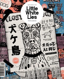
isle of dogs - Issue 74 - Mar/Apr 2018 I personally loved this movie, the entire stile used in the cover in the magazine is in the same style used throughout the movie itself, the movie used these 2D elements through out the stop animation. the posters show off so meany aspects of the movie the setting of the movie ‘the isle of dogs’ the science group trying to find a cure for the ‘dog flu’ it hints to the open scenes that were done in the original Japanese style. This is a common aspect in this imagery it has little elements of the story dotted around this.
2 notes
·
View notes
Text
I started this year in Review in December of 2015 because that’s when I think the year really began.
Dec 27, 2015
Wow! Its only four days until another year begins. I’ve made a lot of changes this year. I began writing novels again and wonder of wonders, I’ve actually finished book one of the Handfasting Trilogy, A Year And A Day, and I’ve began on book two Forever And A Day. This story is about three sisters who live on a planet called Vensoog and the choices they make to help their colony survive the aftermath of a galaxy wide war.
February 8, 2016
This was a good week to get some work done. I am more than halfway through Forever And A Day, the second book in my Handfasting trilogy and I have covers done for both of the first two books. Rather than painting a cover in acrylics, I decided to go with some digital artwork so that I could make them very similar. I think I will go ahead and use Amazons PDK system. It will mean that I can’t put my book up anywhere but Amazon, but its price is excellent—free. And I really don’t have money to pay a regular e-book publisher. My son’s book at Outskirts Press cost almost $2,000. He did get a lot for it, hard copies of his book and it’s marketed in I-Books and Nook as well as Kindle, but sometimes you have to cut your coat to suit your cloth.
I also got my two latest Acrylic paintings done, Cat Napping and Street Vendor and framed. I think I will put at least one of them in ACA’s membership show. Of course entering one of their shows is always problematic, as many times the judges they select don’t seem to care for my art. I used to worry about that, but not anymore. Having seen some of the art ACA’s judges deemed worthy in the past, I killed any feelings of inferiority I used to have art wise.
Now that I have my enlargements back from the printer, I can also start on the three longhorn paintings I intend to do for the Old West Art show in April.
February 28, 2016
Well, so much for good intentions. I DID manage to get the three paintings started. Unfortunately, I also started a bladder infection; my husband came down with the flu (which he shared) so I haven’t done anything else yet. The medicine the doctor gave me for the infection has caused an almost constant migraine and nausea. Hopefully, however, March will be a better month. Here are three canvases.
March 13, 2016
For the last three weeks, I have had three unfinished paintings for the old west show sitting there glaring at me from my art table. Not really my fault I haven’t been able to work on them: I developed a bladder infection for which I went to the doctor, had a bad reaction to the meds he proscribed, and then I came down with Vernon’s flu he brought home from the Pool Workshops. This Thursday, I was finally able to start on Home on the Range and I got part of it blocked in. Unfortunately, after I sat there and looked at it for a while, I decided that I needed to get rid of the clay cliffs I was using as a background because they were competing with what I intended to be the focus — the Longhorn cattle resting in an almost dry river bed. I painted over my entire mornings work on the cliffs with grey and then had to let it sit long enough for me to be able to work it. I confess I really don’t understand why other artists complain about how fast acrylics dry because at some point in a painting, I will have to stop and let it sit so it will be dry enough not to make mud! I substituted some rolling hills for the cliffs with all those dark, cracked clay lines, which looks better, but I still need to cool off the background hills so that I can push them back or maybe I will add a structure or a tree line; I haven’t decided yet. I will be using pieces of the same dry streambed in all three of the paintings. I have one more day to work on it before I have to stop and do Vern’s invoices for this month.
March 22, 2016
Today I finally managed to start on Chilsolm Trail. I got most of the background done and the horses and men drawn up with white pencil. The background took more time than I thought it would, especially the riverbank.
March 23, 2016
Today I was hoping to get all the cows and the cowboy blocked in, but all those horns and legs took a lot more time than I expected. I finally left one of the cows un-blocked and worked on the horse and rider. I used ultramarine blue and powder blue underpainting on the horse. I will go in tomorrow and finish it off with black.
March 24, 2016
Well today, I feel as if I am finally making progress; I do still have quite a bit to do to finish this one though. I think adding a second cowboy and more cows was the right thing to do. Five cows just didn’t look like a trail herd! Tomorrow I am taking a break to do housework, but hopefully by Monday I will be able to go in and finish off the foreground. Then I get to start on the 3rd one—The Bozeman Trail!
March 26, 2016
Saturday morning and I still have to finish off my household chores. Put up the laundry washed yesterday and do the dishes so I will have a clean sink to rinse out my paint brushes. (I say I’m only doing them every other day to conserve water, but the truth is I loathe housework). I’m pretty satisfied with the way Chilsolm Trail is coming along. For Monday I will need to finish off the foreground grass and then put in some shadows and highlights to identify which direction the sun is coming from. Details…
Tuesday March 27, 2016
Well Monday turned out to be a wash. It’s wonderful how other people seem to fill up your day without asking you first… Oh, well. Today I got the foreground grass done on the Chilsolm Trail done, and the background and drawing done on the Bozeman trail. I also got the backing prepared for four paintings. I use contact paper for backing and I reinforce the edges with clear strapping tape and use thumbtacks and Gorilla wood glue on the edges to fasten it down. This is easier to clean than plain brown paper, which seems to absorb dust. No surprise that the back of a painting gets just as dirty over time as the front!
The Proof copy of my first book in the Handfasting series came today, so I will be spending the next few days going over the proof for errors. I am a speed-reader so it should only take me about nine hours. I’m very pleased with the front cover design. The image I designed looks great.
Saturday, Vernon is going to be gone with some friends to the desert so I will have that day free to paint. He is actually very supportive, but the more people in the house when I am trying to work the more interruptions there seems to be…
April 12, 2016
I spent the weekend at the Columbia Inn (wonderful atmosphere, and they use real art bought locally in their room designs!) with my husband. It rained non-stop but that did not stop him and other members of CVP from enjoying panning the dirt brought in for them. They did this in the parking lot under pop-ups so that shows how dedicated they are to their notion of fun! We had a community dinner inside the 49er Mining Supply shop and Rob and Cheryl were wonderful hosts. Vernon has commissioned me to do a painting of the Inn and shop so I will be working on that later this year.
A Year And A Day, has been published on Amazon and Kindle and in May I will be making the rounds to advertise it. FYI, if you plan to use Amazon’s free publishing services; start with the printed edition on Create Space. I started with the e-book and ended up with two e-books (different covers but same book). In order to make the covers match, I took the first one I made off-line. Unfortunately, I had set up a pre-order on it, so Amazon has forbidden me to do any pre-orders for a year. Live and learn.
April 21, 2016
Well, the show and reception for Clovis Art Guild’s Old West & Rodeo show came off okay, despite the low amount of entries. I didn’t win anything this time, but that’s the breaks. The show comes down on Sunday. The next two weeks promise to be full also. Monday through Wednesday, I will need to get back to writing on my book and hopefully start my Safe Harbor painting. Andrew will be working with his Dad on Monday, so that will be the best day to paint. I also need to do some housekeeping on some of my POD sites (FAA, Pixels, and Red Bubble). Thursday, I need to change out my art at the Water Tower Gallery, and on Friday I take down my art from the Sunnyside Library Gallery (I also need to prepare a summer schedule for the library), then Saturday I plan to put up a couple of paintings in the Alliance of California’s membership display for the next two months.
I actually sold one of my hand painted keepsake boxes I have down at the Water Tower (Yaay!) So I suppose that this summer, I need to prepare some more for Christmas and Easter, which means developing some designs. Flower designs work well here as I am hopefully marketing these to women or to men buying for women! I ordered some Acrylic paint pens from Amazon and I plan to use them for the actual design after I paint the boxes. (Target date to do these is in June so they will be ready.)
June 10, 2016
Wow. Has it really been two months since I posted anything? Time flies I guess. I won’t say it has all been fun, but it has been productive. Sadly, I did not win anything at the Old West Show, but all the art was wonderful this year even though it was a smaller show.
I have finished two large seascapes and started my entry for the Miniature works show.
Forever And A Day is done and going through the editing process (this means I print it down at the local printer and go over it for errors. Fun). All Our Tomorrows is about halfway through the first draft. Because there are so many characters involved by now and the story moves from one group to another to remain coherent, I have to bounce back and forth between where the character focus is. I wish I could find another way to tell this so that won’t happen, but so far no dice.
Facebook kept rejecting my ad for A Year And A Day, so I ran it as a regular post and they blocked me out for ‘suspected illegal activity’ for two days…Big pain in the A to get back on. They won’t help you when you need it, but they sure do punish users who try to get around their system…
June 23, 2016
I’m trying to do better at posting to this journal. I just finished Vernon’s invoices for June, so I have had time to edit Forever and A Day three times, and I am starting on the fourth just as soon as I pick it up from the printer. I am in the process of writing All Our Tomorrows that I have already revised twice and it isn’t even finished yet! And I sold a copy of A Year And A day in April, for which Kindle will pay me around the end of June. That tells me if my ad campaign bears fruit in June, I won’t see money from sales until around the End of September.
My only entry I painted this year for the Miniature show is almost finished as I got to work on it today. Right now, it’s sitting on a little easel waiting for me to decide if I’m finished with it. It’s a night scene and those are always a struggle to split the difference between accurately showing that it’s at night and still making the paintings features visible…
August 7, 2016
Wow. I have gone an entire month without actually creating art. Well, not true really; I did five color studies for my Vensoog Handfasting series. I started to do a landscape of it also, but I ended up tossing it out (a rarity for me but it was just awful.) I actually have 4 small paintings drawn up (one 8×10 and two 5x7s). I also have two of my hand painted keepsake boxes started. They only need the painting done on the lids and then put together but there they sit…
Next week won’t be productive art-wise either tho’ because I will be starting on our Income tax. Ick. Migraine coming as always…
October 1, 2016
Wow! I’ve had a really busy summer! I have been working non-stop on getting the second book in my Handfasting Series published, and on top of that Clovis Art Guild had an art show and the Guild had to make arrangements to shuffle things around (our meetings, getting our 501(c) submitted to the IRS, etc.), so I confess I have neglected to write here in this journal. I went to a professional cover designer at fiverr.com to re-design the covers for my books and I am really pleased with how they turned out. I also finished the 2nd draft of the book “All our Tomorrows”. It’s currently being beta read by my son Andrew and a couple of good friends. My hand painted keepsake boxes are selling really well at the Watertower Gallery in Downtown Fresno, so I have also been busy making six more of those (actually a pretty time-consuming project). I start with a raw wooden box that I get from a local craft store, seal it, and then paint the base coat on the bottom and the lid. Then I draw a design on the lid and paint that. Then a varnish coat to protect the box is put on the outside and felt lining is added to the inside bottom and lid. Then I put the jewelry back on (hinges and clasps) and finally it is ready to take to the Gallery! So I have been a busy girl. I also have six smaller paintings prepped (undercoat done and the image drawn up). I hope to have at least one of them ready by Christmas.
I had Pismo Beach critiqued by Master Artist Dennis Lewis at the Clovis Art Guild meeting last night. He confirmed what I was afraid of—those dratted cliffs in the back are still too bright. Considering how many times I repainted them trying to soften them, doing it over again is no big deal, but I wonder if I should also darken up the front. He also had some other suggestions for improving it, so since I have a month before the Fall Open where I intended to enter it, I will probably re work it. Of course, that does mean re varnishing, but what the heck. I think I will re-wash the back with several layers of light grey and add some yellow to raw sienna for the sand front of the beach.
I also need to get in touch with my friends Betsy and Ron who volunteered to Beta read All Our Tomorrows for me and find out what suggestions they had. Andrew already made several, which I have implemented. It does make the book longer as he said I had rushed through several climaxes and through the chapter on the festival so I have added several pages there that involved re-ordering how the chapters were presented. I admit it does make the book seem less choppy. Beta Readers are a blessing… And just think, I haven’t started the editing for format errors yet! Still hope to get it into publication by Christmas…
December 7, 2016
Well, I did it again—missed an entire month of writing on this. In my defense, I should say that during this month, we adopted a new kitten. She was all alone out at one of Vernon’s commercial accounts. The manager had been feeding her but only twice a day, and a cat or puppy that young needs to be fed at least four times a day. We think Mab’s mother must have been killed and she couldn’t come back for her kittens. We never found the others, and it’s my opinion that Mab survived as long as she did because she is one stubborn feisty cat.
We also put on an art show at the Art Hub. Going to be taking it down later today. Yes, I know it’s raining, but sometimes you have to do what you can do.
All Our Tomorrows will be going to print in about 3 weeks. Yay!
I was hoping to get back into my regular artwork, but I caught a sore throat and it has turned nasty. (Can’t get the flu shot until after this clears up. Ick!)
December 15, 2016
Writing my 4th book in the Handfasting series. It’s a Cozy mystery set on Vensoog. Using Jayla (Gideon’s niece from Forever And A Day) as my heroine and Luc’s best friend Jake (All Our Tomorrows) as the hero. The story centers around the theft of the royal family’s Crown Jewels on planet Aphrodite. The thieves escape to Vensoog to try to fence them. There is a planet wide festival on Vensoog that draws interplanetary traffic so it makes good cover. The fence (Lipski) is killed and the jewels disappear. Jayla innocently buys the Lipski’s shop and then finds her body on the beach while she is out jogging.
I have got local, Royal and interplanetary cops who are suspicious of Jayla’s involvement. I have the original thieves, and the local mob who want to find the jewels. A housekeeper robot who was programmed by the original owner as a gigolo and a sales bot who likes to run around naked (haven’t quite decided exactly what I’m going to do with them yet-maybe just comic relief). Then there is Jayla’s nosy, interfering family, and her bossy boyfriend Jake who all trying to help her clear her name and getting in each other’s way.
Note to self: I think I have a form of writers block. I have to decide which of these plot lines to use as the main one, which ones are going to be red herrings and which ones are secondary. My problem is I like all of them so I haven’t written a thing on it that hasn’t felt forced for at least a week.
A Year In Review I started this year in Review in December of 2015 because that’s when I think the year really began.
0 notes
Last Seen Blogs


httpspau
Velvet Von Black

fuzzmeffa
Meffa's Art Grotto

rafelempreendedor45
Sem título

dokidobe
yellow.dr.monv