#also the design is subject to change !! esp the colors since its my first time actually like coloring him
Text
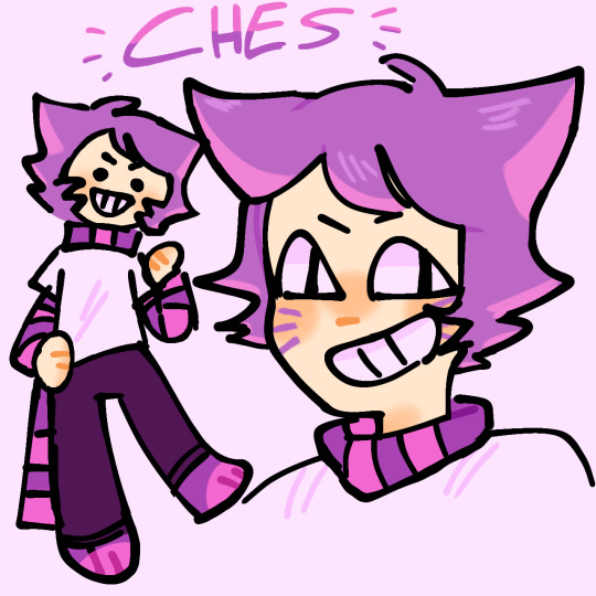
ugliest cat in wonderland
#original characters#original character#ocs#oc#ikna talks#everyone say hi ches :)#heavily inspired by the cheshire cat i think its obvious JSNDJDDN#i made an oc inspired by the white rabbit as well but still not quite happy w his design so im posting this one for now#also the design is subject to change !! esp the colors since its my first time actually like coloring him#i have got to draw my ocs more.... littlest guys
17 notes
·
View notes
Text
Speakeasy!AU Rejects:
So here’s a batch of my more complete rejects from the speakeasy redesign project! In today’s ted talk I’ll be reviewing why things didn’t make the cut and my own dumb blunders along the way (hint: there’s many).

Starting off with Mads: she was the first of the character redesigns I did for this project and it shows in her original pose. As you can see it’s very boring and static- a basic, simple 3/4s pose. I had in mind that that would be what I’d do for all of them- but when I moved on to the second character I realized that wasn’t very visually interesting. Of course that brought along with it the challenge of coming up with 5 or 6 distinct standing poses that showed off both their personality and their outfit designs. So after I finished all of Mads’ designs, I went back and changed the position of her arm. It’s not a super dynamic change but she doesn’t have a very outgoing personality so it fits, and makes sure she doesn’t stand out too much from the rest of the cast.
Click here to see Mads’ completed lineup of designs, and read the write up on my choices!
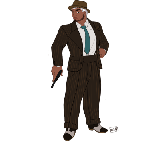
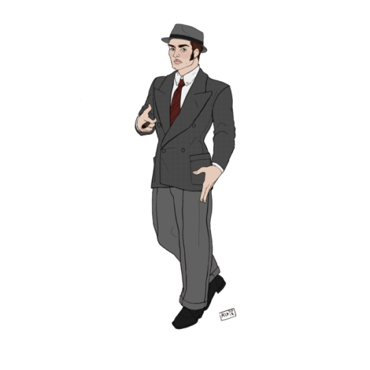
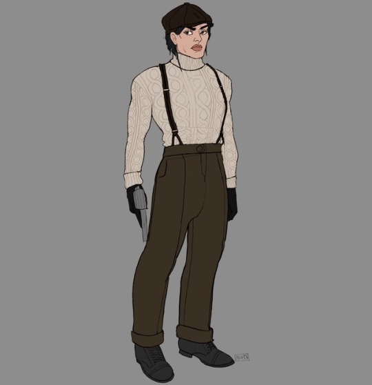
The next couple rejects I’m grouping together because they have the same problem- improper lapel research. Men’s fashion, and more specifically men’s suits, didn’t change too drastically between the 1920s and the 1930s (esp. tuxes). Unfortunately as I’ll get into more later, people label vintage photographs incorrectly, or they get grouped into the wrong searches because they’re similar in subject matter. I was mistakenly referencing 1930s men’s suits instead of mid-late 1920s men’s suits. Luckily for me the most notable and important difference between the two is the lapel size- 1920s suits had very high, small lapels while 1930s suits had the opposite. So I just adjusted those to fix the designs, which is why the rejects look so similar to the finished products.
Click here & here to see the final lineups for Karl and Lars, as well as write ups of my choices for both!
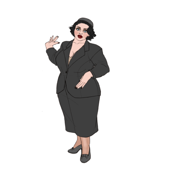
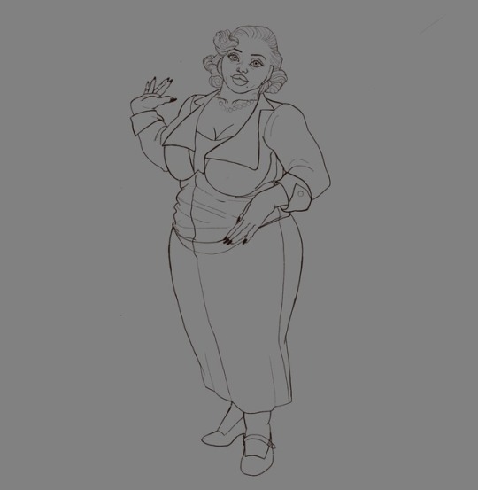
Ahhh the ever lovely Miss Olivia... I had to fight her design more than all the others combined. My first issue was giving her full figure the fashionable ‘potato sack on a coat hanger’ look popular at the time. Lucky for me, she had a wider waist and rounder belly, so I didn’t have to work around an hourglass shape that is antithetical to the look.
Second was my own dumb fault! I was researching early 1930s fashion as well as mid to late 1920s fashion (the volstead act wasn’t repealed until 1933) and got too far away from the prohibition chic I was aiming for (partly because of people mislabeling dates). Here’s a few designs I loved but had to scrap for the purposes of this project because they were obviously from too late in the decade.
The first could be a 1920’s outfit if I shortened her bob, but I discarded this one on account of it being a bit too hum-drum for the character. She’s got a femme fatale vibe the was definitely killed by the muted grey and modest day suit. (I later modified this one into the houndstooth a-line skirt and black blazer jacket combo in the finished piece!)
I really loved this one! But the coifed curls and that neckline/bodice combo is much too 1930s to fit. I’ve kept the lines and I may color it later as a slightly older variant of the character from after the story takes place.
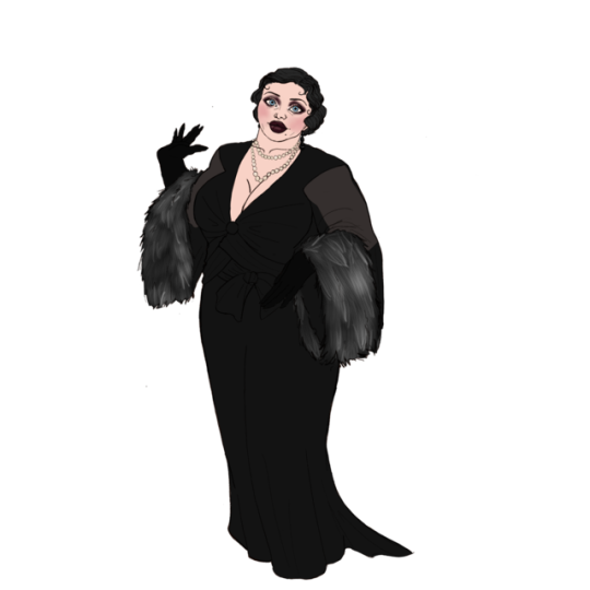
I’m really sad to discard this! I refed it from a gorgeous gown French actress Claudette Colbert wore in the movie ‘The Phantom President’. Even though the silhouette looked very 1930s, I referenced it because I just loved the vampy old Hollywood glamour vibe from it. I unfortunately realized later that I was right in my initial take on the design, as the website I found it on had mistakenly credited the movie as coming out 10 years before it actually did. So into the discard folder this went! Same as the prior design it totally fits Liv’s character so I’ll just keep it as a ‘10 years after the story’ design, because it would be shame to nix it entirely!
Click here to see Olivia’s finished designs and a write up about my choices!
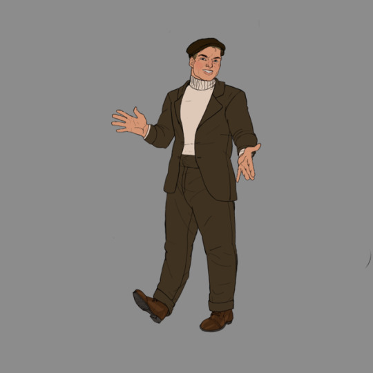
And lastly (from my as of yet unreleased most recent lineup) I actually really like this design! It’s from the right era, fits the sepia tones I’ve been using for the working class characters, and breaks up the rest of his designs’ more fitted silhouettes. Over all it’s my favorite of his designs- but the reason it makes this list is its similarity to one of Mads’ designs! She also has a cream colored knit turtleneck over brown work slacks with a dark brown newsboy cap. When the weather is colder, she probably would wear a matching sportcoat over it, making her design nearly identical to his. Since they work closely together, I want some visual distinction between their designs.
In his final casual design I changed the shirt to be a classic long sleeved undershirt, which fits his character a bit better, solves the above issue, and gives a callback to his canon design (which uses the same collar design)
~~~
All in all this is a very fun project, but I’ve learned a lot from my mistakes and wanted to share my learning experiences and some of the designs I liked. I actually have a few more design ideas for Liv, Felix and maybe some of the others- as well as a 6th character to make a lineup for, so I may be adding to this post!
Karl, Lars, and Olivia belong to @alola-artblog !
#my art#speakeasy#prohibition#volstead act#gin joint#historical fashion#1920s#character design#fashion design#critique#speakeasy au
4 notes
·
View notes
Last Seen Blogs

spectrafire-blr-blog
Fire Extinguisher Dealer Delhi in India

rdtheme1
i prefer your love

nkfw-7
NkFw-7

asktoxicbaldiandfriends
ask toxic,wonder and friends

diabolik-boys
Diabolik Boys