#and of course it's all hand-painted bgs and cels and all that
Text
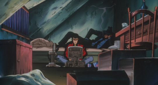
#lupin iii#jigen#dead or alive#i'm about 50 min into this one and honestly?#knock on wood but...it's pretty good so far#they have 45 min to prove me wrong#and a lot can happen in 45 min in a lupin movie#but hey if nothing else this film LOOKS fantastic#huge fan of the character designs#and every shot is gorgeously framed#and of course it's all hand-painted bgs and cels and all that#anyway just liked this shot of them chilling in an upper room somewhere (goemon is just outside on the roof)#one of my favorite repeated visuals in this franchise
17 notes
·
View notes
Text
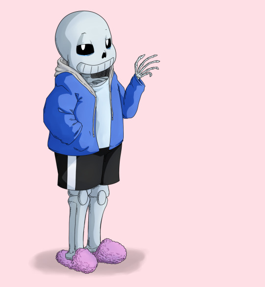
Sans Tutorial?
Last year someone sent an ask for a tutorial about how I draw Sans, but I have been pretty busy and not gotten around to making it! I don’t know how helpful this will be, because it turns out my technique is basically:
1. draw a circle
2. draw the rest of the skeleton
But anyway, I’ll post the steps for this picture here :3
I have picked up some good tips from tutorials but I don’t use them very much because some are too basic, some are too advanced, some are written too proscriptively, and usually the example art looks way better than what I’m doing if I follow along. So my tips may be a mix of too-obvious and not-adequately-explained, but perhaps a few beginner or intermediate level artists will find something useful here :3 I will assume you know what layers are and have software that can do layers. I use Paint Tool SAI, which is pretty affordable, and there are other programs that are free.
First I draw a circle where I want the skull to be. I don’t necessarily stick with this circle as I continue sketching. And one of the advantages of drawing digitally is that I can move parts around if it’s not working. If I’m planning out a complex picture, Sans will be a circle with two more circles for eyes and a vague cylinder/blob as a body, at first.
Then sketch in more detail. Fingers are important, and I often have to go back and refine the sketch of the hands in the middle of doing the lineart.
There are many different and valid styles for drawing Sans. I always draw his eyes as this sort of arch-like shape, like a half circle that’s stretched out vertically. Even if they’re half-lidded, I start with the whole eye shape (and if they’re half closed they tend to end up pretty rectangular).
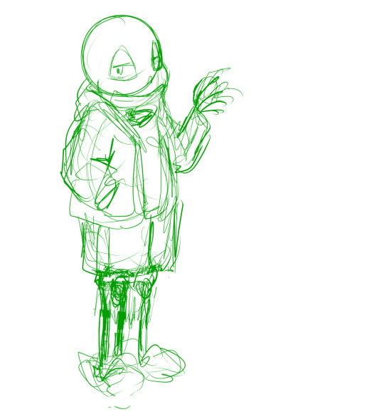
In this picture, I made his legs too short, then too long, and you can see some artifacts of how they got moved around and adjusted. (I pretty much never draw him just standing there in full-body, I guess owo) It’s much easier to adjust things in a sketch than after it’s been lined, so take your time. If I wasn’t feeling confident, or if I wanted to make the linework easier, or if I wanted someone to approve the picture before I did lines, I would do another, more-refined sketch on top of this one. But I’ve been drawing a lot of Sanses over the past few years so I didn’t :3 I do have a brush for sketches that is not totally opaque.
(Beginner tip: If you’re using a serious art program, you can reduce the opacity of the sketch layer and draw the next sketch in a new layer on top. This is how you’ll do the linework too. I also put Sans’s legs on a separate layer when I was adjusting them in this pic. This is also a good time to adjust the framing of the picture; I usually drew it too small and off-center. This pic is a bit off-center because I thought I might add text on the right side about the steps. But then I didn’t.)
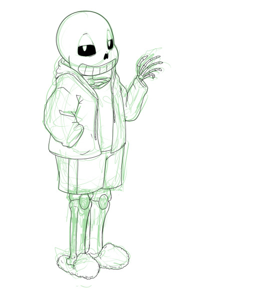
Next is lines. In Paint Tool SAI, I can have multiple layers in a folder and select the whole folder as “selection source” (so I can fill in the colors later). This makes it easy to use a Lineart layer for the smooth curve of Sans’s skull, and a regular Raster layer for the rest of the lines. Of course, make sure the line width is similar. (Being able to choose a selection source other than “current layer” or “whole image” is one of the advantages of SAI in my experience.)
I used thin lines here. I don’t always, but sometimes I try to use thin lines and add plenty of detail and I’m pretty pleased with it. (Often if I want to save some energy I use thicker, rough-textured lines, so that you won’t be able to tell so much where I got the curve of the skull wrong and then adjusted it.) When I first started drawing Sans, I gave him too many teeth. Then I overcompensated and gave him too few teeth. Now I’ve settled on about this many teeth. I like to draw bony, skeletal hands. For any bones, Google image search is your friend. You don’t need to know the proper name of the bone; just search for the body area + bones. I usually draw the nose hole a bit more simplified. I don’t always bother with the drawstring. Sometimes I give him a turtleneck sweater so I don’t have to draw a glimpse of collarbone, ribs, spine inside his shirt. Idk why his tibiae are so thick today owo

Flat colors and cel shading. I like to put a bright color that contrasts with the colors I’m using in the background, so I can easily see corners that got missed by the fill tool. Usually, I do multiple layers of the base colors, so that I won’t have to worry about the edges when shading. (All the color layers are collected in a folder. Not the bg though; if it’s complex it will have its own folder.) Here, I used a shading layer for each base color layer (the shading layer is a clipping layer, so the shade color won’t be visible unless it’s overlapping its correct base color). I don’t like to be organized and label my layers, so I do the shading right after the base color, while I still remember what layer it’s on :3 You can also do the flat colors on one layer (or just in one folder) and then put a multiply or shading layer as a clipping layer over that for the shading (many fewer layers to deal with but you must pay more attention to the staying inside the lines). Aside from the sketches, I still haven’t used any brush other than the default pen. You can of course use more layers and more colors for fancier cel shading. I have used a few extra darker shades on Sans’s neck.

More shading. I usually choose between cel-shading and more shading, but I tried adding a little bit more here since it’s a tutorial. It doesn’t make a huge difference though; if I hadn’t done cel-shading, I would have made the blendy shading stand out more. You can do each color individually (here’s a tutorial about that), but you can also make a clipping layer over all the colors (flat colors on one layer or all the color layers in a folder) and make it a multiply or shade layer, and shading for all the colors there. I like to fill in this shading layer with white so it blends more between the light and dark. This is also a great technique for adding shading to something that has a pattern on its surface (e.g. you can add fur texture to your rainbow cat without painting the texture in every color of the rainbow). This is where I use brushes I adapted myself or stole from other artists :3 and another place where SAI has an advantage because it’s specifically designed to be good at painting. I lightened the background and added a little shadow (blurred with the watercolor brush).

Extra cross-hatchy lines. When I do thin lines, I like to add these lines as a little extra shading/detail. I usually do them before color, and on a separate layer so I can keep them out of the “selection source” when filling in flat colors. This time I did them at the end. They add a little texture to everything and I think they work well on the hand bones.
22 notes
·
View notes
Last Seen Blogs

duffyduckworth16
Sans titre

sheiwosd
제목 없음

rockincherub
ROCKINCHERUB'S NEST

beautyeh2
hot wife

themerlinfandom-archive
For the Love of Camelot