#be glad I spared you all the Venn diagrams
Photo
Please think of me if you ever want a private Tarot reading. Sage Sips' free Tarot content is fueled by private readings, memberships, and coffee (real and virtual.) Any likes, blog follows, social media follows, shares, or comments you can spare all help too! Thanks!
Well, this is interesting.
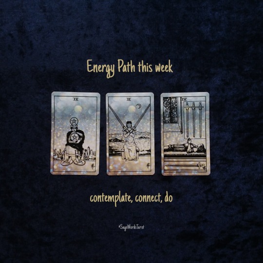
I've been doing these weekly readings for what, a couple of months now? I'd hoped this would happen, but this is the first time that a previous "growing energy" has moved through to be a "fading energy" card. That process alone is giving the Four of Swords special attention. It may be "fading" but honestly it feels more like "getting ready to maybe fade" The Four of Swords is still very much a prominent energy today, even if it isn't the ONLY energy today by any means.
I'll claim it. It's a mood.
The Four of Swords is a big energy for me right now. It was a long week at the day job and I'm glad for the holiday today. More on that later, probably on Sage's Other Words. I'm feeling my introverted, INTP aesthetic, cyberpunk, goth-ish side for some reason. Maybe pure rebellion to all of the sunny, hot weather we've had lately. I dunno.
Wherever the Four of Swords is falling into your personal energy arc - growing, strongly present, fading away, or maybe not there at all - it feels like it is asking for our attention just by virtue of showing up two weeks in a row from two different decks. This week I used the public domain Waite Smith, last week I used the Alleyman's Tarot. The four of swords look almost opposite in the two decks, but both bark up the same tree: mind, intellect, thinking, introspection, all of the rest and abide with your thoughts and feelings sort of thing. Last week the card was asking us to engage with deep thoughts, to contemplate, to contemplate contemplation if you want to get really meta about it.
This week it is more of a think things through before you act kind of vibe. The word "ABIDE" is coming to mind here. Think the thoughts and feel the feels for a little bit before jumping into action.
The two of swords typically means indecision, being of two minds about something. I've always resonated with another, less known, interpretation from Diane Morgan's excellent Tarot book Magical Tarot, Mystical Tao. No mystery why that is my favorite Tarot read ever, since it lands square in the middle of my personal wheelhouse, that liminal, Venn diagram overlap between western witchy Tarot and exoteric Taoism (meaning I follow the spiritual philosophy, not the religion)
Her interpretation is one of spiritual connection to the cosmos. The interconnectedness of everything. Oneness. Or as she put it "mystical unity" found in life. Think of the universality of the energy and the connection to the spirit and energy we talk about in Tarot. I think that is where the Two of Swords is pointing today. That connection to everything, that sense of cosmos, is a very internal, subjective, contemplative thing. If the two of swords in "mystic unity" mode is the current energy, it makes sense that the Four of Swords still seems strong because the two energies are closely related and it makes sense that the two cards would work in tandem to pull our attention to our internal world.
But in typical squirrel rave, strip your gears, 90 degree Tron-turn fashion, life switches from strongly internal to strongly external. We drop the airy, mental, esoteric swords cards right into the action side of swords and the earth element physical realm pentacles. Swords can also be associated with action (like the knight, for example) so the swords are also acting as a bridge from internal focus to real-world focus.
Even though they are nearly opposites, we begin and end with fours. I'll let you figure out the numerology of that if numerology resonates with you. My instinct is to give a shoutout to all the April birthdays out there. A diamond ring and a sparkly, rainbow-y crystal suncatcher sort of crystal window decoration comes to mind here.
With the Four of Pentacles I get "eco-warrior" "ruthless conservation" but not on a political level...it feels very personal level. I connect it with looming potential drought. Save water. Water is life. Mind your budget and your resources. Instead of hunkering down to survive a harsh winter it feels like being disciplined in order to survive a harsh summer. Dune, both the book and movie, and the discipline of the Freman people need to survive in the desert comes to mind here. If you haven't read the books, they are classic science fiction. I totally recommend them for a satisfying pool or beach read this summer.
But that's the vibe on the horizon as it stands now. Mind your budget, conserve water and energy. Hopefully this is a good sign that the collective is gearing up for Plastic Free July both the Australian non-profit AND the just plain concept of reducing your single use plastics. I have it on good authority, that the blog How to Holistic will be talking more about that sort of thing in the near future.
Long story short: contemplate, connect, do
Thanks so much for reading! Next up, more oracle dice on Wednesday if all goes to plan.
See you at the next sip!
0 notes
Note
Hi! I admit I went lurking in your lgbtqia tag, and somewhere in the tags you said that while you are a cis woman you know this because you consciously thought it through, and I would like to ask about it if you don't mind (feel free to ignore this if you do). So, how did you go about it? If I start to think about it I always end up thinking that if you strip away all stereotypes and physical attributes there's nothing left, and I could best describe my experience with gender as (1/3)
„society said I’m a girl and I don’t care enough to say otherwise”, like I don’t have any reason to think I’m not cis but when I think about what makes me a woman I can’t come up with anything other than „they said so”. I didn't want to ask a trans person about it, because when I put it like this it seems really dismissive of what they go through, and on top of that I really don’t want to be *that person* by seeming like I’m demanding that they validate their identity to me when I just (2/3)
get stuck not even halfway through my thought process about this, and I’ve had like multiple crises over this, so I’d like to get this over with if I can. This seemed like my best chance to get an answer without possibly hurting someone, so I will be very grateful if you can answer me, but don’t stress about it if you can’t or don’t want to. (And thank you for reading through this novel-length ask in the first place, really, and sorry for loading all of this on you. Crises, as I said…) (3/3)
(cut because this is gonna get a bit rambly)
First up: I think if you’re having multiple crises about gender it’s ok - in fact imperative - to ask questions about it, you’re not dismissing anybody else’s experience. I hope this answer helps you in some way.
The tl;dr is that, as trans people have taught us, the primary symptom of being [gender] is wanting to be [gender]. The long answer is...longer.
I totally get where you’re coming from on “if you strip away all stereotypes and physical attributes there's nothing left”, but I don’t quite think it’s true - at least not in the way I interact with gender - and I’ll try and break down why.
The thing is, gender is more or less fake. And when I say it’s fake I mean that it’s a very broad-brush system of grouping people which is made up in order to explain, very generally, who people are when you don’t know much else about them. And as a tool that is used to group people on an extremely broad level, it is inextricably intertwined with and born of whatever society you and your gender are operating in. So to start with, you can’t really consider gender outside of society. For me, it doesn’t mean anything when you take it out of the context of interacting with other people. Having (or not having) a gender matters because it’s a way of telling people something about who you are.
In terms of figuring out what things about you say what your gender is - I think of it like...there’s a big bucket of all the attributes people can have that are used to assign them a gender, or for them to pick that gender. Two people from the same society/cultural background will broadly agree on what goes in which bucket, and what the buckets are called. The more different your society and cultural background is, the more different the contents of your buckets are. Some stuff that’s in one bucket for your culture might be in a different bucket for another culture (like colours). What the buckets are and what’s in them changes over time. And, to make it even more confusing, no one person’s gender is made up of all the same attributes from that gender’s bucket, even comparing them to someone of the same gender who agrees with them totally on what the buckets are called and what can be in them. And lots of attributes are in multiple buckets! They can make someone feel lots of different genders depending on the person doing the feeling.
So, ultimately, gender for me is both incredibly, incredibly personal and totally inseparable from my cultural background. And that means that yeah, some of the bits that feel to me like they make me a woman are about my body or ‘stereotypical’ things - and that’s totally fine as long as I don’t make the mistake of thinking that this means someone for whom a DIFFERENT set of attributes makes them female is ‘wrong’ about that. Or the mistake of thinking that the things that make *me* feel like a woman are automatically female attributes for someone of a different gender.
For example, for me I feel the ability/possibility of bearing children is pretty strongly tied to my gender - but I know nonbinary people and men who’ve borne kids, and they’re not women. And I know lots of women who don’t want to or can’t bear kids, and they’re definitely women. So as a marker of femininity, it’s not much use to generalise with. I can only say it’s in my particular gender bucket.
So, having worked through that - and because, like you, I started at ‘well I was assigned female at birth and I don’t disagree’ - I gave up on trying to think about gender as a question of specific attributes. I think of it as: does it make me feel good to be assigned as a woman, in this society I live in, and would it make me feel bad to be assigned as a different gender?
And the answer to both is yes. I like being perceived as female! I feel happy and affirmed in myself when I tick “F” on a survey. I feel more secure in female-dominated spaces. I want to be a woman, it makes me happy to be one, ergo I am one.
Moreover, I don’t want to be perceived as another gender - I point out that I’m a woman if someone’s ever unsure. This was really brought home to me, don’t laugh, when I did a playthrough of Stardew Valley and accidentally made my character male (I get the little symbol confused shush they’re very similar) and spent the entire run through being upset whenever my character was addressed in-game as “Mr Anne”. I wasn’t a Mr! I didn’t want to be! It did not feel good! I have been misgendered occasionally IRL but only for momentary interactions, not persistently - I didn’t realise just how much I wouldn’t like it even in this very harmless context.
But, here’s the thing: I’m not totally sure that I would be a woman or be so confident about being perceived as one if I lived in a society that had very different gender buckets, or put different things in them. I’m a cis woman because I align with the category of ‘woman’ as determined by 21st-century Aotearoa New Zealand. Would I be a woman in, IDK, second-century Scotland? Fucked if I know. And that’s fine, because like I said: for me gender is specifically a way of telling the society you live in something about who you are. I want to tell people I’m a woman, it makes me happy to do so, so I am one; and I was raised as a girl, so I’m a cis woman. It’s as simple and complicated as that.
147 notes
·
View notes
Text
How to speak to your purchasers in regards to the newest Netflix diet documentary
When it involves diet, there’s lots we don’t know.
Although it might be arduous to just accept, the jury’s nonetheless out on purple meat. On eggs. On low carb versus low fats. On Paleo versus totally plant-based.
In truth, there’s little or no we will say with absolute certainty.
Science hasn’t recognized one finest eating regimen or consuming method.
Because of that, you could be positive no documentary filmmaker has. No matter how compelling or convincing the film.
(This contains filmmakers you agree with, by the way in which.)
So what do you do when a shopper—or a good friend or member of the family—watches a trending diet documentary and turns into passionate about:
diet recommendation that contradicts what you’ve been telling them?
questionable consuming strategies you imagine will set them again?
an excessive eating regimen you’re fairly darn positive will fail?
First, take a breath. (Or two.)
Next, perceive that, normally, you’ll be able to’t “prove” anybody mistaken.
More importantly: You shouldn’t even attempt.
There’s a a lot more healthy and more practical method in your purchasers, what you are promoting, and your sanity…
Aim to be useful, not proper.
This mindset lightens the tone of your conversations, fosters belief and appreciation, and permits you to in the end have larger affect. (It’ll make you extra likable on social media, too.)
Admittedly, this doesn’t all the time really feel second nature. But with observe, it will possibly turn out to be that approach.
The payoff is big: Instead of dreading the subsequent huge diet documentary, you need to use it to construct a stronger and extra productive relationship with anybody who seeks your assist.
This article will present you the way.
Why you don’t must be proper.
Before we get to serving to purchasers, let’s deal with a giant hurdle: Our deep must be proper.
The actuality is that this: Most diet debates received’t be resolved anytime quickly. Probably not even in our lifetimes.
(To higher perceive why, learn: Why diet science is so complicated.)
You would possibly even consider it this fashion:
Scientific progress is extra about being progressively much less mistaken than all of a sudden understanding some final reality.
So in some ways, we’ll by no means actually know if we’re “right.”
Accepting this might help you turn out to be a extra considerate, open coach (and human being).
Plus, attempting to show to your shopper that you simply’re “right” interferes along with your capability to develop a robust teaching relationship. It would possibly even hinder your probabilities of serving to them.
Because until you ask questions to search out out what resonates along with your shopper about “Diet Fad X,” you’ll by no means perceive what want they’re attempting to satisfy with that method.
That’s a missed alternative to leverage what issues to your shopper to create actual change. (More on why the most effective coaches shut up and pay attention in a bit.)
There’s one draw back, nevertheless, with accepting that there’s usually no “right” reply in diet: It could be unsettling.
For some coaches, dietary uncertainty raises foundation-shaking questions, akin to:
How can you’re feeling comfy giving steering based mostly on incomplete data?
How are you able to keep away from a disaster of confidence whenever you encounter a brand new, thrilling dietary principle—that goes in opposition to all the things you have been taught?
How are you able to inform the distinction between evolving your teaching philosophy and getting caught up in a fad?
To assist reply these questions, Craig Weller, Precision Nutrition Master Coach and resident train specialist, factors to an enchanting analysis paper titled, The End of History Illusion. It supplies a helpful analogy for coming to phrases with dietary uncertainty.
The scientists’ findings: If you ask somebody how a lot they’ve modified as an individual prior to now and the way a lot they imagine they’ll change sooner or later, they’ll just about all the time say that the majority of their change is already behind them. This is true whether or not they’re 18 or 68.
“As humans, we tend to believe we’re already the person we’ll be for the rest of our lives, but that’s not how it actually works,” says Weller. “It’s the same in science and nutrition.”
“If we glance again 150, 20, and even simply 10 years in the past, there have been issues individuals strongly believed to be true about diet that finally have been disproven or proven to be irrelevant.”
This isn’t to counsel it’s best to ignore the present pondering and analysis on diet. It’s to emphasise uncertainty has all the time existed, not solely in diet and science however in virtually each side of life.
Even if we really feel sure about one thing at present—the love of our life, that superior new job, a SpongeBob tattoo—we’d really feel very completely different in a decade.
So what are you able to do?
Focus on what you understand with the very best diploma of confidence in any given second.
(We’ll cowl the specifics within the subsequent part.)
Then discover new concepts and various strategies as experiments. Gather knowledge, and select the most effective path ahead based mostly on the result.
The profit: You don’t must be proper earlier than you begin. You can use diet experiments to higher perceive what works for every particular person.
This is actually custom-made diet teaching, and it retains you open (and chill) to any method your shopper desires to attempt.
What we (largely) know for positive about diet science
If you suppose dietary uncertainty causes issues for you, think about what it’s like for purchasers.
“There’s a lot of contradictory information out there, causing tribalism and discord where there need not be any,” says Brian St. Pierre, MS, RD, CSCS, Precision Nutrition’s director of diet.
“These passionate and often conflicting messages only end up confusing people and discouraging them from getting started in the first place, since it appears that ‘no one knows what’s right anyway.’”
This is the place you’ll be able to assist present readability and focus.
How? By emphasizing the significance—and effectiveness—of only a handful of very fundamental ideas.
Despite the entire seemingly-conflicting data, there are a number of foundational parts that just about everybody agrees with, says St. Pierre:
Eat extra minimally-processed complete meals and fewer highly-processed meals
More greens are higher than fewer greens
Eating sufficient protein is essential for well being, efficiency, and physique composition
In the long-term, studying to handle your meals consumption based mostly in your physique’s starvation and fullness cues works higher than weighing and measuring all the things you eat. (Read extra on this matter.)
“Make these four principles the foundation of your dietary recommendations,” says St. Pierre.
Think of the center of the Venn diagram as the basics of diet. These maintain purchasers on monitor and enable you to really feel assured in your recommendation.
And these outdoors sections? They aren’t life or demise. Whether your shopper desires to eat like a caveman, hand over meat ceaselessly, or make olive oil their life power is a matter of non-public desire.
Ultimately, your shopper is the boss of how they eat.
So in the event that they wish to attempt one thing new on account of a diet documentary, that’s their name.
Your position: Help them do it higher.
Here’s how one can do exactly that.
Your 5-step information for serving to purchasers (even in the event you suppose they is perhaps mistaken)
Step 1: Give optimistic suggestions.
If a shopper is happy by a diet documentary, don’t inform them it’s mistaken. This can really feel dismissive, and it minimizes their ideas and emotions.
Instead, do as David Burns, MD, a pioneer within the discipline of cognitive behavioral remedy and creator of the T.E.A.M. counseling methodology says: “Find the truth in what they’re saying.”
One approach to do this is thru optimistic suggestions, says Precision Nutrition Master Coach Kate Solovieva, MA. “This allows your client an opportunity to engage in ‘self-enhancement,’ a basic type of motivation that’s associated with both increased self-esteem and sense of control.”
These are belongings whenever you’re serving to somebody enhance their diet.
Welcome their questions, opinions, and considerations in a approach that claims, “What you think matters, and I want to talk about anything important to you.”
For instance:
If they ask a query, you would possibly lead with: “I’m so glad you asked!”
If they’re involved about how their present habits would possibly impression their well-being: “It’s awesome you care so much about your health!”
If they’ve taken a eager curiosity in a selected documentary or diet matter: “I’m impressed you’re looking into nutrition in your spare time. That’s pretty cool!”
Step 2: Express curiosity.
“See if you can have a discussion about the film without explicitly stating your beliefs about it,” advises Solovieva.
So, ask plenty of questions and be listener. Or as Solovieva says: “Practice good coaching.”
Your cost: Find out what they realized that was so intriguing (or unsettling) to them… and why.
Here are some questions that would enable you to study extra, and doubtlessly enable you to determine (collectively) what to do subsequent:
If they’re resisting what you’ve been telling them as a result of the diet documentary conflicts…
Ask this: “Can you tell me a bit more about that? Which points stood out to you? What seems like a better approach to you, and why?”
If they’re anxious their present plan is taking them down the mistaken path…
Ask this: “I can understand why you’re concerned. I’m wondering if you can tell me more about how the documentary conflicts with the work we’re doing together? Is there anything specific you’d like to do differently?”
If they’re fascinated with implementing modifications based mostly on the diet documentary…
Ask this: “What about making this change feels appealing to you? How do you think this change will benefit you? Is there anything about it that you think will be challenging?”
This method helps present your shopper they’re in management. And merely figuring out they’re the decision-maker—and that you simply’ll help their selection—provides them extra confidence in your recommendation.
Step three: Support, don’t decide.
No matter what, you need your shopper to know you’re on their facet.
Let’s say they wish to attempt an method you wouldn’t typically suggest. For occasion, relying in your views, it is perhaps veganism, keto, or intermittent fasting. You need them to really feel comfy discussing their selection with you—in order that they’ll come to you in the event that they slip up, need assistance, or determine to vary course.
In different phrases, there’s no place for “I told you so” in good teaching.
Because in the end, your shopper is both going to:
Decide to not make any modifications after speaking it over with you.
Make a change, notice it’s not working for them, and lean on you for assist.
Find out they really do love vegan, keto, IF, or [insert whatever diet].
All of that are optimistic.
Here are some methods you’ll be able to present your shopper that you simply help them it doesn’t matter what they determine to do:
If they’ve already made up their thoughts about making a selected change…
Say this: “That sounds like an interesting idea. Would you like suggestions on how to implement it and monitor your progress?”
If they’re undecided what to do subsequent…
Say this: “I can tell you’re unsure about what happens next. What are the options you’re considering? Let’s talk through them.”
If they struggle one thing new and it doesn’t work out:
Say this: “This is great intel. Learning what doesn’t work for you is really important. What are your takeaways from this experience?”
Step four: Collaborate on an motion plan.
After you’ve listened to and understood your shopper’s considerations—and proven you’ll help them—it’s time to take motion.
But don’t inform your shopper what to do. (Even if they need you to.) Instead, take what you’ve found and use it to information your shopper.
Maybe they simply wish to make a small change, to search out out if it might make a distinction for them.
In this case, give your shopper choices. Let’s say they wish to incorporate extra celery juice into their eating regimen. They heard it might enhance their well being whereas attempting to shed weight, particularly if they’ve it on an empty abdomen for breakfast.
You would possibly current these choices:
Option A: Keep all the things the identical. “Things are already going pretty well, so you might not even need the celery juice.”
Option B: Go for the center path. “If you want to try incorporating celery juice, you could plan to have it a couple of mornings a week, but still eat your regular breakfast, too.”
Option C: Go all out. “You could also switch to having just celery juice for breakfast every morning. I’d want to make sure you get some high-quality protein, carbohydrates, and healthy fats at your next meal, though.”
These three decisions—do nothing, do one thing, do probably the most you’ll be able to probably do—work for many any diet change your shopper could also be fascinated with.
If the change is one thing that doesn’t appear dangerous to you—like consuming extra greens or consuming extra celery juice—be at liberty to not provide your opinion.
If you suppose the “all-out” possibility might put your shopper’s well being in danger, or critically derail their progress, converse up.
You would possibly say one thing like, “I personally recommend option A or B, as I’m concerned that option C could actually be detrimental to your health. But it’s not up to me. Only you can decide how we move forward.”
Now, your shopper might wish to overhaul the way in which they eat completely. But don’t panic! This is the place experimentation is available in.
Step 5: Encourage your shopper to suppose like a scientist.
Self-experimentation is without doubt one of the cornerstones of the Precision Nutrition teaching program. Because each individual is completely different, you by no means know precisely how a selected approach of consuming goes to work till you attempt.
Here’s how one can body an consuming experiment in your shopper, courtesy of Krista Scott-Dixon, PhD, Precision Nutrition’s director of curriculum.
“Use phrases like ‘exploration,’ ‘attempt,’ and ‘sport,’ when speaking about this with purchasers,” says Dr. Scott-Dixon. “Say one thing like:
We’re going to play a bit sport for the subsequent two weeks.
You’re going to be a scientist, and also you’re going to gather knowledge about your self. Let’s provide you with some indicators to trace that may assist us determine whether or not that is shifting you in the direction of or away out of your objectives.
Once you collect the info, we will analyze it collectively. We may even make some charts and PowerPoints if you need.
Then, we’ll draw conclusions and do some outcome-based resolution making, similar to scientists, to see what our subsequent steps are. But you’re going to be the authority by yourself expertise.’”
Talking in regards to the experiment as one thing scientific however enjoyable encourages your shopper to place their scientist hat on. There are many advantages to working this fashion. It could assist your shopper:
detach emotionally from the result of the experiment
uncover one thing new about their relationship with meals/diet
put apart “the research” and turn out to be immersed in their very own expertise
acknowledge that what works for others could not essentially work for them
contemplate different experiments that would get them nearer to seeing outcomes.
You can apply this course of to any sort of consuming change, from attempting out intermittent fasting to experimenting with an oil-free eating regimen.
The better part? It places your shopper in command of their expertise and ready to study by way of motion. And it casts you, the coach, as a supply of technique, steering, and help—as an alternative of a diet documentary fact-checker.
Remember: It’s all about your shopper.
Sensational documentaries could be difficult for coaches to cope with. Trust us, we get it.
But for many individuals, these docs are their first publicity to diet science. It is sensible your shopper could be satisfied by, and perhaps even involved about, what they noticed in a movie.
Listen intently. Show empathy. Be their ally.
Using this framework, you’ll be able to ease your shopper’s nervousness, harness their enthusiasm, and assist create an efficient plan that feels proper to them.
And you could be 100 p.c sure: Those are critical sport changers.
If you’re a coach, otherwise you wish to be…
Learning how one can coach purchasers, sufferers, pals, or relations by way of wholesome consuming and way of life modifications—in a approach that makes them really feel empowered and motivated—is each an artwork and a science.
If you’d prefer to study extra about each, contemplate the Precision Nutrition Level 1 Certification. The subsequent group kicks off shortly.
What’s all of it about?
The Precision Nutrition Level 1 Certification is the world’s most revered diet training program. It provides you the information, methods, and instruments it is advisable to actually perceive how meals influences an individual’s well being and health. Plus the flexibility to show that information right into a thriving teaching observe.
Developed over 15 years, and confirmed with over 100,000 purchasers and sufferers, the Level 1 curriculum stands alone because the authority on the science of diet and the artwork of teaching.
Whether you’re already mid-career, or simply beginning out, the Level 1 Certification is your springboard to a deeper understanding of diet, the authority to teach it, and the capability to show what you understand into outcomes.
[Of course, in the event you’re already a scholar or graduate of the Level 1 Certification, take a look at our Level 2 Certification Master Class. It’s an unique, year-long mentorship designed for elite professionals trying to grasp the artwork of teaching and be a part of the highest 1% of well being and health coaches on the earth.]
Interested? Add your identify to the presale listing. You’ll save as much as 30% and safe your spot 24 hours earlier than everybody else.
We’ll be opening up spots in our subsequent Precision Nutrition Level 1 Certification on Wednesday, April eighth, 2020.
If you wish to discover out extra, we’ve arrange the next presale listing, which supplies you two benefits.
Pay lower than everybody else. We prefer to reward people who find themselves keen to spice up their credentials and are able to decide to getting the training they want. So we’re providing a reduction of as much as 30% off the final value whenever you join the presale listing.
Sign up 24 hours earlier than most people and improve your probabilities of getting a spot. We solely open the certification program twice per 12 months. Due to excessive demand, spots in this system are restricted and have traditionally bought out in a matter of hours. But whenever you join the presale listing, we’ll provide the alternative to register a full 24 hours earlier than anybody else.
If you’re prepared for a deeper understanding of diet, the authority to teach it, and the capability to show what you understand into outcomes… that is your probability to see what the world’s prime skilled diet teaching system can do for you.
The post How to speak to your purchasers in regards to the newest Netflix diet documentary appeared first on Weight Loss Fitness.
from Weight Loss Fitness https://weightlossfitnesss.info/how-to-speak-to-your-purchasers-in-regards-to-the-newest-netflix-diet-documentary/
0 notes
Text
Create High-Impact Data Visualizations: Nine Effective Strategies
I believe deeply in the value of making data accessible.
In service of that belief, there are few things that bring me as much joy as visualizing data (smart segmentation comes close). There is something magical about taking the tons and tons of complexity that lurks in our data, being able to find the core essence, and then illustrate that simply. The result then is both a mind and heart connection that drives action with a sense of urgency. #winning
While I am partial to the simplest of visualizations in a business data context, I love a simple Bar Chart just as much as a Chord or Fisher-Yates Shuffle. As we have all learned, tools matter a lot less than what we do with the tool. :)
In this post I want to inspire you to think differently. I’ve curated sixteen extremely diverse visualization examples to do that. By design none of them from the world of digital analytics, though I’ll stay connected to that world from a how could you use this idea perspective. My primary goal is to expand your horizon so that we can peek over and see new possibilities.
To spark your curiosity, the visuals I’ve worked hard to find for you cover the US debt, European politics, lynching and slavery, pandemics, movies, gun control, drugs and health, the Chinese economy, and where we spend our lives (definitely review this one!).
The sixteen examples neatly fall into nine strategies I hope you’ll cultivate in your analytics practice as you create data visualizations:
1: The Simplicity Obsession
2: If Complex, Focus!
3: Venn Diagrams FTW!
4: Interactivity With Insightful End-Points
5: What-if Analysis Models
6: Turbocharging Data Visuals with Storytelling
7: The Magic of 2 x 2 Matrices
8: Close Contextual Clusters
9: Multi-dimensional Related Line Graphs
This post has quite a bit of depth, and loads for you to explore, reflect and internalize. It will take a few visits to absorb all the lessons. In as much, my recommendation is to read one section per day. Take time to really understand what’s going on, go to the site, play, look at the higher resolution versions (click on the images), make notes of what you’ll do for the first time or change about what you already do. Most importantly, practice taking action. Then, come back, read the next one and take action. I promise, the rewards will be rich.
Let’s go make you an even more effective influencer when it comes to data!
Strategy 1: The Simplicity Obsession
One of the reasons so many visuals are so very complex is that the Analyst/Creator is trying to demonstrate how clever they are. Sadly in the process of demonstrating aforementioned cleverness, the visuals ends up being incredibly complex crammed with every little bit of amazesomeness they are trying to demonstrate…
(Click on the above image for a higher resolution version)
There is absolutely no doubt in my mind that the Creator worked very hard, and, I sincerely mean this, they are very clever.
The problem is that the essence of what they want to communicate is probably only known to them, or to any person willing to take the time to first learn the job of the analyst, dig into the data themselves, create this picture and then understand what is being said.
It breaks my heart.
Go on. Scroll back up. See if you can understand what is being said.
In my humble opinion there is an additional subtle problem. The Creator was asked to plot the data, or perhaps share the insights, but it is unclear whose job it was to answer this simple question at the end: So What?
When you start with that as your destination, so what, as the creator of any visualization you are going to ask for a lot more context, you are going to make sure the visual is in service of the answer, you'll make sure your cleverness is focused on the outcome the data has to serve.
Please, please, please keep that in mind.
The complicated thing above is trying to highlight an important trend, is missing the context, and is simply not as dramatic as the reality of it actually is!
Here's a better visual showing the National Debt Burden, with four additional elements of context…
(Source)
Did you get what the point was in zero seconds?
Are you a whale-load more scared as you contemplate the red and the green?
Are you freaked out that if there is one thing both political parties in the US seem to be good at it is the red (!)?
That is what a good data visual does.
For the few of you that are a part of the team I lead, in addition to creating a visual for your analysis that is simple and effective, you know that my expectation is that you’ll come with recommendations on what to do.
To demonstrate that there are many paths to JesusKrishnaAllah… Here is another simple view of the debt, with a different x-axis, a stretched out y-axis, along with a different set of context…
(Source: CBO)
Different questions, different arguments, different outcomes. But, you'll get to them much, much, much faster than the first visual.
I can’t stress this enough: Don't try to earn your performance review from the client/audience. Earn it from your boss. Tell your boss how hard you worked, show her how clever you are, earn her praise. Spare your client/audience – show them the simplest manifestation of your brilliant insight, with the NACR criteria applied.
(For more on using NACR to identify out-of-sights, see TMAI #66.)
Strategy 2: If Complex, Focus!
You are going to see my deep bias for simplicity for the rest of this post (or in the 745,540 words written on this blog thus far). I do not want to come across as a simplicity snob.
Deployed well, there are instances where I love complexity.
I thought this was exceptionally well done…
(Source: Michael Paukner | His Flickr collection)
(Click on the above image for a higher resolution version)
While it is a little difficult to follow all the arrows back to the original country, the shape of the graphic is an homage to the visual's topic. The background color could not have been more prefect. And, notice there is just the perfect amount of information about every tree.
There are other more subtle things to admire. I love, love, love that Michael put the US on the right. When we “trip up” our audiences like this, it gives them a pause and forces them to look at all the other information more carefully.
There is of course data itself that gives you many pauses. Notice the youngest tree in the graphic is older than Jesus Christ. Or, that we should all be so glad that the American West was settled last (by then we were more appreciative of nature as humans).
I am fine with complexity, if the essential makes it through. I am fine with complexity, if someone who’ll spend 1/100th of the time on the visual compared to you get’s it.
Strategy 3: Venn Diagrams FTW!
I love Venn diagrams. Ok, strictly speaking Euler. But, let's not get pedantic.
I've used them to simplify the presentation of complex topics. Ex: Six Visual Solutions To Complex Digital Marketing/Analytics Challenges
I am only slightly kidding but one of humanity’s most complex undertaking is to understand what the heck Europe is. One end's up ruing even asking, because you hear back EU, EEA, Euro Zone, Schengen, EFTA, and more.
I felt Bloomberg did a wonderful job with, what looks like an amoeba-inspired, Euler diagram…
(Click on the above image for a higher resolution version)
The color schemes are contrasted enough to allow you to follow along nicely.
The context from the sizes of the economy is a nice touch. (This is embarrassing but I was surprised how big Italy is, and how small Sweden is.)
The clusters of countries next to each other, for the sake of cleaner lines, all by itself has a built-in message. Cyprus and Ireland. UK, Romania, Bulgaria and Croatia. So on and so forth.
Overall, this is a topic that has been tackled numerous times, with painful to see results. Bloomberg managed to make it as simple as possible, with valuable built-in context.
Staying in the same geographic area, and my Euler-love, here's another fantastic visualization of often a very complicated answer: What is each political party in the UK promising?
I adore this as the answer…
(Source: Economist)
(Click on the above image for a higher resolution version)
Would you have believed that the totally out there UKIP would have something on common with Labour? Or that Labour is completely alone in the minimum wage issue?
The visual makes it easier to understand what we might be most interested in from the thousands of pages that form each party’s manifesto. You, the audience, is now empowered to agree more passionately with your party or feel the uncomfortable squirming that comes with realizing what your party is solving for. Both. Fantastic. Outcomes.
Clearly this is a political picture, and someone has to decide what to include and what to exclude because the parties promise the Earth, Moon and the Andromeda galaxy. But that is the life of an Analyst… They have to make tough choices.
Two hopes.
1. I hope every single news organization in every single country in the world will copy this visualization and create it for their main political parties. (Also see related NYT example on Guns below.)
2. What will you do with this? Can you pull out all the content types from your digital existence and create a visual like this one for which goal (overlapping goals) each type is solving for? How about displaying countries and products purchased? Oh, or your main traffic sources and the visitor acquisition metrics?
So much to do, so simply, and so little time!
Strategy 4: Interactivity With Insightful End-Points.
There is a common belief that your company’s decision makers would use data more if they could explore it – more efficiently, deeper, etc. This is almost never true, primarily due to the problem outlined in the orange and blue triangles that outline skill/competency and insights/action.
Hence, in a business context I rarely advocate for initiatives whose only purpose is to allow the broad collection of company employees to go on random fishing expeditions.
Exploratory environments can be useful, especially when they are 1. sharply focused 2. have an ability to eliminate dead end-points and 3. allow for smart elements like modeling. Let’s look at the first two below and the third one in the following example.
Here’s a valuable dataset from the Equal Justice Initiative on Lynchings in America.
(Click on the above image for a higher resolution version)
Even at a glance the data is useful, along multiple dimensions.
In this case exploration of the data makes it even more valuable. You hover your mouse over your area of interest, and click…
You get your data drill-down, but what’s of most impactful is that you also get an end-point with a valuable insight providing meaning to the data.
In this case the number 29 for Jefferson County would be an insufficiently valuable end-point. The inclusion of Elizabeth Lawrence’s story on the other hand provides meaning. That is what gives the exploration a purposeful end-point.
You can now zoom out, move on to exploring other areas, continuing to get enriched value from the data.
In a business context when you are working with interactive data visualizations, ask this very valuable question: In a sea of data, whose job is it to include a logical end-point with an insight of value?
Surely, your terabytes of Google Analytics data dumped into a Tableau exploratory thingamagigy won’t magically throw them out there.
Surely, lay business decision makers, even senior ones, won’t have all the context they need to have to convert thingamagigy fishing expeditions, sorry, explorations, into the brilliance you feel the data contains.
Interactive visualization are great, only when packaged with insights for actions at logical end-points in exploration. Tweet that.
[SIDEBAR]
This is a difficult example to share because of the deeply emotional content it contains. But, those who do not learn from history are doomed to repeat it. Beyond the value of the lessons from the visualizations, I encourage you to explore rest of the EJI website. At the very minimum please consider spending five minutes listening to the story of John Hartfield told by Tarabu Kirkland, and six minutes on the story of Thomas Miles Sr told by Shirah Dedman. Thank you.
[/SIDEBAR]
Bonus: Another insightful visualization on this topic is at pudding.cool, The Shape of Slavery…
A bit more complex of a visualization, a function of the depth of data populated.
Follow the story of Louisiana as you reflect on the data.
Lots of data visualization, storytelling and life lessons in this data set as well.
Strategy 5: What-if Analysis Models.
Building on the thought above, if you create exploratory environments it can be exceedingly accretive to decision-making if we build in what-if type models. Rather than stopping at an end-point, provide an option of doing some type of sensitivity analysis with the goal of prodding the audience to take action.
For example… Let’s say they end up looking at Visitors, Conversion Rates, and Revenue. You can easily imagine how you want someone to explore that data by traffic sources or campaigns or geo or myriad valuable dimensions. You can create an environment where they press buttons to get that data.
Necessary, but not sufficient.
Why not build in a model where the decision maker can change Conversion Rates, to see the impact on Revenue? Move it from 1% to 1.5% to 8%. See what happens by traffic sources. Then, make a smarter decision.
Or, empower them to play with discounting strategies. What happens if they offer a 5%, 10% or 18% discount? Show impact on Revenue and Profit.
Even without bundling insights into your prepackaged environment, the what-if models allow your decision makers to play with scenarios, understand impact and make smarter decisions about what to do.
That’s the key. Don’t make visualizations with dead ends.
Here’s a great example of that from Mosaic. The visualization is about outpacing pandemics.
Quoting them: Vaccines are an essential weapon in fighting disease outbreaks. But how does the time taken to develop vaccines compare to the speed and frequency of outbreaks? And how can we do it better?
This is the simple view that greets you, outbreaks from 1890 to 2016 with vaccine development during that same time…
Each element is clickable.
As an illustration, the longest bar is Typhoid fever and the smallest, mercifully, is Measles. For each bar, click on Measles, you’ll see the first big outbreak (1917, 3,000 deaths) and the last (1989, 123 deaths). It is really easy to explore the data.
What I love is the sensitivity analysis.
Click on the yellow dot, and you’ll see that in action. First, you see what actually happened…
Simple exploration. Good reporting. Easy to understand.
The buttons with the number of weeks represent what I wanted to highlight here. Click on them, and it demonstrates what the outcome would have been if action was taken earlier.
I choose 22 weeks…
Even if the vaccine had been introduced after 22 weeks, a long time, we could have saved 1,628 lives!
The team also built in some hypothetical scenarios to help inform decision-making.
You can play with the implications of a fast-moving flu-like pandemic. It would have grievous overall impact, 30 mil deaths in 12 months.
But, what if we restrict 50% of the travel since we don’t have a vaccine yet. That would have an impact…
Not quite as material as one might imagine, but it slows things down.
What if a vaccine was introduced 22 weeks in?
Insanely helpful. 17 mil lives saved.
This type of modeling is rarer than seeing a rhino in the Ngorongoro crater. (We were there last week, you should go, it is pretty awesome.)
As an analyst, as a Big Data person, as a Data Scientist, pouring the right data on humanity is only marginally effective. In this example, in others above, I hope you’ll see the type of additional creativity we can bring to our work to power smarter decision-making. Starting with no dead end-points.
Strategy 6: Turbocharging Data Visuals with Storytelling.
You know this. Even if data is shared in a simple environment, most people are unable to internalize it. As has been hinted in most examples today, the problem is that the Analyst’s brain has not been packaged with the data.
The Global Gender Gap Report is a fabulous example how to solve this problem. The team nor only shares in a simple and beautiful environment, they also include the story they want to tell in that same environment. The output is not the reporting, the output are the conclusions from the Analyst’s brain.
It is very difficult for me to show the beauty of what they have done in static screenshots. You just have to go there and scroll.
Explore how the initial trend in the gender gap morphs into multiple visualizations, note the subtle but important emphasis on trends, and, most importantly, feel joy from how the story is presented with the data (text on the right).
The website and visualization will work on your mobile device (yea!), but it is best admired on the largest screen you can find.
To tempt you, let me just contrast the gender gap performance of the United States (precipitous decline in the last two years!) with… with… inspired by FLOTUS, the 10 year performance of Slovenia…
Play with the histogram and scatterplot options.
Go back and forth a few times (yes, gender parity is an issue I care deeply about), make sure you absorb the many nuances both in the story (why the above stinky performance by the US?) and the way the text (story) and the visualization (data) play together.
When you send data out, is it bundled with a piece of your brain?
Remember, you’ll be the last person with the intelligence and skills to understand the deep layers and nuances in what the data is actually saying (assuming you are an Analysis Ninja!). It is imperative that your brain go with the data.
Bonus 1: Another fantastic example of this type of sequential storytelling is Film Money….
Lars Verspohl takes you along on a wonderful journey through cost and profit structures of movies. Like me, you’ll love the simple and delightful visualizations, how gracefully flow it all flows, and that all the charts and data are primarily there to support the story that emerges from his analysis.
Please also note the thought put into the order in which the story is told, if and when the visualizations switch (from the one above) and the techniques deployed to keep you interested. All excellent, loads to learn.
Bonus 2: This is one subject, storytelling, that I just love, love, love. Indulge me as I pile on and share one more, dramatically different, example of storytelling where data and text go hand in hand.
The team at Reuters Graphics does a fab job of explaining China’s debt problem.
Almost all the visuals are extremely simple. As you scroll through, observe though how they peel back layers of the onion one by one, segment the data, and zero in on the core point they want to make.
Really lovely. Worth emulating.
Strategy 7: The Magic of 2 x 2 Matrices
If you’ve read anything on this blog, you’ve read the importance of seeking why answers to provide critical context to the what answers that you get out of Adobe or Google Analytics. Hence, the amazing value of Surveys, Usability Studies (on or offline), Heuristic Evaluations, shadowing Customer Service calls, and more.
Customers are an amazing source of problems they are having, sometimes they are also a good source of ideas. The challenge is that if you ask people for their opinions you get tons of ideas.
How do you value them? How do you present them? How fast can you get from data to action?
One solution I love is a visualization strategy used by the team at the New York Times. The example illustrates, simply, the ideas related to an emotionally charged topic: Gun Control.
Everyone knows this is a polarizing topic. Friend against friend. Blue vs. Red. Police and minorities and every other combination thrown in. It is a mess.
But. Is it really as fraught with angst as we believe?
No. It turns out if you ask Americans about individual ideas that will reduce gun deaths… A vast majority of us agree!!
The lowest supported idea is “Demonstrate need for a gun.” Support for it is just shy of 50%. A number that simply sounds unbelievable.
Did you think vast majorities in our countries agree with these common-sense ideas? I have to admit I did not. It is hopeful data.
But, this is not the reason for the inclusion of this visual on our list.
Rather than just share the ideas, the NYT team added incremental value (remember packing the Analyst’s brain?) by asking Experts to opine on the effectiveness of each idea. That’s what you are seeing in the distribution above.
From the 2×2 matrix, here is the slice of ideas American’s support and the ones Experts say are effective…
There are only two ideas rated as ineffective by Expert, but are supported by over 70% of the Americans (national stand your ground law and honor out-of-state conceal and carry permits).
We all basically agree on ideas, and a lot of them will have an impact.
I love the presentation of the ideas and the fact that Experts were brought in to give valuable context. This is what I meant in my above example by not simply taking all the customer ideas and running with them. A wonderful way for you to visualize multiple ideas, and you can combine it with an Expert dimension or a Customer Satisfaction dimension or even a Revenue dimension to give context to the ideas.
One last element of value from NYT.
I’ve said that all data in aggregate is crap. I’m so happy that the NYT team also segmented the data.
What does Mr. Trump support…
What do American law enforcement support…
And, lots more slices that make the data even more meaningful.
Segment. Always, always, always segment!
It is beyond the scope of this humble analytics blog to explore why in the face of such unanimity that nothing actually happens when it comes to reducing gun violence in the US. But, for lovers of data, for believers in the power of data to drive smart decision-making, this is one more reminder on the limitation of data if you can’t tell the story properly.
Strategy 8: Close Contextual Clusters.
Let’s close with examples of work that you’ll normally include in your enterprise analytics efforts.
Usually data we have is lonely. Just the Visits or Assisted Conversions or Order Size. Without other contextual elements, it turns out this data is less useful.
Consider this, conversion rate could go up by a statistically significant percentage… While revenue actually goes down. Or, the overall Visits to the site stay steady… But drop dramatically from your usually second highest source.
The European Monitoring Center for Drugs and Drug Addiction, also known by the gorgeous acronym EMCDDA (!), publishes a ton of data. Their Statistical Bulletin 2017 has a lovely collection of graphs and charts that we all use in some shape or form. The only difference is that we rarely report on Heroin Price and Purity. :)
Along with the use of (mostly) simple visuals to illustrate the data, I appreciated the context that they provide. Sometimes using the time dimensions, sometimes using geographic breakdowns, sometimes using two likely interplaying elements (like above), so on and so forth.
This simple strategy is quite effective at delivering insights – or at least causing the audience to ask relevant interesting questions.
I encourage you to take some time and explore the numerous examples on the site…
I’m confident the visualization strategies will spark upgrades to the work you are doing at your company to communicate data more effectively.
Our friends at the EMCDDA mostly avoid two things that I find as poor practices in data visualization. They triggered this in my mind, let me take the opportunity of sharing them with you.
1. Never ever, never, never, never create the loooooooooonnnnnnnggggggg infographics that seem to be in vogue these days. Essentially they are taking 69 “slides”/graphs/tables and shoving them into a 9-meter-long thing that no browser can render decently. By the time you absorb the third screen full of stuff in tiny font/image, you’ve already forgotten what’s on the second. You have many examples in this post as to how you can avoid making yourself look like sub-optimal Reporting Squirrel.
2. Pie-charts are a very poor data visualization choice. Humans find comparison by angles significantly harder than, for example, by length. I explain this a lot more in the May 14th edition of my newsletter The Marketing Analytics Intersect: Eat pies, don’t share them.
[You should subscriber to TMAI for a weekly dose of intelligence that’ll keep you at the bleeding edge of our industry.]
Bonus: In the spirit of government data, I’ll be remiss if I did not share with you three examples of interactive scatter plots from Our World in Data (produced by the University of Oxford).
The second one is timely, it shows how when we look at health spending and life expectancy the United States is a massive outlier (and not the good kind)…
I love fusion charts, the first one on the site, Child Mortality vs. Mean Years of Schooling, is a good example of that as well. And, it shows great news.
Please review all three. Then, consider plotting one for your digital data. Conversion Rates by Discounts for Top Ten Traffic Sources. Time on Site by Visits to site for Content Types. And, more.
Strategy 9: Multi-dimensional Related Line Graphs.
One final example, to cause introspection about the final years of your life.
Wait. Things really got serious.
They did. But, I really do want you to lean into this one.
A small reason is that you are likely creating graphs like these every single day for your dashboards. I hope you’ll find lessons in how to make yours simpler. Notice the use of fonts and colors. Notice the labeling, or not, of the axis. And other little things.
A big reason is that I care for you deeply and I want this data to be a cautionary signal to all of us to possibly start making new choices.
The plots are from the American Time Use Survey, a multi-year study from 2003 to 2015 conducted by the US Bureau of Labor Statistics.
Age on the x-axis and hours we spend per day with on the y-axis…
(Source: halhen on Reddit | Github)
In our 20s we’ll spend most time with our friends and our parents. Our partner and co-workers will take over our lives from then on through our 50s.
I’ll let you internalize the rest, and please share via comments what you see as the lessons in this data.
Three things stood out for me, as I consider the larger latter chunk of life. 1. We might be giving an extraordinary amount of importance to our co-workers, perhaps worth a rethink. 2. I love my spouse, regardless of who goes first, I felt very sad after staring at the Partner and Alone graphs. 3. The data demonstrated the value of loving oneself – of being proud of who you are, of being comfortable in one’s own skin. After all each individual will spend huge chunks of a decade plus… alone. You have from now until you are 50 or so to get there. Hurry!
: )
The power of great data visualized simply.
Closing Thoughts.
The sixteen diverse sources and visualization strategies help you think differently about how you are bridging the critical last-mile when it comes to impact from data – from you to the person who’ll take and action of business value. We don’t give enough time and attention to this last-mile.
While some of these clearly take special skills (especially the ones that tell integrated stories), I hope you’ll note that most of them are simple and ones that you can create with just a little more effort.
What’s most important today is that I’ve sparked your commitment to upgrading your personal data visualization skills.
Good luck!
As always, it is your turn now.
Which one or two examples did you like the most? Why? Is there a visualization technique you deploy in your analytics practice that’s not covered in this post? What barriers prevent you from improving your data viz skills? What are your pet peeves when it comes to data visualizations? Do you have go-to sources when it comes to inspiring you?
Please share your tips, best practices, critique, and praise for the people who created the above examples, via comments.
Thank you.
PS: I was not kidding in the opening of this post… I've written a lot about data visualization and shared guidance for this type of storytelling in numerous different contexts. To continue your immersion, here's another collection of knowledge…
~ It's Not The Ink, It's The Think: 6 Effective Data Visualization Strategies
~ Great Storytelling With Data: Visualize Simply And Focus Obsessively
~ Data Visualization Inspiration: Analysis To Insights To Action, Faster!
~ 7 Data Presentation Tips: Think, Focus, Simplify, Calibrate, Visualize++
~ Excellent Analytics Tip #21: Convert Complex Data Into Simple Logical Stories
I hope you love it, and paint more beautiful pictures with your data.
Create High-Impact Data Visualizations: Nine Effective Strategies is a post from: Occam's Razor by Avinash Kaushik
from SEO Tips https://www.kaushik.net/avinash/create-high-impact-effective-data-visualizations/
0 notes
Last Seen Blogs

lex-los-life
LexLos Updates

thisfits
This Fits

sinlaspalabras
Naufrago en el mar de los recuerdos.

spiritagay
¯\_(ツ)_/¯

jagparvesh
Untitled