#bestwebsitedesignawards
Text
The Top Six Good Website Design Examples

In our previous article, we have outlined what is a good experience along with giving reference to handpicked best websites illustrating the specific principles of good UX Design, from simplicity to gamification. In this article, we have compiled a list of top six good website design examples that would give you a first-hand experience.

It was Albert Einstein who said; “If you can’t explain it, you don’t understand it well enough.” Though it is often misreported as being; “If you can’t explain it to a six-year-old, you don’t understand it well enough.” what Einstein was driving at was a particular application of “Keep it simple, stupid”.
You know a good website when you see it. But what is it exactly that makes it so good? Whether it is design aesthetics, usability, interactivity, or a value that site provides, each one is a masterpiece that is inspired by in the specific industry.
Below is the list, We found Top Six Good Website Design Examples whose designs are simple, unique and worth learning from. As you browse through the list, each website excels in its own way and seeks through serving its own purpose. While one site may be a great visual design, another website can be an excellent example of interactivity. This means not all the websites fit your industry, business that you can easily copy to your website.
Rather, they’re a great way to gain some website design inspirations and see the cutting edge user experience that happens across the web industry.
Google: Powerful, Super Fast Since 1997
Fast loading has always been a priority for Google since its inception. Being fast and efficient helps users get what they want without waiting. The first thing we have to understand is that Google does not search the internet when a user submits the query but it searches its an index of the internet which makes the search infinitely faster.
For example, when you hit the term “UX design” into Google search box, it returns about 600 million results in about 0.87 seconds which makes it efficient too.

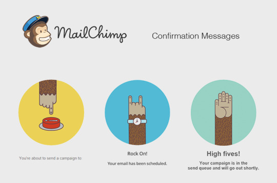
Mailchimp: Humanizing Technology
Mailchimp gives their platform a face of a chimp, their mascot named Frederick von chimpenheimer IV or Freddie for short pops up throughout their web interface adding humor, emotional connection with their users which is one of the aspects of good user experience. This humanization of technology adds fun to the otherwise dull and boring experience of managing your email marketing campaigns. The Mailchimp becomes more like a team member and less like a marketing automation platform to get your email marketing done.
Duolingo: Tearing Down Roadblocks
Learning any new language is challenging and overwhelming too, Duolingo is a language learning platform that pours gamification into your learning. Its lessons adapt to your learning style, Exercises are tailored to help you learn and review vocabulary effectively. Contrary to its competitors which have a rough and rigid signup process by deciding on a plan, pay before actually getting started. Each of these steps adds friction to the users, causing users to drop out of the process.
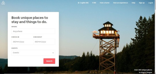
Airbnb: Holiday Lets, Homes, Experiences and Places
The user interface of Airbnb does two things exactly well: booking a place to stay and creating trust between two complete strangers. The home page makes it easy for the user to get started with the booking. The listing page is complete with a description of any additional fees that make it straightforward for any user.
The “Request to book” button sits right under this, being one of the brightest buttons on the page, invites users to click in order to finalize their booking. Airbnb has clearly thought out its copy and used engaging photos and videos to ensure that the interface conveys an emotional tone that helps create a sense of trust between strangers.
Dropbox: File storage and sharing are just the beginning
Dropbox has one of the most easily understandable interfaces by far, Having a file and folder organizational structure is easily recognizable for an average computer user. In terms of learnability, there is nothing too new to learn, it’s as easy as dragging and dropping files from your desktop to dropbox interface because of familiarity.
Dropbox friendly personality, created by lighthearted illustrations, helps the user feel familiar while using it. There is so much attention to detail, sequenced with color palettes, animated icons and wonderful illustrations that it manages to come across experimental, creative and consistent. Check it out!
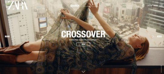
Zara: An ode to Hicks Law
A design principle that limits navigation choice and gives the user clear but restricted options. Zara’s website is a masterclass in simplicity, clean, intuitive and limited. The design idea behind it is that too many options will overwhelm your users. By offering fewer options, they feel confident and its navigation is also considered to be one of the best among eCommerce websites.
Conclusion:
These are just a few of our favorite Good Website Design Examples. Creating a usable, frictionless UI is an essential part of creating a positive connection with a user. When designing or evaluating an interface, it’s best to refer to usability guidelines set forth by Nielsen in order to build a product that provides the best possible user experience. As per me a good example of a user experience website should imbibe all of the following characteristics.
Should unify the experience Emphasize the contentDelivering a unique brand proposition Should be flexibleStreamline processes (by removing friction along the user’s path)
Read the full article
#bestwebsitebydesign#bestwebsitedesignawards#bestwebsitedesignecommerce#bestwebsitedesignforhotel#bestwebsitedesignforitcompany#bestwebsitedesignideas#bestwebsitedesignintheworld#bestwebsitedesignminimalist#bestwebsitedesignnews#gooddesignofwebsite#goodwebsitedesignexamples#goodwebsitedesignexamples2020#goodwebsitedesignfeatures#goodwebsitedesignideas#goodwebsitedesignlayout
0 notes
Last Seen Blogs

itsmegelai
Creative Nonfiction

blanchard76holme-blog
Untitled

edgeaddons
Microsoft edge addons free download at Edgeaddons.com

nadjibaa-blog
İsimsiz

the-basilik
Sans titre