#bisselldesign
Text
Work in Progress
A great winery is looking into burning their logo into the side of their boxes. Their current logo is based on a painting of Pegasus, one of their favorite prize-winning race horses. The complete image of the horse was not in the painting -- body parts were cut off. We took the existing image from the painting and created a complete one (filling in the missing parts). We think it's going to look great burnt into their boxes. We are all anticipating dramatic results. This is the first draft but it came out better than they expected.
0 notes
Photo
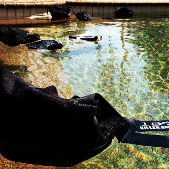
Had some fun at #chinoskatepark and now giving the #187killerpads a well deserved swim. #oldmanskatesesh #bisselldesign
1 note
·
View note
Text
July CAI-CV Quorum Magazine photoshoot
We took Madison Hsieh to help take photos for July's issue of Quorum Magazine. She is a budding photographer and designer/artist. We have seen great point of focus and balance throughout her photos.
With a little bit of art direction, her photos really hit the mark. She also was a trooper when the air conditioning went out and it was 110 degrees in Palm Desert.
We are excited to see how she uses her creative gifts in the future.
Thanks, Maddie, for all your help. Hope you learned a lot and continue to pursue your passion for photography.
0 notes
Photo

Great photo shoot at Indian Hills Community in #PalmDesert. #cai-cv #quorum #bisselldesign #photoshoot (at indian hills )
0 notes
Text
Su Refugio Vertical Banner
Su Refugio is a nonprofit organization helping orphans and widows around the world. They create jobs, build facilities for the community and safe places for children to be while parents are away or in prison.
We were excited to see the final banner ship to their offices just the other day. We designed it so it can be used as either an 8-foot hanging banner or a 3-foot tabletop sign. It came out great and they loved it.
You can check them out and help by giving to their ministry at [email protected].
0 notes
Text
Personal Touch
Sometimes we just need to take it old school. There are times we print out some new thank you cards and hand-write our thanks to those we have been able to work with.
It's great when you can come up with your own stationary on the fly. It gives a nice personal touch.
0 notes
Text
Down Town LA
It's always fun to catch up with our creative friend down in LA. We always take photos wile in town.
0 notes
Photo

Bissell Design Studios Inc. Up late tonight getting Monthly CAI-CV magazine finished up and connecting the SM sites to work properly. Good times. #bisselldesign #socialmedia #letters #bw
0 notes
Photo

You do what you can to get others to see the colors that their jobs will print. Metallic does not show up well in text. #pantone #color #bisselldesign #design
0 notes
Photo


So every time I go shopping at Trader Joe's I see this box and I have always had issues with the design. I picked out the Oatmeal box to show a better cookie box that was done right.
I always just go back to the basics. I think of it as my 1. 2. 3. process. What is the first second and third thing your eyes go to with any design or branding you find? Does your eyes bounce around the page not knowing what is the most important? What is the most important and why?
So these are some of the things I think about and for the Chocolate Chip Cookie box they made everything the same size and when I first saw it I had thought it was the back side of the box but then turned it over and found there was no title or headline so it must have been the front.
If I would have done this layout I would take the image from the back and place it on the front taking the body text on the left and put it under or to the side of the image some how working together with it. The tame would be first and the cookie would stand out as the main point. It helps to having the bag because they are cookies that come in a bag.
The back side could be what is on the front so they can place as much text to explain their selves as they need.
The Oatmeal cookie box speaks for itself. You know what that is and it even has the same thing on the back. That helps those stocking to not even think about what way they are putting it up. The info we want more of is all on the side where we can learn more when we want it. We go to the store to buy the cookie not the story about the cookie.
At least my basic 1. 2. 3. is a start to keep designs focus. Let me know your thoughts.
0 notes
Photo

I enjoy my running so that I can stay in shape but also do better in my work and family time. One of my favorite runs is to this beach on Oceanside. Because I have had some tight deadlines I have not been fortunate to get down there lately. #running #bisselldesign #stressrelease #oceanside #cassidybeach (at Cassidy Street Beach, South O, CA)
1 note
·
View note
Photo

@thatenglishguy1 working the corners. #bike #bmx #mlk #mlkskatepark #bisselldesign (at MLK Skatepark)
5 notes
·
View notes
Last Seen Blogs

sapfilter
Untitled

woodland-wonder
a wonderous wonderful creature of the wooden land
myhuiniverse
military wife

pinkberrypocky
pocky
sm-baby
🌺Cappy Mushy...🍄