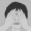
#but the imagery with the pocket itself and surrounding letters is what makes it feel significant
Text
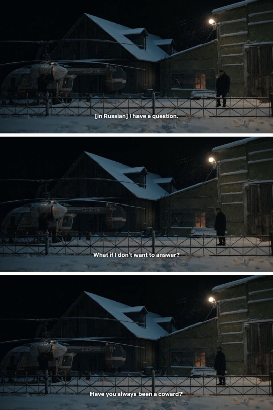

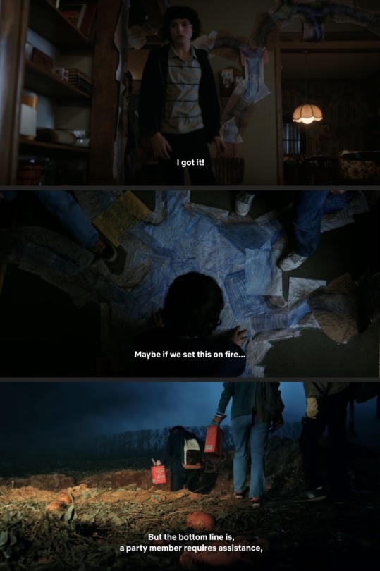

COWARD? STALLING? USED TO BE A HERO? HIDING THE ANSWER IN HIS POCKET!?!?!??
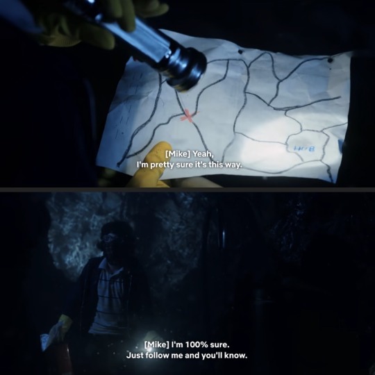
Funny enough, this is what we get 2 scenes later..


#byler#stranger things#mike wheeler#the piggyback#yuri is mike#stalling in telling his gf loves her#the entire audience used to see mike as a hero in the early seasons#now they don't see him that way... in fact the majority hates him#and he's hiding the answer that's related to the stalling...#in his pocket...#POCKETGATE#LETTERGATE#I can’t decide if the pocket is more of a metaphor of a letter existing and less that the actual letter is in that pocket..#like it could honestly be in his backpack too#bc he ‘never really unpacked’#but the imagery with the pocket itself and surrounding letters is what makes it feel significant#anyways mike is the stalling king#with these moments being nearly back to back 😭
131 notes
·
View notes
Text
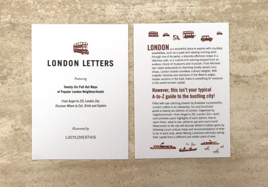
London Letters by Lucy Loves This
During a recent visit to London, I brought a series of pull out maps of popular neighbourhoods in the city, to use as research for this project.
The box contains 26 letters that explore where to eat, drink and explore in an area of London. The purpose of the map is to provide newcomers with the hidden gems of the city while Londoners can embrace a different and artistic point of view.


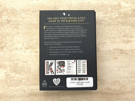
From just looking at the packaging, you can tell the designer considered the size of the maps. They aren’t too small that the information is hard to read but they aren’t too big that it’s hard to carry around the city. They are roughly A6 sized so they can easily fit into pockets and bags. By having a box for all the maps it ensures that they won’t get damaged when exploring London or get lost in bags. In addition, the packaging makes it feel like something that needs to be displayed on a shelf. On the side of the box, it has the name of the series of maps, resembling the design of a book. The hard and sturdy material used helps to portray the resemblance to a hard book cover.
The packaging has a dark grey background with pops of white and yellow. This creates a strong contrast that emphasises the name and the purpose of the maps to the viewer, ensuring they are aware of the key pieces of information. In addition, the packaging has contrasting typography. The name of the product uses a sans serif font while the description uses a serif font. By using different fonts it helps to create defined roles for each, allowing them to stand out as individual pieces of information. In addition, the contrast helps to create a visual hierarchy. The reader will immediately become aware of the key information, which is the name of the product. This is due to London Letters being larger and having a thicker weight compared to the summary of the product.
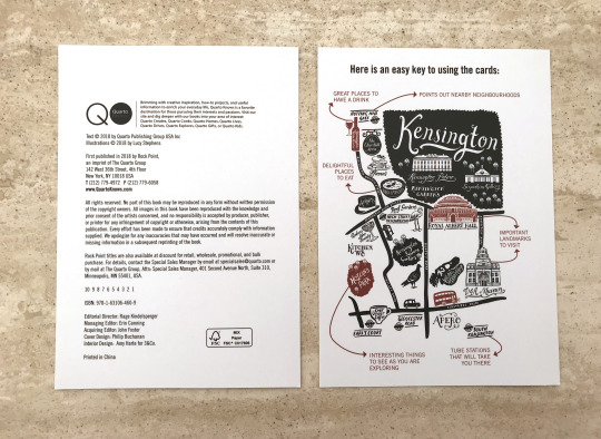
When you first open the packaging you have a few cards that introduce the product and how to use them. The introduction card uses a different typeface for the body copy (that looks like Helvetica Neue Light) and header. There is no clear visual identity because the maps alter between three different typefaces. This could confuse the viewer on the roles of all the typefaces and whether the important presented from them is important.
The key for the maps is unlike any typical key. It’s doesn’t use the typical symbols for restaurants, transport and landmarks. Instead, it explains the illustration and what each area of the maps actually means. The design of the maps and the key are visually interesting which ensures engagement with the audience.
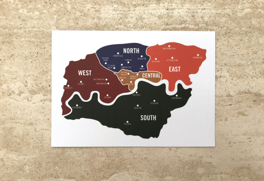
In addition, to the introduction and the key for the maps, this map was also included. This is a map of the different areas of London, it corresponds with the coloured patterns that run on the side of each map. It breakdowns which part of London each neighbourhood is situated in. This is a clever idea because it helps the viewer to visual what areas are close by so they can plan their day out accordingly.

The coloured patterns on the maps

The front cover of the map is the first letter of the neighbourhood. It combines different aspects of the area. By doing this it gives the viewer a greater sense of what to expect and what they could experience when visiting the area. In addition, the design is very visually interesting so it ensures the viewer's engagement with the area. This is due to the level of detail in the letter. It creates several focal points that draw the viewer’s attention to it immediately.
The use of a white background creates a strong contrast between the black and blue found in the letter and the pattern running alongside the map. This helps to emphasise the subject matter for the viewers ensuring they know what the first neighbourhood is about.

The map itself is visually interesting because of the detailed illustrations found on it. The illustrations help the viewer visualise the attractions of the area and what they can expect from the neighbourhood. They also make the map feel less static as it creates a greater sense of the atmosphere. The illustrations suggest the neighbourhood is very lively and has a large amount of nature and wildlife.
The map does feel harder to interpret compared to the key. The illustrations are in close proximity to each other so it is hard to tell what’s what. But having both the map and the key side to side does help to breakdown the map faster.
The information on the side uses visual hierarchy perfectly. The use of different fonts for the sub-headings, locations and the addresses helps the viewer navigate through the information and breakdown the key points. The contrast between the bold and italic fonts helps to define the roles and the information they present.
The hints of blue in the bullet points link back to the colour scheme of the map. This creates clear links to the area Angel is located in and back to the map of London.
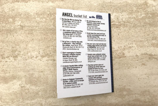
The last page of the map is a bucket list for Angel. It’s laid out in two equal columns with short bullet-pointed statements and the locations for each attraction. The statements use a bold font while the location uses an italic font (same typeface). This helps to define the roles and present what information is important. The bolder statements catch your eye first then leads the viewer to more information about it.
The design on the back page is very simple. There’s no fancy imagery or complicated layouts. There are two simple illustrations on the title of the page but they aren’t overly large. They feel like they’ve been pushed to the side so that the viewer is fully aware of the main focus. The information is just surrounded by plenty of white space which lets the viewer know the importance of the list. This is due to our natural associated with large amounts of white spaces.
Evaluation
I felt these maps was interesting because of the focus on typography and the illustrations. Both these features caught my attention and made me want to explore them further. I also felt this could be an interesting solution to my festival. I don’t intend to make 26 maps as I don’t have that amount of information nor would it be helpful to my audience. I thought I create 8 maps for each team appearing in my festival. So each map would be the same expect the information would be focused on activities and events based around each team. Therefore, if there was a meet and greet for a certain team or player they would be listed on the team’s map. I felt this could be a solution to my map because it would clearly divide the information to what specifically relates to my audience’s interest, ensuring engagement with the map and the festival. This idea sounds great but if games overrun the schedule would fall apart. My audience would be confused and lost if the information wasn’t relayed to them immediately. So I’m leaning towards making my map digital. It would offer live updates to the games and the schedule. My audience would be fully aware of any changes to the events. The app would also offer first access to events and activities as well as opportunities to interact with teams and players. This idea needs more work as I’m unsure how the interface would look or how I would create this. This is something I need to explore further.
I plan to sketch up layouts and how my app could look like. In addition, I plan to start considering how my map would actually look using my location’s map to gain the basic shape of the buildings.
1 note
·
View note
Text
Gestalt—Case Study
For the beginning of week 3, I chose to research into Gestalt: the theory of how humans perceive multiple objects and group them together. I will be constructing my display box this week, so I though gestalt was the perfect research area to understand how I can group unrelated objects together. Gestalt is split into five categories:
Proximity
Similarity
Continuance
Closure
Figure & Ground
Proximity
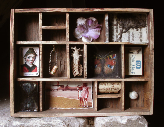
When a set of objects are within a close proximity from each other they are perceived as a group. On the contrary, when two or more objects are distant from each other relative to their size we see them as two separate objects. Proximity can be demonstrated in many different ways, but in terms of display boxes, an example of proximity being controlled to assort items is in this example by Mark Dion titled “Men and Game”.

“Men and Game” is an assortment of photographs which have been produced with various media. Each of the photographs have been kept very close to the others to make us perceive them as one large collective rather than many individual artworks. The effect of this is clear, it separates the viewing experience into two parts, from faraway and from close-up. From faraway, the photographs are visually grouped into one vast shape which has a fluid element to it. Although the edges are entirely made from square frames, being so closed together causes their edges to merge into a more complex outline. From close-up on the other hand, Each photograph can offer a unique experience when they can be viewed individually. This is where the second layer of proximity is implemented. Around the photographs are not only the frames themselves, but between these is more spacing to isolate each photograph from its surroundings, which compliments how they can each be viewed on their own along with as a whole.
Looking at my own project, proximity doesn’t just apply to assorting multiple objects. It could also dictate how more than one elements of a design function together. The main example of this that I have look at is in logo design. The logo I chose to demonstrate a good use of proximity is the Unilever logo. Although on the complex side of modernistic logos, I still find it to be an effective image for Unilever.

The logo consists of 24 icons, each reflecting something about the company, but because proximity has been controlled to keep all of the icons separated at the same time as being confined into the shape of the letter ‘U’, the logo can still be easily understood. This links to Mark Dion’s “Men and Game” example because the work can be viewed in two different ways depending on the distance from where you are. In the case of the Unilever logo, this changes with the size in which the logo is displayed.

The ‘3D Farms & Machine LLC’ logo is an example of bad proximity. It has a chaotic look which is driven by the irregularity within the logo. Good proximity should draw the eye to the main subject of the image, followed by the secondary information. In this logo, the structures aren’t in the same scale relative to each other, the spacing between them and the text varies a lot and there is random pockets of negative space which make the rest of the design feel cluttered.
I can also link proximity with an area I have already researched—typography. The technique of ‘kerning’ is controlling the horizontal space in between each letter. When kerning is done poorly, the letters have a disorganised look to them as our brains are confused as to which letters are part of the type and which are separate.

Although this can be taken advantage of in an interesting way, much like my block prints which were inspired by David Carson, when creating type which has the purpose of being readable, it is crucial that the kerning is controlled so we understand the type as a group.
Similarity

Objects that are similar to each other in terms of individual appearance are perceived as a group or pattern, as each object is just a translation of all of the others. Objects that otherwise would be one large group, can be perceived as smaller groups if there is a consistency with some of the objects.

Mark Dion’s “Cabinet of Marine Debris” illustrates this well. Because the items have been sorted in terms of their appearance (along with their position on shelves) they are perceived as smaller individual groups. This allows the piece to have a sort of hierarchy, in which the objects at the top appear to dominate those lower down. This is only made possible because of the way we perceive them to be separate from the rest as they are not visually similar.
I used this example from Mark Dion because it also shows a good use of proximity along with the similarity. Proximity has been controlled to keep a central balance. None of the objects visually over-power the rest as they are seen as groups rather than single elements. The shelves themselves could also be regarded as spacing because they are keeping the distance between each row.
The most common example of similarity being used to group items together visually is pattern-making. The essence of a pattern is the repetition of the same image to produce a seamless texture.
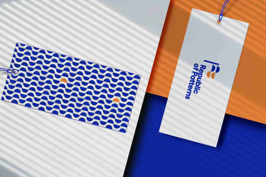
Patterns are often used in branding by implementing certain visual elements of the main logo and using similarity to create a seamless pattern. This is done to be able to carry the visual identity of a brand across multiple mediums without using the logo itself. It’s a technique used a lot when creating logo systems because humans recognised similarity and patterns so effectively.
The above example of the pattern “Republic of Patterns” uses for their logo system also shows how similarity can dominate other visual indications of groups. The two yellow semicircles stand out as their difference in colour draws our eye to them. This shows how breaking similarity can be used with purpose to draw our eyes. However, they are still perceived as a group with the rest of the blue semicircles as their shape remains the same.
Closure
When a shape isn’t present, but implied through negative space, it can sometimes become dominant over the positive space around it, making it the first thing someone sees. This happens because when there is enough visual information, we naturally replace any missing information with what we are familiar with.
This is harder to demonstrate with objects, but is extremely prominent in logo design. For instance, this ‘Dog’ logotype uses closure to imply the image of a dog along with the word.

Having the shape of the dog is enough for use to recognise this as it is familiar imagery. The legibility of the ‘dog’ type isn’t sacrificed however, which is what gives this logo two layers of interpretation. Although the dog itself is part of the negative space, closure has been used to make it the main focus of the whole logo.
Another example of closure being used in logo design, but in a different way, is in the WWF logo.

In this case, closure hasn’t been used to draw focus to a particular part of the logo, but it has been used to highlight the white parts of the panda without using any positive space. Pandas being black and white mean transferring this into a logo requires two colours, black and white. If you use black and white in a logo however, it wont be as versatile on different colours and backgrounds because one of the two colours will most likely blend more with the background. To combat this, the WWF logo uses only one colour—black and uses closure to imply the white space of the panda. Our eyes naturally follow the curves of the positive space to understand where the white space of the panda is and where it ends.
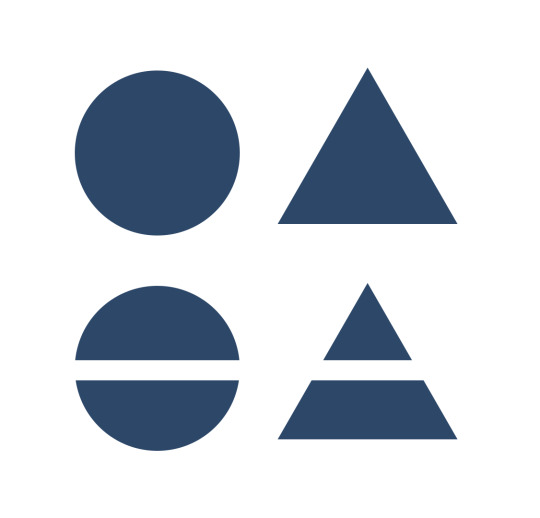
Continuance

The eye naturally moves from one object through another. When certain shapes have elements that line up such as lines or curves, although they may not be connected in terms of proximity or similarity, they can still be grouped by these elements are are aligned. To demonstrate this visually, when two dissimilar objects are placed beside each other with a considerable distance, they are perceived as two separate objects. However, when they are given a consistency between them which in this case is the horizontal line being cut from both, this groups them together.
A connection can be made between two separated objects simply through the negative space between then. An example of this being used in practice is with a logo made for Aerospace.com. Although the concept was never finalised and used, I still find this version in particular to be a very good use of continuance. The logo is constructed solely out of a triangle with an example of intersecting negative space. The negative space in this case follows one angle for the majority of its lines, which are the same angles as the left side of the triangle. Because of this, in relation to the rules I previously made on how to ensure I made an effective logo, this logo proves to work well.

The line sliced from the triangle links to one of the ways in which negative space can be perceived, when there is an inconsistency amongst an organised subject, the inconsistency becomes the most prominent feature. The theory of continuance in gestalt refers to how a viewer perceives matching angles, lines and shapes to be connected to each other, but breaking a connection causes more focus to be drawn to that part of the logo. Therefore, a viewer’s eye is taken from the bottom-centre of the logo, before travelling upwards and because of the increased negative space towards the bottom, the shape in that region resembles a subtle ‘blast off’ from a rocket to me. Further complimenting this is the movement of the viewer’s eye itself; the logo was made for a brand featuring space exploration as it’s main focus, so the upwards movement of the viewer’s eye caused by the continuance of the negative space signifies both a rocket lifting off and upwards progression.
Figure & Ground
The rule of ‘figure and ground’ refers to when the object and its surrounding area are separated as the eye can differentiate them enough. This is one of the most widely used techniques in a wide range of areas of art and design. From illustration, to logo design and even in film making, the foreground and background are always considered in a frame. Depending on how obvious the figure is from the ground can alter the ambiguity of an image. When the figure and background are clearly separate, this is referred to as ‘stable’ figure and ground.

Logos generally tend to feature stable figure and ground. The only time this wouldn’t be the case is when the negative space becomes part of the design to portray two different meanings at one.
‘Unstable’ figure and ground is when there is question whether the positive space is the main imagery or if it is in the negative space. Because of this, figure and ground is used in a lot of optical illusions to at first draw you to one image, before confusing you with another image.
The most famous example of a use of unstable figure and ground is in the ‘Vase/Heads’ illusion.
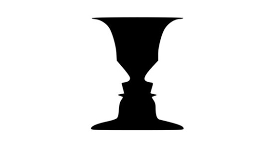
The positive space clearly shows a vase-like shape, so we interpret it as such. However, the ground or negative space is left with another, just as familiar shape of two mirrored faces. This creates an illusion of whether white is the foreground and black is the background or vice versa.
In terms of the display boxes I have looked at, the ‘figure’ element is with the objects themselves. The ‘ground’, being the box itself can play just as large a role in the design as the objects.
This display box by Lisa Temple Cox uses the box itself in a more subtle way. It is distinguishable from the objects meaning the objects stand out more as the main focus. On the other hand her piece “Ladies Entrance Cabinet” uses the ground (the box) more so as part of the design.

To accompany the connotations of the objects, the vivid red is used to signify richness. In this case, the figure and ground work alongside each other towards one emotion.
Looking Back
Without realising, I have already started to implement the rules of gestalt into my own work. I think this is because the psychology of gestalt is based on how humans perceive things, to what naturally looks good to me will be based on these same principles. My lost and found workshop series, specifically part 3 where I looked at the process of block printing by using David Carson as my influence, looked to challenge the conventional methods of how we use gestalt. For instance, David Carson helping to pioneer grunge type allowed for a more experimental approach to using proximity in type. He was one of the first cases where he would strictly overlap certain letters and ignore the usual rules of using consistent kerning.
My main aim of exploring the theory of gestalt was to explain how audiences perceive objects to further understand how I could create a successful display box. Now that I understand this, I can use the gestalt principles in my own work and manipulate them to give my own effect.
Moving Forward
Looking at David Carson as an example, his work carelessly opposes some of the fundamentals of gestalt. However, he does this on purpose because he doesn’t want his type to be read in the conventional way. This links back to his quotation “don’t mistake communication for legibility”. He understood how his audience perceive conventional typography and wanted to drastically challenge this with a completely new form of communication by using type in a unique way. When moving forward this is something I want to consider. Although I understand how gestalt works, this doesn’t mean I have to apply it to my work in any certain way. For example, if I want a disordered look to my work, i should embrace a poor use of gestalt as this will ultimately provoke confusion and carry the disordered look I hoped to achieve. On the other hand, I think it is important that an audience understands the message of my work. And the best way to do this is to critically consider how I use the five elements of gestalt in my work moving forward.
0 notes
Last Seen Blogs