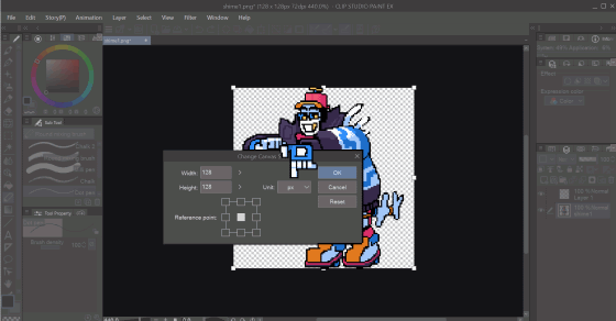
#canvas: 128x128
Explore tagged Tumblr posts
Visit Tumblr Blog
Explore Tumblr blogs with no restrictions, modern design and the best experience.
Last Seen Tumblr Blogs


Fun Fact
Celebrities use Tumblr as well.
Text
I was figuring out how exactly map pixel art works and so I filled the border of the smallest map size in creative and....ah.
#its VERY big#by my count it was 118X118 but the wiki says 128X128????#16384 blocks????? to make a picture Id need to place down 16384 blocks???? are you sure about that????#I was planning on making my pixel art with coloured wool since I wanted to make an automatic wool farm portion in my giant factory#how am I gunna keep it lit? i saw that torches dont show up on a map but i think it would be annoying to have to take away and replace 'em#coloured glass would make it so mobs dont spawn i think....but then I wouldn't need to have so much wool#also do I keep the canvas white??#I experimented with placing things on top of white VS putting it all on the same level VS building some parts up for highlights#oh shitttt wait and when im done with a picture id need to remove the blocks if I were to make another one....shiiit#hmmmmmmm#auuuuuu its 11pm on sunday i gotta shower and go to bed and go to work tmr! FACK!!!!!!!!!!!!!!!#the entire weekend i could play minecraft but it still wasn't enough#i just end up having more ideas than I can work on#and right now all my plans are very grand#this weekend I was working on covering a giant underground lava pool in glass then putting a water elevator to the surface#and I was gunna make a sort of floating tower to go over part of the elevator#and that would be my house while I explore this giant ass cave#i got started collecting materials since I think I want it to be deepslate and crimson stems n stuff#and throughout doing that I was smelting sandstone for a pixel art wall project and collecting quartz for my liminal building ahhhdslkfjslk#ok sorry had to get all that outta my system. I can't talk at my mum about MC anymore cuz I know I'm probs bugging the shit outta her#at least here I'm just talking to the void HELLO VOID ILU VOID#minceraft#personable
1 note
·
View note
Note
What art app do you use to make your fresh sprites???? :3
its always clip studio paint babyyyy I just make the canvas really tiny [for most of my sprites its 128x128]
wasn't going to animate fresh just have him being cute but I knew.. he'd look so cute rocking on his heels... [only roughs though. I aint polishing this HAHA]
145 notes
·
View notes
Note
hello ! first of all, i love your shimejis, they are so damn cute !!
i was simply wondering, what brush do you use for the lines ?? they just look so good despite the 128x128 px, i'm so impressed :o
Thank you so much for enjoying my shimeji(s) !! 💙 :D
I use the built-in "G-Pen" brush from CLIP STUDIO PAINT EX. Since the canvas size is super small, it's important that the brush I use doesn't have any texture. Non-textured brushes help avoid stray pixels when erasing mistakes. xD
I'm not the best at explaining my art process, but this is how I usually make my silly creatures! (Blocking hypercarries !! 💪)

Here is the final product! :DDD Do whatever you want with this xD

86 notes
·
View notes
Note
Sorry if this question is kind of vague but how do you choose a canvas size? The way people talk about canvas sizes in tutorials for pixel has always left me confused.
it basically depends on what you're trying to do. for my portraits i stay small around 100x100 - 150x150. the reason i do that is because i like the way i can stylize the features and keep everything else in proportion.
if you're doing an animated character you would probably want the canvas smaller (if its for a game). if i'm doing a full scene then usually somewhere around 200x200 - 300x300.
for my full landscapes i set my canvas at 1920x1080 in aseprite, then divide it by 5 (you can do maths in aseprite- pretty cool). that way my canvas blows up x5 to a desktop wallpaper size. that's my preference, you might prefer x3 or x6.

thats why knowing what you're doing makes it a bit easier. i would just ask yourself 'how much space do i need for my important features' and use that as a base- dont be afraid to just make the canvas bigger if you need to. i never stick to any standard canvas size or palette and just change things to get to my desired outcome
hope that helps :--3 !
edit: thinking about the question a bit more, it might be because people tend to recommend things like 32x32 or 64x64 or 128x128 and so on.
16x16 32x32 and 64x64 are generally quite standard for game stuff, i tend to do my tiles at 16x16 or 32x32. but if you arent working on a project they largely dont matter unless you want to practise such things. if youre interested in illustration like me (assuming you are cos youre in my inbox) it shouldnt matter to you really! just do whats comfy!
214 notes
·
View notes
Note
any tips for drawing in big resolutions?
i've been having a lot of fun experimenting with limited canvas sizes (100x70, 64x64, 32x32, 9x9 for some reason, and a 128x128) but the bigger ones scare me
so for larger resolution pieces i like to sketch the composition IRL on paper with a pencil. i’ll then shrink it then sketch over it in pixels!! if helps a lot imo :)
75 notes
·
View notes
Text

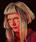
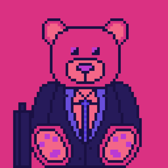
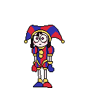
Now this, was just made earlier. A friend requested I draw his favorite Project Moon character Yan Vismok. I have never done canvases larger than 64x64 but I wanted to try nonetheless to how can I manage drawing on a bigger pixel canvas. Proud of this one as this is my first 128x128 pixelated art.
15 notes
·
View notes
Text
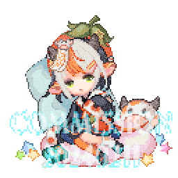
PIXEL ART COMMISIONS ARE OPEN - INFO UNDER THE CUT
Here are some examples of my art, from 2021 to 2025.


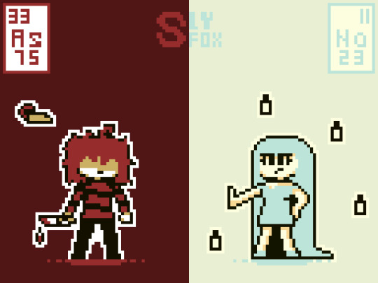


So, I go by SlyFox on other sites, just to clear that up. Prices! (paid through Venmo only) 32x32 pixels Sketch - $4 Lines - $6 Color - $8 Shading - $12 64x64 pixels Sketch - $6 Lines - $8 Color - $11 Shading - $15 128x128 pixels Sketch - $9 Lines - $13 Color - $17 Shading - $21
Prices are somewhat negotiable and if you have plans for a canvas size/idea outside of these I can negotiate for that as well. Message me here if you are interested
#commission#commisions open#taking commisions#art commisions#pixel art#pixel illustration#pixel graphics#aseprite#pixel artist#my art#artwork#digital art#art
5 notes
·
View notes
Note
hiii i really loved your sqq pixel art and i was wondering what software you used? or if you had any tips? i used to be really into pixel art and then stopped and lost everything but your piece inspired me to try it again!!!
thanks in advance! 💞
Hi! That's so wonderful!
I also did pixel art as a kid! And got back into it because I wanted to design a glass stained window for a SQQ's Minecraft cathedral. Don't ask lmao.
For your question; I use this android app:
It's very basic (Doesn't even have brush sizes) but for close up detailing it's very good!
Now tips!
-Use subtle colour differences for a softer look (Even if you dont really notice them from afar). Example:
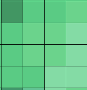
You don't quickly notice the centre squares being any different from the other mid green ones, but they are (Also a nightmare for colour blind people).
This is a section from SQQ's robes that doesn't attract the eye because it's very near a very dark shadow, and it still deserves some detailing! Your brain will still pick up that its not a solid block of colour, which will make anything look better and more polished. Speaking of shadows:
-Dont be scared of harsh contrast! Pixel art is very limited in what I call 'figure boundaries'. It's hard to give a figure a good silhouette and harsh contrasts are your best friends for that!
-Be very abstract on any designs, if you are using a small canvas.
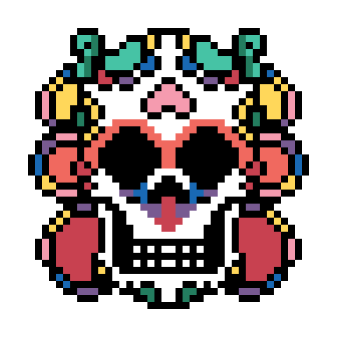
'Dancing God' was made on a 128x128 (for map art purposes) so I had very very limited space for certain details and too much for others. Example of too little space would be the hair crown; it's got 2 colours and no shading at all. An example of too much is the bottom trim of the robes; I had a solid block of G R E E N with some shading, it desperately needed something more.
Shout-out to my wife for suggesting a gradient!
-Don't feel shame for using refences. This is more of a general art tip (Not that I qualify as an artist lmao). References are the foundation of any work of art, don't let the haters tell you otherwise.
I can't actually think of anything more. Other than make saves and try out different ideas. Also, use a friend for criticism; both my wife and husband had to deal with my obsessed 'tism sending an update of progress every few hours lmao. Kisses to them they deal with so much of my shit <3
2 notes
·
View notes
Text
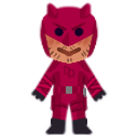
Bapy
Btw yes I know it's really bad quality, I made this on a 128x128 pixel canvas :'D
#its for shimeji purposes ofc#yk the thing that lets you have little guys run aeound on your screen#im making him & blindspot bc theyre my beloveds#possibly more than that too but each one is 40+ frames and idk how much energy i have#marvel daredevil#daredevil#matt murdock#matthew murdock#<3333333#dd's art
4 notes
·
View notes
Text

"so hows ur evening going" I have spent the past three hours building compass rose map art in Minecraft and everything you see here except for the dark grey background which was done with WorldEdit has been placed by hand. This is a 128x128 canvas. I'm still not done btw
32 notes
·
View notes
Text

Alllrighty ppl!! I got a couple new face expression animations of Damian Priest with the static pic I did portrait style in!! Each portrait sprite is done with a 128x128 canvas size on Piskel. Animations are below the cut!


#wwe#Damian Priest#wwe smackdown#wwe fanart#fan art#spriting#sprite animation#piskel#digital art#art#artist#world wrestling entertainment#2d animation#sprite artwork
2 notes
·
View notes
Text
Tutorial Dog
Hello Everyone.
So I've gotten a few questions about how I make the little animals so I thought I'd do a little process post.
Well the first step really is deciding an animal and a palette. For the animal I try to switch it up and not choose the same species back to back, and then I look for a reference. Usually I want a clear full body image to refer to. Next I pick the palette, which for the most part is random. Other than avoiding the same general colours as the previous animal, I use https://lospec.com/palette-list which has a nice selection of user submitted palettes that you can limit by number of colours. My only rule when selecting a palette was that it could not contain pure black, only off black if it was present.
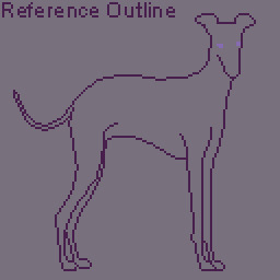
For the animal I've selected an Italian greyhound, which we'll refer to as Tutorial Dog.

For the palette I've chosen: Yana's Modernized Pokemon SGB.

I've numbered the palette to explain better. Next part of the process is making decisions about colours. For me, limited palettes make this step easier since I have fewer decisions to make. Generally 4 colour palettes contain a black, white, and two mid tones. The black and white colours are already decided as colour 1 and colour 4 in the palette, so the big decision is deciding which of the two mid tones is the dominant colour, this colour will cover the most area and be added last. Usually I'll decide this based on if the animal is predominately white toned or black toned. For Tutorial Dog I've decided black toned so the colours will be added in 1,4,3,2 order.
First things first, I do an outline of the general shape of the animal and I'll also use another colour to put the general position of the eyes. The eyes are the most important feature and you'll see me adjust them a few times throughout.
Next we add the shadow. These are the darkest areas and they provide the most detail. It's very easy to muddle the image here so I try to avoid laying down large dark areas. Note that I also place all pixels individually, and use a semi-random placement as patterns or dithering can make areas look too flat. This is also why the little animals are little, the canvas size is 128X128 pixels. This means on average a little animal takes around 4-6 hours to draw, depending on the detail; so drawing 1 a day is very achievable even on work days.
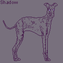
The light is added next using the same semi-random placement, it's best to add the light tone sparingly, using it only to highlight bright areas, as our non-dominant colour with fill out those areas later.

Now the non-dominant colour, this is the point where I usually have a small panic, as the image will always look awkward at this point. This is also the time where if I've made the wrong decision on which colour should be dominant I'll be able to tell. Lucky for me, that only occurred one time while I was drawing the little animals. You can also see here that I've made adjustments to the eyes but they still look a bit wrong.

Now for my favourite part, adding the dominant colour. This is the point where the whole image comes together. I'll usually use the fill tool here. You can also see I've made some adjustments to the nose with the shadow colour, as the detail was unclear.

Now we make final touches, this is the point where really I spend a bunch of time zooming in and out to see if the image looks right; fixing the eyes to make them more clear, reducing some of the shadow colour on the back legs to make it less harsh, and adding more shadow to the ears to give more detail.
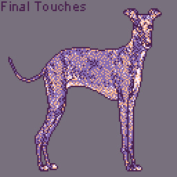
I'll give the animal a 1 pixel wide outline in pure black to help them pop out from the background. The backgrounds use the same palette, but the colours are tinted with a small amount of white so they won't interfere with the animal itself. Then the colours are faded together with dithering. Finally I add my signature and we are done.

Here's a little bonus animation of the process.
If anyone has questions or would like to suggest an animal for future drawings, please send me an ask.
Also any future tutorial or process posts will be found under the tutorial dog tag.
Thank you.
-Vin
10 notes
·
View notes
Text
Cleaned the old one up a little in actual 128x128, but I'm also trying to leave myself room proportionally on the canvas for the others (Jerk Rabbit is tall) so it came out looking about the same. Work on the others is next.
#tadc pomni#tadc fanart#pomni#the amazing digital circus#gooseworx#pixel art#if I'm being honest I think this one looks worse#but I could work it to death and still never be happy with it#so here it is#more to follow#probably
11 notes
·
View notes
Note
Hello! Your art is so inspirational! If you don’t mind sharing, I was wondering what you usually set the canvas dimension to for your artwork? Do you have a set favorite dimension ratio, or do you change it around depending on what you’re trying to achieve? I personally try to change it around, but I typically keep it 128x128 or below. I was just curious what your thought process on this is. Thank you so much, and thanks for sharing your art! #pixelart
for my landscapes i usually do 384 x 216 which scales nicely five times into 1920x1080
for my portraits or little studies i usually stay between 100x100 and 200x200. it basically depends how long i want to spend on a piece and how much energy i want to give nowadays. since a smaller piece is way way quicker to finish than something bigger. i also change the canvas during a piece if i think it would look better with more chunky pixels (lately ive found i prefer smaller)
thank you btw
74 notes
·
View notes
Text
COMMISSION OPEN
Pixel animated art(custom-made)
Basic canvas size:128x128
Export size:200%
File format: gif
one character + animated background's elements and charcter's expression
Limited: fixed action
You can told me what backgorund and elements you want!
*For more info send me DM!


2 notes
·
View notes
Text
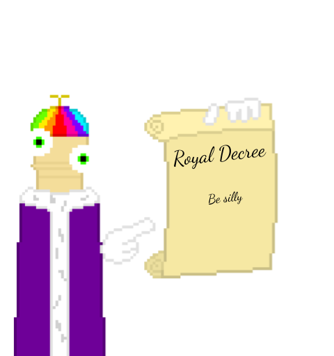
you gotta listen to the decree thems the rules also i didnt feel like trying to do pixel cursive on a 128x128 canvas
4 notes
·
View notes