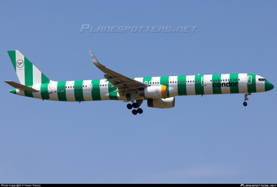
#condor striped livery
Text

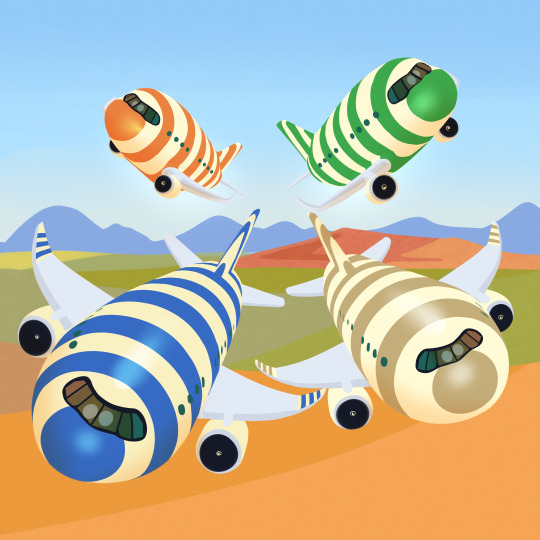
Inktober 12 what if Condor made a black n white striped a330 neo that looked like a cartoon burglar
151 notes
·
View notes
Note

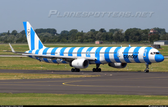
hi! saw this ad for Condor flights and I was wondering if their livery actually looks like this? Thanks in advance!
I completely get the confusion. I also didn't want to believe it at first. Yes, that is legitimately what the condor livery looks like now.

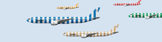
(They come in five colors.)
My highest-note post is actually about condor.
I do kind of love that they just lean into the stripe thing even when what they've come up with for a slogan is just literally nothing. I guess they realized the stripes speak for themselves.
59 notes
·
View notes
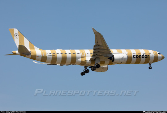
Text
i like the condor stripe livery genuinely

54 notes
·
View notes
Text
A Condor A321 suffers a bird strike at the worst moment, just before rotation
New Post has been published on https://petn.ws/9zWLG
A Condor A321 suffers a bird strike at the worst moment, just before rotation
A Condor flight suffered a bird strike while rolling for takeoff from Madeira Airport. Thursday, April 25 2024, Condor #DE1579 departed Funchal for a 4-hour flight to Leipzig. The flight was operated by an A321-211 with Yellow Stripes livery. The plane was 10 years old with registration D-AIAD. The plane was rolling for takeoff on […]
See full article at https://petn.ws/9zWLG
#BirdNews
0 notes
Text
Holy Deckchairs Batman! Condor reveals stripey new livery and brand image
Holy Deckchairs Batman! Condor reveals stripey new livery and brand image
Condor revealed perhaps the bravest new livery and brand image today we’ve seen in a decade. Actively opting to shun its previous looks and celebrate its leisure market, the airline has adopted a bold new, deck chair and beach towel inspired (I kid you not) livery.
No, it’s not April 1st, and we did have to double check, but condor have done away with the usual horizontal cheat lines and…

View On WordPress
#airbus#Airline#aviation#boeing#brand#branding#condor#design#featured#germany#graphic#leisure#Livery#New#New design#news#stripes
0 notes

Photo

Condor is the leading German leisure carrier that flies to holiday destinations. Its new livery conveys that in the form of bold, bright stripes.
0 notes
Text
German airline unveils candy-striped aircraft
German airline unveils candy-striped aircraft
(CNN) — Most airplane exteriors look more or less the same — white backdrop, bold lettering, company logo — but every now and again, an airline unveils a livery that stands out from the pack.
Take All Nippon Airways’ “Flying Honu” A380s, designed to resemble bright colored turtles, or the stunning indigenous art that adorns one of Qantas’ Boeing 787-9 Dreamliners.
German airline Condor is the…

View On WordPress
0 notes
Photo
Striped Condor appreciation post
149 notes
·
View notes
Note

was thinking about your condor review earlier today. got out of work and saw this. there they are. the stripes
Maybe all the people who keep saying it's dazzle camo are onto something because the green livery really does create a weird effect when you see it from below like this. I don't even dislike it.
#off-duty#transmissions#polairoids#condor#ty for the sighting! I feel like I keep summoning condor planes to visit my followers
45 notes
·
View notes
Text
No. 13 - condor
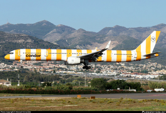
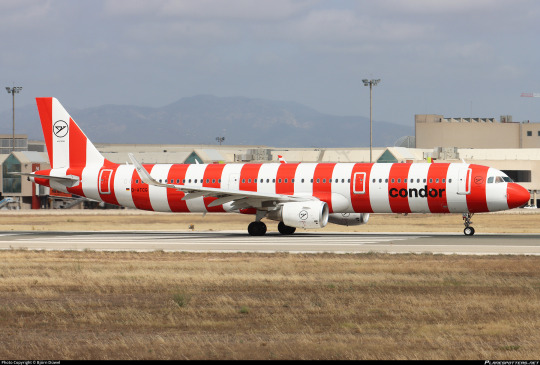
Condor Flugdienst is a German airline which operates medium-to-long-haul scheduled and charter flights with a specialty in flights from Europe to locations associated with vacation and leisure, such as the Mediterranean. They’ve been doing this for 70 years now, but in April 2022 they unveiled an overhaul of their livery. They would get a quick start on rolling it out, as they very confidently ordered 59 new planes to paint it on!
Oh boy.
The worst thing about this livery is that it’s not a thoughtless choice. It’s very intentional and very thought out, and that makes me sad because I’m about to angrily insult someone’s earnest hard work. In fact, they have an entire webpage dedicated to their inspiration and thought process. It will be the source of all images and quotes used in the remainder of this review.

Vacations are striped. And Condor is vacation.
Umbrellas, beach towels, ice cream shops..who doesn’t love them and the stripes will make you smile. They stand for easiness, freedom to experience the world, for the gentle breeze in your hair, sunshine on your face and now for Condor. In the future our fleet will also be in this new design. For decades, stripes have had meaning in our way of life. Timeless, elegant and recognizable – just like us.
I hate to say it, but they’re right (despite the fact that the paragraph is written pretty jankily). That’s a really clever association that’s clearly been thought out and is very recognizable. Like, in isolation I really like this idea. It just sucks that it’s very ugly?

I mean, it really doesn’t help that they picked a colorway that blends right into this picturesque island landscape for this particular shot, but I think what I’m angriest about is that despite committing to this absolutely vile candy cane look they didn’t even extend it to the wings and nacelles, which would have really hammered home the beach blanket look! Also, the black text is practically invisible and looks super out of place. It feels like they have this vision but they get so wrapped up in it that they mess up all the details and forget to make it good.
But the green is very purposeful, too.

Our five colors: Sunshine, Passion, Sea, Island and Beach.
Colors are not only found around the globe on holidays, they also stand for the fact that our world cannot be defined by a single color. Therefore our “Fleet” is looking forward to a new design, visibly striped and colorful in Sunshine (yellow), Passion (red), Sea (blue), Island (green) and Beach (beige).
I really really like these! This feels really nice, the rare airline livery with an explicit meaning that reflects what it doesand isn't just vague corporate jargon about how the color blue somehow reflects Scandinavian identity. If you’re going to do a jellybean livery this is how you should do it - every aspect of the livery swapped, visible at a glance, bright and exciting, everything intentional and explicit in its purpose.
I love the idea and it makes me angry that it looks hideous.
Like, it could be good. They could have tried horizontal stripes, maybe, even diagonal stripes, or some sort of wave pattern to them. I don’t know. With how much care was put into the idea surely someone could come up with something better than I have.

My friend @elyvator's (who took the above photograph) mother recently flew on a condor flight. There's something so surreal about seeing this big garish thing parked in a miserable soggy grey airport next to tarmac and a jet bridge and concrete.
You could miss the text entirely if you weren't looking for it. The stark white engine adds to the perception that the wing doesn't even look attached to the fuselage - like it's floating away. This doesn't belong here, and not in a good way. This isn't a plane that screams 'I might be on an awful rainy airport apron but I'm going to take you to a magical faraway beach', this is a plane as seen by someone still half-asleep after a party with a throbbing head while they're going downstairs to get a glass of water. And it had so much potential to not be that, to be something good. They came up with a great idea and then made every possible wrong choice in implementing it.
I can at least work up a bit of ironic affection for it, a sort of charm in its ugliness. It’s not the planes’ fault, and they wear it as well as they can. They’re still fundamentally cute to me. But that’s not what I’m here to judge. I’m sorry, airplanes. I'm sorry they did this to you.
This...this hurts me. It really does.
condor is getting Runway Runway’s first ever grade of F.
I love the thought process. I love everything about the idea. This could have been so fantastic if only they didn’t make it ugly.
AN ADDENDUM
I still agree with everything I have said here. However, I have since slightly reframed condor's standing. To fully understand how I feel about this airline, I recommend this as a sort of part two to this post.
#tarmac fashion week#grade: f#region: europe#region: west/central europe#region: germany#era: 2020s#condor#leisure airlines
58 notes
·
View notes
Note
i really love your review of condor's stripey look. it could have been good, if only it wasn't bad
Yes precisely. It genuinely comes so close to being so-bad-it's-good but it just isn't quite ostentatious enough to stick the landing, in my opinion. I still respect that they tried something, but...
I will say, having looked at a lot more pictures of the condor planes it also depends pretty dramatically on the plane. Like, just the jarringness of the design as well as the aesthetics. The brighter it is the more offputting it looks and it looks a lot better on longer planes that make the stripes look thinner.
But, like, it's just...they really needed to let this idea bake for a bit longer. It feels like they had this great concept and ran with the first implementation of it they could think up, and I just think I would have brainstormed it a bit longer! Designing liveries isn't my job but I just cannot get over how haphazard a lot of these feel!
It's worth noting that in a broader way a lot of liveries are designed solely in-house rather than by professional design firms. Like obviously there are exceptions, most notably Landor liveries, which I think are pretty widely beloved. There are a few stinkers in my opinion, like the 1989 and 2002 JAL liveries, which I have covered, and the 2001 British Midland livery, which I haven't, but a lot of the Landor designs out there are like...the few really good takes on Eurowhite. A couple of other Landor liveries I've covered are the 1996 VARIG livery, which I think is alright, and the SAS belly stripes livery, which I like a lot. I have a bunch of them in the queue, but anyway, the point I want to make here is: Lufthansa's design, save for the font, was apparently done in-house. Southwest used like five different design studios and extensive focus-group testing and I think the difference is really apparent. Like, you can definitely stumble on something good without hiring a professional - I seriously doubt Flair shelled out for outside help - but I feel like we can take a lesson away from this: outside designers can make bad or even terrible liveries, and in-house designs can be pretty good, but you really do probably want to slow down and have an actual design process where you get at least a bit of a second opinion.
Sorry for taking this simple ask and turning it into an essay, but I've really been thinking about this a lot - both the condor thing and the Southwest spending a fortune on making sure their new livery was good - and the sort of general phenomenon of not even trying that made me so mad I started this blog.
47 notes
·
View notes
Note

Absolutely no clue if you take asks, but I've just started following and it occurs to me I think I saw one of the goofy striped condor planes when I was out flying drones (safely and responsibly, away from the airport's restricted airspace) with friends. I legitimately thought it was an image corruption upon first reviewing the photos I took that day! So it's really funny that no, they are actually Just Like That. 🛩💙
Yeah, I love asks, especially ones that include pictures of airplanes spotted in the wild!
That is absolutely 100% a plane in the Condor Island colourway of the new livery. I love how many people have expressed something to the effect of having seen one of these and thought they can't possibly be real. They really do look a little like a default texture on a 3D model that's only half-loaded, especially the green ones.
Thank you so much for sharing your sighting!
21 notes
·
View notes
Note
Possibly an unpopular opinion but the striped condors are cute and you're just a little hater. (This is all lighthearted jesting ofc so don't take this seriously, but I stand by my opinion on the livery nevertheless.)
It's actually not really an unpopular opinion. I ran a survey about this!

Things to note when reading this: the sample size was 50, of whom 5 did not respond to the question and were excluded. Two other options were provided, 'I'm neutral' and 'it's boring', and nobody picked either. Some of these were free-responses but I grouped them in with the answer they best fit.
So you're actually in line with about one-tenth of a very limited sample. But I consider the opinion way less unpopular when you consider that almost nobody actually feels entirely one way or the other, and most have some degree of conflict or nuance. This livery isn't just divisive between people, it's divisive in people's own minds. And literally every answer got responses, with people even saying that they don't like it but think it's a good design, which is an option I actually put on there as a joke!
I legitimately find some charm in the condor livery, for the record. The fact that I've written a lot about condor isn't because of mindless hatred, it's because I think it's a livery that lends itself a lot to analysis. My opinion is not a kneejerk 'oh, it's ugly'. I have extensively discussed the fact that I think the concept is very good. My issue is not the fact that the planes have stripes and that makes them ugly, but the fact that the implementation is incredibly sloppy and poorly thought out and it just crosses a line from tacky chic to actually aesthetically displeasing. Things like the blank engines, the wordmark, and the almost arbitrary-seeming width of the stripes prevent this design from reaching its potential.
I do derive some charm from the condor planes. But I literally review airline liveries. I'm not going to pretend I don't think they're ugly. I'm reviewing the design, not the actual airplanes. In fact, I've given very low grades to designs I actually find somewhat visually pleasing.
I also just don't hate condor's livery as a livery. It comes up a lot because it's just useful as a tool of comparison and analysis. I don't actually think it's a failure as a livery despite being ugly, and it usually comes up when I'm comparing it favorably to other airlines. Me reclassifying it to a Z grade was really broadly formative to how I think of bad liveries. I see a lot of people in the tags talking about how they at least prefer it to liveries that are boring and, like, yes, that's exactly the point I've been making for a long time now!
I really do recommend reading the reclassification post to get my full reasoning on the subject, but my conclusion is literally that condor's livery is basically antiperfect.
I'm actually glad you sent an ask because I was otherwise going to make a post on the topic and this is just a much less forced segue into the topic. It's unreasonable to expect people to scroll back on my blog and read all of my older condor posts so I want my opinion beyond that one out-of-context funny post where I call the stripes ugly and cringe to be available upfront to people seeing this blog for the first time. I'm not a hater. I just think condor's livery is ugly. It's legitimately one of the most important liveries I've reviewed and I'll stand by that, and the fact that it keeps generating discussion is kind of proof of that.
(Well, no, I am a hater. But I hate Lufthansa. I started this blog specifically because I hate Lufthansa.)
21 notes
·
View notes
Last Seen Blogs

fantastripid
Tanpa judul

theravenpony
Pony Raven/Pup Lumfow

tylermenzel
Tyler Menzel

x-erce-s
anemic and sweet

stripwaxfloors9
Strip and Wax Floors