#creativitycentral
Text
Blog 12: Line Weight

Hello everyone! It’s nearly the end of summer, and with the weight of school drawing ever closer, I’d like to talk about the weight of… line art!
Personally, as an artist, I used to take pride in my uniform, unweighted lines that make my work look more consistent. Indeed, there’s nothing wrong with doing so, but over time, I started to experiment with using line weight in my art and found that it enhanced my work drastically! Thus, I’m passing these findings onto you!
Line weight can be unconscious depending on the pen you use for line art, both digitally and traditionally! However, there are specific ways that weight can be used to emphasize certain parts of your drawings. Areas that aren’t hit by a light source can have thicker lines to simulate shadows. Objects placed closer to the camera, and thus enlarged, can get thicker lines as well. Lastly, things pulled down on by gravity can have a transition from thin to thick lines going down (typically fabrics, like skirts!). These three examples are typically the main examples of varying pen weights being used.

Another common use, however, is shading as well! Familiar with crosshatching? Well, making thicker lines the farther down you go can also enhance its look! This kind of stuff can be found in traditional comics that depend on pure black in order to shade.
If this variance seems daunting, start off with some exercises to warm up to it! Make rows of straight lines that start off thin and end up thick. Make thick lines that end up thin. Make lines that pulsate between thin and thick (this can create a stitch or bead-like appearance!). Go crazy, and don’t be afraid to put pressure onto the paper!
Line art is more than just a more polished sketch, it can be used to make bold emphasis or smooth, flowing textures, and much of that can depend on your use of line weight! Make the most out of it! And with that, I’ll see you all next month!
7 notes
·
View notes
Text
Blog 6: Lines

Hello! I hope New Years has been kind to you all! Remember, new year resolutions aren't everything, as long as you try everyday! Today, I'm gonna be talking about a simple yet versatile part of art.
Whenever you're drawing, there's bound to be lines all around it (Unless you do... lineless art I suppose?). Lines are as crucial a part of an art piece as any other, and there's a ton of things you can do with them! I'll be explaining two ways you can spice up your linework!
Thin, clean lines may look nice, but a lot of the time, a constant mode of thickness can look boring! Not only does varying pen pressure exist, but adding thicker lines in strategic places can give an enhanced effect!
Thicker linework goes well in intersections, places that face away from the light, and dynamic shapes. This can help bring some weight or 3D feel to your art, and make it nicer to stare at all the details!
This method is used more in cartoons and abstract, and may apply to you! Recognize these symbols?

They're utilized in manga iconography and can denote emotions in a simple manner. Drawing lines in certain ways can portray certain emotions all the same! Take these examples.

The zigzags are sharp and progressively get bigger as they extend from the source of emotion. They express agitation and, if contrasted with a visibly calm character, can imply that they're holding something back. The squiggly lines instead bring a sluggish feel, coming from above in a way that resembles rain or sunken spirits. Rays can imitate the sun, and are associated with those happy, energetic feelings.
These are just two small ways that lines can make your art shine, but it's not all! Even so, you should try out these techniques and see if it clicks, or look more into the styles of linework. Try analyzing an artist you like, and see what about their linework really makes it look good! That's all for today, see you next month!
#creativitycentral#creativity central#lineart#art tips#art help#artist tips#new artists#illustration#drawing tips
9 notes
·
View notes
Text
Blog 5: Grey

Despite the colorful holidays as of late, I've been thinking about greys a lot lately, so I wanna tell how I use them to their fullest! Plus, it leads into some other interesting topics.
Most consider greys to be pretty plain colors, alongside black and white. They're totally unsaturated and convey an apathy other colors lack. But check this out!

What colors do these crosses look like? If you said yellow and grey, you'd be wrong I'm afraid. They're both a mute yellow placed on different colors, so how do they look so different? There have been many studies on how color, while scientifically a wavelength of light, can change drastically based on perception alone. Here's one article for a starter, I'd be happy to post about it on it's own, or maybe look for yourself!
In short, a color will look different based on other colors around it. What does this have to do with grey? Well, it means even if grey doesn't seem colorful, it can be in the right context!

This guys got a cool metal arm, which would be grey in reality, right? But with a palette of warn oranges, the neutral grey contrasts strikingly and looks almost to be blue! If you want cool colors in a warm drawing, but less saturation or contrast, neutral colors are your go to!

However, I want his arm to remain a neutral grey, so to uphold that, I have to actually make it a dull orange that's more cohesive and gives the illusion of grey. Strange, isn't it? I also use this tactic to make eyes more natural on someone, by making them a lighter version of their skin color rather than pure white! It still looks white that way through contrast, even if its not.
Of course, many cartoon styles will use pure saturated colors with little regards to the perception of color. However, there are just as many styles which I think would benefit heavily from learning this! In fact, this is what started to change my attitude on color as less of a definitive feature, and more like something malleable to convey atmospheres and emotions! Learning to master color perception will allow you to play around with them much more easily! So try to experiment with neutral colors in your drawings to convey colors they aren't actually are, and happy holidays! ❄️
#art tips#art help#artist tips#grey#gray#new artists#Illustration#creativity central#creativitycentral#drawing tips#color theory
10 notes
·
View notes
Text
Blog 9: Rubber Bands

Hello there! Exams have been coming up for many students and aspiring artists, and I wish you all good luck! Studying is hard, time consuming work, but here’s a trick that can help make your perspective drawings finish themselves quicker!
Or more specifically, foreshortening, the exaggeration of body parts that are closer than others! If you’ve seen dramatic scenes or pieces of people reaching out for the camera, they’re a perfect example of that!
But anatomy is complicated, let alone exaggerated anatomy. While this post isn’t necessarily about that, the use of rubber bands makes foreshortening a breeze!
The name is self explanatory, they look like rubber bands wrapped around a person’s limbs, or any sort of object if you’d want! You could also imagine if someone were to wear a striped sweater. These bands create 2D circles that will curve in various ways depending on the angle, and they grow as they get closer!

Keeping track of these segments can be a lot, but it’s much more straightforward than without! For instance, without perspective, the lines on an arm will be equidistant from one another. However, when foreshortening is applied, basic perspective causes the bands on the upper arm to bunch up closer together than the ones near the tips of the fingers, while also appearing smaller. Knowing this, it’s easy to check if the foreshortening you’re doing is just right!
And it’s not only for arms, this method can be applied to the whole body, from head to toe, which’ll leave you with a ring filled —but nicely drawn— example of foreshortening.
That’s it for today, so I hope you can now implement this trick into your own sketches! If you can, analyze your favorite show for foreshortening, and draw over them with rubber bands to realize their inner workings. As for me, I’ve got to get ready for exams myself, see ya!
4 notes
·
View notes
Text
Blog 11: Queer Animation

Hello everyone, and happy Pride Month! Though the month is coming to a close, the amount of content I’ve seen supporting queer identities did not cease or lessen at any moment, something that’s warmed my heart. So, I’ve decided to throw my own hat into the ring - or maybe, my own cap. This isn’t much of an art lesson, but to be supportive of queer identities is to recognize and take queer history into consideration of how one acts, and the history of queerness has influenced art in entertainment, especially as of recent.
With all the recent attention brought towards shows that are canceled or restricted due to queer inclusion, it may intrigue some to look into how entertainment became so restrictive. From the early to mid 1900s, the Hays Code was enacted in order to regulate what was and wasn’t allowed to be depicted in media. Among the several detrimental restrictions this brought out, it prevented the depiction queer people and behavior. On top of the majority opinion on queer identities at the time, this would oppress their expression heavily for a long time.
However, many people would fight against the Hays Code by depicting said banned material, and notable shows from the 1900s like Bugs Bunny and Tom & Jerry that, while not having queer characters outright, would depict fluid gender expression, drag, and implied queer relationships all under the guise of “comedy” in order to be published. It may seem irrelevant now, but this proactivity would be a domino in the trail of pieces that would lead to the progress queer media has reached today. The Hays Code was temporary, of course, and overpowered by the sheer amount of content against it, making its rules less and less meaningful.
In the late 1900s and early 2000s, shows like South Park and the Simpsons would begin to include queer characters outright. While some didn’t draw attention to their identities, some shows included homosexuality as a major theme, such as Queer Duck. It was in the 2010s that animation and entertainment would change the way they represented queer identities drastically, with protagonists and major characters being confirmed queer and in queer relationships on screen. The most notable shows that provided the stepping stone for queer expression include The Legend of Korra and Steven Universe, both with lesbian couples and the latter dedicating an entire episode to their marriage and kiss.
Despite the extreme positivity these shows brought on through their inclusion, it was and still is a prominent opinion that these shows were not confident enough in their expression, that true supporters would indulge more into queer expression in the shows they created. While things like queer baiting and such can be worthy of criticism, it’s important to remember the roots of queer depiction in entertainment and recognize the progress that’s been made as well. After the lesbian wedding in Steven Universe, the episode and show would be censored in various countries and reduce profits, causing Cartoon Network to end the series prematurely and force the crew making the show to close it on a half baked ending. When such a “small” example of queer inclusion is met with that drastic reaction, it means that unfortunately, not everyone can be satisfied just yet with what show creators are able to depict in their stories.
Even more recently, the cancellation of The Owl House after the reveal of a bisexual protagonist in a queer relationship and other queer characters caused it to end before it could even have a proper length third season, ending much sooner than Steven Universe while being much more ambitious with its inclusion. Of course, there are more fortunate examples of queer representation, but this show, alongside Pride Month, are what drove me to dive into the history of queer entertainment. The difference between now and then is great, and the fight for better queer representation shouldn’t be fought while slandering the predecessors to today’s shows.
On the topic of predecessors, while I have retold a bit of queer history in entertainment, this is just the top of the iceberg. Not only that, but talking to queer elders about their history will be way more meaningful than any research you do online, especially when they’ve lived through that history. With the internet, making these connections has never been easier! As Pride Month comes to a close, your support of queers should not. Learning as much as you can about the past from reliable sources and people will give you a much clearer perspective of the queer community and its progress over the years, and may improve how you consume, critique, and create queer media. With that, I’ll be wrapping up this already long enough post. Once again, happy Pride Month, and see you later!
#creativitycentral#creativity central#creativity#pride month#queer history#pride art#queer representation
2 notes
·
View notes
Text
Blog 8: Self Reference

Hello again! If you didnt read the last blog, I’m posting twice this month to make up for my absence in February! This one is about references, mainly ones of yourself
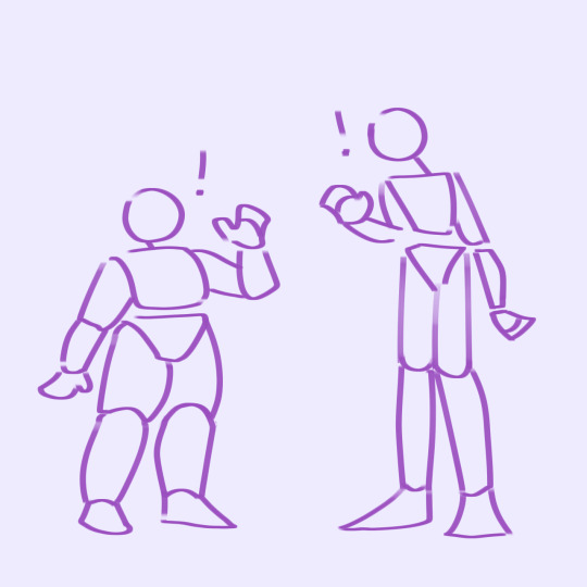
When using backward hands in my previous blog as an example, I thought to myself how exactly could one easily check that it was in the right direction in the first place? What if the pose wasnt a common one? It may not seem like the most obvious thing to do, it certainly wasnt for me, but using references of yourself is just as good as using references from other sources! In fact, it may be even better
Ever gone through the frustration of searching up really specific poses and being unable to find just the right photo? When taking a photo of yourself, you can be as specific or unusual with the pose as you want! Plus, no ones gonna see it, so low resolutions and awkward lighting wont matter if its just a general pose youre after. For poses involving several people, getting a friend to help or editing multiple photos of yourself works too!
It also works for other things, using yourself as a reference is just the beginning. Objects and animals could totally be referenced off of photos youve taken yourself. And, if youre a bit lazy like me, posing your hand whilst drawing can make for a quick reference too!
3 notes
·
View notes
Text
Blog 7: The Big Picture

Hello! I hope youre all doing well! First, let me apologize for a lack of posting in February. I had some technical difficulties and thus couldnt do so, but im making it up with two posts this march! now, onto our first topic
Whenever people look at your art, theyre not going to go over the details at first. It’s the big picture thatll grab their eye, so, contrary to what some beginners may think, the details arent the only thing to focus on.
Have you ever drawn a hand backwards, or uneven proportions, and only noticed way too far into the drawing process? That’s what looking at the big picture is for! Rather than focusing on a single part the entire time, back away and see how that part fits into the whole, if it fits at all. Zooming out on a screen or physically backing away from your piece can give you some perspective!
But sometimes, its hard to fix things. maybe theres something off about your art, but you cant pinpoint what, or you cant figure out how to fix it. That’s okay. Staring at our own artwork can give us a biased view of it, and we are often very critical of ourselves. So, take a break. Look away from your art for a while, distract yourself with a favorite tv show or snack. When you look at your art with refreshed eyes, it may be easier to see what was wrong and how to fix it. Sometimes, nothing was wrong at all! once again, starting over and looking at the big picture gives you just as much help as looking at the details.
Try to remind yourself to take a step back every once n a while, and see how the big picture really looks! It’s real important and ties into other topics such as the composition of poses and colors, so its best to make it a habit! Have a good day, and stay tuned for the second make up post!
#creativitycentral#creativity central#creativity#artist help#artist blog#art tips#artist support#drawing tips#the big picture
3 notes
·
View notes
Text
Blog 2: Learning Styles

Hello again! I hope you all are having a good October, and maybe some spooky spirit yourself! 🎃 I sure am, but onto the topic!
While this isn’t necessarily an art tip, I believe it’s a good reminder to start with, especially since this blog is all about learning! I’m sure some aspiring artists have taken at least one art class or seen plenty of tutorials online. Those tutorials, that rush you straight into what you NEED to learn first before ever progressing! Most commonly, people often say to start with realism or accurate proportions, and only then would you be able to start drawing how you want to. But, from what I’ve seen, that isn’t always the case. I myself am an example of it too!
The thing is, while setting a solid foundation based on reality is good on paper, it’s rarely fun or motivating. Just as people have different learning styles in school, there’s different learning styles in art, and different things that motivate us! One artist may start with figure drawing, another may replicate a style from their favorite anime, another may find joy in still life.
Art shouldn’t be a uniform path for you, and there’s totally no shame in progressing differently from other artists or wanting to draw different things! I, admittedly, have dabbled in realistic figures, but never did I force myself into it. I noticed that my moments with the most improvement were also the moments I discovered fictional media I absolutely adored. It was so fun to draw the same characters over and over, adopting aspects from their original style, or just using plain observation! This allowed me to practice while having lots of fun, and it was a natural process too. While I appreciate the things I’ve consciously done to improve myself, I could never be where I am without the things that inspire me!
This doesn’t mean that realistic art isn’t necessary at all, it’s near impossible to learn without some kind of outside reference or influence. But a balance of both rules and fun is needed, and that balance can be different for everyone. If you feel stuck in a rut, maybe frustrated or lacking motivation to work on your skills, throw it out of the window for a moment! Just go and draw whatever you want, however you want it. Because in the end, that’ll be the thing that actually gets you to draw and put some practice into your skills! If you’d like, feel free to share in the comments how you’ve learned your current skills, or how you’re currently learning right now! What’s done best for you, and what could you tell other artists too?
#creativitycentral#creativity central#art help#art tutorial#artist support#artist tips#drawing#illustration#art style#art styles#learning artist#new artist#learning styles#art tip#art tips
8 notes
·
View notes
Text
Blog 4: Shapes
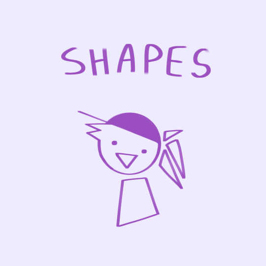
I can confidently say that shapes are one of my FAVORITE things about art! They’re also something very important in art, and with the right understanding, shapes can work very much in your favor!
By definition, a shape is just an outline, a geometric form. However, they often mean more than that! The common thing people learn is that round shapes give a fun, childish vibe. Rectangular shapes have strict, logical, supportive vibes, and triangular shapes are dynamic, energetic. There’s not much rhyme or reason for these vibes other than a bit of psychology and societal influence! However it can be noted that rectangles are associated with sturdy buildings, and circles relate to round, safe toys for children. The Bouba/Kiki Effect is sort of connected to this topic, and it’s something worth reading into, covering how shapes influence speech!
But enough about that, shapes have a history of portraying different emotions, different traits. Although, another reason I love them is for good old simplification! A lot of art is a simplification or alteration of reality, rather than the exact copy. Even then, basic shapes can be used as a foundation to build on top of with more complex structures!
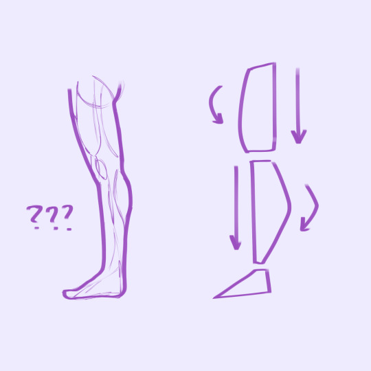
Take this diagram of a leg for example. While the left is definitely more accurate, could you draw it? I could draw it, only by copying a reference, but say you had to draw that same leg in a different position? A unique position, that has no reference at all? That’s where the right leg gets into action. The simplification into basic shapes lets you concentrate on other factors like positioning and dynamics, rather than the accuracy of it all.
Speaking of dynamics-- Have you noticed those arrows? There’s a contrast between the front and back of the thigh, as well as the shin. The thigh is round up front, the shins are round in the back. This, for the most part, follows which area has more muscle leaves the bony side flat. Now, this is far from accurate! The body is rarely perfectly straight, but what this create is contrast, and contrast creates dynamics and energy!
There’s many references for the simplification of body parts, so try to look into those, and create a guide of your own! Many people will structure things with many different shapes, especially when the complexity of their drawings differ, so tell me -or even show- what kind of shapes you use to sketch a body?
This goes back to the talk about how shapes influence language and emotions. A round, chubby character might give off more cheerful vibes than a tall, lanky one. This isn’t a guarantee, but all sorts of media follow this pattern! Using shapes will give the viewer an idea of who your characters are before they even do anything, as well as adding some diversity to your art! Same Face Syndrome is a common word in the art community, and I believe it isn’t so much of a problem that your characters may look similar, but more that there is an untapped potential in giving them designs that match their personality!
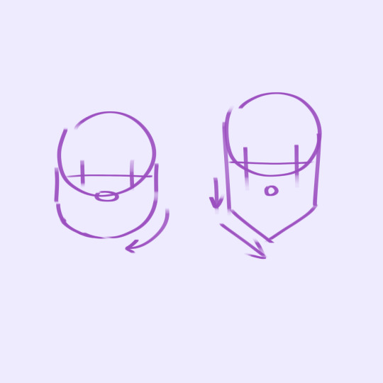
Another example of shapes, used specifically for head shape! Don’t worry if it makes your style feel out of place in some ways though. Sometimes, you’re just going to have to make your style more flexible to encompass a diverse amount of shapes, but you can still preserve something unique in them! Disney is a big user of language in shapes, but look into any 2d animation of your interest! There’s sure to be some usage of shapes if you look for it.
Here, I’ll use a personal example of mine. Take the currently developing psychological horror rpg, Doll Eye! (That’s a mouthful). Doll Eye’s main artist uses shapes to a significant degree, and this can be clearly seen in this main cast, while still preserving a style!
There’s Alfred, the protagonist, as well as a very average, cautious father who only wants a bit of stability. Kao, the support character! Although, he’s mostly known for being a big softie and pacifist, as well as a bit clumsy in his work as a guardian angel. Finally, the antagonist, Dr.Mystery. The use of dynamic, sharp shapes can signal how they provide danger for the main cast, but also that he himself is a morally grey character. There is a striking difference in their shape language, as well as their silhouettes, that shows their personality, rather than having it told for you. Despite this, it’s easy to tell they’re from the same artist. If you wanna, you can dig the internet for some of this artist’s older style, which gave everyone the same body type, same head shape, etc. While cute, it wasn’t nearly as expressive as his current style, and portrays the emotions he wants it to in a much better way!
Got any commentary? Questions? Future blog ideas? Feel free to share them! But until next month, enjoy Thanksgiving!
#art#art blog#artist support#art support#art help#artist help#illustration#art design#artist blog#new artist#doll eye#creativitycentral#creativity central
2 notes
·
View notes
Text
Blog 3: The Unknown

Happy Hallows Eve! I hope everyones having fun, and enjoying the halloween spirit! While I usually post monthly, I’ve decided to post a SPECIAL post for this spooky occasion!
With October has come an influx of horror and scary art, which is great! Tons of people find horror movies a staple of the genre, as well as a recent popularity of horror games in the past century. But how do they do it? Well, there’s a ton of different things that make horror HORROR, but I’ll be covering one for today! Do tell if you want more horror art content though, I’m happy to provide 👻
Just what do I mean by ‘The Unknown’ though? Not knowing something isn’t necessarily scary, its pretty common in our day to day lives. But I suppose I don’t mean just that, but instead, knowing too much, but still not knowing enough.
Like if you felt a breath behind your neck, and you turned around to find nothing there. There’s no danger, but you would’ve been better off not feeling it. Or, maybe you see a group of people, all wearing expressionless masks. Sure, maybe they’re nice folks! But how would you know? You only know so much, and maybe you wish you never encountered them at all.
It messes with your brain, and it becomes confused on whether whatever it’s looking at is a threat or not. A creepy vagueness.
It can be seen in a variety of medias, like writing! The words help guide us to what a character looks like and what they do. But skillful writers will actually omit certain details to leave them to your imagination. Some plot lines will tease at the reader, sending warnings after warnings that something is wrong, yet they reveal no threat. Not until you least expect it.
And in character design/presentation too! Hoodies, masks, well placed shadows, they all obscure a persons face, the thing most depend on to see if someone’s a danger or not. A lack of eyebrows (physically or artistically), hair that covers expressive parts of the face, these can also produce a similar effect. There’s plenty of scary content that takes advantage of the unknown rather than shoving blood and guts into your face.
So what do you think? Look into some horror content if it peaks your interest. My favorite genre is analog horror! Go see if you can incorporate The Unknown into your art. Omit the details in your work that let someone know if its a threat or not, right in the uncanny valley. More isn’t always better as they say! And have a great Halloween, I know I will!
#art#art tips#new artists#artist help#artist tips#creativitycentral#creativity central#illustration#horror art#horror art tips#artist support#art support#art help#happy halloween#happy hallows eve#halloween
6 notes
·
View notes
Text
Blog 1: Intro!

Hello from Creativity Central! I’ve planned this account for a while and am happy to finally start it up! I find the art community to be full of many great things, and want to give back to it in return. I want to provide a place where artists can stop by, collaborate, and support each other. Whether it be asking questions or providing answers and advice, every growing artist deserves it! (Yes, you can use the ask box or submissions for this!) And I myself will post my own art related thoughts and advice on a monthly basis.
But why end there? I’d like to say a bit about myself before anything else!
You can call me by the accounts name, Creativity Central, or CC for short! But I also go by Sahara, and use she/her pronouns! I’m a sophomore interested in the art/animation industry, and am a digital artist (But traditional art is always fun to do). When it comes to subjects of drawing, I really like cartoons and video games, as well as the horror genre!
I hope to have a good time here, and a good time seeing artists of all sorts making the best of their potential! And hopefully, you will too. Be sure to check out the CC website for more information if you’re interested! (Note: There will be no monthly post for September, as I’m posting this intro by then! However, feel free to send in questions, advice, art, etc! The next blog from me will be in October)
#creativitycentral#creativity central#artist support#artist help#artist tips#art tips#art support#new artist#drawing#illustration#art blog#first post#intro#intro post
1 note
·
View note
Last Seen Blogs

redacted-bkdk
[REDACTED] — a BKDK SCP Zine

iito-starain
Hey There.+*
spongelungs
Radio For The Dimensionally Challenged

macarenareynolds
All we have is what's left today