#cssproblems
Explore tagged Tumblr posts
Visit Tumblr Blog
Explore Tumblr blogs with no restrictions, modern design and the best experience.
Last Seen Tumblr Blogs


Fun Fact
69% of Tumblr users are millennials.
Text
Troubleshooting External CSS: Common Issues

Introduction
Welcome to our in-depth exploration of troubleshooting common issues with external CSS. As web developers, we understand the pivotal role that external CSS plays in shaping the visual appeal and functionality of websites. This guide aims to address prevalent challenges that developers encounter when working with external stylesheets and provides practical solutions to enhance your troubleshooting skills.
Common Issues with External CSS
External CSS files are fundamental in styling web pages, but they can also be a source of frustration when issues arise. Understanding and resolving these common problems is crucial for maintaining a seamless user experience. Let's delve into some of the most frequent challenges developers face: - Incorrect File Paths: One of the primary stumbling blocks is specifying the correct path to your external CSS file. Ensure that the file path is accurate and that the file is accessible from the HTML document. - Browser Compatibility: Different browsers may interpret CSS rules differently, leading to inconsistencies in styling. Stay informed about the latest browser updates and use tools like caniuse.com to check for compatibility issues. - Typographical Errors in Code: Small typos can have a significant impact on your stylesheet's effectiveness. Regularly review your code for syntax errors, misspellings, or misplaced characters that may disrupt the styling process. - Importance of Order in Linking Stylesheets: The order in which external CSS files are linked can influence styling. If there are conflicting styles, the browser will prioritize the last defined rule. Create a logical order for your stylesheets to avoid unexpected results. - Caching Problems: Cached files can lead to outdated styles being applied. Consider versioning your CSS files or using cache-busting techniques to ensure that users receive the latest styles. - Network Issues: Slow or disrupted network connections can result in delayed or incomplete loading of external stylesheets. Optimize your files for performance and consider using Content Delivery Networks (CDNs) for faster delivery. - Responsive Design Challenges: Ensuring consistent styling across various devices and screen sizes can be complex. Utilize media queries and responsive design principles to create a seamless user experience. - Effective Debugging Techniques: Mastering debugging tools is crucial for identifying and rectifying CSS issues. Use browser developer tools to inspect elements, check applied styles, and trace the source of problems. By addressing these common issues, you can enhance the reliability and performance of your external CSS, providing a more consistent and enjoyable experience for users across different browsers and devices.
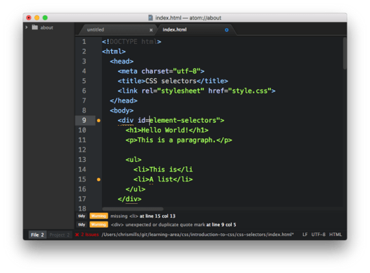
Addressing Incorrect File Paths
One of the frequent stumbling blocks in external CSS troubleshooting is dealing with incorrect file paths. Incorrect paths can prevent the browser from locating and applying the desired stylesheet, leading to styling issues. Let's explore ways to identify and address this common challenge: - Double-Check File Paths: Start by carefully reviewing the file paths specified in your HTML document. Ensure that the paths are accurate and reflect the actual location of your external CSS file. Use forward slashes ("/") for directories in the path, even on Windows systems. - Absolute vs. Relative Paths: Understand the distinction between absolute and relative paths. Absolute paths provide the full URL to the file, while relative paths indicate the file's location in relation to the HTML document. Choose the appropriate path type based on your project structure. - Directory Structure: Maintain a well-organized directory structure for your project. Place CSS files in a dedicated "styles" or "css" directory. This practice simplifies path management and reduces the likelihood of errors. - Case Sensitivity: Be mindful of case sensitivity in file paths, especially on servers that distinguish between uppercase and lowercase letters. Ensure that the casing in your HTML document matches the actual file and directory names. - Use Root-Relative Paths: Consider using root-relative paths by starting the path with a forward slash ("/"). This ensures that the path begins from the root directory of the web server, eliminating ambiguity. Additionally, it can be helpful to use developer tools in browsers to inspect network requests. Look for failed requests or 404 errors, which often indicate issues with file path resolution. By addressing incorrect file paths promptly, you can streamline the styling process and minimize disruptions to your web project.
Ensuring Browser Compatibility
Browser compatibility is a crucial aspect of web development, and discrepancies in how browsers interpret CSS can lead to styling inconsistencies. To ensure a harmonious user experience across various browsers, it's essential to address and overcome compatibility challenges: - Stay Informed about Browser Updates: Browsers regularly release updates that may include changes to CSS rendering. Stay informed about the latest updates for popular browsers like Chrome, Firefox, Safari, and Edge to anticipate and address potential compatibility issues. - Vendor Prefixes: Some CSS properties may require vendor prefixes to function correctly across different browsers. Include prefixes such as `-webkit-`, `-moz-`, or `-ms-` for specific properties to ensure compatibility. Keep an eye on the necessity of these prefixes and update them as needed. - Testing on Multiple Browsers: Test your website on multiple browsers to identify and address any rendering discrepancies. Use cross-browser testing tools or virtual machines to simulate different browser environments and catch compatibility issues early in the development process. - Use Feature Detection: Implement feature detection techniques to check if a specific CSS property or feature is supported by the user's browser before applying it. This ensures graceful degradation or progressive enhancement based on the browser's capabilities. - Browser-Specific Stylesheets: In some cases, creating separate stylesheets for specific browsers may be necessary. This allows you to tailor styles to the unique rendering behaviors of each browser, providing a more consistent appearance. - Compatibility Tables: Refer to compatibility tables, such as those available on MDN Web Docs, to understand the support level of CSS properties across different browsers. This information can guide your decision-making when choosing which features to implement. By proactively addressing browser compatibility challenges, you can create a more inclusive web experience for users, regardless of their choice of browser. Regular testing and staying informed about best practices contribute to a smoother development process and increased user satisfaction.
Avoiding Typographical Errors in Code
Typographical errors in your CSS code can be elusive yet impactful, causing unexpected styling issues on your website. To maintain a clean and error-free stylesheet, consider the following strategies for avoiding and rectifying typographical errors: - Code Review: Regularly review your CSS code to catch typographical errors early in the development process. A fresh set of eyes can often spot mistakes that might be overlooked during the coding phase. - Linting Tools: Integrate linting tools into your development workflow. These tools analyze your code for syntax errors, stylistic inconsistencies, and typographical mistakes. Popular linting tools include ESLint for JavaScript-based styles and Stylelint for CSS. - Text Editors with Spell Check: Utilize text editors that offer spell-checking functionality. This can help identify misspelled property names, values, or selectors as you write your CSS code. - Consistent Naming Conventions: Adhere to consistent naming conventions for your CSS classes and IDs. This not only improves code readability but also reduces the likelihood of typographical errors when referencing styles in your HTML document. - Copy-Paste with Caution: Exercise caution when copying and pasting code snippets. Ensure that the pasted code aligns with the formatting and syntax of your existing stylesheet to prevent typographical errors from creeping into your codebase. - Validation Tools: Use online validation tools to check your CSS code for syntax errors and typographical mistakes. These tools provide instant feedback and can be instrumental in identifying and resolving issues quickly. Typographical errors can have a cascading effect on your entire stylesheet, impacting the visual presentation of your web pages. By implementing these practices, you can significantly reduce the occurrence of typographical errors and maintain a more robust and error-resistant CSS codebase.
The Importance of Order in Linking Stylesheets
The order in which external CSS files are linked in your HTML document plays a crucial role in determining the styling hierarchy and appearance of your web pages. Understanding and carefully managing the order of linked stylesheets can help prevent conflicts and ensure a consistent and intended visual presentation: - Cascade Principle: CSS stands for Cascading Style Sheets, and the cascade principle defines the order of importance when multiple style rules apply to the same element. Styles defined in later stylesheets take precedence over those defined earlier. Be intentional in the order of your linked stylesheets to control the cascade effectively. - Specificity: The specificity of a style rule determines its strength in influencing an element's appearance. Styles defined in a more specific selector take precedence over less specific ones. If you have conflicting styles, consider the specificity of your selectors and adjust the order accordingly. - Overriding Styles: Styles defined in later stylesheets can override conflicting styles from earlier ones. Be mindful of this behavior, especially when using third-party libraries or frameworks that may introduce their own stylesheets. - Reset and Normalize Stylesheets: If you use reset or normalize stylesheets to establish a consistent baseline across browsers, ensure they are linked early in the document head. This sets the foundation for subsequent styles to build upon. - Conditional Stylesheets: In some cases, you may need to conditionally load different stylesheets based on factors like browser type or version. Utilize conditional comments or JavaScript to manage the inclusion of specific stylesheets based on these conditions. - Table of Stylesheet Order: Create a table documenting the order of your linked stylesheets, including their purpose and any specific considerations. This can serve as a reference for you and your team, ensuring consistency in your development workflow. By recognizing the importance of order in linking stylesheets, you can exert greater control over the visual presentation of your web pages and avoid unintended styling conflicts. Consistent and deliberate management of stylesheet order contributes to a more maintainable and predictable styling process.
Dealing with Caching Problems
Caching is a crucial aspect of web performance, but it can sometimes lead to challenges in external CSS files. When browsers and servers cache stylesheets, it improves load times, but it can also result in outdated or missing styles for users. Effectively managing caching issues is essential for maintaining a dynamic and consistently styled web experience: - Versioning CSS Files: Incorporate versioning into your CSS file names or paths. This ensures that when you make updates to your styles, browsers recognize the changes as distinct files, prompting them to fetch the latest version instead of relying on cached copies. - Cache-Control Headers: Set appropriate Cache-Control headers on your server to dictate how browsers should cache your stylesheets. Configure the max-age directive to specify the duration a resource is considered fresh before it needs to be revalidated. - Cache Busting Techniques: Implement cache-busting techniques to force browsers to fetch a new copy of your stylesheet. This can involve appending query parameters, such as a timestamp or a unique version identifier, to the stylesheet URL. - Asset Versioning: Consider leveraging build tools or task runners to automatically append a version hash to your CSS file names during the build process. This ensures that changes to your styles trigger a new version, preventing caching problems. - Use Content Delivery Networks (CDNs): Employ CDNs to distribute your stylesheets globally. CDNs often come with built-in caching mechanisms, optimizing delivery speed. However, be mindful of the CDN's cache settings and adjust them according to your project's needs. - Hard Reload: Instruct users to perform a hard reload (Ctrl + F5 or Cmd + Shift + R) to bypass the browser cache and fetch the latest version of your styles. Educate your users about this option to help them experience your website with the most up-to-date styles. Caching problems can impact user experience, causing styles to appear outdated or missing. By implementing these strategies, you can effectively manage caching and ensure that users consistently enjoy the latest and intended styles on your website.
Overcoming Network Issues
Network issues can significantly impact the loading and application of external CSS files, leading to delays or incomplete styling of web pages. Addressing and overcoming these network-related challenges is essential for delivering a seamless user experience: - Optimize CSS File Size: Reduce the overall size of your CSS files by minifying and compressing them. Smaller file sizes lead to faster downloads, especially in scenarios with limited network bandwidth. - Async and Defer Attributes: Utilize the async and defer attributes in the script tag when linking external CSS files. These attributes control when the browser fetches and applies the styles, minimizing render-blocking and optimizing the loading process. - Lazy Loading: Implement lazy loading for non-essential stylesheets. Load critical stylesheets first, and defer the loading of less crucial ones until after the initial page load. This can significantly improve page load times, particularly for users on slower networks. - Content Delivery Networks (CDNs): Leverage CDNs to distribute your stylesheets across multiple servers strategically. CDNs help mitigate network latency by serving files from servers geographically closer to the user, improving overall performance. - Progressive Enhancement: Design your website with a progressive enhancement approach. Ensure that essential content and styling are delivered first, allowing the page to be functional even if certain styles take longer to load. - Responsive Images: Optimize and implement responsive images to prevent unnecessary data transfer. Use the appropriate image formats and sizes for different devices and screen resolutions to reduce the load on the network. - Network Throttling in DevTools: Use browser developer tools to simulate various network conditions. Throttle the network speed to test how your website performs under slower connections, identifying potential issues users might encounter in real-world scenarios. By proactively addressing network issues, you can enhance the loading speed and reliability of your external CSS files, providing a smoother experience for users across diverse network conditions and devices.
Tackling Responsive Design Challenges
Responsive design is integral for creating a consistent and user-friendly experience across various devices and screen sizes. However, achieving seamless responsiveness can pose challenges that demand careful consideration and implementation. Let's explore effective strategies for overcoming responsive design challenges: - Media Queries: Implement well-crafted media queries in your CSS to define styles for different screen sizes. Utilize breakpoints to adjust layouts, font sizes, and other styling attributes based on the device's characteristics. - Viewport Meta Tag: Include the viewport meta tag in the head of your HTML document to ensure proper scaling on mobile devices. This tag helps control the initial zoom level and viewport width, enhancing the responsiveness of your design. - Flexible Grid Systems: Design flexible grid systems using CSS frameworks like Bootstrap or Flexbox. These frameworks provide a grid-based layout that adapts to different screen sizes, simplifying the process of creating responsive designs. - Relative Units: Use relative units like percentages and ems instead of fixed units like pixels. This allows elements to scale proportionally, accommodating varying screen dimensions and enhancing the flexibility of your design. - Images and Media: Optimize and implement responsive images by using the max-width property to prevent them from exceeding their container's width. Consider using the picture element or the srcset attribute to deliver different image sizes based on the device's screen size. - Testing on Multiple Devices: Regularly test your responsive design on a variety of devices, including smartphones, tablets, and desktops. Emulators and real device testing help identify potential layout issues and ensure a consistent user experience. - Cross-Browser Compatibility: Verify that your responsive design works across different browsers. Test on popular browsers like Chrome, Firefox, Safari, and Edge to address any compatibility issues that may arise. Read the full article
0 notes
