#deanjohn readers: go read Matryoshka Dolls if you haven't already it's amazing
Text
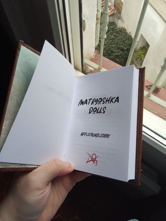
Ficbinding: Matryoshka Dolls
I got out of my reading slump long enough to read Matryoshka Dolls by Applecrumbledore, and I enjoyed it so much I bound it.


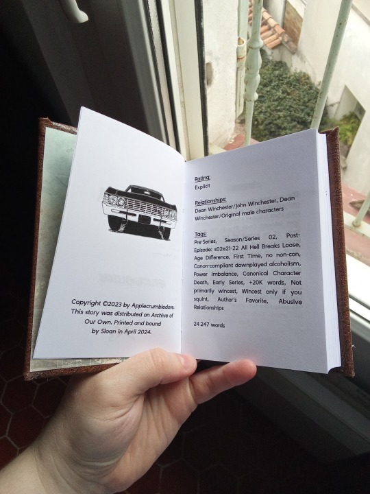
The fic: Supernatural, Dean/John, rated E, 24k
I don't read a lot of Dean/John, but this fic was an excellent surprise. Its tough subject is very well-handled. Sam has a place in it too, and it explores grief and guilt really well. Also it's hot (I can't find the scenes between Dean and John titillating, but there are others).
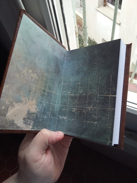
The bind: I try to match the story's tone with the materials and colors I use. I almost bound this in black pleather on account of how dark it is, but at the last moment I chose brown, as a callback to John's leather jacket. I used green for the headbands and bookmark to mimic Dean's eyes. That way, the color representing John surrounds the one representing Dean, to call to mind John's control over his son.
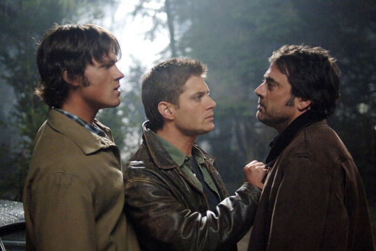
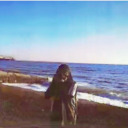
The jacket in question is worn by Dean in early seasons, it was John's and he gave it to him (and even at 26 it looks too big on him 🥺). You can see it in this happy family photo:
What I like about this one:
The typesetting: it's quite sober (to fit the story), but I spent some time on it. I downloaded 20+ fonts before I settled on one. The Impala looks hella good. The drop caps are nice: they're frames instead of decorations, which is neat when the two characters in your story are deadlocked in a situation they love/hate and can't escape. It's also why I chose two parallel lines to highlight the years breaks. They're not much, but they felt more fitting than a single decoration.

The trim: I'm slowly taming my guillotine. This is the first project I used pieces of board as "cushions" when trimming the text block, so it's even despite the sewn spine being thicker, and it worked a treat! Sure, I'll have more grey board waste, but I was so fed up with uneven cuts and warped textblocks that I was about to sell my guillotine and give up on trimming. Look at this beauty. The edges are so smooth, even after rounding the spine.
The margins: they're perfect. I didn't cut too much or not enough.
The rounded spine: that's really my thing. I'm always disappointed when I do a straight spine, it makes the book look boxy, so I'm honing my craft on round spines. This one turned out great.
What I like less:
The cover material: it's not the first time this comes up in this section, because this material is from my stock of too-thick pleather that's not made for bookbinding. It made the corners too thick, but otherwise it behaved well. I can't afford not to use this material I already have, so I knew what to expect and I don't regret choosing it for this project. It's fine.
The endpapers: they're pretty enough by themselves, but I couldn't find ones that truly fit the story or would add meaning. Truth is, I have a very hard time finding endpapers. If someone knows of a site to buy some (accessible from France and not crazy expensive), I take suggestions.
Characteristics:
Fonts: The Blackmore (title), Act of Rejection (author name), ZT Gatha semibold (text)
Materials: fake leather, 80g/m² copy paper, pre-made headband and synthetic ribbon.
Feel free to ask me more about materials and fonts, it won’t bother me at all to tell you what I used, but I’m too lazy rn to write it in this post that’s long enough already.
#deanjohn readers: go read Matryoshka Dolls if you haven't already it's amazing#bookbinding#ficbinding#my bookbinding#spn#I'll never stop taking pictures at the window over my neighbor's courtyard btw that's where I get the most light
22 notes
·
View notes
Last Seen Blogs

cavinabadi
Jasa Bongkar Rumah Tua/Beli Bongkaran Bangunan

bur-oak-resource
Untitled

makeitraw21
Untitled

house-interior-design-in-dubai
Untitled