#design302
Explore tagged Tumblr posts
Visit Tumblr Blog
Explore Tumblr blogs with no restrictions, modern design and the best experience.
Last Seen Tumblr Blogs


Fun Fact
After the announcement of the deal with Yahoo!, there were 170K signatures of unhappy Tumblr users petitioning to prevent the sale in 2013.
Text
302 Blog week 2
This week marks a significant milestone as I embarked on my first substantial week tackling the assignment. Initially, I grappled with apprehension due to the complexity of my chosen topic. However, as the second week unfolded, I gained confidence, mainly attributable to my conversation with Gabby. Her insights and guidance on my progress within the Miro board were instrumental in boosting my assurance. Additionally, Thursday's presentation, showcasing the achievements of previous students, provided a clear benchmark for the standards we aspire to achieve.
Throughout this period, I heavily relied on two invaluable tools: Miro and Google. These platforms became my trusty companions as I delved into my work. Notably, the project timeline emerged as a highlight, injecting an element of enjoyment into the process. Devising a sprint-like system for reflection was engaging and proved to be a practical linear approach tailored to my personal style.
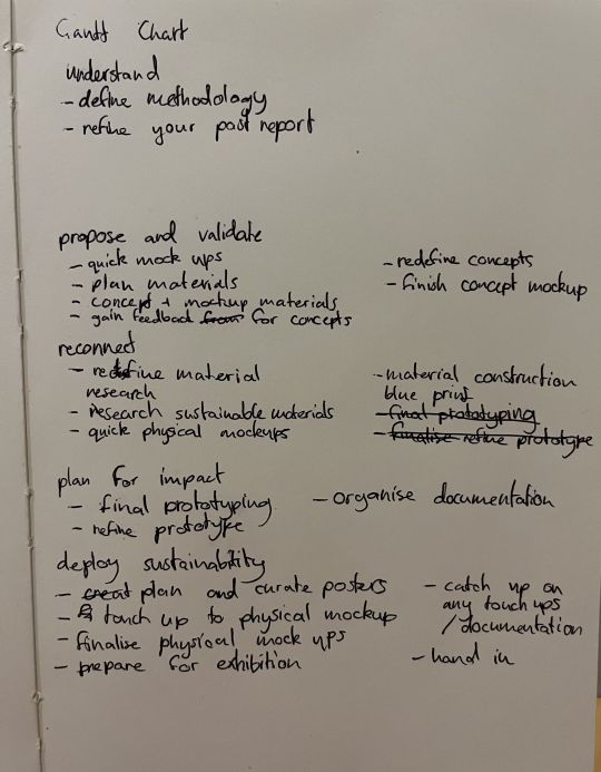
However, one aspect I found that could have been more enjoyable was crafting the Gantt chart. This endeavour demanded substantial time and intricate planning, intricately tied to my chosen design methodology. In hindsight, commencing with my design methodology would have been a strategic move, potentially saving me substantial time when constructing the Gantt chart.
Conversations with Gabby proved to be enlightening. Struggling with generating and refining ideas, her advice to maintain conciseness while emphasizing the species' benefits prompted me to explore beyond the confines of the lake environment. This led me to examine an urbanized context, necessitating a reboot of my Miro layout. Although I initially aligned my Miro board with the double diamond methodology at the semester's onset, subsequent research guided me towards a method better suited to my needs, resulting in a pivotal shift in my approach and the layout itself.
My looming concern revolves around integrating my Gantt chart with my chosen design methodology. This problem underscores a critical aspect of my workflow that requires careful consideration and problem-solving.
To enhance my reflective practice, I intend to incorporate elements from the Reflector's Toolkit, cultivating creativity and a more substantial personal voice in my posts. Furthermore, I recognise the need to enrich my documentation with visual representations, and I plan to include screenshots that illustrate the evolution of my process. It is also paramount to underscore my findings with secondary research, bolstering the credibility and depth of my work. This comprehensive approach will undoubtedly strengthen the richness and rigour of my project.
This is the work I did for the first week, (refinements to 300, more research etc)

0 notes
Text
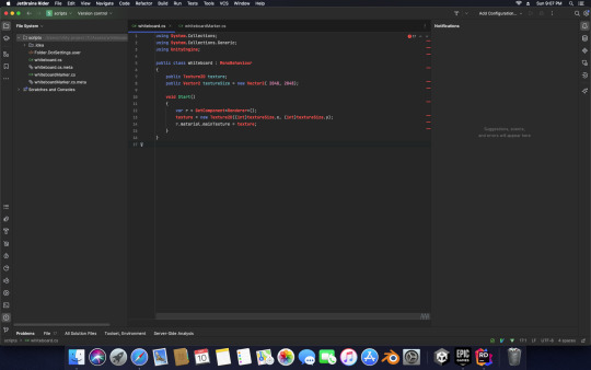
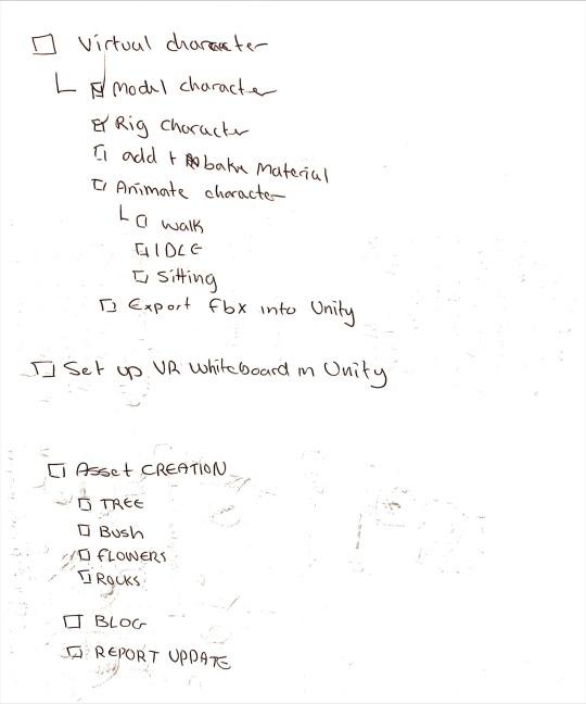
Week 11 - Unity script writing and visual summary
Current status: deliver

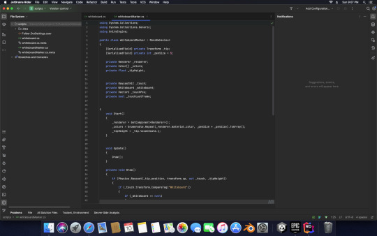
This week I focused on trying to get my unity project to actually function but I have been facing some problems with the script once again. Throughout the week I went through writing the script and resolving any appearing error codes to the best of my abilities.
Bellow is a function whiteboard script. The script I am struggling with is for the pen/marker that is used to draw on the white board.

4 error codes for the whiteboard marker: nth attempt but 1st attempt to fix today - 12/10/2023

made it down to 3 error codes but still having trouble 2nd attempt today - 12/10/2023

3rd attempt for today - 12/10/2023
I have been searching about the error codes on Unity's official forums and other forums that address the error codes. The error codes are easy to fix to more experienced users of unity and c sharp. But since I'm not familiar with this I am struggling a little bit.

4/5th attempt 15/10/2023
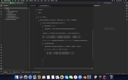
I have been struggling with this error code. I Have tried to resolve it myself using Google and Unity forums and any other resources at my disposal to try and do it myself but to no success. I've decided to seek help from my stream leader and peers for advice and many directed me to someone who could help from the empathic computing lab. I've emailed them but have yet to receive a reply. Two of my peers have offered their help and I have tried their solutions.

Here is a screenshot of trying a suggestion from my peer. While It did resolve the previous code error, three new errors appeared. Which I have to solve with some success.

I have some understanding of which line the error occurs in and the hints of ")" or "}" or ";" expected is what is missing but attempts to fix it sometimes comes up with more errors. Currently all I can do is to continue trying while I wait for a response to my email. I have two back up plans for if I don't get a reply soon enough. First one is two download the script available from the tutorial video I was learning from or have my prototype just be my VR environment with a non-functioning whiteboard.
I am mostly finish with my VR project as the environment is mostly finished and all that's left is for me to get my VR whiteboard functioning. Others things I need to get done is my visual summary, pitch presentation and video. Video won't take long for me to do and I could probably start putting it together. Pitch presentation will probably be made using some previously presentation slide from earlier on this semester. And visual summary is a slow process where its just me compiling everything from my Miro neatly to fit a visual summary for hand in.

I really need to get a move on and push through the next couple of weeks.
0 notes
Text
Week 11 reflection
What?
This week, I finished the coaster’s final design and successfully realised my design in reality. I used three patterns on the coaster design: newborn baby kiwi bird with a circle, adult kiwi bird with a circle, and silver leaf fern. The adult kiwi bird is the website KiwiNibble logo, and the silver leaf fern is an element I used in the user icon on the website forum page.
I have not done laser cutting since I was a year two uni student. Even though I read the introduction guide to the fab lab website, I am still confused about a lot of the details. To solve all the issues in my mind, I asked the fab lab support and their kind support, I know what to prepare before doing the laser cut.
Actual Size +0.15 for cutting
Email the file/ borrow the USB from the fab lab
Buy material: https://store.creative.auckland.ac.nz/design-programme/
Try to see how many pieces of coasters can be printed by 300mmx 300mm
The material I chose to use is cork. This is the material used in the example I researched, and that is exactly what I was looking for.

Before bringing my file to the fab lab, the last step is adjusting the infill and stroke to cut, etch and engrave individually using the RGB red, blue and black. Five pieces of coaster can be printed.

Following the fab lab support of teaching how to use the laser cutter, I waited for the coaster to be printed out for 20 minutes. There was a bit of a mistake because I misremembered the blue and black consequential movement. Luckily, the support found out about this issue before started printing, he helped me change all the strokes to the correct colour. If not, I need to reprint the coaster, I'm grateful for his careful examination.

So what?
I was embarrassed when I found out I got the colours wrong. I read the instructions but got a misunderstanding of the words etch and engrave. I thought I had already read the instructions carefully. If no one figured out the mistake, I would need extra time to do the laser cutting again, which would affect my progress and time. I also had to keep a balance in my time and follow my schedule this week as well.
Now What?
I will be more careful in reading the instructions to avoid this small mistake, but it has a significant impact. Instructions help people to know what is required, what is requested and what needs to be prepared. The assignment instructions are very important so we know what to submit and what will be marked. Keep double-checking the instructions so as not to miss anything important.
Reference:
Gloria. Chan. (2023). DES 301 Hei Man Chan. https://miro.com/app/board/uXjVMwcVIwQ=/?share_link_id=729403324553
0 notes
Text
Week 10 reflection
What?
I had been focusing on work on the home page of Figma. My impression of New Zealand is one of beautiful nature, surrounded by mountains, vast forests and crystal-clear oceans. Based on this impression, I drew this landscape illustration on Adobe AI. It took me an hour to finish the illustrations. The most time-consuming part was the forest. Each tree has a different shape and many complex lines and must be kept thin. All the strokes throughout the illustration are black. After putting separate PNGs on Figma and adjusting the respective sizes, I drew two colour shapes in the forest and sea to make it more in line with the website's style. However, the blue shape of the ocean doesn’t look good even though I tried different forms, so I only kept the green colour shape of the forest. The top-right location looks empty, and I added a flock of migratory birds in flight.
Initially, I want to make the animation appear after the user sign in. I watched some tutorials on YouTube as I have never done animation on Figma. I need some guidance to achieve the desired dynamic effect. In the animation, I tried zooming in on the forest’s centre and then zooming out the whole landscape. Unfortunately, the animation doesn’t achieve a great impact. I ended up giving up adding animation on the home page just to make it simple.

Other work I have done is adding more pages like what you have liked, watchlist and setting page. They are all part of the user profile page. I hope this makes the whole site look more complete. Moreover, adjust all fonts to a uniform style and change and add icons.

So what?
My overall speed has improved with the rescheduling of my schedule. This week, I managed to complete the scheduled homepage and even managed to do more work than scheduled. I'm not as anxious as I was before because I've been able to improve my work progress. I also feel proud of myself that I have improved from last week, when I could only complete an average amount of work in my schedule to exceed my goals. Even though I have another course assignment to finish, I balance my time better than last week.
Now What?
I will keep following the updated schedule to work since it helps me with my time management and improves my creative speed. Insist on spreading the work evenly over the days of the week to get it done. Maintaining this efficiency and working style. This shows that distributing the workload correctly is a good thing to remember.
Reference:
HeiMan.Chan. (2023). DES 301. https://www.figma.com/file/8rZQILNUwspy1Nts5nNaYF/DES-301?type=design&node-id=0%3A1&mode=design&t=98rn8AGvNHFV7dx0-1
0 notes
Text
Week 10 - More unity work and video creation
Current Status: Deliver
For this week I focused on working on some 3D animations for my video and working on the C sharp scripts for unity for the interactive parts of my unity project. The environment is finished I just need to get the actual drawing program I want to create unity to actually function.
I once again took a break from unity after trying two different tutorials and rage quitting at writing scripts and decided to work on creating a 3D animation for my video. First I 3D modelled the figure, then rigged and posed them in a knelling position. I then added a ground that mimicked wet concrete to give some contrast to the smooth figure and to reflect the videos lighting in the background. I then added stand in videos for where I intend to have my stock footage and set up the camera to zoom out as part of a transition for my video.
Please note that the videos used in the above render for the animation will not be actually used but instead are place holders for the stock footage I plan to include in my video.
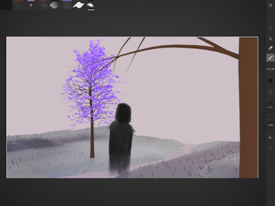
Above is the quickly put together video of my storyboard into an actual video to test how well it works. This was put together in iMovie using a combination of screenshots my storyboard and phone recordings of my 3D blender animation.
Current mood for week 10 and working on unity:
0 notes
Text
week 9: Continuation of asset creation and unity
current stage: development

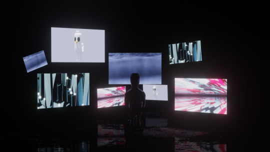
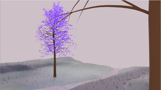
For this week I returned to setting up my virtual reality environment in unity and basically testing if my 3D models I made in blender were functioning in Unity. The image above is a screenshot is off the virtual environment. For some reason all the texture images that were responsible for giving colour and material to the models was functioning for everything except the landscape. I struggled with finding out why the landscape model itself wasn't working despite following exactly all the same steps I did for all of my models. After a couples of tries at trying to figure out what was wrong I decided to take a break and make some more assets as the environment looked sparse and wasn't giving much visual interest.


In order to take a break and be productive I made more 3D assets for my environment while thinking where I went wrong in the previous prototype environment. I made one more tree, a couple of other plants and one landscape as backup or as an addition to give my current landscape asset some interest. This helped me step back and allow my self to reset and look back on where I when wrong in my first attempts.

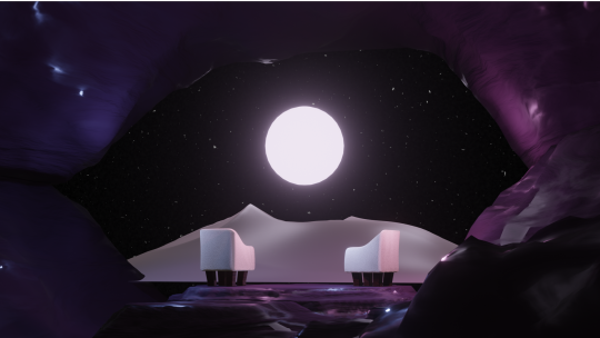
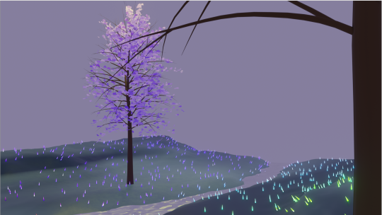
After making the new assets I decided to restart completely and deleted everything before trying again and finally figuring out that all I had to do was drag and drop the image texture file on to the model it self. Perhaps deleting the entire scenario wasn't the best move but I needed to clear the slate/canvas in order to achieve the vision I had. Plus I wasn't really liking the way I placed everything the first time round. Thus I remade the entire environment and added in new assets to make it look less empty and dull. I also played around with using different colours and texture images to achieve the current environment aesthetic. Currently there is a domination of purple and greens I want to introduce some more assets with other colour variations and eventually add in my bird but for now I more focused on actually have a function drawing program in my virtual environment. Aesthetics and environment achieved now I just need that actually functional and interactive part of my project.


I usually like to leave GIFs but haven't the last couple of posts. They're like a reward for each week and they make blogging less stressful for me.
0 notes
Text
Week 9 reflection
What
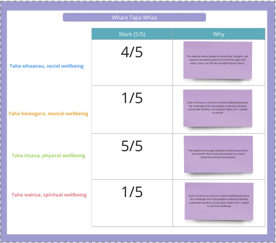
I had been focusing on work on the background page on Figma and getting started with writing Whare Tapa Whaa. Following my chosen design style, the background page has graphics related to each content text with irregular patterns, the colour selected by my mood board. The background page content comes from the research I summarised in the 300 proposals and the secondary research in the inspiration phase. I want to make the content not too long but contain the central insight I want to tell the user because I know some people hate extended reading; less is better than taking care of everyone’s experience.

My biggest challenge in building a background page is how I can get the structure right. I need to get the text, pattern and content order straight. And make them work together in a consistent style. A share button on the down-right side allows the user to share the information with others. This button also allows more students to know KiwiNibble through other social media. I was disappointed that I could only finish the background page on week 9.
In addition to creating the background, I made some detailed changes to the logo colour and added more irregular patterns to the sign-in page. The user page is now done with the foundation part. It's looking pretty sketchy so far. I still need to work on many graphics to make the user page achieve my standards.

Before getting actual writing Whare Tapa Whaa, I need something to help me mark the evaluation performance in these four areas (Taha whaanau, Taha hinengaro, Taha tinana and Taha wairua). Therefore, I made a template in my Miro board and thought about how KiwiNibble’s performance goes in these four areas. My project has greatly impacted Taha whaanau and Taha tinana in my expectation. Unfortunately, my aim isn’t to have a close relationship between Taha Hinengaro and Taha Wairua. I still have two parts to finish for my writing. The idea of making another logo of the KiwiNibble or only using the Kiwi bird design, I think seeing my progress and the work I have to finish, I have to give up making another logo of the KiwiNibble.
So what?
I thought I could finish the background and user pages this week. I realised that I hadn’t finished my original plan properly. I was disappointed that I only completed half of what I thought I could do in a week.
This situation reflects two possible facts: I don't have a clear idea of how fast I'm going to finish, which leads to mis-scheduling and time allocation problems. I often work on weekends, compressing the time available to me. This type of time allocation requires high-intensity work on weekends, which makes it very easy to get tired. If I distribute my time more evenly, I can meet my new work schedule and complete my original schedule each day.
What now?
I think I need to revisit my plan and schedule. I will ask my instructor for suggestions that could help me modify my current program. A new schedule that breaks down what I want to do each day instead of a full week's worth of generalised to-do items. Avoid compressing the week's work into one or two days.
I'm hoping that a new schedule will improve my time management skills and creative speed.
Reference:
Gloria. Chan. (2023). DES 301. https://www.figma.com/file/8rZQILNUwspy1Nts5nNaYF/DES-301?type=design&node-id=0%3A1&mode=design&t=98rn8AGvNHFV7dx0-1
Gloria. Chan. (2023). DES 301 Hei Man Chan. https://miro.com/app/board/uXjVMwcVIwQ=/?share_link_id=729403324553
0 notes
Text
Week 8: video scripting, storyboarding and slight branding
Current status: development

For this week, I decided that I needed to take a break from figuring out unity and asset creations. I was beginning to feel even more burned out and frustrated as I still couldn't figure out how to get things running the way I want it nor was I pleased with how my 3D models were turning out. It was really important for me to pause what I was doing and focus on something else before I started to rage.
In order to feel refreshed but still remain productive I decided to shift my focus on to planning out my video. My reasons for this was to one, distract my self but still remain productive, and two, scripting for the video helped redefine what my project is about and helped me remember why I am doing this project.

Before beginning I asked my self three questions. What is the idea? What is my aim? and what did I do? This helped me redefine my project in away that made it easier for me to convey the main message of my video.

from this I started writing a script based off of the three questions I asked and answered earlier. By this point I already have a vague vision and idea but struggle the type of tone I want to convey. Especially with a vulnerable audience I am trying to portray, I do not want to offend anyone.

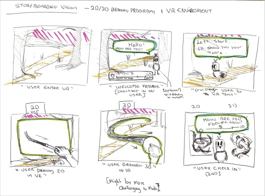
In my storyboard (flowing left to right, top to bottom) I have communicated the stressful events/environments situational depression can emerge from and some symptoms/ effects it can have on a person. Through the use of stock videos and self-made 3D animations I want to convey the stressful events, the disruption and the sad emptiness that come with depression. However, I also plan to use some recorded footage of the project in action to show how the project works and also the possible effects it has on the user outside of the virtual experience. My project aims to help introduce art therapy in virtual environment as starting point for developing a coping skill to manage depression.
For next week I plan to refocus back into unity and asset creation. After this week I'll be more motivated and driven on actually getting my project to function enough to actually be able to create something in VR.
0 notes
Text
Week 8 reflection
What?
This week is also a prototyping week for me to work on. Since I finished my coaster paper prototype, I started work on the interactive website using Figma. I listed what function pages have to include.
Sign-in page
Home page
Forum page
User page
Q&A page
Background page
Interactive section
About me page
Reading/video page
The interactive section is the most challenging part to build up because I have to draw many graphics and let users experience and interact with the website. My mood board inspires the website style, a simple pattern with a shape of solid colour. Although this is what style I have thought for the coaster rather than the website after the conversation with the technical support in the fab lab. If I want to add colour to the coaster, I must draw the colour by myself, and I don’t feel confident enough to do such stuff. Also, the material I chose for the coasters looks better with no colour added so I will pick another design.
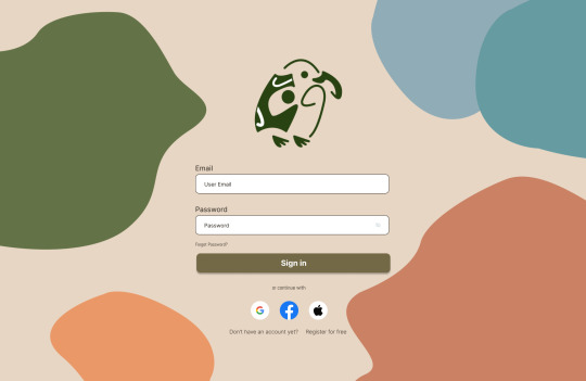
I’m using the Kiwi bird design, like the coaster design for the website icon. The icon colour is now black, but I’m still trying other colours for the best-looking options. The black colour hasn't active my desired results. I have done the first design for the Sign-in page, Forum page, Q&A page, background page, reading/video page and kind of about me page. I’m rejoicing that I have made some progress this week, and I hope to finish the first design of the user page and the interactive selection by next week. I designed to combine the video and reading on one page, but during the making process, I realised this decision would make too much content on one page, so I needed extra time to solve this issue. The new design is both of them have their page.


I named the website KiwiNibble. This name combines the idea of eating habits with the Kiwi bird's association, suggesting a cute and playful connection to both food and the bird. Should I make another logo of the KiwiNibble or only use the Kiwi bird design? I will see if I have extra time to work on it first. Finishing the website first is what I’m going to focus on next week. I still have to change the text style or the colour in the future because they still can look better.
So what?
This week's work made me realise I hadn’t thoroughly thought through my project and had enough time to learn the whole idea. I didn't know enough about all the design details in the Inspiration and Ideation phases, so the prototyping time was slower than expected. If I had a clearer idea of what I wanted to achieve a few weeks before, I could have saved time and used it to design another logo instead of agonising over what to do or not to do.
In addition, various obstacles keep appearing in the process: too much content is concentrated on one page, the lack of technology makes it impossible to achieve the initial required effect, and the original design does not give good results. It makes me less passionate and more agitated. I repeatedly asked myself if this was really what I wanted to achieve.
Overall, my lack of consideration seriously affected my planning and implementation.
Now what?
I need to make a list of things I need to think about for the whole project so that I don't have to spend extra time thinking about it again because something is missing or I haven’t thought about it. In addition, I will list the problems I am likely to encounter and consider ways to deal with them in advance. Early risk assessment allows me to be better prepared for possible problems and avoid being too anxious.
Reference:
Gloria.Chan. (2023). DES 301. https://www.figma.com/file/8rZQILNUwspy1Nts5nNaYF/DES-301?type=design&node-id=0%3A1&mode=design&t=98rn8AGvNHFV7dx0-1
0 notes
Text
Week 7: asset creation and prototyping
Current status: development phase
What I have done:
Make assets for my project in blender
Bird character update
researching and testing out features I want in unity.
How did it go? how do I feel about it? what can I do?
Environment :
During this week I took a break from animating and preparing my bird character for unity and instead focused on creating assets for my environment.
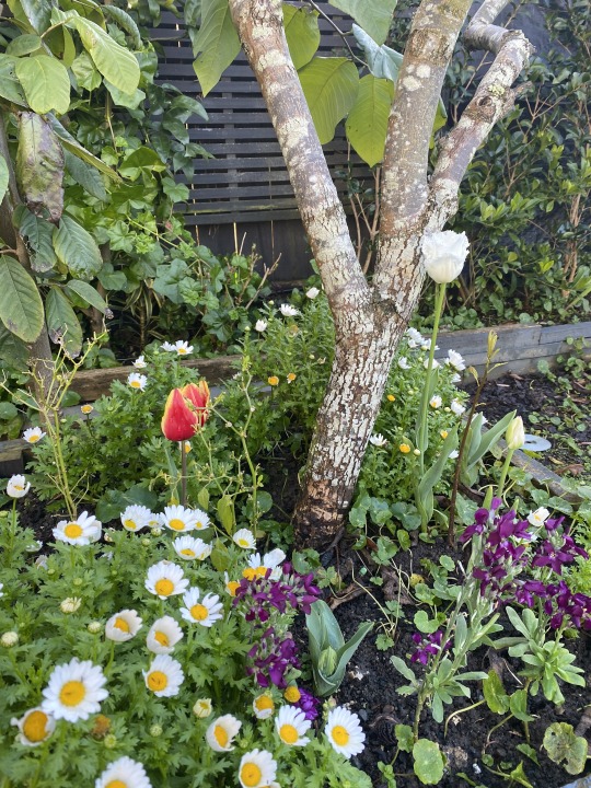
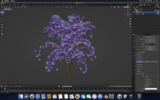
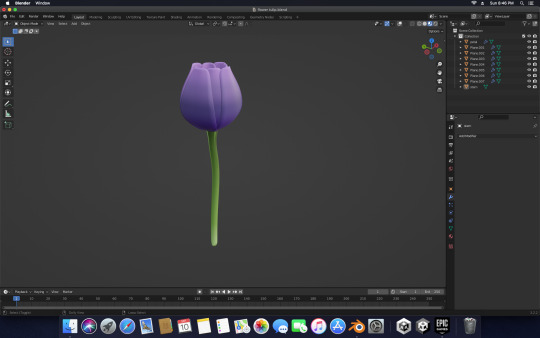
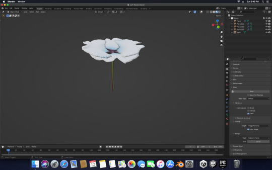
I photographed some flowers from my garden for some inspiration when I creating my assets. While I intend to go for a more stylised aesthetic for my environment I still want to draw inspiration from nature.
I still have a few more assets to create for my project such as more types of trees, rocks and other types of foliage to flesh out my scenes. The amount of work I made so far is enough for a prototype and to give a rough idea of how my project will look. Early on I made three different concept renders of possible environments. I have yet to settle on a singular on but intend to incorporate some aspects from each of them. [I will place the original concept renders below]
Personally, I am struggling with creating environments for my project and perhaps will look for some more inspiration in how 3D artists and video games make their environments to help me with environment development.
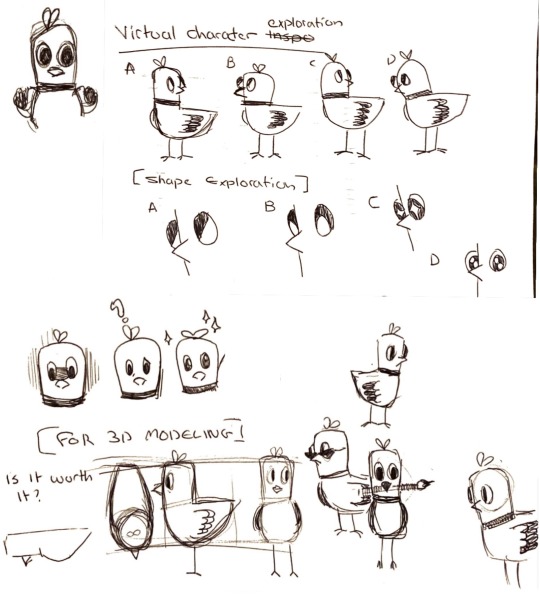
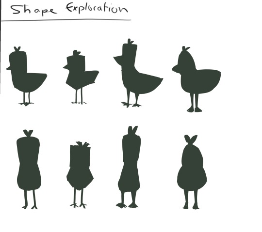
Bird update:
I have finally animated and coloured my bird character for unity. There are still a few more animations I still need to make and have yet to test if it works in unity. My bird was a distraction for me to focus on when I get frustrated with environment development. But ultimately I moved back to environment creation when I got frustrated with my bird character. I'm still figuring out a name for them. I have gotten comments of it looking like a duck, chicken or pigeon and many people asking what type of bird it is. Which I reply " it's a bird, with an identity crisis." or " it's stylised to fit with my environment." but to be honest the birds is a secondary feature that will mostly featured roaming the environment. Depending on how much time I have or how well I can figure out how to use unity, I would like the bird to be intractable. With dialogue such as:
"Hello!"
"How are you today? [a number in put is available for user to interact with from 0 - 10 to indicate how they are feeling]"
"If you need me I will be here"
"I can't fly with my small wings but I have strong little legs to walk around with."
"welcome back! Ready to start painting? I'll go find your brush!"
Personally I would like to have my bird Interactable as I think it would comforting but I am aware of my skill set and will have to settle for it to roam in the background or not appear at all.
Unity update:
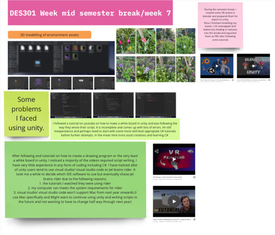
After following and tutorials on how to create a drawing program or the very least a white board in unity. I noticed a majority of the videos required script writing. I have very little experience in any form of coding including C#. I have noticed allot of unity users tend to use visual studio/visual studio code or Jet brains rider. It took me a while to decide which IDE software to use but eventually chose Jet brains rider due to the following reasons:
1. the tutorials I watched they were using rider
2. my computer meets the system requirements for rider
3. visual studio/visual studio code won't support Mac from next year onwards (I use Mac specifically and Might want to continue using unity and writing scripts in the future and not wanting to have to change half way through next year)
I followed a tutorial on youtube on how to make a whiteboard in unity, to simulate drawing in reality and was following the way they wrote their script. The images above are the script I wrote based off the tutorial. However, It is incomplete and comes up with lots of errors due to my lack of familiarity and skills with unity and the IDE I am using. I'm still inexperienced and perhaps need to start with some more skill level appropriate C# tutorials before further attempts. In the mean time I am making more assets and learning C#. I was too eager and overestimated my self and skipped the basic tutorials because I wanted to focus on what I wanted to make first. But I am now aware that I need to slow down, take a step back and reevaluate what I can and can't do before continuing.
I currently feel a bit overwhelmed and burnt out but I'm trying to push through. I do find that when I'm stressed or need a way to focus I tend to doodle my little bird which helps me think and makes me feel a bit better. I hope I can include them and share the same effects they have on me to everyone else.
[link to the unity tutorial video that I was referencing earlier]
youtube
I personally think this is as very good tutorial I just need more practice and familiarisation with JetBrains Rider and Unity.
1 note
·
View note
Text
Week 7 reflection
This week is a prototyping week for me to work on. From the top five options I summarised in week 6, the coaster is what I will make for the paper prototype. It’s a good thing that coasters aren’t difficult to present on paper. Before the actual prototyping, I drew six sketches about how the illustration looks on the coaster. The ideas come from my mood board.
The up-left one is a kiwi fruit cut open to reveal its green flesh.
The up-middle one is a kiwi bird made by combining Maori graphics.
The up-right one is a simple line drawing of a kiwi bird surrounded by a Maori circle.
The down-left one is a traditional Maori pattern, Pātikitiki - Flounder shape, symbolic of kai moana, the sea, the availability of food, and fertility. It is also a tukutuku pattern with similar associations.
The down-middle one is kiwi birds and kiwi fruits depicted in soft colours.
The down-right one is a silver fern with a green irregular shape.

Three of them are using the kiwi bird as the element. Even Though they are using the same element, the details and the collaboration with other elements make them look so different. All of the above elements are considered to be representative of New Zealand, traditional and have a special meaning to the local people. I think using the Maori-related elements can help my project product link to Maori culture. The coasters are made with cardboard, paper, watercolour paints and water brushes. First, cut the cardboard into appropriate size pieces and then paste the paper on the surface. Draw a sketch in pencil first, then use watercolour paints and water brushes to colour. Is amazing to see the paper prototype show my ideas perfectly. They even show better than I expected.

From my experience, compared to using paper prototypes for a website, I would rather start by using Figma. The function on Figma makes it easy to create each website page and show the whole UI flow process. Also, I feel so stressed about completing the project on time, so I am hoping to start the website in Figma as soon as possible. There are some sketches about creating a section of daily login rewards.
Kiwi Bird is a mascot for the website.
To attract users keep using my website, aiming to make the user develop a habit of using the website.
Users can log in and out to have fun and gain experience in similar games. You can level up after a certain amount of experience.
Whenever a level is reached, the appearance of the upgraded user can be changed. Kiwi bird's egg growing to an adult kiwi bird.

I still have many design details I haven't decided on yet. I have to consider its realizability and practicality. From my classmates��� feedback, like changing the reward in the prize, recipe or something physical. They are some realisable ideas as well, I hope I can make the decision by next week.
0 notes
Text
Week 6 - storyboarding and concept art continuation. (virtual character modelling and rigging test)
Current status: development phase

What I've done this week:
Presentation- I've given my 302 presentation however felt that I didn't do as well as I wanted to. I even made a script outline for my presentation but panicked and missed some key points and facts I wanted to mention. In my panic and rush I forgot to mention the status of ethics approval for my project which brought up some concerns in some feedback. However,I want to clarify that due to the not having ethics approval for this project. I will not be doing primary research and instead will be using secondary data and mostly user testing for the technical feasibility and user testing will be done in class.
Developing a virtual character - The inclusion of a virtual character was pulled from last weeks storyboard from the encouragement of my stream leader. After a rough patch in creating concepts for virtual environments. I have had this consideration of including a virtual character as a comfort character that inhabits and brings life to my virtual environments while being Interactable with the user. This character has been in the background of my project since week 2 and have been a reoccurrence in my mind since then.
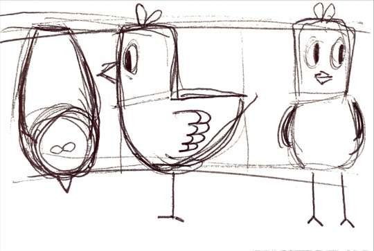
3D modelling and rigging virtual character in Blender - Originally I thought of having a virtual character that was either a dog or cat or some type of other animal instead of a bird. But then thought "but birds are everywhere?" I see them in the city, in my neighbourhood, at the park, near the beach, ect. There seems to be some type of bird in most environments. And I feel that this non distinct avian would fit in any of the virtual environments I decided to develop. [skip here for talk straight to point talk about 3D modelling and rigging] Basically I made some basic sketches of the my Bird and did some very minor adjustments and exploration to the general shape of the body and eyes. Once I was happy I was a simple sketch and used that as my reference for modelling in blender. Once I was happy with my model, I began rigging my model after a quick refresher on how to rig in blender on youtube.
video of test virtual character rig in blender. ( Sorry for the sound, I don't know how to remove it. But you can hear some birds chirping in the background which grounds my early statements of birds being nearly every where.)

some closer screen shots of the Miro board. I find the beady eyes cute, but some might find it disturbing?
What I plan to do during the break before week 7:
I do intend to continue making weekly blog updates to keep a routine. ( To be honest I feel like mid semester breaks are illusion we tell ourselves to give some semblance of a drive/ goal for productivity but in truth a percentage of us are most likely still working on our projects/assignments during the break)

0 notes
Text
Week 6 reflection
I have been focusing on choosing what to develop as physical objects to help promote the website. There are a total of nine ideas:
Coaster
Low cost; practical; easier to achieve; easily distributed to others as promotional materials; able to create the illustrations by using Adobe Illustrator; It can also be used as a lanyard if it is rounded and attached with a string; Unique; I’m interested in
Card
Low cost; easier to achieve; easily distributed to others as promotional materials; can be used as a bookmark; able to create the illustrations by using Adobe Illustrator; less practical than coasters; I’m interested in
Pendant
Medium cost; unique; no experience in designing pendants; practical; multiple material options; easily distributed to others as promotional materials; I’m interested in
Poster
Low cost; easier to achieve; experience in designing posters; not unique enough; can present more sets of information at a time; less interested; able to create the illustrations by using Adobe Illustrator; less practical
Brochure
Low cost; easier to achieve; Not unique enough; can present more sets of information at a time; less practical; less interested; able to create the illustrations by using Adobe Illustrator; not unique
Shopping bag
Medium cost; unique; no experience in designing a shopping bag; practical; don't know how to sew; I’m interested in; easily distributed to others as promotional materials
Napkin
High cost; unique; no experience; practical; difficult to produce; I’m interested in; easily distributed to others as promotional materials
Lunch box
High cost; unique; no experience; practical; difficult to produce; I’m interested in; distributed to others as promotional materials
Cutlery set
High cost; unique; no experience; practical; difficult to produce; I’m interested in; hard to distribute to others as promotional materials

Based on ambition and ease of achievement, little interest, I made a scope map to help me to understand the advantages and disadvantages of each option. The top five options are a coaster, card, pendant, lunch box, and shopping bag. Some things have a far superiority (much more interesting and easy to achieve) over others, and some have a balance of accessibility and interest. Considering the time left, I don't think it's a good decision to challenge too difficult an option. In fact, the most difficult cutlery set was the first idea I thought of, but the high cost and difficulty of achieving it made me choose to balance options instead of the original idea.

Trying to get more inspiration after creating a mood board such as colour choices, design style, material and shape. I’m a bit wondering if my project can be done before the due date because I still have many design details I haven't decided on yet. I must do some work during the break.

0 notes
Text
Week 5 reflection
This week is a brainstorming week for me to work on. The feedback I got from my presentation asked me why I created a website rather than an app by listing their features so I can compare which is the best option. It's a tough decision.
One of the hardest things for me to choose is that the app has a more interactive and intuitive interface based on the device's operating platform for a more immersive experience. However, one of the purposes I want to achieve in this media is users are able to read literature related to eating habits. Normally, we don’t present a lot of information at once in an app. On the other hand, a website is more appropriate to present large sets of information at a time. Also, if the users want to share the website information with others: they only need to share the URL via email or text message. After much deliberation, I finally chose the website.

To help me start brainstorming ideas, I created a scamper map to develop the details of my interactive website. I'll start by considering the following:
Style of the app
Function
Target audience
How to promote the website
Content
Text style
Tools

Figma, Adobe Illustrator and Photoshop are the tools chosen to use on this project. I have used them to design two apps and one interactive website before. The prototype function on Figma makes designers able to show the whole UI flow process. Comparing Figma, Adobe Illustrator can draw more complex illustrations. Therefore, I prefer to draw the complex art on Adobe Illustrator then transfer the png on Figma. I use Photoshop when I need to adjust colors and crop layers. Using familiar tools makes me feel more confident in completing projects and ensures the website quality.
In addition to creating websites, I would like to design physical objects to help promote the website. Still haven’t decided which option to choose. I’m gonna make a moodboard to inspire myself.
P.S. My speech was more intense than I expected. Since I had so much information to say, I spent a lot of time keeping it under five minutes.
0 notes
Text
Week 5 - storyboarding and environment concepts
Status: currently in my develop phase with story boarding and concept rendering.
tools/tech used: Ive been mostly using blender for concept renders and asset creations. I plan to use unity as my main program for the final project and have my project viewed in a oculus quest 2 VR head set. Though I might have my environment be prototyped in Mozilla hubs.
What I did this week:
Storyboard the initial process of user entering the VR environment
Concept images/renders of possible environments in blender but still need more work to fill them out.
more research and resource gathering on how to use unity and how to create a drawing program in unity.

Challenges I faced this week:
this week I struggled with issues involving rendering my concepts in blender but that was fixed by simply changing the render engines from cycles to EVEE. (examples of the two different renders below)

2. Another challenge I faced was my storyboarding, because I am still deciding between having a 2D or 3D drawing program in Unity. I am also debating on the decision of including a virtual character for the user to interact with and as a way to check in on the players well being.
Ive also tried to make a very crude animated story board using already rendered concept image and a doodled version of a virtual character.

3. I have been gathering video resources from youtube and unity's website in hopes to prepare myself for learning to bring my vision in to reality.
What I plan for next week:
To continue storyboarding the rest of the experience and resource gathering. May be actually start to familiarise my self with unity.
0 notes
Text
Reflections week 4
Last week I was too tired of my work so I have to get some charge this week. There are 11 pages of presentation slides and a script to prepare the presentation. The slide design is based on my previous display on DES 300 since I have a similar How Might We statement.

Before the presentation started, I was already nervous because I was never used to presenting in front of many people. I think everyone in the community stream did so well during the presentation. All the focussing questions sounded so interesting, and wondering what their final outcome would look like. Even though we are in the same stream, everyone's topic and style look so different. In the thought presentation, what I talked about:
Introduced my values (follow them on my project)
My updated How Might We statement
The reasons why I made the change
Design Methodology
Preliminary research
The main insight from the research
Scope
The details about the plan A, B, C
Plan timeline
The limitations of the plan
Methodology timeline
Showing the Miro board process

The content is come up by the conclusion during the class, and my decision with my friends about The content comes from what Ayla mentioned during the course and my determination with classmates about what work we should put on the slides and say in detail on the presentation. I’m proud that the feedback I got from Ayla is positive. My voice is clear, loud enough, and my explanation is clear. Brainstorm is what I will work on; I will brainstorm ideas based on my inspiration in the first three weeks.
0 notes