#draw it bad and redo it better down the road it will scratch so many itches i promise
Note
Have you ever wanted to draw something but you fought due to your skill level at the time you decide not to do it
yeah! i have! i just draw it poorly lol
21 notes
·
View notes
Photo

APPRECIATION & INTERVIEW
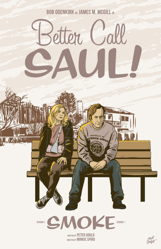
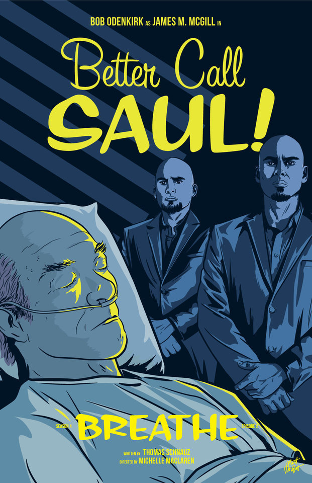
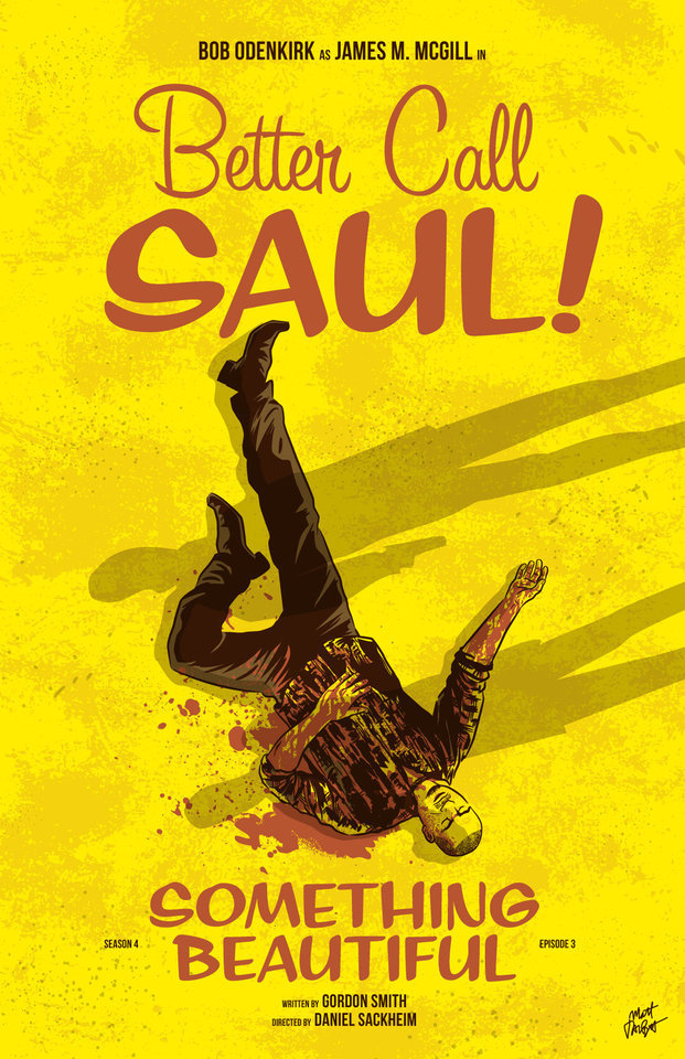
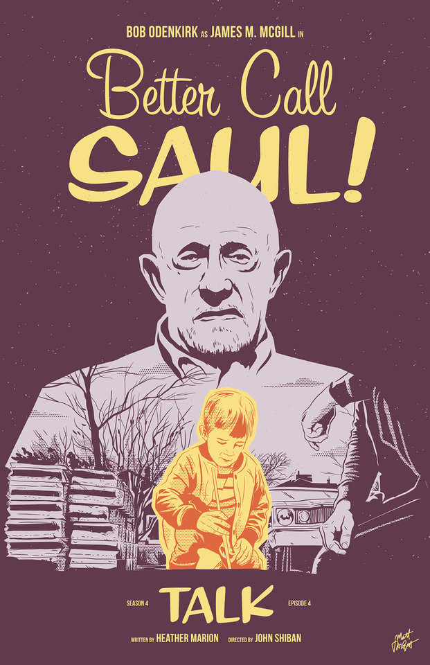
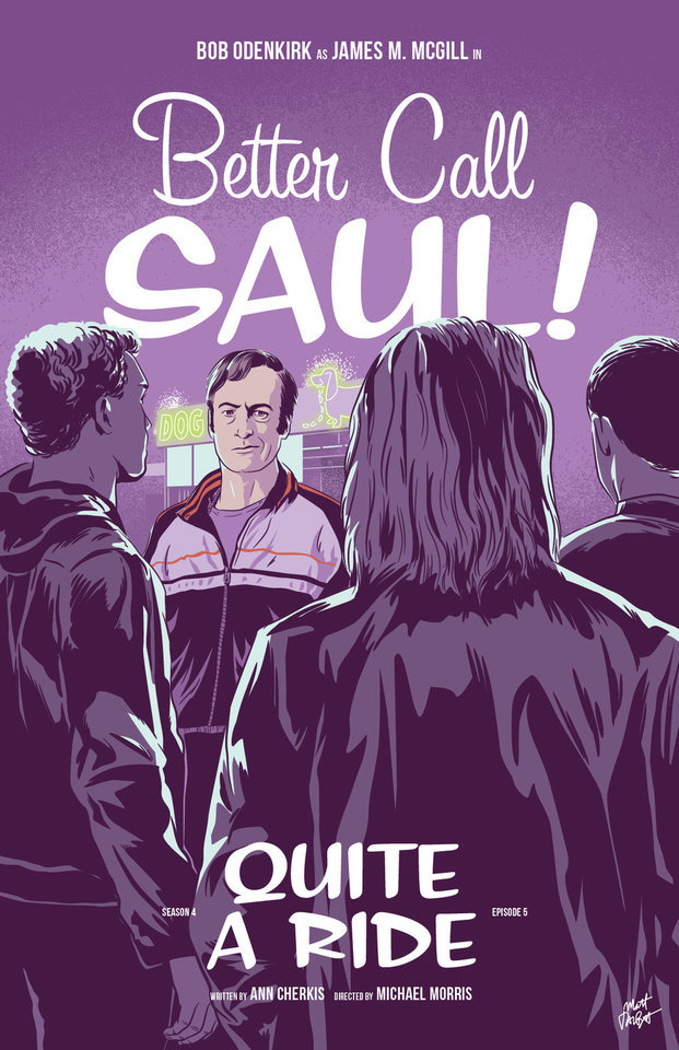
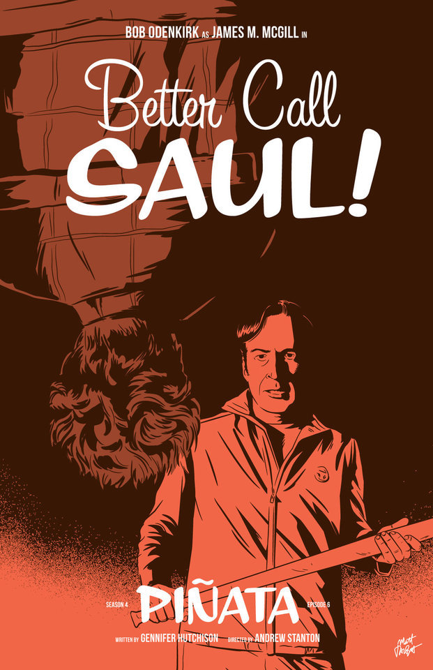
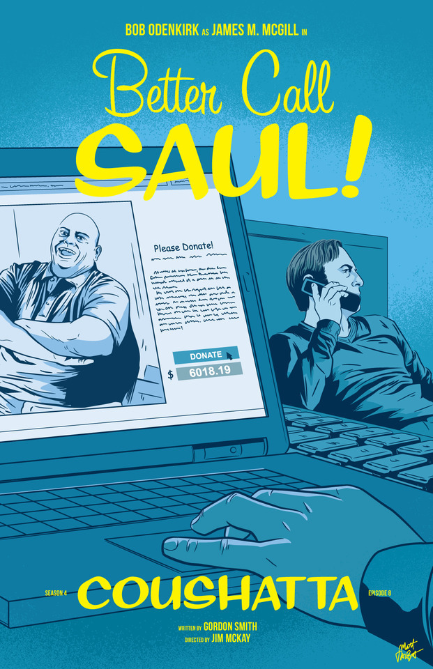
Better Call Saul episode posters by Matt Talbot
After 4 nearly years, I thought it was time to catch up with Matt Talbot about his Better Call Saul poster project. The last time we talked during Season 1, Matt was deep in the hustle of making his name as an illustrator: juggling a full-time job, freelance projects, as well as band. Finding time for personal projects like this one can be a significant challenge. (Not to mention surviving the death of your tools: During Season 1 his Mac laptop died, and this season, his Wacom tablet bit the bullet). But despite these challenges, the 43-year-old New Hampshire native has persevered to create a clever and thoughtful series of episode posters that has garnered considerable attention, and brought with it new high-profile clients and art exhibitions.
First, congratulations on all of your success and recognition with this series of posters. It’s well-deserved. What’s been the most gratifying feedback you’ve received?
Thank you! Every interaction I’ve had with anyone from the show has delighted me. I've been surprised by all of the cast and crew members who have said nice things – every note I’ve gotten has meant a lot to me. That being said, Michael McKean randomly tweeting at me that he has my poster for Chicanery hanging in his home blew my mind. I was eating dinner when my phone showed the notification and I literally jumped up from the table. I’ve been a fan of Michael’s since I saw Spinal Tap in the ‘80s and never in a million years would I have guessed I’d make something he valued enough to hang in his home.
Tell me about your contributions to Gallery1988 exhibitions. How does that process work?
It's a pretty simple process. They invite me to be part of a show, and I make something to send them. I’m very excited for the opportunity to show there, and I feel like it’s a milestone in my art-making career.
Across the 4 seasons, which BCS posters are your favorites? Which one are you most proud of? I’m particularly fond of Rebecca, Rico, Marco, Switch, Sunk Costs and Something Beautiful.
Oh man, it's hard for me to evaluate my own stuff. I tend to like the posters where I find a way to get a different take on something they did in the episode. I would say that “Sunk Costs” is also one of my favorites because I did something differently than how they shot it, and because Mike is so recognizable even from the back. I was also pleased with “Off Brand” because it was when I finally figured out how to draw Bob Odenkirk.
How has your process for creating these posters evolved over 4 seasons?
When I started this project I had a vague idea that I would focus on scenes rather than portraits or likenesses, but that didn’t even last half a season! The characters were too good not to include. In that way, the posters have evolved in my willingness to draw characters, and also, hopefully, my ability to draw them.
My process is now something like: Watch the show on Monday; think about it on Tuesday, figure out what stood out to me and do a thumbnail sketch or two; draw it on Wednesday night; post it Thursday afternoon. I’m a bit faster at drawing these now compared to when I started. And I’m a bit more decisive on choosing which subject matter to depict.
There have been quite a few changes on the visual side of Better Call Saul over the last 2 seasons. New directors (Minkie Spiro, Daniel Sackheim, and Andrew Stanton), a new cinematographer Marshall Adams, even new cameras. What are your thoughts on how the show’s visual grammar has evolved? Has any of this impacted your posters from Seasons 3 & 4?
I try not to just redraw literal scenes from the show, and I don’t need to tell you that they shoot the show in an incredibly beautiful way. I mean, they always, always, pick the best angle, the best shot to capture something. For that reason, it’s sometimes hard to to come up with another take on a moment from the show.
That being said, the visual style hasn’t really impacted my posters as much as the evolving subject matter has. The show, I think, is substantially darker than it was in the early going. It was easier to depict Jimmy’s hi-jinx in the first couple seasons. But with Chuck’s deteriorating mental state, the cartel stuff, Mike going deeper into Fring’s world and of course, Jimmy’s loosening sense of morals, the funny moments are harder to spot. That’s lead me to some more somber layouts and color choices.
We didn’t discuss this in our first interview. Which typeface are you using in your posters, or is this custom typography?
The main logo and episode titles are set in Sign Painter, from the excellent House Industries.
The Heisenverse is known for it’s color theory and use of color. How has that impacted your color choices in these posters?
I’ve kind of adhered to their blue=good/red=bad symbolism, but I also try to balance out colors between episodes and not repeat myself in sequential posters.
Many of your posters (especially ones this season) use a monochromatic, or simple palette of 1-2 colors. Tell me more about why you chose that approach. Is this a signature of your style? I’ve seen this approach in a lot of your work.
You know, in the early seasons, I was trying to use simpler color palettes, but I wasn’t very disciplined and I got away from that. I’m trying to stick to a more consistent style in season 4. It is a conscious decision. I also feel like with the week-to-week nature of this project, it helps quickly set apart each poster. And, I really do love limited color palettes. Giving myself color constraints helps me figure out different ways to solve layout problems.
I’ve heard other illustrators say that Bob Odenkirk’s facial features are tricky to capture. Do you share that sentiment? Which characters are more challenging to illustrate?
I do agree with that. I had a really hard time with him at first. I kind of think I have a better handle on it now, but I’m always trying to get better. I feel like if you can get his mouth right, it goes a long way.
I found Hector hard to capture both times I drew him. Mike, on the other hand, is just pure fun to draw. Jonathan Banks is so distinctive and iconic.
What’s been the most difficult poster thus far? Why was it challenging?
Maybe it’s because a lot of time has gone by, but I can't think of one that stands out as having been really difficult.
Francesco Francavilla did alternate posters for some of his Breaking Bad posters. Inevitably, when artists look back at their work, they consider revising or redoing it because of a variety of reasons – their point of view has changed, their skill/style has evolved, or maybe they were never truly content with the final product. Looking back at 4 seasons worth of posters, are there any that make you want to scratch the revision itch?
Yeah, more than I would care to admit. I would really like another crack at Amarillo. I know I could do a better job and that drawing is just super flat. In season two, I decided to to experiment with style and I kind of wish I hadn't. I like Cobbler, but I wish I had drawn it in my normal style. I would redraw Nailed for sure. Oh man, if I start going down this road it's not going to end well, so I'll just stop.
You mentioned earlier this season you were excited to draw Track Suit Jimmy. Who or what haven’t you drawn, that you are eager to illustrate?
Howard! It bums me out to no end that I haven't drawn him, but it just hasn't worked out. And I need to include Kim more. It's kind of criminal that her face only appeared for the first time in a poster this season.
What’s your opinion of Season 4? Tell me about your favorites – episode, scene, character.
I think season 4 is brilliant so far. The Kim/Jimmy relationship has deepened so much this season, and feels so real, but full of inevitable heartache. Oh, the flash-forward to Breaking Bad’s timeline was amazing. Mike doing his audit in the Madrigal warehouse. Really, anything Michael Mando does on screen. It's hard to pick. I so enjoy the deliberate pace of this show.
Where’s your favorite place to discuss the show?
I honestly don’t talk about it too much online, though I lurk in a few places and read a lot. I actually discuss it mostly with my wife!
I know you get this question a lot, so let’s cover it here so folks understand: Do you have plans to sell any of this work online?
I really appreciate that people like it enough to want to buy it or hang it, but I don't plan to sell the Better Call Saul posters online. I’m doing this for fun, not to make a buck off the show, and I don’t own the rights to sell it anyway.
What’s next for Matt? Do you have any other poster or illustration projects in the works? Is you band performing soon?
I have several more pieces for Gallery1988 shows coming up. I’m pulling together an art show at a local brewery for whom I design all of their labels and stuff. I’m patiently waiting for a t-shirt I designed for one of my all-time favorite movies to be announced. And for the past several Octobers, I spent the month drawing a horror poster per day. I’m not sure if logistically I can do that again this year, but I’ll probably fit at least a few in. We’ll see how it goes. Sadly, with all of my illustration work, I haven’t had any time for music making, but someday I hope to get back to that!
Follow Matt: Web site / Tumblr / Twitter / Dribbble / Instagram / PosterSpy
– Interview by Shayne Bowman, Heisenberg Chronicles
#better call saul#artist interview#matt talbot#mine#heisenberg chronicles#illustration#fan art#posters#favorites#mattrobot#bcs season 4#gallery1988#g1988#house industries#sign painter
92 notes
·
View notes
Text
3 Ways AdToons are Better than Free Software for Whiteboard Animation
Just spoke with Terry… I’m so pissed off.
More on that in a bit… but first let me get something off my chest.
When it comes to free software for whiteboard animation…
Do you sell to robots?
Then why have robots create your video marketing?
Think about it this way. You hate chatting with an automated phone system because it’s so cold and annoying.
So do you really want a robot creating a video promoting your prized brand? Of course not! The result is a video that is… cold and annoying
Some things are best left to humans. The subtle talents of real artists and writers can’t be recreated with cheap software in your marketing videos used by providers like Powtoon and the folks you find on Fiverr.
Which brings me back to Terry and our conversation that pissed me off.
We were talking the other day about a marketing video he needed done… and things went bad. Really bad. But… I saw it coming.
Let’s chalk it up as another person bit by El Cheapo. No, not the drug lord who El Chapo, who is a menace to society.
We are speaking of another menace!
This El Cheapo is ruining digital marketing. These El Cheapos pose as whiteboard animation providers. They attract attention because they offer lots of crazy discounts. But they don’t deliver quality animation work. In fact, it’s downright bad.
But many don’t realize it until it’s too late because they focus on the low fees they charge. And they end up biting many an innocent business owner on the rumpus.
They took Terry’s money and couldn’t deliver.
In fact, he couldn’t get past the script phase.
Terry forwarded a few websites of helpful tips and asked ElCheapo.com to summarize the concepts and turn them into a powerful script for his new marketing video.
The team came back with a trimmed down plagiarized script of said websites and said, “What next?”
“Uhhh. You didn’t do what I asked the first time!” replied Terry.
So more back and forth they went… with more time and money wasted. Poor Terry spun his wheels hoping they would finally get it.
They did NOT.
I chalked it up to another marketer sucked into the empty promises of El Cheapo, who uses deep discounts to lure you in… and then underwhelms big-time with the work they produce.
We have all heard the phrase, you get what you pay for.
Here’s another one: A bad decision is a bad decision if it only costs you $300.
But you string enough of those together and you could have had your video assembled by the experienced and outstanding team of humans at AdToons, talented script writers, artists, and marketers.
But these El Cheapo sites pray on deal finders. Those who have a hard time parting from their dough. However, if they did it right the first time, they’d save money in the long run.
A couple years ago, I was at a trade show. A couple ladies walked up to our AdToons booth asking for a bit of my time. I obliged. We started by looking at their website on their phone.
The business owner asked me to check out her animation videos on her website. She had four or five short videos created by El Cheapo. “They are not converting, and no one is watching them,” she explained. “We also noticed that the artwork is on some of our competitors websites. What should I do?”
“You had these done on a bargain basement freelance site. Correct?” I asked, knowing the answer.
“How could you tell?” she replied
“Well, I’ve also seen that artwork used on several other websites. We call that stock illustration from an archive of some kind. Just like you have stock photography websites.” I continued
“Remember when stock websites were the rage? This company was able to charge you so little because that’s just one giant template.”
Here’s the reality…
For branding purposes going the El Cheapo way is not the smartest thing to do. In your video, your brand should speak to important elements of your values. You can’t use canned images you can find on every street corner to do that
Your brand is unique, and your story is as well. It should be professionally done.

Given all this here are three main reasons why we are better than Powtoon software, Fiverr or other similar El Cheapo services.
Here’s why you don’t want to go cheap:
3 Reasons AdToons is Better than Fiverr and You Using PowToons
1) These providers don’t know what to write
If El Cheapo doesn’t know what to write, they will look to you to give them direction, like our friend Terry. For many, English is their second language. This makes communicating back and forth somewhat difficult.
However, the most important language they must possess is the language of direct response marketing. I can bet they don’t have that, certainly not the 10+ years of learning from Dan Kennedy, Michael Masterson, Matt Furey, Russell Brunson and many other successful copywriters that the AdToons team has.
Or maybe you provide them with a script. But you’re not a pro marketing script writer either. How well do you understand the triggers to get someone to buy? How well do you understand human emotion and how to infuse that into the script? We don’t disagree that you know your audience better than anyone… but assembling a script for whiteboard animation is another animal altogether. Every script we create comes with a solid, effective framework behind it.
2) These providers don’t know what to draw
Yes, you can match words with images. This is “Concepting 101.” This is the most basic of all video art creation. An example of this is creating two characters who simply say the script back and forth in text bubbles. Oftentimes they miss important information by NOT reading between the lines.
These providers only scratch the surface for what is there. Mining below the surface is a result of understanding the intent of the message, understanding direct response marketing, and having an understanding of the actual intent of the video.
That’s why I like to say our artists are in “Concepting 404.”
You can see more of what I’m referencing in this video…
Watch this video to experience the AdToons difference
Not too long ago, someone came back to us after going with a cheaper whiteboard animation option previously. He wanted us to discount our pricing the second time around because they had invested in a previous “cheaper” option and then were going to redo it again with us. We said, “No discounts.”
Their “other option” didn’t lift results the way AdToons is known to do. We asked to see what the other provider did once we finished his project. We merge the two videos with where the narration lined up exactly. This way you can see the clear difference in quality.

Bottom line: You can’t get what we deliver with free software for whiteboard animation. Or going the discounted route of a freelance site, like Fiverr.
3) You can’t trust them to deliver
What happens when you invest in free software for whiteboard animation and it’s too complex to figure out… NOTHING. Your video ideas sit on the shelf. What happens when El Cheapo doesn’t deliver… what are you stuck with? Lost money. But more importantly that’s time you can’t get back. You lost your investment. So was the free software for whiteboard animation worth it?
There are lots of fly-by-nights out there. Ones that may not be around tomorrow. So you need to put your trust in a company that has been there and done that… and for more than 10 years. That way when you have changes down the road you can reconnect with us to handle all your future tweaks and changes.
If you have tried whiteboard animation software that is out there and are not satisfied, then you need to try a group of professionals who’ve created hundreds of original marketing videos from scratch for satisfied clients.
You need to try AdToons.
Let me know what the biggest hurdles you need to overcome to attract prospects to your business, and we’ll assemble the team to solve those problems.
Run over here no and let’s start the conversation. Leave the free software for whiteboard animation for your children’s school projects.
You are one video view away from landing your whale!
Best,
Vince Palko
The post 3 Ways AdToons are Better than Free Software for Whiteboard Animation appeared first on AdToons.
from AdToons https://www.adtoons.com/3-ways-adtoons-are-better-than-free-software-for-whiteboard-animation/
0 notes
Last Seen Blogs

petiteboleyns
sans titre


i-dont-eat-drywall
I AM MENTALLY UNWELL ABOUT THE SELF-iSH ALBUM

clearlykrispyfury-blog
뜨거운새벽

aminmughal
Untitled