#edit: whoops forgot content warning tags
Explore tagged Tumblr posts
Visit Tumblr Blog
Explore Tumblr blogs with no restrictions, modern design and the best experience.
Last Seen Tumblr Blogs


Fun Fact
Kazakhstan’s Minister of Communications and Informatics has blocked the Tumblr site because it contained 60 sites of terrorism, extremism, and pornography in 2015.
Text
Aaaanyways, I wanna put on my comic-art-nerd hat and talk about panel-to-panel action in that Supergirl: Woman of Tomorrow preview because yes, I have been staring at it for days, and yes, I will continue to do so until it is released next month! XD
LET’S GO:
I apologize in advance for the funky formatting, there’s an art to tumblr text posts and I...have not mastered it. XD
It’ll go image, then analysis.
Also, just to be clear: I’m not doing this so much to be like, ‘WOW THIS IS GROUNDBREAKING, STUNNING, NEVER-BEEN-DONE!’ In fact, many comics do the things I’m gonna highlight/geek out over! Rather, it’s more about, like. Appreciating the construction of the pages, panels, etc.
Okay, so! Page 1, the SPLASH PAGE

Okay, so, admittedly, I don’t have a ton to say about this opening image, largely because it is one single illustration as opposed to a series of panels. But even then! It quickly establishes that we’re not on earth--the foliage, rock formations, and GIANT WOOLY FRIEND(?) give that away. Also! Said rock formations and wooly friend’s horns frame our new character RIGHT IN THE MIDDLE OF THE PAGE, letting you know that even though she is tiny, she is important. And, I will just say, I love the dust effects on the ground. The repeated semi-circle shapes evoke the feeling of rhythmic, galloping hoof beats, even without actual movement or sound. Lovely.
And now, PAGE 2!

So, I’ve highlighted panel 3, but before I get there! Panels 1 & 2 do such a nice job of giving us an idea as to the actual, physical size of these two characters, as well as the power dynamic at play. This random dude takes up the WHOLE DANG PANEL with his bulging muscles and is framed in an up-shot; in panel 2, Ruthye is not only shown from above--we’re literally looking down at her--she is also relegated to the bottom half of the panel. Additionally, it’s a great way to show the action of her turning to pull the sword from her belt, obscuring it from both our view and his, to bring out the ‘big reveal’ in the next panel.
Speaking of! Panel 3! Our establishing shot! We’re introduced to the full interior of this tavern. We see where everything is placed--walls, furniture, and perhaps most importantly, the various patrons!
Establishing shots are so important to have in visual media because they help us, the reader/viewer, to orient all of the various components within a sequence or scene.
It’s also helpful for the artists because then they can better maintain things like screen direction and continuity.
If we don’t have a shot like this, then subsequent action can become confusing to the point of distraction.
YOU WOULD BE SURPRISED how often this is neglected or forgotten in comics! Scenes will change abruptly and it’s like, ‘wait, wait, where are we?’
ADDITIONALLY, the establishing shot not only gives us basic spatial information, it ~sets the mood~ XD Setting! Atmosphere! Genre! It’s all here.
I mentioned this in my prior post, that the art gives off some intense fantasy vibes, what with the organic shapes, rough textures, and color palette.
Folks who’ve read advanced copies have described the book as a fantasy/western; that extends even to the series title design! The designer revealed that the western look of the text is deliberate.
So A+ to the art team for NAILING IT!
Okay, on to page 3!

Not a ton of notes on this one, but that’s only because the prior page has done such a solid job of laying out the space, as well as the relationship between these two characters WITH JUST WITH THE ART. (Okay, okay, the words help too. XD) Once more, we see this big brute tower over Ruthye, panel- to-panel; he’s always ‘large and in charge’ regardless of the angle. Even in that final panel! Ruthye is the largest element because she’s closer to us, but the guy is still positioned ‘above’ her, literally talking down to Ruthye from over his shoulder.
(And HMMMM. That unassuming stranger in the back there, underneath the lanterns that seem to act as an arrow pointing right at her...could she be...important?)
(Her tiny size would seem to imply that she isn’t...AND YET...)
PAGE 4!
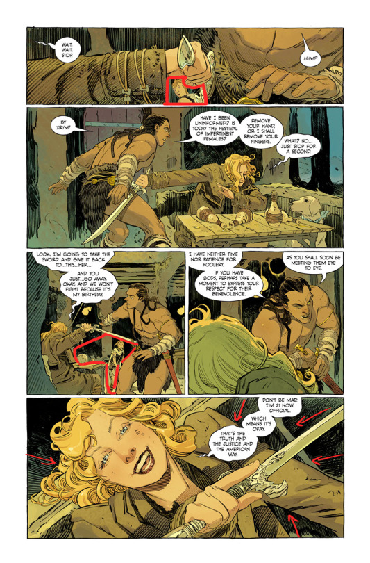
MMMM them FRAMES within FRAMES!
Okay, but before I get into that, I do wanna briefly mention panel size and shape.
All of these pages (save for 1 and 7, which are full-page illustrations) pretty much stick to a very traditional panel structure. Each panel is completely enclosed, and there is zero variety in terms of shape. It’s all rectangles.
BUT. The size and orientation change--take, for instance, that ‘skinny’ horizontal panel up top, the way it perfectly suits the ‘shape’ of the elements/action being shown. It’s a close on Kara’s wrist/hand, reaching out for the sword in the guy’s belt.
I mention this because often, writers don’t dictate stuff like panel layout in a script. They will give the artist the number of panels, and what needs to be included in each one, but the actual, overall organization of the page? Totally up to the artist.
So! Really knowing what you want to highlight and convey is key, because you can use the panels’ size/shape/relation to other panels to ENHANCE those images, like that sword grabbing up top!
AND! Another thing I love about that panel in particular is the way that Kara’s hand and the sword make a tiny frame for Ruthye! Who is, again, VERY TINY!
I keep mentioning the size thing because it’s a nice bit of economical visual storytelling; the child character is going to be smaller than the adult characters anyway, but by calling attention to it repeatedly, we as the viewer are constantly reminded that this kid is small! She needs help! She needs to be protected! Which is like, the whole premise of the inciting incident. XD Good stuff!
(Also more dot eyes in comics that aren’t humor comics, please.)
There’s another frame down in panel 3 as well! Evely uses this device several times throughout this sequence; it’s such a great use of the multiple swords in the scene, AND shows that she can really pack all of the characters in there without cutting any of them off/obscuring them behind various objects.
And like, NO TANGENTS, which takes some serious skillz.
ESPECIALLY when you consider all that beautiful linework. LOOK AT THEM INKS.
...In particular, look at them inks in panel 5! The shading on the booth is done in such a manner that the ‘grain’ of the ink defines the perspective. We’re looking down at Kara, from above. This is a helpful little bit of orientation, as there’s not a ton of room around Kara to have any other perspective lines to help sell the angle.
ALSO, NOTE THE POSITION OF MR. BRUTE IN PANEL 4, AND THEN KARA’S EYELINE IN PANEL 5. It will be important in...
PAGE 5!

Allow me to explain:
In panel four on page 4, we see the guy reach for his sword, his body language revealing that he’s intent on moving towards Kara.
In panel 5 on the same page, we get that lovely down shot of Kara looking right up at us, the viewer. But also, the implication is that she’s ACTUALLY looking at Tough Guy, because in the next page, we see that he’s positioned himself right above her to swing that sword down!
(My apologies for the poor attempts at drawn annotations.)
There’s no action lines cluttering up the beautiful art; Not-Conan’s hair, rather, acts as the action line/guiding ‘arc’ so that we can better follow the movement.
Kara, likewise, doesn’t have any action lines on her, but her posture and hair act as visual cues to tell us that she slides over in the booth, out of the way of the sword.
In particular, the way her right shoulder/arm draws closer to her body, and the way her left hand comes up to offset the way she’s now positioned, really sells the ‘slide’.
More beautiful indicators of movement in panel 2; the hair, the action line on the sword, the torn fabric of Kara’s shirt.
Panel 3 brings more FRAMES WITHIN FRAMES! And, actually, as I’m looking at it? I think it could be argued that we actually have a FRAME within a FRAME within a FRAME!
First frame: Panel border, natch.
Second frame: Goofus’ sword, arm, and face frame Kara.
Third frame: Kara’s arm and sword work with Goofus’ head again to frame tiny Krypto.
LAYERS.
And now, a note about colors!
I said before that I love the palette at play. The earthy tones give the entire setting an organic feel--this is not a high-tech locale! We’re dealing with natural materials here.
BUT THEN THOSE BLUES!
Not only do we get that nice split complementary thing happening with the yellow, but it also signals the blue of Kara’s costume, a little hint of which is revealed in the final page.
And, like. It’s night time. XD
(I just gotta say, love the cold blue outside the window next to Kara’s table, contrasted with the warm yellow of the interior. Even though this is a bar, there’s still that element of like. Coziness.)
Also! Even though the overall palette is heavy on the yellows, Kara’s hair is more saturated and leans towards a warmer yellow, while the rest of the yellows in the scene are cooler. Thus! We have CONTRAST! Our eyes are drawn right to her.
And I know--I KNOW--that SG comics twitter already hates King because Kara’s DRINKING and personally I want more of the story/context before I pass any judgement but I must admit, the shapes? In panel 5? With Kara drinking in the foreground?
I kinda love it.
Also mmmm-MMMM, more of them SOFT BLUES.
Okay. PAGE 6!

Now THIS PAGE is what inspired this whole endeavor.
Because, okay. If I’ve not made it clear by now: I read a lot of comics.
And I generally enjoy all of the comics I read!
But, what I’ve found lately, is that if I don’t enjoy a comic, it’s because I, as a reader, find myself confused by the art.
Confused as in, the art is hard to follow.
That can be because the color design/ink work doesn’t have enough contrast, or the composition is muddled, but most frequently?
It’s poor panel-to-panel action.
When there’s no flow/connection between what’s happening in one panel vs. another, suddenly it’s on you, as the reader, to do a lot more of the work as you go through the scene. And sometimes! We don’t even have enough visual information to DO that work!
So when I read this, I was like, ‘ah, thank you, an easy flow of action for my brain to appreciate.’ XD
AND SO. Panel 1! Same stuff we’ve been seeing! The ink work, hair, clothing details, etc. all work to show us which direction each character is moving. Kara’s arm and jacket all point to her slamming that mug in the dude’s face; dude’s sword serves as a GIANT ARROW illustrating the path of his stab.
Not much to say on panels 2 and 3 other than: FACIAL EXPRESSIONS! And also, HAIR!!!
PANEL FOOOOUR!!!!
Love. This. Panel.
Again, I really love that there are no action lines slapped on top of this gorgeous art, all of the movement is conveyed in the inks, body language, clothes, and so on.
Like. There’s a conscious decision, here, to not have Kara’s hair obscuring the dude’s torso, and that’s good! Because his belt/uhh...kilt? Skirt? Is showing us the speed and direction of his jab; if Kara’s hair were in the way, it would break up the flow.
BUT THEN HOW TO SHOW THAT KARA’S DIPPING FORWARD???
Note the ties on her cuff, and the inks on her jacket!
There’s nothing special happening with Krypto, BTW. I just circled him because he’s a Good Boy who deserves to be noticed.
Panel 5, more of the same, the inks telling us how these characters are moving through space. ALSO, the length of the lines conveys speed without needing to add something distracting/obscure the art with a ‘blur’ effect.
Final panel! I. LOVE. THIS.
Particularly the movement in Kara’s hair, just. Beautiful shape language.
But in addition! You’ve got that LOVELY line of action in Kara’s spine as she flips him over, the sword likewise curved in the direction of the throw.
And of course, the dude is crumpling in the appropriate direction, bent in the middle as he collides with the table to--quite literally--complete the circle.
Also, just. The characterization here, is PHENOMENAL.
People (read: irate fans on twitter) have expressed concern (read: complained) about Kara having a sword. Some have even gone so far as to suggest that Kara’s basically a murderer now, because she’s using a weapon.
Never mind the fact that in an episode of JLU, Supergirl used both a sword AND a gun to defend herself while in Skartaris because she had no powers.
Except we see here that Kara DOESN’T USE THE SWORD to take the guy out, she uses his own force against him. She only uses the swords in the FINAL PAGE in a type of ‘yield’ fashion.
(This particular ‘fight’ sequence reminded me of Brainy’s fighting style in the show so of course that added to my overall enjoyment.)
Like, Kara’s got no powers here, she very well could have used the sword to defend herself, and would...kinda be justified.
But she didn’t!
Like. Even drunk and therefore out of it, Kara 1.) Steps in to help that kid and 2.) doesn’t use superpowered lethal force on the guy. (I mean, she can’t use her super powers anyway, what with the red sun, but you get the idea.)
And like, the flourish there, of the arms, the way the jacket swirls around her, like a gymnast sticking the landing, GAAAAAHHHH I just love it. It’s great.
Okay, FINAL PAGE, #7:

I mean. What more can I say? EVELY AND LOPES, MAN.
Just some top notch art.
(Also get it guys, it’s a LITERAL shirt rip! XD)
(And look! There’s that tiny bit of blue!)
But anyways, if you’ve made it this far, I applaud you, and thank you for indulging my desire to just. Geek out over one of my favorite comic artists drawing one of my favorite comic characters.
And just to like, reiterate, I’m not suggesting that this comic is THE BEST EVER or that it’s going to redefine the medium, or anything. XD Everything I’ve mentioned here is...pretty basic storytelling mechanics. Watch any movie, and you’ll see all this same stuff at work.
RATHER, this whole post is more about...admiring two artists who clearly know what they’re doing.
And they’re doing it so well! :D
TL;DR: I’m so excited that the Supergirl book has Evely and Lopes, guys. So. Excited.
#stranger speaks#long post#supergirl: woman of tomorrow#art analysis#comic art analysis#edit: whoops forgot content warning tags#cw: alcohol#cw: blood
10 notes
·
View notes
Text
Make It Hurt

Characters: Soulless!Sam x Reader x Demon!Dean.
Words: 189.
Warnings: explicit sexual content, double penetration, vaginal sex, anal sex, 18+.
A/N: @letsby requested #2 for my Eleven Sentence Challenge and a Winchester sandwich... and what better sandwich than our two nasty daddies?! Prompt is in bold. EDIT: I totally forgot to add tags when I originally posted this, whoops. While likes are gold, feedback/reblogs are golden. Please support your content creators. My work is my own, therefore I do not give consent for this story to be re-posted or translated to any other site.
“Are you sure about this?” The taller of the two men asks as he moves to stand behind you, the head of his cock resting hot and wet against the entrance to your puckered asshole.
“Yes,” you say, voice shaky and unsure, and glance over your shoulder at him. “I want it to hurt.”
“Oh sweetheart, you might regret that later,” comes from beneath you as the man buried to the hilt inside your pussy, lets out a wretched laugh. You look back down at him, not missing the way his lips curl up into a malicious grin. “It’s definitely gonna hurt.”
“I can take it,” you affirm.
“Good,” he replies, “but you don’t really have a fuckin’ choice. You’re gonna take it whether you want it or not.”
He nods past you and almost instantly, your breath is snatched from your lungs as your asshole is filled to the brim with cock. They don’t give you time to adjust or tell them it’s too much, they simply start to work in tandem— one in, one out— until the pain bleeds into pleasure, and you’re crying out for more.
***
Supernatural: @allys-creative-bubble @angelofthetrenchcoats @akshi8278 @cluz1babe @deanwanddamons @deanwinchesterswitch @fandom-princess-forevermore @flamencodiva @fairlyspnfanfic @hobby27 @jensengirl83 @jensenswinchester @katelyn--renee @mrswhozeewhatsis @notinlovewithdeanwinchester @peachyafshawn @patrick-hockslutter @pink-sparkly-witch @spnbaby-67 @sammykb1994 @sharp-cheekbones-locked @tumbler-tidbits @treat-winchesterswith-kindness @thoughts-and-funnies @thegirlwhorunswithwinchesters @vicmc624 @waywardbaby @winchest09
Forever: @amandamdiehl @b3autyfuldisast3r @buttercandy16 @crashdevlin @dangertoozmanykids101 @daughterofthenight117 @donnaintx @danneelsmain @dandywinchesterbras @deangirl93 @doozywoozy @downanddirtydean @foxyjwls007 @gayasslookinass @hoewkeye @heyyouwiththeassbutt @hoboal87 @ilovefanfic86 @jewelswrites-ish @joseyrw @letsby @letsdisneythings @mogaruke @notyourtypicalrose @nik2write @novawillowbarnes @obsessivelycapricious @pinkshenanigan @princessmisery666 @rattwritesfics @sea040561 @sweeterthanthis @slutformarvelmen @simpformarvelmenandwoman @stoneyggirl @that-one-gay-girl @warriorqueen1991 @wonder-cole @xoxabs88xox @zooaliaa
#dean winchester#dean winchester x you#dean winchester x reader#dean winchester fanfiction#jensen ackles fanfiction#sam winchester#sam winchester x you#sam winchester x reader#sam winchester fanfiction#jared padalecki fanfiction#dean x reader x sam#how am i supposed to write something in just eleven sentences?!
319 notes
·
View notes
Text
Ok. Hi. Reason here. I am working out how to handle everything and would value some feedback on my initial thoughts moving forward.
First things first, I will be going back and putting content warnings for police violence (along with any other relevant cws) on asks from yesterday.
They, and asks going forward, will also be tagged so that anyone who needs to filter this conversation from their dashboard can do that as well. (I haven’t figured out what to tag them as but I’ll update this when I do. Suggestions welcome.) edit: whoops I forgot to do this sorry y’all.
I haven’t decided yet whether to gather up some asks into compilation style posts or just post them individually.
I may be going back to asks from yesterday and editing in my thoughts rather than reblogging, to avoid really overwhelming your dashes. I will let swift’s thoughts stand but add my own response. Edit: I also ended up not doing this because there were so many new asks to get to.
I understand and want to uphold and amplify the anger and frustration that was expressed by many of you. I feel out of my depth here. I’m so fucking grateful to everyone of you who’s shared their thoughts and their time and effort with me.
Moving forward from here is going to be... I don’t really have a roadmap for this. But I am profoundly disappointed, like many of you. I’m trying and failing to find words.
Please be patient with me today as I work through the inbox. I will try to have a more personal post up as well. Big luv
1 note
·
View note