#fixed footer css
Explore tagged Tumblr posts
Visit Tumblr Blog
Explore Tumblr blogs with no restrictions, modern design and the best experience.
Last Seen Tumblr Blogs


Fun Fact
The Tumblr office adopted Tommy, an 11-year-old Pomeranian.
Text

Fixed Footer at Bottom Our Telegram Channel
#fixed footer at bottom#fixed footer css#fixed footer html#footer design#html css#codingflicks#learn to code#code#frontend#css#html#css3#frontenddevelopment#html5 css3#webdesign
1 note
·
View note
Text

Sticky Footer on Scroll
#sticky footer on scroll#fixed footer#html css#divinectorweb#webdesign#frontenddevelopment#css#html#css3#learn to code#footer html css#vanilla javascript
5 notes
·
View notes
Text
ao3 skins faq
Just a few answers to questions I've seen in the notes on this poll
What is a site skin? A site skin is CSS code that changes the way AO3 looks. This could be anything from changing the page colour to the font to the way tags look to hiding parts of the site - and more.
Where do I find site skins? There are a few places. The easiest one is in the site footer (that red band at the bottom of the page). There are four skins linked there under the word Customize, and you can click on them to see what they do. Another place to find skins is https://archiveofourown.org/skins?skin_type=Site Those skins were created years ago and loaded into AO3 for easy applicaiton. Just hit the Use button and they'll be applied to your account. Lastly, you can find skins created by other AO3 users. Some people post their code on AO3 itself, some use github or other code repositories. A lot of folks share their skins here on tumblr with images and then a link to the code itself.
How do I save them to my account? If you're using the ones in the footer or the ones linked on the Public Skins page, you don't need to save them. Those are built into AO3. If you want to create your own (or use one created by another user), that's when you save them to your account. Tap on your name at the top of the Ao3 page. Then select Dashboard, then select Skins. Tap the button labelled Create Site Skin and give your skin a unique name. Write or paste the CSS code into the big box, then hit the Submit button to save it. If you want to use it right away, hit the Use button on the next page.
What's the difference between a Work Skin and a Site Skin? A work skin changes the appearance of an individual AO3 work, and it changes it for everyone who looks at that work. This lets you turn your fic into something that looks like an email or a text chain or a newspaper, etc etc without having to use images. Work skins can also be turned off by other users, so if they just want to read the plain text of your work they still can. A site skin changes how the entire site looks - but only for you.
How do you have 100+ site skins?? I start a lot of skins that I abandon partway through. I also create skins for certain specific purposes - for example, changing the look of all of the buttons on the site - and then I can just grab that chunk of code and add it to any "full" site skins I create for the purposes of sharing. I have a lot of experiments that fail, but I keep the code around because maybe I'll learn how to fix it someday.
Can I create my own site skin if I don't know how to code? You can! AO3 has a site skin Wizard that will help you change the colours, fonts, and font sizes on the site. Go to your Dashboard > Skins > Create Site Skin and then tap on Use Wizard. Give your skin a unique title. Click on the ? bubbles to get examples of how to enter information into each box. If there's anything you don't want to change, you can just leave that box empty. When you add in colours, they must be hex colour codes, and they must include the # at the start. Any font you add need to exist on your device (so it might work on your computer but not on your phone because your phone doesn't have that font installed). You can add parent skins to Wizard skins, too. See below!
I wish I could have [X functionality] in [Y aesthetic skin] You can! If you create one site skin in order to block certain works or tags, you can add that skin on top of an aesthetic skin. To do so, edit your aesthetic skin, scroll down and tap on the Advanced button (lower left of the CSS box), tap on Parent Skin, type in the name of your blocking skin and Add Parent Skin. Then save your aesthetic skin, and the two are combined! You can also do this with those skins that are native to AO3. So for example, you want a Reversi (dark mode) skin that Shortens Long Tags and also hides the "you have muted some users" banner. Create a site skin with the muted users code:
p.muted.notice { display: none; } And add Reversi and Shortening Long Tag Fields to it as parents. (you can also copy/paste all of the code into a single site skin, if you'd prefer)
For more FAQs, you can check out the Skins & Archive Interface section on AO3's FAQ page. Or you can drop questions in the notes, too.
316 notes
·
View notes
Text
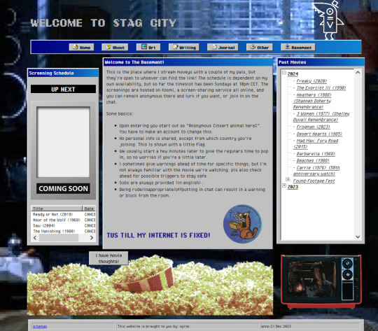
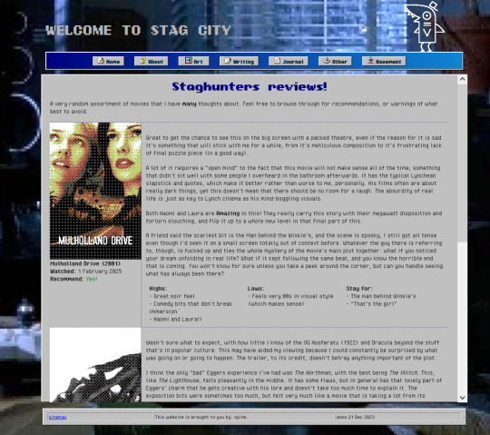
STAGCITIES UPDATE!!!
Very excited for this one: I re-did a lot of the css on my website! It's responsive, better sectioned, and just looks prettier imo.
Here's a quick tour.
Zoomed-out to 70% to fit, but the home page! left is old, middle is new, right is a mobile device impression.
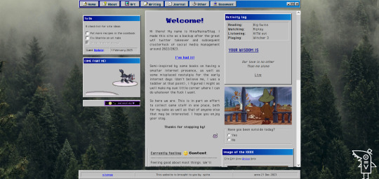
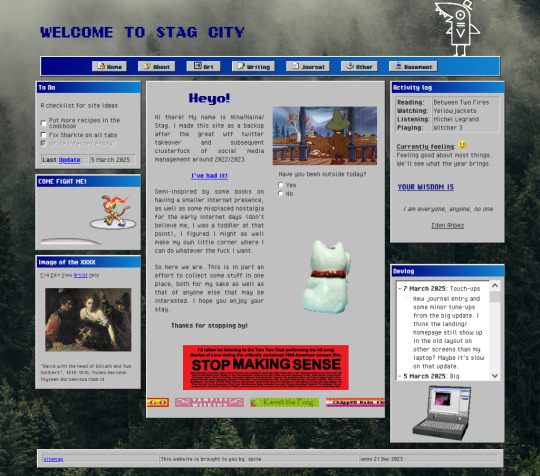
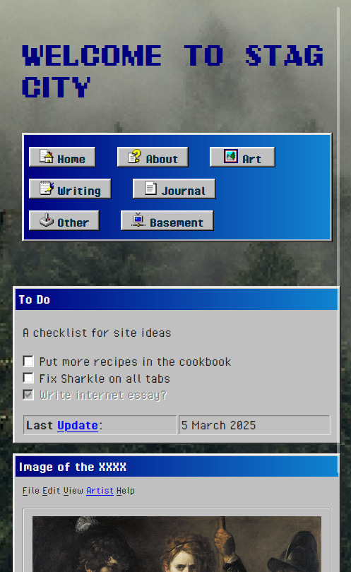
The header and footer are the same on every page. Sharkle is now at the top and works everywhere! I took some bits from the main section of the old homepage and moved them to the sidebars. On the whole, I think it looks a bit more organized.
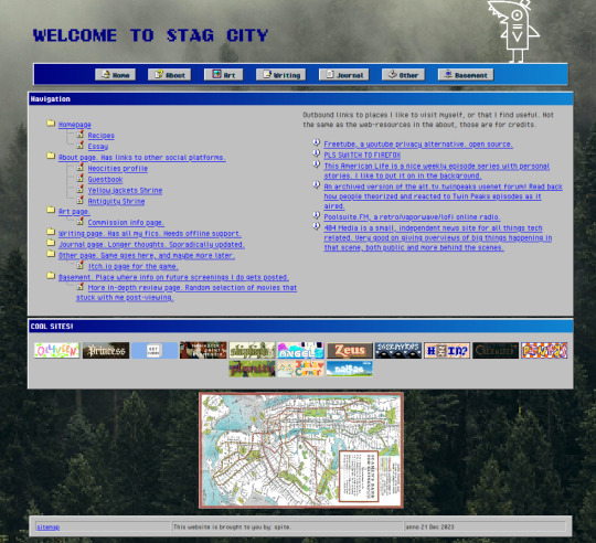
sitemap is basically the same, but now has a fun map of the manhattan subway there.
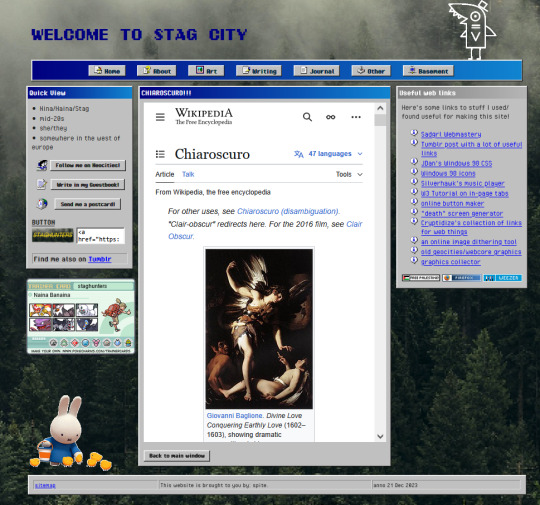
the about is also basically the same. it's the same length everywhere, and opening up tabs within this page stretches them out all the way to the bottom if needed.
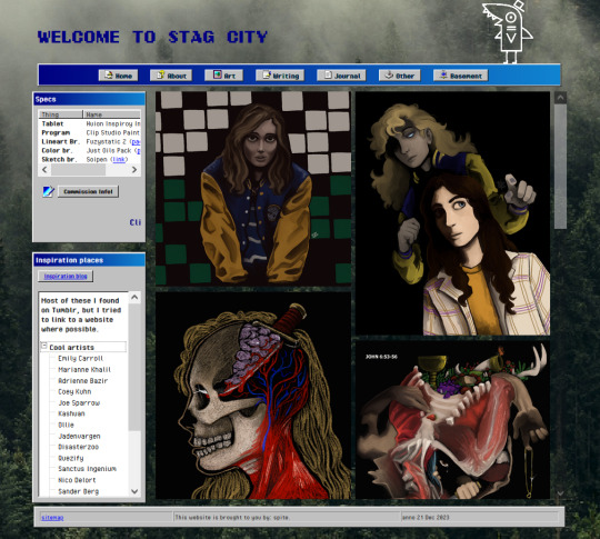
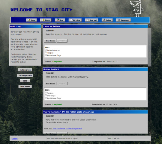
same goes for art and writing!
journal got some overhaul! as you may see (this is 70% again) elements don't start floating away from the center when screensize changes. kitty is still grumpy tho

other page now has the zine and some preview images!

basement looks WAY nicer, and now has a good popcorn link to the reviews page
Very proud of managing this, but I still gotta fix some more of the old pages before I get to making new stuff. TLDR: gridbox my bestie <3
#stagcities#neocities#wasn't too big of a challenge to overhaul#just the usual keep track of closing tags on things
5 notes
·
View notes
Note
Ur website so cool!! ❤️❤️ Do you have by any chances coding tips? Been trying to make my own website for a while but adhd won't let me concentrate a second when it comes to learning coding
Thank you! And 100% It is deceptively approachable but also time consuming, I'm familiar enough with html from a highschool class where we did need to write code out by hand, and then soft practice with coding toyhou.se profiles and futzing around with free code snippets. Largely though I don't think you need to know everything or to write everything by hand, you just need to frankenstein code pieces together (As long as they're free ofc).
I used this first, it's fucking insanely handy and lets you make a simple layout with sidebars, navigation, header, footer and a body base ect, and then just generate and copy the code. The html itself also has greyed out little notes about what parts do what!
I'll be real the rest of it after that is just me googling what I want to do or googling html snippets bc I forgot them. So like html image link with size attributes ect ect, how to make a html image gallery. I don't use one site exclusively but w3schools.com has a bunch of common ones and also has a little live code editor in its tutorials.
Like I still get greatly stumped for hours bc code's kinda sensitive and one or two characters out of place will break sections of it especially when ur just frankensteining. Trying out little segments in live code editors is really helpful because you can kinda break it apart and diagnose the issue before putting it into your site html.
Also if it helps this is kind of how I break it down in my brain as another ADHD-er. so fuckign sorry for how this looks im doing it in snipping tool. But code bits love to live in cages even if it all looks the same, iit would also help if you clean your code up mine is pretty horrid but you just want to familiarize yourself with the little "Sections" ig that's where doing things by hand would help because you would 100% know what each chunk is for but yk yk.
CSS is a different beast I barely understand. The parts of code where it starts stacking on top instead of being horizontal is css and it's basically how you do fancier things to your code, it's linked to stuff you already have down. So like changing the background in the body text box or something, you can only do so much in there. Css targetting the body text box is where you can level it up. Again the sadgrl layout builder has notes so you're not completely blind in there. There's also 100% so many resources to explain what all these words mean, my mmethod is incredibly avoidant I don't know what flex is I haven't needed to fight her yet ect ect.

Sorry if this is confusing this is just my hack and slash understanding atm. Be humbled by code I've spent too long trying to fix up hysterical margin issues just because I had a random apostrophe somewhere or because I tried to spell it colour and not color ect.
33 notes
·
View notes
Text
Web Designing 101: Everything You Need to Know as a Beginner
Introduction
In case you've ever wondered how web sites go from clean pages to sleek, interactive stories, you have stepped into the world of web designing. From the format and shades to the fonts and navigation, net layout shapes how customers sense and engage online. In today’s digital-first international, know-how the fundamentals of net layout is essential—now not only for designers however for all and sundry who wants to launch a website with cause and varnish.
Whether or not you are an entrepreneur, innovative, or someone seeking to pick up a valuable skill, this guide will walk you via the crucial factors of net layout, display you the equipment you want, and assist you begin constructing web sites which might be each lovely and useful.
1. What exactly Is net design?
Internet design is greater than simply making things look pretty—it’s bridging aesthetics with usability:
Visual layout (UI): choosing colorings, typography, and layouts that engage customers and bring brand identity.
User revel in (UX): Crafting intuitive and exciting navigation paths thru the web site.
Responsive layout: making sure the web page works properly on laptop, pill, and cell gadgets.
Interaction layout: Incorporating animations, buttons, and comments to make the site sense alive.
🧩 Why internet design matters
First Impressions matter: A smooth, professional site builds agree with right away.
Better Engagement: nicely-designed websites encourage customers to stay longer, discover greater—because of this higher conversions.
Seo pleasant: clean code and mobile responsiveness assist your site get located via engines like google.
Stick out from the gang: precise, well-designed sites assist you stand aside in a crowded online space.
2. The net Designing technique: A Step-through-Step manual
Right here’s a newbie-pleasant roadmap to approach your net design adventure:
A. Research & planning
Define Your goals: Do you want to showcase a portfolio, promote products, or proportion content?
Recognise Your audience: who're they, what troubles do they've, and how do they seek on line?
Competitor analysis: discover strengths and weaknesses in competitors' web sites to set your USP!
B. Wireframing & layout
Caricature the structure: Use tools like Figma, comic strip, or Adobe XD—or maybe pen and paper—to map out pages.
Focus on Hierarchy: arrange content material to manual attention, placing CTAs where they naturally belong.
Make sure White space: deliver your layout room to respire—litter overwhelms.
C. Visible layout (UI design)
Pick a shade Scheme: A number one palette of two–three colorings maintains the layout unified. Use gear like Coolors or Adobe color for notion.
Pick web-secure Fonts: Pair a serif header with a sans-serif frame; Google Fonts is a first-rate free supply.
Include Imagery: Use satisfactory pictures or icons (Unsplash, Pexels, Flaticon) to make your format pop.
D. Responsive layout
Mobile-First technique: layout for the smallest display screen first, then scale up.
Trying out across devices: Use browser tools or preview in actual devices to ensure your web site works anywhere.
Bendy factors: keep away from fixed width—use percent-based totally sizing and bendy grids.
E. Development basics
HTML for structure
html
CopyEdit
<header><h1>web site title</h1></header>
<nav>…</nav>
<main>…</main>
<footer>…</footer>
CSS for style
css
CopyEdit
Body font-own family: Arial, sans-serif; history: #f8f8f8;
Header heritage: #003366; color: white; padding: 20px;
Optional: JavaScript for Interactivity
Show/cover content, animate buttons, reply to person actions
F. Checking out & Refinement
Pass-Browser exams: make sure it looks correct on Chrome, Firefox, Safari, and side.
Usability assessments: Ask actual people to test it—look ahead to confusion, damaged hyperlinks, or gradual pages.
Performance checks: Use Google PageSpeed Insights and GTMetrix to optimize load time.
G. Launch & preservation
Use a reliable Host: alternatives variety from Bluehost and SiteGround to cloud solutions like AWS.
Select a CMS: WordPress, Webflow, or maybe headless CMS depending in your desires.
Monitor & enhance: Use analytics equipment to track overall performance and refine primarily based on real facts.
Three. Critical tools each newbie need to recognize
Layout & Prototyping
Figma: loose collaboration with effective UI equipment.
Adobe XD: tremendous for prototyping and interaction-heavy designs.
Cartoon: A macOS favourite—easy however effective.
Improvement
VS Code: A free, extensible code editor with heaps of beneficial plugins.
Browser DevTools: best for actual-time edits and debugging.
Git + GitHub: version manage way to song adjustments and collaborate.
Portraits & images
Canva: smooth tool for simple banners or social photos.
Unsplash/Pexels: terrific unfastened pictures.
TinyPNG: Compress pictures with out dropping first-rate.
Fonts & Icons
Google Fonts
Font terrific or Flaticon
Overall performance & checking out
Google PageSpeed Insights
GTMetrix
Google Analytics
Four. Middle layout standards every clothier ought to comply with
Visual Hierarchy
Highlight crucial factors (headlines, CTAs) the use of length, colour, and site.
Alignment & clarity
Steady spacing across elements maintains your layout balanced.
Consistency
Repeating design patterns builds familiarity and accept as true with.
Accessibility
Alt text for pix
Keyboard navigation
Colour contrast ratios (use equipment like WebAIM contrast checker)
Comments
Make certain buttons and inputs respond (hover styles, click animations) so customers understand what’s happening.
Five. Not unusual errors novices ought to keep away from
Litter Overload: Too many fonts, snap shots, and buttons confuse customers.
Ignoring cellular: laptop-most effective web sites frustrate most people of cellular visitors.
Slow Load times: massive pics or heavy scripts force users away.
Terrible clarity: Tiny fonts, low assessment, and lengthy paragraphs harm consumer experience.
Broken hyperlinks & Typos: Small errors break credibility.
6. Studying & developing: What’s subsequent After the fundamentals?
Be part of on-line publications: Coursera, Udemy, or freeCodeCamp have notable tutorials.
Construct a Portfolio: Create small initiatives like a non-public web page, landing pages, or event microsites.
Observe other web sites: analyze top manufacturers and nearby competition—what works and why?
Study a CSS Framework: discover Bootstrap or Tailwind for faster, cleanser code.
Iterate & update: Your first website isn’t your ultimate—hold refining as you learn.
Conclusion
Net design is a blend of art and technology—stability visuals with usability to create stories human beings enjoy. With this manual, you have got the fundamentals covered: making plans your site, learning the equipment, know-how format and visuals, building and trying out your design, and launching it live.
The nice component? Web layout is a adventure of continual boom. Practice regularly, collaborate with others, and keep refining your capabilities. Destiny you'll thanks for starting now.
FAQs
1. Do I need to learn coding to be a web clothier?
Not continually—tools like Webflow or Wix permit you to layout visually. However knowing HTML/CSS allows you customise and stand out.
2. Am i able to layout on cell devices?
It is better to use computing device for layout work. Mobile tools exist, however actual layout paintings desires display screen area and precision.
3. How long does it take to build a basic web site?
Easy portfolio or brochure web sites can take some days. More complicated designs and CMS integration might also take some weeks.
4. Ought to I begin with a non-public assignment or purchaser paintings?
Start with personal or pattern tasks—no deadline stress—then show off them on your portfolio to attract actual customers.
Five. Where can i get feedback on my design paintings?
Join communities like Dribbble, Behance, Reddit’s r/web_design, or facebook/Webflow corporations to acquire critique and enhance quicker.
0 notes
Text
How to Remove or Change Footer Credit in WordPress (No Coding Needed)
Do You Know That 70% of WordPress Users Want to Customize Their Footer Credit?
You’ve built a beautiful WordPress site—but at the bottom, it still says “Powered by WordPress” or displays the theme developer’s name. Sound familiar? You’re not alone.
For many site owners, these default footer credits can feel like an eyesore. Worse, they limit your site’s branding and professionalism. Whether you’re managing a business website or personal blog, your site should reflect your identity—not someone else’s.
But here’s the catch: most themes don’t make it easy to change or remove this text. Some lock the footer credit into the code, while others only allow editing with a premium upgrade.
The good news? You don’t need to be a developer to fix this.
In this post, we’ll guide you through multiple ways to remove or change your WordPress footer credit, with or without touching code. 🔍 What is a Footer Credit in WordPress?
A footer credit is the text or link at the bottom of your WordPress website, often saying things like “Powered by WordPress” or “Theme by [Developer Name].” While it may seem small, it plays a big role in how your site is perceived.
Why change it?Improve branding Enhance credibility Give your site a more professional look
🛠️ 7 Ways to Remove or Change Footer Credit in WordPress
Using the Theme Customizer
Many themes offer a setting under Appearance > Customize > Footer where you can directly edit or remove the footer text. If you’re lucky, this is the easiest solution.
Editing footer.php File
Go to Appearance > Theme Editor, find footer.php, and look for the footer text. You can edit or delete it here—but be cautious. Always use a child theme to prevent losing changes during updates.
Using Footer Credit Plugins
If your theme doesn’t allow direct edits, try a plugin:Remove Footer Credit Footer Putter
These tools provide a user-friendly interface to customize or remove footer credits without editing code.
Hiding Footer Text with CSS
Not ideal, but quick. You can add this under Appearance > Customize > Additional CSS:
.site-info { display: none; }
⚠️ This only hides the text visually. It's still in your source code.
Changing Footer with Theme Hooks
If your theme uses action hooks (e.g., GeneratePress), you can add this to your functions.php:
function remove_footer_credit() { remove_action('generate_credits', 'generate_construct_footer'); } add_action('init', 'remove_footer_credit');
Check your theme’s documentation for hook names before applying.
Use a Child Theme
Editing core theme files directly is risky. Instead, create a child theme, copy over footer.php, and make your changes there. This keeps your customizations safe during theme updates.
Know the Legal Stuff
Some free themes require you to retain credits due to licensing. Always check your theme's license before removing footer text, especially if you're using a GPL-compliant or freemium theme. ✅ Final Thoughts
Removing or changing footer credit in WordPress helps your site feel more authentic and professional. Whether you prefer plugins, customizer settings, or direct file editing, there’s a method for every skill level.
📌 Pro Tip: Always back up your site before making any changes to theme files.
💬 Have you customized your WordPress footer yet? What method worked best for you? Let us know in the comments!
🔗 Read the full guide here: https://reactheme.com/ways-to-remove-or-change-footer-credit-in-wordpress/
0 notes
Text
Testing the code
/* CSS for the copyright notice */ footer { position: fixed; bottom: 0; width: 100%; background-color: #333; color: white; text-align: center; padding: 10px 0; font-size: 14px; font-family: Arial, sans-serif; }
footer a { color: #ffcc00; text-decoration: none; }
footer a:hover { text-decoration: underline; }
#code #learning
0 notes
Text
SEO Best Practices for Website Development: Building with Optimization in Mind
In today's highly competitive digital landscape, having a beautifully designed website isn't enough. At AceOne Technologies, we understand that to truly stand out, your website must be optimized for search engines from the ground up. Implementing SEO best practices during the development stage can save time, enhance search rankings, and improve user experience. By seamlessly integrating SEO into your website development process, you set the foundation for long-term digital success.
1. Plan Your Website Structure and Navigation
A well-organized site structure is essential for SEO, ensuring search engine crawlers can effectively index your pages and improve discoverability. Organize content into logical categories and subcategories that are intuitive for users and search engines alike. Use descriptive, keyword-rich URLs that clearly represent the content. Finally, implement an XML sitemap and submit it to search engines to guide them in finding and indexing all your pages efficiently.
2. Optimize Page Load Speed
Page speed is crucial for both SEO and user experience, as slow websites can frustrate visitors and rank lower in search results. To optimize load speed, minimize HTTP requests by reducing page elements such as images, scripts, and CSS files. Optimize images through compression and use next-gen formats like WebP to maintain quality with better performance. Enable browser caching so that browsers can store parts of your site, such as images and stylesheets, reducing the need to reload resources. Additionally, using a Content Delivery Network (CDN) helps distribute content, speeding up load times for users in different regions.
3. Mobile-First Design
With over half of global web traffic coming from mobile devices, having a mobile-friendly website is essential. Implement responsive design to ensure your site adjusts seamlessly to different screen sizes using flexible grids and layouts. Regularly test mobile usability with tools like Google’s Mobile-Friendly Test to identify and resolve any issues that could hinder the user experience. Additionally, optimize for touch by designing buttons and interactive elements that are easy to use on touchscreens, enhancing overall accessibility and functionality for mobile users.
4. Clean and Efficient Code
Search engines favor clean, well-organized code that facilitates easy crawling and indexing. To achieve this, use semantic HTML tags like <header>, <section>, <article>, and <footer> to give context to your content. Minify your CSS and JavaScript by removing unnecessary spaces and comments to reduce code size. Additionally, ensure that structured data markup, such as schema markup, is in place to help search engines understand your content better and enable rich snippets in search results.
5. Prioritize Content Optimization
Content is a major driver of SEO, so ensure it is optimized for both readers and search engines. Include target keywords naturally by researching and integrating primary and secondary keywords into headers, body text, and meta tags without overloading them. Use descriptive titles and headings, structuring content with an <h1> tag for the main title and <h2> and <h3> for subheadings, to help search engines grasp the hierarchy and relevance of your content. Create unique meta descriptions that are concise, engaging, and keyword-rich to encourage clicks. Additionally, add descriptive alt text for images to improve accessibility and help search engines understand image content.
6. Internal and External Linking
Linking is essential for boosting SEO and guiding users through your site. Use strategic internal linking to distribute link equity and direct users to related content, and include quality external links to credible sources for added context and authority. Regularly check and fix broken links using tools to maintain site health.
7. Secure Your Site with HTTPS
Security is an important ranking factor, making the transition to HTTPS crucial for both SEO and user trust. To secure your site, install an SSL certificate to enable HTTPS, ensuring data encryption and a secure connection. Additionally, check for mixed content issues to confirm that all resources on your site load over HTTPS, preventing browser warnings and enhancing user confidence.
8. Optimize for Local SEO (If Applicable)
If your business has a local focus, optimizing for local search can drive traffic and engagement. Create location-specific pages with unique content for each service area, set up and maintain a complete Google My Business profile with accurate information and high-quality images, and encourage customer reviews to boost credibility and influence local search rankings.
9. Use Analytics and Tracking Tools
To measure the effectiveness of your SEO efforts, integrate analytics tools during development. Use Google Analytics to track user behavior, page views, and conversions to gain insights into visitor interactions. Employ Google Search Console to monitor your site's search presence, identify issues, and optimize performance.
Final Thoughts
Building a website with SEO in mind from the start saves significant effort in the long run and positions your site for better visibility and higher traffic. At AceOne Technologies, we emphasize the importance of considering site structure, page speed, mobile optimization, clean coding practices, and comprehensive content strategies to ensure your website is primed for user engagement and search engine success. Following these best practices during website development provides a competitive advantage and sets your business up for sustainable online growth.
#Digital Marketing Jonesboro AR#Website design Memphis Tn#Website Design Fayetteville AR#Website design Little Rock AR#Mobile app development Memphis Tn#Mobile app Development Little Rock AR#Website Design Rogers AR#Mobile app Development Rogers AR#Digital Marketing#Website Development#Website Design#Mobile App Development#Mobile App Design
0 notes
Text
How to Handle Complex PSD Designs During WordPress Conversion
Converting complex PSD designs to WordPress can be a challenging task, but with the right approach, you can achieve a seamless transition. Here’s a step-by-step guide to help you navigate the PSD to WordPress conversion process efficiently.
1. Understand the Design Thoroughly
Before starting the PSD to WordPress conversion, ensure you fully understand the PSD design:
Analyze Layout: Break down the design into sections like header, footer, content, and sidebar.
Identify Features: Note any special features such as sliders, forms, or interactive elements.
Check Responsiveness: Ensure you understand how the design should adapt to different screen sizes.
2. Prepare Your Tools
Equip yourself with the necessary tools for a successful PSD to WordPress conversion:
Design Software: Use Adobe Photoshop or a similar tool to inspect and slice the PSD.
Development Environment: Set up a local WordPress environment for testing.
Plugins and Themes: Install necessary plugins and choose a base theme if needed.
3. Slice the PSD
Slice the PSD into manageable pieces for the PSD to WordPress conversion:
Header and Footer: Extract these elements as separate images.
Content Areas: Slice images used in the content area, such as backgrounds and icons.
Buttons and Icons: Save these as individual images for easy integration.
4. Convert to HTML/CSS
Create a static HTML/CSS version of the design as a precursor to the PSD to WordPress conversion:
HTML Structure: Write clean, semantic HTML to match the design structure.
CSS Styling: Apply CSS to achieve the visual appearance. Use responsive design techniques like media queries for mobile optimization.
5. Integrate with WordPress
Convert your static HTML/CSS into a WordPress theme in the PSD to WordPress process:
Create a Theme: Set up a new WordPress theme directory and create necessary files (style.css, index.php, etc.).
Template Files: Break down the HTML into WordPress template files (header.php, footer.php, sidebar.php).
Theme Functions: Add theme support features in functions.php and enqueue styles/scripts properly.
6. Implement Functionality
Add dynamic functionality during the PSD to WordPress conversion:
Custom Post Types: Create custom post types if the design requires special content types.
Widgets and Menus: Set up widgets and custom menus as needed.
Plugins: Integrate plugins to add features like sliders, contact forms, or SEO enhancements.
7. Test Thoroughly
Ensure everything works as intended:
Cross-Browser Testing: Check compatibility across different browsers.
Mobile Responsiveness: Verify that the site looks good on various devices.
Performance: Test site speed and optimize images and scripts for better performance.
8. Debug and Optimize
Fix any issues that arise:
Debugging: Use debugging tools to identify and resolve errors.
Optimization: Optimize CSS and JavaScript files, and implement caching to enhance site speed.
9. Deploy and Monitor
Deploy the site to the live server:
Migration: Use migration tools or plugins to move from the local environment to the live server.
Monitor: Keep an eye on the site’s performance and user feedback to make necessary adjustments.
10. Documentation and Maintenance
Document the conversion process and plan for ongoing maintenance:
Documentation: Write detailed documentation for future reference.
Updates: Regularly update WordPress, themes, and plugins to ensure security and functionality.
By following these steps, you can effectively handle complex PSD designs during the PSD to WordPress conversion, ensuring a smooth transition from design to a fully functional website.
0 notes
Text

Sticky Footer on Scroll
#sticky footer on scroll#sticky footer#fixed footer#learn html#html5#code#divinector#html css#frontenddevelopment#webdesign#css3#css#learn to code#vanilla javascript#javascript#html
6 notes
·
View notes
Text
What are some best practices for converting Figma designs to HTML?
Converting Figma designs to HTML can be a seamless process with the right approach. Here are some best practices to ensure an effective transition from Figma to HTML:
Prepare Your Design: Before you start coding, ensure your Figma design is clean and well-organized. Use proper layers, naming conventions, and components to make the conversion easier.
Export Assets: Export all necessary assets (images, icons, etc.) from Figma in the appropriate formats. SVGs are great for icons and logos, while PNGs or JPEGs are better for detailed images.
Use a Style Guide: Implement a style guide or design system. Ensure you capture all the typography, color schemes, and spacing in your CSS to maintain design consistency.
Responsive Design: Ensure your HTML and CSS code is responsive. Use media queries to adapt your design for different screen sizes and devices, reflecting the responsive design principles used in Figma.
HTML Structure: Build a semantic HTML structure based on your Figma layout. Use proper HTML5 elements like <header>, <nav>, <main>, and <footer> to enhance accessibility and SEO.
CSS Grid and Flexbox: Utilize CSS Grid and Flexbox to replicate complex layouts and alignments from Figma. These modern layout techniques will help you achieve the design as closely as possible.
Test Across Browsers: Test your HTML output across different browsers and devices to ensure cross-browser compatibility and fix any inconsistencies that arise.
Iterate and Refine: Compare your HTML output with the Figma design and make necessary adjustments. Iteration is key to ensuring the final result matches the design closely.
By following these best practices, you can effectively convert your Figma designs to HTML while maintaining design integrity and functionality.
0 notes
Text
What are HTML5 and CSS3?
The abbreviation CSS stands for “cascading style sheets”. Web designers and writers use CSS to style and format HTML content. CSS is used to improve the look and feel of a web page as well as to manage its style.
This article will explain what CSS3 and HTML5 are. We also explain how it will assist us in developing a cutting-edge website.

What do CSS3 and HTML5 mean?
HTML and CSS, two core language elements, are used to build web pages.
HTML discusses how the pages are assembled in tables, text, headers, and pictures or graphics. It's the standard computer language for making web pages look good.
On the other hand, CSS is the code used to describe each page's appearance, mainly in layout, fonts, and colours.
HTML5
A new version of HTML called HTML5 has been released. It is a huge step up from HTML4, which didn't let web designers add features to sites that HTML didn't enable. They had to use their tools and add plugins to their browsers to do that.
Web users couldn't access the content without a device supporting those proprietary technologies or apps. One example is that Adobe Flash can't be used in Safari on Apple mobile devices.
HTML5's main goal was to eliminate the need for plugins and private technologies. You can make offline apps and add music, video, and animations to your web pages without downloading extra plugins.
CSS3
To add and change things on a web page, web designers and writers use CSS3 and HTML. CSS lets you style a web page in a way that is easy for people to use and looks good. You can choose from different fonts, pictures, colours, tables, etc.
We needed CSS to move different parts of a web page around. Values like "fixed" and "absolute" let you move the visual parts of a web page.
A previous CSS form, CSS2, has been updated to become CSS3. It has a lot of useful improvements and new features that make your online presence better and are now used in modern browsers, such as:
Let people watch videos from other sources without having to add extra plugins
Adding graphics to a web page has become easy.
letting information be shown in more than one column
letting you precisely place all of a web page's navigable parts
Making changes to a document's white space
How do HTML5 and CSS3 work?
There are plenty of different ways for web developers to express themselves with HTML5 and CSS3. Here is a quick rundown of what they are so you can make websites that are on the cutting edge.
The Navigation Tag
This part of HTML5 is often forgotten. Finally, it would help if you always tried to put valuable links inside Nav ("") tags. That may not seem like a big deal, but it becomes apparent when considering how it could help your website's SEO.
Search engine optimization, or SEO, is ensuring that famous search engines, like Google, will list your website. If your name is higher on this list, more people will likely visit your website, and you can expect more business.
Inside links help Google determine what search terms people should use to find your site. The links in your menu are a good sign for crawlers. When you use the Nav tag, tell the bots, "These are the most important links on the website," and help them figure out what it's about. There's no chance you'll get in trouble for not having a Nav tag, but you should do everything possible to help the search engine bots.
The headers and footers
These tags are essential, but they do an important job. When it comes to SEO, headers and footers ("<header>" and "<footer>") work well. The tags split the main text from the header and footer.
Each of the <div> tags in the header and footer are different from the others. This way, search engines can tell the information on your website apart from other material and rank it correctly.
Audio, video, and output
Users are showing an increasing interest in various forms of multimedia. Gone are the days when guests could only read text-based information. It's easy to add video and audio tags ("<video>" and "<audio>"), and HTML5 lets you make any changes you want with JavaScript and different codecs, so you can quickly get the content to work the way you want it to.
The output ("<output>") tags in HTML5 are also used to make customizations easier. Making the page output in JavaScript makes it easier to change and edit any JavaScript parts that are on it than trying to do it through HTML. It sounds pretty easy, and it does make the process go more quickly.
The Articles
People who visit your site should be able to choose how they want to read your information if you want to get all kinds of customers. There is an article tag ("<article>" for those who love reading).
Instead of using many Div tags, developers can use the Article tag to markup single pieces of information, like a blog post. Using the Article tag to separate a website's main text even more between the header and the footer helps make the code cleaner and helps search engines find the site better.
Regarding search engine optimization (SEO), the article tag is likely one of the best. Some things are likely to happen, but they still need to. Search engine crawlers will likely use these tags to determine what information is on your site and give it the right amount of weight in the algorithm. This will help your site rank higher because Google likes content. When you wrap your text in an article tag, you tell Google your site has content. It's also possible that keyword and link texts inside the Article tag will be given more weight than those outside it. This is because, in articles for search engine bots, you have written specific content about the keyword. For the same reason, giving the article title (<title>") traits can also help your search engine optimization (SEO).
Canvas
Canvas tags ("<canvas>") are a more modern feature of HTML 5 that can be used to add different images. This lets you make more changes to the design because certain tags can wrap around where the graphics, images, or charts should go. This makes the design of your website simpler and your code clearer.
Captions and Figures
These two things work together to speed up a long process. You can separate a picture or image by using the figure tag ("<figure>"). After that, a caption ("<figcaption>" tag) can be used to add text to the figure's caption. The caption tags help determine where the caption should go next to the image. This makes adding the necessary text to the image a lot easier.
These tags can be used in the same ways that headers, footers, articles, and sections are.
Making use of CSS3
The abbreviation CSS refers to "cascading style sheets." It is a language for creating style sheets that may be used in conjunction with HTML5. CSS2 is the style sheet language that is currently being used by the World Wide Web Consortium (W3C). The W3C is an organization that makes sure that the best codes are used online. The most recent stable point in the growth of CSS was in 2010. However, W3c is working on adopting CSS3, and some of its modules have already been accepted.
With CSS3, you can focus more on the website's appearance, while HTML5 handles the layout. With CSS3, you can get the newest benefits in fonts, colours, and different backgrounds and border styles.
It's important to remember that not all browsers can handle CSS3. Some work well with some programs and could be better with others. For instance, Firefox can't handle reflections right now. Safari and Chrome, on the other hand, allow everything except overflow scrolling. This module is currently not supported by any major web browsers.
Internet Explorer is at the bottom of the list because it only handles a few modules. However, the most recent versions are getting better at this. Here is a list of all the browsers that support CSS3.
Some Attributes and Pseudo Class Selectors
You can add more details about features to tags and divisions with pseudo class selectors. They are easy to spot because they come after a colon. For example, Hover is an easy selector showing text when the mouse is over a specific tag.
It is possible to set a page's root (":root:") element in CSS3. This has always been " in HTML, but in CSS3, the feature is now more powerful. With CSS3, more class selectors give you more choice over how siblings match. This is paired with more flexibility, which lets related parts do more complex things. This makes the whole process easier to understand and more linked, which makes the result much better.
In the same way, the new attribute selectors give you more power over certain parts of your elements. You can give attributes or look for matches with other elements to make this happen. You can choose traits with this format: "element[att^=val]".
Conclusion
CSS3 and HTML5 are fundamental languages that enable us to create web pages. CSS3 and HTML5 allow us to include navigation tags, header and footer, audio, video, article, canvas, caption, figures, and more. It aided us in developing a cutting-edge website.

Janet Watson MyResellerHome MyResellerhome.com We offer experienced web hosting services that are customized to your specific requirements.
Facebook Twitter
0 notes
Text
What is new in WCAG 2.2
Notes from Deque Webinar 9/7
This will take years for rules and regulations to catch up. 2.2 in final comment period. 2.2 is focused on improving the experience of people with mobility and cognitive disabilities.
Overview:
Added 9 new Success Criteria.
Remove 1 Success Criteria: Parsing
Mobility improvements:
2.4.11 & 2.4.12 Focus not being obscured.
When navigating by keyboard focused element must not be covered by content. Helps people using keyboard navigation. Example a model where someone can tab to items behind it.
AA the item must be partially visible.
AAA the item must be totally visible.
2.5.7 Dragging Movement - AA
Drag and drop cannot be the only way to do something. Provide a simple pointer alternative. Keyboard alt does not meet this. Much have a touch screen/pointer alternative.
2.5.8 Target Size Minimum - AA
Touch area 24x24 CSS px. Minimum Size or control spacing. This applies to desktop and mobile. Draw circles 24 px in diameter and make sure they don't intersect.
You can provide an alternative. That is fine.
Inline exception. Links in text is fine. It's constrained by line height
User agent control. You often can't control browser controlled user elements like drop downs. If you build yourself it applies but if you use browser default it doesn't.
Essential: Maps may have overlapping, legal forms that need to look the same as the paper form.
2.4.13 Focus Appearance - AAA
Focus indicator has sufficient size and contrast from unfocused state.
2 CSS px thick parameter.
Contrast of 3:1 between same pixels in the unfocused state.
Cognitive Improvements
3.2.6 Consistent Help - A
Phone, email, FAQ link, contact info
Always in the same place. Example contact links on the footer.
3.3.7 Redundant Entry - A
Don't require people to enter info more than one. Make it easy for people to enter the info multiple times. They shouldn't have to enter same info more than once in the same session. For example shipping and billing where you can check a box to use shipping address for billing.
Alternate ways to populate info with the same data.
3.3.8 and 3.3.9 Accessible Authentication - AA and AAA
Authentication rules. Must have a way to authenticate that doesn't rely on transcribing codes, recalling something or solving puzzles.
No cognitive function test.
Double AA allows for captcha that requires recognizing items and clicking. AAA does not.
Do not block the ability of password managers and browsers to fill in password. Don't block copy/paste of passwords and username.
Applies to all possible steps including MFA, change password, recover account.
4.1.1 Parsing - A (REMOVED)
Most Parsing issues don't impact accessibility issues. They are hard to fix. Browsers can normally fix.
Issues with duplicate IDs in forms will be covered by the success criteria on accessible labels and names.
0 notes
Text
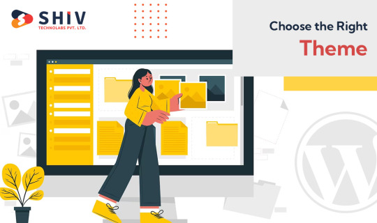
How to Customize WordPress Themes - Step by Step Guide

WordPress, with its user-friendly interface and versatile themes, has revolutionized the way websites are built and customized. Whether you're a blogger, business owner, or an aspiring developer, the ability to customize WordPress themes is a powerful skill that can help you create a unique and visually appealing website. In this step-by-step guide, we'll walk you through the process of customizing WordPress development services to make your website stand out.
Step 1: Choose the Right Theme
Selecting the right theme is crucial, as it forms the foundation of your customization journey. Browse through the official WordPress Theme Directory or consider premium theme marketplaces for a wide variety of options. Look for a theme that aligns with your website's purpose and offers the flexibility you need for customization.
Step 2: Install and Activate the Theme
After choosing a theme, you need to install and activate it. Navigate to the "Appearance" tab in your WordPress dashboard and click on "Themes." Choose "Add New," upload the theme file, and activate it. You can also preview the theme to ensure it suits your vision.
Step 3: Customize Using the Customizer

WordPress offers a powerful tool called Customizer that allows you to make changes to your theme in real-time. From the dashboard, go to "Appearance" and click on "Customize." Here, you'll find various sections like Site Identity, Colors, Background Image, and more, depending on the theme.
Step 4: Customize Site Identity
In the Customizer, start by customizing the site identity. Upload your logo, set the site title and tagline, and choose a site icon (favicon). This helps in brand consistency and recognition.
Step 5: Customize Colors and Typography
Under the Colors and Typography sections, you can adjust the color scheme of your website. Choose a color palette that matches your brand and makes your website visually appealing. You can also adjust font styles and sizes to enhance readability.
Step 6: Set Up the Homepage
If your theme supports custom homepages, you can configure it in the Customizer. You can choose a static page or your latest posts as the homepage. Customize the layout and add sections like featured content, testimonials, or a call-to-action.
Step 7: Add Widgets and Menus
WordPress widgets are small modules that can be added to different areas of your website. In the Customizer, you can navigate to the Widgets section and add widgets to the sidebar, footer, or other widgetized areas. Similarly, set up your navigation menus to ensure easy navigation for your visitors. If you choose to hire a professional, who provides WordPress development services, they can customize the theme based on your brand image.
Step 8: Customize Individual Pages and Posts
While the Customizer offers general settings, you can also customize individual pages and posts. When creating or editing a page, you'll find options to customize the layout, featured image, and other elements specific to that content.
Step 9: Use Page Builders
To take customization to the next level, consider using page builder plugins like Elementor, Beaver Builder, or Divi. These plugins provide a drag-and-drop interface that allows you to design and customize pages with advanced layouts, widgets, and elements.
Step 10: Customize Using CSS
If you're familiar with CSS (Cascading Style Sheets), you can add custom CSS code to further personalize your theme's appearance. Some themes even provide a custom CSS section in the Customizer, making it easier to apply your styling changes.
Step 11: Regularly Update Your Theme
As you customize your WordPress theme, remember to keep it updated. Theme developers often release updates to improve functionality, fix bugs, and enhance security. Always back up your website before updating it to avoid any potential issues.
Step 12: Test Responsiveness
With the increasing use of mobile devices, ensuring your website is responsive is essential. Use the Customizer's responsive preview feature to see how your changes look on different screen sizes.
Step 13: Seek Professional Help
If you have specific customization needs that go beyond your expertise, consider hiring a WordPress development company. They can help you implement complex customizations, optimize performance, and ensure a seamless user experience.
In conclusion, customizing WordPress themes empowers you to create a website that reflects your brand identity and meets your unique requirements. With the right theme, tools, and approach, you can transform a template into a beautifully customized website that stands out in the digital landscape. Remember to experiment, test, and continuously refine your design to achieve the desired results.
0 notes
Text
Convert PSD into WordPress: A Comprehensive Guide
Introduction:
In today's digital era, having a stunning and functional website is crucial for businesses and individuals alike. If you have a Photoshop Design (PSD) file and want to transform it into a fully functional WordPress website, you've come to the right place. In this article, we'll explore the process of converting a PSD into a WordPress theme, step by step. So, let's dive in and uncover the secrets of turning your PSD design into a remarkable WordPress website.
Understanding PSD to WordPress Conversion
Why Convert PSD into WordPress?
WordPress has emerged as the most popular content management system (CMS) due to its flexibility, user-friendliness, and extensive theme options. Converting a PSD into a WordPress theme offers numerous benefits, such as:
Dynamic Website: WordPress allows you to create dynamic websites with interactive features, including blogs, image galleries, contact forms, and more.
SEO-Friendly: WordPress follows best practices for search engine optimization (SEO), helping your website rank higher in search engine results.
Easy Content Management: With WordPress, you can effortlessly manage and update website content, eliminating the need for technical expertise.
Wide Range of Themes and Plugins: WordPress offers a vast library of themes and plugins, allowing you to customize your website as per your requirements.

The Conversion Process
Step-by-Step Guide for PSD to WordPress Conversion
Step 1: Analyzing the PSD Design Before diving into the conversion process, carefully analyze the PSD design to understand its structure, elements, and functionality. Identify sections, such as headers, footers, sidebars, and content blocks, to effectively convert them into WordPress templates.
Step 2: Slicing the PSD In this step, use image editing software like Adobe Photoshop to slice the PSD design into individual image files. Ensure that the images are optimized for the web to enhance website performance.
Step 3: Create HTML/CSS Markup Transform the sliced PSD elements into HTML and CSS code. Focus on creating a well-structured markup with clean and semantic code. This ensures better website performance and easier integration with WordPress.
Step 4: Break the Markup into WordPress Theme Components Now, break the HTML/CSS markup into distinct components of a WordPress theme, such as header.php, footer.php, sidebar.php, and index.php. Utilize WordPress template tags and functions to make the theme dynamic and customizable.
Step 5: Adding WordPress Tags and Functions Integrate WordPress tags and functions into the theme components to enable dynamic content generation. These tags allow you to display posts, categories, tags, and other WordPress-specific elements on your website.
Step 6: Enqueue Stylesheets and Scripts Use WordPress' enqueue functions to add stylesheets and scripts to your theme. This ensures proper organization and loading of assets, improving website performance and maintainability.
Step 7: Implement Theme Options and Customization Add theme options and customization features to your WordPress theme. This allows users to modify colors, fonts, layouts, and other visual aspects of the website without touching the code.
Step 8: Test and Debug Thoroughly test your newly created WordPress theme across various browsers, devices, and screen sizes. Identify and fix any bugs, layout inconsistencies, or compatibility issues to ensure a seamless user experience.
Best Practices for PSD to WordPress Conversion
Ensure a Smooth Conversion Process
Optimize Images: Compress and optimize images to reduce page load times and improve website performance.
Maintain Responsiveness: Ensure your WordPress theme is fully responsive, adapting to different screen sizes and devices.
Use Child Themes: Create a child theme to preserve your modifications when the parent theme receives updates.
Follow WordPress Coding Standards: Adhere to WordPress coding standards to ensure compatibility, maintainability, and security.
Utilize Custom Post Types: Leverage custom post types to handle different types of content, such as portfolios, testimonials, or team members.
Conclusion
Unlock the Potential of Your PSD Designs
Converting a PSD into a WordPress website opens up a world of possibilities. It allows you to unleash the power of WordPress's robust features while showcasing your design skills. By following the step-by-step process mentioned above and implementing best practices, you can transform your static PSD design into a dynamic, user-friendly, and highly customizable WordPress website. So, go ahead and convert your PSD into WordPress to unlock the potential of your designs and create a remarkable online presence.
0 notes